• Home
  • Project
    • Residential
    • Hospitality
    • Commercial
    • Public & Cultural
  • Interview
    • Architect
    • Interior Designer
    • Founders & Brand
    • Artist
  • Material
  • Product
  • Feature
  • DDI Finds
    • Emerging Studio
    • Rising Designers
    • New Practices
  • About
  • Magazine
  • Contact Us
Design Diary International
Features

Chaco Canyon: Architecture Without Kings in the High Desert

by DDI Edit Team June 9, 2026
written by DDI Edit Team

Sacred architecture has often emerged from shared belief systems rather than formalized power or imperial ambition. Chaco Canyon belongs to an indigenous tradition where building was inseparable from land, ritual practice, and collective memory. Shaped over generations by the Ancestral Puebloan peoples, it reflects a way of constructing space that prioritized continuity, orientation, and material intelligence over visual display. Set in the high desert of the American Southwest, the canyon reveals a distinct architectural response to climate, belief, and social organization, one rooted in material restraint, spatial discipline, and enduring cultural presence.

CHACO CANYON, New Mexico, USA

Chaco Canyon occupies a wide, arid basin in the high desert of northwestern New Mexico. Unlike settlements that grow gradually from domestic need, Chaco emerged between the ninth and thirteenth centuries CE as a deliberately organized ceremonial and architectural center, constructed by the Ancestral Puebloan peoples. Its isolation, limited water sources, and absence of nearby timber make the scale and ambition of its architecture particularly striking. Rather than accommodating its environment in a modest way, Chaco reshaped it through long-term planning, material control, and regional coordination.
Period and Cultural Setting

Major construction activity at Chaco Canyon began around 850 CE and continued in phases until approximately 1250 CE, a period commonly identified as the Bonito Phase. This era was marked by intensive building and the consolidation of Chaco’s influence across a wide territory of the American Southwest. Chaco was not a political capital in the conventional sense, nor is there evidence of kings or dynastic rule. Instead, it functioned as a ceremonial and administrative center, drawing people, resources, and ritual authority from distant communities.

Archaeological findings suggest that many of Chaco’s buildings were not intended for permanent habitation. Instead, they supported seasonal gatherings, storage, ceremonial preparation, and ritual activity. This distinction is essential in understanding Chaco not as an urban settlement but as a carefully planned architectural landscape shaped by ritual use.
Architectural Layout and Spatial Organization

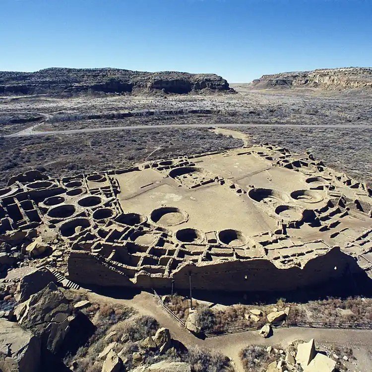
The canyon contains more than a dozen major masonry complexes known as “Great Houses,” positioned along the canyon floor and linked through sightlines and engineered routes. These structures are notable for their scale, geometric clarity, and deliberate orientation. Several Great Houses align closely with cardinal directions, while others respond to solar and lunar cycles.

The largest and most extensively studied complex, Pueblo Bonito, developed incrementally into a vast D-shaped structure comprising more than 600 rooms arranged around central plazas. Spatial hierarchy is clearly expressed. Open plazas accommodate large gatherings, while movement inward leads to increasingly restricted rooms and ceremonial spaces. This layered organization indicates controlled access and ritual progression rather than open residential use.

Construction Methods and Material Use

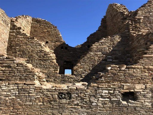
Stone defines Chacoan architecture. Builders quarried sandstone locally and employed a core-and-veneer construction technique, with rubble fill enclosed by carefully shaped exterior stones. Over successive building phases, masonry became more refined, with thinner and more regularly cut stones laid in precise horizontal courses.

Walls often exceed one meter in thickness, providing both structural stability and thermal regulation in a climate marked by extreme temperature variation. Roofs and floors were supported by timber beams, primarily ponderosa pine, transported from mountain ranges more than 70 kilometers away. The acquisition and movement of this timber required sustained organization, underscoring Chaco’s reach and regional integration.
Interior Spaces and Ceremonial Architecture

Interior space at Chaco reflects a clear functional hierarchy. Rectangular rooms dominate the Great Houses, many of them windowless and likely used for storage or ritual preparation rather than daily living. Circulation within these complexes is narrow and controlled, reinforcing spatial order.

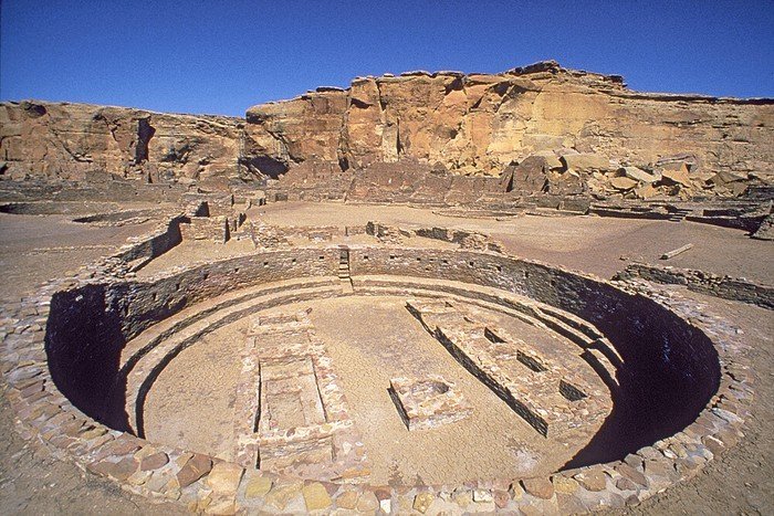
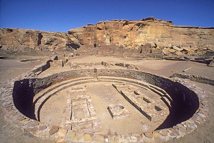
The most distinctive interior element is the kiva, a circular, subterranean ceremonial chamber. Kivas were entered from above by ladder, marking a deliberate transition from an open plaza to an enclosed ritual space. Interior features typically include bench seating, wall niches, a central fire pit, and ventilation shafts designed to regulate airflow and smoke.

Large Great Kivas, some exceeding 19 meters in diameter, served as communal ceremonial spaces and are often positioned prominently within the architectural layout. The contrast between rectilinear room blocks and circular kivas establishes a consistent spatial dialogue throughout the canyon.

Astronomy, Orientation, and Ritual Time

Chacoan architecture demonstrates a sophisticated understanding of astronomical cycles. Numerous buildings and landscape features align with solar solstices, equinoxes, and lunar standstills. The best-known example, the Sun Dagger on Fajada Butte, uses the interaction of light and shadow cast by stone slabs to mark seasonal transitions with precision.

These alignments suggest that architecture at Chaco functioned as a calendrical instrument, regulating ceremonial timing, agricultural cycles, and social order. Built form, landscape, and sky were treated as an integrated system rather than separate realms.

Surface Treatment and Architectural Restraint

Decoration at Chaco is notably restrained. Visual emphasis rests on proportion, repetition, and the precision of stonework rather than applied ornament. Where plaster or pigment appears, it is used sparingly and without elaborate figuration.

This restraint directs attention to spatial sequence and material presence. Shifting light across stone surfaces, the contrast between open plazas and enclosed chambers, and the tactile quality of masonry become the primary architectural language of the site.

Road Networks and Regional Integration

Beyond the canyon itself, Chaco is connected to an extensive system of engineered roads, many of them remarkably straight and wide. These routes link the canyon to outlying settlements, shrines, and resource zones across a broad region.

The scale and clarity of these roads indicate that Chaco was conceived as part of a wider regional framework. Movement of people, materials, and ritual knowledge occurred along these corridors, reinforcing Chaco’s role as a central node rather than an isolated complex.

Decline, Abandonment, and Continuity

By the late twelfth century, large-scale construction at Chaco Canyon ceased. Prolonged drought, environmental pressure, and shifts in social organization likely contributed to this change. The site was not destroyed but gradually left behind as populations dispersed to other areas of the Southwest. Despite physical abandonment, Chaco retained cultural significance. Descendant Pueblo communities continue to recognize the canyon as an ancestral place, maintaining spiritual and historical connections that extend beyond continuous occupation.

Chaco Canyon stands as one of the most accomplished examples of Indigenous architecture in North America. Its importance lies not only in its monumental scale, but in the integration of planning, material intelligence, interior organization, and astronomical knowledge. Built without kings, written records, or ornamental excess, it reflects a form of architecture shaped through collective organization, environmental understanding, and long-term cultural continuity.

Sources

Lekson, Stephen H. The Chaco Meridian: Centers of Political Power in the Ancient Southwest. AltaMira Press, 1999. Vivian, R. Gwinn. Chacoan Prehistory of the San Juan Basin. Academic Press, 1990. Kantner, John. Ancient Puebloan Southwest. Cambridge University Press, 2004. Sofaer, Anna. “The Primary Architecture of the Chacoan Culture.” Journal of Anthropological Research. UNESCO World Heritage Centre, Chaco Culture World Heritage Site Dossier.

Images: Public sources / National Park Service archives

Copyright: © Sacred Sites

June 9, 2026 0 comments
0 FacebookTwitterPinterestEmail
Founders & Brands

Meet Femo Wong, the Chinese Designer Behind Femo Design

by DDI Edit Team June 9, 2026
written by DDI Edit Team

Over the past decade, Femo Design has quietly built a reputation for original furniture rooted in restraint, material intelligence, and long-term thinking. Based in Shenzhen, a southern Chinese city known for its manufacturing depth and evolving design ecosystem, the studio operates at the intersection of design, craft, and production. Founded and led by Femo Wong, an architect by training and an active curator of furniture exhibitions, Femo Design approaches furniture as a process rather than a product. In this interview with Shweta for Design Diary International, Wong reflects on authorship, craftsmanship, material experimentation, and the realities of building an original design studio in today’s global landscape.

Femo Design has a quiet confidence to it. What was the initial impulse behind starting your own design studio, and what did you feel was missing in the design landscape at that moment?

The core motivation for establishing Femo Design was actually to translate our understanding of “good design” into tangible products. My shift from architecture to furniture design was driven by the appeal of the complete creative process of turning a sketch into a physical product. This sense of accomplishment, of having full control and rapid execution, is something you can never get from working as a mere “cog in the machine” at an architecture firm after graduation.

When I started collecting original furniture pieces in the early days, I noticed that the domestic market was either flooded with blind copies and imitations or filled with “internet-famous designs” that overemphasized flashy aesthetics. Truly original works that balanced functionality, craftsmanship, and aesthetics while conveying the warmth of design to users were extremely rare. Meanwhile, many manufacturers underestimated the value of design, seeing it merely as “icing on the cake.” A severe information gap existed between designers and manufacturers.

Therefore, in founding the studio, we had two goals: on one hand, to create original designs that we ourselves believed in; on the other hand, to build a bridge between design and manufacturing, enabling good designs to truly come to life and gain recognition in the market. This vision of “filling the gaps” has endowed Femo Design with that inherent understated confidence. Our assurance does not stem from gimmicks, but from our unwavering commitment to the essence of design.

Your work often balances restraint with character. How do you personally define “good design,” and has that definition evolved since you began your practice?

To me, the core of “good design” has always been “form follows function, and details reveal warmth.” Specifically speaking, first and foremost, it must address actual user needs, such as the comfort of seating and the proportional harmony of furniture; this is the non-negotiable baseline. Secondly, it should respect the inherent properties of the materials used, avoiding unnecessary ornamentation. Finally, within a minimalist framework, it should convey uniqueness through details. This is the balance between restraint and individuality you mentioned.

Take our “Danish Chair” as an example. It is crafted by bending two solid wood pieces into shape with no redundant structures, yet the subtle cutting treatments on the backrest and leg joints make it both sleek and memorable.

While the core of this definition has remained unchanged, its scope has expanded. When I first entered the industry, my understanding of “good design” was largely confined to the form and craftsmanship of the product itself. Later, after collecting over 2,700 original furniture pieces and curating numerous exhibitions, I gradually realized that good design also needs to embrace long-term value and industry significance. It should not only be functional and aesthetically pleasing, but also stand the test of time and even inspire more people to appreciate original design.

Now, I pay greater attention to the reasoning behind a design: why choose this material, whether the structure can be optimized, and what small improvements it can bring to the user’s life. These considerations have made the definition of “good design” more comprehensive.

Growing up and working in China, how has cultural context influenced your understanding of form, proportion, and materiality?

The pursuit of a “sense of propriety” and “authenticity of materials” in traditional Chinese culture has been subtly influencing me all along. For instance, our understanding of “proportion” is easily linked to the concept of the “golden mean” in traditional Chinese furniture. It is not rigid symmetry, but a dynamic state of equilibrium.

Take our “Tree Branch Table.” The angle of the branching legs and the size of the tabletop were repeatedly adjusted to achieve that comfortable sense of proportion. This sense of balance echoes the idea of “negative space” in traditional Chinese spatial design, which is uncluttered and unassuming.

When it comes to materials, I have a particular fondness for natural materials such as solid wood and stone, which stems from the Chinese pursuit of harmony between humans and nature. Our “Mushroom Stool,” for example, uses solid wood with knots and natural cracks as its base. Instead of deliberately concealing these so-called imperfections of the material, we preserve them to showcase the vitality of nature. This is actually a modern interpretation of the traditional Chinese philosophy of unity between man and nature.

Additionally, the supply chain advantages of China’s manufacturing industry have also influenced my material choices. Mature domestic craftsmanship in solid wood processing and stone cutting, for example, allows me to more easily explore the potential of these materials, translating the material aesthetics of traditional culture into reality through modern techniques.

Many of your designs feel intentional rather than trend-driven. How do you protect your creative process from the pressure of fast-moving global design cycles?

The key is to stop competing with peers and only measure ourselves against masters. I have always believed that trends are short-lived and fickle, while good design is enduring and refined. I spend over ten hours every day researching materials and studying original furniture pieces, benchmarking our work against designs by masters such as Hans J. Wegner and Arne Jacobsen.

I ask myself, “Will my design still be relevant in ten years?” rather than “What is trendy this year?” This long-term mindset allows us to rise above the pressure of rapid iteration. My habit of collecting has also helped me stay grounded. Many of the thousands of furniture pieces in my collection are classic designs from decades ago. Their enduring popularity is not due to fleeting trends, but to their solid functionality and timeless aesthetics. Whenever I hit a creative block, I spend time in the collection area of our studio, feeling the curves and textures of these vintage pieces. It always reminds me that the core of design is to solve problems and deliver value, not to chase hot topics.

Moreover, our creative process is deliberate. From concept development to prototyping and craftsmanship refinement, we never rush through any stage. For example, the curvature of a chair seat may go through over a dozen rounds of prototyping before finalization. This dedication to detail is, in itself, a resistance to the fast-paced mindset.

Craftsmanship plays a visible role in your work. How important is the dialogue between designer and maker in your studio, and how hands-on are you in that process?

The collaboration between designers and craftsmen is the key. Without exaggeration, it is the only way to turn great ideas into great products. More often than not, a designer’s concept is idealized, but craftsmanship has its practical limitations, such as the bending limits of solid wood and the precision requirements of stone cutting. These all require constant communication with craftsmen.

I have always believed that designers are not directors, but collaborators. The experience of craftsmen can help us avoid many pitfalls and even inspire new creative directions.

Our level of participation in this process is 100 percent. From the initial discussion of craftsmanship plans to the first round of prototyping, detail adjustments, and finally mass production, I personally visit the factories and work closely with the craftsmen every step of the way. Only through hands-on involvement can we accurately grasp the craftsmanship details and ensure that the original intent of the design is not diluted.

Furthermore, I firmly believe that craftsmanship is not a simple combination of a designer’s ideas and a craftsman’s execution, but the result of a collision between the two. The skills of craftsmen make designs more feasible, while the ideas of designers expand the possibilities of craftsmanship.

What role does material experimentation play at Femo Design? Are there materials or techniques you are particularly drawn to at this stage of your journey?

Material experimentation is the wellspring of inspiration for our creations, so much so that many of our designs actually start with material experiments. Different materials have distinct characteristics, such as the warmth of solid wood, the coolness of stone, and the flexibility of rattan. We never force a material to fit a preconceived design. Instead, we develop designs based on the inherent properties of the materials.

I am genuinely interested in all types of materials. I believe that no material is inherently superior or inferior. Any material can be used to create excellent designs as long as its intrinsic attributes are fully leveraged. Recently, I have been working on a series of products using rattan weaving and bamboo, which will be unveiled to the public in a month’s time.

Your collections often feel personal, almost introspective. Do your designs reflect your own life experiences, or do you consciously separate the personal from the professional?

I believe that every designer’s work is inevitably linked to their personal learning journey and life experiences. Additionally, the cultural environment you grow up in exerts a profound influence on your design sensibilities. I do not see design as just a job; it is an integral part of my life.

Spending over ten hours a day researching materials is both accumulation and daily routine. Even discussing design with friends or visiting factories are all part of my life. This state of integration between study, career, and life allows my personal emotions to blend naturally into my creations.

As a young designer building a brand, what challenges have been the most defining for you, both creatively and commercially?

The core challenge has been balancing the purity of creativity with the feasibility of business, a hurdle that cannot be avoided in either dimension. On the creative side, in the early days, I often fell into the trap of self-satisfaction, creating works with overly complex craftsmanship and high production costs. Although I was personally satisfied with them, they failed to gain traction in the market. This experience made me realize that great creativity cannot be divorced from commercial reality; otherwise, it will remain merely a prototype, unable to deliver real value.

On the commercial side, the most critical challenge was getting the market to recognize the value of original design. When we first launched the brand, many clients would compare our products with counterfeits and label original designs as too expensive. Furthermore, some factories, seeing the popularity of our designs, resorted to direct plagiarism, which disrupted our market position. These two issues nearly derailed the brand.

Later, through curating exhibitions and participating in industry trade shows, we continuously promoted the concept of original design, helping more people understand that the higher price reflects superior craftsmanship, innovative design, and intellectual property rights. At the same time, we established in-depth collaborations with reliable manufacturers to optimize the supply chain, controlling costs while ensuring product quality.

This journey made me understand that creativity is the soul of a brand, but business is the vehicle that brings that soul to life. Both are indispensable.

How do you see the role of designers evolving on the global design stage? Is there a distinct voice emerging, or is it still evolving?

The role of designers on the global stage has evolved from followers to participants, but a distinctive design voice is still in the making. It has not yet fully taken shape.

In the early days, many designers were focused on learning Western design concepts and craftsmanship. Today, with the upgrading of manufacturing capabilities and the improvement of the original design ecosystem, a growing number of designers are presenting their work at international exhibitions, and more global brands are collaborating with designers from this region on product development.

At present, there is no single, clearly defined identity comparable to the simplicity of Danish design or the luxury of Italian design. Designers are exploring different paths, some drawing inspiration from traditional culture, others pushing the boundaries of material craftsmanship. This is a process of continuous experimentation and accumulation.

I see this as a positive sign. It suggests that the design voice emerging today is not rigid or monolithic, but diverse and evolving. Over time, with the accumulation of more original work, a clearer identity will emerge, rooted in cultural context yet accessible to global buyers.

Sustainability is increasingly discussed in design. How do you interpret responsibility and longevity within your own work, beyond labels and certifications?

To me, sustainability is not about labels, but about longevity considered from the very beginning of the design process. Creating products that stand the test of time reduces waste, while respecting materials and optimizing craftsmanship helps minimize environmental impact.

We adhere to the philosophy of quality over quantity. We do not release new products simply to chase trends. Instead, we focus on refining long-lasting designs. For instance, our “Danish Chair” and “Shell Chair,” first introduced in 2018, have been continuously refined and remain popular today. A piece of furniture used for decades is far more sustainable than fast-changing products.

We also focus on material conservation and craftsmanship optimization. Our “Half-and-Half Table,” for example, achieves zero material waste through precise cutting. We prioritize FSC-certified timber and design furniture with disassemblable structures to support transport, maintenance, and longevity. These practices may not always carry formal certifications, but they reflect a tangible commitment to responsibility.

What kind of spaces do you imagine your furniture living in?

I do not want my designs to be confined to a specific type of space. Instead, I hope they integrate naturally into users’ lives, whether the environment is bustling or calm, becoming part of everyday routines and offering practical value and subtle warmth.

Collaboration is often a turning point for designers. Are there disciplines or industries outside furniture that you would like to explore?

Absolutely. I am particularly interested in collaborating with professionals in materials science, as furniture design is closely connected to material technology. I am also keen to work with ceramic and textile artists, whose expertise can enrich material expression and introduce new layers of texture and craft.

Looking ahead, how do you envision the future of Femo Design?

Our future focus will be a three-part strategy: deepening craftsmanship as the foundation, expanding product categories as an extension, and developing a stronger brand narrative as the soul.

Craftsmanship will always remain central. We will continue to work closely with skilled craftsmen and manufacturers while exploring new technical possibilities. Product expansion will be measured and aligned with our core philosophy. At the same time, we aim to communicate design culture more actively through exhibitions, publications, and eventually a private design museum dedicated to original design.

Finally, when someone encounters a Femo Design piece for the first time, what feeling or thought do you hope it leaves them with?

I hope their first impression is comfort, whether through visual simplicity or user-friendly functionality. After that, I hope they feel curiosity, wanting to touch the materials, examine the details, and understand why the design was made the way it was.

On a deeper level, I hope our work helps people appreciate the value of original design, not the fleeting excitement of trends, but the dedication that comes from patient refinement. Ultimately, the goal of design is to enhance life, and I hope Femo Design’s work becomes part of those small, lasting moments of everyday joy.

www.femo-design.com

June 9, 2026 0 comments
0 FacebookTwitterPinterestEmail
Products

Febal Casa Presents Origina at Salone del Mobile, a Kitchen System Conceived as an Architectural Intervention Around the Atlas Island

by DDI Edit Team June 6, 2026
written by DDI Edit Team

Febal Casa presented Origina at Salone del Mobile as a kitchen system that approaches its brief as an architectural project rather than a furniture proposition, one that is as concerned with how it shapes the spaces around it as it is with what happens at the worktop.

The composition is organised around the Atlas Island, whose essential geometry and generous proportions give it the authority of a sculptural object in the room, functioning simultaneously as a cooking surface, a storage volume and the social gathering point that anchors the visual logic of the entire living space. A plinth detailed with 45-degree joints works against the island’s considerable volume and lightens it visually, while doors with bronze mirrored aluminum frames introduce a reflective quality that captures and redistributes light through the composition without any decorative gesture that competes with the design’s fundamental restraint.

The tall unit system that completes the Origina configuration takes the same approach into the vertical plane, with glass doors and backlit shelves that turn the wall-mounted elements into a lit interior facade rather than conventional cabinetry, adding rhythm and warmth to the surfaces surrounding the island so the composition reads as a unified spatial intervention rather than a collection of individual kitchen components.

For households that require a separation between the kitchen’s public and working faces, Origina accommodates a secondary operational zone that sits within the system’s overall stylistic logic while remaining discreet enough to handle everyday tasks without drawing attention away from the composition’s primary visual statement.

Origina is available through Febal Casa’s authorised dealer network across Italy and internationally.

June 6, 2026 0 comments
0 FacebookTwitterPinterestEmail
Smart Living

Salter Slushie Maker: A Frozen Drinks Machine That Takes On Ninja at Half the Price

by DDI Edit Team June 5, 2026
written by DDI Edit Team


At-home slushie machines have become a genuine kitchen appliance category over the past two years, largely on the back of the Ninja Slushi, which sells at £299.99. Salter, the British kitchen appliance brand, has now entered the same space with its own Slushie Maker, priced at £179.99 and built around a similar operating premise.

The machine has a 2.5-litre tank and a 200W built-in cooling system that freezes liquids directly without the need for added ice. Pour in a premixed liquid, select a program, and the machine handles the freezing and texturing from there. Five preset programs cover slushies, frozen cocktails, frappes, milkshakes, and chilled juice, each optimizing for a different texture and temperature. A digital display at the front shows the current drink temperature as it drops, and a sliding scale allows manual adjustment of both temperature and texture within each setting.

Dispensing is via a self-serve pulldown handle at the front with a removable drip tray underneath. A rinse mode runs warm water through the system for cleaning. The standout feature for extended use is the 12-hour Stay Cold function, which holds the contents at between 3°C and 7°C once a batch is made, removing the need to use the machine immediately after preparation. Surfaces are wipe-clean, and the drip tray is removable.

The Salter Slushie Maker is priced at £179.99 and is available now from salter.com and Amazon UK, with a launch discount bringing it to £164.99 at time of writing.

salter.com

June 5, 2026 0 comments
0 FacebookTwitterPinterestEmail
Smart Living

Le Creuset Fruit Cocotte Collection: Three Stoneware Pots Shaped Like a Peach, a Strawberry and a Blueberry

by DDI Edit Team June 5, 2026
written by DDI Edit Team

Hosting has shifted from formal dinners to everyday gatherings, with more people investing in their kitchens and tablescapes as extensions of their lifestyle. In that context, the objects that sit on a table or a kitchen counter carry more weight than they used to. They are part of the atmosphere, not just the function.

Le Creuset has understood this for some time. The French cookware brand, founded in 1925 in the town of Fresnoy-le-Grand, has built its reputation on enameled cast iron that lasts decades, but it is the brand’s instinct for color and form that has made it a consistent presence on social media and in homes that care as much about how a kitchen looks as how it performs. The seasonal and themed collections it releases periodically, from pumpkin-shaped casserole dishes for autumn to the current summer offering, tap into a very specific appetite for cookware that doubles as a conversation piece.

The Fruit Cocotte collection is the latest of these. It arrives as three individual stoneware cocottes, each shaped and colored after a different fruit: a peach, a strawberry, and a blueberry, each with a fitted lid and a small handle that complete the form precisely. These are not approximate references to the fruit. The shaping is deliberate and detailed, the kind of object that earns a second look when it appears on a dining table.

Beyond appearance, the practical credentials are sound. All three are made from Le Creuset’s stoneware, produced from specialist clays that maintain a consistent temperature during cooking. They are thermoresistant from minus 23°C to plus 260°C, meaning they move from freezer to oven without issue and serve equally well for hot soufflés or chilled desserts. The capacities differ slightly across the three shapes: the peach holds 0.58 liters, the strawberry 0.57 liters, and the blueberry, the smallest of the three, 0.48 liters.

For summer hosting specifically, the scale and format of these cocottes suit individual portions of desserts, dips, condiments, or small baked dishes, and the fruit shapes translate well to a table that is deliberately dressed for the season. Placed together, the three make a natural set.

At £50 per piece in the UK and $55 in the US, they sit at the more accessible end of Le Creuset’s range. All three are available now directly from Le Creuset.

lecreuset.co.uk

June 5, 2026 0 comments
0 FacebookTwitterPinterestEmail
Smart Living

Aqara Smart Lock U500: Three Versions for Gates, Glass Doors and Standard Entrances

by DDI Edit Team June 5, 2026
written by DDI Edit Team

Most smart locks are designed around a single door type, typically a standard wooden front door with a mortise or deadbolt. The Aqara Smart Lock U500 series, now available in the UK, takes a different approach, offering three separate versions built for door types that retrofit smart locks have historically struggled with.

The Smart Gate Lock U500 is designed for iron gates and grille-style doors. The Smart Glass Door Lock U500 fits glass doors without drilling or structural modification, using a surface-mounted clamp system that leaves the glass intact. The Smart Rim Lock U500 uses a front-and-back surface-mounted design with no mortise required, making it a straightforward upgrade for most standard entrance and interior doors. All three are built with full metal frames, reinforced dual-hook bolts, and a through-lock cylinder engineered to resist prying and forced entry.

Despite the different physical configurations, the three models share identical features across unlocking methods and connectivity. Fingerprint recognition uses a 160×160 pixel sensor and stores up to 50 unique prints locally, with all access data encrypted using AES. Additional unlocking methods include NFC, passcode, and app control via the Aqara Home app. Apple Home Key support allows the door to be unlocked directly from an iPhone or Apple Watch via Apple Wallet. Voice assistant compatibility covers Amazon Alexa, Google Home, and Samsung SmartThings.

Connectivity runs on Matter over Thread using the Aliro standard, which handles cross-platform integration without requiring cloud-based credential storage. A Thread border router is required for Matter functionality. A gyroscope sensor detects when the door closes and triggers automatic locking without needing a separate contact sensor. Additional features include a Do Not Disturb mode that suppresses general alerts during set hours while retaining notifications for forced entry or doors left ajar and a One Tap Dual Unlock function that allows multiple Aqara locks to release simultaneously.

The outer panels are rated IP65 and the inner panels IP54. Power comes from four AA batteries with a quoted battery life of up to seven months. A USB-C emergency port allows the lock to be powered by a phone or power bank if the batteries are depleted. A built-in doorbell is included on the rim lock.

All three models are available now through Aqara’s UK online store. Pricing ranges from £279.98 to £299.99 depending on the version, with a 15% launch discount available using the code AQAUKU500 at checkout.

aqara.com


June 5, 2026 1 comment
0 FacebookTwitterPinterestEmail
Features

Minimalism Is Getting Boring

by DDI Edit Team June 5, 2026
written by DDI Edit Team

Restraint was once a discipline. It is now, far too often, an absence of decision. And the difference between those two things is the difference between a great room and a showroom.

There is a particular kind of interior that has become so familiar it no longer registers as a choice. You have been inside it many times, possibly without quite noticing, because that is precisely its quality: it does not ask to be noticed. The walls are white or a shade of white that has been given a name suggesting earth or mist or something harvested. The floor is pale timber or large-format stone tile in a colour that does not commit. The furniture is low, its lines clean, its upholstery a variation on the same narrow range of tones that the walls and floors have already established. There are no books visible, no accumulated objects, no evidence of particular taste or specific passion or accumulated life. The kitchen has no handles. The storage has no visible presence. Everything that might reveal who lives here has been resolved, resolved being the word the design world uses when it means hidden. The room is, by every current measure of the professionally desirable interior, very good. It is also, if we are being honest with ourselves, completely interchangeable with ten thousand other rooms being photographed this month for ten thousand other Instagram accounts and design publications and property listings across the world. We have arrived, somehow, at the condition in which the most ambitious design aspiration a client can bring to a project is a room that looks like it could belong to anyone.

This is worth examining carefully, because minimalism was not always this. When Mies van der Rohe designed the Barcelona Pavilion in 1929, the radicalism of the project lay not in the absence of ornament but in the precision of the decision-making behind every element that remained. The cruciform column was not a simple column from which decoration had been removed. It was a specific object, proportioned and positioned with an exactness that made the space around it legible in a way that no conventionally detailed column could achieve. The marble planes that divided the interior were not blank surfaces. They were selected for their specific veining, their colour, the particular quality of their surfaces, so that the material itself carried the visual complexity that the overall compositional restraint withheld. Mies understood something that the current culture of minimalism has largely lost: that restraint is a technique of concentration, not elimination. You remove everything that is not necessary so that what remains carries full weight. The discipline is in knowing what is necessary. The difficulty is in making that determination honestly, for a specific space and a specific life, rather than defaulting to what has become aesthetically safe.

“We have arrived at the condition in which the most ambitious design aspiration a client can bring to a project is a room that looks like it could belong to anyone.”

The shift from minimalism as a philosophical position to minimalism as a stylistic template happened gradually and is difficult to date precisely, but its acceleration is clearly visible in the decade following the widespread adoption of platforms like Instagram and Pinterest as primary reference tools for the brief-writing process. The consequences of this shift are architectural as well as aesthetic. When clients arrive at a project with a folder of saved images that all share the same spatial vocabulary, the designer’s role changes from the development of a specific response to a specific set of conditions into the faithful execution of a pre-existing image. The room is designed backward from its photograph. And a room designed backward from its photograph is a room in which every decision has been made in service of legibility at a glance, which is to say in service of the very opposite of what the best domestic interiors have always offered: the quality of revealing more the longer you spend time inside them.

There is a psychological dimension to this that the design world has been reluctant to discuss directly. Maximalism requires commitment. It requires the willingness to accumulate and display objects that reveal specific passions, specific histories, specific personalities, and in doing so it exposes the person who made those choices to a form of judgement that the neutral room entirely avoids. A beige room with concealed storage and handle-free cabinetry does not tell you anything about the person who lives in it. That is not an accident. The rise of the neutral interior has coincided precisely with a cultural moment in which the performance of taste has never been more public or more consequential, and the safest form of taste, in a world where everything is photographed and shared and evaluated, is the taste that offers no target. Minimalism, in its current dominant form, is not a design philosophy. It is risk management. It is the spatial equivalent of declining to have an opinion.

The architects and designers who understand this are not, by and large, the ones currently dominating the conversation. Lori Morris, whose work is examined at length elsewhere in this issue, has spent thirty years building rooms of such layered specificity and accumulated personality that they remain genuinely difficult to categorise, which is precisely why they are so resistant to imitation. Renzo Mongiardino, the Milanese designer whose theatrical interiors for clients including the Rothschilds and Lee Radziwill treated the domestic room as a complete narrative world, made spaces that told you everything about the life being lived inside them within the first thirty seconds of standing in them. The apartments that Jean-Michel Frank designed in Paris in the 1920s and 1930s were spare without being empty, stripped of historical ornament without being stripped of material intelligence, the walls upholstered in vellum and parchment, the furniture designed with a sculptural exactness that required the room around it to be equally precise. These are all, in their different ways, minimal interiors. What distinguishes them from the current template is that the discipline behind them is evident, the decision-making is specific, and the resulting rooms carry the unmistakable character of a point of view.

“Minimalism, in its current dominant form, is not a design philosophy. It is risk management. It is the spatial equivalent of declining to have an opinion.”

The question for the design industry is whether this represents a temporary plateau in the development of a still-vital aesthetic position, or whether it signals something more significant: the exhaustion of an idea that has been stretched well beyond the discipline and intelligence that originally animated it. The evidence suggests the latter. A design movement that began as a rigorous response to the visual excess of a particular historical moment has become, through repetition and commercial adoption and the flattening effect of social media reference culture, the new visual excess. The rooms that would have seemed radical in their restraint thirty years ago are now indistinguishable from the developer finish of a new-build apartment in any major city in the world. That is not the sign of a living idea. It is the sign of an idea that has completed its journey from the studio to the showroom to the commodity catalogue, which is the journey that all design movements eventually complete. The question that follows is always the same: what comes next. That question, at this particular moment in the history of interior design, feels genuinely open in a way it has not felt for some time. Which is, if nothing else, a reason to be interested

June 5, 2026 0 comments
0 FacebookTwitterPinterestEmail
Features

The New Material Palette

by DDI Edit Team June 5, 2026
written by DDI Edit Team

The materials shaping architecture today are no longer being chosen only for how they look or how easily they replicate at scale. They are being reconsidered for what they cost the planet, and that reconsideration is producing some of the most serious building being done anywhere in the world right now.

For most of the twentieth century, the dominant materials of construction were chosen for their predictability. Concrete, steel, and sealed glass performed consistently regardless of where they were used. They could be specified from a catalogue and delivered to a site without reference to local climate, geology, or craft tradition, and they produced buildings that looked and felt broadly similar whether they were built in Mumbai, Manchester, or Minneapolis. This was understood as progress. The detachment of architecture from place was, for several decades, one of modernism’s proudest achievements. What is becoming clear, across a growing body of practice and a deepening crisis of environmental consequence, is that this detachment carried a cost the industry is only now beginning to fully account for.

Rammed earth is part of the response, though calling it a revival misrepresents what is actually happening. The material never disappeared from building practice in the regions where it was always the logical choice: the earthen architecture of the Sahel, the pisé traditions of southern France and northern Africa, the compressed earth construction of rural India. Its reappearance in serious contemporary architectural practice is less a nostalgic gesture than a recognition of performance qualities that no synthetic material has yet matched at equivalent environmental cost. The thermal mass of a rammed earth wall is exceptional. It absorbs heat during the day and releases it slowly through the night, reducing the energy demand of a building’s mechanical systems over its entire operational life. Martin Rauch, the Austrian specialist whose firm Lehm Ton Erde has done more than any other single practice to advance the technical possibilities of contemporary rammed earth construction, collaborated with Herzog and de Meuron on the Ricola Herb Centre in Laufen, Switzerland, completed in 2014, producing walls of compressed local earth whose surface quality and structural performance together made the argument that rammed earth was not a material of limitation but of genuine architectural ambition. The Chapel of Reconciliation in Berlin, completed in 2000 by architects Reitermann and Sassenroth on the former death strip of the Berlin Wall, makes a different but equally serious case: a rammed earth cylinder whose material carries the specific weight of the ground from which it was made, in a place where the ground itself is the whole subject.


Ricola Herb Centre, Herzog and de Meuron with rammed earth specialist Martin Rauch, Laufen, Switzerland, 2014. Walls compressed from local earth, their surface bearing the striations of successive layers — each a record of the construction process and a thermal instrument within the building’s environmental strategy.

The limitations of rammed earth are real and should not be softened for the sake of the argument. It is slower to construct than conventional masonry, dependent on skilled labor that is increasingly difficult to source outside specialist practices, and its performance in high-rainfall climates requires careful detailing that raises both cost and complexity. These are not trivial objections in an industry whose economics are calibrated around speed and repeatability. But they are objections about the system surrounding the material rather than about the material itself, and the distinction matters because it locates the problem where it actually sits: not in rammed earth’s performance, but in construction culture’s reluctance to reorganize itself around materials whose demands differ from those it has normalized.

“The detachment of architecture from place was, for several decades, one of modernism’s proudest achievements. What is becoming clear is that this detachment carried a cost the industry is only now beginning to account for.”

Lime plaster operates within a similar tension between material logic and construction habit. The widespread adoption of cement-based renders across the twentieth century solved one problem, namely speed and uniformity of application, while creating another that went largely unexamined for decades. Cement seals walls. It prevents the movement of moisture vapor through the building fabric, trapping humidity within the structure and creating the conditions for condensation, mold, and the progressive deterioration of the materials behind the finish. Lime allows walls to breathe, regulating moisture through the wall’s cross-section and producing an interior environment whose air quality is measurably better than that of a sealed cement-rendered space. The surface itself behaves differently over time: where cement cracks and stains in ways that are difficult to repair without complete removal, lime develops a patina, carbonating slowly as it cures and producing a surface that deepens and enriches rather than simply deteriorating. John Pawson, whose use of lime plaster across projects including the Novy Dvur Monastery in the Czech Republic, completed in 2004, established it as a surface capable of spiritual as well as sensory refinement, understood long before the sustainability conversation caught up that lime is not a substitute for cement but a categorically different proposition about what a wall should do and how it should age.

The more speculative end of the new material palette is occupied by mycelium, the root structure of fungi, which has attracted serious architectural attention since Ecovative Design, the American biomaterials company founded by Eben Bayer and Gavin McIntyre in 2007, demonstrated that mycelium grown on agricultural waste could be formed into structural blocks with compressive strength comparable to conventional insulation materials, produced with a fraction of the embodied energy. The most architecturally visible demonstration of mycelium’s potential was the Hy-Fi tower, erected at MoMA PS1 in New York in 2014 by the architectural practice The Living, led by David Benjamin, who grew approximately ten thousand mycelium and corn stalk bricks on site and assembled them into a structure that stood for the duration of the summer programme before being composted entirely at its close. The project was honest about being an experiment, testing at architectural scale a material whose durability, structural range, and performance under sustained environmental stress remained unresolved. Those questions remain substantially unresolved today, which is not a reason to dismiss the material but a reason to describe its current status accurately: a serious research direction whose translation into standard construction practice is a question of years rather than months, and possibly of decades.

Hy-Fi Tower, The Living (David Benjamin), MoMA PS1 courtyard, New York, 2014. Approximately 10,000 mycelium and corn stalk bricks grown on site and composted in their entirety at the close of the summer programme. The most architecturally serious public demonstration of mycelium’s spatial potential to date.

Recycled composites sit in a different position within this conversation: less speculative than mycelium, more immediately deployable than rammed earth, and carrying a particular honesty about what they are doing and what they are not. Interface, the American flooring company that committed in 1994 to eliminating its negative environmental impact by 2020 under the Mission Zero programme initiated by founder Ray Anderson, has over three decades developed flooring systems incorporating recycled fishing nets, reclaimed carpet tiles, and post-consumer waste into products whose performance matches or exceeds conventionally manufactured equivalents. The argument for recycled composites is straightforward and should not be overstated. They manage the waste that the construction industry produces rather than reducing the rate at which that waste is generated. They operate within the existing system of material consumption rather than proposing an alternative to it. This is a meaningful contribution but not a transformation, and the distinction between the two is one that the broader sustainability discourse in architecture has not always been careful to maintain.

What connects rammed earth, lime plaster, mycelium, and recycled composites is not a shared aesthetic or a unified theoretical position but a shared shift in the criteria by which materials are being evaluated. Carbon is no longer an abstraction managed in annual reports. It is a number that clients, regulators, and a growing number of architects are insisting on knowing before a material specification is finalized. The question of where a material comes from, what was consumed to produce it, and what happens to it at the end of a building’s life is moving from the margins of the design brief toward its center. This shift is uneven across the industry, far more advanced in practices working at the scale of the individual house or small institution than in those working at the scale of urban development, where the economics of speed and replication continue to exert a pressure that no amount of environmental conviction has yet fully overcome. But the direction of the shift is clear, and the buildings being produced at its leading edge are, by any serious measure, among the most architecturally interesting work being done in the world right now. Not because they are made from unusual materials, but because the discipline those materials demand has produced an architecture more specific, more considered, and more honestly connected to the conditions of the place and time it was built in than the glass and concrete default it is beginning, slowly and unevenly, to replace.

June 5, 2026 0 comments
0 FacebookTwitterPinterestEmail
Public & Cultural

Resting Pavilion, Osaka Expo 2025: MIDW Turns Excavation Into Architecture

by DDI Edit Team June 4, 2026
written by DDI Edit Team

Fact File

Project: Resting Pavilion, Osaka Expo 2025

Location: Yumeshima, Osaka, Japan

Area: 248 m²

Architects: MIDW

Structure: Jun Yanagimuro Structure Design, Toshiaki Kimura

Furniture: Studio arche

Year: 2025

Photography: Benjamin Hosking


Yumeshima, the artificial island hosting Expo 2025 in Osaka, sits on reclaimed land with inherently weak ground conditions. Any construction on the site required the removal of a volume of soil equivalent to the weight of the proposed building before work could begin. For most projects, such an undertaking would be an inconvenient prerequisite that the team would resolve and then forget. For MIDW, it became the design.

The entire site was excavated into a sequence of alternating hollows and mounds, an operation that simultaneously fulfilled the soil removal requirement and generated a rhythmic, undulating topography across the ground plane. The excavated terrain was then used directly as formwork: a roof was cast using the contoured earth surface as its mold, lifted, rotated ninety degrees on the plan, and placed back onto the ground. The result is a continuous cave-like void between the undulating ground surface and the raised roof above it, a spatial condition that the images read as both simultaneously open and sheltered, structural and geological.

The images make the formal quality of this operation legible in a way that a description alone cannot. Looking across the pavilion from ground level, the roof is a large-format mesh structure, its triangulated grid curving and dipping in a fluid form that bears the imprint of the terrain from which it was cast. The mesh reads as light and almost transparent against the sky, its grid casting a patterned shadow across the pale ground surface below. A single tapered concrete or steel column supports the structure at one point, its pyramidal form making the most direct structural statement in an otherwise deliberately ambiguous composition. The ground itself rolls in soft waves beneath the roof, with a low curved bench set into one of the hollows, and the tree canopy of the adjacent landscape is visible through and above the mesh on all sides.

Wisteria has been planted on the mounds, climbing upward over the rising roof surface and beginning to establish itself across the mesh grid. As the plants grow, they cast shade on the ground below while building a new ecosystem within and around the structure. The relationship between the planted vegetation and the built mesh is visible in the images: green growth is already threading through the steel grid at the upper edges, blurring the boundary between the constructed and the natural.

MIDW has framed the project with a specific long-term intention. If the pavilion is retained after the Expo rather than demolished, the structure would gradually become overgrown, with the wisteria and adjacent forest eventually absorbing the built form into the landscape. The pavilion’s current state, visible in these photographs, is an early point in what the architects envision as a longer process of transformation, from temporary installation toward something closer to ruin and rewilding.

The project is a direct response to the specific conditions of its site: the weak ground, the soil removal requirement, the reclaimed island context, and the temporary nature of the Expo program. Each of these constraints is addressed by the same operation: excavating the terrain, which generates the topography, produces the formwork, creates the spatial experience, and sets the conditions for the vegetation that will define the structure’s future. This project treats the problem and the solution as the same act.

June 4, 2026 0 comments
0 FacebookTwitterPinterestEmail
Features

Seven Ceilings – The Surface Nobody Sees And Everything It Has Always Been Saying

by DDI Edit Team June 4, 2026
written by DDI Edit Team

The floor holds the body…

the wall defines the room….

But it is the ceiling that carries the building’s most unguarded statement about what it believes and who it imagines is beneath it. Every other surface must negotiate with use — it must be walked on, leaned against, opened, closed, furnished against, worn down by the daily friction of occupation. The ceiling alone is exempt from all of that. It asks nothing of the body except the one thing the body is least inclined to give it: attention. And in the long history of building, the cultures that have understood this — that the surface overhead is the surface most free to carry serious ideas precisely because it carries none of the body’s weight — have produced the architecture that endures longest in the mind after the body has left the building.

This is why the ceiling has historically been the surface on which civilizations placed their cosmologies. Not decoration as an afterthought applied to a completed room, but ideology given a spatial address. The Roman dome opened to the sky because Roman spatial philosophy required a legible connection between human interior and celestial order. The Nasrid muqarnas vault dissolved stone into a geometry of infinite subdivision because Islamic architectural thinking considered the representation of the infinite a form of devotion, not ornament. The Gothic painted vault turned the interior of a stone enclosure into a sky because medieval theology required the worshipper to feel, in the body rather than the mind that they were already partway into heaven. In each case the ceiling was the room’s argument — the surface through which the building said the thing it most needed to say, trusting that at some point, in some unguarded moment, the person beneath it would look up.

What follows brings together seven ceilings drawn from eight centuries, five continents, and as many distinct traditions of building — Roman concrete engineering, Nasrid plasterwork, Fatimid woodcarving, Safavid tilework, Gothic stone vaulting, Dravidian rock excavation, and Beaux-Arts civic grandeur. They share almost nothing in material, technique, or cultural context. What they share is the conviction that the space above a person’s head is worth getting right, and that getting it right is among the most demanding things architecture can ask of itself. To stand beneath any one of them is to understand that you are not looking at a ceiling. You are looking at what a particular civilization, at a particular moment in its history, chose to say when it had all the tools of building at its command and one surface left to address.

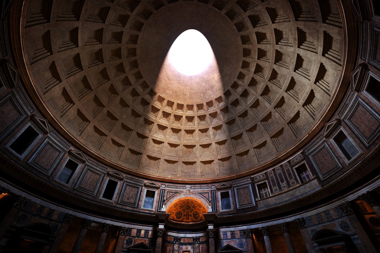
The Pantheon Dome

Rome, Italy ·  118–128 AD  ·  Commissioned under Emperor Hadrian

Interior of the Pantheon dome, Rome, 118–128 AD. Five concentric rings of 28 coffered recesses stepping toward the 8.7-metre oculus — the building’s sole source of natural light and its central cosmological gesture. The disc of direct sunlight that the oculus casts onto the interior walls and floor shifts position continuously across the course of each day.


Dome Span: 43.3 metres    Oculus Diameter: 8.7 metres     MATERIAL: Unreinforced Roman concrete


The Pantheon’s dome remains, after nearly nineteen centuries, the largest unreinforced concrete dome in the world, and its survival is not merely a matter of structural luck. It is the product of an engineering intelligence that understood concrete as a composite material whose performance could be calibrated through the careful gradation of aggregate — heavy volcanic tufa and brick near the base of the dome, progressively lighter pumice and scoria as the structure rises toward the crown — so that the mass decreases as it ascends, reducing the tensile stresses that would otherwise fracture an undifferentiated shell. The dome spans 43.3 metres. The distance from the floor to the apex of the oculus equals that figure precisely, meaning that a perfect sphere would fit within the interior volume, touching the pavement and the rim of the oculus simultaneously. This is not a structural coincidence. It is a cosmological proposition, the enclosure of ideal geometric form within a built room, and it is expressed with greatest force at the ceiling.

The coffered interior surface descends in five rings of twenty-eight recesses, stepping inward and upward toward the oculus in a progression whose perspectival geometry makes the dome read considerably deeper than it is. The coffers are structural as well as spatial — they reduce the mass of the shell substantially without compromising its integrity, and they were originally gilded, the gold recalling the conventional surface of the night sky in Roman decorative tradition. At the centre, the oculus is open to weather: rain enters and drains through a slightly convex floor; wind crosses the interior; a circle of direct sunlight traces a slow arc across the walls and pavement over the course of each day, animating a surface that would otherwise be fixed. Hadrian did not build a roof with a hole in it. He built a sky through which the actual sky was intermittently visible, and the entire ceiling is organized around that distinction as around a theological argument from which everything else follows.


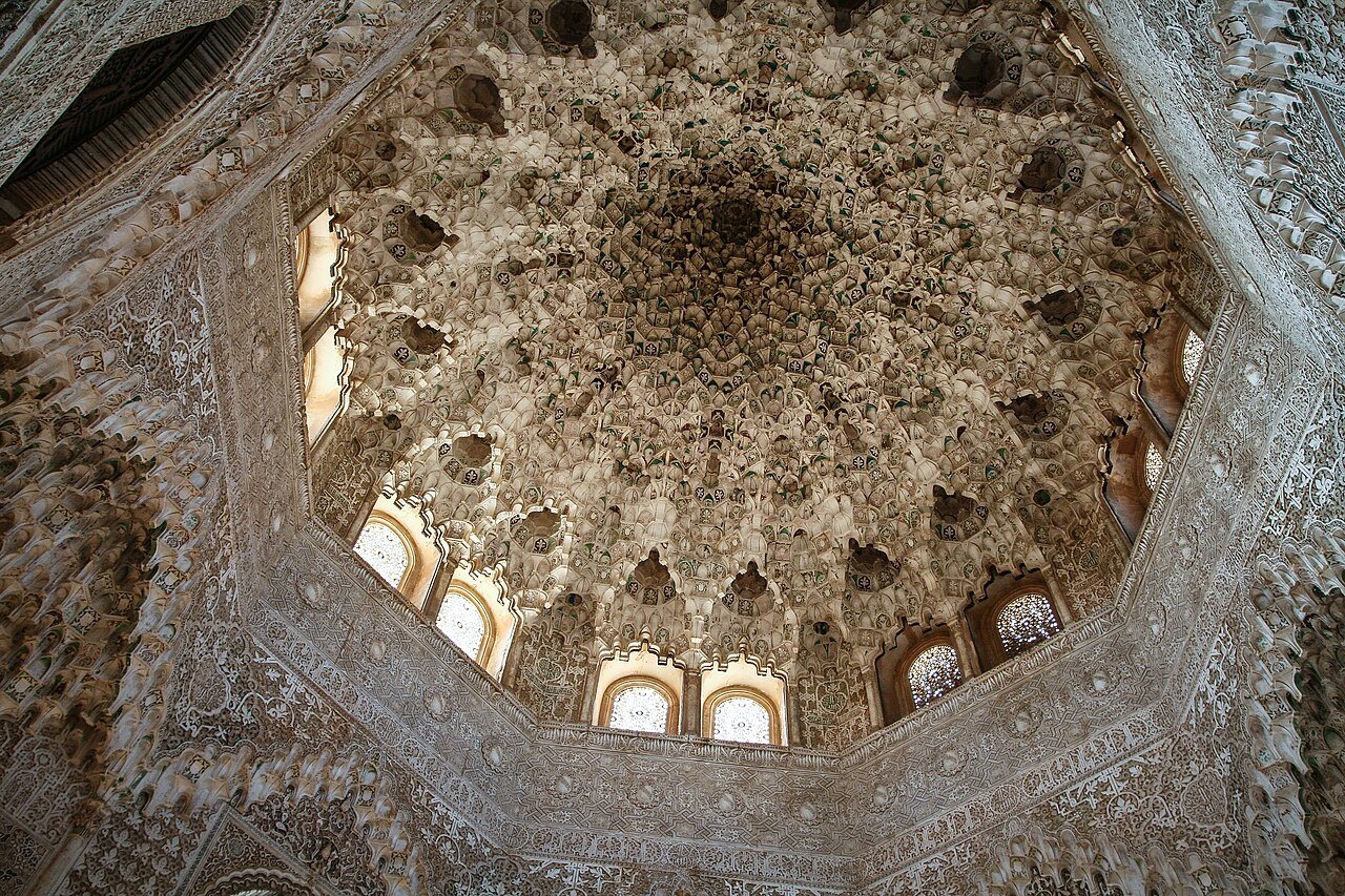
Sala de las Dos Hermanas, Alhambra

Granada, Spain  ·  c.1354–1391  ·  Nasrid Dynasty under Muhammad V

Muqarnas stalactite vault, Sala de las Dos Hermanas, Palace of the Lions, Alhambra, Granada, c.1380. Approximately 5,000 individual carved plaster cells arranged across 16 radiating arms, transitioning the square plan of the hall into a circular, skylit crown. The poet Ibn Zamrak’s verses, inscribed in the frieze below, describe the vault as the heavens in motion.


Cells (approx.)~5,000 plaster units Radiating Arms: 16 Material:Carved and polychromed plaster


The muqarnas vault of the Sala de las Dos Hermanas in the Alhambra’s Palace of the Lions is the most complex plaster ceiling produced within the Nasrid tradition, and it is worth being precise about what that complexity means structurally before considering what it means philosophically. The vault is composed of approximately five thousand individual plaster cells arranged within a system of sixteen radiating arms that emerge from the square plan of the hall at its base and resolve, through successive tiers of diminishing cells, into a small octagonal lantern ringed with windows at the crown. What appears, from below, to be a surface in a state of exuberant dissolution is a precisely engineered transitional structure: the geometric solution to the problem of converting a square room into a circular, skylit vault without a conventional pendentive or squinch. Each tier of cells corbels slightly inward from the one below, the whole assembly operating as a three-dimensional canopy that is structurally self-stabilizing through the interlocking geometry of its components.

The painted surfaces — blue, red, gold, and white in the original polychromy — were not applied to a completed form but were integral to the plaster work as it was laid, so that carving and coloring were a single operation rather than sequential stages. The poet Ibn Zamrak, court poet to Muhammad V and a figure whose verses are inscribed in the dado frieze running around the hall below the vault, wrote that the ceiling was like the heavens in rotation, and the description is less literary than architectural: at the crown, light enters from sixteen directions simultaneously through the lantern windows, animating a geometry that does not resolve into stillness but continues to multiply the further the eye travels from the centre. This is the precise spatial ambition of the muqarnas tradition — not the creation of a fixed image overhead but of a surface that the eye cannot fully possess, that withholds its resolution, and in doing so makes the act of looking a perpetually renewed experience.

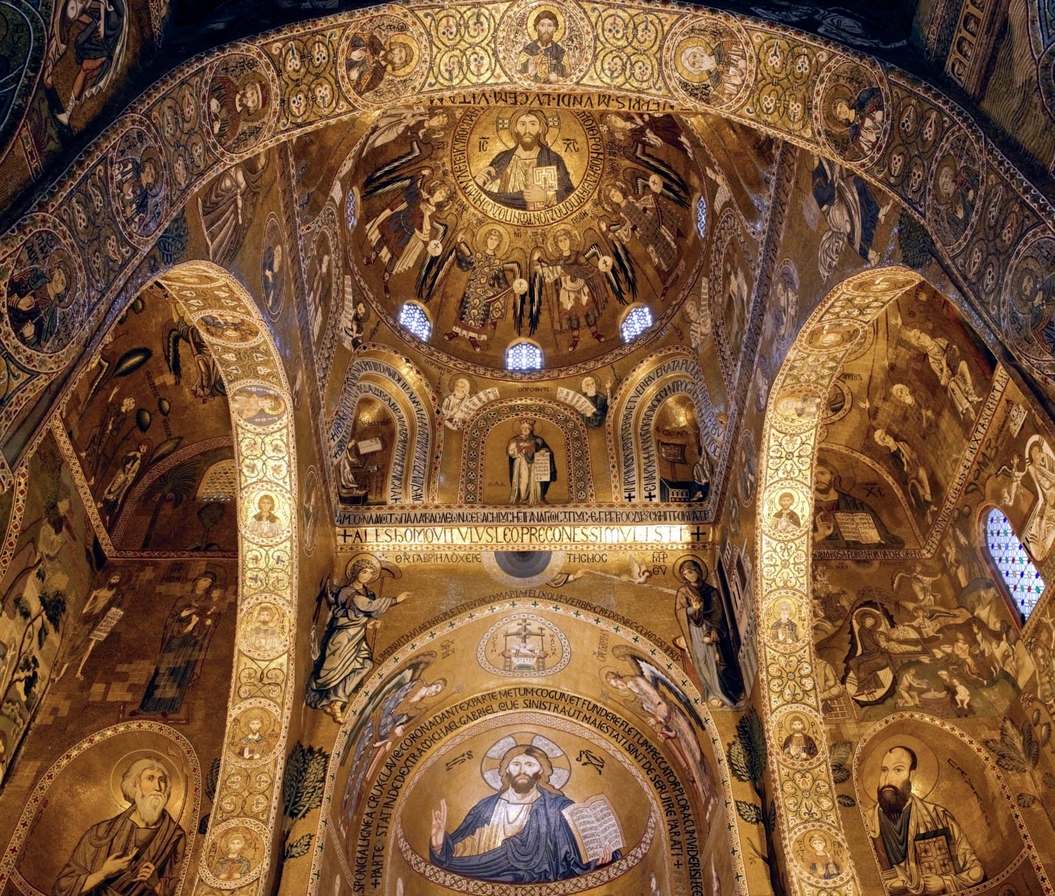
Nave Ceiling, Cappella Palatina

Palermo, Sicily  ·  Consecrated 1143  ·  Roger II of Sicily

Painted wooden muqarnas ceiling, nave, Cappella Palatina, Palazzo dei Normanni, Palermo, consecrated 1143. The largest surviving Fatimid-style wooden muqarnas ceiling outside Egypt, executed in a pictorial programme derived from the Fatimid courtly tradition — hunting scenes, musicians, animals, and human figures — with inscriptions in Arabic Kufic script, above walls lined with Byzantine gold mosaics. Three traditions, one ceiling, one Norman Christian king.


Tradition:Fatimid Islamic woodwork Script:Arabic Kufic inscriptions Context: Norman-Arab-Byzantine court


There is no other ceiling in the world quite like the one above the nave of the Cappella Palatina in Palermo, and the reason for this has as much to do with the political culture of Norman Sicily as with any architectural ambition in the conventional sense. Roger II, who commissioned the chapel in the early twelfth century and consecrated it in 1143, ruled a kingdom in which Islamic, Byzantine, and Latin Christian traditions coexisted in a proximity that was, for its historical moment, extraordinary. His court at Palermo was trilingual — Arabic, Greek, and Latin were all administrative languages — and his palace complex was staffed by craftsmen, scholars, and administrators drawn from across the Mediterranean world. The Cappella Palatina is the spatial expression of that court, and its ceiling is the single most concentrated demonstration of what such a culture could produce when it chose to direct its full resources at one surface.

The ceiling is a muqarnas structure executed in painted wood, a Fatimid form translated into timber almost certainly by craftsmen brought from or trained in the tradition of Fatimid Egypt, and it is the largest surviving example of that form in wood outside Egypt itself. It covers the full nave above walls lined with Byzantine gold mosaics depicting Christ Pantocrator and scenes from the New Testament and the lives of Saints Peter and Paul. The painted programme on the wooden cells belongs entirely to a different tradition: Fatimid courtly imagery of the kind found on Egyptian painted wood of the eleventh century, including hunting scenes, men at banquet, musicians playing the oud and flute, peacocks, falconers, a menagerie of real and fantastical animals, and figures in the dress of the Islamic courtly world. The inscriptions are in Arabic Kufic. There is no Christian iconography anywhere in the ceiling — in the private chapel of a Norman Christian king who had himself depicted in Byzantine mosaic as a king crowned by Christ on the walls of the church of Santa Maria dell’Ammiraglio, a few hundred metres away. This is not syncretism as a philosophical position but as a practice of power, the architecture of a ruler who understood that beauty drawn from multiple traditions was a more potent declaration of sovereignty than beauty drawn from one.

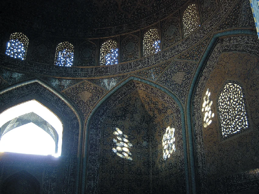
Interior Dome, Sheikh Lotfollah Mosque

Isfahan, Iran  ·  1603–1619  ·  Shah Abbas I, Safavid Dynasty

Interior of the dome, Sheikh Lotfollah Mosque, Isfahan, 1603–1619. A spiral arabesque of cut-tile mosaic in turquoise, cream, black, and gold radiating from a central sunburst medallion — a surface engineered to read differently in morning and afternoon light through the precise calibration of glaze chemistry and tile geometry. The mosque has no minaret and no courtyard; it was built as the private place of worship of Shah Abbas I’s royal household, accessed by a bent corridor from the royal palace.


Construction: 1603–1619 Technique: Cut-tile mosaic (معرق kāshi) Access: Via qibla-correcting bent corridor


The Sheikh Lotfollah Mosque has no minaret and no courtyard, and for an architect this absence is not a detail but the key to the entire building. It was built as the private mosque of Shah Abbas I’s royal household, connected directly to the Ali Qapu palace on the western edge of the Naqsh-e Jahan Square in Isfahan by a corridor that bends at an angle calibrated to correct the orientation of the prayer space toward Mecca without that correction being legible from the public square outside. The mosque presents a composed and symmetrical face to the most formally planned civic space in Safavid Iran while its interior is governed entirely by the demands of devotion and the experience of the single domed room at its centre. That room’s ceiling is the most technically accomplished tile surface produced within the Safavid tradition.

The interior dome is tiled using the cut-tile mosaic technique known in Persian as  mo’arraq kāshi, in which each tile is cut to a precise shape and assembled into the overall pattern rather than painted after firing, so that the color runs through the body of the tile and does not depend on a glaze surface that might wear or fade. The pattern begins at the crown with a golden sunburst medallion and spirals outward and downward through an arabesque of turquoise, white, black, and cream tiles, the arms of the spiral expanding as they descend toward the drum windows, filling the entire dome interior with a continuous geometric field that has no seam and no interruption anywhere across its surface. The dome’s glaze chemistry was calibrated so that the turquoise tiles, which face slightly toward the single window in the drum, catch morning light and make the dome read as a cool, luminous field, while in the afternoon the same surface shifts toward the cream and pale gold of the ground tiles, producing an entirely different spatial temperature in a room that has not changed. This is not an accidental optical effect. The architects and tilemakers of the Safavid court understood that a fixed surface could be made to produce a kinetic experience through the engineering of reflectance and light angle, and the Sheikh Lotfollah dome is the most refined built demonstration of that understanding anywhere in the Islamic architectural world.

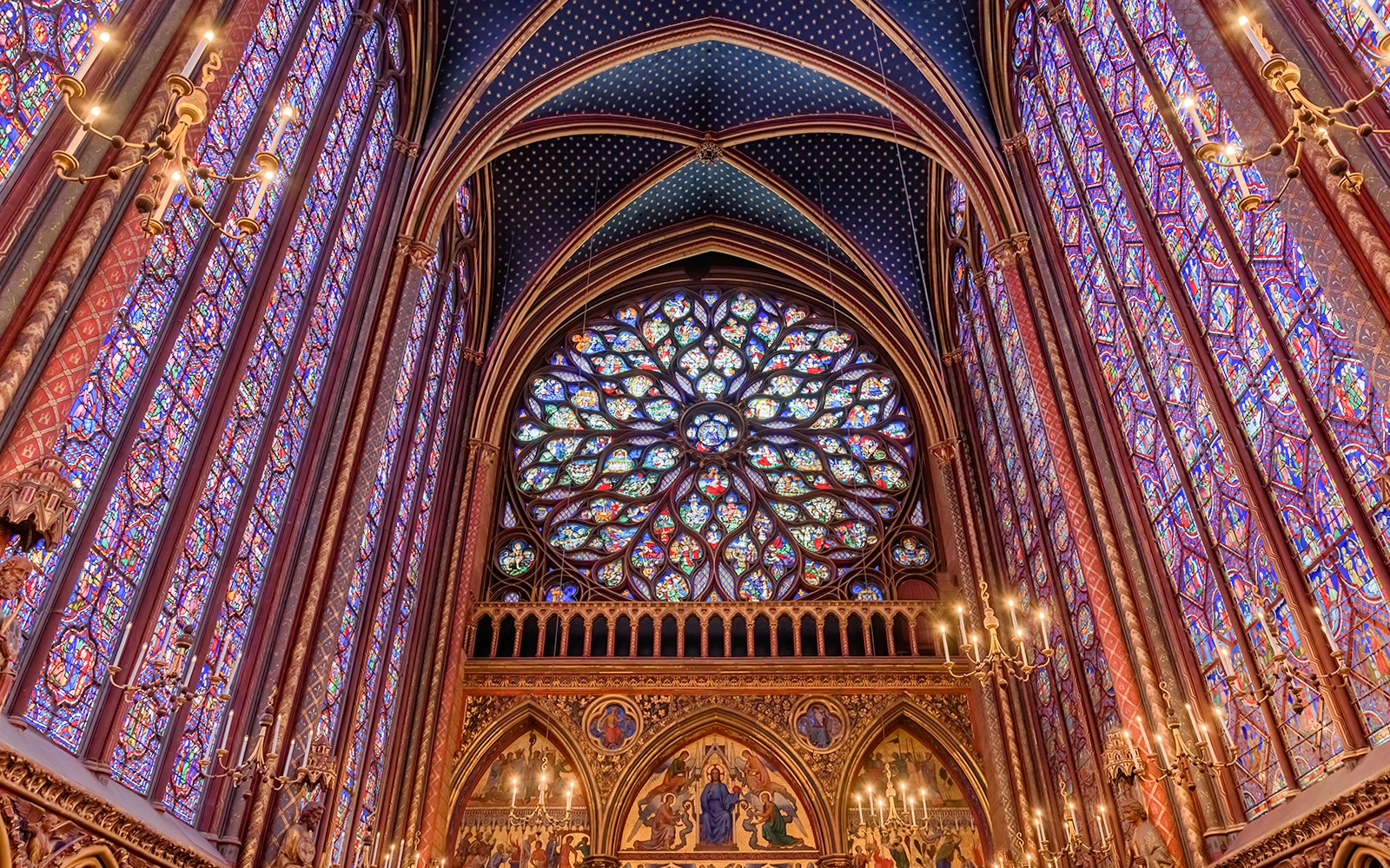
Upper Chapel Vault, Sainte-Chapelle

Paris, France  ·  Consecrated 26 April 1248  ·  Louis IX of France

Painted ribbed vault, upper chapel, Sainte-Chapelle, Île de la Cité, Paris, consecrated 26 April 1248. A deep ultramarine field sown with gold fleur-de-lis stars, carried on gilded ribs that reduce the structural stonework to the minimum required to hold the vault above approximately 600 square metres of stained glass across fifteen windows depicting 1,113 individual scenes. The ceiling and the windows function as a single theological instrument.


Consecrated: 26 April 1248 Glazing:~600 m² stained glass Scenes depicted:1,113 across 15 windows


Sainte-Chapelle was built to contain a relic, and this purpose is inseparable from the character of every surface within it, including the ceiling. Louis IX had acquired what was presented as Christ’s Crown of Thorns from Baldwin II of Constantinople in 1239, paying 135,000 livres — a sum representing roughly three times the annual revenue of the French crown — and the chapel he built to receive it was conceived not as a church in any conventional liturgical sense but as a reliquary scaled to the dimensions of a building. The logic of the reliquary is the logic of the vessel: the object it contains must register as more precious than the container around it, and everything the container does must be in service of that revelation. At Sainte-Chapelle, this means that the stone has been reduced to the absolute structural minimum — slender columns, externally expressed flying buttresses, walls dissolved almost entirely into glass — so that the interior is less a room than a lantern, a space constituted by colored light rather than by enclosing surfaces of any material weight.

The ribbed vault of the upper chapel is painted a deep ultramarine and sown with gold fleur-de-lis stars against a field of gold, the ribs themselves gilded so that the structural system reads as ornament rather than engineering. When the fifteen windows are struck by direct sun, the interior fills with a shifting field of colored light — red, blue, purple, gold — that moves across the vault surface and animates the painted field in a way that no static decorative programme could achieve independently. The ceiling and the windows are not two surfaces but a single instrument: the vault’s deep blue ground provides the dark field against which the colored light transmitted through 1,113 individual scenes registers with maximum intensity, and the windows provide the coloured light without which the vault would simply be a ceiling. Sainte-Chapelle understood something about the ceiling that most ambitious buildings never articulate so clearly: that its quality is not intrinsic but relational, that a ceiling is always in conversation with the surfaces and conditions around it, and that the most compelling ceiling is not the most elaborate one but the one most precisely calibrated to the room it completes.

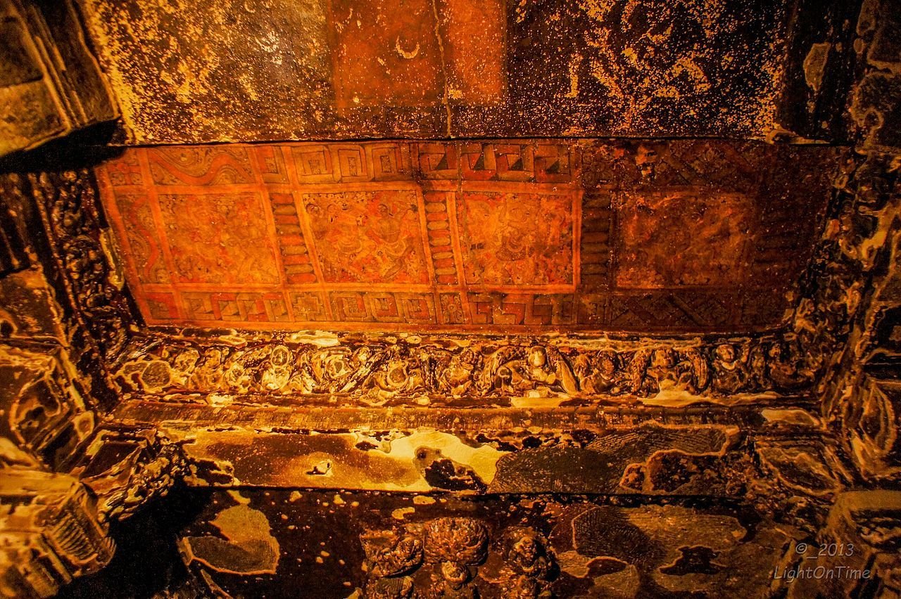
Mandapa Ceiling, Kailasa Temple, Ellora

Maharashtra, India  ·  c.756–773 AD  ·  Rashtrakuta Dynasty under Krishna I

Carved basalt ceiling, mandapa assembly hall, Kailasa Temple, Ellora Cave 16, Maharashtra, c.756–773 AD. Every surface seen here was once interior to a solid cliff face. The entire Kailasa complex — temple tower, mandapa, subsidiary shrines, courtyard, flanking elephants, and narrative relief galleries — was created by removing an estimated 200,000 tonnes of basalt from a single volcanic rock mass, working downward from the summit. The ceiling was not built. It was disclosed.


Method: Top-down rock excavation Material: Single basalt cliff, monolithic Rock Removed: Estimated ~200,000 tonnes


The Kailasa Temple at Ellora is the only ceiling in this survey that was never constructed. It was uncovered. The entire complex — the main shikhara tower, the mandapa assembly hall, the subsidiary shrines dedicated to the river goddesses and to Nandi, the courtyard flanked by life-sized stone elephants, and the galleries of narrative relief carving that line the surrounding rock walls — was created during the reign of the Rashtrakuta king Krishna I, approximately 756 to 773 AD, not by assembling material but by removing it, working from the top surface of a basalt cliff face downward and inward so that what emerged was a freestanding temple complex continuous with the rock from which it was taken at every point, with no joints, no mortar, and no structural division between the ceiling of the mandapa and the rock above it. There is no other building anywhere of comparable scale that was made by subtraction alone.

The mandapa ceiling, continuous with this same undivided basalt, is organized around large lotus medallions in shallow relief, the petals layered in concentric rings whose geometric precision is the more remarkable for having been achieved in a material that permits no revision once cut. Unlike every other ceiling in this survey, it could not be planned at a distance from the surface and then applied — it had to be conceived and executed simultaneously, each chisel stroke permanent in a way that no other ceiling-making process demands. The Kailasa complex’s most dramatic surfaces are the relief carvings on the surrounding walls, which depict scenes from the Ramayana and the Mahabharata with a sculptural energy and narrative density that have no parallel in the ancient world. But the ceiling of the mandapa asks, more quietly and more insistently than any of those scenes, the question that the whole temple poses to anyone who thinks seriously about what building is: what is the relationship between making something and finding it? Every other ceiling discussed in these pages was constructed from materials brought to a site and assembled into a surface overhead. This one was always there. The builders’ task, across the better part of two decades, was simply to see it clearly enough to let it out.


Main Concourse Ceiling, Grand Central Terminal

New York, USA  ·  Opened 2 February 1913  ·  Reed & Stem with Warren & Wetmore


Celestial ceiling, Main Concourse, Grand Central Terminal, New York, 1913; restored 1996–1998. A Mediterranean blue-green vault with gold-leaf constellations of the winter zodiac — Orion, Taurus, Aquarius, Gemini, and Canis Major among them — 37 metres above the concourse floor. The constellations are rendered in mirror image, depicted as they appear from outside the celestial sphere looking inward, a convention derived from medieval manuscript astronomical tradition.


Ceiling Height; ~37 metres Annual Footfall: ~45 million Restored: 1996–1998


Grand Central Terminal opened on 2 February 1913 as the product of a collaboration between the firms Reed & Stem, who were responsible for the engineering and circulation logic of the building, and Warren & Wetmore, who developed its Beaux-Arts architecture, and the Main Concourse that resulted is among the great civic interiors of the twentieth century anywhere in the world. Its scale — 37 metres from the concourse floor to the vault above, the room itself approximately 76 metres long — is deployed not to impress through intimidation, which is what civic scale most commonly does, but to dignify, to give the daily act of moving through a city the spatial quality of something that deserves to be done with a measure of attention. Forty-five million people pass through it each year, making it one of the most heavily used buildings on earth, and the ceiling they pass beneath is, in its way, the most democratically ambitious surface in this survey: a medieval sky, produced within a Beaux-Arts vocabulary, installed over a commuter railroad terminal, available without charge to anyone who needs to catch a train.

The constellations are painted in mirror image, reversed left to right from the way they appear when observed from the earth’s surface, and this detail has attracted more interpretive attention than almost any other element of the building. The most historically grounded explanation holds that the painters worked from a medieval manuscript source that depicted the heavens as a sphere surrounding the earth and showed the constellations as they would appear to a figure outside that sphere looking inward — a convention of ancient astronomical illustration derived from the armillary sphere and the celestial globe, in which the sky is modelled as a surface seen from outside rather than from within. Whether or not this was the painters’ conscious intention, the effect is of a sky that is simultaneously familiar and subtly wrong: close enough to the observed sky to be read as sky, different enough to register as something other than nature reproduced. The vault was obscured for decades under layers of grime from coal smoke and tobacco, restored between 1996 and 1998 at a cost of approximately 12 million dollars, and the restoration revealed that what had been read for generations as a dark and oppressive surface was in fact a luminous field of extraordinary refinement. Grand Central’s ceiling does what the best ceilings in this survey all do, though in entirely different materials and for an entirely different population: it reminds the people beneath it, in a language they may not consciously register but that the body understands, that the space they are moving through is worth more than the journey they are making.


“The ceiling is the surface that architecture asks the least of us to notice, and the one it has used most insistently, across every culture and century, to say what it most needed to say.”

— ✦ —


June 4, 2026 0 comments
0 FacebookTwitterPinterestEmail
Newer Posts
Older Posts

Recent Posts

  • Florim Introduces SensiVenezia, a Porcelain Stoneware Collection Inspired by Venetian Terrazzo
  • LEGO Botanical Wave Transforms TANK Shanghai with 380,000 Brick-Built Flowers
  • The Great Eastern Home Introduces Its Latest Collection of Italian Vintage Mirrors
  • Smart Homes Are Changing Architecture: What Happens When Technology Becomes Part of the Building?
  • AARQE9’s Nikhaar Dhawan & Bahaar Dhawan Rohatgi Unveil the Sculptural Lunar Drip Table

Recent Comments

  1. Smart Home Architecture: How Technology Is Changing Design on Aqara Smart Lock U500: Three Versions for Gates, Glass Doors and Standard Entrances

Newsletter

  • Home
  • About Us
  • Contact Us
  • Editorial Policy
  • Privacy Policy

© 2026 Design Diary International. All Rights Reserved.

Design Diary International
  • Home
  • Project
    • Residential
    • Hospitality
    • Commercial
    • Public & Cultural
  • Interview
    • Architect
    • Interior Designer
    • Founders & Brand
    • Artist
  • Material
  • Product
  • Feature
  • DDI Finds
    • Emerging Studio
    • Rising Designers
    • New Practices
  • About
  • Magazine
  • Contact Us