• Home
  • Project
    • Residential
    • Hospitality
    • Commercial
    • Public & Cultural
  • Interview
    • Architect
    • Interior Designer
    • Founders & Brand
    • Artist
  • Material
  • Product
  • Feature
  • DDI Finds
    • Emerging Studio
    • Rising Designers
    • New Practices
  • About
  • Magazine
  • Contact Us
Design Diary International
Hospitality

 S+A Collective Wraps a Jayanagar Restaurant in a Green Birdcage Skin

by DDI Edit Team June 20, 2026
written by DDI Edit Team

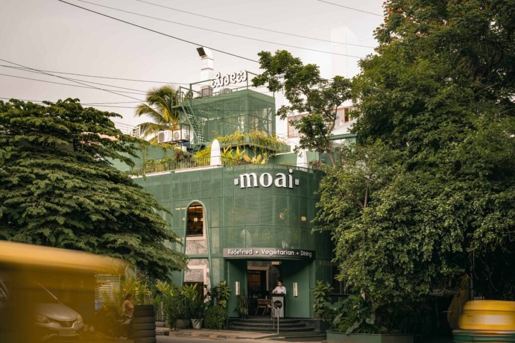
From the street, Moai is a building wrapped in green, its existing structure sheathed in a perforated metal skin the color of deep foliage, the restaurant’s name set into an arched opening, and a planted roof terrace spilling over the parapet above. S+A Collective has reworked a building in Jayanagar into a vegetarian restaurant whose central aim is to dissolve the line between indoors and outdoors, letting the dense greenery of the neighborhood act as a spatial element rather than a backdrop. Framed views set up a constant exchange between the enclosed dining areas and the landscape around them, holding openness and intimacy together, and the architecture works in an earthen yet modern register where material, form, and detail combine into a warm place to eat.
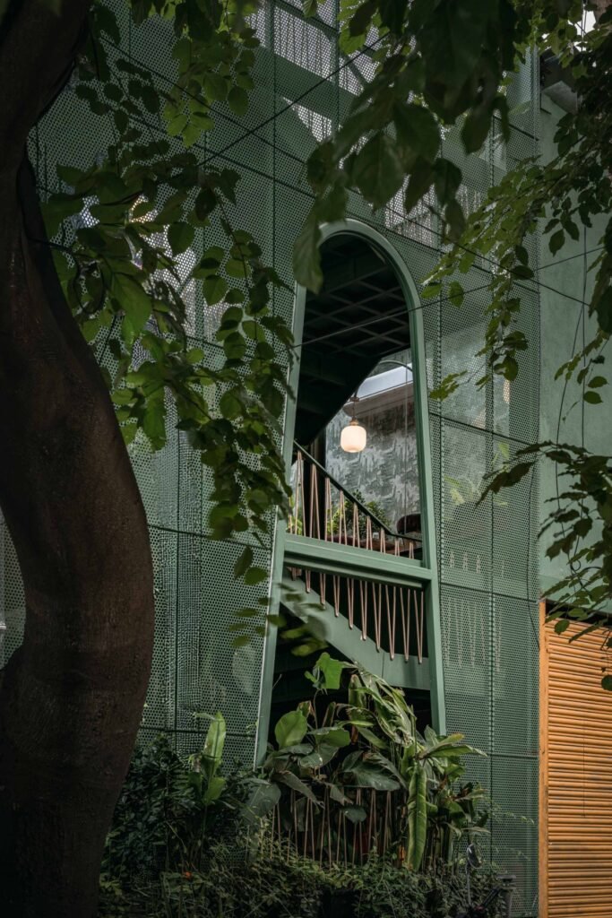
The facade carries the central idea, working as a perforated metal skin that wraps the original structure and does real work rather than sits there as decoration. This porous envelope handles light, ventilation, and privacy while changing how the building reads from outside, and it draws on two overlapping metaphors, the birdcage and the greenhouse, a lightweight enclosure that is at once protective and open, blurring the line between containment and connection. In the photographs the green mesh glows softly against the surrounding trees, so the whole building looks like something growing rather than something built.

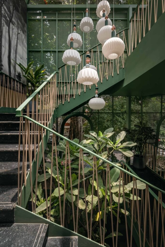
The boldest spatial move is the stair that climbs through the heart of the plan, painted the same deep green as the skin and threaded around a mature tree and banks of planting. Its balustrade is a thicket of slender pale rods set at angles, almost like reeds or the strings of an instrument, and from it hangs a cascade of fluted white pendant lamps strung with ceramic beads in green and terracotta, dropping through the double-height void. The black stone treads, the green steel, and the greenery together make circulation the centerpiece of the interior, a piece of landscape you move through rather than just a way upstairs.
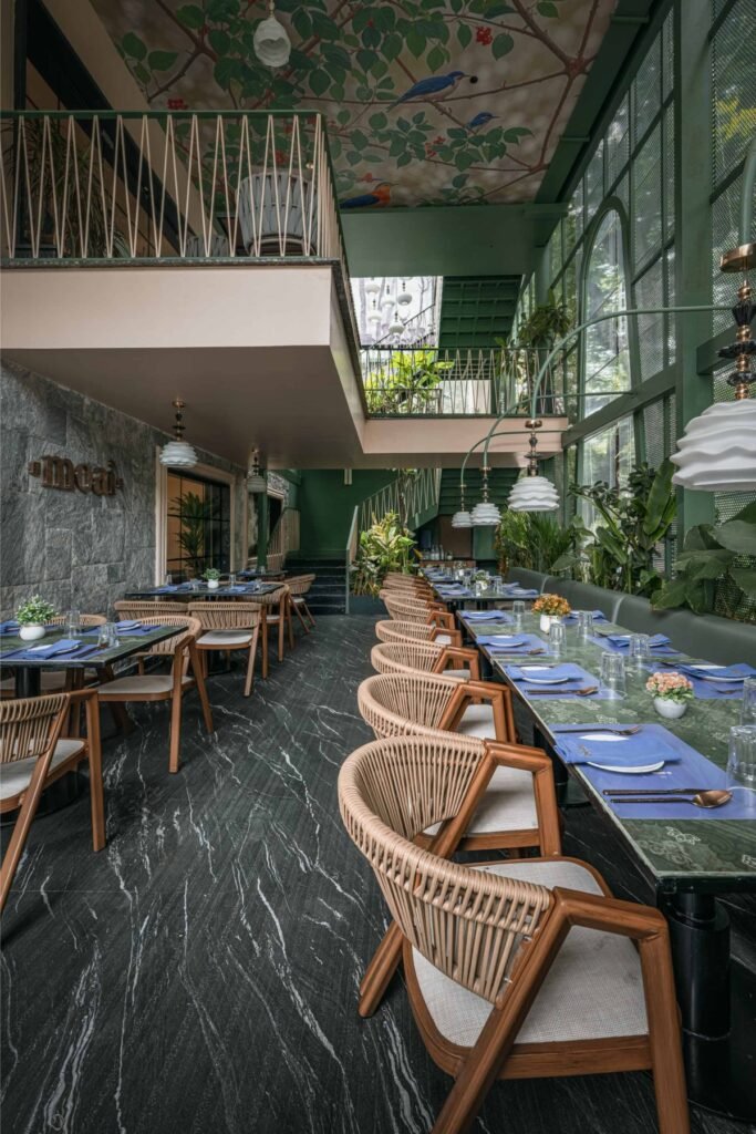
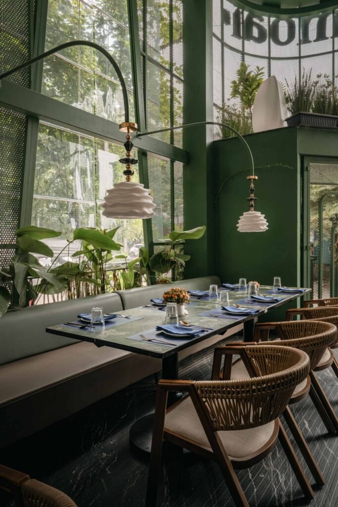
The dining areas unfold around this green spine in a set of distinct but connected settings. One long communal table runs beside a wall of dense tropical planting under a glazed roof, lined with a banked bench in grey and terracotta and ringed by cane-backed timber chairs, the marble tabletops dressed in blue linen and small posies. Tall windows screened by the perforated mesh break the daylight into soft dapples, while veined green stone tables and dark marbled flooring keep the rooms cool and natural in tone. Even the most enclosed corners stay tied to the green outside, so privacy never means being shut away from the garden.
Overhead sits one of the most charming touches in the project, a painted ceiling of birds among flowering branches that arcs over the main dining hall, echoing the birdcage idea in pigment as well as structure. Below it the layered section comes into full view, the green mesh wall rising the full height of the space, the reed-like balustrade tracing the mezzanine edge, and the pendant lights falling in clusters through the gap between levels. The effect lands somewhere close to an aviary turned restaurant, dense, green, and alive, yet calm enough to settle into a meal.

Material choices back up the story of preservation and renewal, since the original Sira stone cladding has been kept and made a feature of for its raw tactility, set deliberately against the precision of the new metal fabrication. That contrast between the rough permanence of the old stone and the crispness of the new intervention roots the project in both memory and relevance, so the building holds on to its past even as it takes on a fresh identity. The earthy stone, the green steel, and the soft plaster tones all pull the same way.
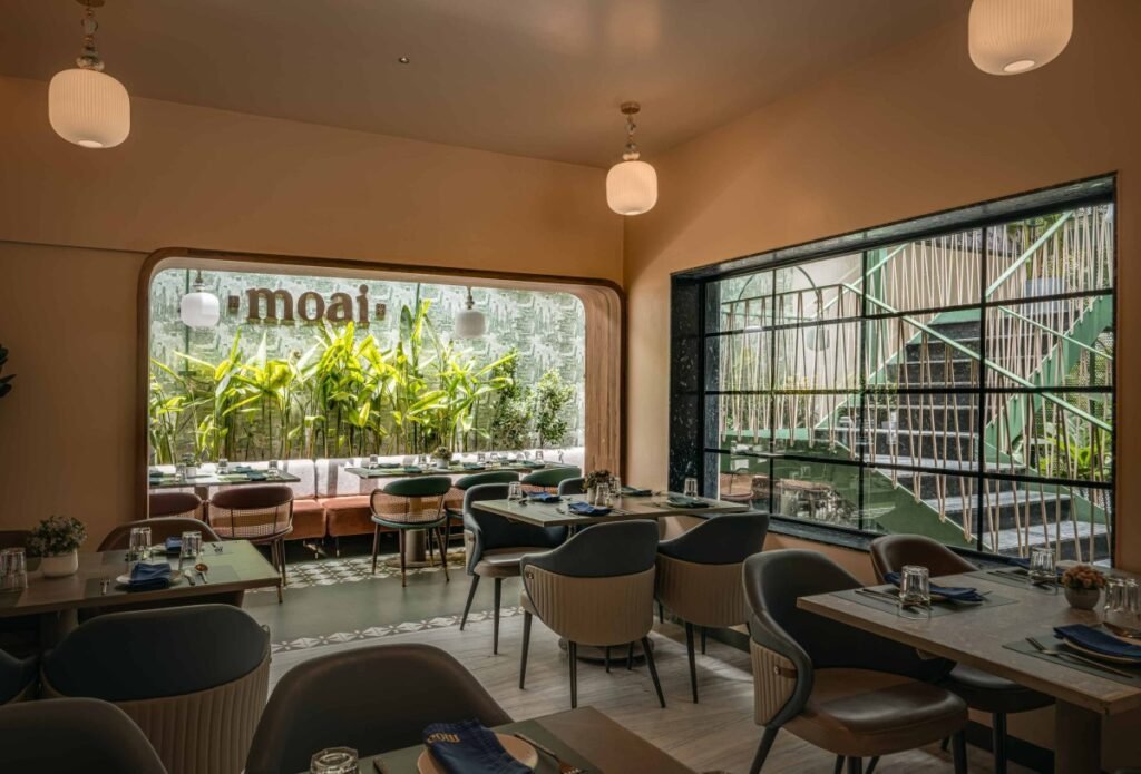
What comes out of this is something more than a restaurant, a study in continuity and change where nature is built into the spatial language and an existing structure is reinterpreted rather than erased. Moai works as an urban retreat where architecture, landscape, and food meet, reframing what was already on the site while making room for the ordinary rituals of gathering and eating. It chooses connection over enclosure at almost every turn and feels more generous for it.
Fact File

Project name: Moai
Office name: S+A Collective
Typology: Hospitality (vegetarian dining, adaptive reuse of an existing building)
Project location: Jayanagar, Bangalore, Karnataka, India
Completion year: 2025
Built area: 5,800 square feet
Lead architect / designer: Ar. Suhan P S
Design team: Nayana, Priya
Landscape consultant: Earthen Edge
Key materials: perforated green metal skin, retained Sira stone cladding, green veined stone, dark marble flooring
Photography: Naresh and Nayan
June 20, 2026 0 comments
0 FacebookTwitterPinterestEmail
Public & Cultural

Moonrise, Chattanooga, Tennessee, United States by Marc Fornes / THEVERYMANY

by DDI Edit Team June 20, 2026
written by DDI Edit Team

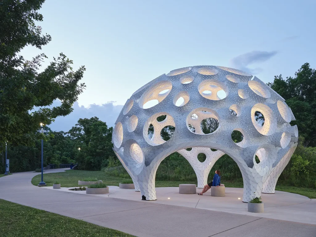
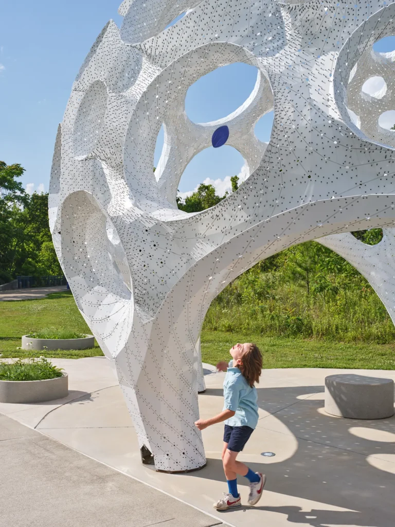
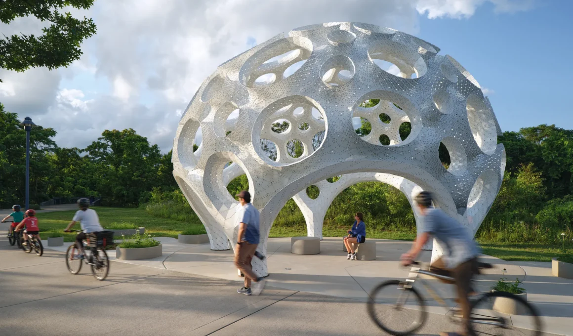
Marc Fornes / THEVERYMANY has installed Moonrise, a permanent public structure at Wheland Foundry Trailhead in Chattanooga, commissioned by Public Art Chattanooga, and the studio is insistent on one point above all: that it should be read as a civic space rather than a sculpture. The name refers to the moment the moon clears the horizon and a familiar landscape briefly turns into something else, which the studio offers as a metaphor for a project it positions on the threshold between art and architecture. From a distance, in the photographs, the dome reads as a fragment of lunar surface, and only up close does it resolve into a system of interlocking aluminum strips, each said to be three millimeters thin, riveted by hand into a self-supporting double-layer shell.
The studio’s central argument is that the structure and the aesthetic are the same thing. THEVERYMANY has spent more than a decade working between computational design and physical fabrication, and it presents Moonrise as a continuation of that line, citing Buckminster Fuller’s principle of doing more with less and reworking geodesic logic through algorithmic form-finding. By the studio’s account, the geometry is generated rather than drawn, with each component shaped by code, cut by machine, then carried to the site and assembled like an oversized three-dimensional puzzle so that rigidity and span come from the interlocking precision of the parts rather than from mass. It is a coherent description of the method, though it is also the studio’s own framing of its work, and a visitor has no way to read the algorithm off the finished surface.

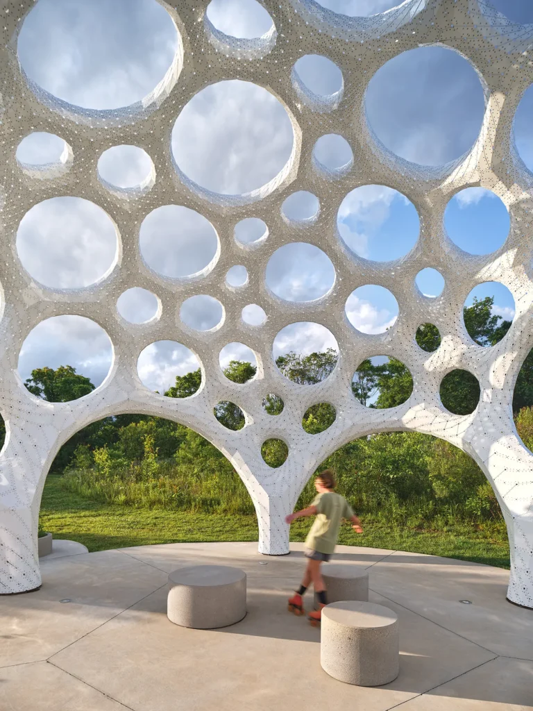
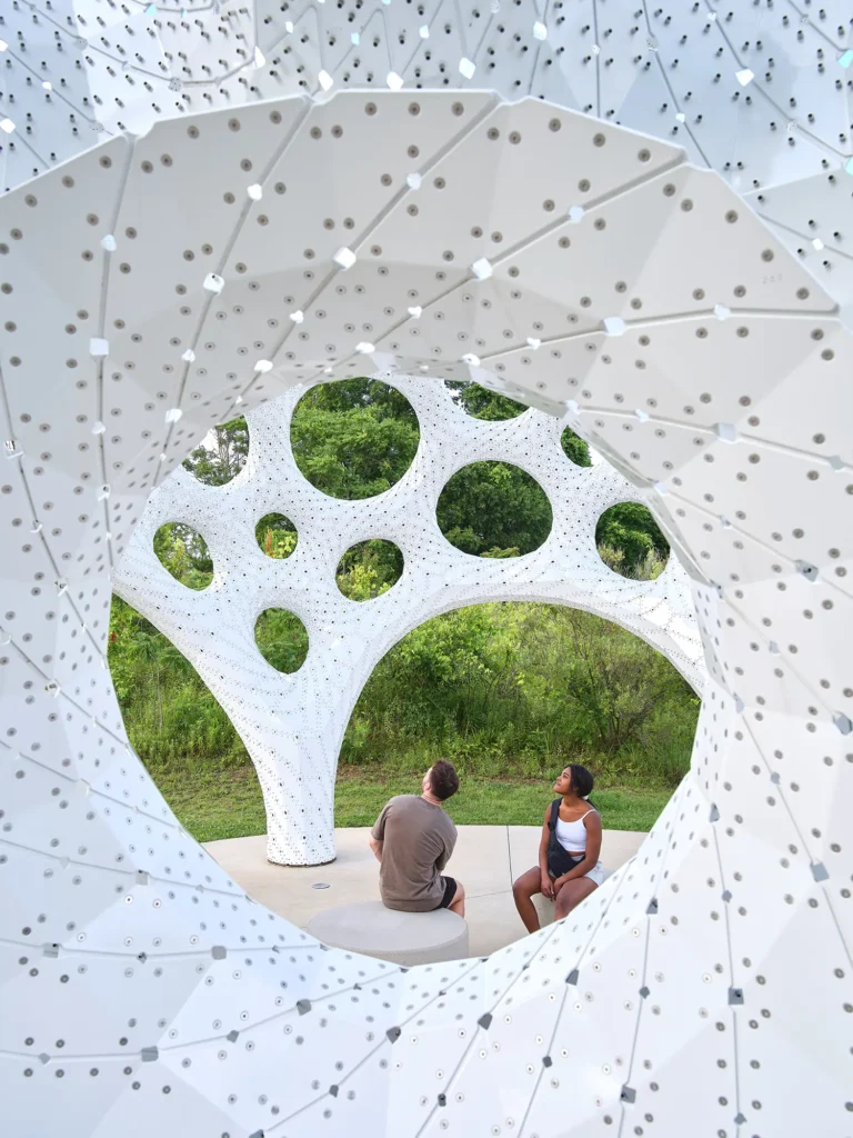
The fabrication logic, as explained by the studio, is what does the structural work. The double-layer shell is said to spread loads across the whole surface so that no single strip carries much stress alone, with the riveted connections between the two skins providing the depth that thinness cannot. What looks like one continuous surface is described as two skins acting together, and the many circular openings punched through the shell are presented not as decoration but as a way of removing material while keeping structural continuity, each aperture supposedly calibrated to the load paths around it. The photographs make the two-layer depth visible at the cut edges of the openings, which supports the account, even if the precise structural behaviour is something only the engineering can verify rather than the eye.

The experience the project trades on is one that changes with distance, and here the images and the claim line up reasonably well. From across the park the dome reads as a single white object dense with texture, its shadow patterning the plaza. At middle distance the apertures open it up and it turns permeable, letting light and sky through, and the wide shots of cyclists passing show that shift clearly. Inside, the openings frame fragments of sky, cloud, and tree, and the riveted surface overhead becomes a field of fine detail. The source material claims the structure produces a genuine slowing-down in the people who pass through it, and while the photographs do show visitors seated and looking up, whether that deceleration is real or simply a well-staged photo set is exactly the sort of claim a press image cannot settle.

The relationship to the site is one of the more persuasive threads, partly because the studio underplays it. Wheland Foundry Trailhead is named for a former metal foundry, a place where metal was once cast and assembled, and installing a rivet-assembled metal structure there sets up a quiet rhyme between the site’s industrial past and the project’s method. Fornes does not, by the account given, make the reference explicit, which is to the project’s credit, since the resonance reads as contextual rather than literal. It is the kind of connection that works precisely because it is not spelled out.

The civic claim is the one worth pressing on, because it is the project’s own headline. Fornes states that Moonrise is designed for gathering, rest, and reflection, with circular concrete seats orienting people toward the dome to support this purpose. The structure is permeable enough to enter, large enough to shelter a group, and open enough to keep a connection to the park. Whether it actually performs as everyday civic infrastructure, somewhere residents return to across seasons, is something only time and use will show, and the freshly completed, sun-populated-to-lightly-populated photographs cannot stand in for that record.

It is also worth noting what the framing leaves out. There is no public figure here for cost, fabrication time, or how the thin aluminum and its many riveted joints are expected to weather Tennessee’s seasons over years of outdoor exposure and public handling, all of which matter for a structure that stakes its case on permanence and minimal material. The studio’s roster of commissioners, from luxury brands to a place in the Centre Pompidou collection, is offered as evidence of seriousness, but it is reputation rather than performance data, and a civic structure ultimately has to answer to maintenance budgets and weather as much as to design pedigree.

What is not in dispute is that Moonrise is an accomplished piece of computational fabrication, and the photographs make a strong case for its sensory pull. The open question is the one the project sets for itself by refusing the word sculpture. A dome this thin, this intricate, and this dependent on being experienced from within asks to be judged as civic space rather than as spectacle, and that is a higher and slower bar than a striking silhouette. Whether Chattanooga returns to it once the novelty fades, and whether it holds up to the wear that genuine public use brings, is what will decide if the claim was earned or merely well made.


Fact File

Project name: Moonrise
Studio: Marc Fornes / THEVERYMANY
Typology: Public art, permanent pavilion / civic installation
Location: Wheland Foundry Trailhead, Chattanooga, Tennessee, United States
Commissioned by: Public Art Chattanooga
Structure: self-supporting double-layer aluminium shell
Material: 3mm aluminium strips, hand-riveted
Method: computational form-finding, machine-cut components, hand assembly
Photography: Keith Isaacs

June 20, 2026 0 comments
0 FacebookTwitterPinterestEmail
Commercial

Silver Lining, Kolkata Spaces and Design

by DDI Edit Team June 18, 2026
written by DDI Edit Team

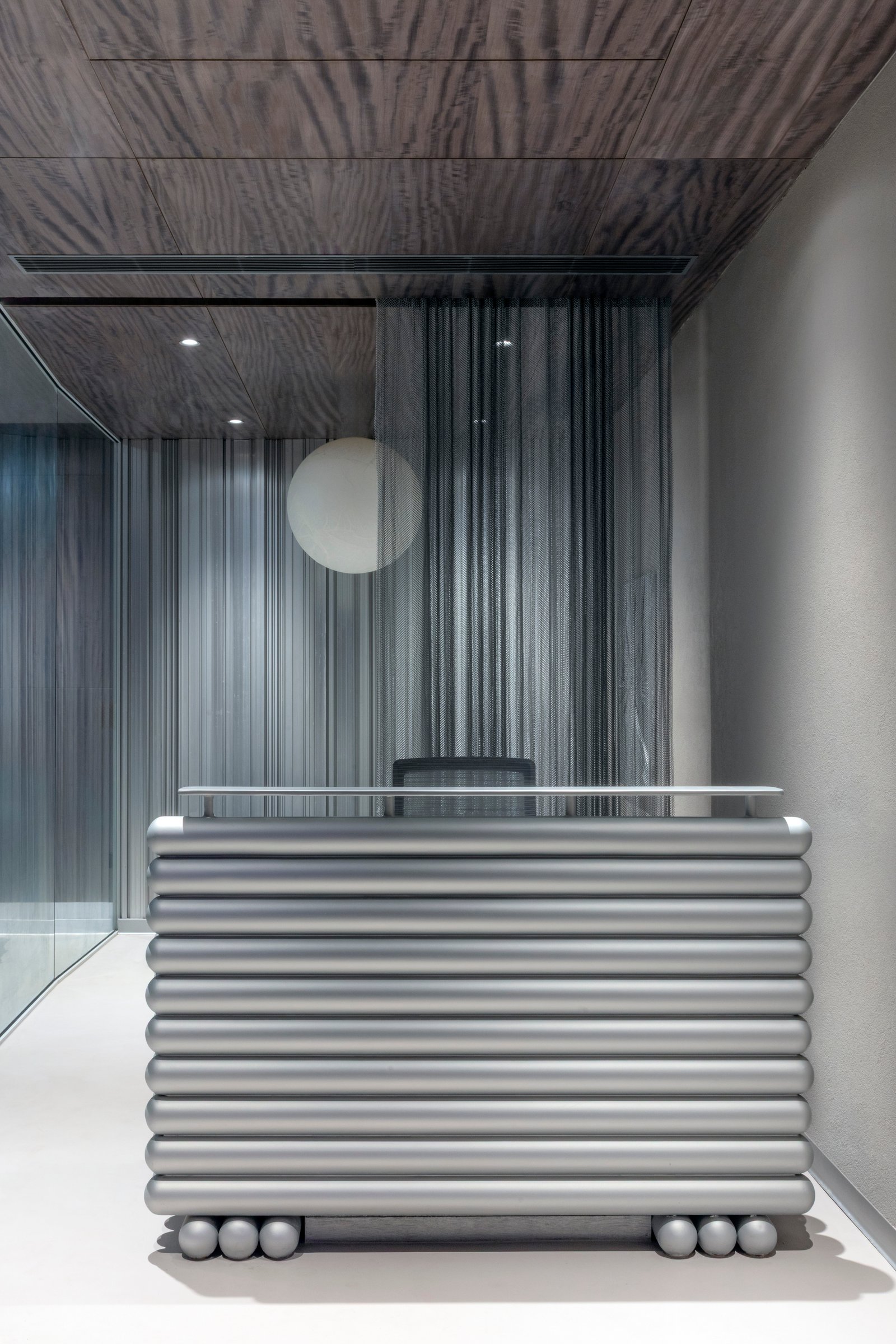
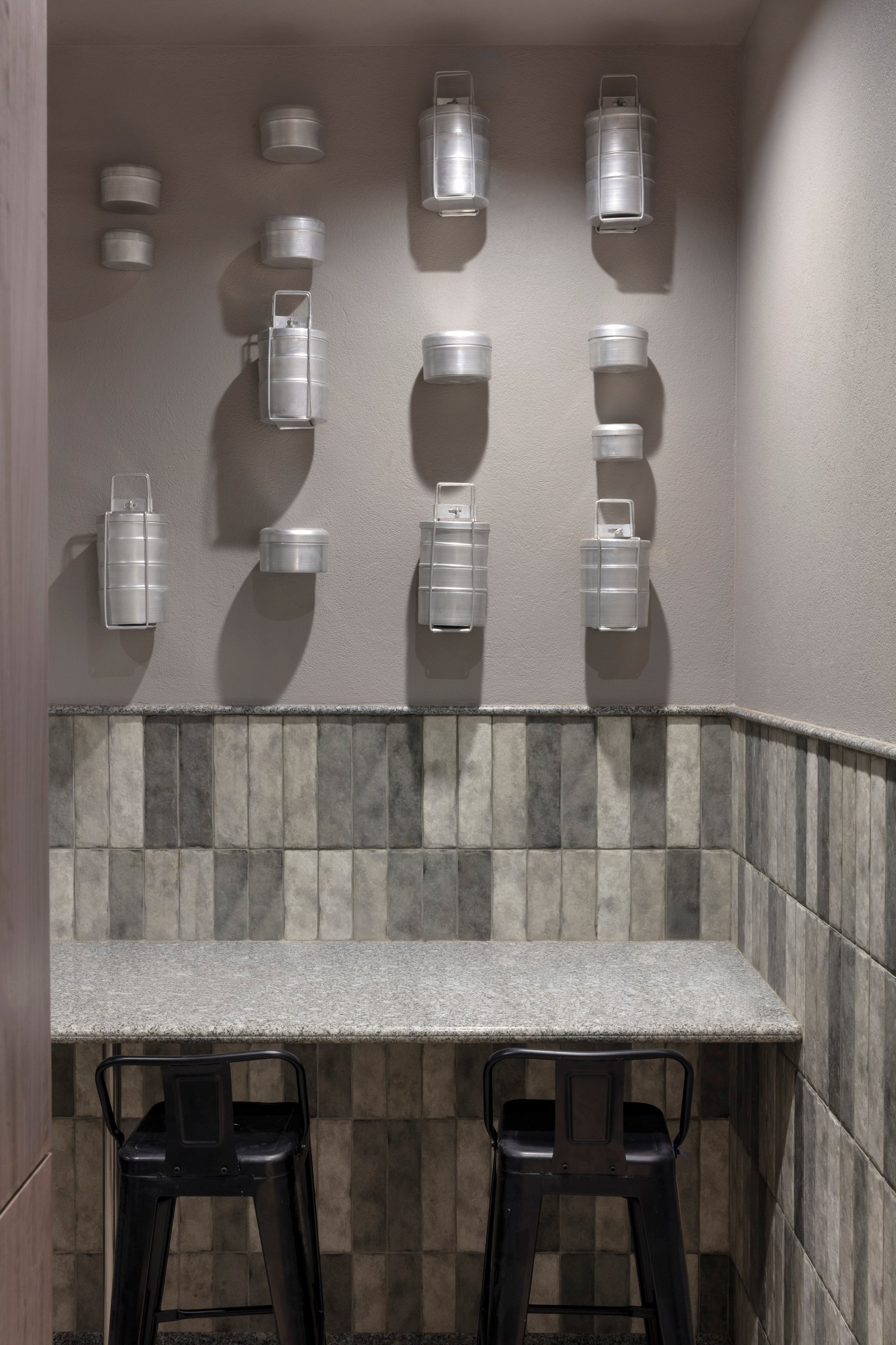
In the pantry of this 2,100-square-foot office in Kolkata, aluminum dabbas of varying sizes are mounted across the wall above the counter, their stacked tiffin forms casting shadows on the textured surface behind them as the light shifts through the day; they are the most familiar of Indian objects treated as a wall installation, matter-of-fact and slightly surprising, and it is this moment more than any other that tells you what Pooja Bihani of Spaces and Design was thinking about when she designed Silver Lining, an office for East India’s largest Apple reseller where aluminum has been taken from its most industrial applications to its most domestic ones and asked to hold the whole space together across a monochromatic silver palette that runs without interruption from the reception desk to the pantry wall.

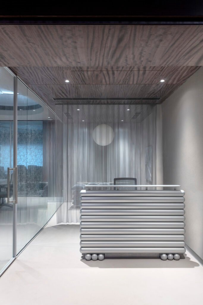
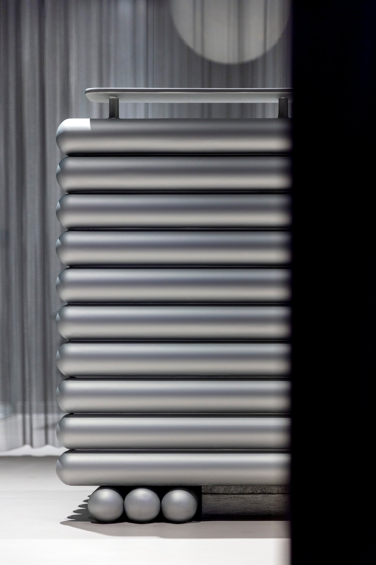
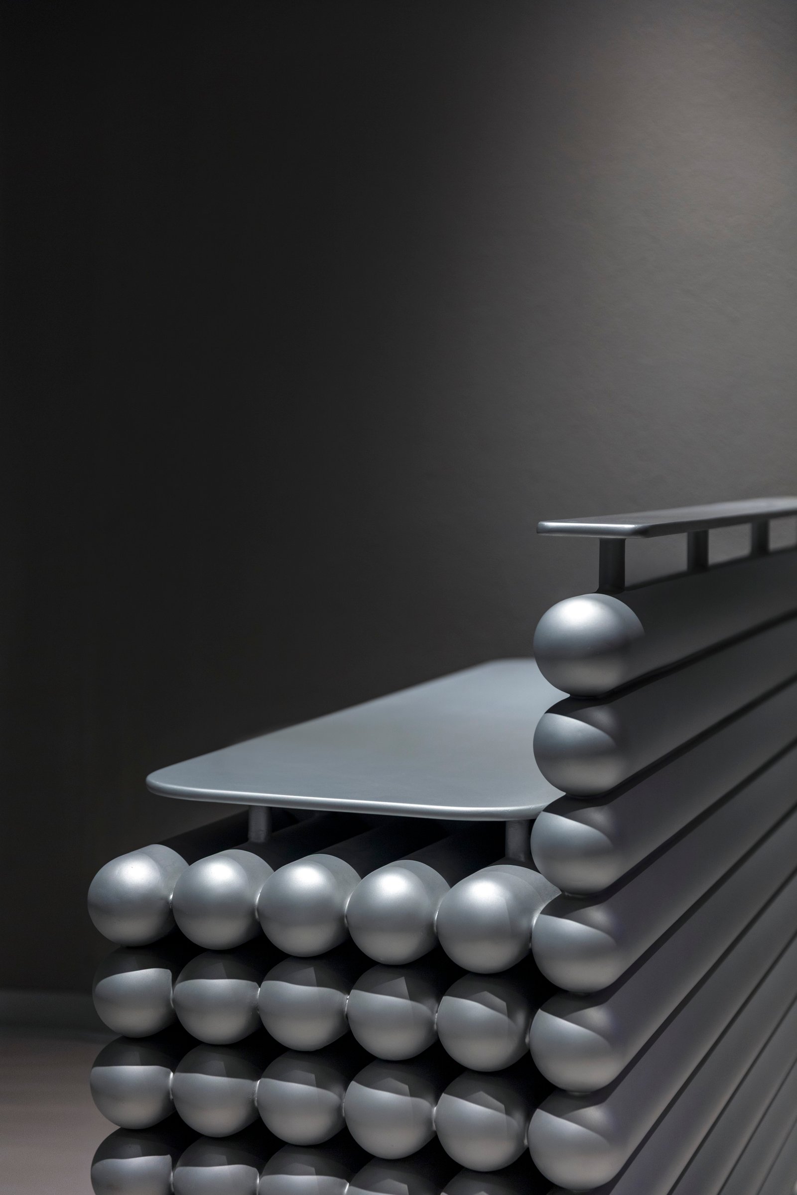
The reception desk is the first indication of how seriously that question has been taken: a custom-fabricated structure built from stacked aluminum sections with spherical forms sitting between each layer, the whole thing reading less like a desk and more like a cross-section of an industrial component scaled up to furniture size, its surfaces catching light across every curve and ridge, the flat grey aluminum top sitting above it with the precision of a machined part, the material doing here exactly what it does in the hardware world the client inhabits, which is to say, performing at a level where the means of making it are part of what you see when you look at it.

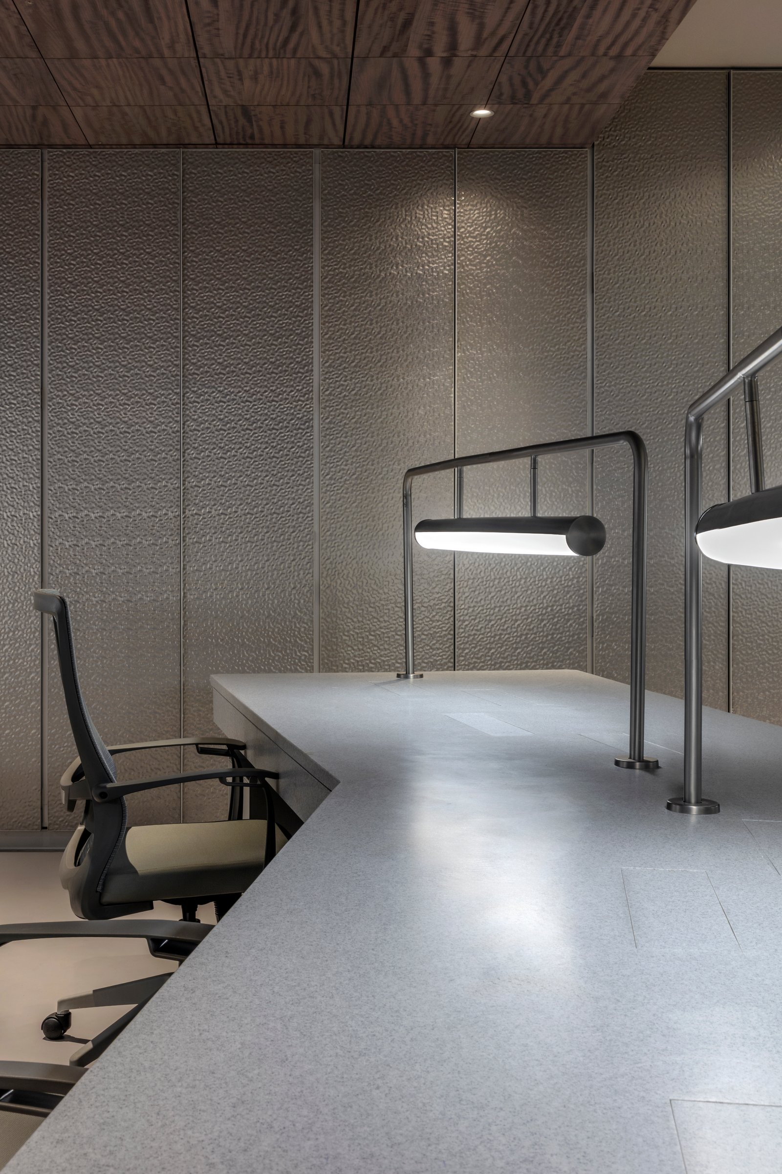
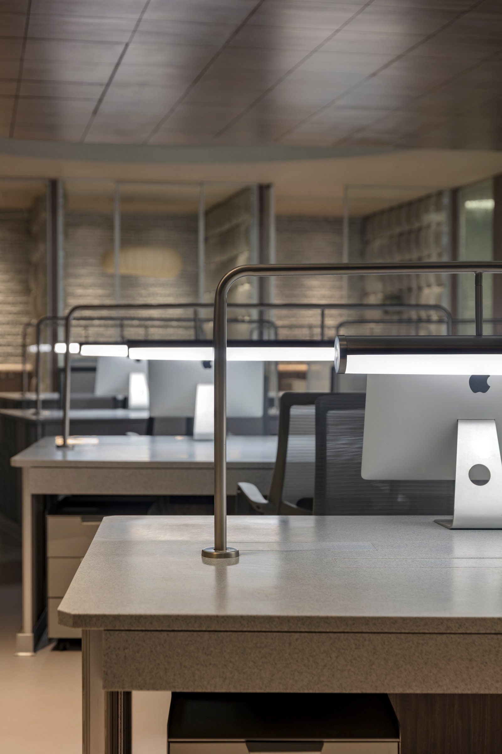
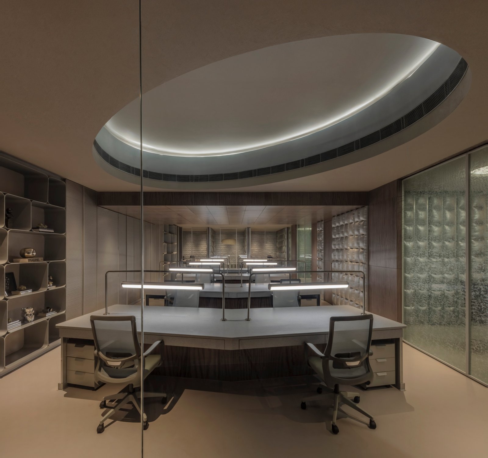
The site offered real constraints: low ceilings, limited natural daylight, a single facade for light, and conditions that could have easily made 2,100 square feet feel compressed and dim, but two elliptical punctures in the false ceiling pull daylight down into the workstation floor in a diffused glow that shifts through the day, the oval forms glowing against the warm beige ceiling and drawing the eye upward so that the low height of the room stops being the first thing you notice. Below them, aluminum workstation desks with linear pendant lights on articulated metal arms sit in the silver-grey palette, honeycomb shelving to one side, and textured glass partitions to the other, and throughout this floor the fabrics and wall surfaces carry the same subtle shimmer as the metal around them, the distinction between hard and soft surfaces becoming genuinely uncertain in certain lights.

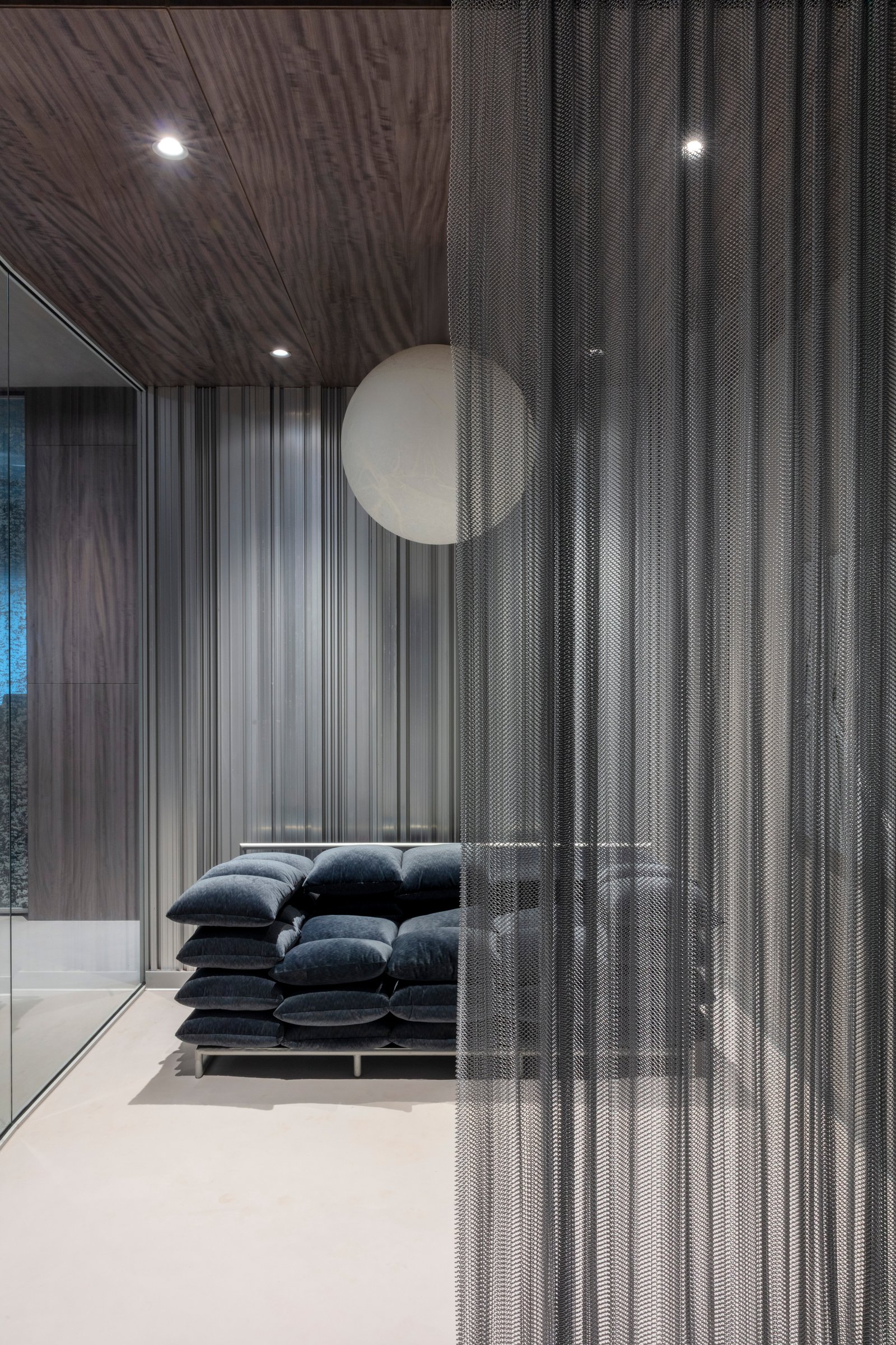
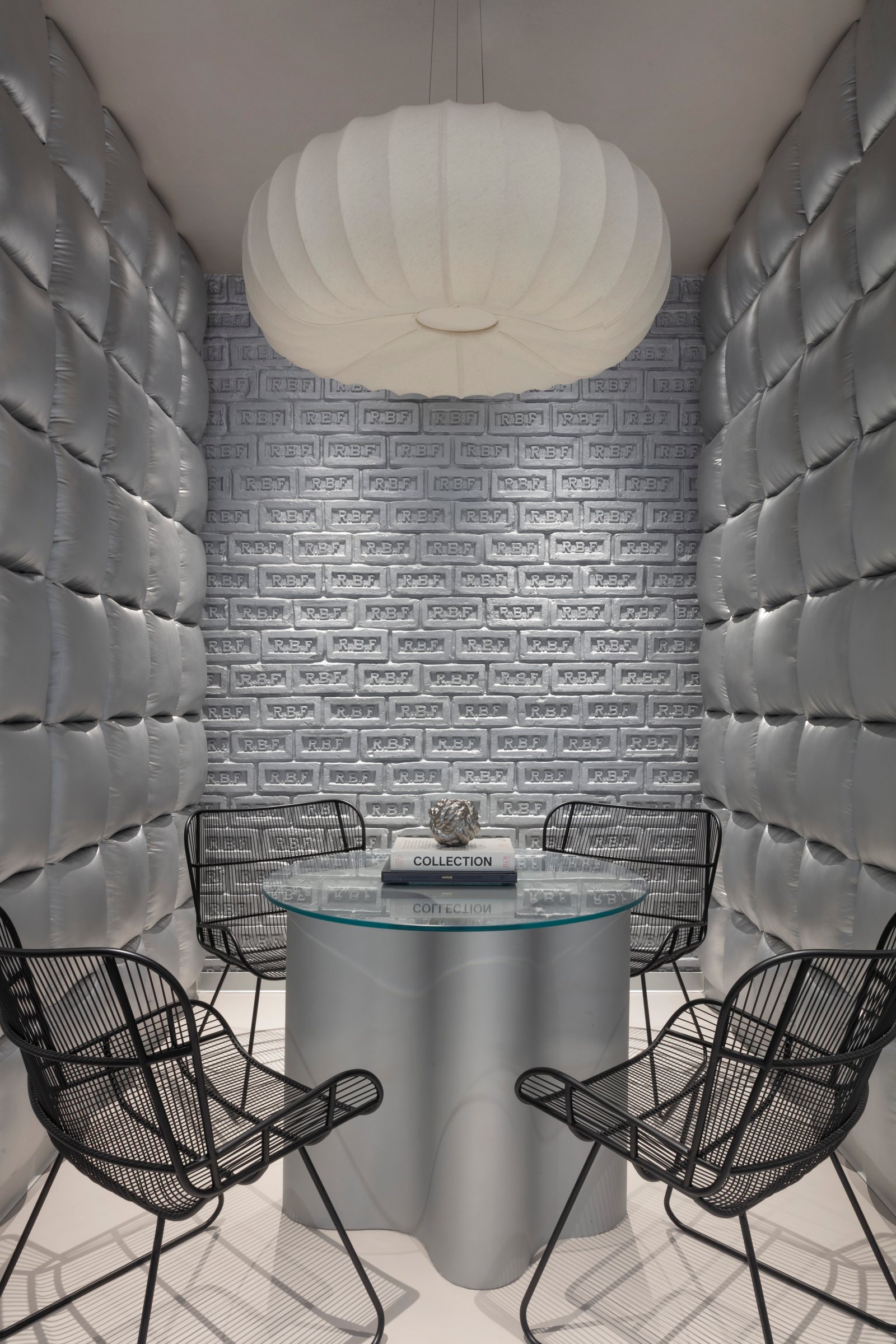
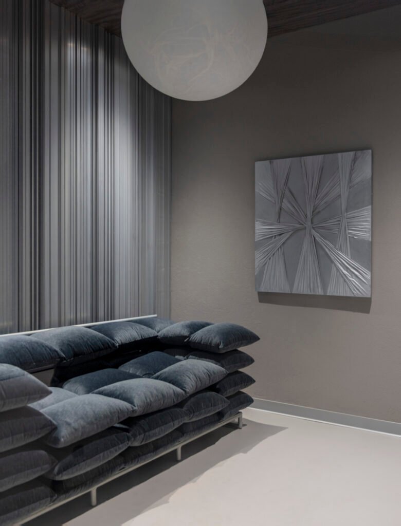
The visitor lounge is enclosed on both sides by quilted silver puffer fabric panels, deep-buttoned metallic squares that absorb and reflect light depending on the angle, and their acoustic quality as deliberate as their visual one, and the back wall carries a custom installation of cast elements, each embossed with the client’s initials in a repeating grid that runs floor to ceiling, the branded surface sitting between a wall finish and typography scaled to architecture. A cylindrical aluminum pedestal table with a glass top sits at the center, with two black wire chairs on either side, and above it is the Davido Groppi moonlight, a large white globe pendant whose soft, warm glow is the only non-metallic quality in the room and the detail that stops the space from reading as cold. Elsewhere through the office, metal curtains sway as partitions between spaces, catching glints of light as they move, and glass panels carry fabric layered within them so that transparency takes on a texture it does not usually have, the material language finding new registers in surfaces that are neither fully one thing nor another.

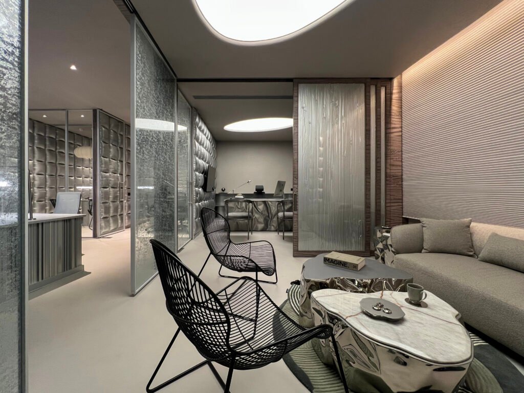
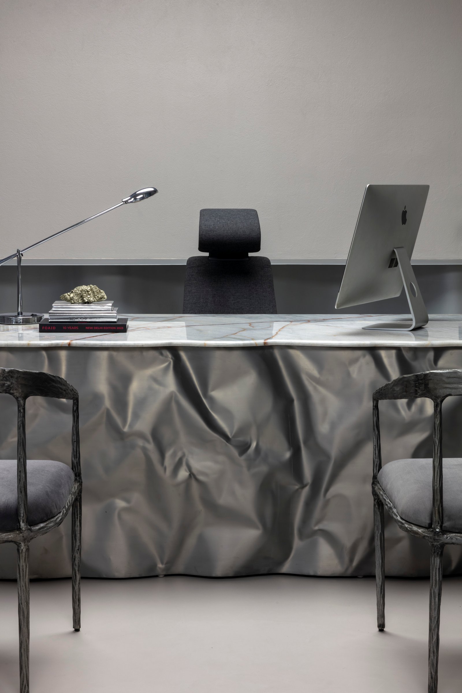
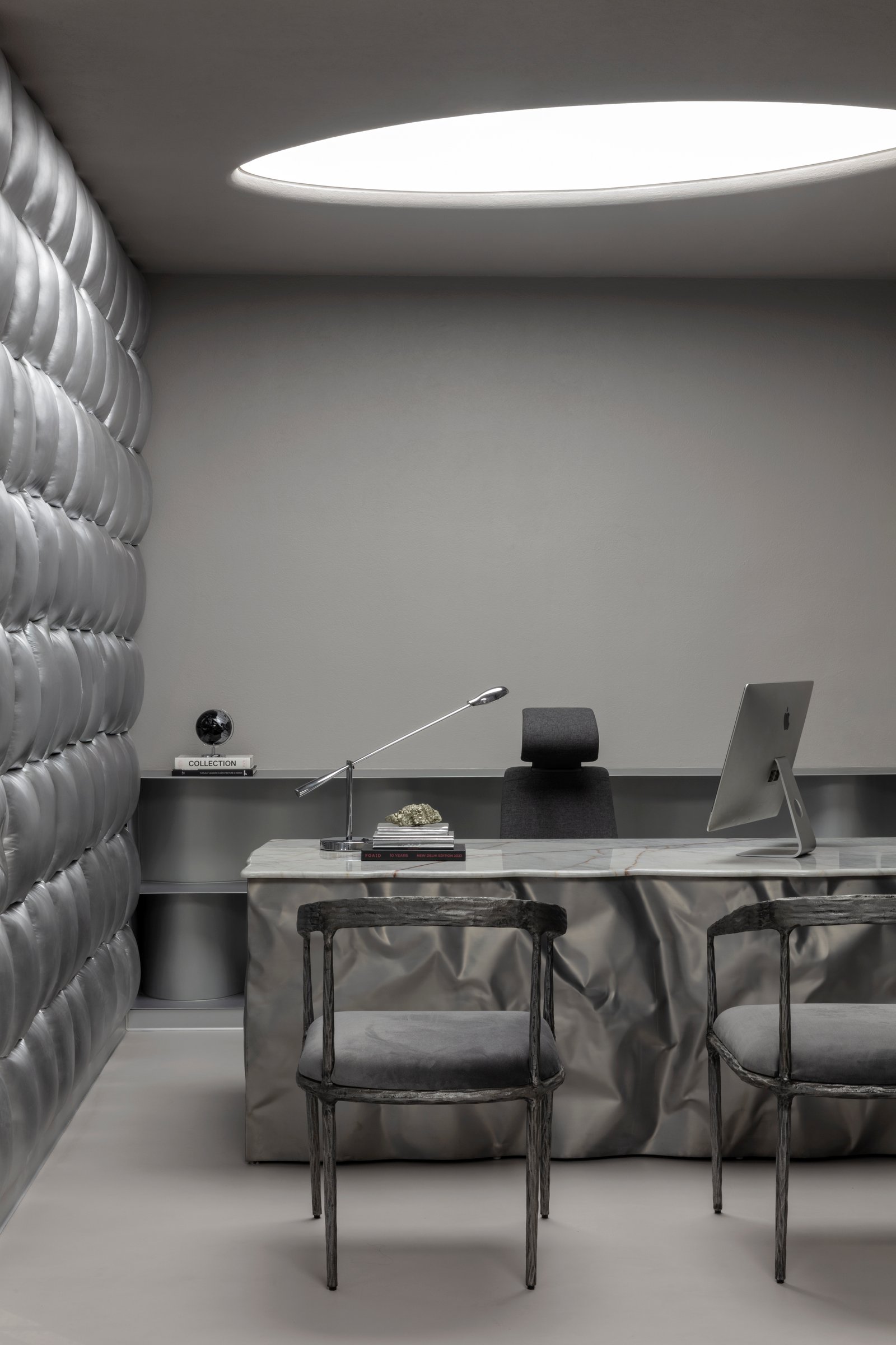
The same quilted fabric appears in the executive chamber alongside the embossed wall, the palette and material logic identical to the visitor lounge but the scale smaller and the atmosphere more enclosed, while the director’s cabin goes somewhere entirely different: a desk whose entire front panel is an aluminum sheet worked into crumples and folds as though gathered by hand and then fixed in place, the surface catching light across every ridge and hollow differently depending on where you stand; bricks along the back wall painted silver so that even the most conventional building material has been pulled into the palette; and above the crumpled metal base, a slab of white marble with warm brown veining carries an Apple iMac, a silver desk lamp, stacked books, and a raw pyrite crystal. Two cast-metal chairs with the rough texture of hand-forged work sit in front of it. The contrast between the crumpled metal and the flat marble, between the cast roughness of the chairs and the precision of the Apple hardware on the desk, is not incidental.

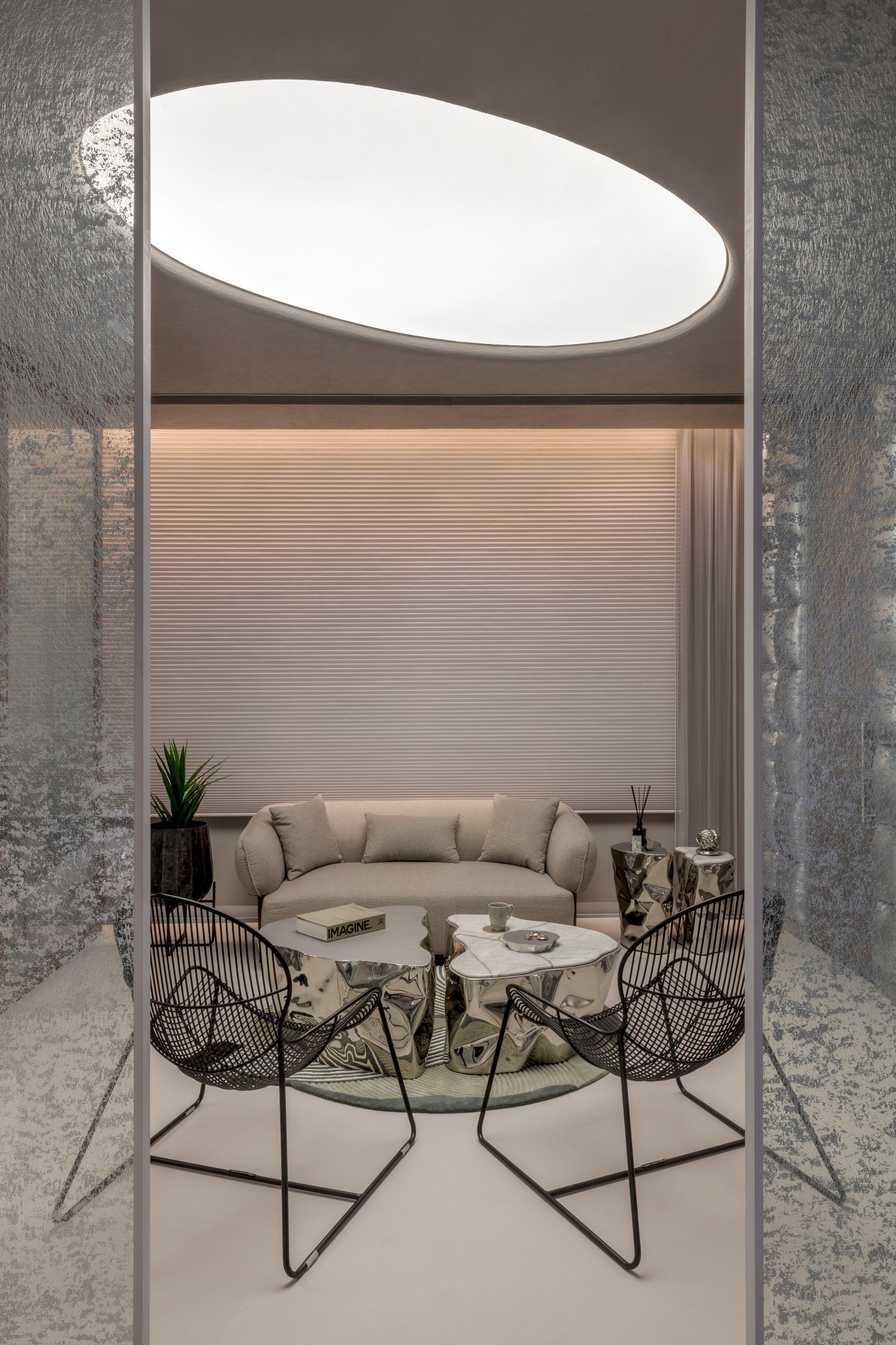
The director’s lounge adjacent carries the same coffee table form as a smaller echo: a crumpled metallic base with a white marble top, a grey sofa, two black wire chairs, a wall of horizontal ribbed aluminum panels running alongside, and glass partitions between the lounge and the cabin that are textured and semi-transparent so the crumpled desk and the sofa exist in the same line of sight without occupying the same room, the layers of glass and surface multiplying across the space.

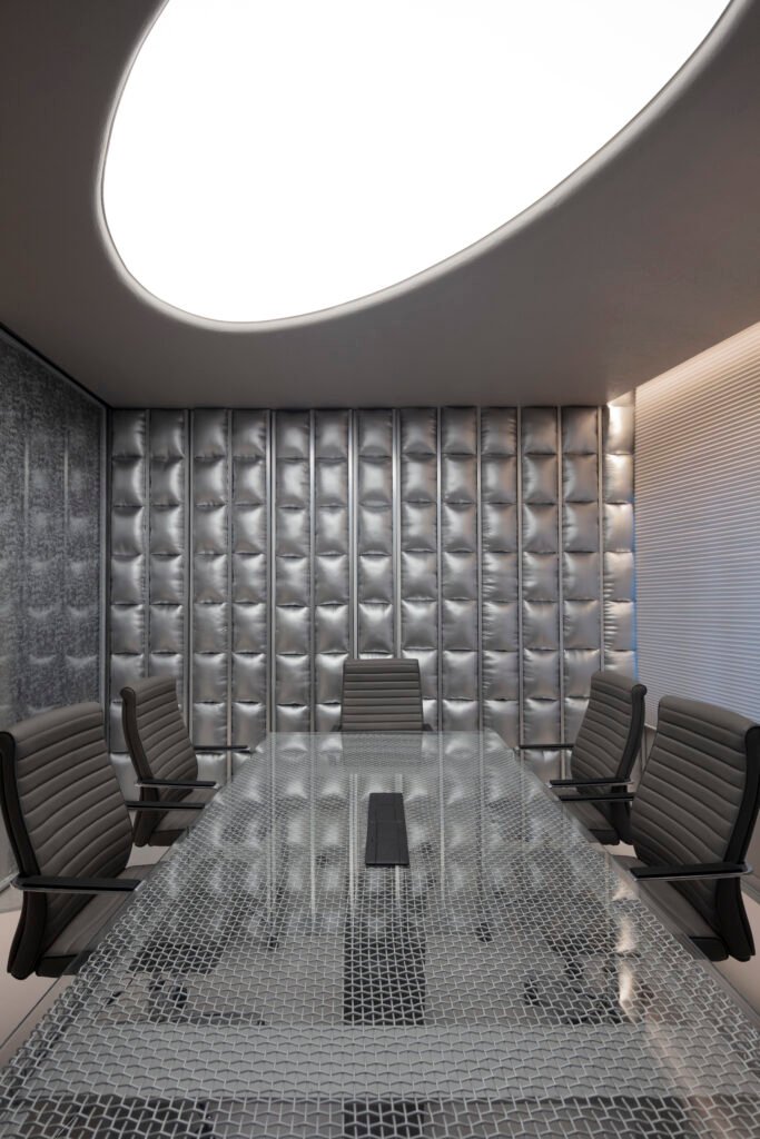
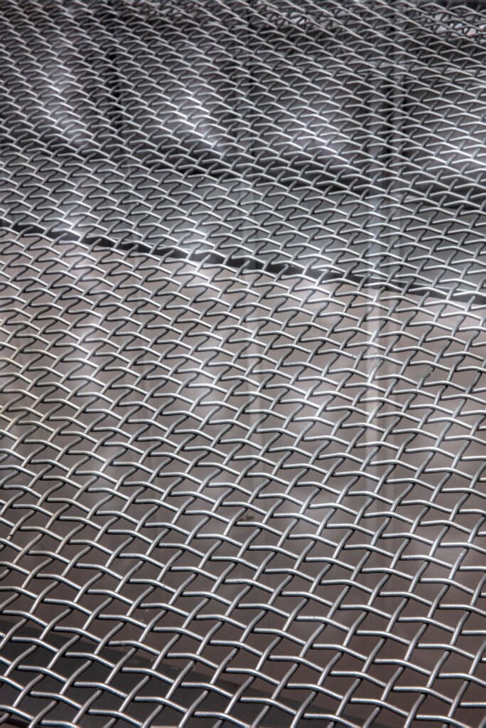
The conference room has a glass-topped table with a geometric diamond mesh pattern embedded in the glass; grey leather executive chairs around it, the back wall hung in vertical metal curtain strips in silver and grey that frame the presentation screen at the center; and the adjacent wall in a heavily textured silver-grey surface whose distressed quality sits against the precision of everything else in the room without resolving the tension between them, which is where the room is most interesting.

And then the pantry again, with its dabbas on the wall and its black bar stools and its speckled stone counter, the room where aluminum is most itself, most recognizable, and most connected to daily life rather than to precision hardware or architectural ambition and which turns out to be the room that holds the best argument for everything the rest of the office is trying to do.


Fact File

Project Name: Silver Lining

Location: Kolkata, India

Size: 2,100 sq ft

Typology: Office

Design Firm: Spaces and Design

Principal Designer: Pooja Bihani

Photography: Pankaj Anand

Website: spacesanddesign.com

Instagram: @spacesanddesign

June 18, 2026 0 comments
0 FacebookTwitterPinterestEmail
Products

The Quiet Mechanics Behind the Handleless Kitchen

by DDI Edit Team June 18, 2026
written by DDI Edit Team

As contemporary kitchens prioritize seamless facades and touch-activated interiors, the hidden mechanics inside cabinets are now as vital to design as visible surfaces. Blum, the Austrian hardware manufacturer, has positioned its TANDEMBOX antaro within this shift, presenting the full-extension, double-walled box system as a foundation that furniture designers can adapt across standard drawers, inner drawers, and high-fronted pull-outs intended for kitchens, bathrooms, and broader living spaces.

The company’s case rests substantially on durability, an attribute that has grown more important as fitted furniture is expected to perform reliably across decades rather than years. According to Blum, the system is built around a proven cabinet profile fitted with low-friction cylindrical nylon rollers that eliminate metal wear and are intended to deliver a featherlight glide that persists for the lifetime of the drawer. The manufacturer states that each box system is tested for one hundred thousand opening and closing cycles and is offered in thirty kilogram and sixty-five kilogram weight-bearing variants, figures the company says are meant to reflect the everyday demands placed on furniture over its working life. Blum maintains that its quality controls extend further to static load tests, lateral load tests, and slam open and shut tests, a regimen the company argues allows the system to exceed both legal requirements and international quality testing standards.

Alongside the engineering claims, design considerations have moved closer to the center of how such hardware is specified. Blum describes the TANDEMBOX antaro as minimalist and timeless, characterized by a clear-cut rectangular profile and a linear appearance available in grey, silk white, and stainless steel color schemes. The system is supplied in a range of nominal lengths spanning three hundred and fifty millimeters to six hundred and fifty millimeters and in two side heights comprising the standard M and the deeper D, a spread the company says is intended to let the same hardware integrate across kitchens, living rooms, and bathrooms without compromising the visual language of a scheme.

The movement toward quieter, handleless interiors is most visible in the motion technologies the system can accommodate. Blum pairs the TANDEMBOX with several mechanisms aimed at making the drawer feel effortless in use. BLUMOTION, the company’s mechanical soft-close system, is designed to draw the drawer shut in a gentle movement, while SERVO-DRIVE provides an electrical alternative that opens the drawer with a light touch and closes it softly. TIP-ON BLUMOTION offers a mechanical route that opens the drawer through an easy push and closes it quietly. It is these last two technologies, SERVO-DRIVE and TIP-ON, that enable the handleless drawer designs increasingly sought in contemporary interiors, removing the visible pull from the front of the unit altogether.

Installation has become a competitive consideration of its own, particularly for trade users working to tight schedules. Blum says assembly of the TANDEMBOX antaro is straightforward, rapid, and tool-free through its INSERTA technology, supported by three-dimensional adjustment options governing height, side, and tilt alignment. The manufacturer adds that it supports the process through its EASY ASSEMBLY app, available across both Android and iOS platforms.

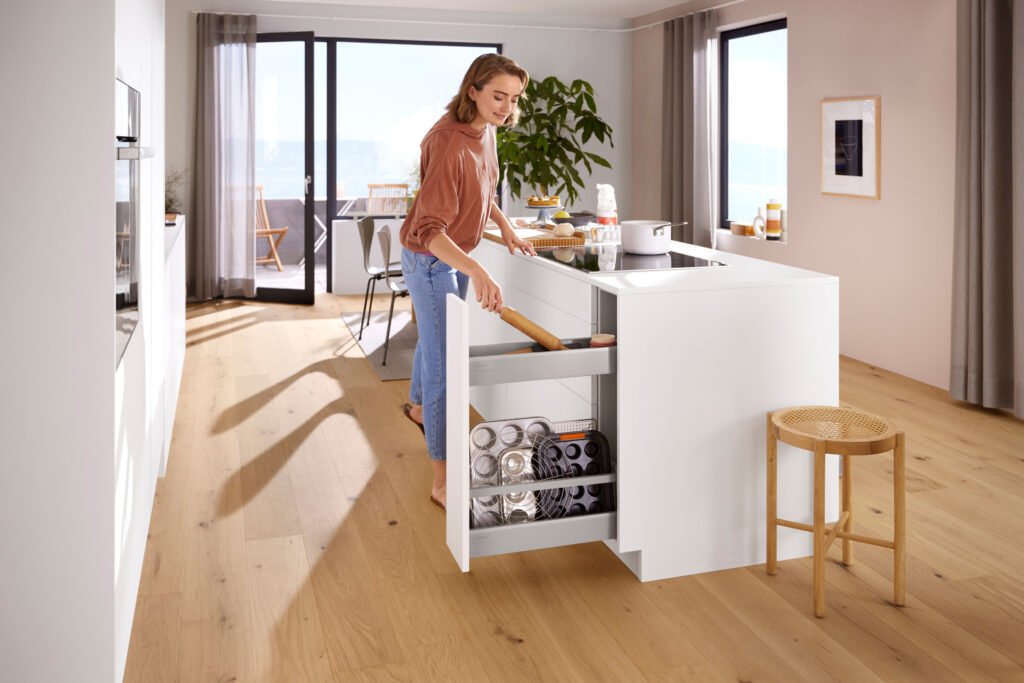
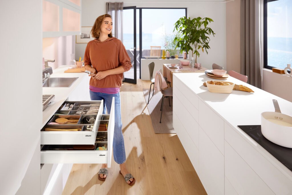
Storage organization, long an afterthought in drawer design, has emerged as a selling point in its own right. To combine generous capacity with ordered interiors and clear visibility, Blum offers the option of pairing the TANDEMBOX antaro with ORGA-LINE, its range of inner dividing systems. The company says these organizers are intended to keep the contents of a drawer arranged, readily visible, and within reach, whether the items in question are chopping boards, cutlery, bottles, or pots and pans.

Where the system arguably distinguishes itself is in its attempt to reclaim the awkward and underused corners of a home. Blum presents several applications built on the TANDEMBOX antaro that are designed to extract storage from difficult spaces. The SPACE CORNER is described as a cabinet application that opens up accessible storage within the often-neglected kitchen corner, while the SPACE TOWER takes the form of a tall pantry unit composed of inner pull-outs stacked one above another to furnish a clear overview and ready access to its contents. The SPACE STEP, meanwhile, is positioned as a two-in-one solution, providing a step for reaching higher shelves alongside a concealed drawer that recovers storage from the toe-kick.

Taken together, the proposition Blum advances is that a single drawer platform can meet the competing demands now placed on fitted furniture, namely durability, a restrained aesthetic, quiet and increasingly handleless operation, and the efficient use of space. The breadth of side heights, lengths, and motion technologies is intended to give designers latitude when planning drawers for varied rooms, and the company’s emphasis on weight and slam testing is offered as evidence that the double-walled system can absorb years of daily use. For a category of hardware that spends its working life hidden behind a drawer front, the marketing increasingly turns on what happens out of sight.

Website: https://www.blum.com/in/en

June 18, 2026 0 comments
0 FacebookTwitterPinterestEmail
Founders & BrandsInterviews

Richard Hutten: Still Young, Still Wild

by DDI Edit Team June 11, 2026
written by DDI Edit Team

On thirty years of Dutch design, the seriousness of play, and why the most interesting word he has learned recently is brainrot

The most interesting word Richard Hutten has learned recently is “brainrot.” He mentions it with the particular combination of amusement and precision that runs through everything he says, and it is worth sitting with for a moment, because coming from a man whose work has been in production for over thirty-five years, whose objects sit in the permanent collections of more than forty museums worldwide, and who helped found what many consider the last genuinely consequential movement in contemporary design, the observation carries a specific weight.

He designs for the real world, for real people, for objects that need to be felt and touched and smelled, and what he sees happening around him is a design culture increasingly optimized for the twenty-second scroll rather than the thirty-year relationship between a person and the thing they own. Designs are made to be Instagrammable now, he says, and a spectacular look is winning over genuine engagement with real needs, wishes, and desires. He reaches for an analogy that is pointed without being cruel: some people think McDonald’s is the best restaurant in the world. He personally prefers a dinner prepared by a real chef using the best ingredients and their own imagination. True connection, in his view, can only exist in the real world, and he has spent his career making objects that participate in that real world rather than merely representing it on a screen.

This is the position of someone who understood, long before the current conversation about authenticity and meaning in design, that the things worth making are the ones that accumulate value through use and time rather than through visibility. Some of his designs have been in production for more than thirty-five years. The Dombo mug, which no company wanted to produce when it was first shown, has now sold over a million units worldwide, and he still receives inquiries from manufacturers wanting to make it. Last year, early pieces from the collection of the late Karl Lagerfeld were shown and sold at an exhibition in Paris. People encountered work that was decades old and experienced it as fresh, almost as if it had just been made. That kind of response, he says, is incredibly meaningful, and it confirms something he has believed since he was a student: being original and sincere is the only way to stay relevant and meaningful for a long period of time.

“I do not follow trends; I make them.”

He arrived at this conviction early. His graduation work from the Design Academy Eindhoven in 1991 was a table-chair, a single object that collapsed the distinction between two familiar forms, and it was subsequently displayed in twenty museums worldwide, which is an unusual trajectory for a graduation piece and a clear early signal of what kind of designer he was going to be. He opened his studio in Rotterdam the same year and two years later, in 1993, presented his work at Milan Design Week for the first time alongside a small group of Dutch designers, Hella Jongerius and Marcel Wanders among them, under the name Droog Design.

What they showed was unlike anything else at the fair that year; the work concerned not how things looked but the ideas, questions, and stories that gave them their reason for existing, and the design community that encountered it recognized immediately that something different had arrived. By the week’s end, the presentation was so crowded that movement through the space was impossible, with news spreading solely by word of mouth in an age without the internet. By the time the week was over, they were the talk of the town.

Droog Design became one of the most significant movements in contemporary design, and Hutten has described it, without false modesty, as the last real movement the field has produced. In the eighties there was Memphis. In the nineties there was Droog. Since then, he argues, there has been no movement of comparable significance in design, art, or architecture. The point he is making is less about self-promotion than about the rarity of genuine conceptual rupture, about how infrequently something arrives that genuinely changes what is possible to think and make within a discipline. Design had been mainly about aesthetics and beauty, he says. Droog added humor, social awareness, and sustainability to the equation. They stirred up the design community with a human-centered approach, and the design community has not fully recovered from the stirring, which is precisely the point.

He does not follow trends and is very clear about this. He makes them. Clients come to him not to solve a problem but because they are interested in his perspective, and that distinction matters enormously to him. Design has traditionally been framed as problem-solving, a definition that has never satisfied him because it positions the designer as reactive, as someone who begins with what already exists rather than with what could. His own formulation is the one he has held to throughout his career: he does not solve problems; he creates possibilities. The difference describes a fundamentally different relationship to the design process, one that begins with a concept, with what he calls defining the rules of the game, before anything else happens. Once the rules are in place, the play begins.

“I don’t solve problems; I create possibilities.”

Play is central to his practice and to his thinking, though not in the way the word is sometimes understood when applied to design. He is not talking about lightness or whimsy or the absence of seriousness. He is talking about something deeply serious that merely wears the appearance of lightness. The analogy he reaches for is a child with a football: the child does not wait for inspiration to strike before kicking it. He just starts to kick and sees where it ends. That, Hutten says, is how he designs. You begin, you move, and the direction becomes clear through the movement rather than before it. But play without stakes is not play, which is why he also points to the rules: they matter, the boundaries matter, and the concept that precedes the experimentation gives it its direction and its meaning. Freedom without structure produces distraction. Structure that allows for freedom produces design.

This is why his work can be simultaneously approachable and intellectually rigorous, why it carries a quality that invites people in immediately while rewarding sustained attention over time. The Dombo mug is the most direct expression of this. He designed it with his young son in mind, wanting to create a mug as large and generous as the child himself, and the disproportionately big handles that resulted turned out to also make it more ergonomic and easier to hold for young children and people with limited mobility, an accidental rightness that he did not plan for and that the object delivered on its own. When it was first shown publicly, a child came to the booth, saw it, grabbed it, and refused to let go. The mother had no choice but to buy it. No company had wanted to produce it when he first presented it. The world eventually caught up.


His thinking about play draws explicitly on the Dutch historian Johan Huizinga’s concept of homo ludens, the playing human, which Hutten places at the end of a progression that moves from homo sapiens to homo faber to homo ludens: from thinking to making to playing. The final form of any project always follows the concept rather than being imposed from outside, and whether he is working on furniture, a public installation, or an interior, the underlying approach remains continuous. The disciplines have never felt separate to him. They are all different ways of expressing ideas and creating experiences that offer both joy and intellectual engagement simultaneously, and it is that combination, the joy and the intellect together, that he believes design at its best is capable of and currently failing to pursue.

“I cherish the child in me who wonders every day about the world around him.”

His work is held in the permanent collections of over forty museums worldwide, among them MoMA New York, the Victoria and Albert Museum in London, the Vitra Design Museum, and the Stedelijk Museum Amsterdam. Some of his designs have reached audiences of hundreds of thousands, in some cases millions, not by following what was current but by holding to a clear personal vision and offering something distinctive. Long-term relationships with clients, some of which have lasted decades and become genuine friendships, create the space for dialogue and shared commitment to quality that shorter, more transactional arrangements cannot produce. Since 2008 he has been art director of Gispen, one of the Netherlands’ oldest and most established furniture brands, a role that places his thinking at the center of an institution with nearly a century of history behind it. Earlier this year he was named a judge for the Dezeen Awards 2025, a recognition that positions him precisely where he has always been: at the point where the design conversation is being shaped rather than simply observed.

His early work was made when he was young and wild, he says. Now he is older and wiser. But all of it, across thirty-four years and every discipline and scale he has worked in, has been made by the same person, and that person has always been concerned with the same things: love, friendship, connectivity, surprise, joy, beauty, happiness, and meaning. What has remained constant, and what he considers his greatest strength, is curiosity, and alongside it the ability to wonder. He still cherishes the child in him who wonders every day about the world around him, and he says this without irony and without self-consciousness, which is perhaps why it lands as clearly as it does.

The question that occupies him at this stage of his career is not only about design. It is about how he can leave the world a better place for his children. He is not the kind of person who starts to complain. He wants to take action. The optimist in him hopes that when future generations encounter his work, they understand that you can do good and still enjoy doing so; that seriousness and playfulness are not opposites but necessary conditions of each other; and that brainrot, for all its accuracy as a description of where attention currently lives, is not where it has to stay.

Interview by Shweta

richardhutten.co

June 11, 2026 0 comments
0 FacebookTwitterPinterestEmail
Interior DesignersInterviews

Alena Bulataya: Space Is Never Neutral

by DDI Edit Team June 11, 2026
written by DDI Edit Team

When Alena Bulataya walks into a space for the first time, she does not look at the style. She observes how the space behaves. Circulation, balance, light distribution, and moments of tension reveal themselves immediately, before the brief has been read or the client has spoken. Most people cannot explain why they feel good in a particular space, she says, but their body knows. Good design speaks to the eyes. Great design speaks to the nervous system. This is the principle she pursues, and one she actively passes on to every member of her team at AB Design Buro.

Bulataya is the founder and creative director of an international studio whose work spans private villas, restaurants, beauty clinics, spas, offices, and apartments across Belarus, the UAE, Qatar, the United States, and Europe. The range is not accidental. Working across typologies removes hierarchy, she says. A private villa, a restaurant, and a clinic are not fundamentally different—they are all environments that influence behaviour, perception, and emotional state. What changes is the intensity and rhythm of that interaction. The discipline she has built her practice around is the same across all of them: understanding what a space needs to do to the person inside it, and then making that happen without the person ever knowing it is being done to them.

She studied at the National Academy of Fine Arts and then continued in Milan, and she is clear about what each gave her that the other could not. The academy trained discipline, a precise understanding of proportion, balance, and composition, and developed a way of seeing where you instinctively recognize when something is resolved and when it is not. Milan introduced context and, with it, an understanding that design is inseparable from culture, industry, and lifestyle and that form without relevance to the world it inhabits is simply form. One gave her a rigorous visual language. The other taught her that design is always part of a larger system, economic, cultural, and human, and that a designer who does not understand that system is only ever working on the surface of it.

“Good design speaks to the eyes. Great design speaks to the nervous system.”

Creation, for Bulataya, was never inherited. She did not grow up surrounded by artists or designers, and there was no moment in her childhood that pointed inevitably toward the career she built. What she had instead was awareness, an early understanding of how strongly the environments and contexts you place yourself in shape the way you think and see. She made conscious decisions about which cities, cultures, and creative communities to move through, treating contrast itself as a form of education. No one is tied to a single place, she says. The world is too diverse to remain within one perspective. For her, inspiration comes from contrast, from moving between cultures, rhythms, and ways of living. It is within these differences that depth is formed.

The studio she opened more than fifteen years ago did not begin as a fixed structure. There is a moment, she says, when working within someone else’s framework begins to limit the way you think. For her it was not about independence but about authorship. As the demand for her work grew, it became clear that a different level of control was needed over concept, process, and execution. The team evolved organically through shared vision and increasing project scale, with flexible teams emerging across different cities as the work expanded. Today the studio operates simultaneously across multiple cities, countries, and continents while maintaining a consistent approach.

Consistency at that scale, she says, is not achieved through control at the end. It is embedded at the level of thinking. Spatial logic, hierarchy, and proportion are established early and guide every subsequent decision. In her practice, elegance and functionality are rarely in tension because they are rarely treated as separate concerns. Elegance is clarity, the absence of excess. Functionality is logic, the absence of friction. When the structure is precise, the visual outcome is no longer a matter of choice. It becomes inevitable.

“When the structure is precise, the visual outcome is no longer a matter of choice — it becomes inevitable.”

One of her hospitality projects was built around a challenge that had nothing to do with visual identity. The primary question was time: how the same space transitions from a calm morning atmosphere into a dense, high-energy evening environment without physical transformation. This required designing not objects but scenarios. A successful restaurant, she says, is not defined by a single atmosphere. It is built through layers of light, rhythm, density, and reflection. The task is not only to accommodate different moods but also to actively shape them, to guide emotional experience almost like a conductor directing an orchestra. A client later described the completed space as feeling like an exhale. Moments like these confirm that design operates beyond the visual. It affects how people feel before they can articulate it.

The difference between a spa and a restaurant, in her formulation, is not stylistic. It is perceptual. A spa slows time. A restaurant accelerates it. In a spa, stimuli are reduced. In a restaurant, they are orchestrated. In recent projects she has begun integrating what she calls soft zones, areas without visual noise, direct light, or pressure. In one wellness project, combining matte travertine, diffused light, water sound, and tactile materials led a client to say this space feels like an exhale. Good design, she says, is almost invisible. Bad design constantly interferes.

Dubai and Qatar want to be the most in architecture, technology, innovation, and scale. She has worked extensively across both markets and understands exactly what this ambition requires from a designer: not just solutions, but a strong and confident perspective. Clients there want to see the outcome before it exists. Decisions are fast, expectations are high, and the demand for immediate clarity is constant. New York asks something entirely different: spatial constraints that demand precision where every square foot is critical and complexity embedded within limitation rather than expressed through scale. The core process across all of these markets remains unchanged, she says. What changes are the parameters: climate, cultural patterns, materials, and light. Design is not adapted emotionally. It is calibrated.

“A spa slows time. A restaurant accelerates it.”

The material that has surprised her most in her practice is stone. It carries a sense of permanence and weight, yet in the right composition it can feel almost fluid, particularly through light and scale. Its perception shifts dramatically through texture, finish, and surface treatment, from raw and monolithic to refined and tactile. Its potential becomes especially evident through unconventional geometry, where it moves beyond its expected rigidity and becomes part of a more expressive, sculptural language, no longer simply applied but fully controlled and integrated into the formation of each piece.

Clients, she says, almost always begin with images rather than with how they want to feel and live in a space. It is understandable, because visuals are easier to communicate than feelings. But design begins with a projected sense of self, with how a person envisions their future experience. Only then does the visual language become precise. The space that truly works is the one that reflects who the client is, not what they saw on a screen.

On luxury, she is direct. Luxury is not a cost; it is an alignment with one’s own perception. A well-designed space does not require explanation. It simply works on a sensory and emotional level. The underlying principle of her work across fifteen years has been three words she does not treat as a slogan but as a way of thinking: see more, do more, and be more. Seeing deeper, creating with intention, living in a space that truly reflects who you are. Luxury today, she says, is not about meeting expectations. It is about being authentic and shaping your environment accordingly.

The typology she thinks about most and has never been given is large-scale public or cultural spaces, particularly in cities like New York and Miami. Not because of scale. Because of impact, the ability to shape collective experience. Every environment she designs, from a private apartment to a restaurant accommodating changing light and crowds, reflects the conviction that space guides behavior, often unconsciously. A public cultural space is simply that conviction operating at its largest possible scale. It is, she says, where design becomes something closer to responsibility.

“Luxury is not cost. It is alignment with one’s own perception.”

Interview by Alisha M

bulataya.com

June 11, 2026 0 comments
0 FacebookTwitterPinterestEmail
Features

The Throne Before Comfort: When Furniture Became Power

by DDI Edit Team June 10, 2026
written by DDI Edit Team

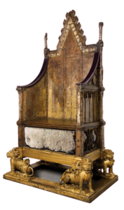
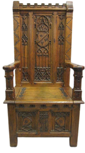
The medieval throne chair did not evolve from domestic seating. It emerged separately, shaped by ceremony rather than comfort and by permanence rather than use. Between the 12th and 15th centuries, across royal courts and ecclesiastical spaces in Europe, the throne existed as a fixed point within architecture, not as an object meant to circulate within it.

Most early examples were carved from solid oak or stone, materials chosen for durability and symbolic weight. Oak was slow-grown, dense, and resistant to movement. Stone, when used, eliminated the possibility of relocation altogether. These chairs were intentionally heavy. Some were built directly into raised platforms or apse walls; others were simply too massive to be moved without dismantling. The throne was not designed to follow its occupant. Authority was expected to come to it.

Formally, medieval thrones borrowed directly from the architectural language surrounding them. Tall backs rose vertically, often echoing the proportions of nave walls or choir screens. Armrests were squared, rigid, and structural rather than sculptural. Bases were broad and grounded, reinforcing visual stability. There was little interest in refinement. What mattered was presence. The chair needed to be seen from across a hall and read instantly as immovable.

Comfort was deliberately secondary. Seats were narrow, backs upright, angles uncompromising. Upholstery was largely absent. Wood and stone remained exposed. The physical experience of sitting reinforced the psychological weight of the role. To occupy the throne was to remain alert, restrained, and publicly visible. Sitting was not private or casual; it was performative and witnessed.

In religious settings, this logic reached its clearest expression in the cathedra, the bishop’s throne. Positioned within the apse of a cathedral, the cathedra established spiritual authority through placement rather than ornament. The word “cathedral” itself derives from this chair, underscoring how completely the seat defined the space around it. Decorative carving, when present, tended to be symbolic and controlled: crosses, geometric rhythms, or restrained figural references tied to doctrine. Excess was avoided.

Secular thrones followed parallel principles. In grand halls, the throne occupied the visual center, often raised on a dais. Everyone else stood, knelt, or remained physically lower. Hierarchy was enforced spatially before a word was spoken. Unlike later Renaissance seating, there was no attempt to soften or personalize the chair. It stood for the office, not the individual.

Surviving medieval throne chairs are rare. Many were altered, destroyed, or replaced during political upheavals, religious reformations, or later stylistic revivals. Others were worn down by centuries of ceremonial use. Those that remain are typically found in cathedrals, abbeys, or long-held royal collections, often with clear institutional records rather than private provenance. Their value lies less in craftsmanship alone and more in continuity of place.

The throne’s influence did not end with the medieval period. Its core principles remain visible today. Elevated seating in courts, parliamentary chambers, and ceremonial settings continues to signal authority through height, centrality, and immobility. Even contemporary leadership spaces quietly follow this logic. Where one sits still matters.

For Design Diary International, the medieval throne chair is not a historical curiosity. It is a reminder of a time when furniture was designed to shape behavior, enforce hierarchy, and anchor institutions. Long before flexibility and comfort became design virtues, the throne defined an opposing idea: that a chair could govern.

Collector’s Guide: Identifying an Authentic Medieval Throne Chair

Material. Primarily solid oak or stone. Oak should display dense grain, weight, and natural age-related shrinkage. Stone examples are uncommon and typically ecclesiastical.

Construction. Simple plank construction with pegged joints. Joinery is functional rather than refined. Sophisticated mortise-and-tenon detailing usually indicates later periods.

Fixity. Evidence of immobility is common. Look for bases designed to sit on platforms, irregular undersides, or signs of long-term placement.

Surface. Original medieval thrones were not upholstered. Surfaces show wear consistent with ceremonial use rather than daily domestic sitting.

Carving. Minimal and symbolic. Crosses, geometric patterns, or restrained heraldic elements. Overly ornate carving often points to Gothic Revival reinterpretations.

Proportions. High backs relative to seat depth. Narrow seating intended to enforce upright posture.

Patina. Deep oxidation, softened edges, and visible tool marks. Uniform finishes usually suggest restoration or reproduction.

Provenance. Most documented examples are tied to specific cathedrals, abbeys, or royal sites. Clear institutional records are essential.

Heading Title

Products

Florim Introduces SensiVenezia, a Porcelain Stoneware Collection Inspired by Venetian Terrazzo

by DDI Edit Team October 18, 2026
Art & ExhibitionPublic & Cultural

LEGO Botanical Wave Transforms TANK Shanghai with 380,000 Brick-Built Flowers

by DDI Edit Team October 18, 2026
Products

The Great Eastern Home Introduces Its Latest Collection of Italian Vintage Mirrors

by DDI Edit Team October 17, 2026
Features

Smart Homes Are Changing Architecture: What Happens When Technology Becomes Part of the Building?

by Shweta October 16, 2026
Products

AARQE9’s Nikhaar Dhawan & Bahaar Dhawan Rohatgi Unveil the Sculptural Lunar Drip Table

by Shweta October 8, 2026
Products

The Colosseum, Hyderabad, India, Brings Art, Craft and Collectible Design into the Contemporary Home

by Design Diary International October 6, 2026
Features

What Makes a Building Feel Timeless? The Architecture of Materials, Proportion and Patina

by Design Diary International October 6, 2026
Residential

Long Island Luxury, USA by Lori Morris

by Design Diary International October 4, 2026
Products

Poltrona Frau’s Archibald Sofa System and Baldwin Tables Bring New Flexibility to Contemporary Living

by Design Diary International October 1, 2026
Public & Cultural

Urban Pixel: Maurizio Sergiusti Turns Discarded Road Signs into a Monumental Land Art Installation in Sardinia

by DDI Edit Team September 26, 2026
June 10, 2026 0 comments
0 FacebookTwitterPinterestEmail
Features

Seven Ascents: Staircases That Shaped Architecture

by DDI Edit Team June 10, 2026
written by DDI Edit Team

Stairs are the most physical of architectural elements. You do not simply see them; you submit to them. They dictate pace, posture, breath, and direction. Every ascent asks something of the body, and every descent reveals how a building wishes to be experienced.

Long before elevators flattened movement into efficiency, staircases shaped hierarchy, ceremony, climate response, and spectacle. Some were designed to slow the body, others to discipline it, and a few to turn movement itself into theater. Across cultures, the staircase became a place where architecture reveals its intentions most clearly.

This feature brings together seven of the world’s most influential staircases, each representing a distinct philosophy of ascent. From ceremonial processions and geometric intelligence to climate-driven repetition and urban performance, these stairs are not connectors between floors. They are experiences in their own right. To walk them is to understand how architecture once taught us where to pause, where to look, and how to rise.

Chand Baori, Abhaneri, Rajasthan

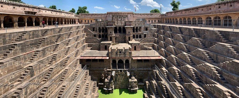
Chand Baori stands in the village of Abhaneri in eastern Rajasthan and dates to between the 8th and 9th centuries, a period when water access determined the survival of settlements across the region. The structure was commissioned during the reign of the Nikumbha dynasty and built as a permanent response to seasonal drought rather than as an architectural monument.

The stepwell drops roughly 30 meters below ground level and is organized across thirteen descending tiers. Approximately 3,500 stone steps line three sides of the square well, arranged in tight, repeating patterns. There is no central staircase and no prescribed route. One can descend diagonally, laterally, or straight down, depending on where the water level sits at any given time of year. This flexibility was essential. As the water receded during dry months, access remained possible without altering the structure.

The steps are narrow, steep, and deliberately repetitive. Comfort was never a consideration. Stone was chosen for durability and thermal performance. As the well deepens, the temperature drops noticeably. Even today, the lower levels remain significantly cooler than the ground above. The stair itself becomes a climatic mechanism, creating shade, air movement, and thermal relief.

Chand Baori was not used only for water collection. It functioned as a social space, a resting place, and a point of daily congregation. Movement through the stair was constant and collective. There is no sense of procession or hierarchy here. What the structure demonstrates, with remarkable clarity, is how stair architecture can operate simultaneously as infrastructure, climate control, and civic space, long before such ideas were formalized in architectural theory.

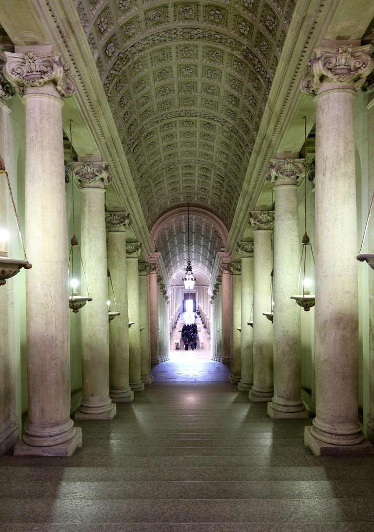
Scala Regia, Vatican City

The Scala Regia is the ceremonial staircase linking St Peter’s Basilica to the Apostolic Palace in Vatican City. Its present form dates to the mid-17th century, when Gian Lorenzo Bernini was commissioned by Pope Alexander VII to transform an awkward, constricted passage into a formal processional route.

The stair occupied a narrow corridor compressed between major structures, a condition first addressed in the early 16th century by Antonio da Sangallo the Younger. Rather than enlarging the footprint, Bernini worked through proportion and perception. The stair rises roughly 23 meters, narrowing as it ascends. Columns along the walls reduce in diameter and spacing, while the floor tightens beneath a continuous barrel vault. This calculated manipulation creates a forced perspective, making the ascent appear longer and more monumental than it is.

Constructed primarily in stone and stucco, the Scala Regia is materially restrained. Ornament is limited and secondary to geometry. Light enters from the side, creating uneven illumination that emphasizes depth and rhythm rather than symmetry. The effect is controlled and deliberate, guiding pace and posture.

At the base stands Bernini’s equestrian statue of Emperor Constantine, completed in 1670. Placed at the threshold of ascent, it introduces a narrative of authority and divine sanction before movement begins. Historically used by ambassadors and dignitaries approaching papal audiences, the Scala Regia remains a precise study in how spatial constraint can be turned into architectural power through proportion, sequence, and control.

Tulip Stairs, Queen’s House, Greenwich

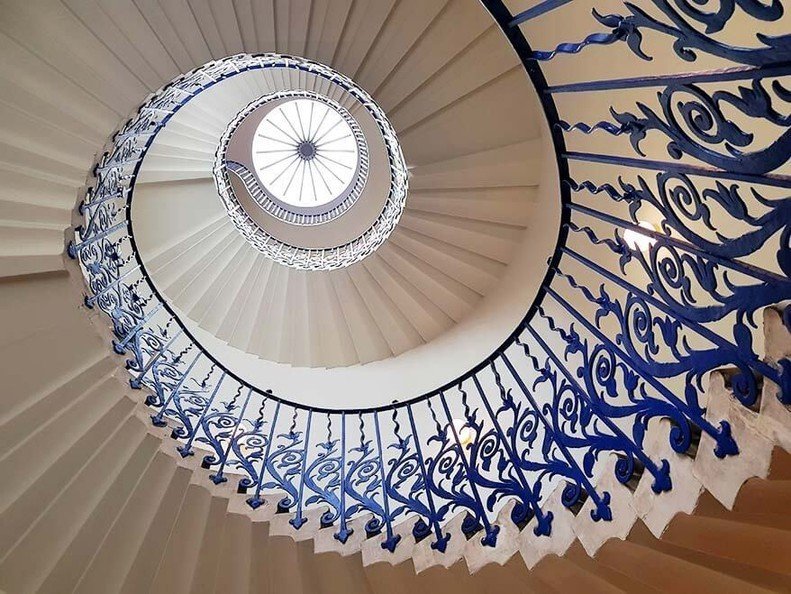
The Tulip Stairs are located within the Queen’s House in Greenwich and were completed in the early 17th century. They are widely regarded as Britain’s first self-supporting spiral staircase without a central column. Each tread is cantilevered from the wall and supported structurally by the tread below, creating a continuous helical loop. This construction allows the center of the stair to remain open, admitting light through the void and reinforcing the visual lightness of the structure. The stair coils upward with mathematical precision rather than decorative flourish.

The balustrade, formed in wrought iron with repeated tulip motifs, provides contrast to the technical discipline of the stair itself. Materials were chosen for structural clarity: stone treads, iron railing, and plastered walls. There is no excess ornament competing with form.

The Tulip Stairs mark a pivotal moment when engineering logic allowed staircases to float visually, influencing later developments in modern and cantilevered stair design.

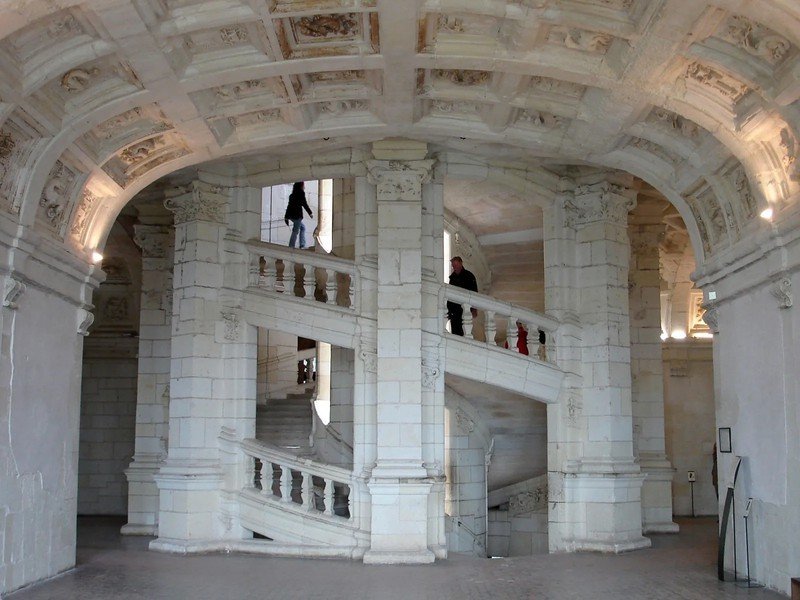
Double-Helix Staircase, Château de Chambord

The staircase at the center of the Château de Chambord was constructed in the early 16th century as part of King Francis I’s ambitious Renaissance palace in the Loire Valley. Unlike the grand ceremonial stairs that would later define European palaces, this stair was conceived as an experiment in movement, visibility, and circulation. It occupies the very core of the château, rising through a tall vertical volume and acting as the organizational spine of the building.

The structure consists of two intertwined helical ramps wrapped around a hollow central shaft. Each helix functions independently, allowing one person to ascend while another descends without ever crossing paths. Despite this separation, the occupants remain visually connected through openings that face into the central void. Light enters from above, filtering down the shaft and illuminating the movement of bodies as they spiral upward. The effect is calm, continuous, and surprisingly modern.

Built entirely in stone, the staircase is structurally self-contained. Each spiral supports itself, and the central void serves both as a light well and a visual anchor. There is no theatrical emphasis on arrival or pause. The stair does not slow the body or enforce ritual. Instead, it prioritizes clarity of movement and spatial logic. Circulation here is not an afterthought; it is the architectural idea.

The staircase is often linked to ideas circulating within Leonardo da Vinci’s circle during Francis I’s reign, reflecting Renaissance interests in geometry, proportion, and mechanical intelligence. Whether or not Leonardo himself was directly involved, the stair clearly embodies a shift in thinking. Movement through a building is treated as a design problem worthy of invention.

For architects, Chambord remains a foundational reference. It demonstrates how circulation, structure, and perception can be integrated into a single architectural device, long before these concerns became formalized in modern architectural theory.

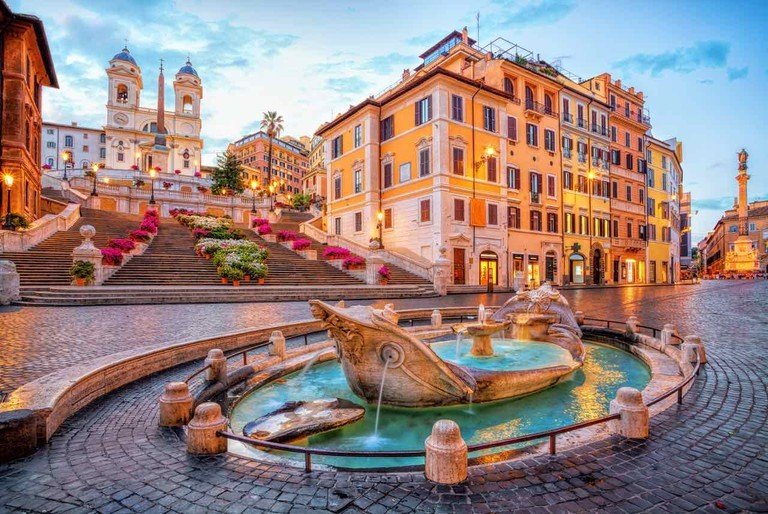
Spanish Steps, Rome

The Spanish Steps were completed in 1725 to resolve a long-standing urban problem: how to connect the low-lying Piazza di Spagna with the elevated church of Trinità dei Monti above. Designed by Francesco de Sanctis, the staircase was never intended as architectural circulation in the conventional sense. It was conceived as public infrastructure, a piece of city-making rather than a component of a single building.

The stair consists of 135 stone steps organized into a sequence of widening and narrowing flights, punctuated by generous landings. These changes in width are not decorative. Their slow movement creates moments of pause and allows the stair to absorb large numbers of people without congestion. From the outset, the Spanish Steps were designed to be occupied. Sitting, stopping, gathering, and observing were all anticipated uses, not later appropriations.

Materially, the stair is restrained. Built in stone, it relies on proportion, rhythm, and topography rather than ornament to assert its presence. There is no singular axial climb. Instead, movement is dispersed, allowing people to choose their pace and path. The stair functions as a social condenser, mediating between the commercial energy of the piazza and the calm elevation of the church above.

Unlike ceremonial staircases that reinforce hierarchy or procession, the Spanish Steps belong entirely to the public realm. They democratize ascent. Anyone can linger, cross paths, or simply sit and watch the city unfold below. For architects and urban designers, the Spanish Steps remain a benchmark example of how a staircase can shape public life, not by directing movement, but by accommodating it.

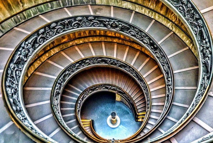
Bramante Staircase, Vatican City

The staircase known today as the Bramante Staircase was built in 1505 during a period of intense reconstruction within the Vatican Palace under Pope Julius II. Donato Bramante was tasked with reorganizing circulation between the papal apartments and the Belvedere Courtyard, a space intended for art, sculpture, and controlled movement rather than ceremony. The brief was pragmatic. This was not a stair meant to impress visitors but one meant to work.

Bramante’s solution departed completely from the stepped staircase. He designed a wide spiral ramp that coils around a central void, allowing people, horses, and carts to move continuously between levels. The slope is shallow and consistent, removing the physical interruption created by risers. Movement here is steady and unbroken. One does not climb so much as progress.

The ramp is built in stone, robust enough to carry heavy loads and withstand constant use. Its width accommodates two-way traffic without congestion, and the central opening allows daylight to filter down through the spiral, preventing disorientation as one ascends. There is no emphasis on arrival, no landing designed for pause. The architecture does not ask the body to stop, look, or acknowledge authority. It simply carries it upward.

This approach was unusually forward-looking for the early 16th century. Circulation is treated as infrastructure rather than an ornament. Bramante accepted movement as a fundamental architectural problem and designed directly for it, rather than allowing it to be a by-product of form.

The logic of this ramp would resurface centuries later in large public buildings, transport terminals, and museums. For architects, the Bramante Staircase remains a quiet but decisive moment when architecture stopped choreographing ascent and began engineering it.

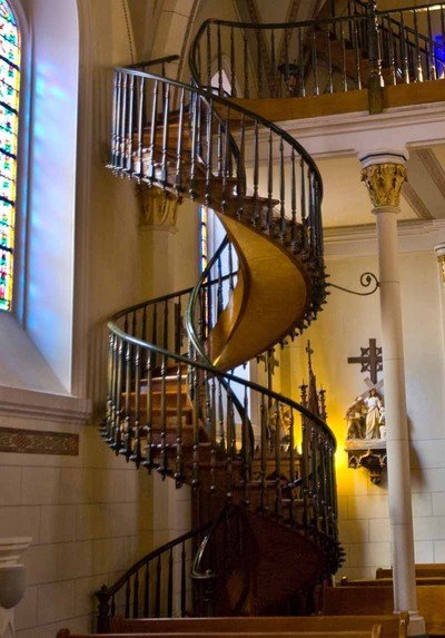
Spiral Staircase, Loretto Chapel, United States

The spiral staircase inside the Loretto Chapel in Santa Fe was constructed between 1877 and 1881 to address a very specific architectural problem. When the chapel was completed, there was no access to the choir loft. The space available was extremely limited, making a conventional stair impractical. What was required was a compact, vertical solution that could be inserted without altering the existing structure.

The resulting staircase rises approximately 6.5 meters in a tight double-helix spiral. It has no central support column, a feature that immediately sets it apart from most spiral stairs of the period. Instead, the structure relies on two continuous wooden stringers that coil upward together, forming an inner and outer spiral. Each tread is connected using wooden pegs rather than metal nails or screws, and the stability of the stair comes from compression and precise joinery rather than mechanical fastening.

The entire staircase is constructed from wood, including the treads, stringers, and handrail added later. Its footprint is remarkably small, yet it supports vertical movement safely and efficiently. The rise is steep and the diameter tight, reinforcing the fact that this stair was never intended as a ceremonial element. It is a solution-driven piece of construction, focused entirely on access and economy of space.

Over time, the staircase has become surrounded by legend, often attributed to miraculous origins. From an architectural perspective, however, its significance lies elsewhere. It demonstrates a high level of material understanding and structural logic, showing how geometry and craftsmanship can replace conventional support systems. For architects, it remains a compelling example of how constraints can produce highly inventive construction without reliance on modern technology.

June 10, 2026 0 comments
0 FacebookTwitterPinterestEmail
Features

Taos Pueblo: Architecture as a Living Practice New Mexico, USA

by DDI Edit Team June 9, 2026
written by DDI Edit Team

Taos Pueblo is located in northern New Mexico, where the high desert begins to rise toward the Sangre de Cristo Mountains and seasonal shifts remain sharp and immediate, shaping how land is used and how buildings endure. The settlement beside the Rio Pueblo de Taos, a narrow but reliable water source, has supported habitation for centuries, determining construction and daily life in this demanding environment. The surrounding landscape remains largely open, allowing the pueblo to retain a direct visual and material continuity with the land from which it is built.

Historical Continuity

Construction at Taos Pueblo is generally dated between the eleventh and thirteenth centuries CE, though oral histories place the community’s presence in the region far earlier. What distinguishes the site is not a singular period of construction but the absence of a fixed moment of completion. Buildings were extended, repaired, reduced, and rebuilt as families grew and circumstances changed, allowing the settlement to evolve without rupture. Architecture here was never conceived as a finished condition but as something continuously shaped by use, memory, and necessity.

Despite Spanish colonial intrusion beginning in the sixteenth century and subsequent political shifts under American governance, Taos Pueblo retained its spatial organization, material practices, and communal governance, absorbing external pressure without dismantling its architectural logic. The pueblo remains inhabited today, functioning simultaneously as a home, a ceremonial center, and a cultural landscape.

Settlement Structure and Massing

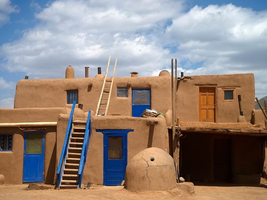
The settlement is anchored by two primary residential masses, commonly referred to as the North House and South House, which rise in stepped, multi-story formations. Their profiles are irregular, shaped by gradual accumulation rather than by symmetry or axial planning. Upper levels are reached by ladders rather than internal staircases, a decision that reinforces privacy, reduces interior circulation, and preserves structural continuity.

From a distance, the pueblo reads as a single earthen mass, its color shifting subtly with light, moisture, and season, yet never departing from the ground it comes from. There is no visual hierarchy imposed through ornament or façade articulation. Mass, proportion, and repetition do the work instead.

Material Logic

Adobe defines the architecture entirely. Sun-dried bricks are made from earth, straw, and water drawn directly from the surrounding land, binding the buildings physically and symbolically to their site. Walls are load-bearing and often more than a meter thick, providing thermal stability against heat, cold, and wind while also allowing interiors to remain compact and efficient.

There is no applied finish in the conventional sense. Surfaces are replastered repeatedly over time, creating subtle variations in texture and tone that record maintenance rather than disguise it. Material aging is neither hidden nor corrected. It is accepted as part of the architectural condition.

Construction and Maintenance

Maintenance at Taos Pueblo is not treated as an occasional intervention but as a continuous, shared responsibility, carried out through regular replastering, roof rebuilding, and surface renewal that often involves collective participation. Walls are reinforced when required, roofs are rebuilt rather than patched, and surfaces are renewed without any attempt to return them to an imagined original state, because preservation here has never meant visual consistency but continued use.

What emerges from this approach is an architectural condition sustained through repetition and care, where permanence is achieved through attention over time rather than through fixity, and where repair remains visible as part of the building’s life rather than something to be concealed.

Interior Spaces

Interior spaces follow the same practical logic. Rooms are compact and stacked vertically based on family needs, featuring low ceilings for warmth and strategically placed openings to regulate light and airflow without mechanical systems.

Interiors remain subdued and utilitarian, shaped by daily routines rather than display. Fireplaces anchor domestic life as sources of heat and gathering, storage niches are built directly into thick adobe walls, and furnishings are kept minimal, allowing the architecture itself to support habitation without accommodating excess.

Circulation and Thresholds

Movement through Taos Pueblo takes place largely outdoors. Rooftops function as walkways, ladders provide vertical access, and terraces operate as shared circulation spaces that link households across levels. Entry points are deliberately modest, with low doors and narrow openings that control heat loss and reinforce privacy.

Thresholds are clearly defined yet understated, marking transitions without ceremony. This circulation system responds directly to climate, social organization, and security, reinforcing a collective spatial order while allowing individual domestic life to remain protected.

Ceremonial Architecture

There is no strict separation between domestic and ceremonial space within the pueblo. Kivas, circular and partially subterranean ceremonial chambers, are embedded within the settlement rather than isolated as monumental structures. Their placement reinforces the integration of ritual practice into daily life, ensuring that ceremonial and domestic rhythms remain intertwined.

Open plazas and shared spaces between buildings accommodate seasonal ceremonies, communal gatherings, and everyday interaction. Architecture functions here as a framework for collective life rather than as an object of individual expression.

Surface, Wear, and Time

Surface wear is visible throughout Taos Pueblo. Walls soften at edges, plaster layers accumulate unevenly, and color shifts subtly with moisture and light. These traces are not treated as deterioration but as evidence of continuity, marking the passage of time through use rather than neglect.

Architecture here is shaped by time in a literal sense. Wear is accumulated, not erased, and renewal occurs without erasing memory.

Architectural Significance

Taos Pueblo represents an architectural tradition grounded in restraint, material honesty, and continuity. There is no emphasis on novelty, no separation between land and building, and no hierarchy between form and function. Architecture emerges through adaptation rather than ambition, sustained through daily life rather than monumental intent.

Its endurance lies not in preservation but in continued habitation, making Taos Pueblo one of the clearest examples of architecture as a living cultural practice rather than a finished artifact.

Sources

Dozier, Edward P. The Pueblo Indians of North America. Holt, Rinehart and Winston, 1970. Noble, David Grant. Ancient Ruins of the Southwest. Northland Publishing, 1994. Snead, James E. Ruins and Rivals: The Making of Southwest Archaeology. University of Arizona Press, 2001. UNESCO World Heritage Centre, Taos Pueblo. National Park Service, Taos Pueblo Cultural Landscape Documentation.

Images: Public sources / National Park Service / UNESCO archives

June 9, 2026 0 comments
0 FacebookTwitterPinterestEmail
Features

Rock-Hewn Churches of Lalibela: Architecture by Subtraction

by DDI Edit Team June 9, 2026
written by DDI Edit Team

The rock-hewn churches of Lalibela are in the northern Ethiopian highlands, within a rugged volcanic plateau shaped by erosion and seasonal water flow. Unlike conventional architectural ensembles, the churches are positioned below ground level, excavated directly from the rock rather than constructed above it. Access is gained through a network of sunken courtyards, narrow trenches, and carved passageways, making movement through the site gradual and controlled. From the surrounding terrain, the complex is largely concealed, revealing itself only as one descends into its interior spaces.

Historical Context

The churches were created primarily during the late twelfth and early thirteenth centuries under the Zagwe dynasty and are traditionally associated with King Lalibela, after whom the site is named. Historical and religious accounts describe the complex as a symbolic counterpart to Jerusalem, conceived during a period when Christian pilgrimage to the Holy Land had become increasingly difficult. While legend attributes the project to divine instruction, archaeological evidence suggests a sustained construction process carried out over several decades, involving skilled craftsmen and a clear organizational framework.

Construction Method

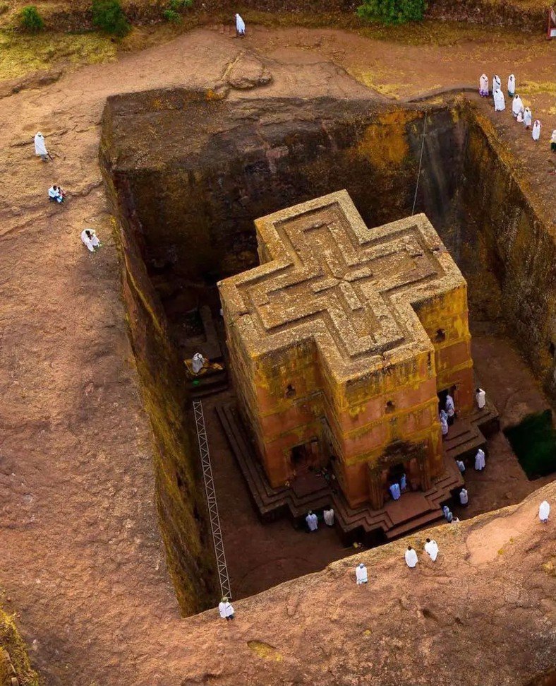
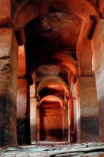
Each church at Lalibela is monolithic, carved from a single mass of volcanic tuff. Construction began by cutting deep trenches into the rock to isolate solid blocks, from which exterior walls, roofs, and interior volumes were excavated inward. This method eliminates the distinction between structure and finish. Columns, arches, ceilings, floors, and openings are all part of the same continuous material body. There is no mortar, no applied surface treatment, and no secondary cladding. Architecture here is defined entirely by removal, proportion, and alignment.

Spatial Organization

The complex consists of eleven principal churches, arranged into two main groups separated by a seasonal stream and connected through a dense system of carved circulation routes. Movement through the site is deliberately indirect. Pathways narrow and widen, light levels shift abruptly, and views are revealed incrementally rather than all at once. There is no dominant axis or single focal approach, and the orientation relies on bodily movement and spatial memory.

Interior Architecture

Interior spaces vary in scale and form. Some churches follow basilica-like layouts with longitudinal aisles and rows of columns carved directly from the rock, while others are compact, centrally organized volumes. Columns are simply proportioned, with restrained capitals and minimal carving. Light enters through small, high-set openings, producing interiors that remain dim and thermally stable throughout the day. The subdued lighting reinforces focus on ritual use rather than architectural display.

Bete Giorgis

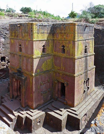
Among the churches, Bete Giorgis (the Church of Saint George) is the most formally distinct. Carved in the shape of a Greek cross and sunk deep into the rock, it is fully visible only from above. Access is gained through a narrow trench that turns repeatedly before reaching the entrance. The building’s clarity lies in its geometry and precision rather than ornament. Its isolation within its own excavated courtyard reinforces its ceremonial significance within the complex.

Surface Treatment and Symbolism

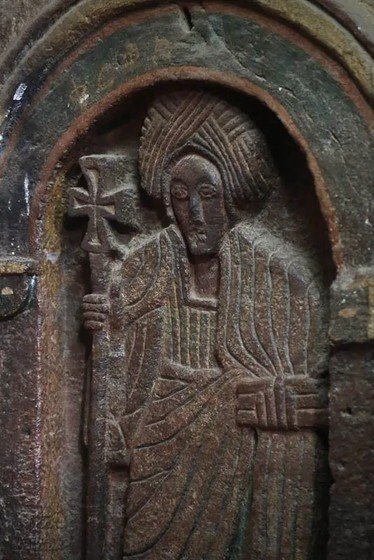
Surface decoration across Lalibela is restrained. Carved crosses, blind arcades, and shallow reliefs appear selectively, integrated directly into stone walls without disrupting their continuity. These elements function as symbolic markers rather than ornamental embellishment. Interior surfaces are largely left plain, allowing temporary textiles, icons, and liturgical objects to define ceremonial moments without altering the architecture itself.

Use and Continuity

Lalibela is not a dormant historical site. It remains an active religious center, with daily prayers, seasonal festivals, and major pilgrimages continuing to shape the use of its spaces. Floors are worn smooth through centuries of barefoot movement, and edges bear the marks of repeated contact. The architecture has aged through continuous use rather than abandonment, reinforcing its role as a living environment rather than a preserved monument.

Environmental Response

The sunken construction of the churches provides natural thermal regulation, protecting interiors from both heat and cold. Thick stone walls stabilize internal temperatures, while narrow openings limit glare and direct exposure. Acoustically, the carved interiors amplify chant and prayer, allowing sound to resonate through enclosed volumes and reinforcing the ceremonial function of space.

Architectural Significance

The rock-hewn churches of Lalibela represent a form of architecture defined by material discipline and spatial control rather than assembly or visual excess. Land itself becomes structure, enclosure, and interior. There is no separation between building and site, no reliance on applied finish, and no emphasis on monumentality through height or scale. Instead, architecture emerges through subtraction, sequencing, and long-term ritual use. Lalibela stands as a rare example of an architectural system sustained across centuries, where belief, material, and space remain inseparable and where continuity, rather than novelty, defines its lasting relevance.

Sources

Phillipson, David W. Ancient Churches of Ethiopia. Yale University Press, 2009. Gerster, Georg. Churches in Rock. Phaidon, 1970. Buxton, David. The Abyssinians. Thames & Hudson, 1970. Heldman, Marilyn. “The Architecture of Lalibela.” Journal of Ethiopian Studies. UNESCO World Heritage Centre, Rock-Hewn Churches of Lalibela.

Images: Public sources / UNESCO archives

June 9, 2026 0 comments
0 FacebookTwitterPinterestEmail
Newer Posts
Older Posts

Recent Posts

  • Florim Introduces SensiVenezia, a Porcelain Stoneware Collection Inspired by Venetian Terrazzo
  • LEGO Botanical Wave Transforms TANK Shanghai with 380,000 Brick-Built Flowers
  • The Great Eastern Home Introduces Its Latest Collection of Italian Vintage Mirrors
  • Smart Homes Are Changing Architecture: What Happens When Technology Becomes Part of the Building?
  • AARQE9’s Nikhaar Dhawan & Bahaar Dhawan Rohatgi Unveil the Sculptural Lunar Drip Table

Recent Comments

  1. Smart Home Architecture: How Technology Is Changing Design on Aqara Smart Lock U500: Three Versions for Gates, Glass Doors and Standard Entrances

Newsletter

  • Home
  • About Us
  • Contact Us
  • Editorial Policy
  • Privacy Policy

© 2026 Design Diary International. All Rights Reserved.

Design Diary International
  • Home
  • Project
    • Residential
    • Hospitality
    • Commercial
    • Public & Cultural
  • Interview
    • Architect
    • Interior Designer
    • Founders & Brand
    • Artist
  • Material
  • Product
  • Feature
  • DDI Finds
    • Emerging Studio
    • Rising Designers
    • New Practices
  • About
  • Magazine
  • Contact Us