• Home
  • Project
    • Residential
    • Hospitality
    • Commercial
    • Public & Cultural
  • Interview
    • Architect
    • Interior Designer
    • Founders & Brand
    • Artist
  • Material
  • Product
  • Feature
  • DDI Finds
    • Emerging Studio
    • Rising Designers
    • New Practices
  • About
  • Magazine
  • Contact Us
Design Diary International
Features

Always There, Always Underfoot

by DDI Edit Team June 3, 2026
written by DDI Edit Team

Underfoot

The floor is the only surface in architecture that the body cannot ignore. Everything else can be looked away from. The floor is always there, underfoot, and what it is made of, how it is laid, and what it carries in its pattern and its material and its age shape the experience of a space in ways that most people feel without ever being able to name.
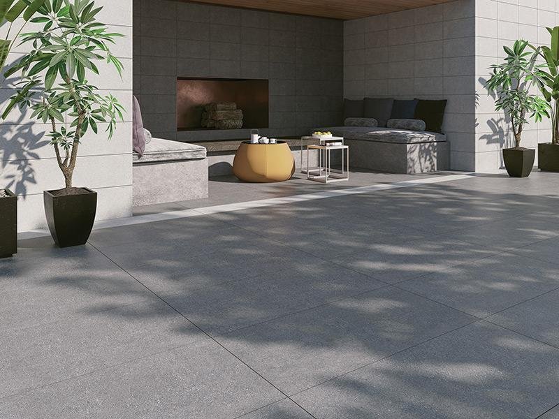
Consider what people do when they want to change a room. They repaint the walls or reupholster the furniture. They replace the light fittings, rehang the curtains, bring in new objects, and move things around. They do almost everything except change the floor, and they do not change the floor not because it is unimportant but because changing it is an act of such consequence and such commitment that most people will live with a floor they do not love for decades rather than face the disruption of replacing it. The floor is the most permanent decision in any interior, which means it is also the most revealing one. It is the surface that stays when everything else has moved on, that outlasts the fashions and the repainting and the furniture changes that accumulate above it across the life of a building. In old houses, the floor carries the memory of every life that has been lived in the rooms above it, in the paths worn smooth between door and fireplace, in the threshold stone polished by generations of hands and feet, and in the slight hollows that form over centuries at the places where people have stood and turned and stood again. No other surface in a building accumulates time this way. The floor is where the building keeps its history, and it is the surface through which that history is most directly communicated to the body of the person standing in the room, whether they are aware of it or not.
This is not a minor observation about interior decoration. It is a description of one of the most consequential and least examined relationships in the history of architecture, the relationship between the surface beneath a person’s feet and the meaning of the space they are standing in. Every great architectural tradition in human history has understood this relationship and worked with it deliberately, treating the floor not as a finishing material applied after the real design decisions have been made but as one of the primary surfaces through which a building communicates its intentions about order, hierarchy, beauty, and the nature of the world. The contemporary design industry’s treatment of flooring as a specification decision made late in the process, chosen from a catalogue after the plan has been resolved and the budget has been reduced, represents a narrowing of architectural intelligence that would have been entirely incomprehensible to the people who laid the floors of the Alhambra, the Pantheon, the great Ottoman mosques, or the brick floors of the farmhouses of Tuscany and the Netherlands that are still, centuries after they were laid, among the most beautiful surfaces that domestic architecture has ever produced.
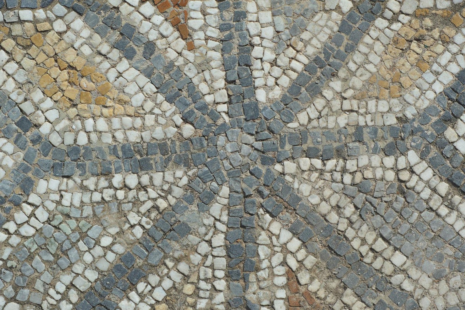
The ancient world left behind floors that make the contemporary design conversation about materiality look timid by comparison. In the House of the Faun in Pompeii, a mosaic floor assembled from nearly one and a half million individual tesserae of glass and stone depicts the Battle of Issus, in which Alexander the Great defeats Darius III of Persia, with a level of pictorial ambition and technical refinement that would be remarkable as a panel painting and is extraordinary as a floor. The foreshortening of the dying horse on the left side of the composition alone represents a degree of pictorial sophistication that European painting would not recover for the better part of a thousand years. But what matters here is not the quality of the image, which is genuinely exceptional, so much as the decision to put it on the floor, to make a surface that people walked across, that servants swept, and guests stood on at dinner parties, the occasion for one of the most ambitious works of pictorial art in the Roman world. The Romans who commissioned and inhabited that floor understood something that the contemporary industry has largely lost, which is that the floor is not the background to the room. It is the room’s first statement, and everything that happens above it either confirms or contradicts what it has already said.
The geometric mosaic floors found throughout Pompeii and across the Roman world more broadly were not decorative in the contemporary sense of the word, which implies something added to a surface for visual interest after its functional purposes have been satisfied. They were communicative in a precise and deliberate way, conveying information about the values, the social position, the cultural references, and the cosmological understanding of the people who commissioned them. A floor decorated with marine creatures in a Roman dining room was a statement about the abundance of the sea and the wealth of the household that could command it. A geometric pattern at the threshold of a room was a boundary marker, a signal that the person crossing it was entering a space governed by a different set of social rules. The Romans used their floors the way contemporary architects use their facades, as the surface most immediately legible to anyone approaching or entering a space, and they devoted to them a corresponding level of design intelligence and material investment. The Pantheon, whose floor of alternating circles and squares in giallo antico, porphyry, and granite has been in place since the second century, is a building that most visitors look up at the moment they enter, drawn by the oculus and the famous coffered dome above them. The floor is equally considered, equally specific in its geometry, and equally essential to the experience of the space, its pattern of warm yellows and deep purples and the grey-green of the granite creating a surface that holds the enormous room together from below with the same authority that the dome holds it from above.
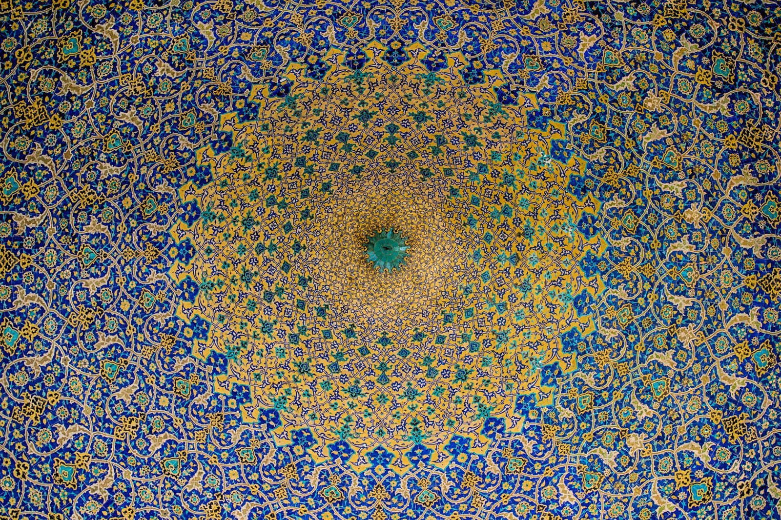
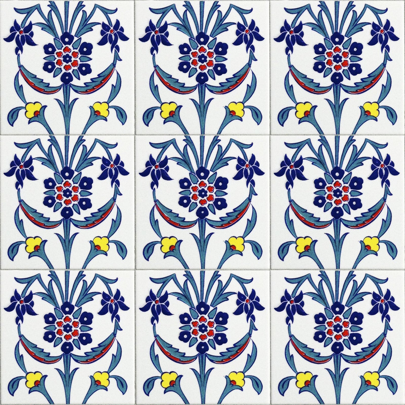
The Islamic architectural tradition carried the design intelligence of the floor to a level of geometric complexity and philosophical ambition that has never been surpassed in the history of any building culture. The tile work floors of the Alhambra in Granada, of the great mosques of Isfahan, and of the Ottoman imperial mosques of Istanbul are not patterns in any decorative sense. They are arguments about the nature of the infinite, encoded in the mathematical logic of geometric repetition and worked out in ceramic and stone with a precision that required a level of mathematical understanding that European architecture would not fully develop for several more centuries. Islamic art’s prohibition on figurative representation directed the creative energy of its architectural tradition toward geometry, and the floor became one of the primary surfaces on which that geometry was pursued in its most complex and rigorous forms. A craftsman in fourteenth-century Granada working on the tile work of the Alhambra was not a decorator in any diminished sense of the word. He was working within a tradition that understood geometry as a form of theology that saw in the infinite extension of a repeating pattern an image of divine order that human reason could approach but never fully comprehend. The floors of the Alhambra encode this understanding in every tile and every joint, and walking across them, which visitors still do today, produces a different quality of spatial experience than looking at any other surface in the building, because the geometry is beneath the feet rather than before the eyes, and the body’s relationship to it is physical and continuous rather than visual and intermittent.
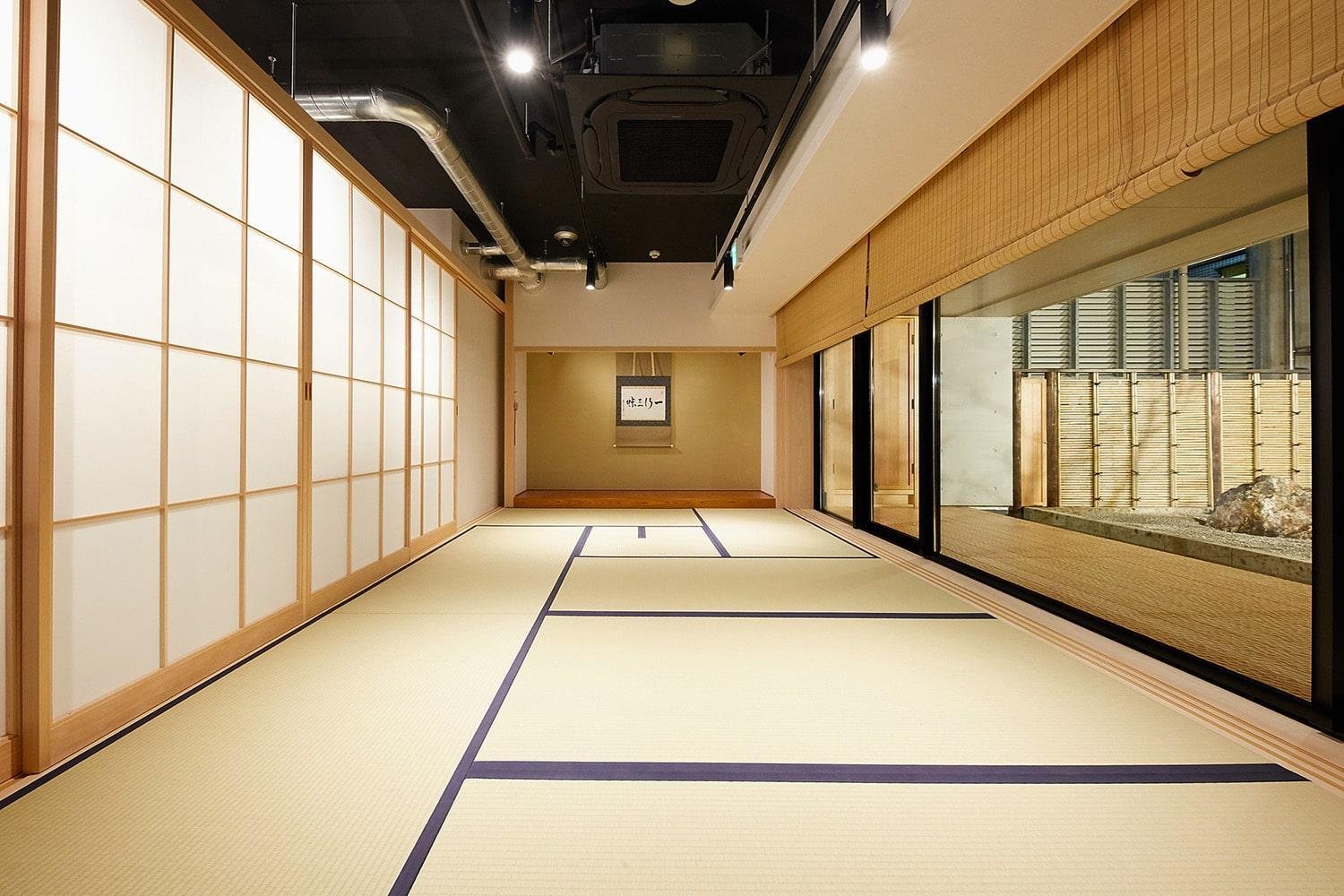
In Japan, the relationship between the floor and the life lived above it is more explicit and more socially codified than in any other architectural tradition, and it has produced one of the most distinctive and most consequential floor materials in the history of building. The tatami mat, made from a core of rice straw covered with woven rush grass, has been the defining floor surface of Japanese domestic and ceremonial architecture for over a thousand years, and its influence on the spatial character of Japanese interiors extends far beyond the material itself. Tatami rooms are measured in mats, making the floor not just a surface but the room’s measuring unit and the organizing principle of the building’s spatial system. The floor determines the plan, and the plan determines everything. The removal of shoes before entering a tatami room is not a practical measure for keeping the surface clean, though it serves that purpose as well. It is a ritual acknowledgement of the boundary between the outside world and the interior space, a gesture of respect for the floor and for the life that takes place above it, an understanding that the surface underfoot is not neutral but charged with meaning and deserving of deliberate attention.
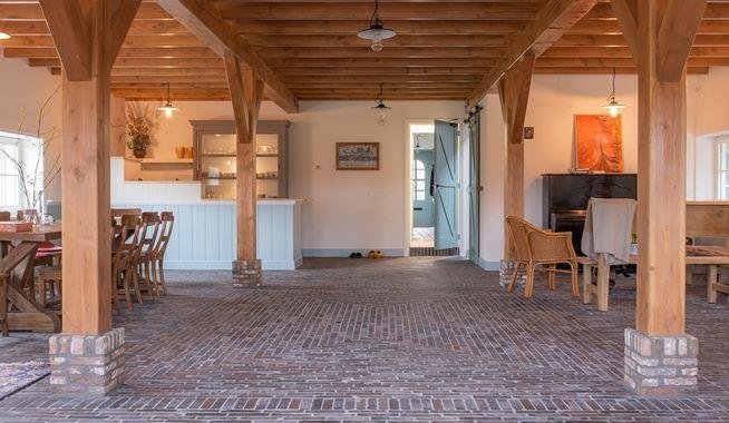
The floor traditions of Europe’s vernacular architecture are less philosophically codified than those of the great formal traditions but no less intelligent in their use of material and pattern, and they have produced surfaces of extraordinary quality and enduring influence. The brick floors of Tuscany and the Netherlands, laid in herringbone patterns across farmhouses and civic buildings that have been in continuous use for four and five centuries, are among the most beautiful surfaces that domestic architecture has produced anywhere in the world. They are beautiful not because of any particular design ambition but because of the qualities of the material itself, the warm terracotta tones of handmade brick, the irregularities of surface and color that give each floor its individual character, and the way the herringbone pattern creates a directional energy that moves with you through a room rather than stopping the eye in any one place. These floors age magnificently. The high points of the pattern wear down slightly under centuries of foot traffic, producing a surface that records the history of the life lived above it in the most direct possible way, in the paths worn smooth between door and fireplace, between table and threshold, and between the places where people have stood and moved and lived for generations. No manufactured floor covering can do this. It is a quality available only to materials that are genuinely what they appear to be and that have been given the time to become fully themselves.
Carlo Scarpa’s use of brick flooring in several of his most important projects, most notably in the ground floor rooms of the Querini Stampalia Foundation in Venice, which he renovated in the early 1960s, represents perhaps the most instructive modern example of what a floor can do when it is treated as a primary design element rather than a finishing material. Scarpa raised the floor of the Querini Stampalia slightly above the level of the surrounding canal, using a system of stepped brick platforms that acknowledge the presence of the water outside while protecting the interior from flooding, and the floor he designed for that space is a composition of extraordinary refinement, a pattern of brick and Istrian stone that creates a dialogue between the local vernacular material and the classical building tradition of Venice, between the practical need to manage the relationship between the building and its watery site and the spatial and aesthetic ambitions that any serious architect brings to the design of a room. The floor resolves all of these considerations simultaneously, and it does so in a way that is immediately and continuously present to anyone who moves through the space, not as an object of conscious attention but as the ground condition of the entire experience.
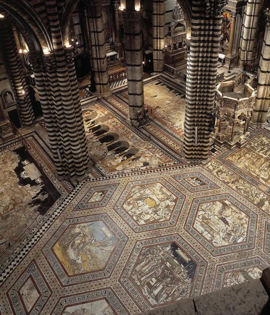
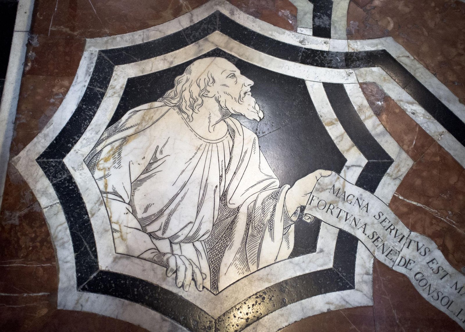
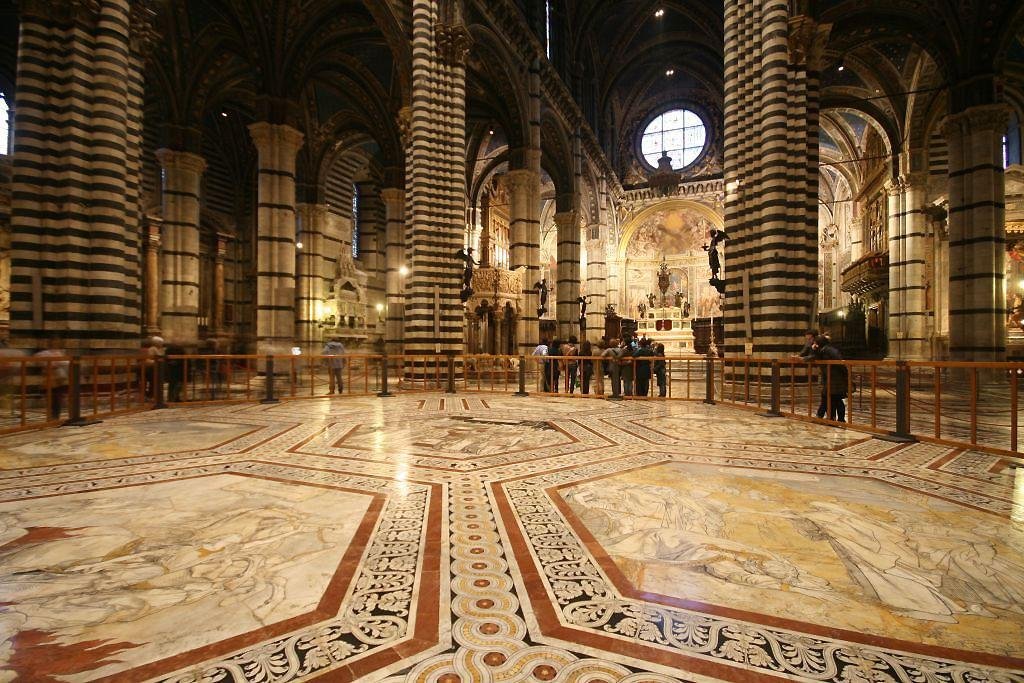
The most overlooked floor tradition in the contemporary design conversation, and perhaps the one with the most to offer a profession currently searching for ways to connect the built environment to the natural and cultural world, is the tradition of the intarsia floor, the use of contrasting stone inlays to create patterns and images that carry specific iconographic meaning. The intarsia floors of the great Italian cathedrals, most spectacularly the Cathedral of Siena, whose floor of fifty-six marble panels depicting scenes from the Old Testament, the Sibyls, and the history of the church was laid over a period of nearly two centuries, from 1369 to 1547, with Pinturicchio and Beccafumi among the artists who contributed to it, are among the most ambitious works of decorative art produced by any civilization, and they are floors. They are covered with wooden boards for most of the year to protect them from the foot traffic of the tourists who visit the cathedral daily, which means that one of the most extraordinary floors in the world is, for practical reasons, a surface that almost nobody walks across, and the irony of this situation captures something important about the relationship between the contemporary world and the tradition it has inherited. We protect the floor by preventing people from experiencing it as a floor, which is to say by removing from it the one quality that makes it specifically and irreplaceably what it is.
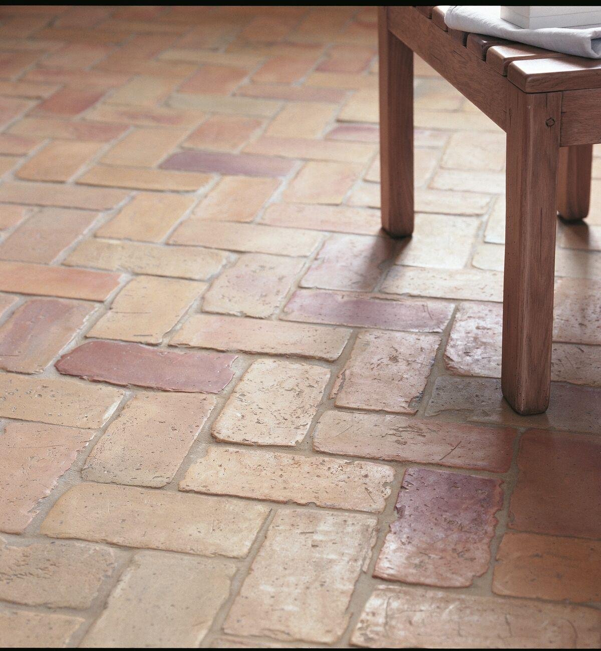
The contemporary luxury design market’s current interest in natural stone floors, in the travertine and limestone and marble and the handmade brick and the terrazzo that have been appearing with increasing frequency in high-end residential and hospitality projects across Europe and North America and increasingly in India and the Middle East, reflects an intuition about the relationship between material and experience that the tradition from the Roman mosaic to the Querini Stampalia brick floor has always understood. Natural stone floors carry the weight of the geological world beneath a space, and the body registers that weight even when the mind does not consciously notice it. Walking across a floor of genuine travertine is a different physical experience from walking across a porcelain tile printed to resemble it, not because the eye can necessarily tell the difference but because the body can in the thermal mass of the surface, in the acoustic quality of the footfall, and in the slight variations of texture and color that remind the body continuously that it is in contact with something formed by natural processes rather than manufactured to simulate them. The floor is the surface through which the building speaks most directly to the body, and it speaks most clearly when it is made of materials that have their own genuine character rather than borrowed character.

The floor will always be there, underfoot, whether the architect has thought about it seriously or not. The difference between a floor that has been considered and one that has merely been specified is the difference between a space that works on the body from below as well as from every other direction, that holds the experience of a room together from its foundation, and a space that leaves the body in contact with a surface that has nothing to say. Every tradition that has built seriously has understood this. The Pompeian mosaic maker, the Islamic geometric tile worker, the Japanese tatami craftsman, the Tuscan bricklayer, and Scarpa working out his brick and stone patterns for the Querini Stampalia: all of them were designing from the ground up, in the most literal sense. The floor is the most permanent decision in any interior. It is worth treating it as such.
 

June 3, 2026 0 comments
0 FacebookTwitterPinterestEmail
Features

The Object That Glass Has Never Surpassed

by DDI Edit Team June 3, 2026
written by DDI Edit Team

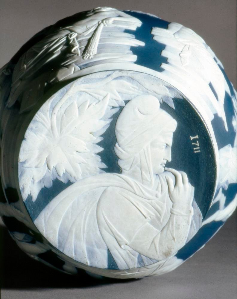
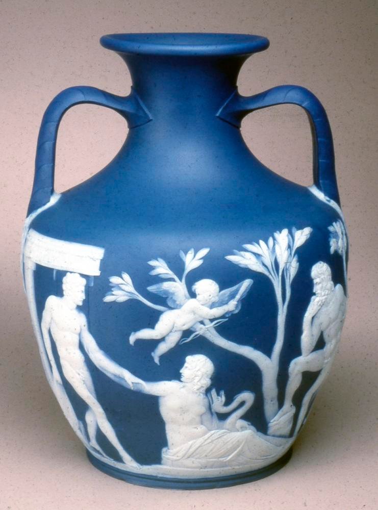
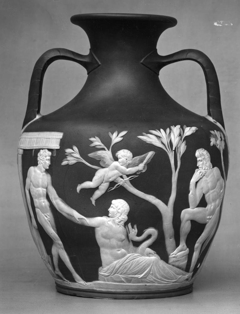
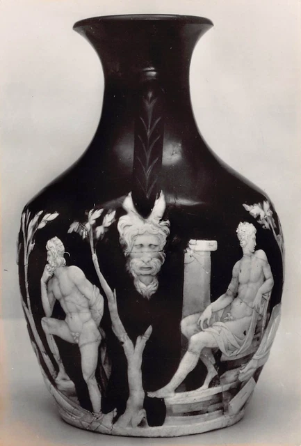
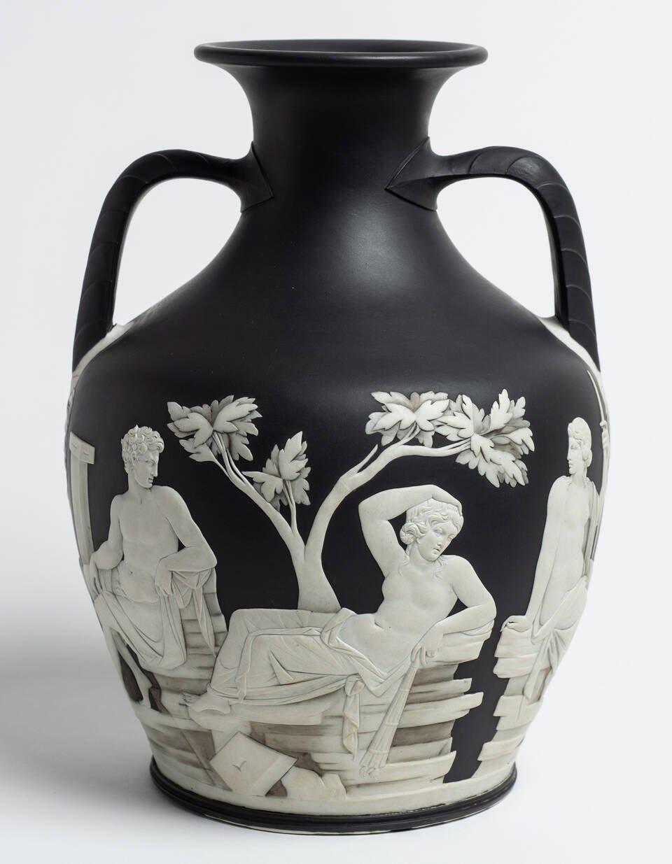
The Portland Vase. Roman, 1 to 25 AD. Cameo glass. Height 24.5 cm, diameter 17.7 cm. British Museum, London, Room 70.

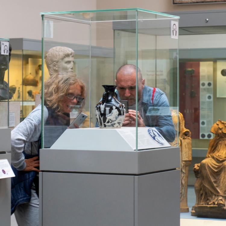
It is smaller than you expect. Standing in Room 70 of the British Museum, looking at the object that has been called the finest piece of glass ever made, the first thing that registers is not the grandeur of a ceremonial vessel but the intimacy of something that could be held in two hands, a dark cobalt blue amphora of 24.5 centimetres in height and 17.7 centimetres at its widest point, its surface carrying a continuous band of white carved relief figures moving through a scene that scholars have been arguing about for four centuries without reaching agreement, the figures themselves serene in the way that objects made with absolute conviction tend to be serene, indifferent to the centuries of interpretation that have accumulated around them and to the extraordinary technical achievement that produced them, which is one of the most sustained acts of craft skill in the history of any material in any civilisation.

The technique that produced those white figures against that dark ground is called cameo glass, and it was practised in the Roman world for approximately two generations, from around 50 BC to around 50 AD, a window of perhaps a century during which a small number of workshops in the ancient world understood how to do something that nobody before them had done and that nobody after them would fully recover for more than a thousand years. The Portland Vase is the finest surviving example of this technique, the largest and the most completely resolved, and it is also the most studied single object in the history of glassmaking, with research consistently producing both technical admiration and continued uncertainty, because the vase is an object that reveals the more clearly you look at it how much remains unknown about who made it, when exactly, for whom, what the scenes on its surface depict, and by what precise sequence of operations a workshop in the ancient world produced a surface of this quality in a material as unforgiving as glass.

The making begins with the dark blue glass itself, a cobalt-rich silicate of a depth and purity that the Roman glassmakers achieved through the addition of specific mineral compounds to the molten batch in proportions that varied by workshop and period and that were not written down in any surviving text. Recent research by Associate Professor Richard Whiteley of the Australian National University has challenged the long-held classification of the Portland Vase as blown glass, presenting evidence that it may have been cast rather than blown, a distinction that would significantly alter the understood sequence of its making. What is not disputed is the dip-overlay method by which the dark blue vessel was partially submerged in molten opaque white glass while still hot, the white layer adhering to the surface of the blue and cooling with it into a compound object of two colours fused together, the evenness of that white layer across a vessel of this size representing a technical achievement whose difficulty anyone who has worked with glass will understand and anyone who has not will tend to underestimate, because glass at the temperature required for fusion is a material of extremely narrow tolerance and the margin between the white layer adhering correctly and the entire object cracking from thermal stress is not wide.

Once cooled, the white layer was given to a carver, and it is here that the making of the Portland Vase becomes something that the distinction between craft and art was invented to describe and cannot finally contain. The carver’s task was to remove the white glass wherever it was not required, leaving raised figures in relief against the dark blue ground that showed through wherever the white had been taken away, using metal points and abrasive wheels of the kind used by gem engravers, grinding the surface fraction by fraction in a process of such precision and such slowness that the figures which remain tell you almost nothing about the effort of their removal. The raised areas vary in height across the surface of the vessel, the deepest relief giving the foreground figures their three-dimensionality, the shallower carving suggesting recession and atmosphere in a material that contains no middle distance of its own. The modelling of the flesh, the drapery falling across the figures, the musculature of the male forms and the softness of the female, the snake that appears between the two scenes, all of it is achieved through the removal of glass rather than its addition, through a process of controlled subtraction that is as close to sculpture as to craft and as close to drawing as to either.

Seven figures appear across the two scenes separated by bearded horned heads below the handles, arranged in a composition of considerable pictorial intelligence, their relationships implied through gesture and gaze rather than stated explicitly. The most widely accepted identification is the marriage of Peleus and Thetis, the mortal king and the sea goddess whose union produced Achilles, with the deity Oceanus presiding from one side. Other scholars have proposed the story of Mark Antony and Octavia, or an allegory of the afterlife connected to the Eleusinian mysteries. None of these identifications has been conclusively established, and the vase keeps its narrative to itself with the same opacity that the dark blue glass keeps its depth.

The vase was found in Rome at the beginning of the seventeenth century, in a tomb on the Monte del Grano that was believed at the time to be that of the Emperor Alexander Severus, though this attribution has not been confirmed. Its first recorded appearance in a collection is in a letter from the French scholar Nicolas-Claude Fabri de Peiresc, who noted it in 1600-1601 in the possession of Cardinal Francesco Maria Del Monte, one of the most significant collectors of the Roman Renaissance and a man whose eye for quality was so consistently reliable that the vase’s presence in his collection was itself a form of authentication. From Del Monte it passed to the Barberini family, who held it for approximately 150 years, during which period it became known as the Barberini Vase, its reputation as the supreme example of ancient glass established through a combination of genuine technical admiration and the social currency that attached to ownership of an object this universally acknowledged to be exceptional. Peter Paul Rubens saw it and wrote about it. Its fame spread through Europe by word of mouth and through the letters of connoisseurs, and it was this accumulated reputation, built over a century and a half of Barberini ownership, that gave the vase the cultural weight it carried when it left Rome under the most undignified circumstances imaginable, because it was lost in a card game. Sometime before 1778, Princess Cordelia Barberini-Colonna sat down to a game of cards and came away without the vase, which passed to a Scottish art dealer as settlement of her debt, beginning the journey that would bring it to England.

In 1778 it was purchased by Sir William Hamilton, the British Ambassador at the Court of Naples, whose collection of antiquities was among the most significant private collections of the period, and who brought it to England and sold it in 1784 to Margaret, the Dowager Duchess of Portland, for a considerable sum, after whom it takes the name by which it is now universally known. Two years after the Duchess’s death, her son the third Duke of Portland made the decision that would determine the vase’s subsequent cultural history more than any other act of ownership, lending it to Josiah Wedgwood, who had been attempting to produce a replica in his newly developed jasperware and who understood the Portland Vase well enough to know how far he was from achieving it. The project consumed four years of his most intense effort, repeated visits to study the surface, trial pieces, refined jasper bodies, rejected results that a less exacting practitioner would have accepted, until he finally produced in 1790 what he considered a satisfactory copy and offered the first edition of fifty pieces at fifty guineas each, an extraordinary price that reflected his own assessment of what he had achieved. Those first-edition Wedgwood Portland Vases are now in museum collections across the world, their value a function of both their own quality and the quality of the object that inspired them, the copies made precious by proximity to the original in a way that makes no logical sense and perfect cultural sense simultaneously.

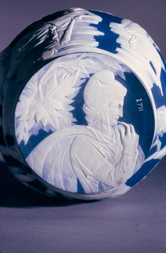
The vase was deposited in the British Museum by the fourth Duke of Portland in 1810 and remained on loan from the Portland family for over a century, displayed and studied and copied and argued about, until the seventh Duke sold it to the museum in 1945 for a sum that has never been made public. On 7 February 1845, an Irish visitor named William Lloyd entered the museum and threw a nearby Assyrian stone sculpture against the case containing the vase, shattering it into more than two hundred fragments. The popular legend that Lloyd was drunk when he did this has been repeated so consistently that it has acquired the authority of fact, but contemporary accounts do not conclusively support it. What is clear is that the fragments were gathered, the first restoration was attempted in the same year, a second restoration followed in 1948, and by 1986 the joints of that second restoration rattled when the vase was gently tapped. The third and current reconstruction was completed in 1987 by a new generation of conservators using new adhesives and a new understanding of the object’s physical history, and the Portland Vase as it stands in Room 70 today is the product of this third reconstruction, with a small number of fragments that could not be placed stored separately, and the cameo glass disc showing a pensive figure in a Phrygian cap that was attached to the base from at least 1826 displayed independently, its original relationship to the vase still an open question.

The shattering and the restoration enhanced rather than diminished the vase’s reputation, in the way that the breaking and mending of significant objects sometimes does, by adding to their story a chapter of vulnerability and survival that makes them feel more human than objects of pure perfection can ever feel. The Victorian period that followed the 1845 restoration saw the Portland Vase become the inspiration for an entire craft revival, when Benjamin Richardson of the Red House Glassworks at Wordsley offered £1000 to anyone who could reproduce it in cameo glass. The challenge was taken up by Philip Pargeter, who in 1873 supervised the production of the first cased glass blank shaped like the vase, blown by Daniel Hancock, and by John Northwood, who between 1873 and 1876 carved one of Pargeter’s blanks into the first modern glass replica made by the cameo technique, an achievement that led to a flood of commissions and a Victorian vogue for cameo glass that lasted until the end of the century and produced some of the finest decorative glass made in England before or since. Northwood’s replica is now held at the Corning Museum of Glass in New York, a copy of the original that is itself now a museum object, the replica acquiring the dignity of the thing it replicated through the quality of its own making.

The contemporary world has not lost interest. In 2024, the Crocker Art Museum in Sacramento mounted an exhibition titled The Portland Vase: Mania and Muse, featuring more than sixty works by contemporary artists including Viola Frey, Squeak Carnwath, Hitomi Hosono, Clare Twomey, Roberto Lugo, and Michael Eden, each engaging with the vase as both a historical object and a cultural provocation, questioning why a single ancient vessel continues to exert such authority over the artistic imagination more than two thousand years after it was made. In 2012, the Stourbridge glass community produced a twenty-first century cameo glass replica of the Portland Vase to celebrate four hundred years of glassmaking in the region, with support from the British Museum’s own curators, an act of homage that demonstrated how completely the vase had become the benchmark against which the entire tradition of cameo glass measures itself. The words Portland Vase yield over sixteen million results in a Google search, appearing as aspirational photographs, tattoos, non-fungible tokens, and commercial replicas in every material and at every price point, a measure of how thoroughly a Roman workshop’s achievement between the years of 1 and 25 AD has penetrated the visual culture of a world that did not exist when it was made.

What made it museum worthy, to answer the question that the museum is always implicitly being asked to answer about every object in its collection, is not its age alone, nor its survival, nor even the undisputed beauty of its surface, though all of these contribute to its standing. What made it museum worthy is the convergence of qualities that very rarely appear together in a single object: a technical achievement so complete that it has never been fully surpassed in the same material, a pictorial intelligence that rewards sustained attention without yielding to it entirely, a history of ownership and influence that encompasses some of the most significant figures in the history of art and craft across four centuries, a destruction and restoration that added to its meaning rather than subtracting from it, and a continuing capacity to inspire, provoke, and instruct makers across every medium who encounter it in the glass case where it has been standing since 1810. The Romans who made it between the first century before and the first century after the common era could not have anticipated, even in their most ambitious conception of their own work, that two thousand years later it would be in a museum in a city that did not yet exist, generating sixteen million search results in a technology that lay further in the future than Troy was in their past, still debated, still studied, still copied, still the object by which glassmakers measure the distance between what they can do and what has already been done.


The Portland Vase is on permanent display in Room 70 of the British Museum, Great Russell Street, London. britishmuseum.org

June 3, 2026 0 comments
0 FacebookTwitterPinterestEmail
Hospitality

Jungle Homes Tadoba, Maharashtra-India, by Nashine Architects

by DDI Edit Team June 2, 2026
written by DDI Edit Team

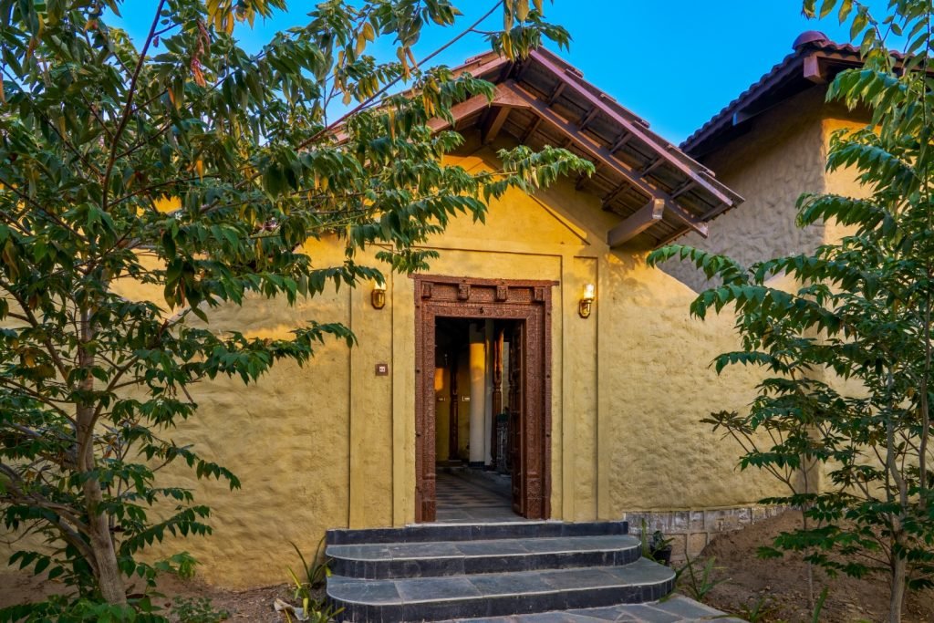
The entrance to Jungle Homes Tadoba is a set of doors that did not originate here. Massive carved wooden panels salvaged from a rundown wada somewhere in Maharashtra, their surface dense with brass fittings and ornate metalwork jali with a green patina on either side, carved columns flanking them, the whole assembly set into a new sandstone wall as though it had always been there, and it is this threshold more than any other point in this 35,000 square foot, 24-room resort adjacent to the Kolara Gate of the Tadoba-Andhari Tiger Reserve that tells you what Ar. Sukumar Nashine and the team at Nashine Architects were working toward, which is that a building can carry real history rather than a simulation of it, and that the doors of abandoned wadas across Maharashtra have more to say about place and time than any new material could manage.

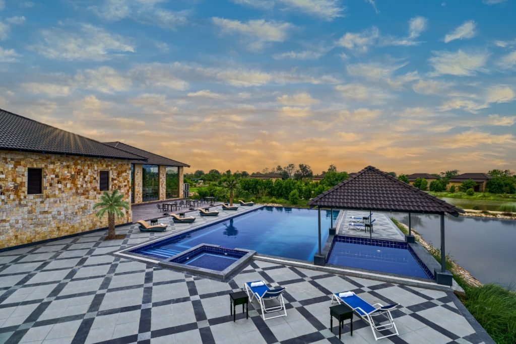
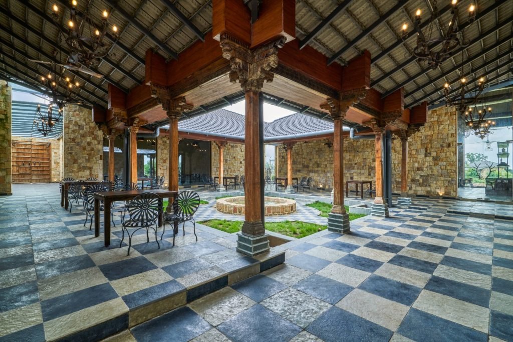
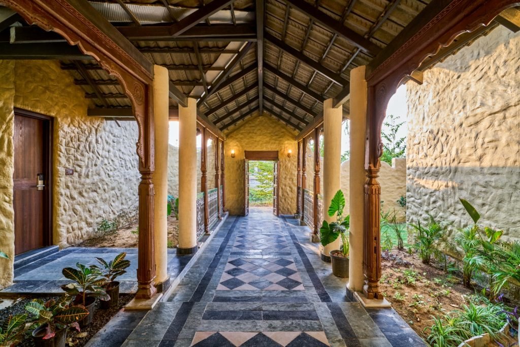
Beyond the doors, a Tandur stone checkerboard corridor leads into the main building, with a dark grey and cream pattern running the full length of the passage between carved wooden columns and lime-plastered walls. This same checkerboard reappears throughout the resort wherever the Wada reference is most explicit: in the central courtyard, on the cottage floors, and at the pool deck. The pattern serves as the resort’s spatial signature, just as sandstone serves as its material one.\

The central courtyard is the heart of the main building and the most direct translation of the Wada typology into a working resort. Sandstone walls of warm golden tones enclose the central courtyard, bordered by a colonnade of salvaged carved wooden columns, each with a patina reflecting its history. At the courtyard’s center, a circular stone platform carries a large dark ceramic urn on a ring of grass, and the checkerboard Tandur paving extends outward from it in all directions.

The semi-open space, sheltered by the colonnade but open to the sky, promotes a cooling cross-breeze and provides shade in Tadoba’s summer heat of 48 degrees. Dining tables and wrought iron wheel-back chairs are arranged under the colonnade on either side, with the cooking, reception, and banquet hall all organized around this space. The courtyard serves the same purpose as in every wada it references, holding the life of the building together at its open center.

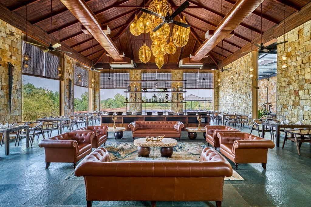
The restaurant occupies one of the largest volumes in the main building, its pitched timber roof rising high above sandstone walls on all sides, large openings between the stone columns letting the forest landscape in on multiple sides with bamboo roller blinds drawn partially against the afternoon light. Brass cage pendant clusters hang from the timber rafters in warm amber, tan leather Chesterfield sofas are arranged in the central lounge zone, round tables on either side for dining, and a long display shelf running through the middle carrying ceramic vessels and objects. The dark slate floor creates a seamless transition between inside and outside, with stone walls and large openings blurring the boundary between the restaurant and the forest.

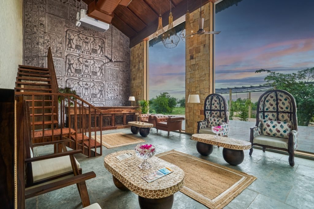
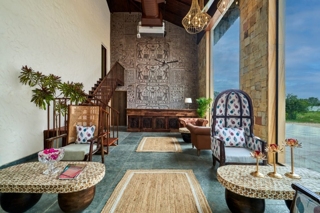
The lobby lounge sits at the double-height space beside the entrance, where a staircase of salvaged heritage wood with rattan panel balustrades rises along one wall, and a full-height mural in grey-brown on the other carries a dense field of hieroglyphic-like script and figural patterns across the entire wall surface, less decorative wallpaper and more an archaeological surface, the marks of something that predates the building around it. Tables with bone-inlay mosaic tops on dark turned-wood globe bases are arranged across jute rugs on the stone floor, dome-shaped high-back chairs in patterned upholstery alongside them, a deeply carved wooden console below the mural wall, the whole space opening through sandstone columns to the landscape and the sky beyond.

The 24 cottages are distributed across the site at a remove from the main building, their separation from the public zones reinforced by the twin lakes created from restored natural channels on the site, the water functioning as a natural boundary between the communal and the private and, as the season allows, as a watering hole drawing wildlife from the reserve beyond.

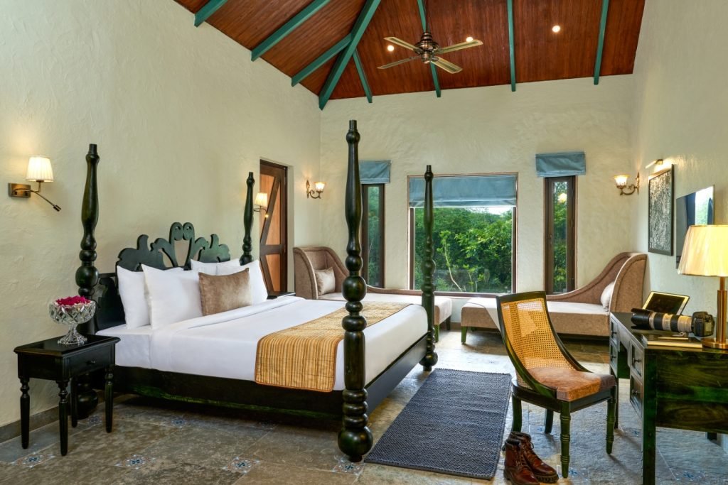
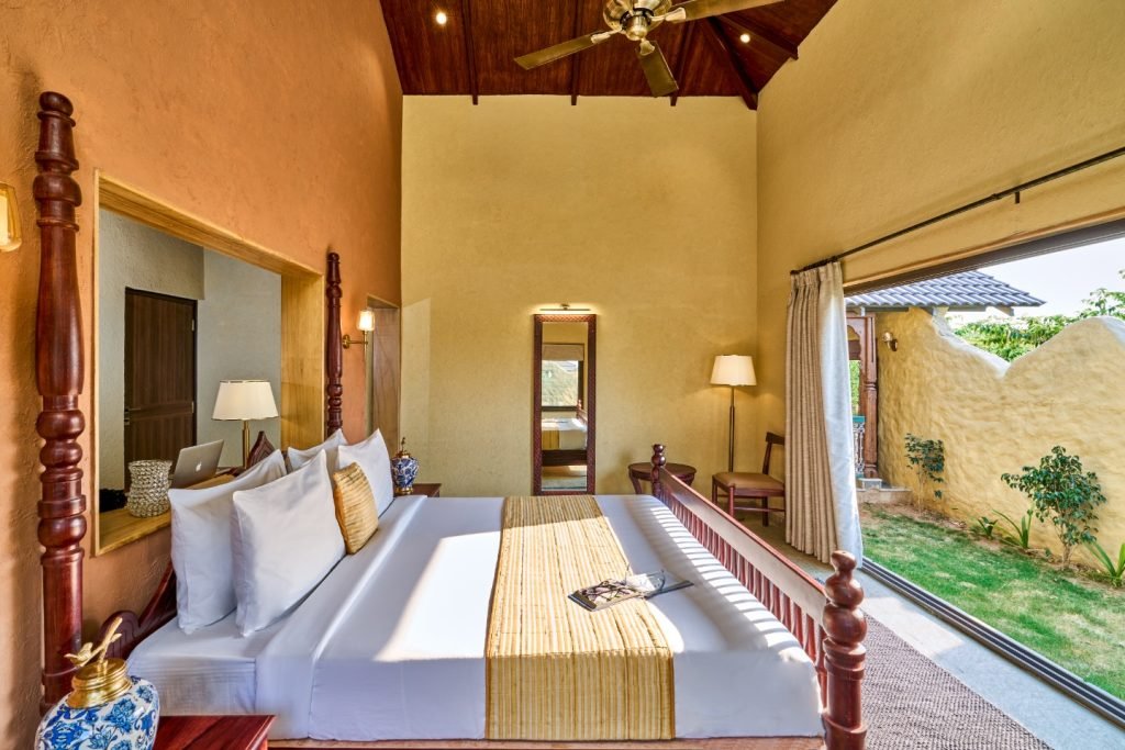
Each cottage carries the same vocabulary as the main building in a reduced register: lime-plastered walls in warm ochre or terracotta tones, high vaulted timber ceilings with exposed rafters and a ceiling fan, four-poster beds in dark rosewood or green-painted wood with turned spindle posts and carved headboards, Tandur stone floors with blue-grey diamond insets, and carved wooden door surrounds salvaged from wadas set into the new construction so that each cottage arrives at its entrance with a piece of inherited architecture already in place.

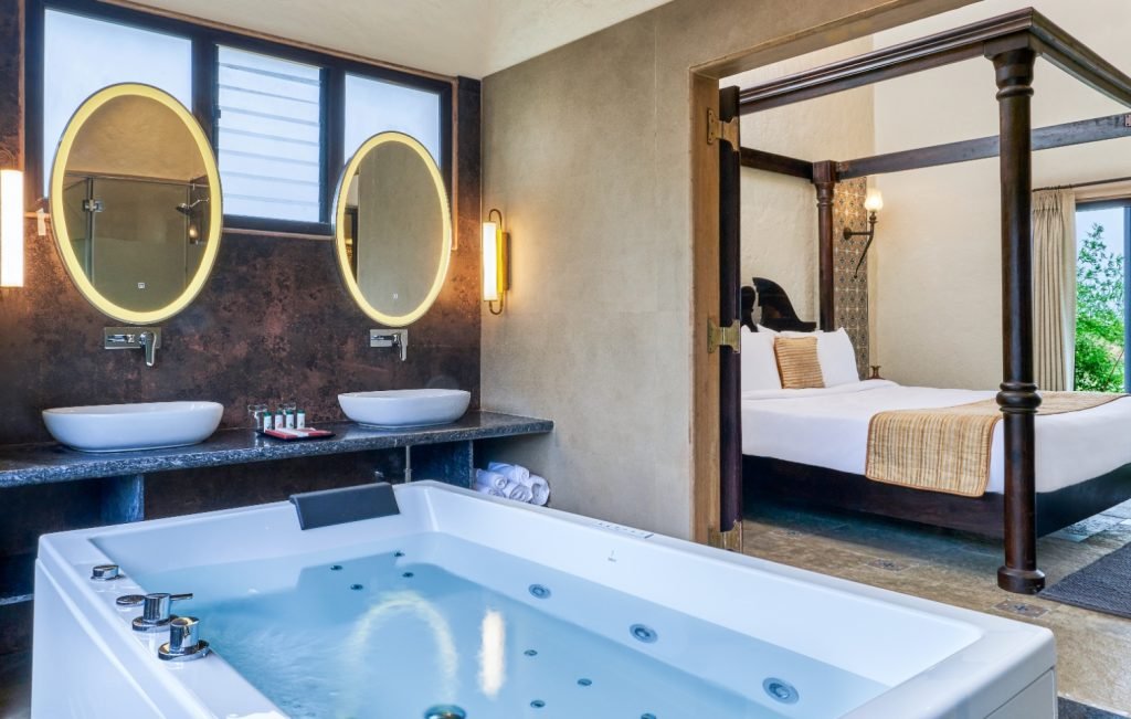
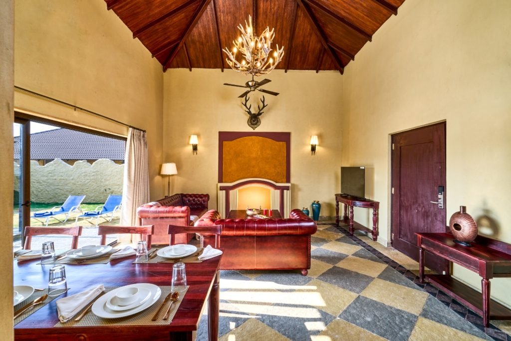
Rattan chairs, handcrafted and light, sit at the desks, and several rooms open fully to enclosed private garden courtyards with grass and sandstone walls; the inward-looking logic of the wada is brought down to the scale of a single guest room. The more expansive villa units carry a living room with red Chesterfield sofas, a stone fireplace with an ochre-painted surround, a dining table under an antler chandelier, and a checkered stone floor, the room reading less like a resort villa and more like a forest bungalow furnished by someone who has been collecting for a long time. In the bathrooms of certain room categories, a jacuzzi bath and double oval backlit mirrors in dark stone and terrazzo sit open to the bedroom through a framed arch, the wet and dry zones continuous rather than divided.

The pool deck continues the checkerboard in stone, sun loungers along the water’s edge, a jacuzzi pool adjacent, and beyond both the twin lakes stretch toward the treeline, the water still in the early morning when the forest at the edge of the reserve begins to move.

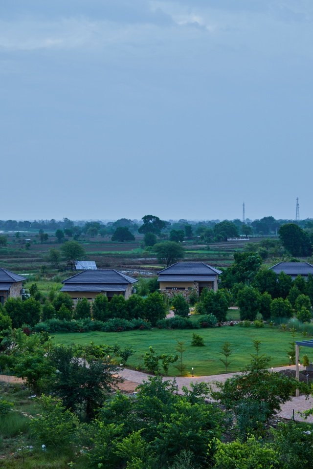
From an elevated point on the site at dusk, the cottages sit low in the landscape, their dark terracotta hip roofs just visible through the trees that have been planted between them, the resort distributed across the ground rather than imposed upon it, the semi-arid land of Tadoba flattening out toward the tiger reserve in the distance.

Fact File 

Project Name: Jungle Homes Tadoba

Location: Tadoba, Maharashtra

Project Type: Resort / Hospitality & Leisure

Year Built: 2025

Project Size: 35,000 sq ft

Design Firm: Nashine Architects

Principal Architect: Ar. Sukumar Nashine Team

Design Credits: Ar. Shashank Nashine & Ar. Sonia Nashine

Photograph Courtesy: Vrushasen Mohite

June 2, 2026 0 comments
0 FacebookTwitterPinterestEmail
Commercial

The Spatial Continuum in Kolkata, India, by Abin Design Studio

by DDI Edit Team June 2, 2026
written by DDI Edit Team

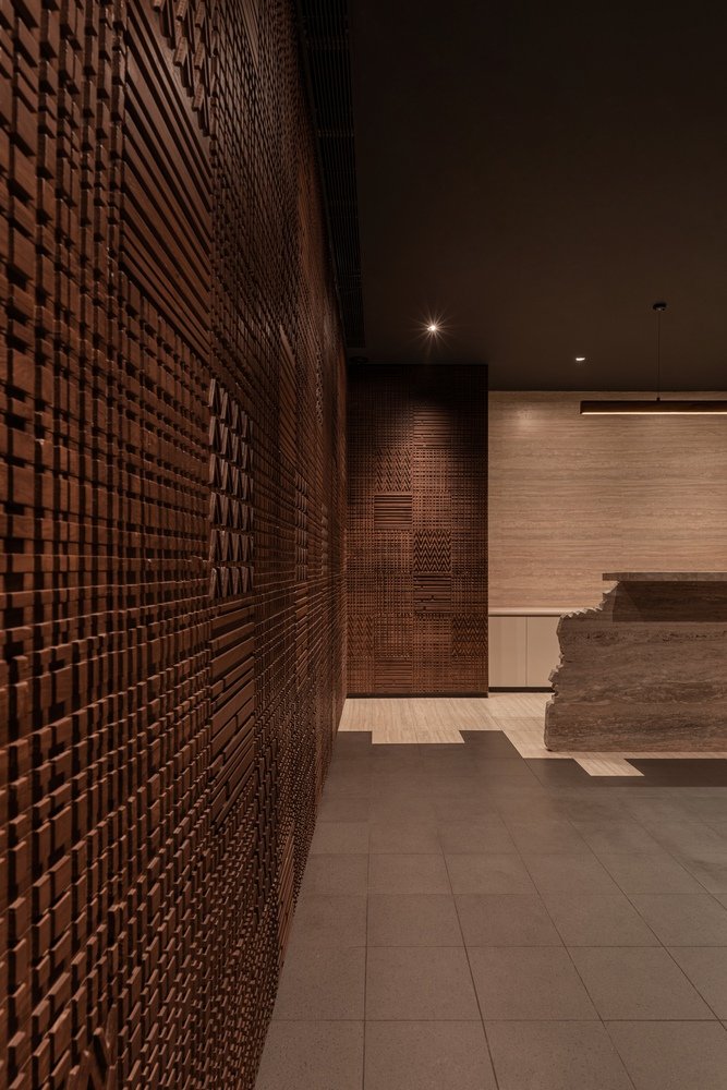
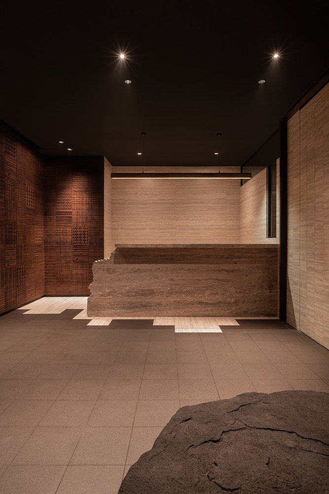
The wall to the left of the reception desk in this 6,512-square-foot office interior for a developer company in Kolkata is the one that takes the longest to read: floor-to-ceiling blocks of warm brown wood stacked and interlocked in varying orientations, their arrangement forming a shifting field of geometric patterns across the full surface, horizontal rows giving way to chevrons, chevrons to diagonal grids, diagonal grids back to horizontal, the whole thing reading as part wall, part textile, part something for which there is not an immediate category, and it is this surface more than any other that tells you what Abin Chaudhuri was working through when he designed The Spatial Continuum, which is that restraint and craft are not opposites, that a minimal interior can carry something handmade and intricate without the two things cancelling each other out.

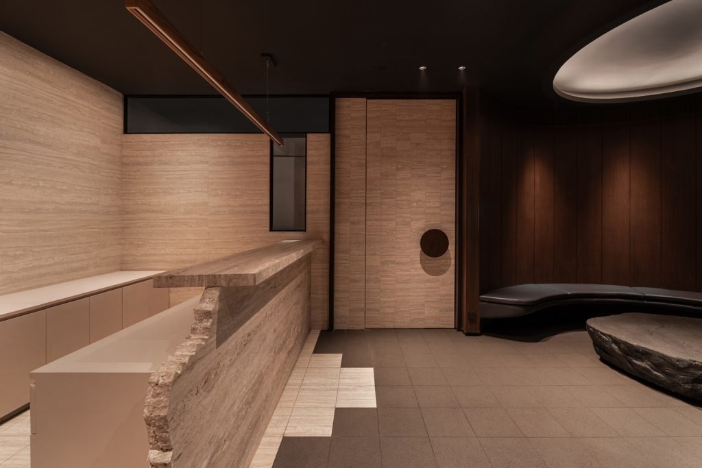
The reception counter directly across from it makes the same point in a different material. The travertine has a smooth, polished top surface that is horizontal like a desk surface, while the face on the visitor’s side is left deliberately rough, preserving and exposing the stone’s natural fractured edge. This way, the same block of material appears both finished and unfinished at the same time, with the quarried origin of the stone fully visible on the most front-facing surface of the office.

A linear pendant in warm bronze hangs above it, a travertine-clad door stands behind it with a single circular dark disc as its only hardware, and at the base of the desk the floor transitions from the dark grey tile of the main lobby into an inlaid travertine geometric pattern that marks the desk’s footprint on the floor. A large raw basalt boulder sits directly on the lobby floor to one side, its irregular dark form sitting in the reception as though it arrived before the architecture did.

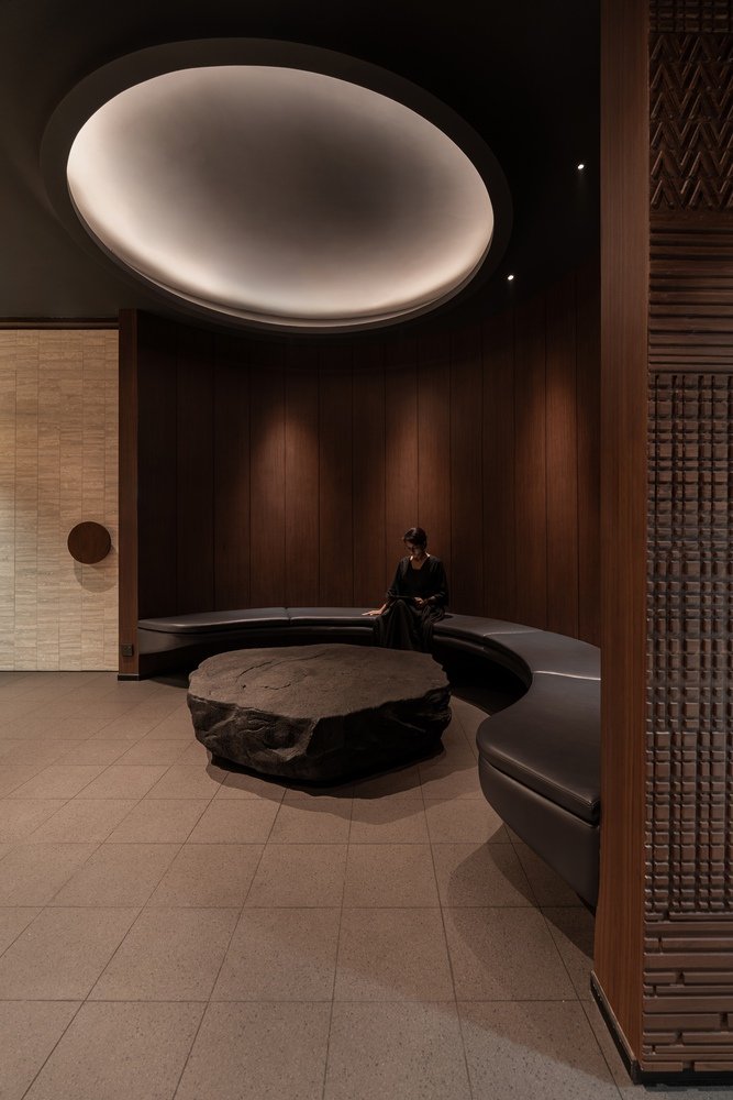
The seating alcove within the reception moves into a darker and more enclosed register. Dark timber wall paneling in vertical planks curves around a continuous black leather banquette, the bend of the bench following the bend of the wall, and at the center of this arc the same rough basalt stone appears again, this time as a low table, its flat top and natural broken perimeter making it the room’s least processed surface and, for that reason, the most arresting. Above it, a large elliptical recessed ceiling light glows in warm white against the dark ceiling, its oval form hovering over the seating with the quality of a moon rather than a fitting, the only source of light in a space that is otherwise entirely in shadow.

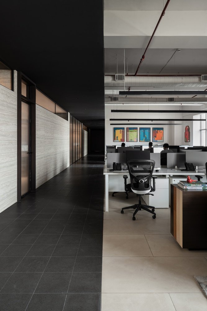
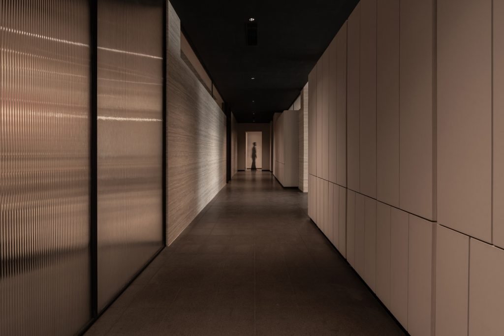
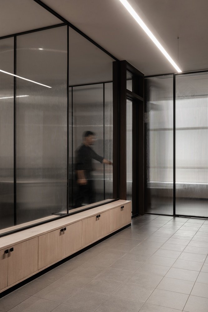
The corridor running the length of the office is where the project’s spatial logic becomes visible. One side carries the private zone: ribbed, fluted glass partitions in dark steel frames reveal stone-clad interiors behind them, the glass diffusing the light from within so that the offices read as warm amber volumes through the corridor rather than as transparent rooms, and alongside the glass, a low credenza in light oak sits at the base. The other side is flush panel walls in warm, sand-toned joinery running without interruption, their surfaces divided only by hairline shadow gaps, everything behind them invisible.

The ceiling throughout is black, the floor is in dark grey tile, and moving through this corridor, with warm glowing glass to one side and quiet flat panels to the other, is an experience that has been designed rather than left over.

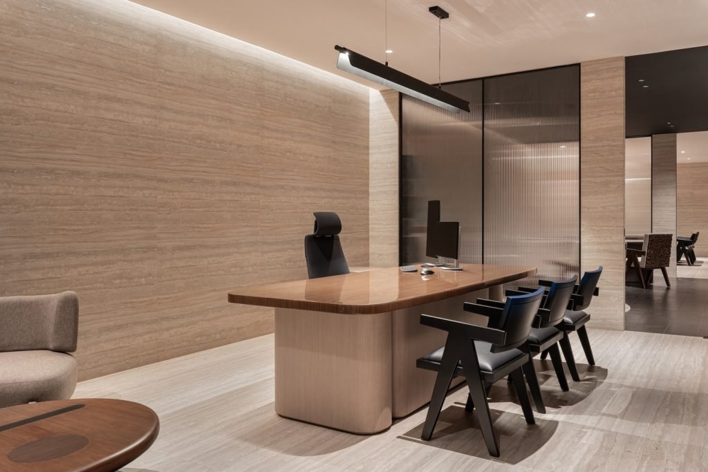
The private offices feature travertine wall cladding from the reception, glowing warmly with linear veining and backlighting at the cornice. In the principal cabin, the desk is in warm timber with softly rounded corners and a solid curved pedestal base, its form organic enough that it reads as furniture rather than office equipment, three chairs in black with Pierre Jeanneret-derived X-frame legs placed across from it, and a linear pendant above.

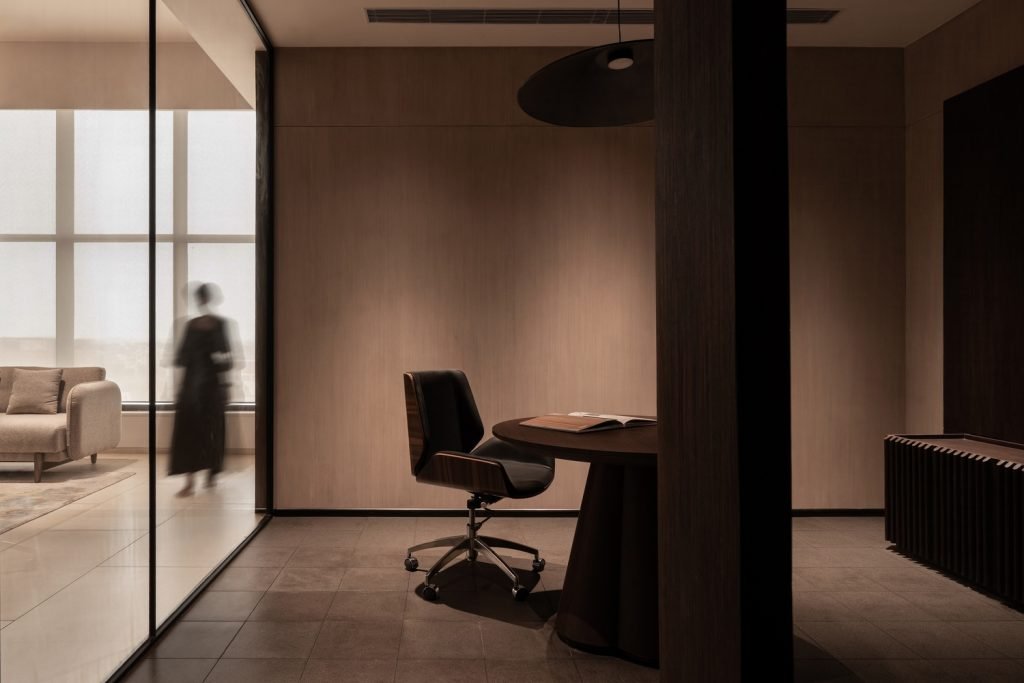
Through the fluted glass partition beyond, another room is visible, its forms softened and blurred by the ribbed glass, the layers of transparency and material multiplying across the depth of the plan. Elsewhere in the private zone, a smaller cabin carries a round dark timber table on a pedestal base and a single leather office chair, a large disc-shaped dark pendant above, the room quiet and focused, and through its glass wall the lounge beyond is visible with a blurred figure moving through it.

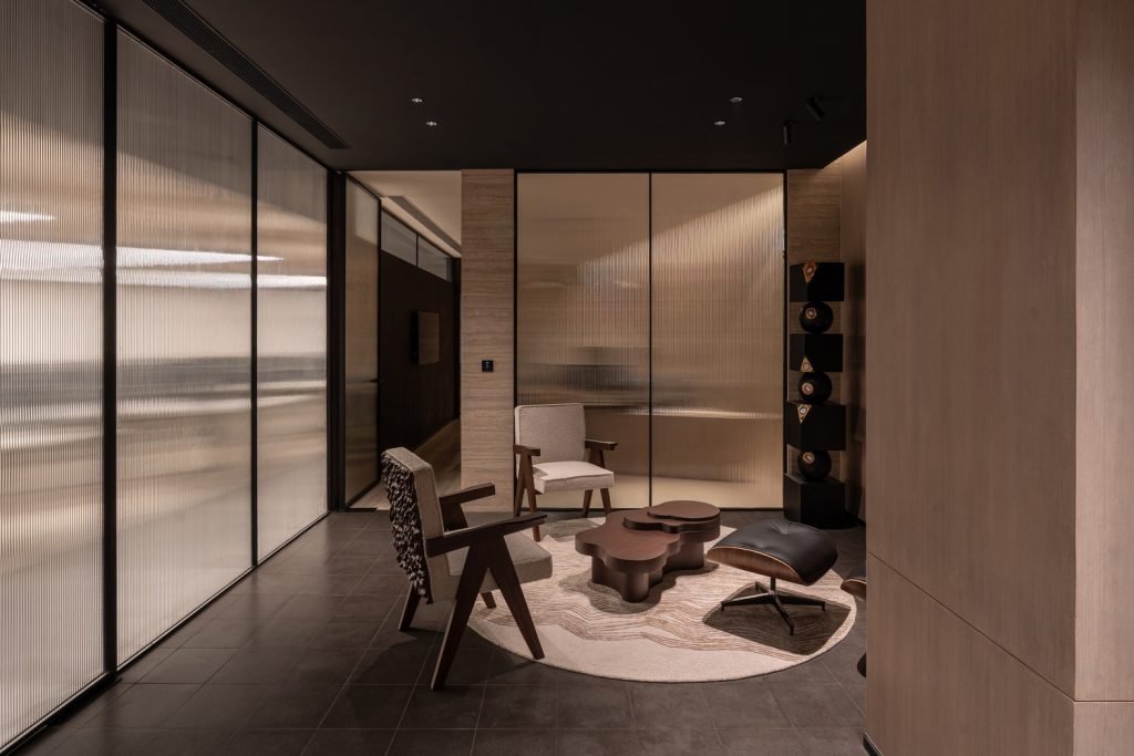
The breakout lounge sits at the junction of the private and open zones, with a round off-white rug with an organic topographic pattern on the dark floor, a set of clover-shaped low tables in dark timber clustered at the center, a classic Eames lounge chair in black leather with its ottoman, a dark timber sculptural chair alongside, and against the wall a tall stack of dark ceramic vessel forms each diminishing in scale toward the top, reading as sculpture rather than as shelving. Through the fluted glass partitions enclosing this pocket, the stone-clad office behind glows warm, and the whole corner operates as the kind of cocooned pause the open floor cannot offer.

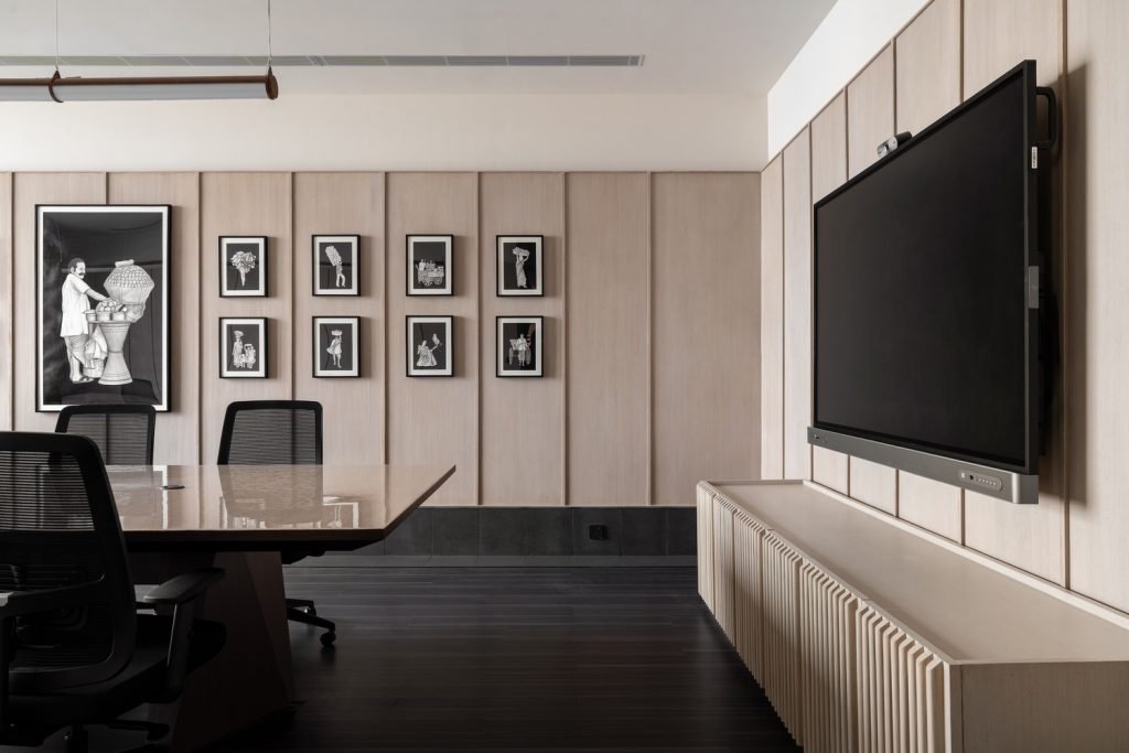
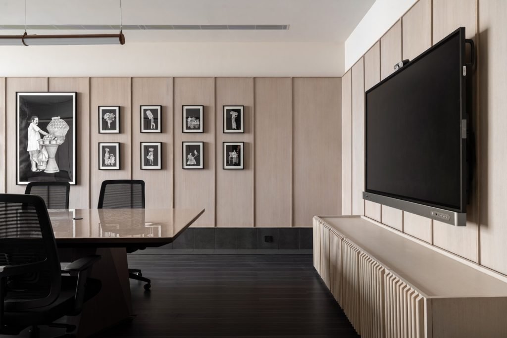
The conference room sits behind the workstation floor and works in a different palette: light oak paneling in tall vertical planks, a high-gloss dark timber conference table, black mesh ergonomic chairs, and on the long wall a collection of black and white photographs in varied frame sizes, a large portrait of a man beside a ceramic vessel anchoring the arrangement, the rest of the grid smaller and more intimate, the art giving the room a character that the rest of the office earns through material and craft.

A ribbed light timber unit below the mounted screen extends the pale wood tone to the presentation wall, creating a noticeably warmer and more domestic atmosphere than the corridor.

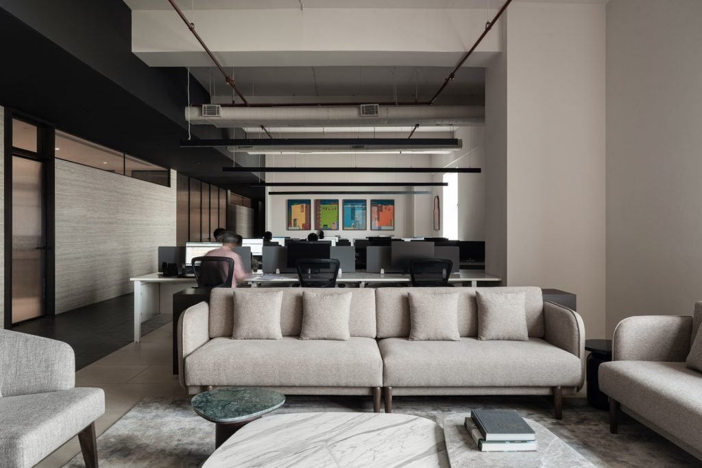
The open workstation floor occupies the brightest and most expansive part of the plan, its ceiling exposed and painted black with services and linear pendant lighting running in parallel rows, white workstations in clean rows below, and the floor open and legible from the lounge that marks its edge. Three large canvases in vivid orange, green, and blue with architectural motifs hang on the back wall, their color the sharpest contrast in the project to the warm neutrals of the private zones, a beige linen sofa, a green marble side table, and a white stone coffee table sitting at the threshold between the two worlds, the open floor behind and the enclosed spine ahead.

Fact File 

Project Name: The Spatial Continuum

Location: Kolkata

Project Type: Office Interior Design

Year Built: 2025

Built-up Area: 6,512.17 sq ft

Design Firm: Abin Design Studio

Principal Architect: Abin Chaudhuri

Team Design Credits: Abin Chaudhuri, Pratishi Parekh, Priyanjana Das, Somendra Muhale, Jibendra Basak, Partha Ghoshal, Amit Kumar Sonar

Photograph Courtesy: Manan Surti Photography

Website: abindesignstudio.com

Instagram: @abindesign_studio

June 2, 2026 0 comments
0 FacebookTwitterPinterestEmail
Residential

Arch in the Grove in Goa’s Anjuna by 19 Dot Architects

by DDI Edit Team June 2, 2026
written by DDI Edit Team

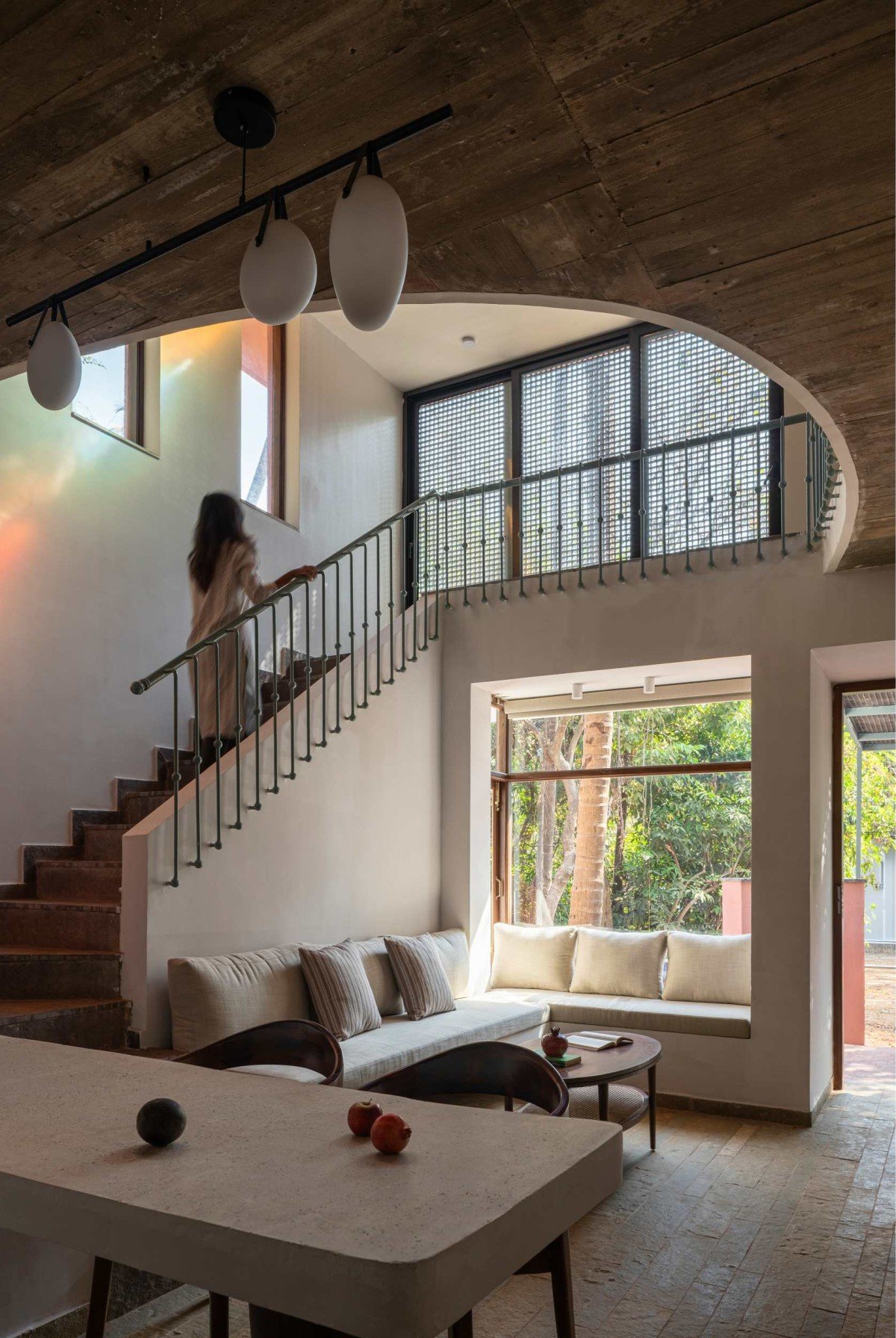
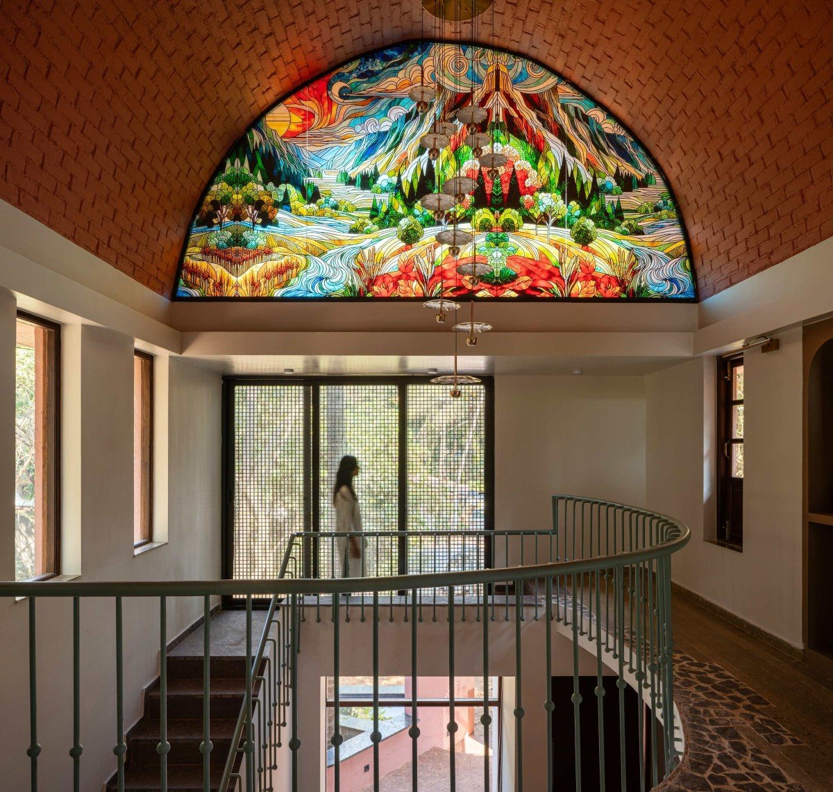
The stained glass that fills the semicircular arch on the front facade of this two-storey laterite house in Anjuna, Goa, is not decorative in any conventional sense; its scale alone rules that out: a full half-circle of leaded glass set into the brick vault at the building’s crown, depicting a landscape of mountains, rivers, tropical trees, and a blazing sky in reds, oranges, yellows, blues, and greens dense enough that from a distance, through the palm grove surrounding the house, it reads less like a window and more like a painting hung high on a terracotta wall, and it is this detail more than any other that tells you what the architects at 19 Dot were thinking about when they designed Arch in the Grove, which is that a house sitting in a Goa grove a short walk from the beach can carry one element that operates entirely outside the logic of its materials and its program and is made more itself for having it.

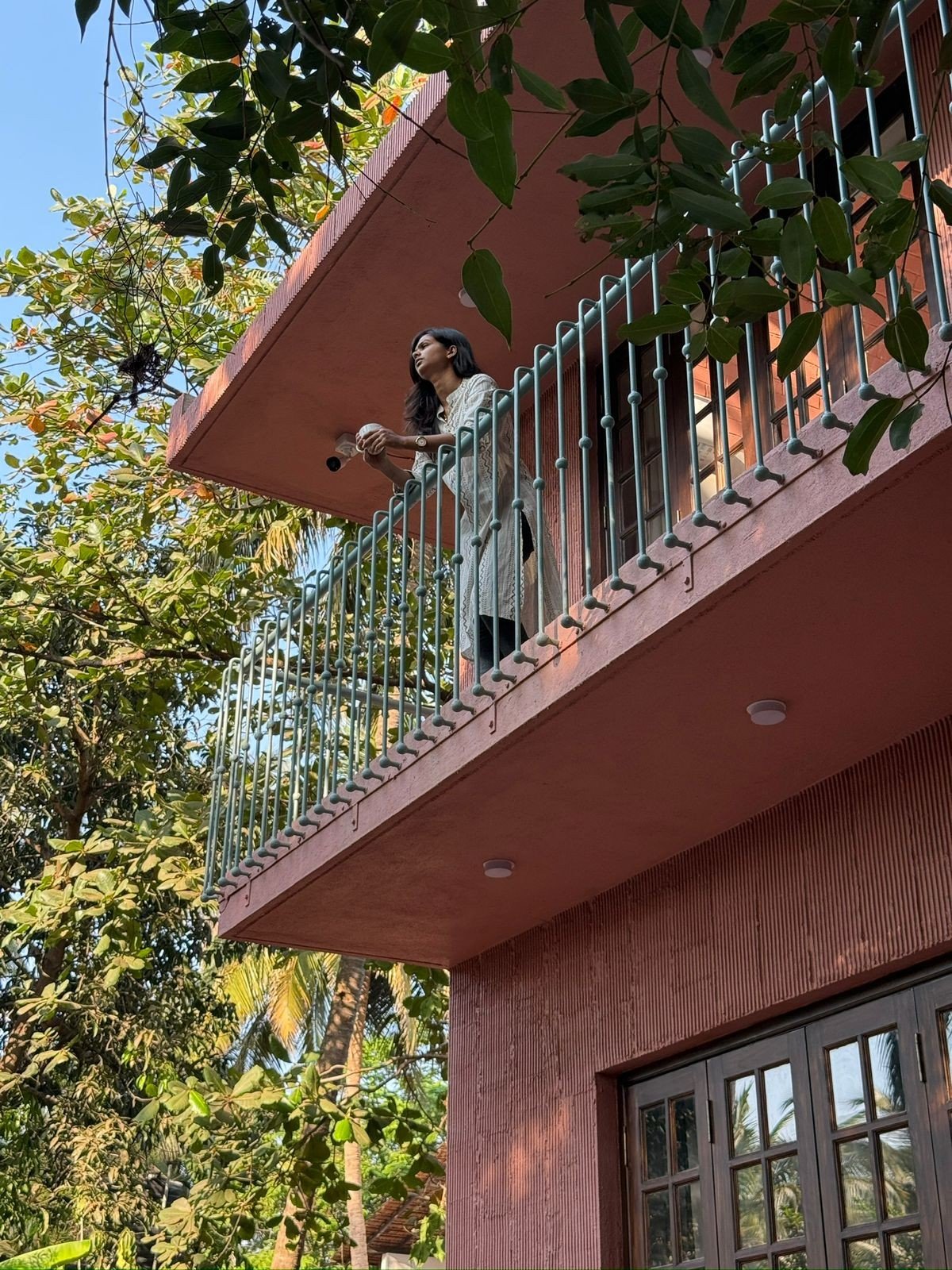
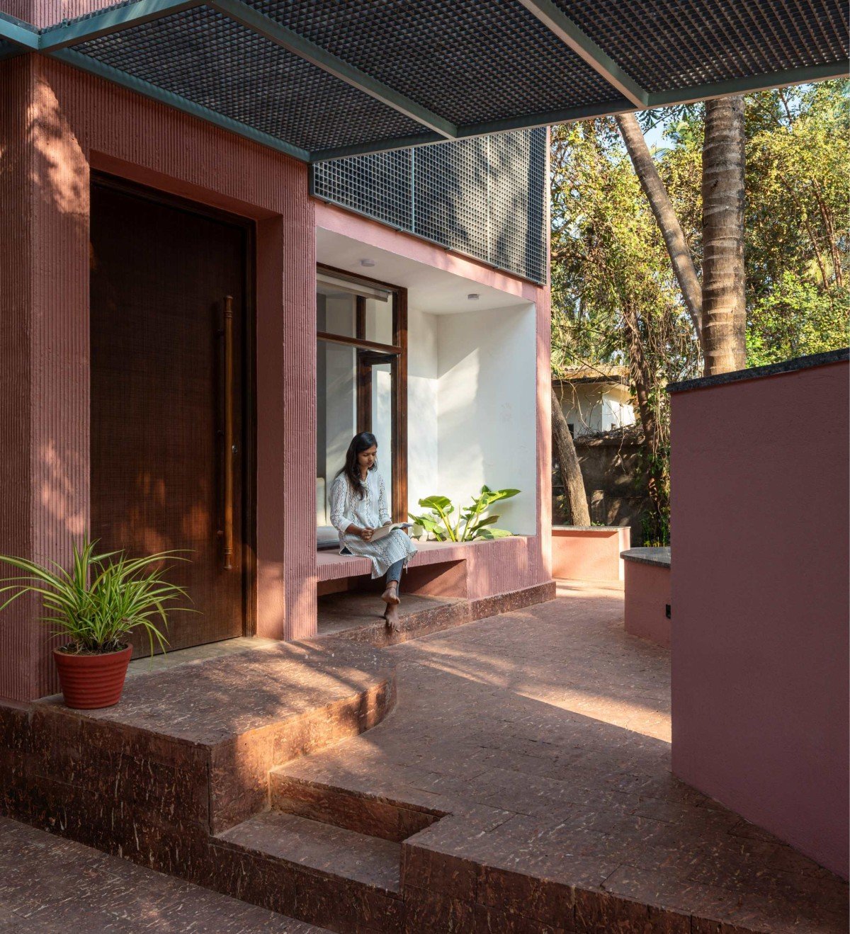
The building from the outside is deep salmon pink, the laterite blocks in their natural earthy tone sitting solidly in the Goa light, a canopy extending over the parking bay to one side, a small pool at the base of the entrance facade, and, above the ground floor, a large metal mesh screen covering the double-height void of the staircase before the vault rises beyond it to the arch and the glass. A verandah at the entrance offers the first moment of cover before the interior, the threshold between the grove and the house unhurried. At dusk the whole building changes: interior light pushes warm amber through the ground-floor glazing, the stained glass catches the last of the sky, and the palm trunks around it go dark against all of it, the house sitting in the grove as though it has always been there.

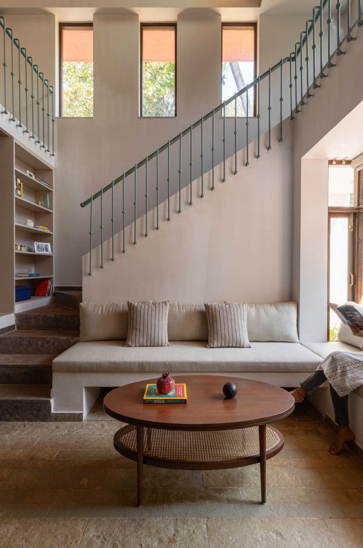
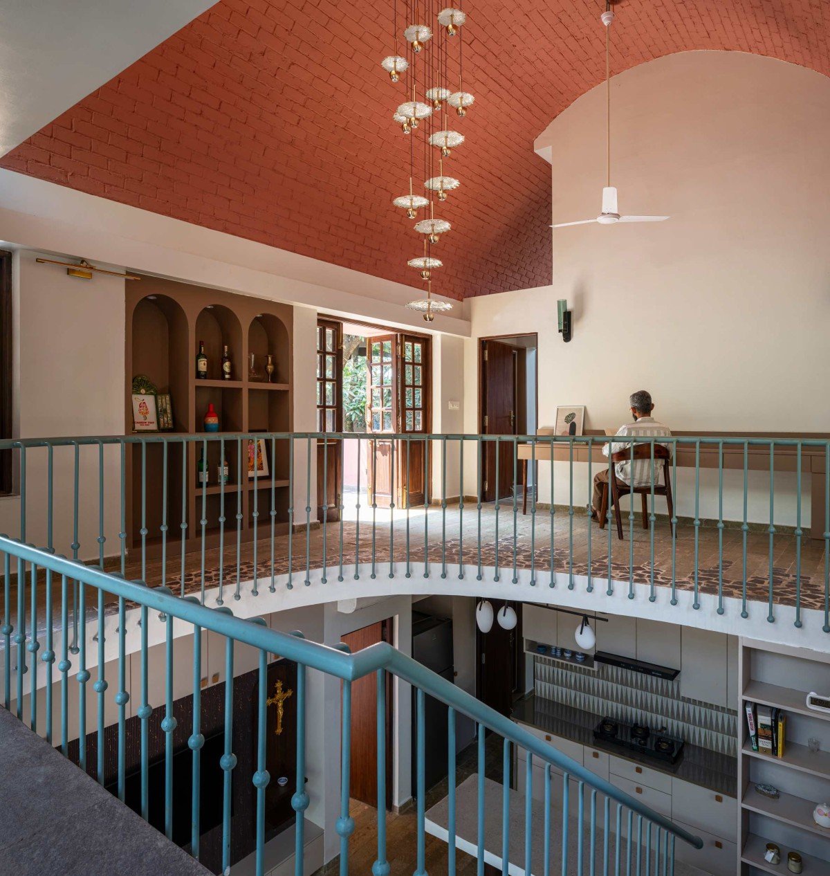
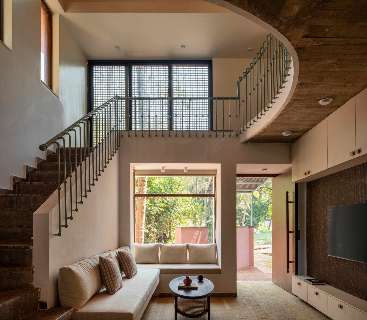
Inside at the ground floor, the double-height living area opens directly from the entrance, and the staircase is the first thing that describes the space’s full range: a curved run of kota stone treads with a teal-painted metal balustrade running alongside, the baluster rods each ending in a small ball finial, the handrail continuous and smooth, rising against one wall and curving at the top to meet the upper landing, and alongside its base a built-in sofa in off-white upholstery is set into the curve of the staircase wall, with striped cushions on it, a round timber coffee table with a cane lower shelf in front, and books and small objects on both, so that the staircase and the seating exist as a single connected thing rather than as circulation alongside furniture. Three tall narrow windows cut into the wall above, their terracotta brick surrounds visible through the glass, tree foliage pressing close outside, and open bookshelves built into the wall under the stairhold books and objects accumulated over time, the shelves neither styled nor sparse.

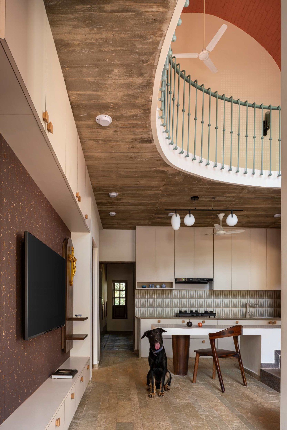
The living area extends to a window seat built flush with a large square window looking onto the back garden, its cushions in the same off-white as the sofa, the coconut palms and broad-leafed trees pressing up against the glass so that the seasons arrive in this room through color and density rather than temperature. The kitchen is open to the room without a partition, its flat-front cream cabinets running the length of the back wall with a geometric triangular-pattern tile backsplash in grey-green, globe pendant lights on a black track rail above the island, and a dark timber chair at the peninsula, the whole kitchen visible from the sofa as part of the same continuous floor, the ceiling above it in rough exposed timber and concrete that reads as the honest underside of the floor above rather than a finished surface.

On the living room wall opposite, a television is mounted on a surface in dark, heavily-grained material flecked with gold, and a white TV cabinet is below with small brass pulls and a gilded figure on the wall alongside. The floor throughout is kota stone in large, irregular pieces laid close.

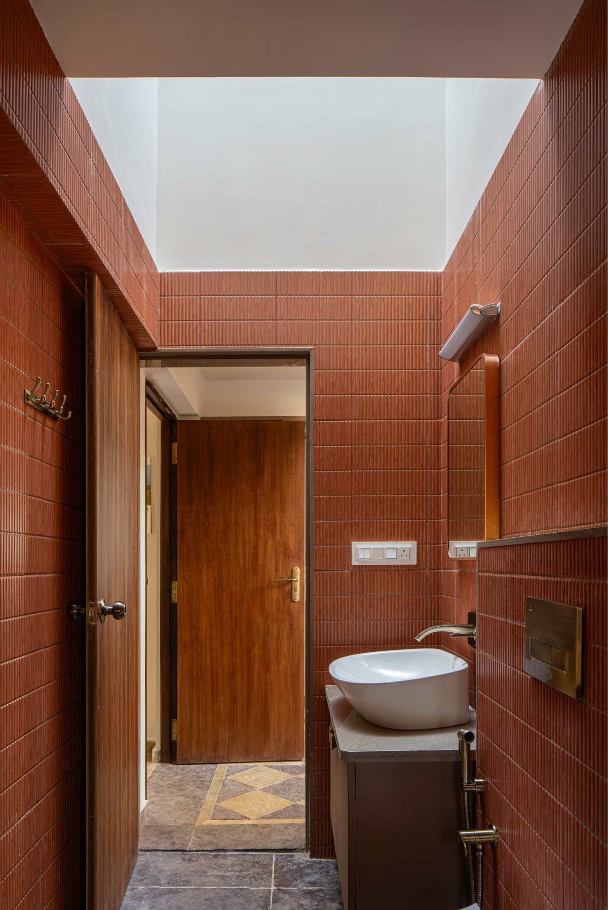
The bathroom on the ground floor is the house’s most enclosed interior moment and its most considered one: walls, ceiling, and surround are entirely clad in small ribbed terracotta-red tiles running in horizontal courses, their glazed ridged surface carrying the same deep clay tone as the exterior laterite so that the color of the building comes inside in a different material register without any announcement.

A rectangular skylight cut into the ceiling opens the room directly to the sky above, the white light falling down between the red tile walls and landing on the kota stone floor with its small diamond inset in ochre yellow, the white vessel sink on its compact vanity, and the warm timber door with a brass handle. The detail that makes the room is the one that costs nothing: the skylight and the tile together, the open sky above the most enclosed space in the house.

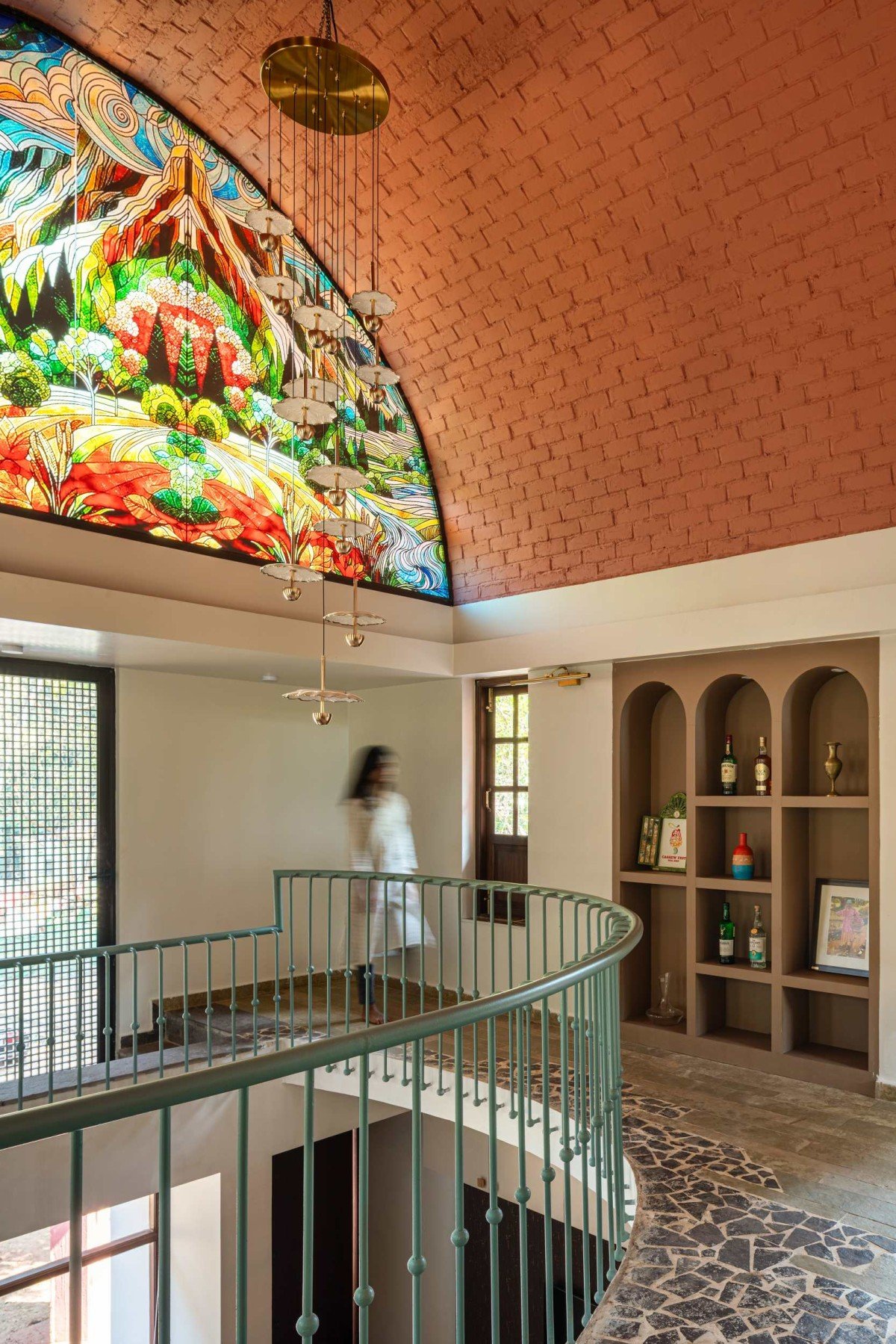
The staircase arrives at the upper level at the full height of the vault, and this is where the stained glass becomes something you are inside rather than looking at from the street. It fills the entire semicircular arch above the void, the mountain landscape, and the river and the trees in orange and green and red and blue leaded glass, sending colored light across the brick vault ceiling and the teal railing and the kota stone floor below through the morning, the quality of the interior shifting depending entirely on the angle of the sun, the glass doing what it was placed to do, which is to make the house impossible to describe without beginning there. The chandelier hanging through the void on a long brass chain, its multiple glass disc pendants cascading downward, catches and redistributes the colored light further into the space. At the upper landing a curved balcony railing in the same teal metal extends the line of the staircase balustrade; arched niches in the wall behind hold bottles and small objects, and wooden French doors open to the trees.

The two bedrooms are positioned at the rear of the house for quiet and for the views of the green landscape that the clear glass at the back was placed to deliver, the contrast between this and the stained glass at the front being the house’s underlying logic: color and opacity toward the street, transparency and natural light toward the garden.

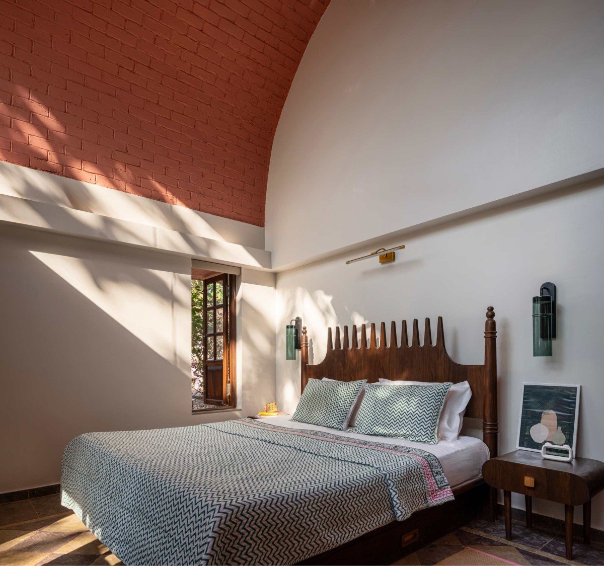
The upper bedroom sits under the vault, its ceiling in exposed red brick curving above the bed on one side and a white plaster wall on the other, the two surfaces making no attempt to meet, the brick warm and irregular, the plaster flat and cool, morning light from a timber-framed window falling across the white wall in patterns of shadow from the trees outside.

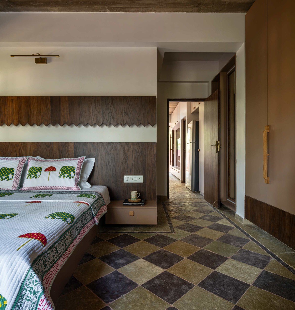
A substantial dark timber bed with a tall carved slotted headboard carries a block-printed cotton in blue-green chevron, a dark timber bedside table alongside, two wall sconces in different forms flanking the headboard, a brass picture light above, a small framed print leaning against the skirting, and the kota stone floor in a two-tone diamond pattern. The ground floor bedroom repeats the same checkered stone underfoot, a dark wood-paneled headboard wall with a scalloped top edge running its full width, and the block-printed bedcover here in a green elephant print, making the room lower and quieter than the one above it.

The balcony off the upper bedroom extends into the grove on a cantilevered slab, the teal balustrade with its ball finials carrying the interior railing detail to the exterior edge, the palms and the broad-leafed trees at eye level from here, and the morning light coming through them in the same way it comes through the stained glass inside, differently colored and differently filtered, the same house, the same grove, the same light.

Fact File 

Project Name: Arch in the Grove

Location: Anjuna, Goa, India

Architects: 19 Dot Architects

Area: 1,668.41 sq ft

Year of Completion: 2026

Website: instagram.com/19dotarchitects

Photograph: Manthan Yadav

June 2, 2026 0 comments
0 FacebookTwitterPinterestEmail
Commercial

Sana Chouhan Salon, Jammu & Kashmir- India by Aviral Design Studio

by DDI Edit Team June 2, 2026
written by DDI Edit Team

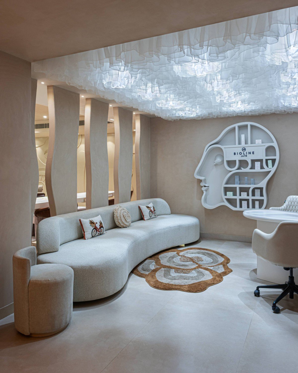
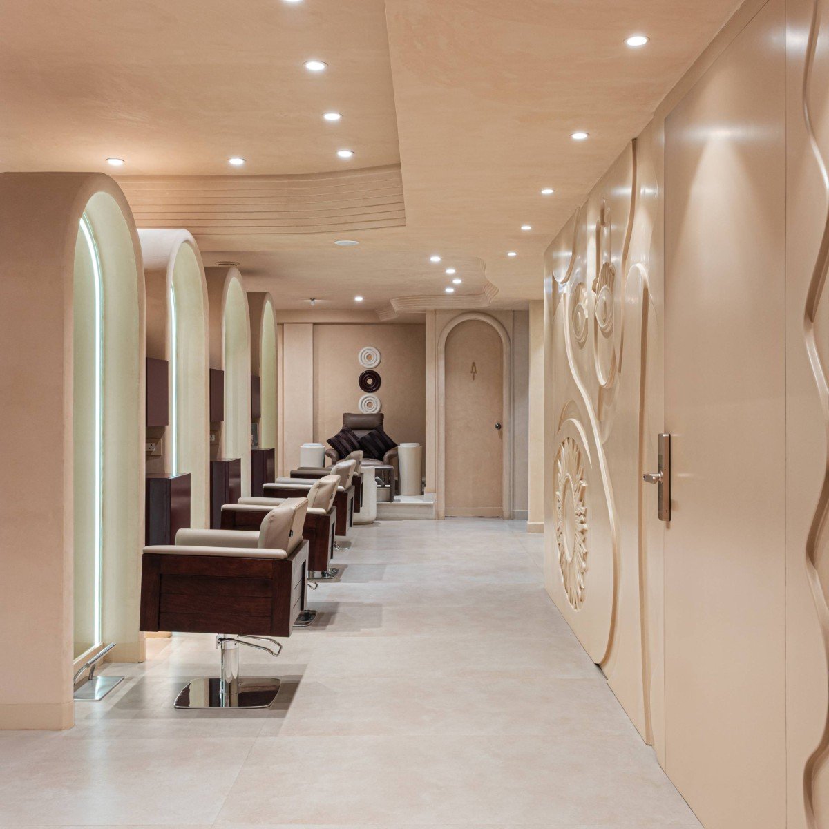
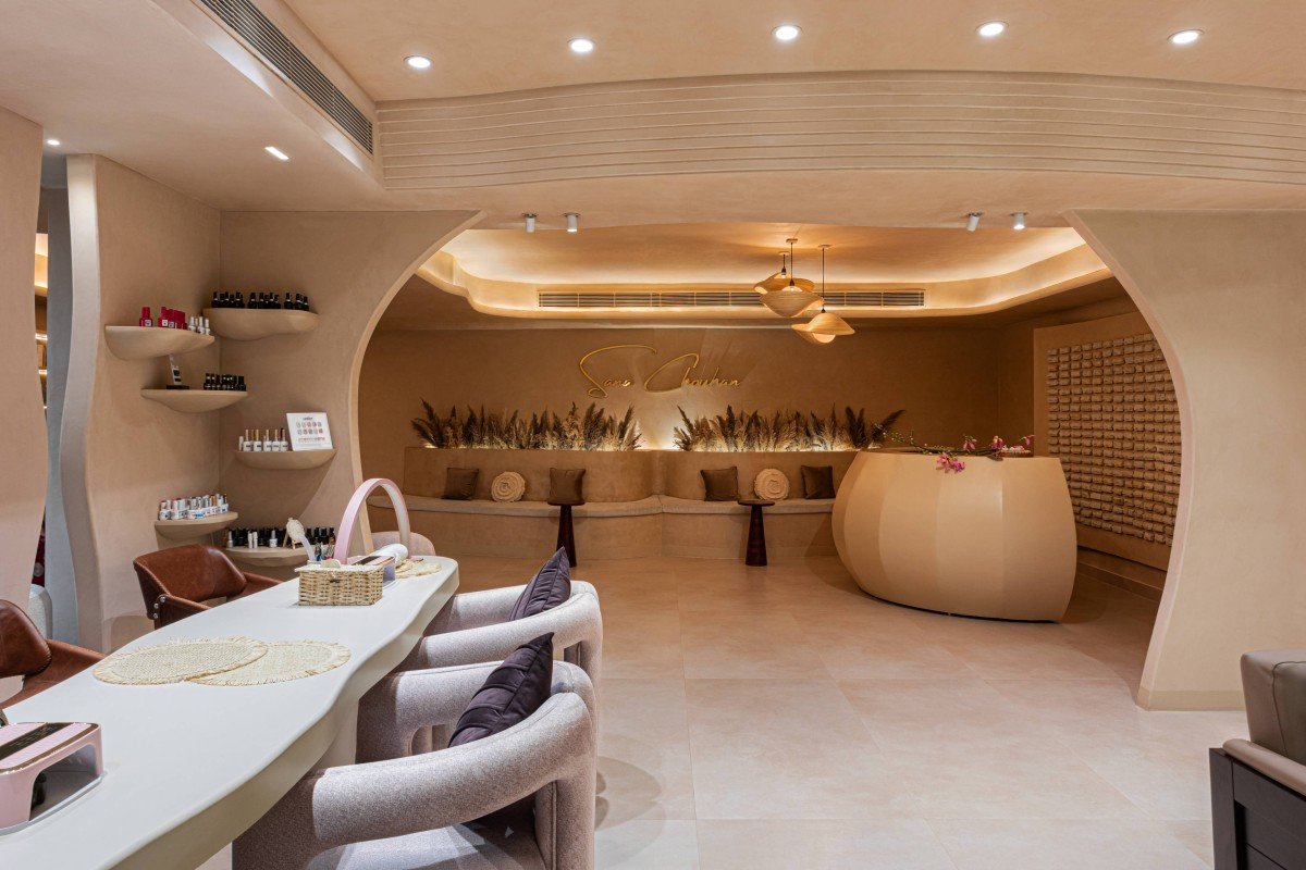
In the heart of Jammu, Sana Chouhan Salon by Aviral Design Studio reimagines the contemporary salon as a sculpted retreat rather than a fast-paced commercial interior. Conceived as a deeply immersive beauty environment, the project moves away from the visual noise typically associated with salon spaces and instead embraces softness, tactility, and emotional calm. The result is an interior that feels less like a retail destination and more like a carefully carved sanctuary shaped by light, contour, and atmosphere.

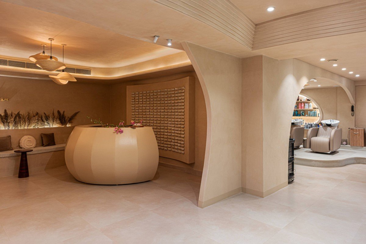
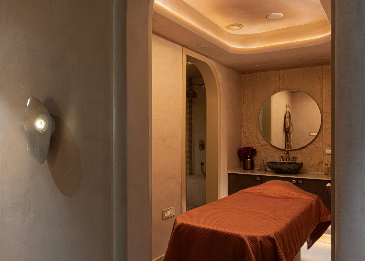
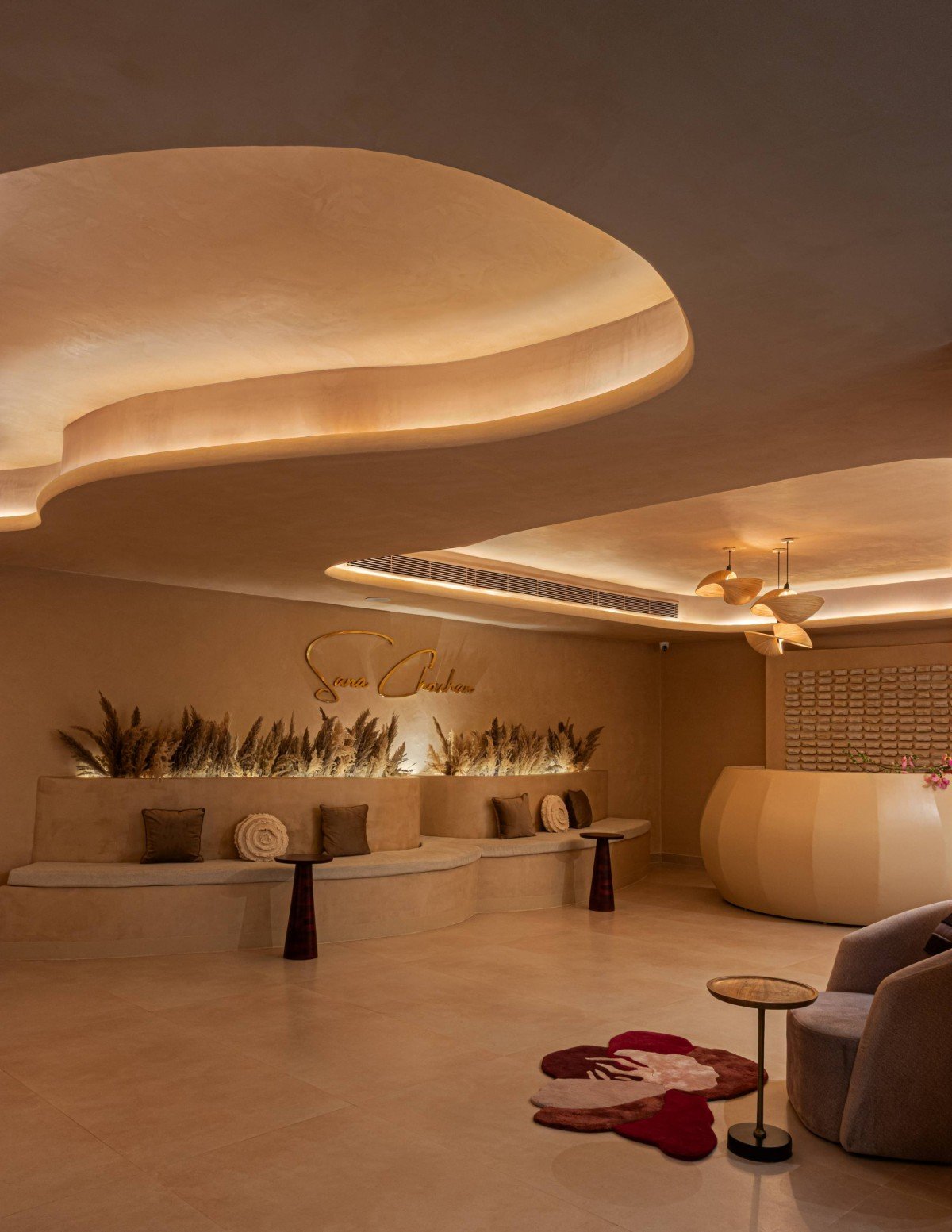
From the moment one enters, the salon unfolds as a muted landscape of warm neutrals and fluid forms. An earthy palette of sand, ecru, beige, and soft clay tones wraps the space in warmth, while textured plastered surfaces diffuse light gently across walls and ceilings. There is a noticeable absence of visual clutter. Ornamentation is restrained, allowing architecture itself to become the primary medium of expression.

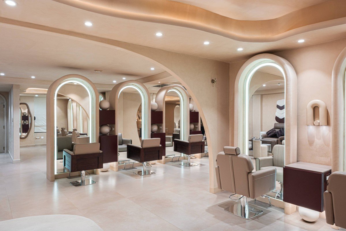
The planning rejects rigid geometry in favor of movement and softness. Arches, curved transitions, and rounded edges dissolve sharp boundaries, creating a continuous spatial rhythm that guides visitors intuitively through the salon. Instead of corridors and enclosed partitions, the layout unfolds through layered openings and sculpted thresholds, allowing one space to flow seamlessly into another.

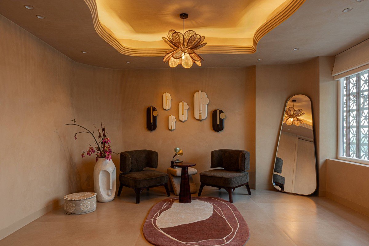
A defining feature of the project is its expressive ceiling language. Sculpted contours sweep organically across the ceiling plane, wrapping around structural and service elements with remarkable fluidity. Concealed cove lighting traces these curves, producing a soft ambient glow that amplifies the salon’s cocoon-like atmosphere. The lighting strategy is intentionally atmospheric rather than dramatic, designed to heighten texture, shadow, and depth while maintaining visual serenity.

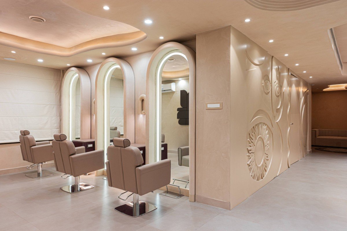
Within the styling area, arched mirrors emerge as architectural anchors rather than simple functional fixtures. Repeated rhythmically throughout the salon, these softly illuminated arches establish continuity and procession. Their sculptural presence creates a sense of spatial cadence, while carefully introduced deep burgundy accents provide measured contrast against the otherwise monochromatic backdrop. Styling stations balance solidity with elegance, appearing almost like freestanding installations embedded within the interior landscape.

Materiality throughout the salon remains cohesive and tactile. Custom-crafted curved forms reinforce the project’s commitment to softness and continuity. Plush upholstery, muted fabrics, and textured finishes encourage physical comfort, ensuring the sensory experience extends beyond the visual. Metal and timber accents are used sparingly and with precision, allowing the quieter material palette to remain dominant.

One of the salon’s most memorable moments is concealed in plain sight. The makeup room is hidden behind what initially appears to be a sculptural relief wall inspired by the Hamsa hand, abstracted as a contemporary symbol of protection and auspiciousness. Rather than functioning as a conventional doorway, the installation reads as integrated artwork, blurring the boundary between architecture and object. This moment of concealment introduces an element of curiosity and discovery within the otherwise calm spatial narrative.

Beyond this threshold lies a more intimate beauty space designed almost like a private sanctuary. At its center sits an artistic makeup console whose sculptural form continues the salon’s overarching vocabulary of curves and softened geometry. Face-inspired murals and expressive decorative elements subtly reinforce themes of identity, transformation, and self-expression. The atmosphere here becomes quieter and more personal, allowing moments of preparation and ritual to unfold within an emotionally comforting environment.

The bridal lounge and waiting areas continue this sense of calm through carefully controlled lighting and sculptural furniture pieces. Curved seating elements, soft-edged counters, and ambient pendant lights create a lounge-like experience rather than a transactional waiting zone. The reception desk itself becomes an object of focus, resembling a monolithic sculpted form emerging organically from the floor plane.

Elsewhere, spa rooms and treatment areas maintain the same restrained material palette and fluid geometry, ensuring continuity throughout the project despite varied functions. Planning prioritizes intuitive circulation, allowing clients to move naturally through styling, spa, bridal, and grooming zones without abrupt transitions. Each space feels distinct yet visually connected through shared forms, textures, and light quality.

The project also demonstrates careful technical resolution beneath its sculptural language. Constraints such as limited ceiling height and fixed service layouts were addressed through meticulous detailing and layered ceiling articulation, preserving spatial openness while integrating mechanical systems seamlessly. Vastu considerations further informed spatial organization, requiring precise coordination between functionality and geometry without compromising the salon’s fluid architectural language.

What ultimately distinguishes Sana Chouhan Salon is its understanding of luxury as atmosphere rather than excess. There is no dependence on opulence, ornament, or spectacle. Instead, luxury is communicated through proportion, softness, tactile depth, and emotional resonance. Curves slow movement. Warm light softens perception. Textures invite touch. The salon becomes less about display and more about experience.
More than a beauty destination, Sana Chouhan Salon stands as an immersive interior environment where architecture, emotion, and ritual merge into a singular spatial experience, calm, sculptural, and quietly transformative.


Fact File

Project Name: Sana Chouhan Salon
Location: Jammu, Jammu & Kashmir, India
Typology: Salon Interior
Architects: Aviral Design Studio
Area: 4200 sq. ft.
Year of Completion: 2025
Photography: Courtesy of Aviral Design Studio

June 2, 2026 0 comments
0 FacebookTwitterPinterestEmail
Residential

The Breeze Court House, Gujarat-, India, by Studio Blank Canvas

by DDI Edit Team June 2, 2026
written by DDI Edit Team

Located at the corner of two streets in Ahmedabad, The Breeze Court House by Studio Blank Canvas is designed as a private residence for an intergenerational family of five. The project responds directly to Ahmedabad’s climate while negotiating the challenge of openness and privacy within a dense residential setting. Rather than relying on decorative gestures, the house builds its identity through proportion, materiality, filtered light, and carefully layered spaces.

From the outside, the house appears as a composed and robust built mass. Large planar surfaces, deep projections, exposed RCC finishes, and earthy textured walls give the structure a grounded presence against the street. The west facade remains largely closed to reduce heat gain, while the southern edge opens more selectively through recessed balconies and custom-designed metal and wooden screens. These screens soften the geometry of the facade while filtering sunlight into the interior spaces throughout the day.

Being positioned on a corner plot allowed the architects to create a peripheral layer of landscape around the house. Greens are not treated as leftover pockets but as an active buffer between the built form and the street. This layer helps soften noise, reduce visual exposure, and create a gradual transition from public to private space.

The entrance begins through a modest vestibule that acts as a pause before entering the main living areas. Inside, the spatial planning is intentionally fluid. The living, dining, and kitchen spaces remain visually connected, yet each area can function independently when required. Large sliding glass openings extend these spaces toward the outdoor deck and landscaped sit-out, maintaining a continuous relationship with natural light and greenery.

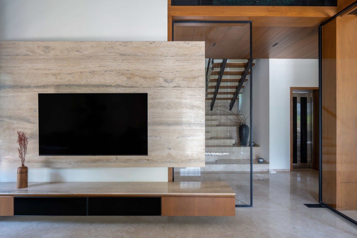
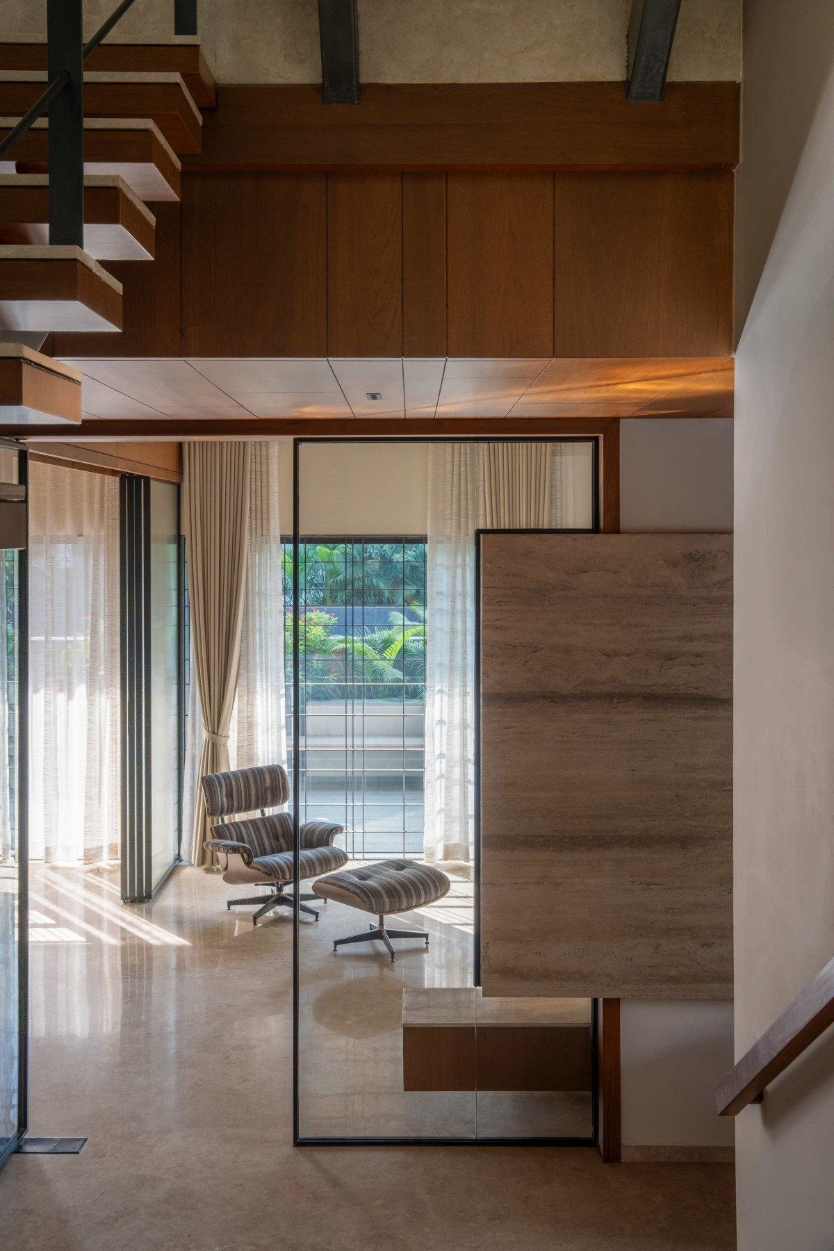
The interior palette is restrained and warm. Beige marble surfaces, wood-lined ceilings, exposed concrete, and slim black metal sections create a language that feels minimal without becoming cold. One of the strongest visual elements within the living area is the suspended stone-clad television partition. Instead of being treated as a solid wall, it appears to float lightly within the space, subtly dividing functions while preserving openness and visual continuity.

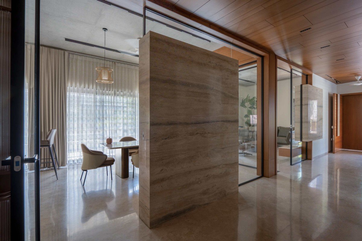
Throughout the house, transitions are handled with unusual clarity. Passageways are not reduced to circulation corridors but become spatial experiences in themselves. The movement from the foyer toward the dining area is framed by full-height glass partitions, warm timber surfaces, and carefully controlled natural light. These layers create changing reflections and transparency throughout the day, giving even quieter spaces within the house a sense of depth.
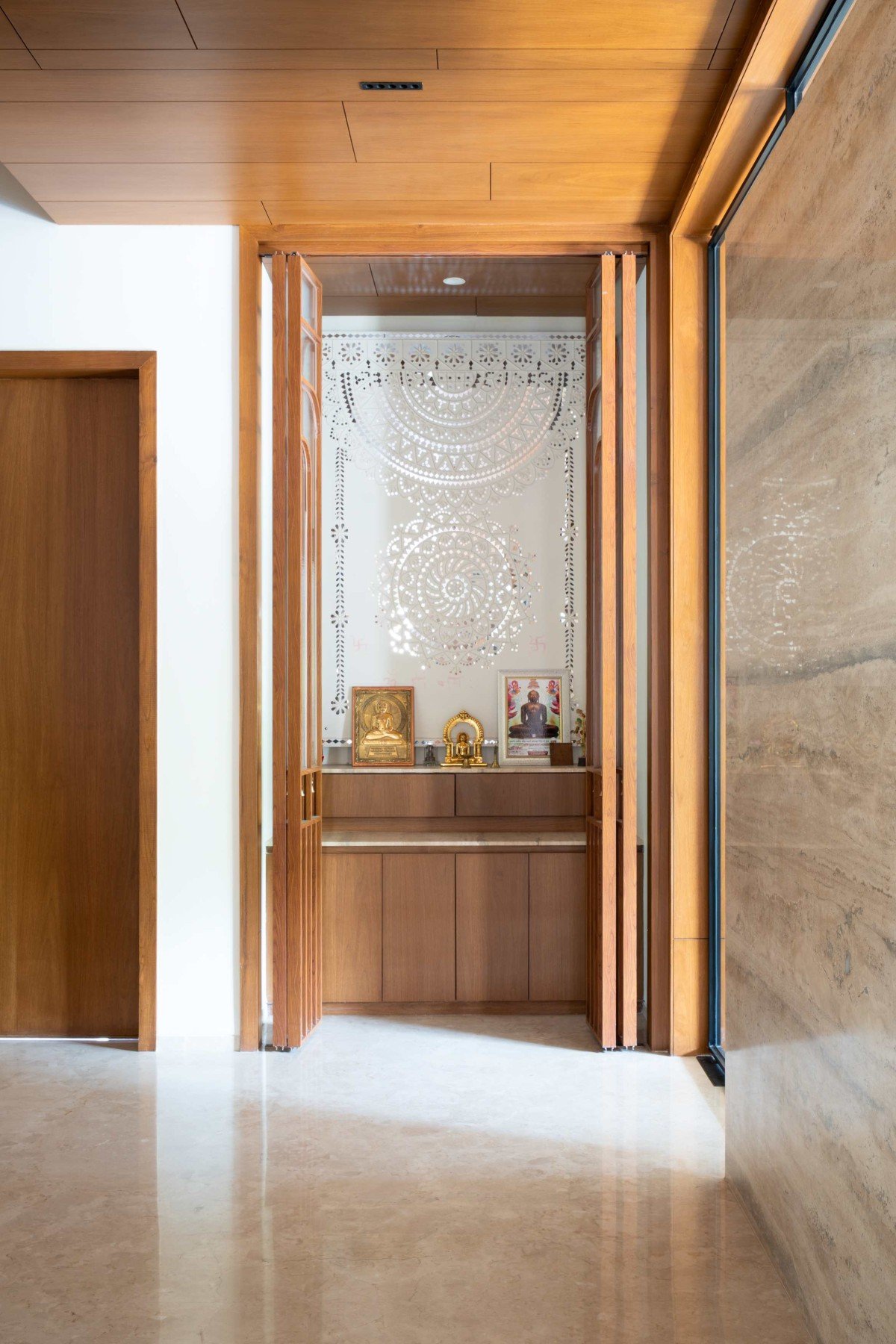
The pooja space continues the restrained material approach seen elsewhere in the home. Enclosed within foldable wooden doors, the space remains visually understated while carrying a strong sense of presence. A delicately patterned backdrop catches light softly during the day, allowing the focus to remain on ritual and stillness rather than ornamentation.
At the center of the house, the staircase becomes both a functional and sculptural element. Locally sourced marble forms the heavier base of the staircase, while the fabricated metal structure above introduces visual lightness. A skylight positioned overhead draws natural light into the vertical core of the house, transforming what is typically a purely utilitarian zone into one of the most spatially dynamic parts of the residence. From certain angles, the staircase frames views back into the living spaces and landscape outside, reinforcing the sense of openness that runs throughout the project.

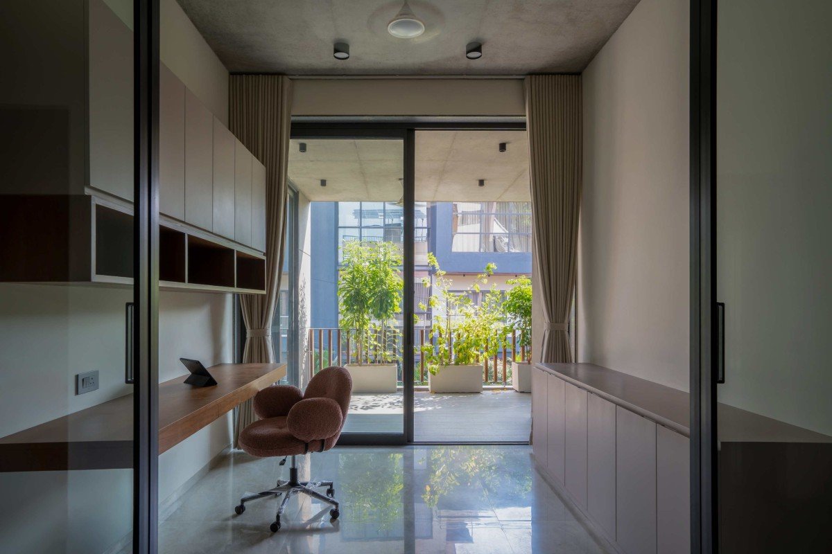
The upper floor follows a more practical layout with bedrooms and a shared study area. However, the defining feature here is the large common balcony screened with vertical wooden and metal members. Lined with planters and open to filtered sunlight, the balcony functions as an informal family space rather than just an extension of the rooms. The study area opens directly toward this terrace, allowing daylight and greenery to become part of the everyday working environment.

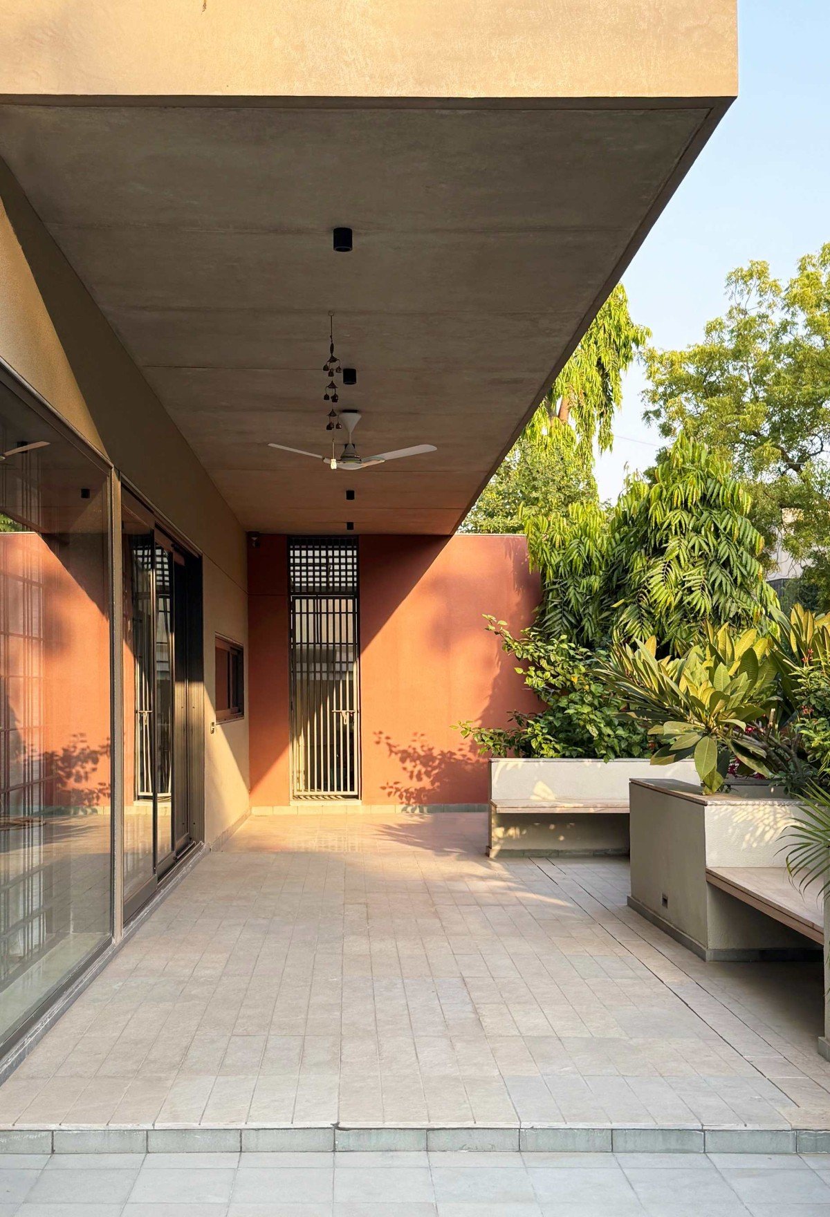
The sit-out spaces across the house further strengthen the relationship between architecture and climate. Deep overhangs protect these semi-open areas from direct sun while allowing airflow to move freely through the house. The outdoor seating edges, integrated planters, and shaded decks create quieter moments within the larger built form, softening the otherwise strong architectural geometry.

What makes The Breeze Court House compelling is the discipline with which the project handles restraint. The house does not depend on excessive material variation or visual drama. Instead, it focuses on balance: openness without exposure, solidity without heaviness, and minimalism without sterility. Every architectural move, from the puncture-less western wall to the screened balconies and layered interiors, feels tied to climate, privacy, and everyday family life rather than stylistic display.


Fact File

Project Name: The Breeze Court House
Location: Ahmedabad, Gujarat, India
Typology: Private Residence
Architects: Studio Blank Canvas
Lead Architect Designer: Ar. Khyati Pankhania
Design Team: Jaydeep Rathod, Akshay Jain
Area: 4800 sq. ft.
Year of Completion: 2025

June 2, 2026 0 comments
0 FacebookTwitterPinterestEmail
Residential

Arcade Residence, Kollam, Kerala- India by De.Solve Studio

by DDI Edit Team June 2, 2026
written by DDI Edit Team

Bharanikavu sits in Kollam district in southern Kerala, where the landscape stays dense and green through most of the year and the light at dusk turns everything amber before it goes. It is in this setting that De.Solve Studio, led by Ar. Arjun V A, Ar. Anoop P Nair, and Ar. Ananthan S, completed Arcade in 2025, a 4,488 square foot single storey residence for a businessman, his wife who teaches, and their two daughters.

The family came to the project with a clear and deeply held set of references: the grandeur of single-storey colonial palaces and the spatial sensibility of traditional Kerala architecture. What they wanted was not a reproduction of either but a house that carried the spirit of both into contemporary life. Arcade is the architects’ answer to that ask, and it holds together as completely as any house of recent years in Kerala.

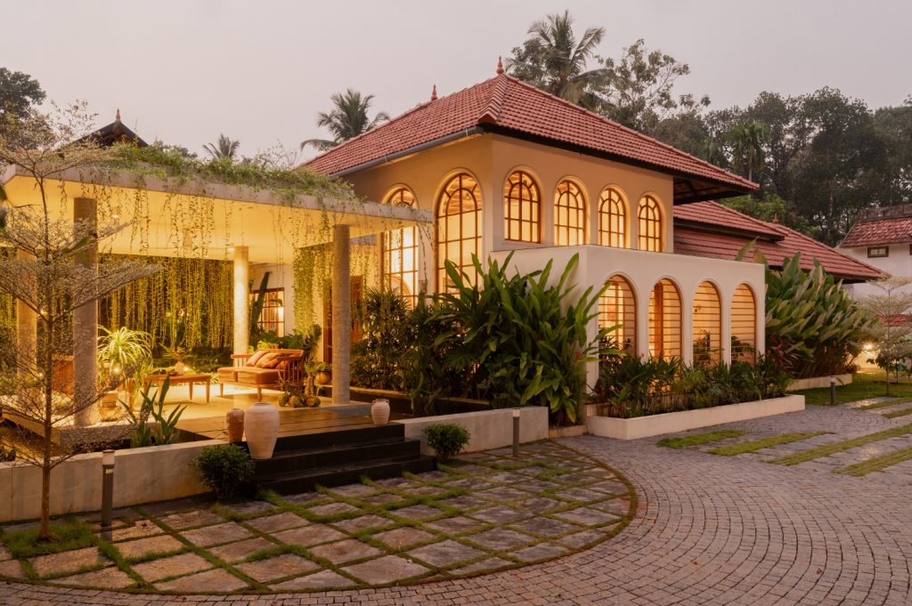
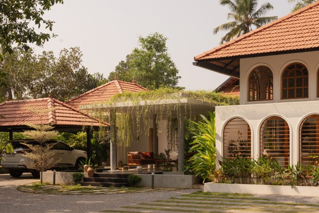
The approach tells you what the house is about before you reach the door. The driveway is laid in a circular cobblestone pattern with grass growing in the joints between the stones; the geometry draws the eye toward the building as the coconut palms and tropical planting of the site frame it from either side. The facade that comes into view is a layered composition that takes time to fully read. At plinth level, a row of arched openings with horizontal timber louvers runs along the base of the main block, with dense plantings of heliconia, cordyline, and tropical species rising in raised planters in front of them. Above the plinth, a row of tall pointed arched windows with warm timber frames sits within cream-rendered walls under a clay tile hip roof, its ridge finished with a decorative finial at the peak.

To one side, the entrance pavilion extends as a separate structure with cylindrical concrete columns supporting a flat slab roof that has been entirely colonized by trailing vines, long green curtains of them cascading toward the ground in a way that makes the boundary between the built and the grown genuinely unclear. The architects describe the interplay of arches and layered roofscapes as the most striking architectural feature of the house, and standing in front of it at dusk when the arched windows are lit amber from within and the vines are in dark silhouette against the fading sky, that description is not overstated.

The entrance lobby is one of the most carefully realized spaces in the project. The entrance lobby blurs the boundary between exterior and interior, opening on all four sides to lush greenery and trailing vines that create a green canopy overhead. A carved timber main door of considerable scale and presence anchors the back wall, its surface detailed in a grid of raised panels that catches the light differently through the day. Cylindrical concrete columns support the flat roof above. To one side a wooden daybed with rust cushions sits facing the greenery, the space functioning as an outdoor living room before the house proper begins. A waterbody at the entry adds a sensory dimension to the arrival sequence, the sound of water present before the door is reached. The morning light filtering through the vines and the plantings moves across the polished concrete floor in patterns that shift through the day, and it is in this space that the project’s aspiration for quiet luxury grounded in simplicity is most plainly legible.

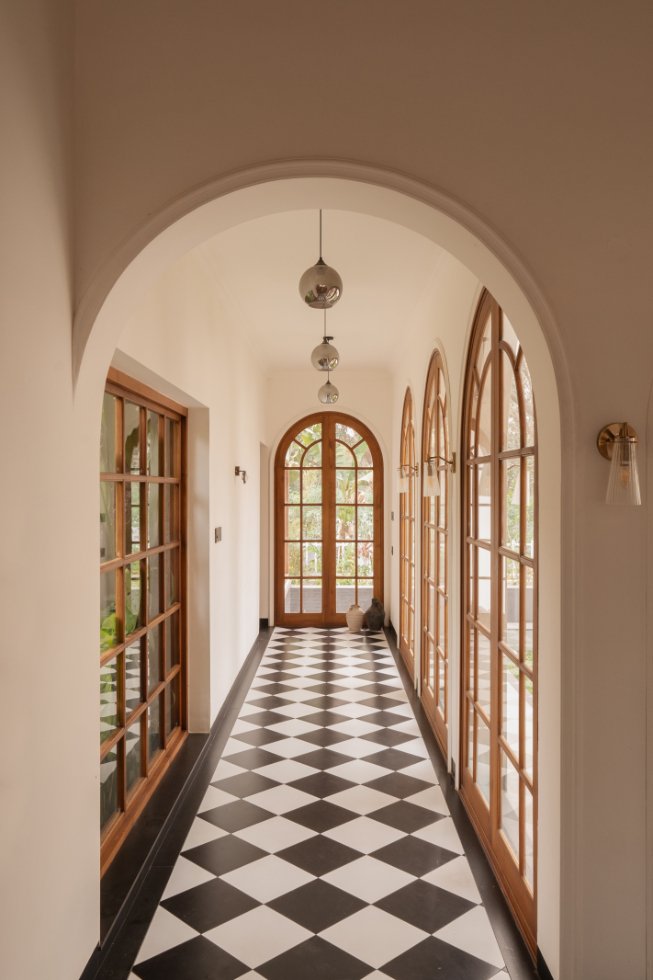
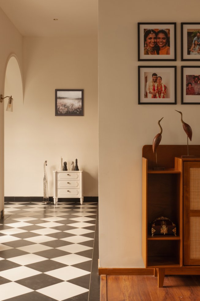
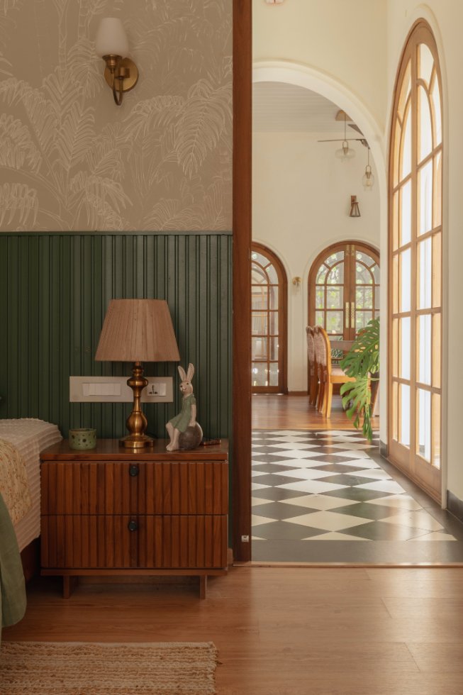
From the green foyer, an internal corridor divides the house into its two principal zones, and this corridor deserves to be discussed at length because it is one of the finest interior passages in recent Kerala residential architecture. The floor is laid in large-format black and white diamond checkerboard tiles, the pattern giving the space a confident rhythm that carries all the way to its end. On one side, a procession of plaster arches frames timber-framed windows that look out to the courtyard and garden beyond, each bay containing a brass wall sconce at the same height, the repetition building into a spatial sequence that feels genuinely processional.

Silver triple-globe pendants hang at intervals along the length of the corridor from the ceiling above. The whole passage terminates in an arched timber door with a terracotta pot set beside it and the garden visible through the glazing beyond, framing the view as carefully as any designed prospect in the project. Walking this corridor from one end to the other is not a neutral act of circulation. It is a spatial experience that sets the tone for every room it connects.

To one side of this axis lies the semi-public wing, accommodating a convertible space that can function as either a guest bedroom or an office depending on what the household requires. To the other lies the private zone, where the family living room, dining area, kitchen, and three bedrooms unfold around the corridor and around a private courtyard that forms what the architects describe as the climactic and emotional heart of the house. This courtyard draws natural light and ventilation through the plan while visually connecting the family spaces that face it. Extending from the most private corner of the plot, a swimming pool is positioned to maximize seclusion while also cooling the breeze that passes through it before flowing into the courtyard and the adjacent living areas.

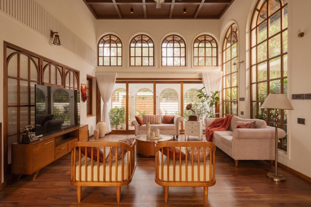
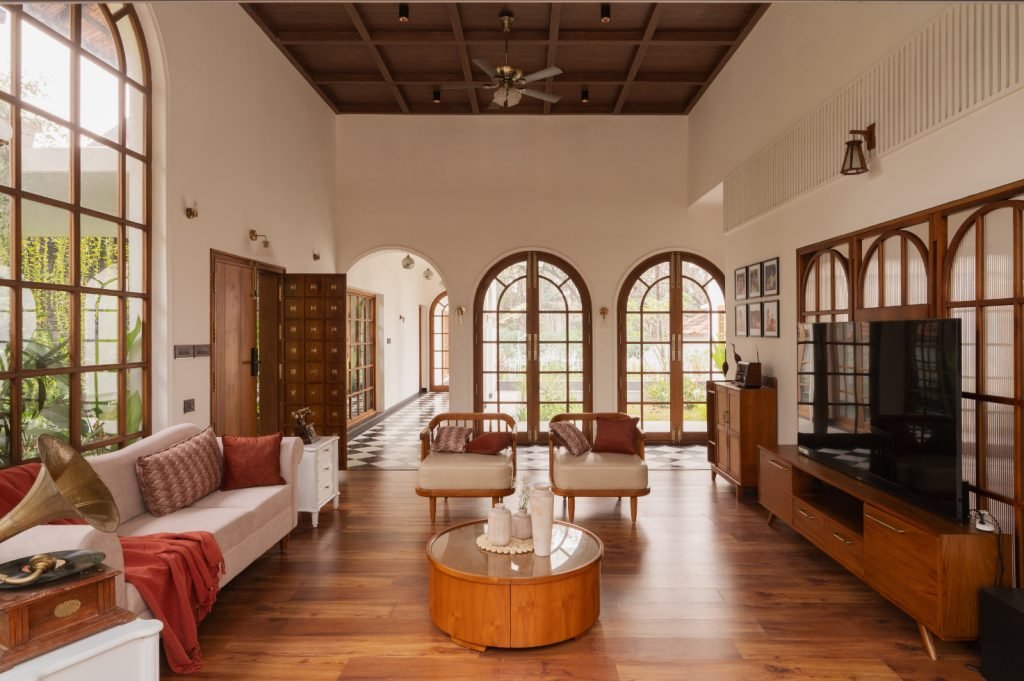
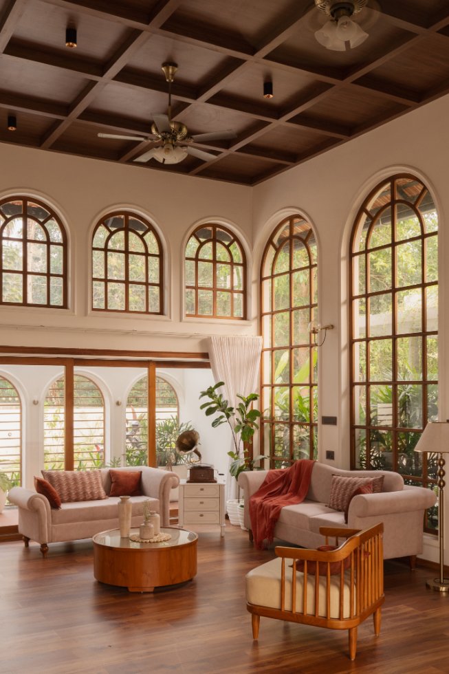
The living room is where the architectural language established on the facade is most fully delivered inside. The room has a tall ceiling with a dark coffered timber grid overhead, the squares of the coffering deep enough to cast their own shadows and give the ceiling genuine visual weight. The exterior wall is entirely given over to arched windows in two registers, full-height arched French doors at the lower level, and a row of tall pointed arched clerestory windows above, all in warm timber frames with the garden pressing close on the other side. In the photographs, the combination of the dark coffered ceiling, the cream walls, the double register of arched glazing, and the warm walnut floor produces a room of genuine richness, one that holds the colonial reference the clients described without feeling historical or frozen in time. Light pink upholstered sofas with rust accent cushions sit around a round wooden coffee table with a glass top, two wooden spindle-backed chairs are positioned at the front of the seating arrangement, a vintage-style floor lamp stands to one side, and an indoor ficus is in the corner.

A TV unit with arched panel detailing sits against the opposite wall, the arched motif carried even into the joinery so that the architectural language of the building is present at every scale. Morning light from the east and the softer evening glow from the west wash the room in natural golden tones through the day, the quality and direction of the light shifting as the sun moves across the site.

The dining room is glimpsed most dramatically from the corridor through an arched doorway that frames it before you enter. Three tall arched French windows in warm timber occupy the far wall, the garden visible beyond them, and the room sits on a raised timber-floored platform that lifts it slightly above the checkerboard corridor level, the transition between the two floor surfaces marking the move from circulation to gathering. The dining table and chairs are in light timber; globe pendant lights are clustered above a ceiling fan; a monstera plant is in one corner; and a white-painted sideboard is in another.

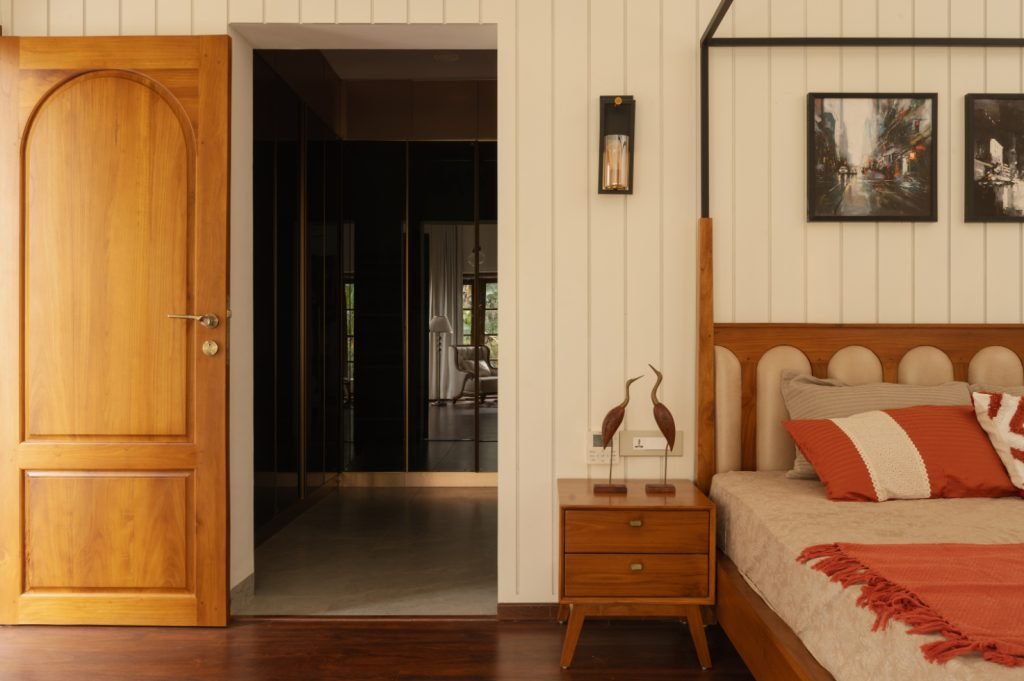
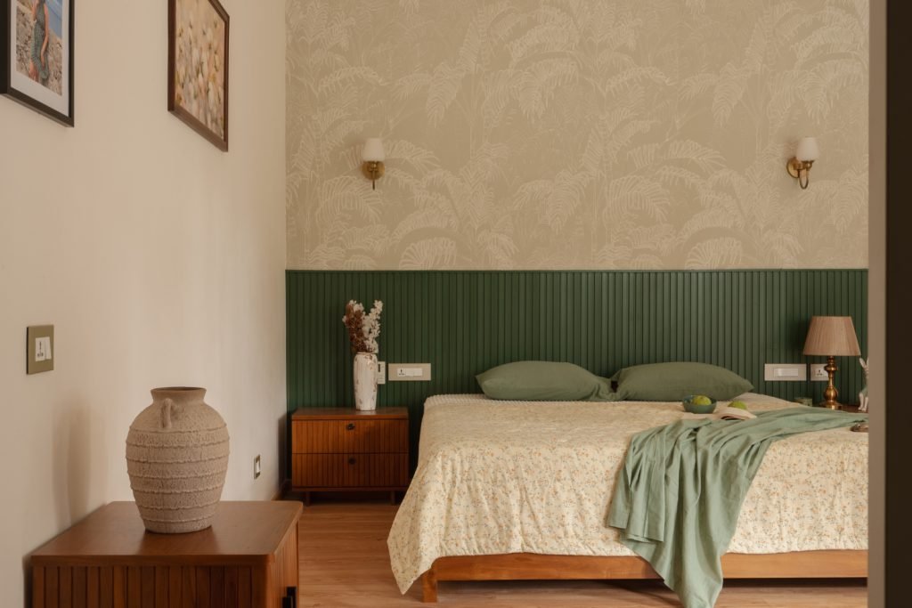
Looking through one of the bedroom doorways into the corridor beyond is its own small visual pleasure. In the foreground, a bedside table carries a brass lamp with a pleated shade, a small rabbit figurine, and a brass power socket against a wall of deep green vertical panel wainscoting below botanical wallpaper printed with palm and leaf forms in soft sage tones. A brass wall sconce sits above. Through the arched doorway behind, the checkerboard floor of the corridor extends away, arched windows visible at the end, the depth of the frame giving the shot three distinct spatial layers. It is a detail that rewards the kind of looking that good interiors invite.

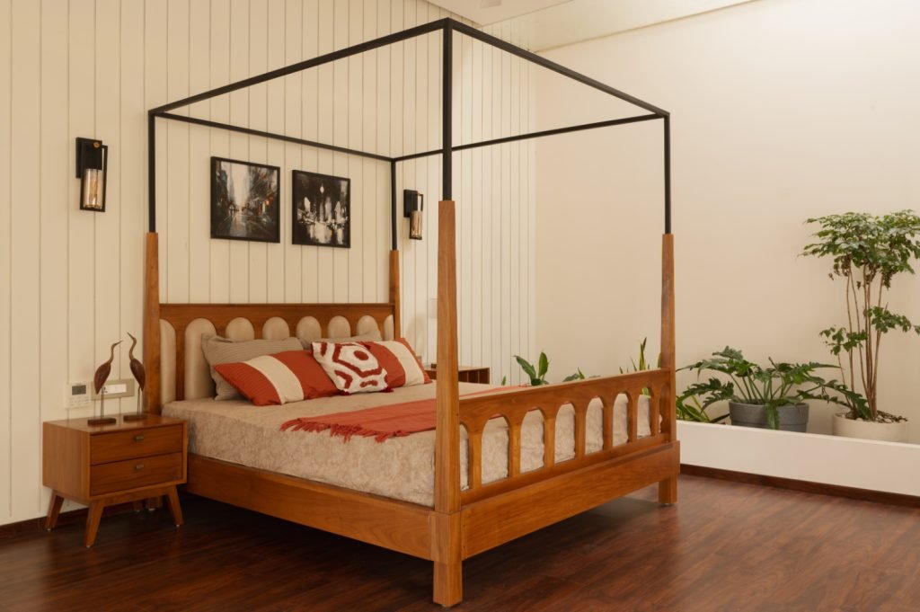
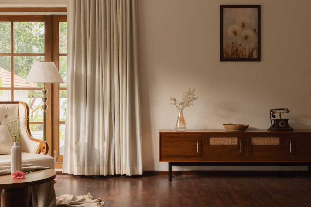
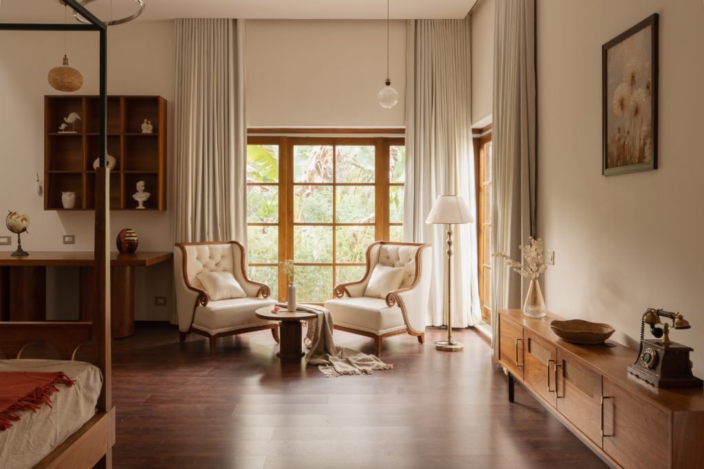
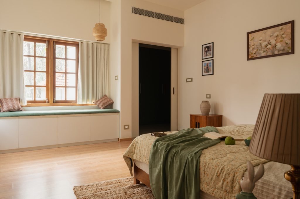
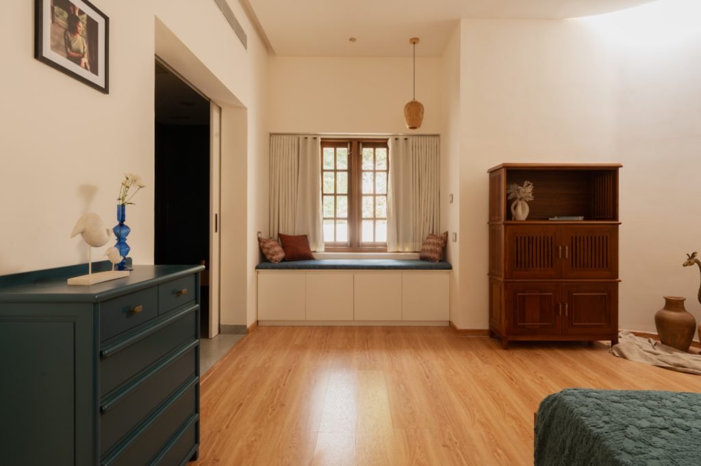
The bedrooms themselves are each resolved within the same vocabulary while having distinct characters. One is anchored by a four-poster bed with a black metal canopy frame and a carved wooden headboard carrying arched cutout detailing that echoes the architectural arches throughout the house, terracotta and rust bedding, cream vertical shiplap-style walls, and wall sconces on either side. A small planted corner with an indoor tree sits in the angle of the room, the planting bringing the green of the entrance lobby inside. Another bedroom has a window seat built into a timber-framed bay window looking out to the garden, a teal-painted chest of drawers with brass handles to one side, a wooden slatted cabinet opposite, and a rattan pendant overhead. A sitting area within what appears to be the master suite has two tufted carved wooden armchairs in cream upholstery positioned before a large timber-framed French window that looks directly into banana palms and tropical planting, the garden framed as deliberately as any artwork. A rattan-fronted sideboard carries a vintage black telephone, a glass vase of dried flowers, and a woven bowl; the room is composed with the ease of a space whose occupants know precisely what they want to live among.

The palette throughout, soft whites and warm wood in every room, holds the house together while allowing each space its own temperature and mood. The arched windows and timber frames that define the exterior reappear at every interior threshold and within the joinery details, creating the continuity between outside and inside that the brief asked for and that the photographs confirm at every scale. Arcade is a 4,488-square-foot house in Bharanikavu that revitalizes a family’s deep admiration for colonial grandeur and Kerala spatial tradition without diminishing their significance.

June 2, 2026 0 comments
0 FacebookTwitterPinterestEmail
Residential

Kala Residence, Gujarat- India by K.N. Associates

by DDI Edit Team June 2, 2026
written by DDI Edit Team

Located in Bakrol, Anand, Kala is a private residence designed by K.N. Associates that brings together traditional Indian elements and a restrained contemporary language within a carefully detailed built form. Spread across a 2160 sq. ft. residence on a 3686.80 sq. ft. plot, the house is designed around openness, layered spatial experiences, and a strong material identity rooted in craftsmanship.

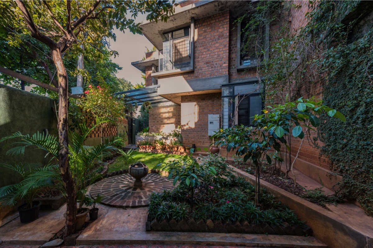
The exterior presents a composition of clean white volumes intersected with exposed brick surfaces, creating a balance between solidity and texture. Rather than relying on ornamentation, the facade derives its character from proportion, light, and material contrast. Deep projections, recessed balconies, and extended slabs create strong shadow lines across the structure throughout the day, giving the house a constantly shifting visual depth.
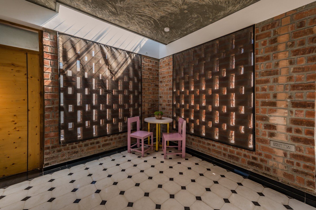
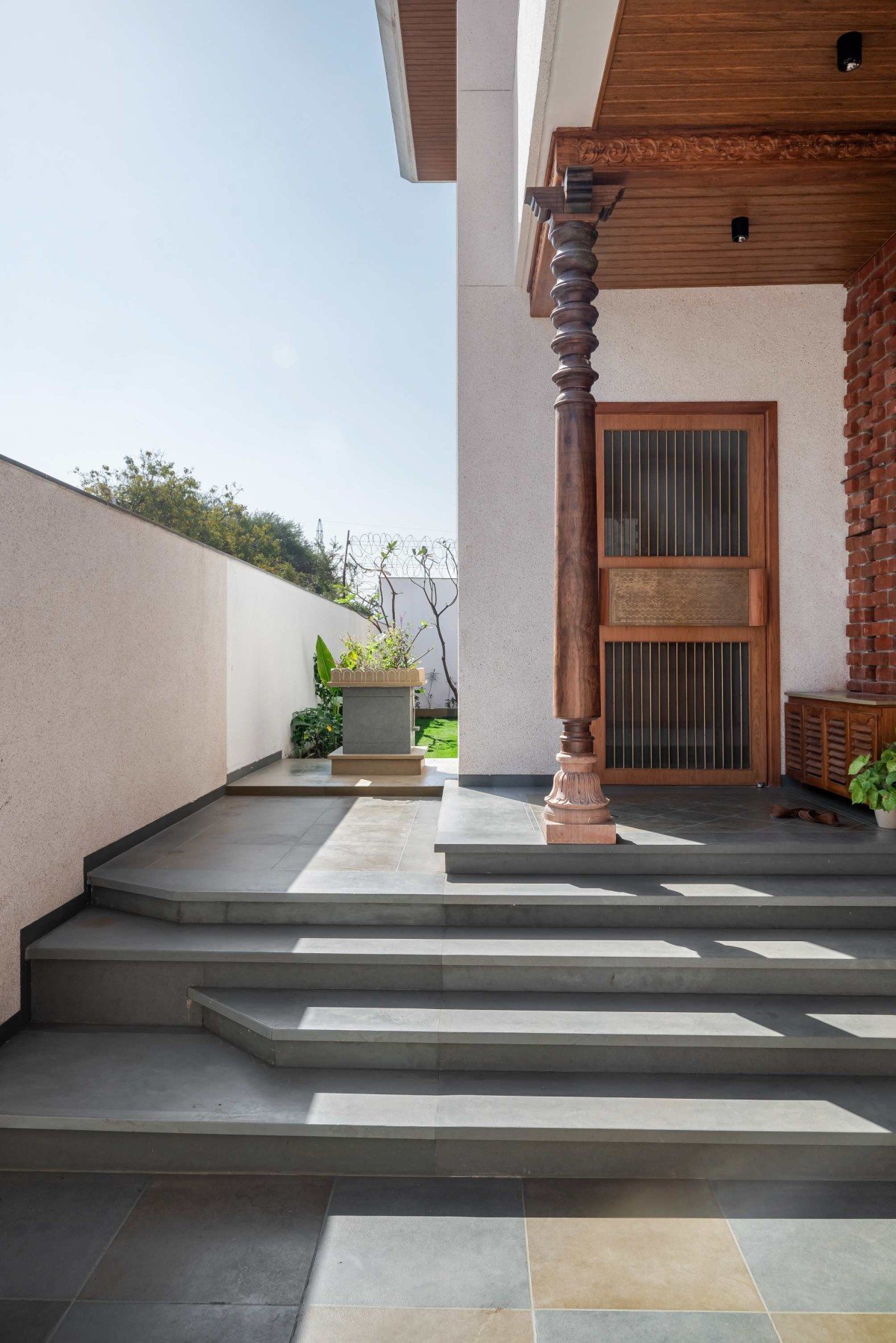
At the entrance, the exposed brick jaali wall becomes one of the defining architectural elements of the project. It filters light into the semi-open porch while also introducing ventilation and privacy. Positioned against the otherwise minimal white facade, the jaali softens the geometry of the structure and establishes a visual connection to traditional Indian architectural vocabulary without appearing decorative or forced.
A carved wooden column placed at the entry further strengthens this transition between contemporary and traditional elements. Instead of being treated as a nostalgic insert, it becomes part of the architectural rhythm of the house, grounding the otherwise sharp linear language of the exterior. The stepped entrance sequence, finished in muted stone tones, adds to the sense of arrival while maintaining the understated material palette seen throughout the project.

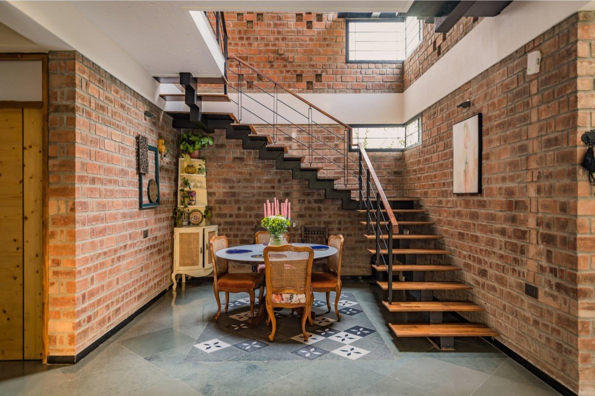
Inside, Kala continues this balance between warmth and restraint. The foyer is designed as an intimate transition space containing heirloom objects and a brass Ganpati murti, creating a deeply personal layer within the architecture. The flooring, composed of multicolored Kota stone laid in varying grid patterns, introduces texture and movement underfoot while visually connecting different parts of the home.

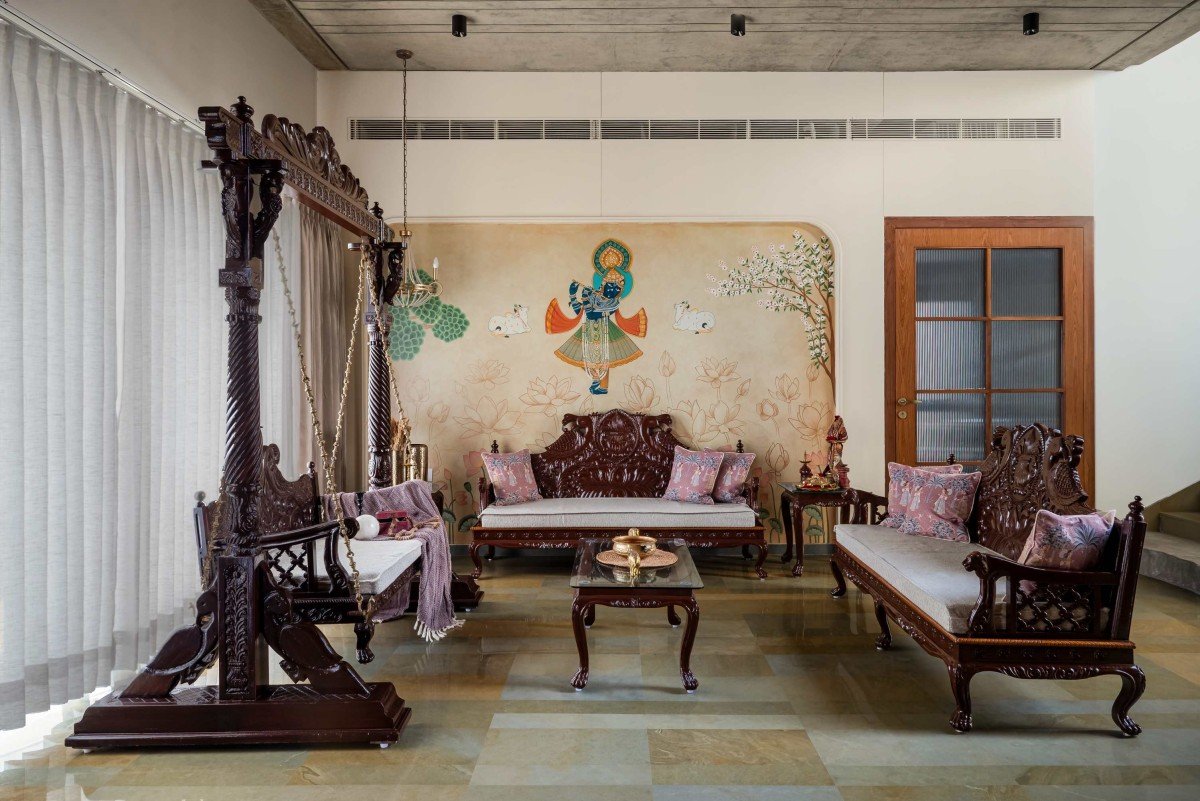
The living room combines heavy carved wooden furniture with clean contemporary surfaces and exposed RCC ceilings. Rather than competing with each other, these elements work in contrast. Traditional wooden seating, neutral fabrics, and the indoor swing bring warmth and familiarity to the space, while the exposed concrete ceiling introduces a sharper and more minimal counterpoint. A Krishna-inspired artwork by artist Avinash Gondaliya becomes a focal point within the room, adding color and narrative without overwhelming the space.

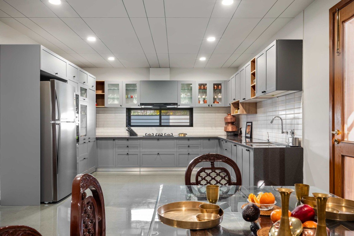
The dining and kitchen areas are designed with a similar sense of contrast. The kitchen remains muted and functional, defined by sleek cabinetry, clean lines, and understated finishes. Adjacent to it, the dining space leans more heavily into crafted detailing through carved wooden chairs, brass accents, and a richly detailed crockery unit. Together, the spaces balance utility with visual richness without disrupting the overall calmness of the house.

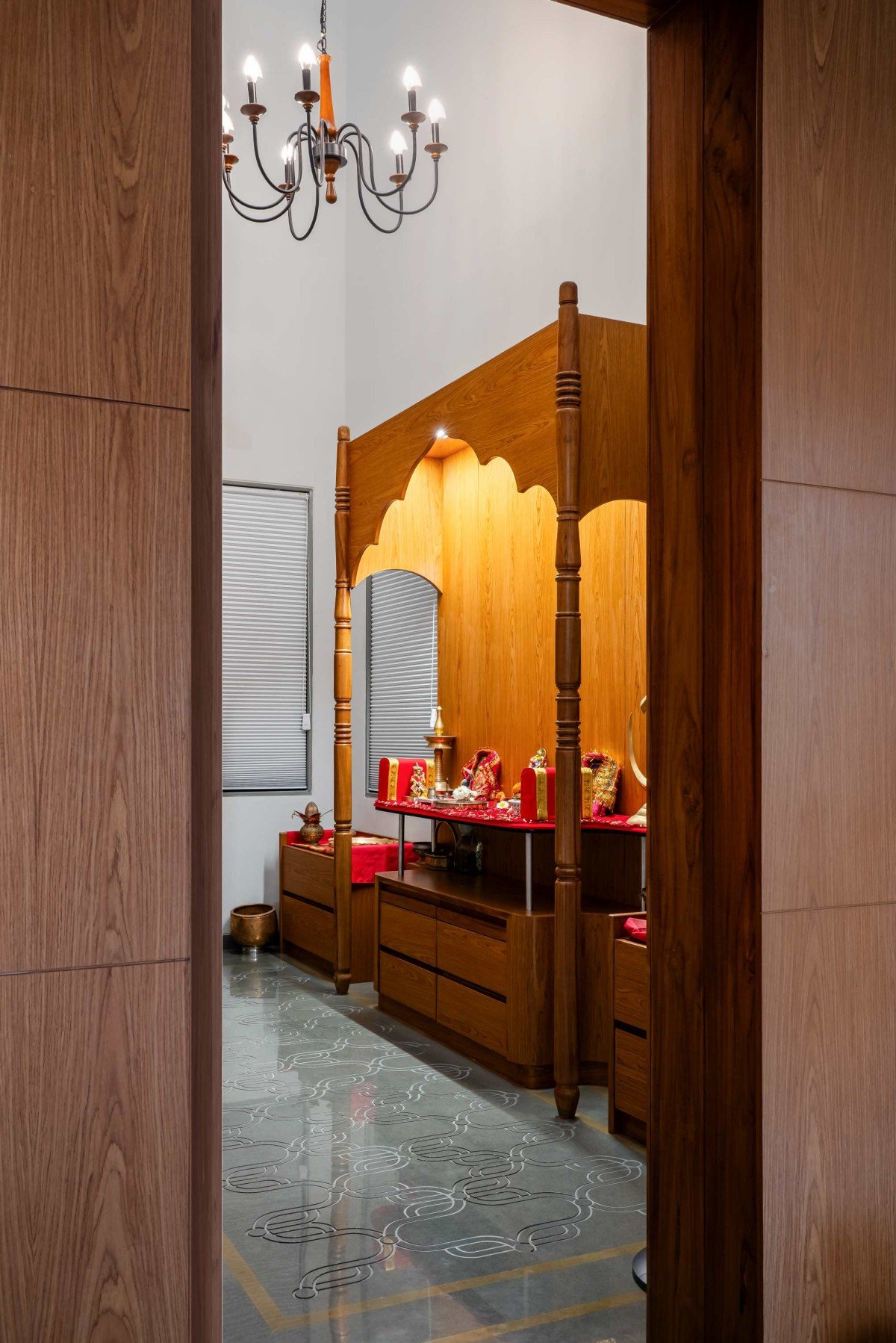
One of the most spatially significant areas within Kala is the double-height pooja room. Detailed with traditional wooden columns and finished in grey Kota flooring with CNC-cut borders, the space carries a ceremonial quality while remaining visually restrained. A vintage chandelier descends through the volume, introducing softness and scale without becoming excessive.

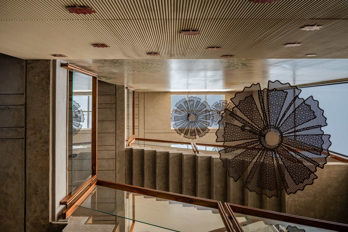
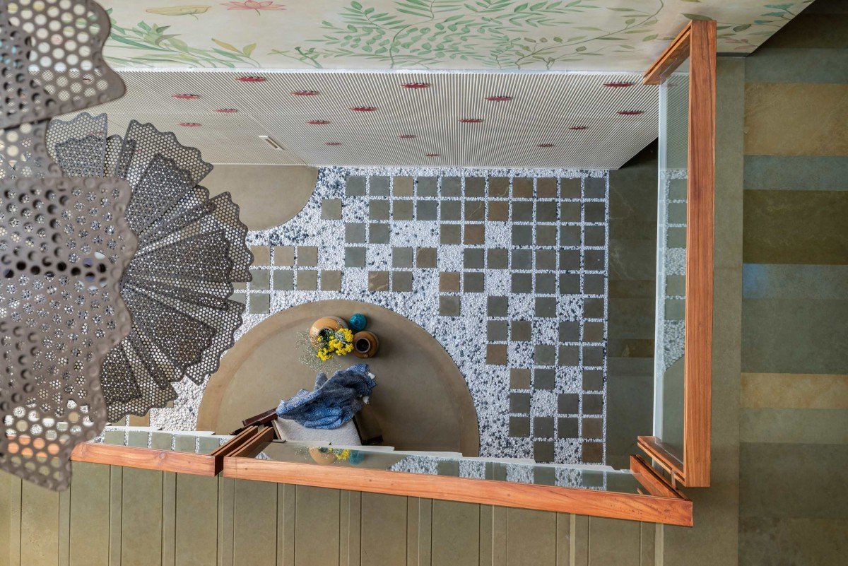
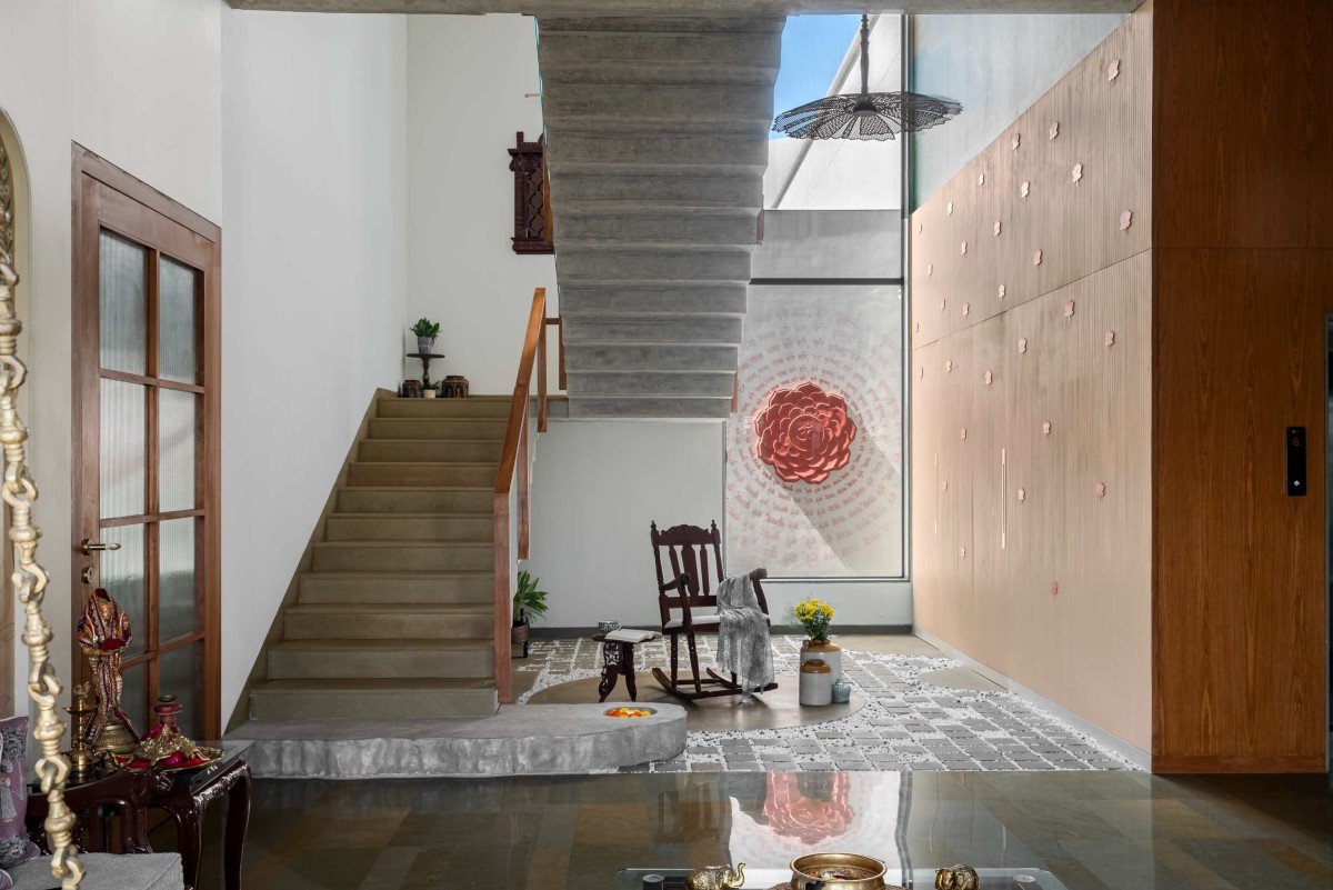
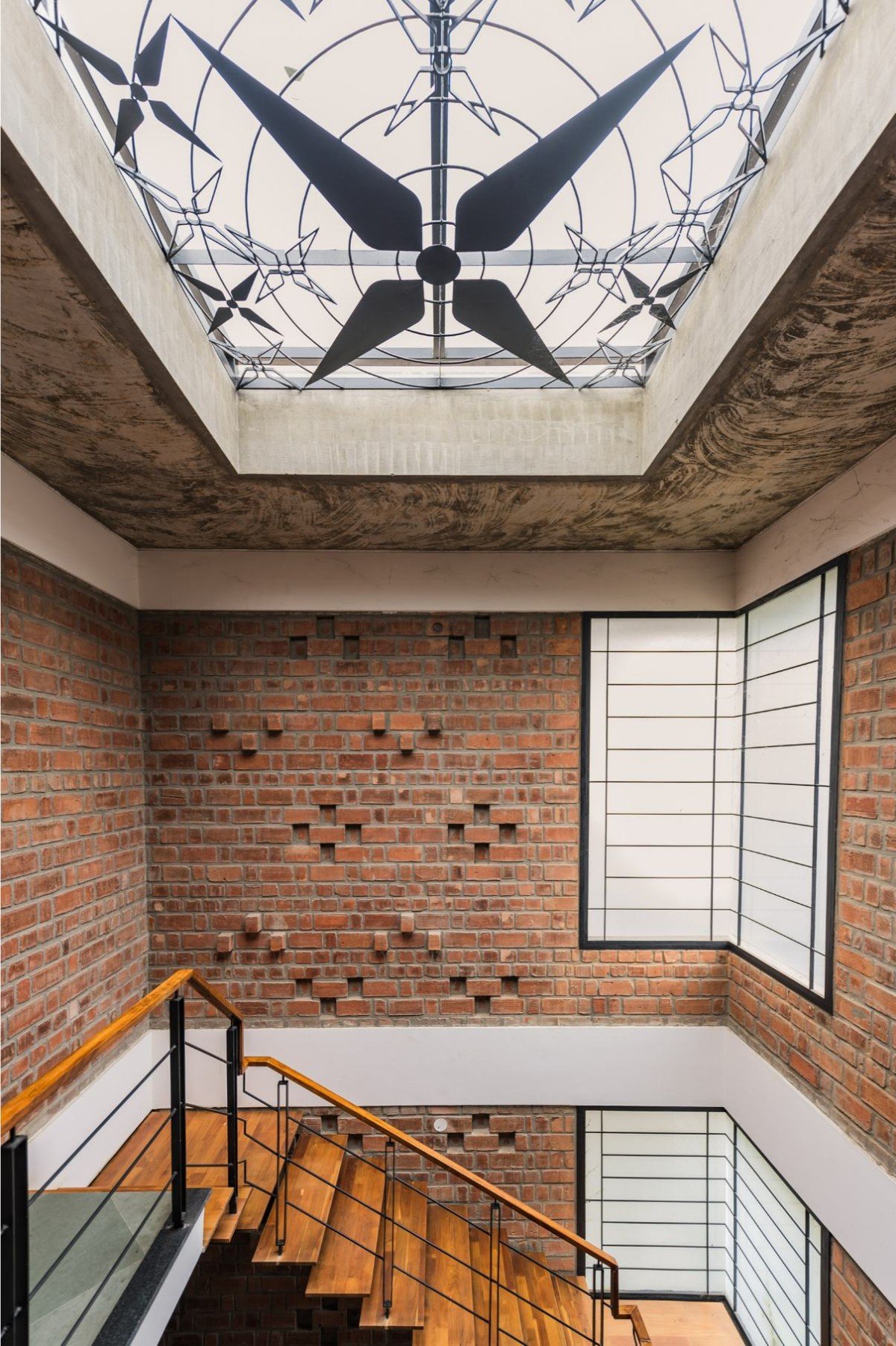
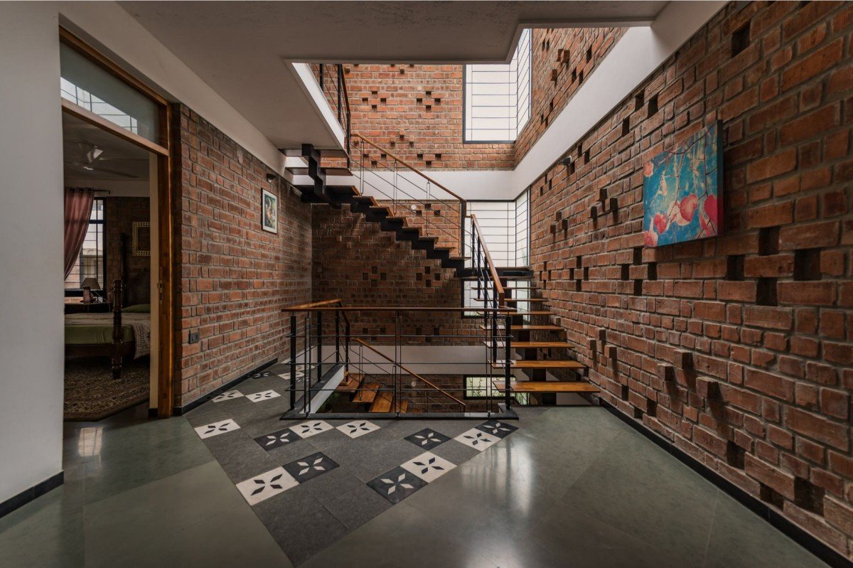
At the center of the house lies the triple-height courtyard, which acts as the primary source of light and spatial continuity. Natural light enters through skylights and tall openings, moving across the Kota flooring and pebble inlays throughout the day. A sculptural RCC staircase rises through this volume with Jaisalmer stone treads and wooden railings, creating a strong vertical element within the otherwise grounded material palette. Suspended above, a perforated pendant light casts shifting patterns across the surfaces, adding another layer of movement to the space.

The upper floors continue the material language established below. Kota flooring, exposed RCC ceilings, teak finishes, and glass partitions maintain openness while introducing warmth and privacy where required. Study areas and office spaces remain visually connected to the rest of the house, avoiding enclosed or isolated planning.

The bedrooms each carry a distinct atmosphere while remaining part of the larger architectural vocabulary. The master bedroom uses soft neutral tones, warm wood finishes, and fabric panels to create a quieter and more refined setting. Brass sconces and vertical wooden battens introduce texture and rhythm without relying on decorative excess. The children’s room features functional, clean-lined furniture and integrated storage with playful details, while the parents’ bedroom maintains a minimal aesthetic enhanced by personal items like a sitar and rehal.

Throughout Kala, materials are used with clarity and restraint. Exposed brick, Kota stone, wood, brass, and concrete appear repeatedly, but always in measured proportions. The house does not attempt to recreate tradition literally, nor does it pursue minimalism at the cost of warmth. Instead, it builds its identity through carefully layered contrasts, where crafted details coexist with clean volumes and contemporary spatial planning.

June 2, 2026 0 comments
0 FacebookTwitterPinterestEmail
Residential

Swasti, Bangalore Studio Alaya

by DDI Edit Team June 2, 2026
written by DDI Edit Team

The name on the gate is Swasti, and it sits on a green boundary wall in a Bangalore neighborhood without offering any clue about what lies behind it, which is exactly as it should be for a house designed from the inside out, conceived by Ar. Lavanya Goradia of Studio Alaya built for Roopasri and her children a home that is simultaneously a shelter, a garden, a creative studio, and a declaration of self, built in 3,826 square feet on a nearly square plot of 355 square meters where the building has been placed diagonally so that the residual spaces at the edges become active gardens rather than dead corners.

Two existing trees were the first constraints and the first gifts: an African Tulip tree celebrated as the focal point of the front garden, its presence anchoring a composed landscape of circular brick paving, a dark stone urn at the center, lawn and ferns and palms and bougainvillea and terracotta pots, the whole scene framed by the exposed brick facade behind it with vines already climbing and a glass canopy marking the entrance, the house presenting itself from the street as something rooted and patient rather than eager to impress. The second tree, quieter, sits outside a Juliet balcony on the upper floor, establishing a contemplative relationship with the building that takes years to develop and cannot be designed in advance.

The side courtyard reveals the true nature of this place: a narrow garden passage enclosed between the brick house wall and the boundary, so densely planted with hanging baskets, trailing vines, and terracotta pots that it resembles a greenhouse corridor more than a garden. Above, a steel and glass pergola supports the hanging plants while light filters through. In the middle of it all, a white iron table and two chairs are set in a gravel clearing, creating a lush, slightly untamed, yet entirely deliberate space—one that only a home built for someone who genuinely loves plants could embody.

Inside, the entry hall is where the architecture declares itself most forcefully, the ceiling covered in a swirling grey and dark painted texture that moves across the surface like a concrete fresco, a long skylight running along one edge so that a blade of natural light falls diagonally across the wall and floor through the day and shifts with the hours, the classic black and white octagonal tile with diamond inserts underfoot, a full-height mirror panel on one side reflecting the brick wall opposite, and at the far end a brick jali corner where two walls of perforated brick allow light through their rectangular voids in diagonal cutting patterns that shift across the floor and walls as the sun moves, a pink table and two pink chairs placed there with the lightness of an afterthought and the precision of a decision, a space for a child to sit in extraordinary light.

The staircase void is the architectural heart of the house, the black steel open-riser stair with warm timber treads and a wood handrail rising through brick walls whose surface carries deliberately protruding individual bricks in scattered patterns, giving the wall a texture that catches light and shadow at different times of day; and above it all is a skylight with a large black iron grille in a radiating geometric star or compass form, its pattern casting a dramatic shifting shadow down through the void and onto the floors below as the sun moves, a ceiling that functions as a clock for anyone who knows how to read it, and beside the stair on the first floor a brick jali section opens into the exterior so that the movement of light through the house is never static, never resolved, always in process.

The dining area sits at the base of the stair in the double-height space, a round blue table surrounded by carved cane-back French-style chairs with pink candles and green flowers on it, the patterned black, white, and grey tile floor beneath it, the brick walls rising on all sides to the full height of the void with their protruding brick texture running throughout, a small white cane-door cabinet, and a framed artwork and a shelf of objects completing a room that is entirely domestic in its furnishing and entirely architectural in its spatial ambition, the two things coexisting without tension.

The kitchen opens directly from the dining: white modular cabinets with a white subway tile backsplash, open shelving on the brick wall with a clock and kitchen objects, and the same patterned tile floor running through; the whole thing is practical and undesigned in the best possible way, a kitchen that belongs to someone who cooks in it rather than someone who photographs it.

The living room on the ground floor is where the personality of the house becomes most legible: a teal velvet sofa with cushions in yellow and pink and floral prints alongside a blush pink sofa and a round printed fabric ottoman on a faded pink Persian rug over the dark grey polished concrete floor; a green painted antique cabinet with cane panels; a grandfather clock; a large gilded mirror leaning against the wall; a floor lamp; a dark side table; plants coming in through the open folding door from the side garden; the room full of things that have been chosen and accumulated and placed with the particular intelligence of someone who knows what she likes; the garden outside every window and through every curtain so that the boundary between the room and the planting is permanently soft.

The study carries an antique dark wood writing desk with multiple small drawers, a carved wooden cane-seat chair at the window, teal velvet curtains, a framed painting of a woman on the brick wall, a gold-painted decorative Indian chest, a round yellow-framed mirror, a white bookshelf full of colorful books, and polished concrete floors—all of it personal and readable as a room that belongs to a specific person rather than a designed interior type.

The master bedroom is built around a dark solid wood four-poster bed on a large Persian rug, green linen, a pink velvet armchair by the window, a Saraswati painting on the brick wall, a macrame wall hanging, a gold-framed mirror above the headboard, and pink curtains opening to the balcony and the garden beyond; the white-painted brick ceiling above with its grid pattern from the arch panel roof structure is a room that is eclectic and warm and deeply inhabited, every object present because it means something to the person who lives there, and the child’s bedroom next to it is equally direct: a black bed frame, mustard bedding, a black desk with a blue-drawer pedestal, a pegboard on the brick wall for organizing school things, black-framed windows looking straight into the tree canopy, and the arch panel ceiling grid visible above.

Table-mould bricks in a rat-trap bond reduce material consumption while improving thermal performance throughout the house, with painted exposed RCC slabs and arch panel roofs visible in the ceiling patterns of each room; skylights and controlled openings modulating light and ventilation; and rainwater harvesting, solar energy, composting, and food cultivation integrated into a house that sustains itself as it was designed to sustain the family within it.

June 2, 2026 0 comments
0 FacebookTwitterPinterestEmail
Newer Posts
Older Posts

Recent Posts

  • Florim Introduces SensiVenezia, a Porcelain Stoneware Collection Inspired by Venetian Terrazzo
  • LEGO Botanical Wave Transforms TANK Shanghai with 380,000 Brick-Built Flowers
  • The Great Eastern Home Introduces Its Latest Collection of Italian Vintage Mirrors
  • Smart Homes Are Changing Architecture: What Happens When Technology Becomes Part of the Building?
  • AARQE9’s Nikhaar Dhawan & Bahaar Dhawan Rohatgi Unveil the Sculptural Lunar Drip Table

Recent Comments

  1. Smart Home Architecture: How Technology Is Changing Design on Aqara Smart Lock U500: Three Versions for Gates, Glass Doors and Standard Entrances

Newsletter

  • Home
  • About Us
  • Contact Us
  • Editorial Policy
  • Privacy Policy

© 2026 Design Diary International. All Rights Reserved.

Design Diary International
  • Home
  • Project
    • Residential
    • Hospitality
    • Commercial
    • Public & Cultural
  • Interview
    • Architect
    • Interior Designer
    • Founders & Brand
    • Artist
  • Material
  • Product
  • Feature
  • DDI Finds
    • Emerging Studio
    • Rising Designers
    • New Practices
  • About
  • Magazine
  • Contact Us