
The difficulty with this house was not its size but what surrounded it. Set within an existing G+2 structure in Kharvel Nagar, Bhubaneswar, the 2,200-square-foot residence is hemmed in by buildings on either side. The arrangement left the designers with limited scope for conventional side openings, making daylight and ventilation as much an architectural question as an interior one.
Chirag Design Studio’s response was to work harder with the facade. Steel balconies project beyond the existing structure, while large windows and carefully positioned openings pull the outside further into the plan. The balconies are not simply extensions of the rooms; they become part of the mechanism through which the house acquires light, air and a greater sense of depth.
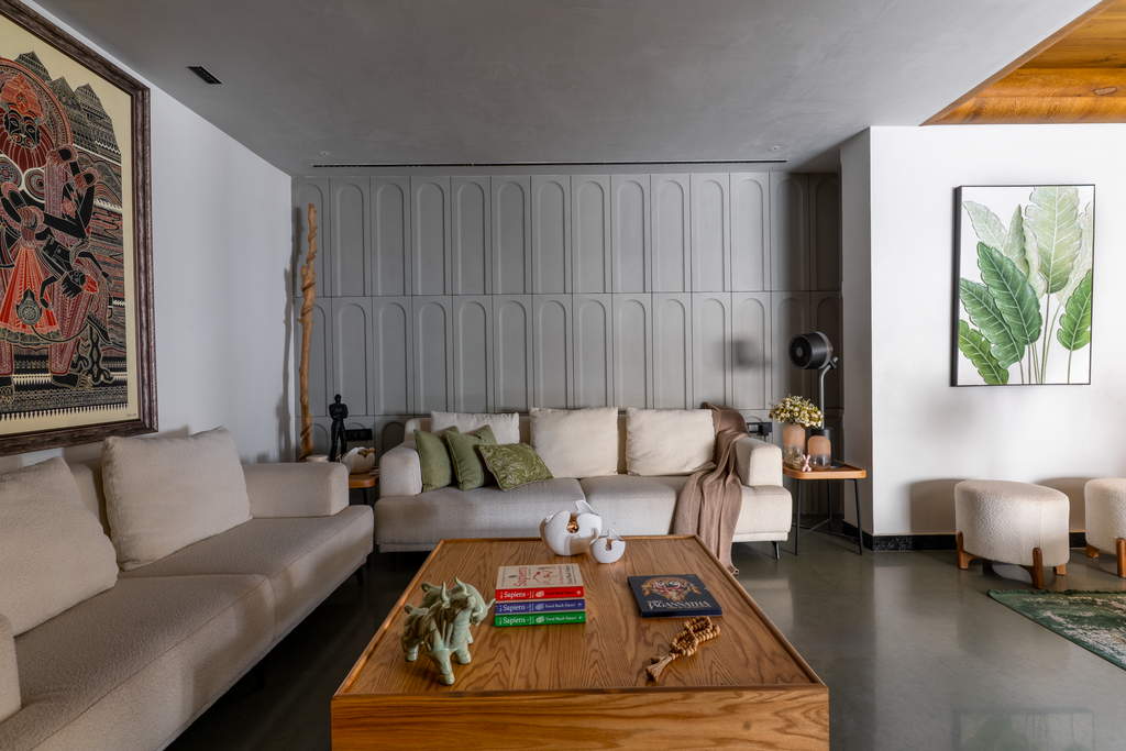
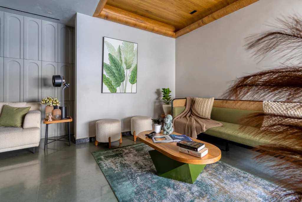
That decision is important to understanding the interiors. The house is described as Japandi, but its character does not come from applying a recognizable style to each room. There is little of the polished, highly controlled version of minimalism often associated with the term. Instead, the designers have allowed stone to remain stone, timber to retain its grain and cane to remain visibly woven. Grey lime plaster and textured concrete provide similarly unfinished surfaces. The effect is less about decoration than about reducing the number of competing visual elements.
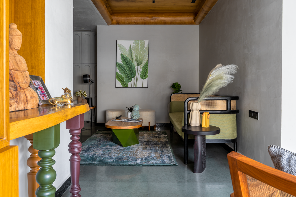
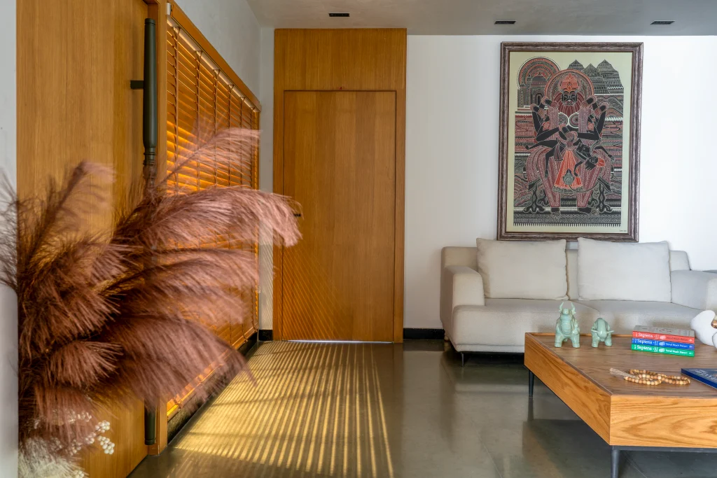
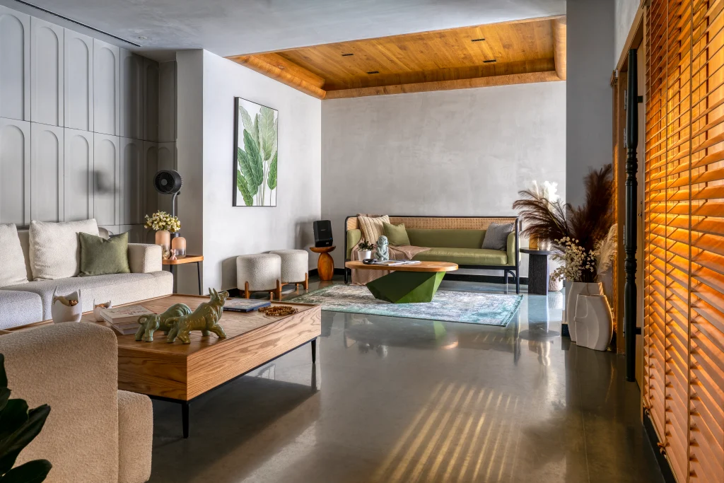
Kota stone, laid in large 6-by-3-foot slabs, establishes much of the ground plane. Against it, light oak and oak veneers introduce warmth without changing the restrained character of the rooms. The palette stays close to stone, timber and earth, with olive, terracotta, taupe and plum appearing in smaller doses. It is a material strategy that gives the relatively compact residence some visual continuity rather than dividing it into a collection of individually decorated rooms.
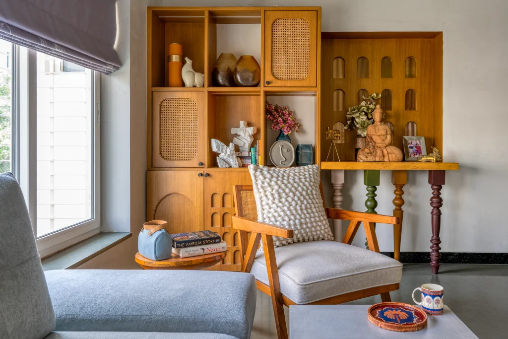
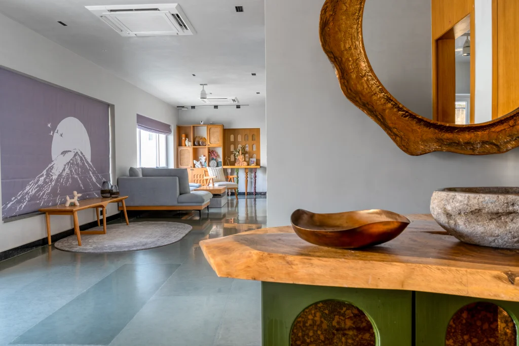
In the living room, that continuity is carried through custom furniture. Oak and cane recur in the sofas and lounge chairs, while muted upholstery keeps the pieces close to the architecture. Storage is treated similarly. Arched units with cane shutters and open niches sit between more solid architectural surfaces, while a handcrafted console, with baluster-like legs in olive, taupe, terracotta and plum, provides one of the few moments where color is allowed to become conspicuous.
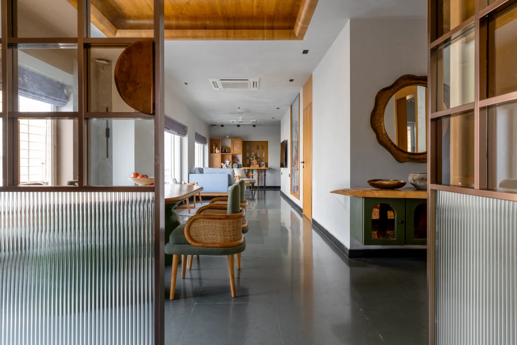
The arches are used elsewhere, although not as a decorative motif repeated for effect. Smaller arched openings establish partial views between the living and dining areas and the circulation space leading towards the staircase and lift lobby. The house therefore reveals itself in fragments. From one room, another is visible without the plan becoming completely open, an approach that allows the designers to negotiate privacy and openness at the same time.
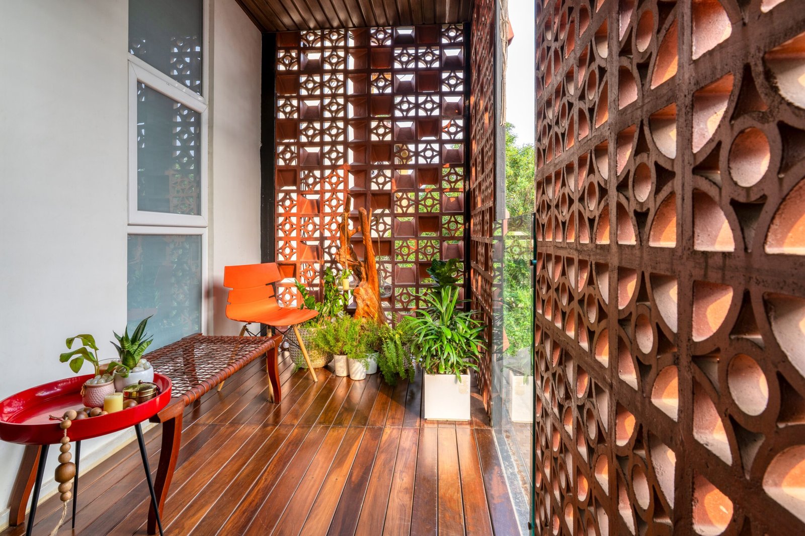
That negotiation becomes more apparent at the rear of the living spaces and in the master bedroom, where the cantilevered balconies become substantial architectural elements. The master suite opens onto a balcony running across the facade, with teak flooring and terracotta jaali screens. The screen has a practical function: it filters direct sunlight, protects privacy and allows air and daylight to pass through. On the facade, red brick cladding adds another layer of texture.
Inside, the Wabi-Sabi reference is most convincing when it appears through individual objects rather than through explanation. At the handwash area, for example, a circular hand-beaten basin has been left with an irregular edge. It sits on a live-edge oak counter, with brass detailing and an olive vanity incorporating arched brass mirror inserts. The combination works because the materials do not all arrive with the same degree of finish. Stone, timber and metal retain their different physical qualities.
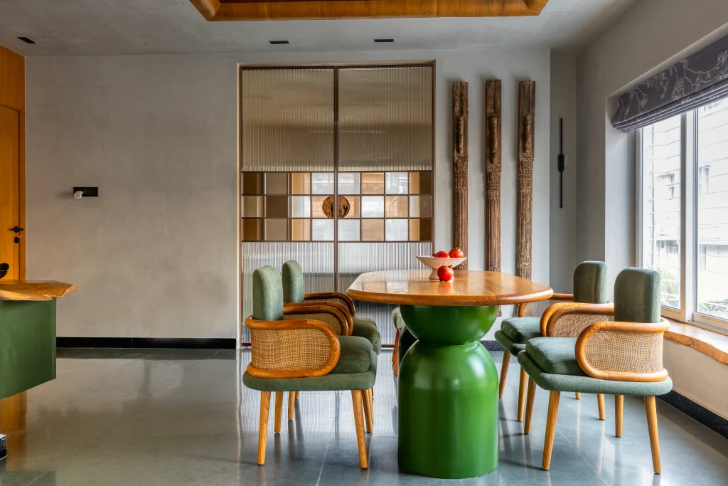
The same attitude appears in the dining area, where wicker chairs and organically shaped furniture are accompanied by live-edge details. Elsewhere, hand-embroidered blinds carry small references to Japanese imagery, including Mount Fuji and birds. These details prevent the neutral palette from becoming anonymous, but they are used sparingly enough that the house does not turn into a literal interpretation of Japanese interiors.
The pooja room is similarly restrained. A fluted glass partition separates it from the adjoining space without making it completely opaque, while natural stone and brass-finished shutters keep the material language consistent with the rest of the house. Its most distinctive element is a hand-engraved white marble backdrop marked by radiating circular patterns. Rather than introducing a separate decorative vocabulary, the room uses craft and texture to distinguish itself.
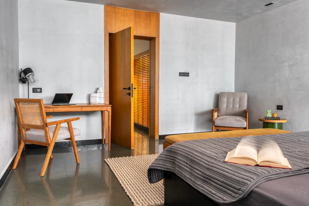
The bedrooms follow the same material logic but are not identical in character. The daughter’s room is organized around an island bed, with a custom oak study table positioned behind it. Grey lime plaster, cane, warm oak and textured upholstery form the base, while burnt-orange accents bring a little more color into the room. The blinds introduce cranes and red sun motifs, giving the space a more graphic interpretation of the Japanese influence.
The kitchen takes a noticeably different approach to materiality, dictated partly by Bhubaneswar’s humid climate. Instead of continuing the timber-heavy language, the cabinetry has been customized in stainless steel using ArttDinox by Jindal Steel. Here, the decision is practical: the material offers durability, ease of maintenance and hygiene while retaining the clean lines required by the interior. Kalinga Stone surfaces complete the kitchen, with KAFF appliances integrated into the arrangement.
Bathrooms return to the more tactile vocabulary of the main interiors. Natural stone runs across floors, walls and surfaces, while white Indian marble with leather finishes is used for vanity and seating elements. Oak cabinetry and cane shutters soften the harder surfaces, keeping the bathrooms visually connected to the rest of the residence.
What gives the project its identity, ultimately, is not the presence of Japandi references but the way the designers have used restraint to solve several unrelated problems at once. The site required a response to restricted daylight and ventilation. The existing structure limited the freedom normally available to a new-build residence. The clients wanted to avoid the glossy finishes associated with trend-driven interiors. And the house still had to accommodate the very ordinary requirements of a family home.
The resulting architecture does not attempt to disguise those conditions. The balconies acknowledge the constraints of the site. The screens manage light and privacy. The material palette keeps the interiors visually connected. Custom furniture and handmade elements introduce variation without turning the rooms into displays of craft. Even the kitchen’s stainless-steel construction is a response to where the house is located rather than an attempt to force every room into one aesthetic formula.
That is where the project moves beyond a styled Japandi interior. Its strongest decisions are architectural and practical first, aesthetic second. The Japanese and Scandinavian references provide a vocabulary, but the house is ultimately shaped by light, climate, privacy, material behavior and the limitations of an existing urban structure.
Fact File
Area: 2,200 sq. ft.
Typology: Residential
Firm: Chirag Design Studio
Principal Designer & Styling: Chirag U Swain
Location: Kharvel Nagar, Bhubaneswar, India
Structure: Existing G+2 residence
Photography: Ar. Lalatendu Nayak
Design & Material Partners
Lighting: Futura Lighting
Windows & Fenestration: Beautiful Homes by Asian Paints
Artifacts: Studio Orion
Bathrooms & Bath Fittings: Kohler
Natural Stone Cladding & Flooring: Stone Life
Rugs & Carpets: Carpet Kingdom
Curtains & Blinds: Embellish
Stainless Steel Kitchen Systems: ArttDinox by Jindal Steel
Kitchen Countertops & Surfaces: Kalinga Stone
Kitchen Appliances: KAFF
Furniture: Lusso Mebel
