• Home
  • Project
    • Residential
    • Hospitality
    • Commercial
    • Public & Cultural
  • Interview
    • Architect
    • Interior Designer
    • Founders & Brand
    • Artist
  • Material
  • Product
  • Feature
  • DDI Finds
    • Emerging Studio
    • Rising Designers
    • New Practices
  • About
  • Magazine
  • Contact Us
Design Diary International
Residential

Gaivota Apartment — São Paulo, Brazil

by DDI Edit Team May 29, 2026
written by DDI Edit Team

When the apartment next door became available, Studio Arthur Casas found a way to absorb it without breaking what was already there.


Fact File

Architecture and Interior Design: Studio Arthur Casas

Type: Residential Renovation

Year: 2025

Photography: Fran Parente


The project begins with a premise that most renovation briefs do not contain. The apartment is already finished, designed, decorated, inhabited, and resolved. Studio Arthur Casas has completed a home for a young couple in São Paulo’s Gaivota district, and the family has settled into it, and then the apartment next door becomes available. The practice now faces the question of how to extend an existing home, not how to design a new one, while preserving the existing internal logic, which is more demanding than it appears, because the difficulty of addition lies in managing to avoid disturbing the existing structure.
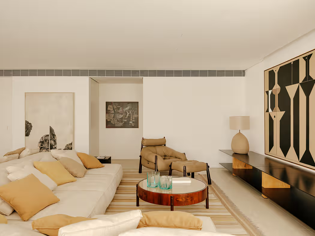
The family is young and growing, a couple with three small children, and what the additional unit needed to provide was scale, more room for gathering, a proper place for the children, a guest suite, and the ability to receive people at the kind of generous São Paulo scale that a single apartment, however well designed, could not accommodate. The second unit, adjacent to the first and connected through the gourmet area, needed to be integrated seamlessly to create a single interior rather than two separate homes.
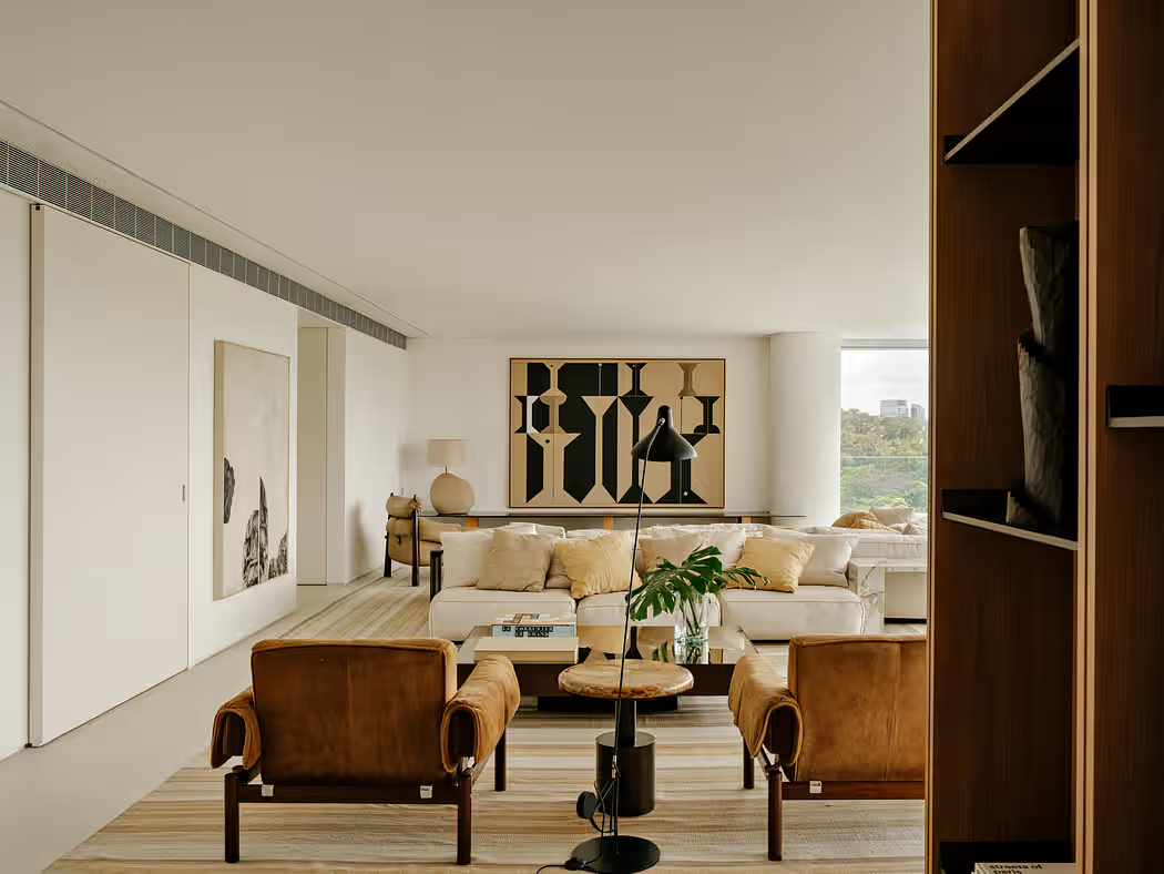
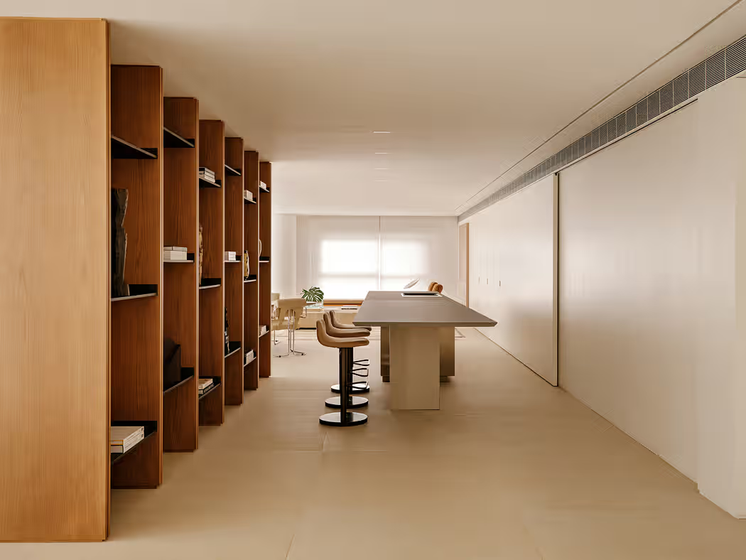
The device that resolves this is a large bookcase in deep-stained timber that runs the full height of the connecting wall between the two units, its open shelves holding books, sculptures, and objects in the manner of a library rather than a partition, broadening sightlines from one unit into the other while establishing a visual threshold that the eye crosses without registering as a structural boundary. Standing at the gourmet island in the second unit and looking back through the bookcase toward the first, the apartment reads as a single deep interior, with the large geometric artwork in the original living room visible in the distance through the timber shelving and the park view beyond the full-height glazing framing the whole sequence. The join is visible if you look for it and invisible if you simply live in the space, which is precisely what the project required.
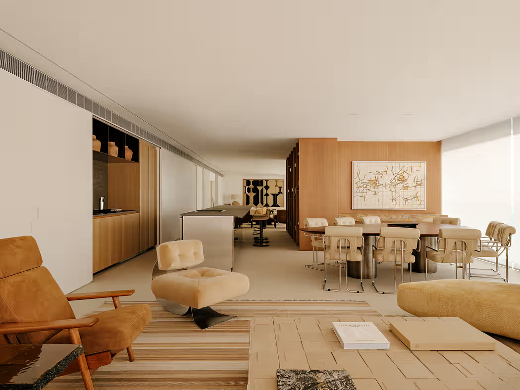
The gourmet island, which connects the two units, is designed with the same economy of means that governs the entire renovation. Its stone countertop is completed using reused material, and a new metal foot is designed to relate to the proportions and character of the original piece rather than replace it. The bar stools at the island, upholstered in tan leather and mounted on black pedestal bases, are positioned against the bookcase wall. This arrangement allows the act of preparing food and the act of crossing from one section of the apartment to the other to share the same territory, with the kitchen and the threshold occupying the same moment in the plan.
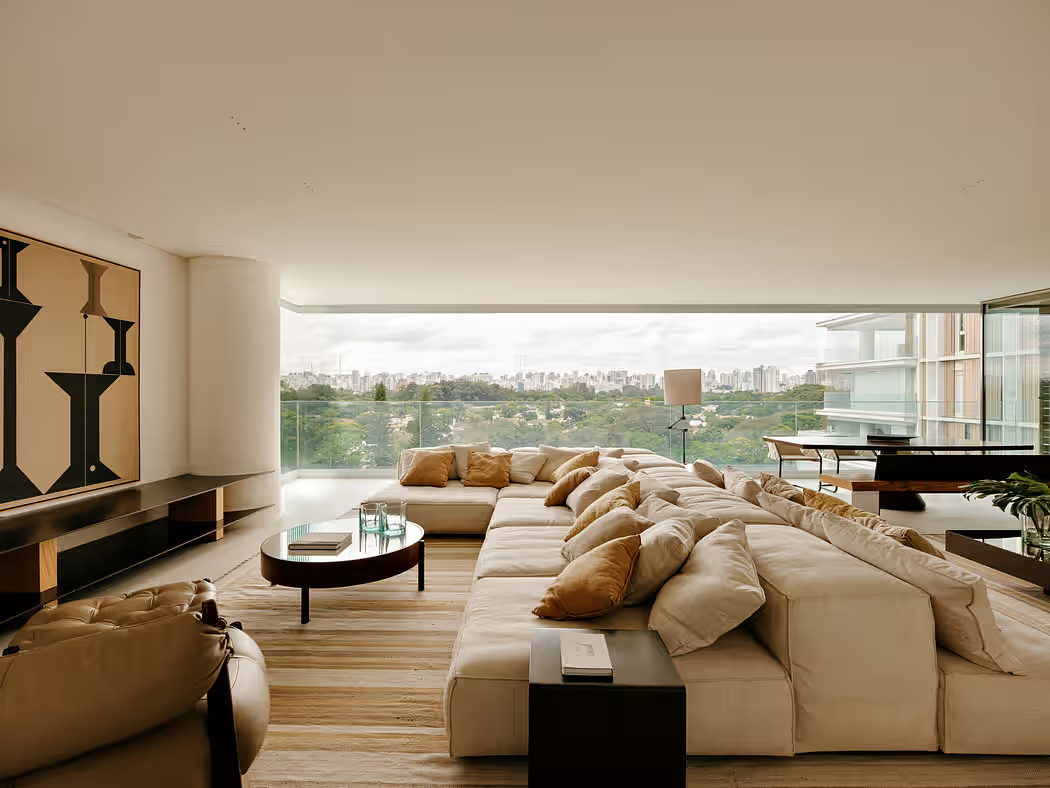
The first section of the home, the original apartment, organizes the social life of the family around an island sofa of substantial scale in off-white upholstery with mustard scatter cushions that anchors the living and home theater space in a configuration generous enough to hold an extended family gathering and relaxed enough for a weekday evening with three children. A large geometric artwork in black and beige occupies the wall beside the television unit, a piece in dark wood with oak accents that sits low along the wall and grounds the artwork above it. The retractable projection screen disappears when not in use, allowing the room to shift from cinema to daily occupation without the visual weight of equipment asserting itself between screenings. To one side of the living area, two tan leather armchairs in the Brazilian vintage tradition, low and reclined and deeply comfortable, face across a rosewood coffee table with a glass top toward the main sofa, the arrangement giving the room a second social register alongside the island sofa, a place for conversation at a different scale and in a different proximity.
The park view along the glazed perimeter showcases São Paulo’s dramatic greenery, a sweeping tree canopy that enhances the need for thoughtful interior choices. The plaster ceiling runs continuously across the enlarged apartment, uninterrupted from one unit to the other, and the large-format ceramic tile floors of the social areas establish a visual continuity that the bookcase then reinforces, the material logic of the floor and the ceiling making the junction between the two former units feel like a spatial decision rather than an architectural fact.
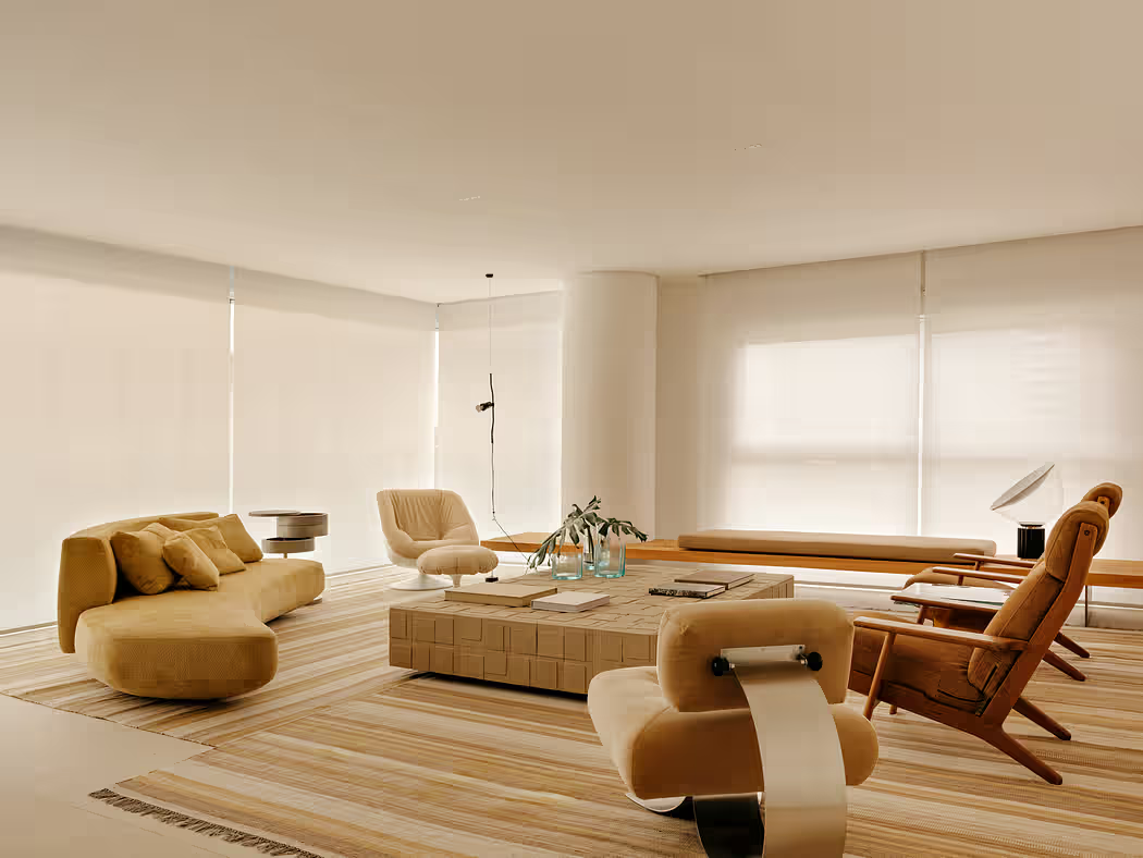
The second unit introduces a larger living room with a more intimate character than the first despite its scale. A curved organic sofa in mustard velvet introduces a different form language from the rectilinear island sofa of the original unit, and the furniture here, a sculptural cantilever lounge chair, a wooden coffee table in a gridded block pattern, and vintage wooden armchairs, all assemble with the ease of a room that has been lived in rather than staged. Roller blinds filter the São Paulo light rather than admitting it directly, giving the room a diffused quality that the full-height glazing of the original apartment does not have, and the effect is of two living rooms that feel genuinely different in atmosphere despite the consistency of material and palette that connects them.
The dining table in the gourmet area scales up to accommodate the larger gatherings the expanded apartment was commissioned to host, its chrome-framed chairs mixing vintage Brazilian pieces with more contemporary selections in the manner of a table that has accumulated over time rather than been assembled at once. Above it, on the timber-paneled accent wall, an abstract artwork in gold and cream provides the warmth that the neutral palette of the social areas deliberately withholds, leaving the artworks and the furniture to bring texture and emphasis to rooms that have chosen restraint as their primary register.

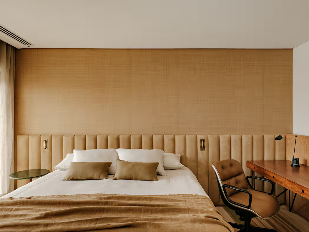
The private spaces shift the material language of the apartment perceptibly. In the primary bedroom, a channeled upholstered headboard in warm wheat fabric spans the full width of the bed and extends sideways, its fluted vertical panels continuing the room’s material warmth while the textured wall covering above it, in the same amber-honey tone, gives the bedroom a depth and enclosure that the white walls of the social areas do not attempt. A vintage rosewood desk with a leather desk chair sits to one side of the bed, the kind of furniture that takes decades to acquire the particular quality of presence it now has, and the combination of it with the bespoke headboard and the warm wall treatment produces a room that reads as the most personal space in the apartment, the place where the clients’ accumulated choices are most legibly themselves.

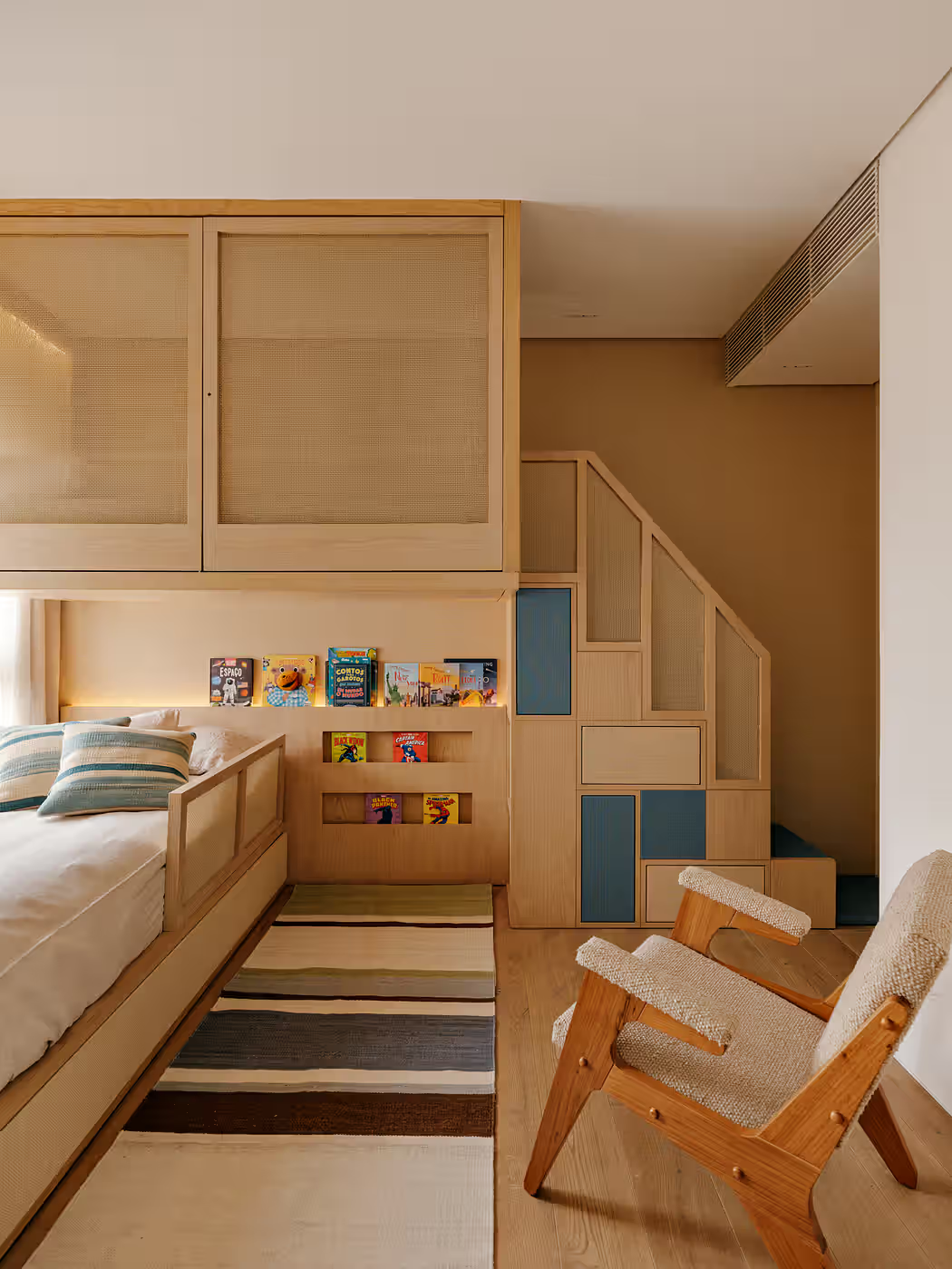
The children’s room in the second unit is the most architecturally inventive space in the project and is clearly designed for its specific users. A complete bespoke timber system in pale natural maple occupies the entire primary wall: a lower bunk bed with integrated open book ledges displaying the children’s books along its face, overhead storage with perforated cane panel doors above it, and a staircase to a loft sleeping area whose risers incorporate drawer storage painted in a warm denim blue, the only color accent in an apartment that has otherwise held firmly to its neutral palette. The system is complete and considered in the way that the best children’s furniture always is, which is not the way of visual playfulness but the way of genuine thought about how children actually inhabit a space and what they need from it across different hours of the day.

The guest room has been designed with its future in mind. Its current use as a guest suite is built on a spatial logic that anticipates its conversion into a third children’s bedroom as the family grows, and the decision to build that future change into the current floor plan rather than leaving it to a subsequent renovation reflects the broader intelligence of a project that treats flexibility not as a concept but as a specific set of spatial decisions made in the present to accommodate needs that are not yet present but will be.

In the bathroom, natural oak cladding covers the vanity unit and the surrounding walls in a continuous grain, topped with a dark stone basin whose surface reads almost like slate against the warmth of the timber around it, a black matte faucet providing the single precise contemporary note in a material combination that is warm, specific, and entirely consistent with the private register the bedroom spaces establish. Warm indirect lighting behind the vanity panel creates an amber glow at floor level that makes the bathroom feel inhabited rather than functional, the kind of light that the social areas of the apartment, with their plaster ceilings and their park views, have no need to provide.

What Studio Arthur Casas has produced in Gaivota Apartment is a renovation that absorbs the fact of its own expansion so completely that the enlarged home reads not as two apartments joined but as a single interior that has always been exactly this size, which is a more difficult achievement than the seamlessness of the result makes it appear. The bookcase that joins the two units is the evidence of the work. The apartment that surrounds it, moving from its park-facing living room through the gourmet junction to the new dining scale and the second living room and the children’s timber world beyond, is the result.

arthurcasas.com

May 29, 2026 0 comments
0 FacebookTwitterPinterestEmail
Residential

Balaji Abode, Madurai- India, by Yegam Studio

by DDI Edit Team May 28, 2026
written by DDI Edit Team

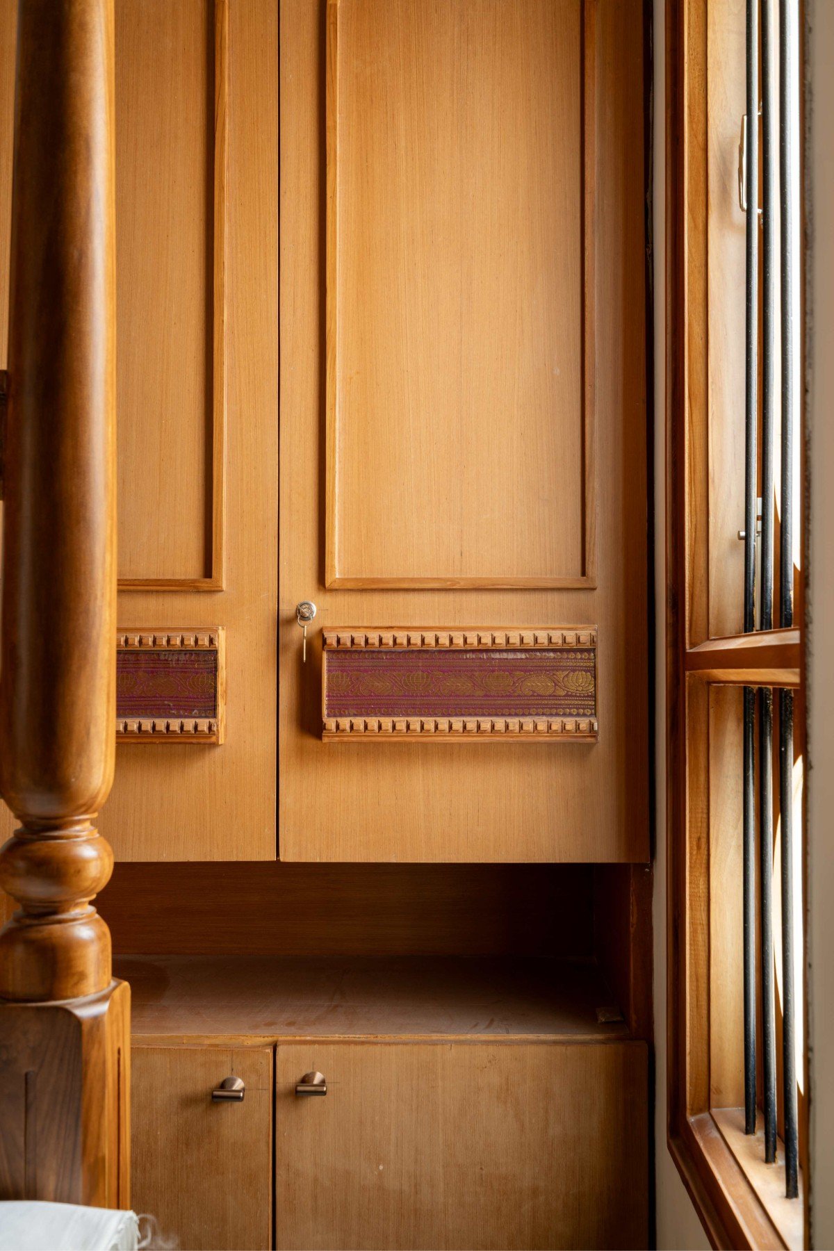
In the wardrobe of the traditional bedroom of this 2,100-square-foot home in Madurai, the door panels carry an inlaid strip of deep purple silk with a gold border running across their middle, the fabric held between two wooden moldings the way a painting sits within a frame, and it is this detail more than any other that tells you what Ar. Porchezhiyan of Yegam Studio was thinking about when he designed Balaji Abode, a two-floor residence built above an existing ground floor in a city whose history is layered enough that you can reach into almost any part of it and come back with something worth using.

The brief was direct: an old-school traditional home, and the response was equally so, almost every component custom-built on site so that the design language remained under continuous control from the first decision to the last. The home carries a foyer, a living area, a dining room and kitchen, and three bedrooms, the shared spaces and one bedroom held within a cohesive traditional aesthetic, and the remaining two given entirely different identities shaped by the people who occupy them.

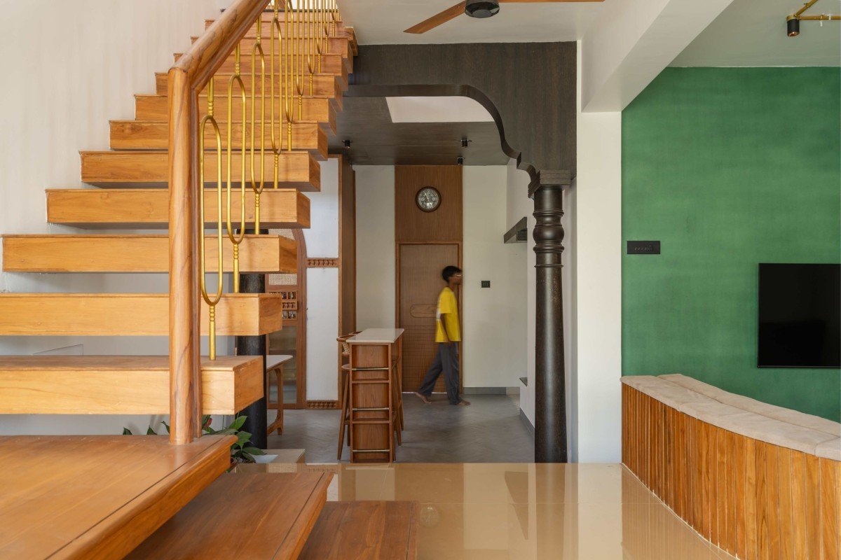
The ground floor announces the house’s intentions at its threshold. A turned wooden column in very dark stained timber, heavy and classical in its proportions, stands in the foyer as a reference to the carved pillars of Madurai’s temples, and steps lead up to a split-level living area where a curved built-in sofa in grey-beige upholstery wraps around a raised platform, its front panel clad in vertical timber slats, the form of the seat gathered inward rather than placed against the walls.

A large arched double-leafed door in warm teak occupies the wall behind it, its curved top panels plain and tall, and a window with turned vertical bars brings light across the polished floor. A brass pipe track runs along the ceiling carrying small directional lights, the detail contemporary in its form and entirely untroubled by the traditional timber and masonry language around it.

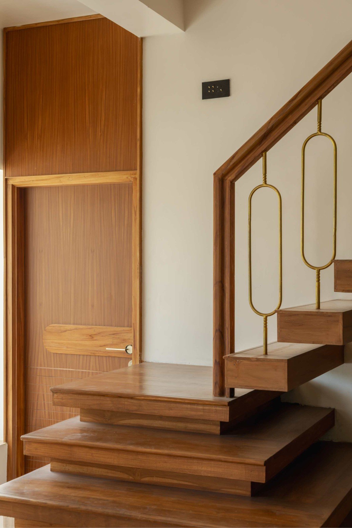
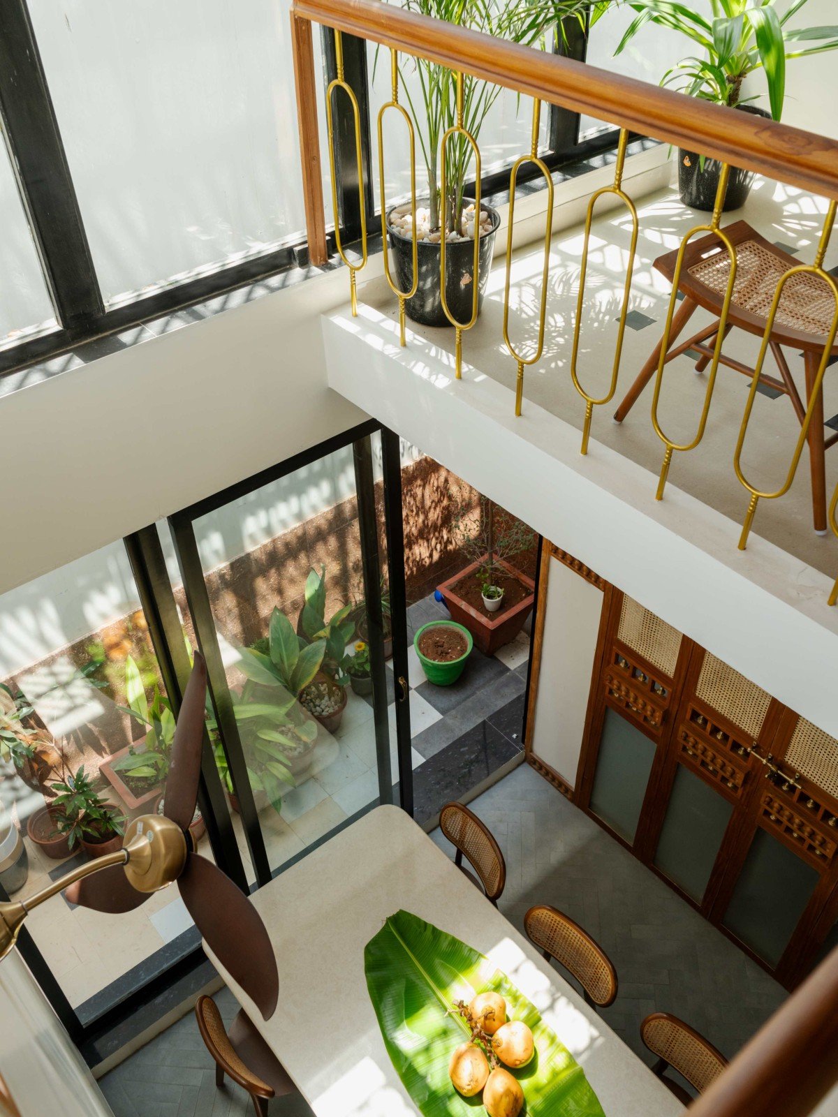
The staircase is the ground floor’s most considered piece of joinery: floating teak treads cantilevered from the wall, the brass balustrade running alongside carrying elongated pill-shaped oval forms as its balusters, each form clean and repetitive, the brass warm against the honey of the teak handrail above, the whole run rising to the upper floor with the confidence of something designed as furniture rather than as structure. Below the first flight, a bench seat built into the underside of the stair carries the same vertical slatted teak paneling as the sofa platform, the detail repeated in a smaller key.

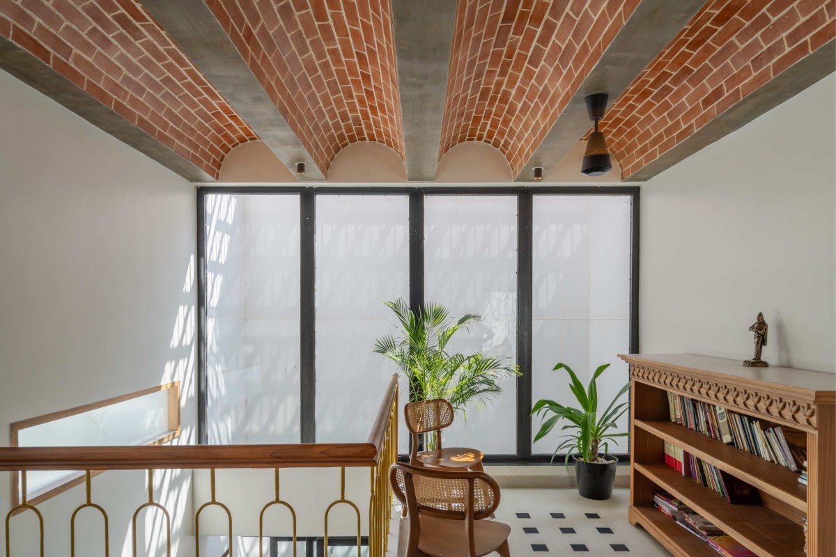
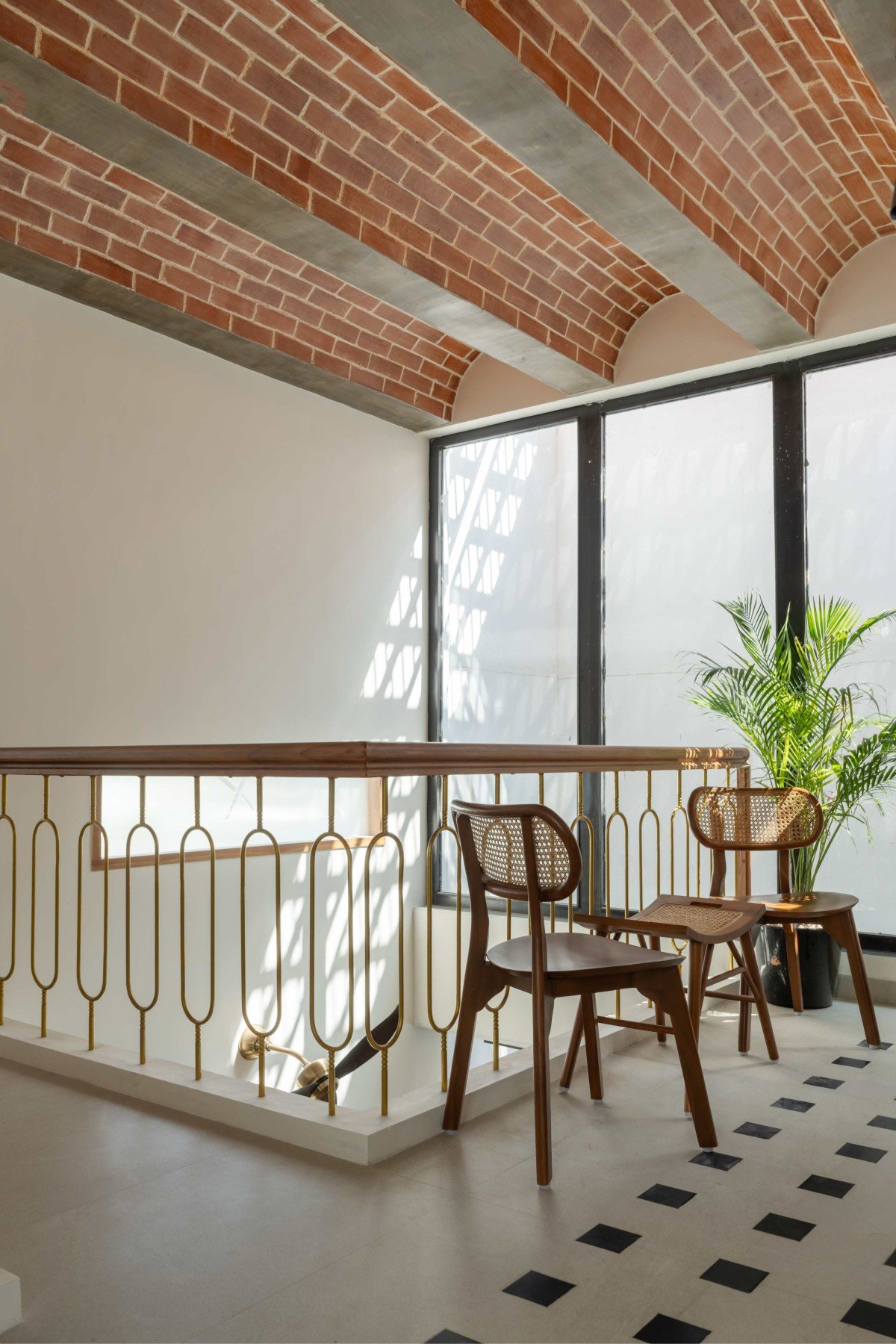
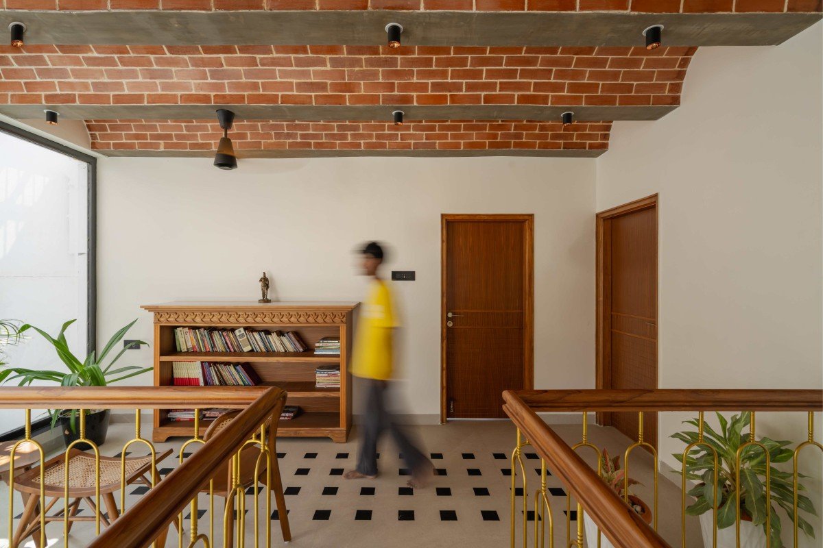
The upper landing is where the house’s defining structural gesture reveals itself. A reverse filler slab ceiling runs the full width of the space in a series of parallel barrel vault arches in terracotta brick, the red tile laid upside down over a temporary arch and cast in concrete, the shuttering removed to leave the raw brick underside of each vault exposed, the concrete beams between them equally unfinished, the whole ceiling warm and tactile and carrying the weight of its own making in a way that a plastered surface would have concealed entirely.

The landing beneath it, flooded with morning light through large black-framed glass panels through which tree shadow falls across the floor in slow-moving patterns, carries two rattan-backed chairs, a carved teak bookshelf with a traditional frieze running along its top edge and a small bronze figurine on its surface, plants arranged at the balcony railing, and the same brass balustrade continuing from the staircase around the landing’s edge, the oval balusters standing against the white wall and the brick vault above them in a combination that sits between traditional and contemporary without resolving itself into either.

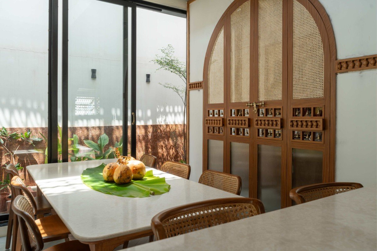
The dining room below is organized around two objects in particular. The table is a custom piece, a white stone rectangular top with soft rounded corners on teak legs whose junction with the top surface is worked into a carved arched bracket, the leg not simply meeting the top but making a small architectural event of the connection, rattan-backed chairs around it, and a banana leaf laid across the stone with fruit placed on it as though the room was ready before it was photographed. Against the wall, an arched cabinet in warm teak, its arch filled with cane panels and its lower portion carrying rows of small brass bells across each panel, functions as a prayer and display piece at dining room scale, its bells and carved detailing a direct reference to Madurai’s temple architecture brought indoors, and through the full-height glass wall beside it, a small courtyard planted with broad-leaved tropicals and a terracotta-tiled back wall brings light and greenery into the room from one side while the cabinet holds the cultural weight on the other.

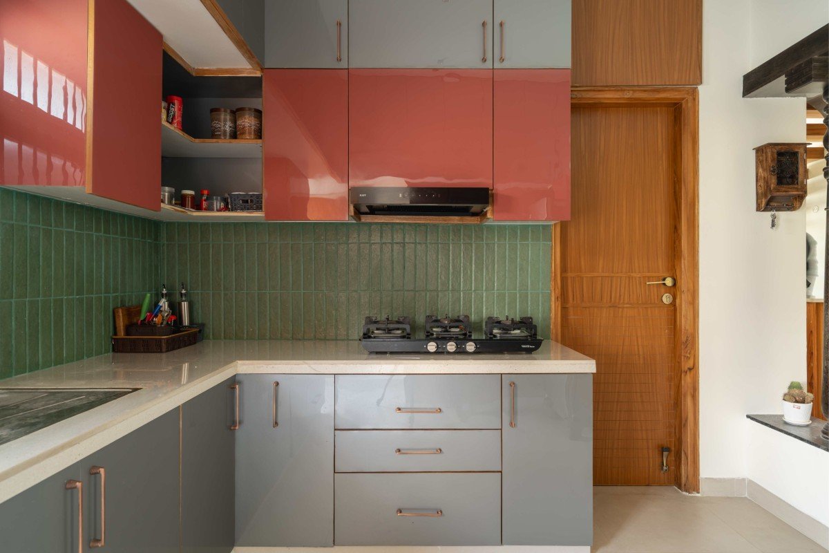
The kitchen works in a different register; its palette is direct and unambiguous: grey high-gloss lower cabinets with copper-finish handles, burgundy-red upper cabinets with open shelving, a backsplash of vertical green glazed tiles in a rich deep tone, a white stone counter running the full length of the wall, and a teak door set into the far end alongside an antique wooden wall cabinet that is the only piece in the room recalling the traditional language of the spaces beyond it. The kitchen island with its white stone top carries shelving in its body with brass rod rails across each shelf, rattan-backed bar stools pulling up alongside.

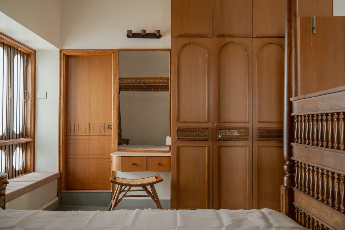
The three bedrooms divide clearly between their identities. The traditional room features full-height teak wardrobes with arched panel doors, a design detail inspired by temple architecture and repeated across the entire run. It also includes a dressing table with a mirror and drawers fitted with turned brass hardware, a rattan stool in front, and a four-poster bed made of dark turned wood at the center of the room. The wardrobe panels showcase a strip of Madurai saree silk, with the purple and gold of the fabric being the only color in a room that is otherwise entirely in shades of honey and dark teak.

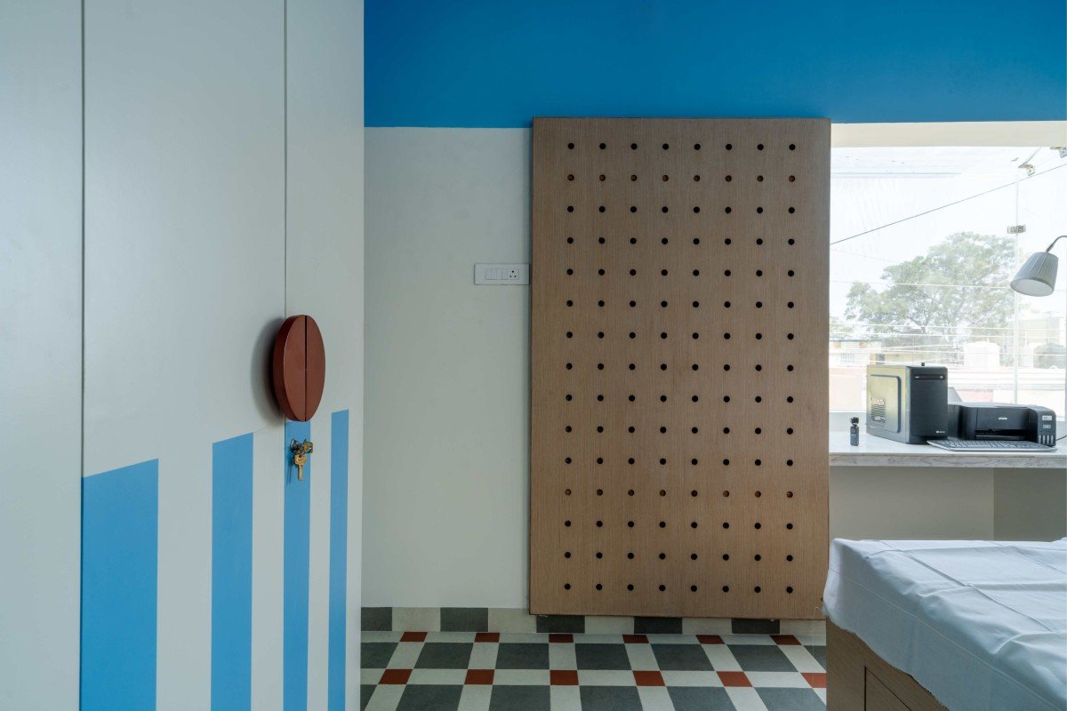
The second bedroom works in blue and white and grey; its wardrobe is painted with blue stripe details, its floor is in a multicolored checkerboard of grey and terracotta tile, there is a perforated wood panel against the wall, and there is a red oval form mounted beside it. The room belongs unmistakably to someone whose taste runs toward the graphic and the contemporary. The third carries an iron bed frame in grey-black, its walls white, a wire grid above the headboard pinned with music and film posters, the room’s accumulation of personal references as deliberate as any of the custom joinery in the spaces below it, the same principle of intent applied in an entirely different vocabulary.

The brick vault ceiling on the upper landing holds the morning light the way it has since the shuttering came away, the raw terracotta and concrete unchanged, the arches as they were when they first came into view, every hour of sun crossing them differently as the shadow of the trees outside shifts slowly across the glass.

Fact File 

Project Name: Balaji Abode

Location: Madurai, Tamil Nadu, India

Architects: Yegam Studio

Lead Architect Designer: Ar. Porchezhiyan

Civil Consultant: Modern

Builders Area: 2,100 sq ft

Year of Completion: 2025

Photograph: Studio Taniga Instagram: @yegam_studio

May 28, 2026 0 comments
0 FacebookTwitterPinterestEmail
Residential

House by the Tree, Hubballi- Karnataka, India, by VJ Architects

by DDI Edit Team May 28, 2026
written by DDI Edit Team

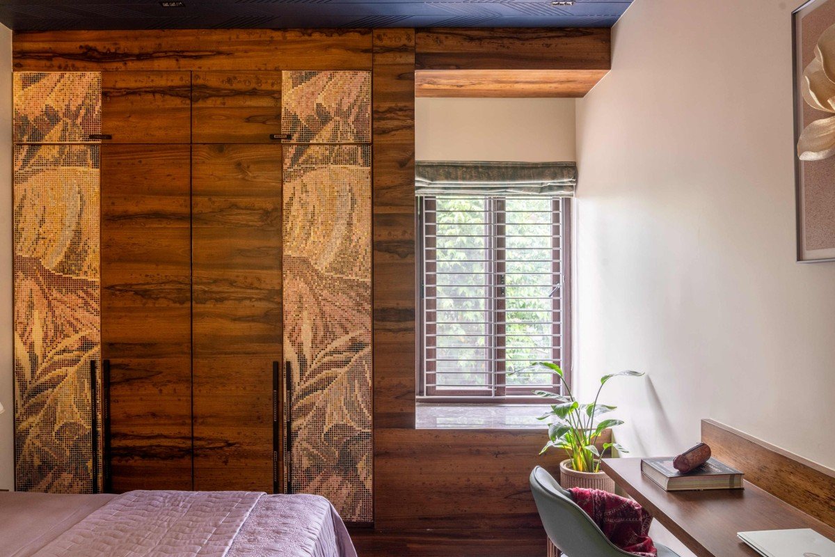
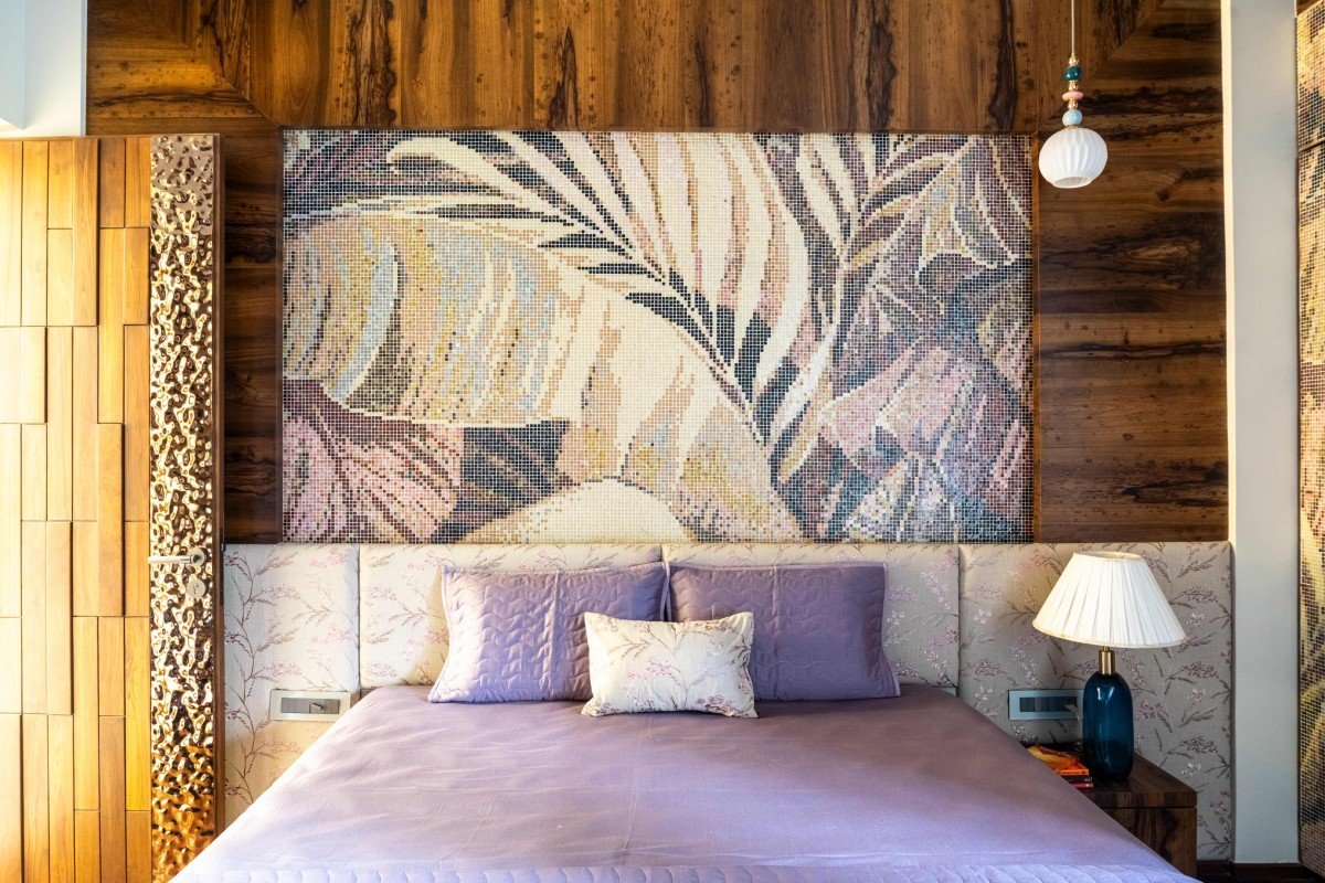
The wardrobe in one of the bedrooms of this 5,500 square foot house in Hubballi is surfaced not in veneer or lacquer but in a mosaic of small tiles arranged into a composition of tropical leaves, the monstera and palm forms rendered in gold, amber, orange, and cream across the full height and width of the doors, and the same composition continues across the room to a large mosaic panel set into the dark walnut wall above the headboard, the leaves here in softer tones of pink, lavender, and cream, the two surfaces holding a conversation across the width of the space, and it is in this room that you understand the botanical preoccupation running through the entire house, from the CNC-cut leaf-and-vine panel on the facade to the figured screen door in the master bedroom, the same organic vocabulary returning in material after material, which tells you what Ar. Vishwas Jeevannavar of VJ Architects was thinking about when he designed House by the Tree, a residence on a site in Hubballi whose defining natural feature is the mature tree at its edge.

From the street, the facade makes its first statement: a dark brown volume on the first floor with the botanical CNC panel cut into its surface, leaves and stems pressed out of the solid cladding so that light passes through and the panel reads as both wall and screen, set against white rendered sections on the ground floor and warm beige stone tiles on the right flank with linear LED strips running between them so that at dusk the elevation glows in a combination of warm amber and cool geometry; the cantilevered second-floor balcony with its glass railing and planted pots extending toward the tree canopy; solar panels on the roof; a small niche at the gate carrying a deity figure; and the brick-paved forecourt below.
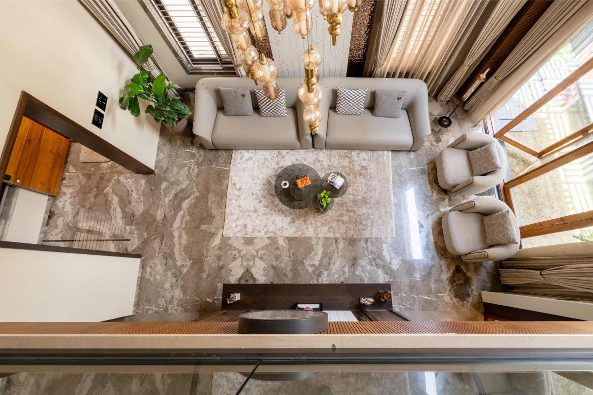
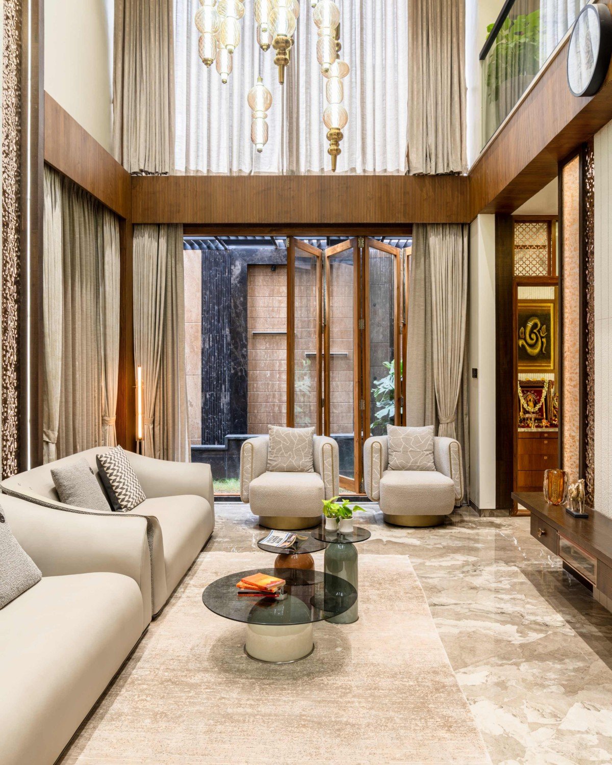
Inside, the double-height living room opens the house at its largest scale: bifold timber-framed doors fold entirely away to a courtyard where a water feature in dark stone sits against a planted wall, and descending through the full height of the volume is a chandelier of multiple amber teardrop glass pendants on brass stems at different lengths, the cluster reading as a three-dimensional form rather than a light fitting, warm against the cream curtains that flank the doors. A cream sofa and two barrel armchairs sit around two circular glass-top coffee tables of different sizes, and on the wall to one side, the puja room is visible through its opening, the gold Om symbol on its marble wall catching the living room light from across the room.

The puja room door is carved dark wood, the frame dense with floral and arabesque carving, a transom of lattice jali above, and the carved surround occupying the full height of the opening. Inside, there are white marble walls with grey veining, a large three-dimensional gold Om symbol on a dark wooden backing panel, a marble altar shelf arranged with deity figurines, framed photographs, flowers, diyas, and offerings, and a crystal pendant above.

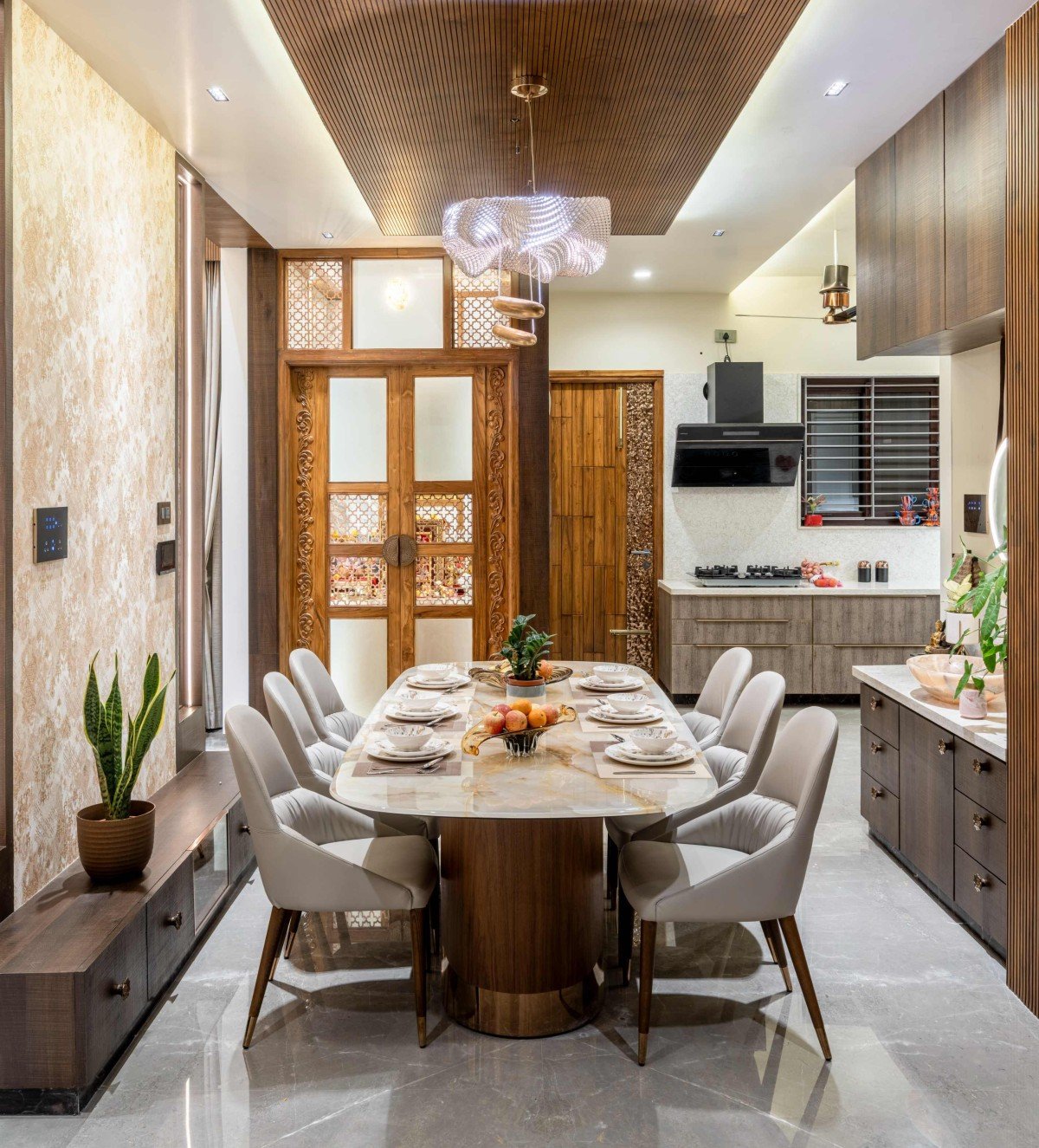
The dining room holds the house’s most theatrical single object: an onyx table, its surface warm honey-gold with orange and amber veining, set on a single dark walnut cylinder; eight cream high-backed chairs around it; and above it a chandelier that is a sculptural form first and a light fitting second, an undulating surface in crystal that waves across the ceiling plane with multiple copper pendant drops descending from it at varying lengths, the piece shifting in quality depending on where you stand beneath it. Dark walnut ribbed panels line the ceiling around the white central section, the kitchen opens into the zone on one side, and the puja room door with its carved surround faces the table from the other so that the room is framed on one side by the most contemporary object in the house and on the other by its most traditional one.

The staircase landing between the floors carries a three-dimensional painted relief of Radha and Krishna on a swing set into a recessed wall niche, the figures modeled in depth, the colors vivid against the cream wall, a small wooden bajot with an open book below it, and a tall potted plant alongside.

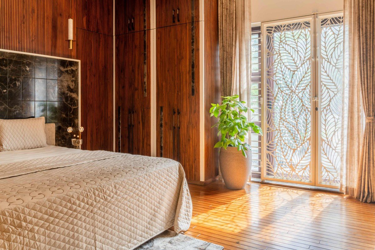
The bedrooms each carry their own complete material identity. The master bedroom has dark walnut ribbed panels on the headboard wall and around it and set into them a panel of black marble with white and silver veining, the margin around the marble backlit in warm amber so that the stone glows within its frame, and a floating shelf below with white drawer units and small plants on the warm timber floor. The screen door on the room’s opposite wall features a leaf-and-vine cutout pattern in cream that filters afternoon light, creating shifting botanical shadows across the floor, while the motif of the facade is brought indoors in a different material.

The figured burl wood bedroom wraps the same dramatically grained veneer across the wardrobe doors and the walls to either side and into the ceiling trim, the swirling figuring so intense that the room reads as a single continuous surface broken only by a small louvered window and a brass sconce, with warm gold embroidered linen on the bed. A third bedroom carries a cream-and-grey two-tone wardrobe with a dark wood paneled feature wall holding a painted golden tree-of-life artwork and a crystal wall sconce alongside it. The children’s bedroom is quieter in its arrangement, a built-in wooden shelf niche with fabric-backed panels holding small figurines and a painted canvas, the dark hardwood floor in use rather than on display, and three children playing chess on the floor in the afternoon light.

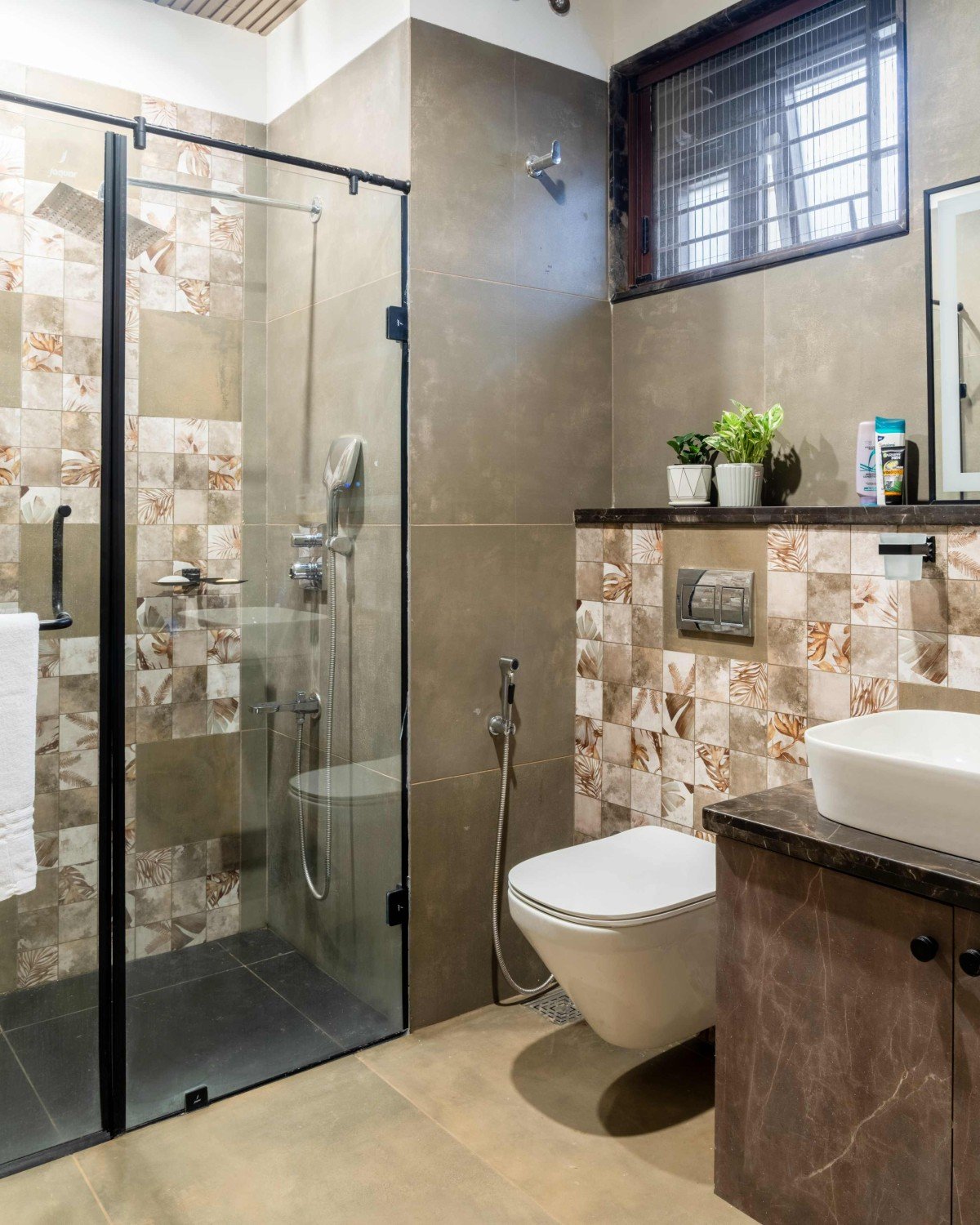
The bathroom carries botanical-print tiles in warm brown and cream alternating with plain grey large-format tiles in the glass-enclosed shower and a dark marble vanity top with a white vessel sink.

The botanical panel on the facade, the screen door in the master bedroom, the mosaic on the wardrobe doors, the mosaic above the headboard, and the tree outside with its canopy extending over the driveway all share the same motif, which runs from the street to the innermost room of the house.

Fact File 

Project Name: House by the Tree

Location: Hubballi, Karnataka, India

Architect: VJ Architects ,

Lead Architect Designer: Ar. Vishwas Jeevannavar

Area: 5,500 sq ft

Year of Completion: 2025

Instagram: @vjarchitects

May 28, 2026 0 comments
0 FacebookTwitterPinterestEmail
Residential

Baan SudSaenSuk, Chiang Rai- Thailand by BodinChapa Architects

by DDI Edit Team May 28, 2026
written by DDI Edit Team

Chiang Saen sits at Thailand’s northern tip, where the Mekong forms the border with Laos and the mountains of Myanmar pile up on the opposite bank. It was once a significant city of the Lanna Kingdom, and that history has not gone anywhere—temple ruins push through the soil, old city walls still stand in sections, and the vernacular architecture of the region carries centuries of accumulated knowledge about how to build in this climate, on this terrain, for this particular way of life. When BodinChapa Architects, led by Phitchapa Lothong and Bodin Mueanglue, were commissioned to design a private residence here, the site came with all of that weight attached.

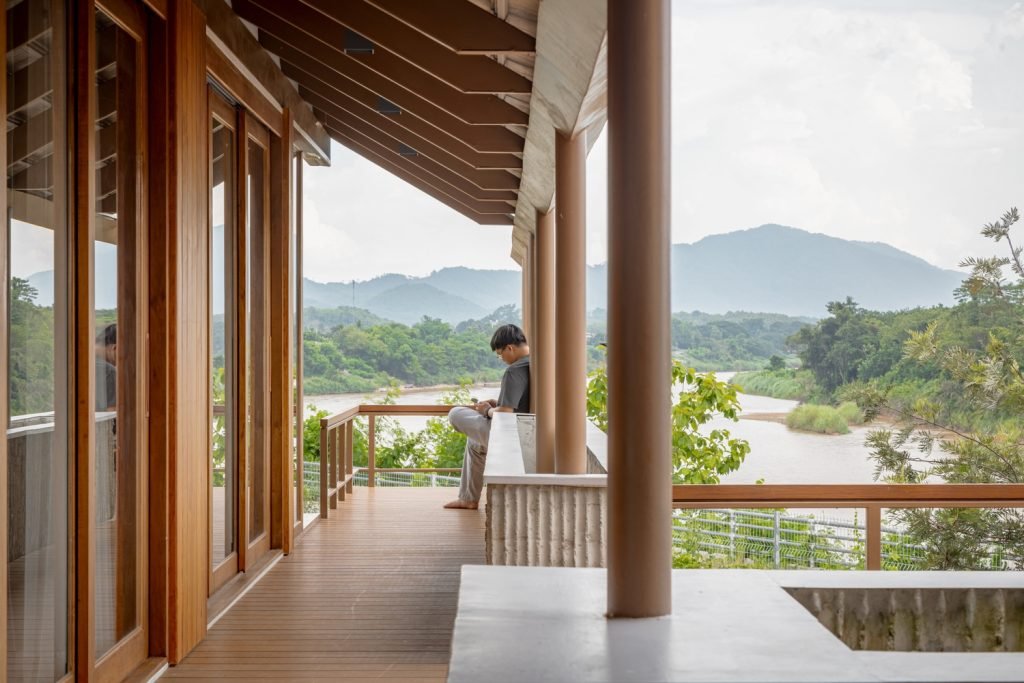
Their response was to take it seriously. The architects first studied Lanna vernacular housing, particularly the Ka Lae house, known for its steep gabled roof and efficient management of heat, rain, and social rhythms over centuries. The point of that research was not to find forms worth reproducing but to understand the reasoning behind them, reasoning that turns out to hold up well against contemporary ways of living. The Ka Lae house was built with its gable end facing south, orienting the long axis of the building across the sun path to manage solar gain and capture the prevailing breeze. Baan SudSaenSuk does the same, and the south-facing gable end here frames a view of the Mekong River and the mountains beyond that makes the climatic logic feel like an act of generosity toward whoever lives inside.

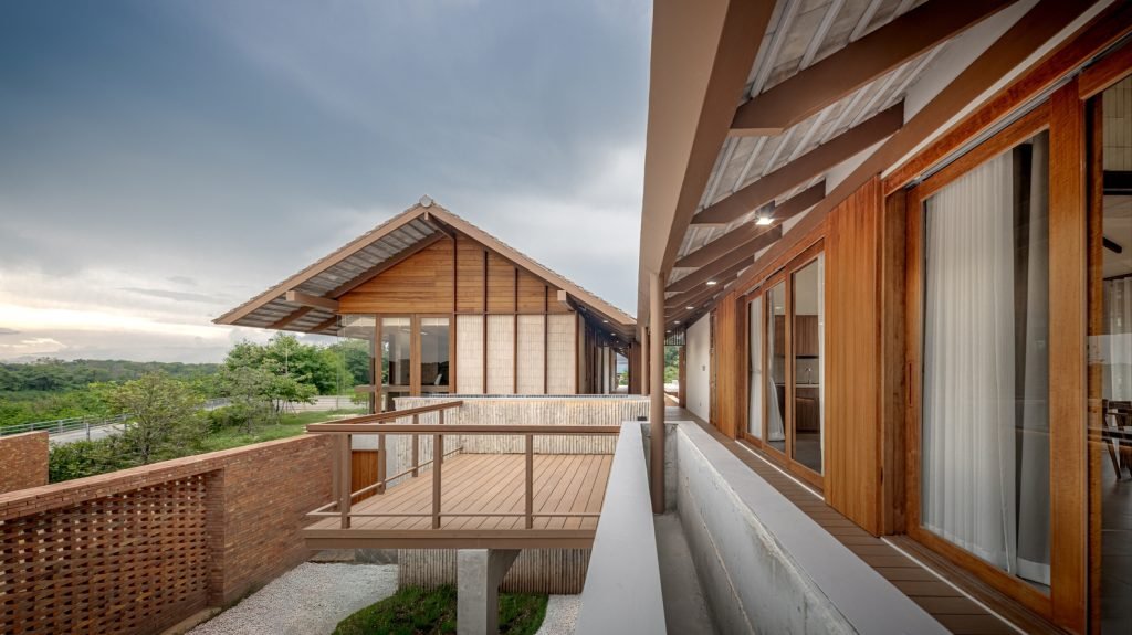
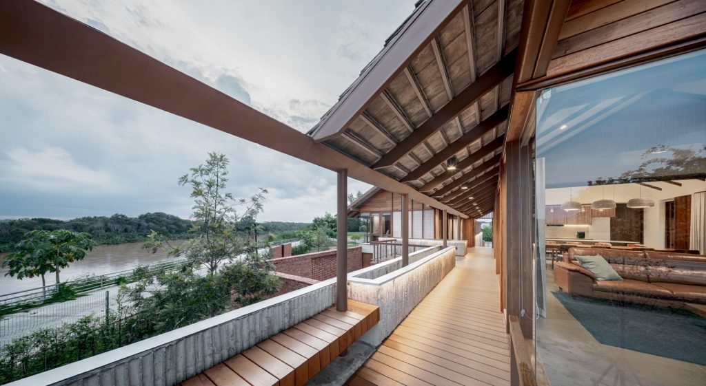
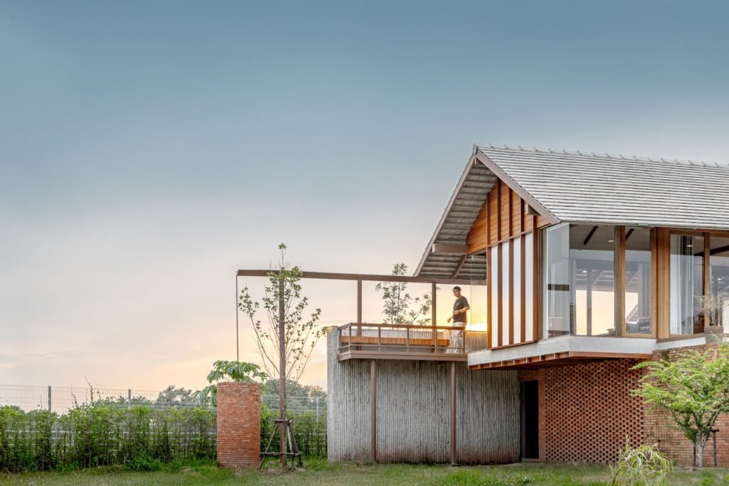
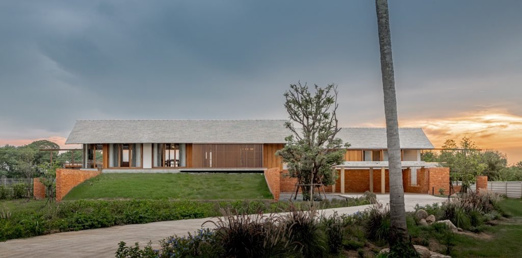
The site sits close to the river, separated from the bank only by a public village walkway, which created the central design problem of how to open the house toward that landscape without exposing it to everyone passing by. The architects rotated the building axis 45 degrees from the site boundary so the long elevation never runs parallel to the walkway, creating a spatial buffer wide enough for planting and earthen mounds to filter views from the path. The house is elevated on a cast concrete base, referencing traditional Lanna architecture, which enhances air circulation, improves views of the river, and provides useful storage below. From the south-facing terrace, the Mekong bends through the frame of the roof overhang, mountains layered behind it in blues and greens that change through the day.
The plan follows the traditional Lanna twin-house concept, separating the sleeping quarters into one gabled volume and the kitchen and service areas into a second, keeping private life clearly distinct from the activity of cooking and gathering. The two volumes are connected by the Chan and the Tern, transitional spaces native to northern Thai domestic architecture with no clean Western equivalent. The Chan extends as open timber terraces to the north, south, and central areas of the house, while the Tern functions as a semi-open connective zone at the heart of the plan, neither room nor corridor, linking the two volumes while drawing air through the building and reducing heat in the interior rooms. Connecting the twin gables above is a continuous rainwater gutter that channels collected rainfall into brick water reservoirs positioned to the north and south of the house, where it is stored and reused for garden irrigation. It is a passive system that works precisely because the building’s section and its environmental strategy were developed together from the start.

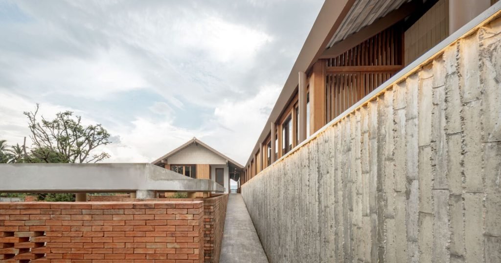
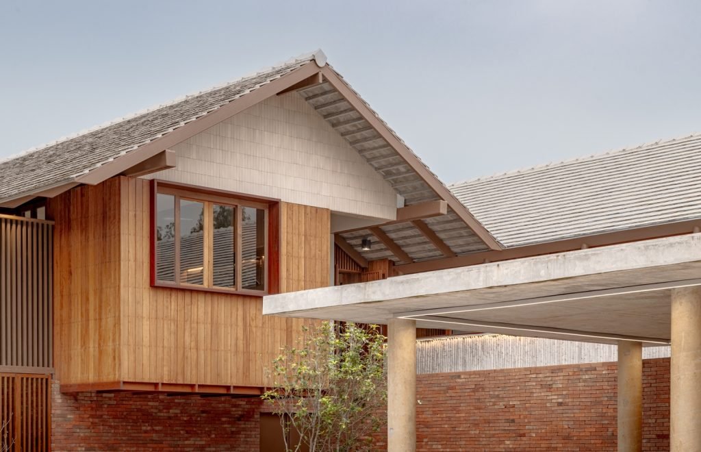
Along the perimeter the architects reinterpreted the fa lai, the traditional sliding wooden panels of Lanna architecture, as contemporary facade elements in the form of timber screens and louvred panels that provide visual filtering and an additional layer of privacy. They give the elevations a rhythm and depth that shifts through the day as the light angle changes, the house reading differently at dawn than it does at dusk. The architectural lines of the building are articulated through brick and cast-in-place concrete walls, the concrete cast using bamboo as formwork to leave a striated vertical texture across the surface. Brick wall planes and earthen mounds form another defining characteristic of the house, drawing the surrounding greenery physically closer to the living spaces while visually anchoring the building to the earth beneath it. These same elements mediate the perceived height of the elevated structure, establish the boundaries of an internal courtyard, and organize the landscape around the house into a coherent whole. Together with the bamboo-textured concrete walls, they unify the architectural components without any single element dominating the others.

Inside, the pitched ceilings follow the roofline through each room, the master bedroom sitting under exposed timber beams with pale ceramic tile walls, hardwood floors, and a full-height glazed opening to the south that pulls in garden light and a view of the trees. The study is positioned with a direct sightline to the Mekong, floor-to-ceiling timber-framed glazing holding the river and the mountain range in frame across the desk in a view that changes with the season and the water level. The living spaces open onto the river-facing terrace through sliding glazed panels, and it is on that terrace, under the generous overhang of the roof with the Mekong below and the mountains of Myanmar across the water, that the accumulated intelligence of every decision made in this project becomes most apparent.

Completed in 2025 across a built-up area of just under 7,000 square feet, Baan SudSaenSuk is architecture that grows from where it stands, shaped by a river, a kingdom, and a way of building that understood this landscape long before contemporary practice arrived to interpret it.


Fact File

Project Name: Baan SudSaenSuk

Location: Chiang Saen District, Chiang Rai Province, Thailand

Architect: BodinChapa Architects

Principal Architects: Phitchapa Lothong, Bodin Mueanglue

Project Type: Private Residence

Built-up Area: 6,996 sq ft

Year of Completion: 2025

General Contractor: Blackboard Construction

Manufacturers: L-Thai, Watsadu Niyom

Photography: Witsawarut Kekina

Firm Website: bodinchapa.com

Firm Instagram: @bodinchapa_architects

May 28, 2026 0 comments
0 FacebookTwitterPinterestEmail
Residential

Rumah Tahu, Sumedang, West Java- Indonesia by suatudio

by DDI Edit Team May 28, 2026
written by DDI Edit Team

Sumedang sits in the highlands of West Java, a town set among hills that turn a deep green in the wet season and haze blue at the horizon on clear days. It is not a city that gets much attention from the architectural press, which makes what Suatudio has built here quietly significant. Rumah Tahu, a residential project completed in 2025, houses a single family in two generations. The architect and his wife are the residents of the South Dwelling, while his parents occupy the North Dwelling. The practice designed Rumah Tahu as a single architectural entity comprising two interconnected dwellings, prioritizing family relationships over programmatic convenience.

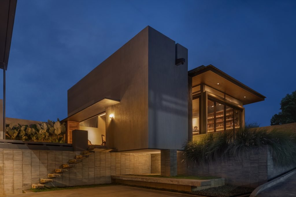
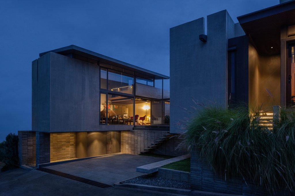
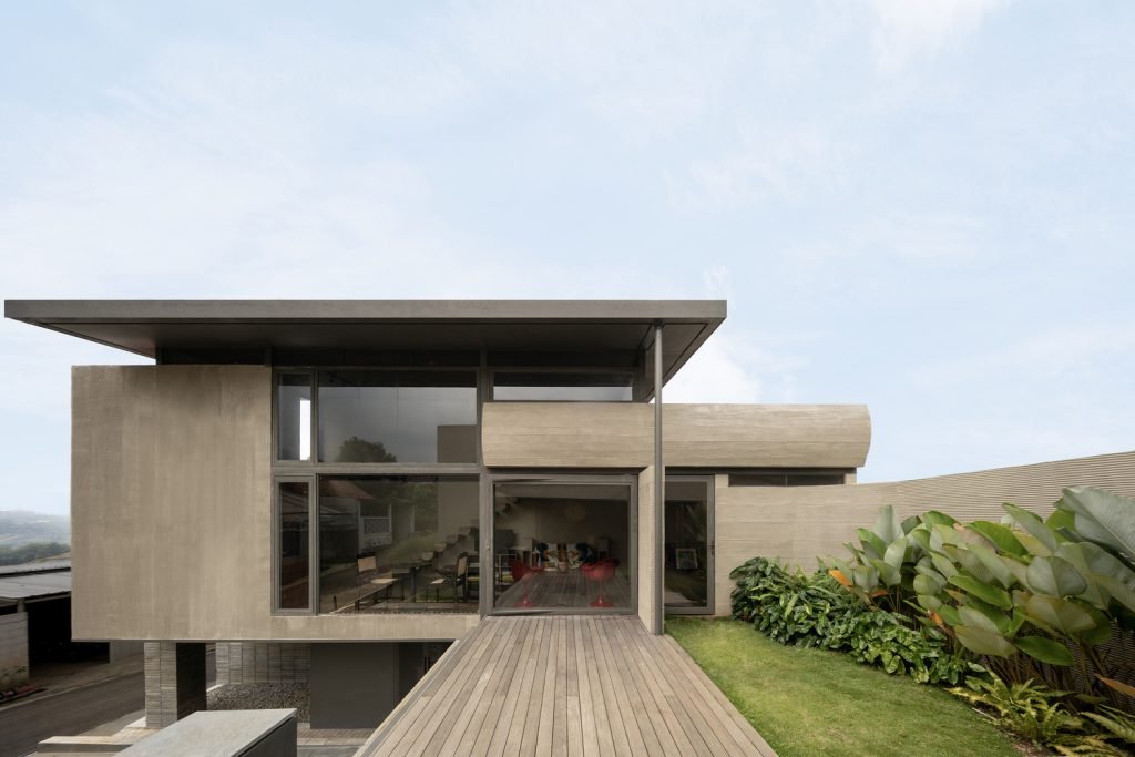
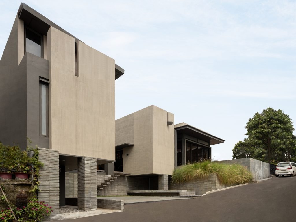
From the street, the two buildings read as a pair of board-formed concrete volumes sitting on a sloped site, connected by wide stone and concrete steps that climb the ground between them. The concrete is not the smooth, poured grey of institutional modernism but something more considered, a fine ribbed texture running consistently across every surface, almost like corduroy, shifting in tone between warm sand and cool grey depending on the light and the time of day. Below each volume, slim horizontal courses of dark charcoal brick form the plinths where the buildings meet the sloping terrain, a different texture and a different scale from the concrete above, grounding the structures without making them feel heavy. Wide cantilevered roof overhangs on dark steel frames extend over the glazed facades, cutting the tropical sun and giving both buildings a horizontal emphasis that keeps them from feeling monolithic despite the solidity of the concrete walls. Dense sweeping clumps of ornamental fountain grass are planted around the base of the North Dwelling in particular; their movement in the wind softens what would otherwise be a very hard edge between building and ground.

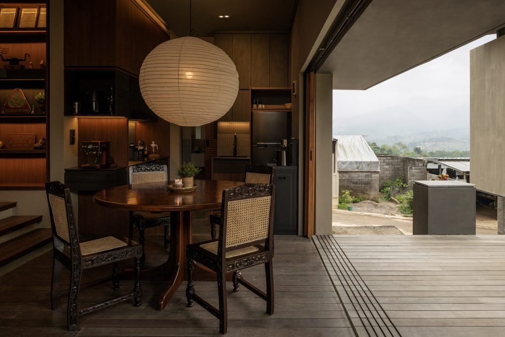
At night the project reveals a different character entirely. The concrete recedes into the darkness, the ribbed surface catching only the ambient light from the street, and what you see instead are the interiors glowing through the full-height glazing. The South Dwelling dining room and living space are warm with table lamps and the soft burn of timber joinery. The North Dwelling shows a large paper globe pendant hanging low over a round dining table, a Noguchi-scale presence that gives the room its identity from thirty meters away. The two buildings on the hillside at dusk, their interiors lit and the mountains of West Java visible as dark shapes behind them, look like exactly what they are—two households that have chosen to remain close to each other.

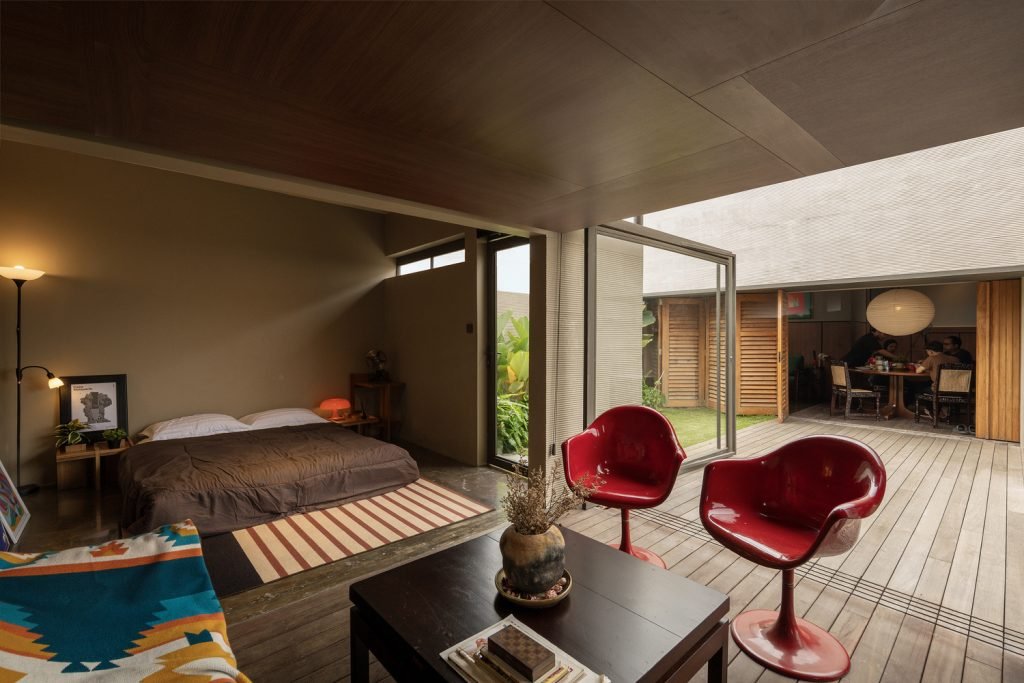
The project takes the standard Indonesian type-36 housing plot of 72 square meters as its starting point and refutes the assumption that limited floor area must produce limited spatial quality. Suatudio retained half of each 72 square meter plot as open space, a decision that immediately changes what the house feels like to be inside. The garden is placed not at the front of the building, as the typology conventionally dictates, but along its side, creating a long continuous outdoor room that runs the full length of the dwelling and connects directly to the interior through large panels that open completely. The ulin wood deck, made from Bornean ironwood, one of the hardest and most durable timbers in the region, spans between the two dwellings and between the interiors and the garden. It is wide enough to be furniture, to hold chairs and a table and a conversation, and warm enough in tone against the grey concrete to pull the eye toward it from every angle. When the glazed panels of both dwellings are opened simultaneously toward the deck and garden, the interiors, deck, and garden merge into a single continuous space, and the distinction between inside and outside becomes a matter of where you choose to sit rather than where the architecture says you should be.

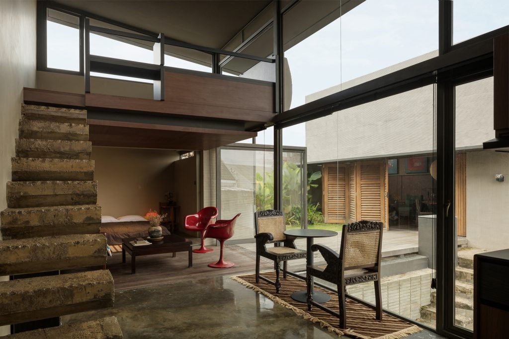
The South Dwelling is organized around spatial openness and cross-ventilation. Permanent partitions are kept to a minimum in the central area, which stays fluid and flexible for daily use. The bathroom is positioned at the eastern end of the plan, where it acts as a thermal buffer against the morning heat from that direction. The bedroom sits at the western end for greater privacy. The double-height living space is the most dramatic room in the house, and it earns that description through volume and character rather than size. A staircase built from rough-cut stone climbs one wall to a mezzanine level above, the texture of the stone deliberate against the smooth concrete and dark timber of everything around it. Below, the living room holds an eclectic mix of furniture that speaks clearly to the architect who lives here—vintage carved Indonesian chairs with rattan backs sit alongside red tulip-style seats from a different era entirely, a dark timber coffee table, a striped rug, books, and objects arranged with the casual confidence of someone who knows exactly what they like. The full-height glazed wall opens entirely onto the ulin deck and through it to the garden, the bedroom visible through a sliding glass partition to one side with its own direct connection to the outdoor space, red chairs positioned at the threshold as if the deck were simply another room.

The North Dwelling, more enclosed and suited to an older generation, maintains a clear connection to the shared garden and South Dwelling via the deck. The studio organized it into two zones. The semi-private zone brings together the dining area, kitchen, sitting room, and bathroom in a continuous space that can be opened fully toward the side garden through large folding timber and glass panels. The dining room is anchored by the large paper globe pendant that reads so clearly from the outside at night, hanging low over a round solid timber table surrounded by carved wooden chairs with rattan seats—furniture that belongs to a household with a long history and a considered relationship with Indonesian craft. Behind the dining table, dark timber joinery lines the kitchen wall, shelved and organized and lit from within, a coffee machine given its own dedicated counter space in a detail that says something particular about the priorities of whoever lives here.

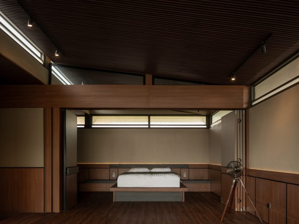
The sitting room in the North Dwelling is the room that stays with you longest. A wall of steel bracket shelving runs floor to ceiling, carrying what appears to be several hundred books in the full range of conditions that a well-used library acquires over decades—some upright, some stacked, some leaning, all read. Low seating is arranged in front of it, cushioned and without armrests, positioned for a long afternoon rather than a brief visit. A slatted timber ceiling runs overhead; clerestory windows set high in the wall bring in a band of diffuse light that travels across the room through the day without ever becoming harsh. The private zone of the North Dwelling contains the main bedroom and a living room connected by a sliding wall that can be opened to form a single larger space when the family gathers across both dwellings. The bedroom itself is almost entirely dark timber, paneled walls, a slatted ceiling, and a platform bed sitting low to the floor, with clerestory strip windows running along the junction of wall and ceiling so that the room has light and air without any sense of exposure.

The material consistency across the two buildings holds everything together without making the project feel repetitive. Board-formed ribbed concrete, dark charcoal brick, warm ulin timber decking, dark steel framing, and timber joinery inside each material appear in both dwellings, and each carries through from exterior to interior in a way that makes the project read as a single piece of architecture regardless of which household you are in. The tropical planting, with banana plants with their broad leaves catching the light in the courtyard between the buildings and the ornamental grasses moving in the wind at the perimeter, keeps the project rooted in its West Java hillside setting.

Rumah Tahu covers a combined area of just over 1,400 square feet across both dwellings. It is a project that takes the most ordinary housing constraint in Indonesia and uses it to ask a more interesting question than the constraint usually produces: not how do you fit a family into 72 square meters, but how do you design a home around the specific shape of a family relationship?


Fact File

Project Name: Rumah Tahu

Location: Sumedang, Jawa Barat, Indonesia

Architect: Suatudio

Principal Architects: Gagas Firas Silmi, Arif Rachman Hidayat, Adhietya Orlandho Putra Sunarmo

Lead: Gagas Firas Silmi Design

Team: Rahsya Afwan

Structural Engineering: Alite

Project Type: Private Residential

Project Size: 1,410 sq ft

Year of Completion: 2025

Photography: Tristan Salim

Website: suatudio.com

Instagram: @suatudio


May 28, 2026 0 comments
0 FacebookTwitterPinterestEmail
Residential

Edmonds Overlook — Edmonds, Washington, United States

by DDI Edit Team May 26, 2026
written by DDI Edit Team

CAST Architecture Builds a Family Home Around a Meadow on a Wooded Bluff Above Puget Sound


Fact File

Architecture: CAST Architecture

Type: Residential, Private House

Year: 2025

Photography: Peter Bohler


On a wooded bluff just north of Seattle, within the city limits of Edmonds, there is a clearing in the trees that opens to one of the more extraordinary views available from private land in the Pacific Northwest: Puget Sound in the foreground, the Olympic Mountains beyond it, the water and the peaks visible across a sweep of landscape that the surrounding Douglas fir and cedar frame rather than obstruct. When CAST Architecture first visited the site, they found a secluded forest glade with these vistas perched atop a high seaside bluff, and the design challenge they faced was not how to take advantage of the view but how to take advantage of it without taking it apart—how to build a family home on the site while keeping the clearing that made the site worth building on at all.

The answer is a plan organized around an absence. The house is composed of two wings that cradle the meadow between them, holding it as the project’s most important room rather than filling it with structure. The wings are kept close to the perimeter of the site, leaving the center unbuilt and the clearing intact so that the meadow reads from within the house not as the space between buildings but as the primary space around which the buildings have been arranged. It is a planning decision that requires considerable restraint and produces, in the completed building, a quality of relationship between the architecture and the landscape that a more conventional siting could not have achieved, the house belonging to the clearing rather than the clearing belonging to the house.

The approach to the building is deliberately withheld. Rather than revealing the house on arrival, the design sequences the experience so that the clearing and the view are discovered progressively rather than announced immediately. A covered bridge with a green roof connects the upslope garage and office to the main house, doubling as a front porch and marking the threshold between the arrival sequence and the domestic interior without making that threshold feel abrupt. Between the two structures, a gentle stair pulls visitors down through the gap and toward the meadow, establishing the balance between shelter and exposure, compression and release, that the project sustains throughout its interior organization. The site required considerable technical resolution before the architecture could begin: located on a steep slope in a landslide-prone area, the project demanded a twenty-month land-use and building permit process led by an expert team of engineers addressing vehicle access, fire access, stormwater management, erosion mitigation, and potential earth movement. The clearing and the view are there because someone spent twenty months ensuring they could be responsibly built upon.

Inside, the floor plan is efficiently organized and closely tuned to the routines of a family’s daily life, each room sized to its purpose without the excess that a view site can encourage when the temptation to make every space a viewing platform overrides the need to make every space functional. The house opens fully to the Sound and the mountains, but it also maintains a close relationship to the trees and planted ground around it, the two conditions in productive tension rather than resolved in favour of either. The most striking moment in the plan is an open-corner dining area defined by double-height windows at a corner left deliberately free of structure, so that the room reads less as an enclosed box than as an extension toward the landscape, the corner dissolving into the view in a way that connects the act of sitting at a table to the act of looking across water at mountains. An outdoor extension of the great room offers a more intimate and sheltered threshold between the interior and exterior than the main deck or meadow, creating a domestic middle ground.

Smaller gestures keep the experience of the house from becoming only about the panorama. A window seat along the stair offers narrower, more specific views through the trees, the kind of framed glimpse that a large unbroken window cannot provide and that gives a house the quality of having multiple relationships to its landscape rather than one sustained confrontation with it. The second-floor primary suite sits in the canopy, its elevated position giving it a character that the practice describes as having treehouse vibes, an image that fits the project’s consistent closeness to the site’s mature trees, which are as much a part of the design as the views they frame and the clearing they surround.

The material palette inside is warm without being heavy. Clear-finished fir runs across much of the interior, giving the light-filled rooms a warm cast during the grey Pacific Northwest winters when natural light is limited and the quality of the interior surfaces plays a larger role in creating the atmosphere. In the kitchen, white oak cabinets bring a lighter tone alongside the fir, and the combination of the two species within the interior reflects the same material logic that governs the exterior, where the house is clad in materials chosen for their relationship to the wooded setting rather than their contrast with it. The house is compact compared to similar homes in the area. This decision reduces both the carbon impact of construction and the ongoing energy consumption during occupancy. The project’s environmental ethic extends from preserving the clearing to the sizing of the conditioned space within it.

What CAST Architecture has built on this wooded bluff above Puget Sound is a house organized around the discipline of not building where it was not necessary to build, and the result of that discipline is a site that retains the quality that made it worth designing for in the first place. The meadow is still there. The trees still frame the water and the mountains. The house sits at the perimeter of the clearing, looking inward at what it preserved and outward at what the land already had. The experience of being inside it is that of a building that understood its own limits clearly enough to stay within them.


castarchitecture.com

May 26, 2026 0 comments
0 FacebookTwitterPinterestEmail
Commercial

Fuzhou ESUO Future Kindergarten by Dika Architectural Design Center: Where the Building Itself Becomes the Curriculum

by DDI Edit Team May 26, 2026
written by DDI Edit Team

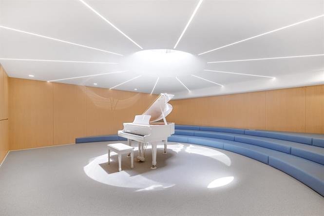
Dika Architectural Design Center has completed the Fuzhou ESUO Future Kindergarten at No. 12 Shangxiadian Road, Jianxin Town, Cangshan District, Fuzhou, for client Fujian Shenghe Education Management Group, covering a land area of 4,408 square meters and a total construction area of 9,613 square meters, and the building that has come out of that brief is unlike anything else currently standing in the city’s educational landscape.

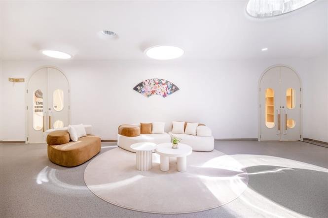
From the basketball court that faces the main facade, the building reads immediately as a departure from every convention that typically governs kindergarten architecture in China. The structure is entirely white, its surface punctuated by circular porthole windows of varying sizes, irregular openings, and a geometry that refuses to resolve into a recognizable orthogonal form, sitting instead somewhere between a vessel, a lunar base, and a purpose-built world that belongs entirely to the children inside it. To the right of the main block, a freestanding sculptural white volume rises in an organic, almost biomorphic mass, its curved surfaces and tubular connectors reinforcing the interstellar narrative from the outside in a way that no signage or cartoon imagery could. The ground plane in front of the building is surfaced in a deep red rubber running track with white markings and blue paving and basketball courts, with color used as a spatial signal rather than decoration, making the campus readable and navigable to a child without a single word of instruction.

Architecture as the Third Teacher

The design team’s core position, which governs every decision made across the project from the roof down to the door handles, is that a kindergarten’s architecture should function as what Dika calls the third teacher, not a container for education but an active participant in it. This meant rejecting the conventional design logic that places the building as background and furniture or toys as the primary experience and instead embedding the theme of exploring the universe into both the building’s forms and its spatial functions from the very first line drawn in the design process. The team deliberately abandoned the concrete cartoon symbols that appear in most traditional kindergartens, choosing instead to work entirely through abstract architectural forms, fluid spatial logic, and the construction of layered scenes that allow the interstellar narrative to build gradually as a child moves through the campus, without ever resorting to illustration or literal representation.

Genuine child-friendliness, as Dika defines it, operates on three principles: respecting children’s natural curiosity without indulgence, encouraging imagination without flamboyance, and ensuring safety without restriction. These three ideas are not in conflict here but are expressed simultaneously, which is architecturally the harder thing to achieve and the more convincing thing to look at. Circulation routes, flexible spaces, and the integration of classrooms with activity zones are all arranged so that children move intuitively and self-direct their exploration rather than being guided through a predetermined sequence of single-purpose rooms, and the result is a building where spatial exploration itself becomes a growth game that requires no adult to initiate.

The Exterior and the Outdoor Interstellar Base

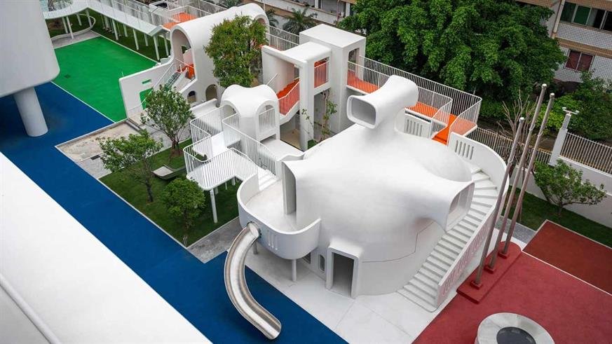
Viewed from above, the campus reveals the full ambition of the three-dimensional activity system that Dika has constructed across the site. The outdoor core zone takes a cluster of cosmic settlement pods as its design prototype, with staggered curved white volumes, interconnected three-dimensional circulation routes, a central domed structure that functions as the outdoor adventure complex’s focal point, its surface smooth and unbroken except for small porthole openings at the base, a curved stainless steel slide that sweeps from its upper level to the ground, and a staircase that climbs to its roof terrace. This structure sits within a landscape of blue, red, and green ground surfaces, connected by raised walkways and overlooked by orange-accented arched structures that frame views across the campus and provide shaded, semi-enclosed spaces for smaller-group activity between the main outdoor zones.

The blue staircase that rises from the outdoor ground plane is one of the campus’s most direct spatial gestures, a single bold element in cobalt blue that cuts across the predominantly white and red palette of the exterior and gives the outdoor circulation a landmark that children can orient themselves around from anywhere on the site. Tube slides run from the upper levels of the play structures to the ground, and the entire system of ramps, stairs, elevated walkways, and slides means that movement between different levels of the campus is never purely functional but always part of the adventure sequence the design has constructed.

The Corridors as Interstellar Plank Roads

The corridors that connect the building’s internal spaces and wrap around its outdoor edges are one of the most distinctive spatial decisions in the project. Dika has designed them not as passage nodes but as what the team calls “interstellar plank roads,” a narrative thread that connects the exploration routes across the entire campus and gives children a reason to slow down, look around, and engage with the space rather than simply move through it. The yellow-orange corridor visible along the building’s perimeter is the clearest expression of this: a sequence of arched openings in deep amber yellow, each one framing a different view of the campus beyond, with orange rubber flooring underfoot and blue rubber visible through the arches at a lower level, the colors shifting as a child moves through and creating a sensory sequence that changes with every step. Light falls through the arches in long diagonal stripes across the floor, and the curved surfaces on either side of each opening soften what would otherwise be a hard transition between inside and outside.

These corridors are designed as all-weather adventure paths shielded from wind and rain, which makes them usable throughout Fuzhou’s rainy season and ensures that the outdoor exploration experience is not interrupted by weather in the way that a conventional kindergarten’s play areas would be. As children move through them, they can pause at the arched openings, chase light and shadow, or engage with the small interactive moments built into the corners and recesses beneath the arches so that the passage itself becomes part of the daily exploration rather than time spent waiting to arrive somewhere else.

The Planet Room and the Astronaut Installations

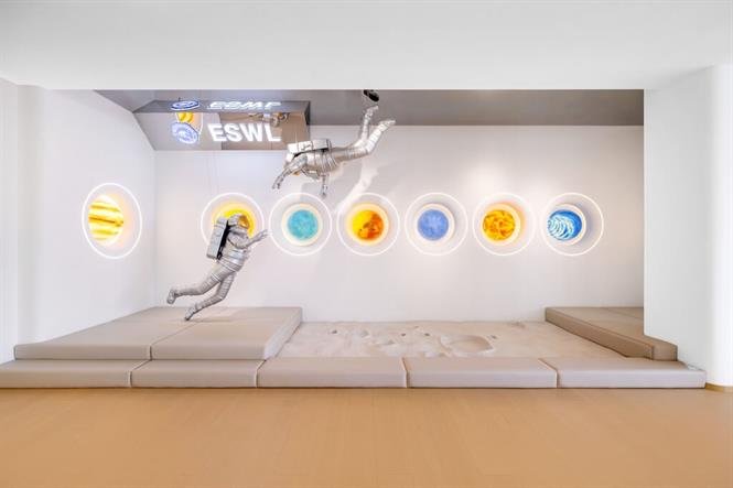
Inside the building, the interstellar theme finds its most direct spatial expression in the room designed around floating astronaut sculptures and illuminated planet installations. Two life-sized silver astronaut figures are suspended in the space, one reaching toward the wall and one tumbling in mid-air above a cushioned platform, and behind them a row of circular wall-mounted displays shows the planets of the solar system in illuminated color, each one glowing with its own color and texture against the white wall. The platform below is covered in soft grey cushioning with a small sculptural surface texture, and the overall effect of the room is that of a pressurized cabin interior, quiet and contained, with the cosmos visible through its circular windows. This is the room where the building’s conceptual anchor is most visible: the idea that a child who spends time in a space like this is not being told about space but is being placed inside it and that the learning that follows is spatial and physical before it is verbal or instructional.

The Activity Room with Climbing Wall

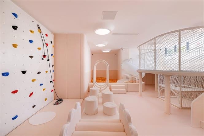
One of the building’s fully equipped indoor activity rooms combines a climbing wall, a ball pit, a tube slide, and a mesh-enclosed elevated play platform within a single continuous space finished in a warm blush pink that runs across floor, walls, and ceiling without interruption. The climbing wall occupies the full height of the left wall and is fitted with colored holds in red, blue, and yellow against a white surface, providing a range of grip sizes and positions that accommodate children at different stages of physical development. The ball pit sits beyond it, filled with orange balls and accessed via a low arch opening, with a tube slide dropping into it from the level above. The mesh-enclosed platform on the right side of the room sits at an elevated level connected to the slide and to the main floor below, and the circular ceiling lights are recessed into the pink surface so that the room reads as a single enveloping spatial experience rather than a white box with equipment added to it. Every surface that a child might come into contact with is rounded, padded, or smoothed, and the color palette of the room keeps the energy high without introducing the visual noise that primary-colored equipment in a white institutional space typically produces.

The Classroom with Arched Shelving

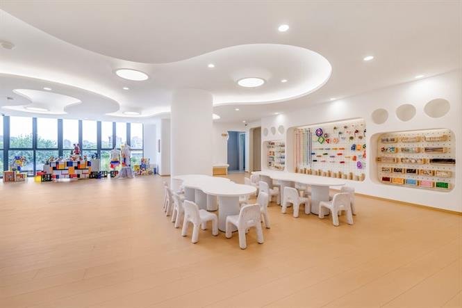
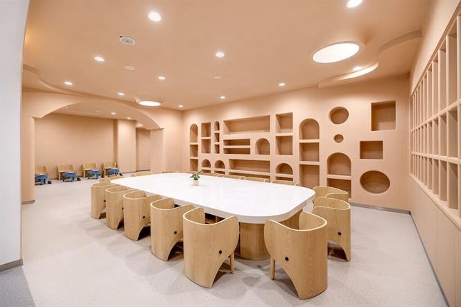
The dining and gathering classroom shows a different register of the same design intelligence, with warm peach walls, a terrazzo floor, and a wall-mounted shelving system of considerable spatial ambition: arched niches, circular openings, and rectangular recesses of varying sizes are arranged across the full width of the wall in a composition that reads as an architectural elevation rather than a storage solution, each opening a different size and shape, and each one contributing to a surface that gives the room depth and character without requiring anything to be placed in it. Curved wooden chairs scaled to children sit around a single large white table with rounded corners, and the ceiling carries circular recessed lights that echo the circular motifs in the shelving wall. The adjacent smaller classroom visible through an archway continues the peach palette with smaller-scaled seating, and the transition between the two spaces is handled through the same arched threshold language that runs throughout the building.

The Restroom

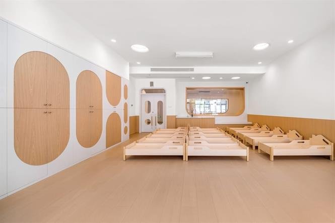
The nap room takes a quieter approach to the same material palette, with white walls and warm wooden flooring providing a calmer, lower-stimulation environment appropriate to the room’s function. A full-height storage wall in white with large oval timber inserts serves as the room’s defining feature, the warm wood tones introducing softness and natural material quality into what is otherwise a light, restrained space. Small wooden cots are arranged in rows across the floor, and the circular ceiling lights and arched door openings maintain the building’s geometric language without imposing it in a way that would compete with the room’s need for quietness. The windows in the nap room carry the same rounded timber framing as the storage wall, and a low viewing window set into the wall allows supervision without the full visual exposure of a glass door.

The B&B Italia UP Series

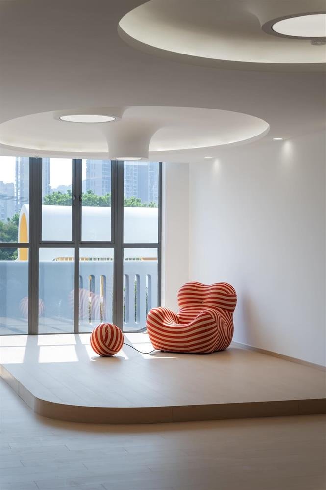
The furniture selection includes the UP Series by B&B Italia, the frameless, fully enveloping chair and ottoman first presented by designer Gaetano Pesce at the Milan Furniture Fair in 1969, specified here in a bold red and white stripe that makes each piece immediately identifiable as an object of visual and tactile interest in a space that is already rich with both. The chairs appear in the building’s more open, contemplative spaces, placed on raised timber platforms or near large windows where a child can sit and look out across the yellow corridors and the campus beyond, and the contrast between the chair’s exuberant graphic quality and the white calm of the rooms it occupies is precisely calibrated. The choice of this specific piece, with its long design history and its quality of unconditional physical enclosure, communicates something about the emotional register the project is aiming for: a space that holds children rather than only activating them.

Construction Challenges

The irregular geometry of the building presented significant technical challenges throughout construction that were resolved through close collaboration between the design and construction teams at every stage of the build. The arched outdoor spaces feature an asymmetric arch and curved ramp design that place extremely high demands on on-site casting techniques, requiring precise execution, careful surface polishing, and continuous coordination between disciplines that in a more conventional project would work more independently. Fuzhou’s rainy climate added further complexity to a process that required dry working conditions, increasing time pressure across the entire construction program. Every arch edge required rounding, and every concrete base layer had to be polished to form smooth arcs before any finish was applied, ensuring that the safety standards mandatory for a kindergarten were met without reducing the visual integrity of forms that depend on their smoothness and continuity to read correctly. The gap between the building as drawn and the building as constructed is, by any measure, small, which is a more significant achievement in a project of this geometric complexity than it would first appear.

Project Overview

Fuzhou ESUO Future Kindergarten is located at No. 12 Shangxiadian Road, Jianxin Town, Cangshan District, Fuzhou, China. Land area: 4,408 square meters. Construction area: 9,646 square meters. Client: Fujian Shenghe Education Management Group Co., Ltd. Design: Dika Architectural Design Center.

For more information visit www.dika001.com

May 26, 2026 0 comments
0 FacebookTwitterPinterestEmail
Residential

RDTH architekti’s No-Wall Apartment in Prague Rebuilds a 101 Square Metre Floor Plan Around a Single Central Furniture Block and Almost No Walls

by DDI Edit Team May 26, 2026
written by DDI Edit Team

When Prague-based RDTH architekti, led by principal architects René Dlesk and Tamara Kolaříková with design team members Kristián Vnučko and Kristýna Kopecká, took on the reconstruction of this 101 square meter apartment with an 8 square meter loggia, the starting point was a question that most apartment renovations never ask: what if nearly every wall came out?

The answer, completed in 2026 from a 2022 design, is a 96 square meter usable floor plan that does not divide itself into rooms in any conventional sense and that holds within its continuous space the functions of what might otherwise be a four-bedroom apartment, a sleeping area, two kitchen configurations, a bathroom, a toilet, a home office, and a dining zone, all of it organized not by partition walls or doors but by a single compact furniture block placed and slightly rotated at the center of the layout so that each functional zone falls naturally into place around it. The apartment, photographed by Filip Beránek, balances the logic of a studio with the spatial hierarchy of a multi-room flat, and the photographs make clear that this balance is not theoretical but genuinely lived.

The Case for Removing the Walls

The starting observation behind the No-Wall Apartment is a specific and defensible one: apartments organized around a central corridor, with individual rooms connecting to it like grapes on a stem, impose fixed boundaries on light, ventilation, movement, and use that do not suit every resident and do not adapt to changing needs over time. The enclosed room, however well proportioned, has a clearly defined beginning and end, and that clarity can feel liberating or limiting depending entirely on who is living in it and what they need from the space on a given day.

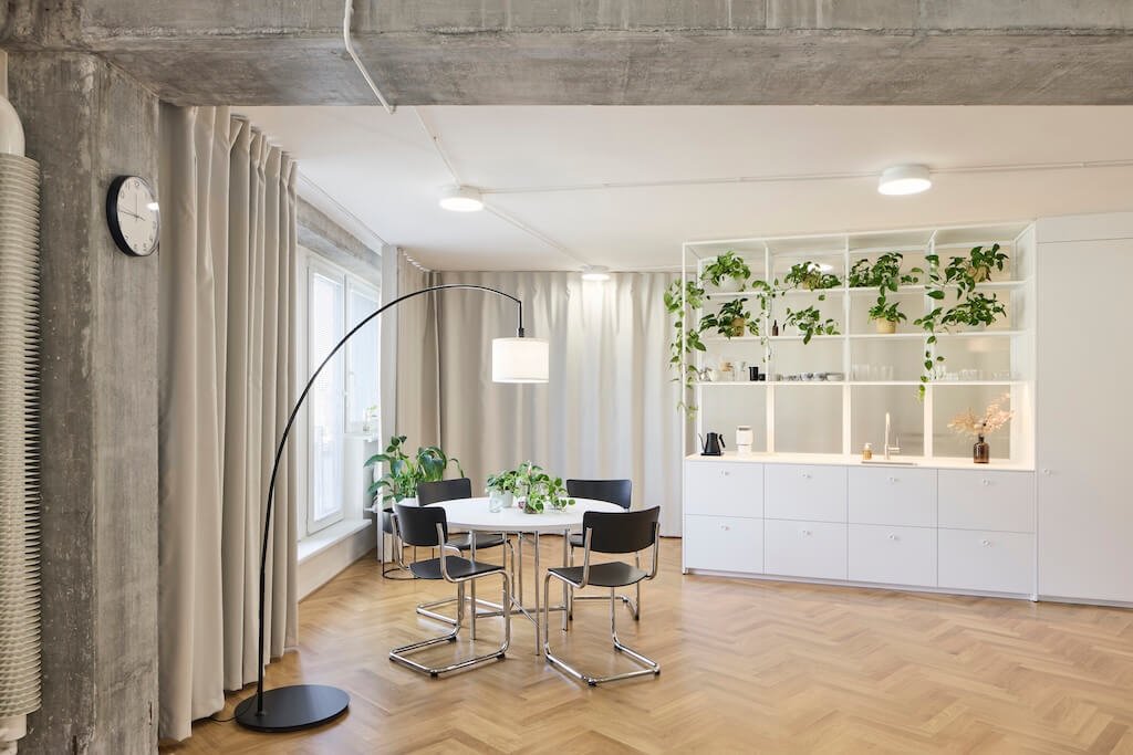
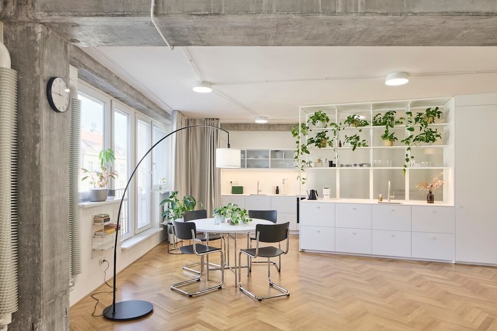
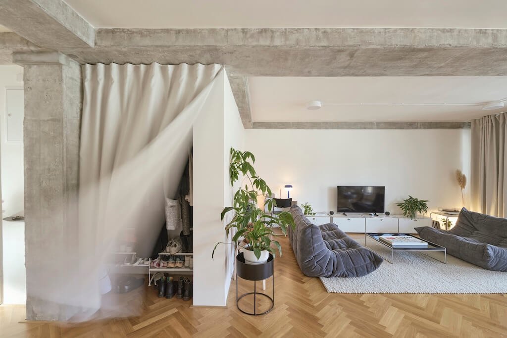
With the exception of the installation shaft and the skylight, RDTH Architekti removed all fixed partitions from the interior and then restructured what remained using three primary building elements: built-in furniture, glass concrete blocks, and curtains. Everything beyond these three elements, the freestanding furniture, the plants, and the personal items and accessories, is insertable and removable, meaning the apartment retains the ability to change as its residents’ lives change, without structural intervention. The toilet is the only space in the apartment with a conventional door. Every other transition between zones is handled by the central furniture block, by the glass block walls of the sanitary areas, or by full-length curtains that can be drawn or opened in an instant.

The Central Furniture Block

The furniture block that sits at the heart of the layout is the project’s most considered spatial decision, and in the photographs it reads as exactly what it is: a compact white volume slightly rotated off the apartment’s primary axis so that its faces create four distinct zones without any of them being enclosed. On one side the bedroom opens toward it, with a white bed frame and sage green linen sitting against the large glass concrete block wall that separates the sleeping area from the bathroom beyond it. On the other side, the living area unfolds, with the herringbone oak parquet running continuously across the full floor and the exposed concrete columns and beams of the building’s skeleton rising at intervals through the space. The block itself contains storage and service functions, and because it does not touch the ceiling, the space reads as a single room no matter which part of it you are standing in.

Two Kitchens

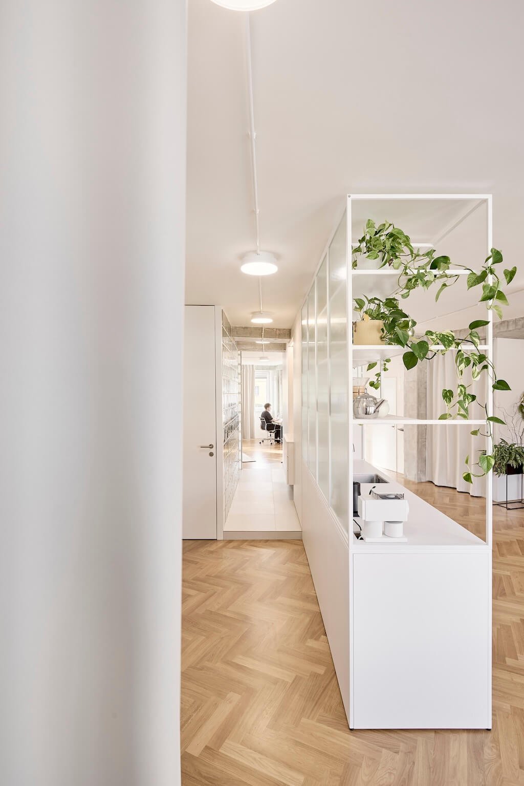
The apartment contains two distinct kitchen configurations, a decision that reflects both a practical reality and an honest acknowledgment of how urban domestic life in a well-served city actually works. The first kitchen sits directly in the living area and functions as what the architects describe as a home café: it is not intended for cooking and takes the form of an open shelving unit with ribbed glass panel doors, white cabinetry below, and a worktop surface, the kind of setup suited to coffee, breakfast, and the casual use that bookends a day spent largely outside the apartment. This unit, visible from the dining table where a round white table sits with cantilever chrome chairs beneath an arc floor lamp, works as both a display surface and a spatial divider between the dining zone and the living area beyond.

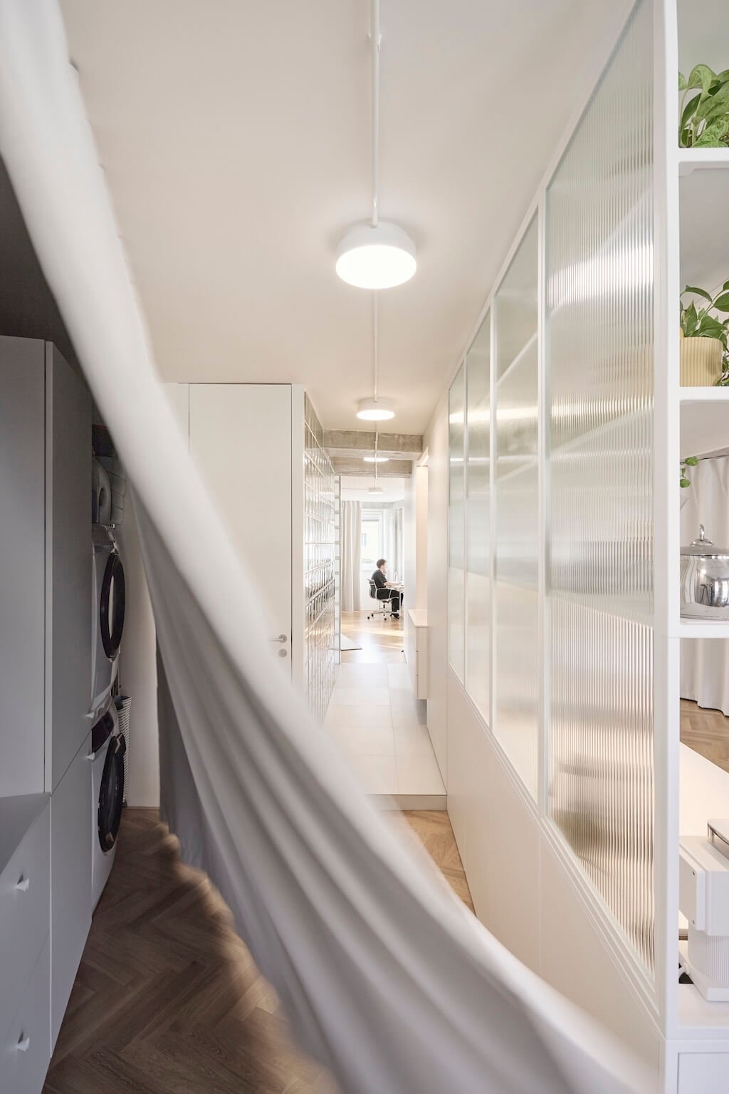
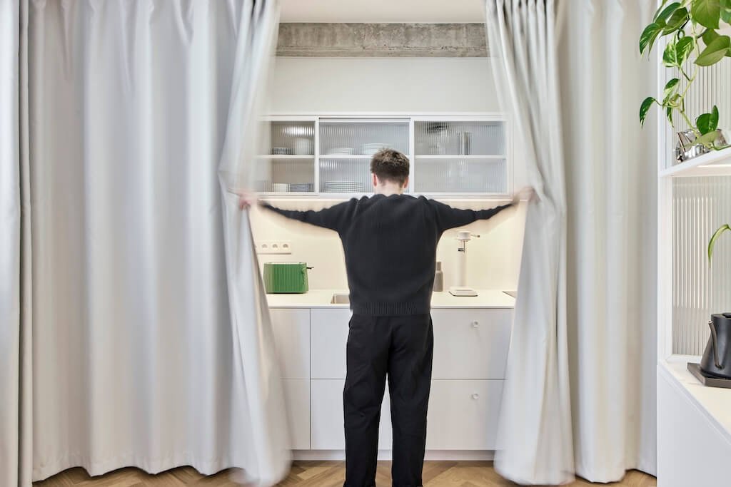
The second kitchen, fully equipped with all appliances and connected to a freestanding stacked washer and dryer, occupies the rear of the layout and is separated from the rest of the apartment by a full-length curtain that runs on a ceiling track and can be opened or closed entirely within a few seconds, as the image of a figure pulling the curtain apart to reveal the white kitchen behind makes physically clear. When the curtain is closed, this half of the apartment disappears. When it is open, the kitchen, the laundry, the open shelving stacked with plants and kitchen equipment, and the corridor leading to the home office at the far end of the plan are all visible in a single diagonal view that shows the full depth of the floor plate.

The Sanitary Block and the Washbasin Decision

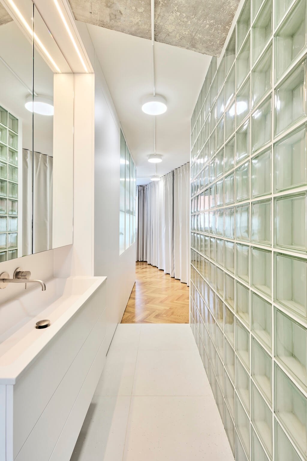
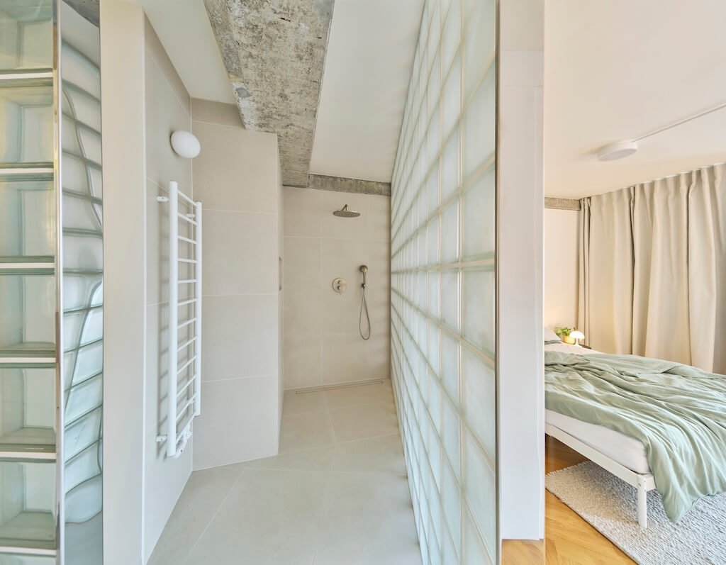
The sanitary facilities are organized behind the central furniture block, separated from the living and sleeping areas by walls built from glass concrete blocks, a material that transmits light while remaining opaque to vision, so that the bathroom and shower area contribute to the general luminosity of the apartment without sacrificing privacy. The glass block wall runs the full height of the partition and is wide enough to form the visual backdrop to the sleeping area on one side, its grid of pale green-tinted glass blocks reflecting light across the sage green bedding and the white floor of the shower zone on the other.

One of the more specific spatial decisions in the sanitary block is the deliberate placement of the washbasin outside the enclosed shower area, on a raised section of floor that contains the water and sewage distribution for both the basin and the sink, which runs along the length of one wall with a wall-mounted brushed steel tap and a linear LED-lit mirror above. By moving the washbasin outside the wet zone, the architects have given it a function that extends beyond hygiene: it becomes accessible from the corridor, from the bedroom, and from the wider living space, which in practice means it works as a utility surface as much as a bathroom fitting and does not require anyone to enter the shower room to use it. The toilet occupies its own smaller enclosed volume adjacent to the sanitary block, separated by an opaque but light-transmitting glass concrete wall and fitted with the apartment’s only conventional door.

Materials and Atmosphere

The exposed concrete skeleton of the building is the apartment’s primary material statement, and RDTH Architekti have returned it to its natural finish of raw concrete after what was presumably a previous renovation that had concealed or painted over it. The columns appear at regular intervals across the open plan, their texture and color sitting in deliberate contrast to the white plaster of the internal walls and the white built-in furniture throughout, and the concrete beams that run between them at ceiling height give the space a structural legibility that makes its openness feel earned rather than arbitrary. A clock sits directly on one of the concrete columns in the dining area, and the contrast between that domestic gesture and the industrial quality of the material it is fixed to is characteristic of the whole project’s relationship between the raw and the inhabitable.

The floor throughout the apartment is solid oak-wood parquet in a herringbone pattern, warm and consistent across every zone, with the transition to ceramic tiles marking the raised threshold of the bathroom and shower areas. The curtains, in a neutral linen-adjacent tone, appear at the windows and as spatial dividers, and in both roles they serve the same two functions the architects assign to them: instant light regulation and improvement of acoustic comfort. The open shelving units in white steel carry trailing pothos and other indoor plants across multiple rooms, introducing a consistent green note that runs through the apartment from the dining area through to the corridor and the kitchen.

Lighting

The lighting system across the entire apartment runs on a single circuit, with individual fittings controlled digitally either from the residents’ mobile phones or from a home tablet, and with digital rocker switches placed in the positions where conventional switches would normally be found. The fittings themselves are simple, predominantly circular flush-mounted ceiling lights in white, with the linear LED strip above the bathroom mirror as the only directional exception. The decision to run everything on one circuit with digital control rather than separating the apartment into lighting zones by room is consistent with the overall logic of the project: the apartment does not have rooms in the conventional sense, so it does not need room-by-room lighting zones.

The City as an Extension of the Home

One of the design decisions that shapes the apartment’s storage and program is explicitly tied to its urban location. Within a ten-minute walk there are grocery stores, restaurants, cafes, sports facilities, parks, cultural institutions, a large library, and a metro station with a direct connection to the international airport, and RDTH Architekti have treated this proximity as a reason to keep the apartment’s storage capacity for groceries minimal and its floor plan correspondingly open. An apartment that can rely on the city for most of what a conventionally equipped flat would need to provide internally can afford to use that freed-up area differently, and the No-Wall Apartment does exactly that, keeping the square meterage it has gained by removing both walls and storage requirements in open, uninterrupted floor space.

Openness as a Long-Term Decision

The architects are direct about the fact that the degree of openness in this apartment is a conscious and informed decision rather than a universal proposition and that future residents or future needs might require a different configuration. The layout is designed to accommodate those changes without structural work: elements of the built-in furniture can be replaced, additional dividing elements can be introduced, and the curtains, glass blocks, and central furniture block that currently define the spatial hierarchy can be supplemented or reconfigured as priorities shift. The apartment in its current form is a response to a specific client’s specific moment, and the honesty of that framing is part of what makes the project worth studying.

Project Details

Project name: No-Wall Apartment. Architecture firm: RDTH architekti. Location: Prague, Czech Republic. Photography: Filip Beránek. Principal architects: René Dlesk, Tamara Kolaříková. Design team: Kristián Vnučko, Kristýna Kopecká. Construction: David Koubek. Gross floor area: 101 m². Usable floor area: 96 m² apartment, 8 m² loggia. Design year: 2022. Completion year: 2026. Materials: Solid oak-wood parquet, ceramic tiles, glass concrete blocks. Client: Private.

May 26, 2026 0 comments
0 FacebookTwitterPinterestEmail
Residential

Salt Pan House, Goa We Design Studio

by DDI Edit Team May 26, 2026
written by DDI Edit Team

The ten-acre property in the village of Agarvado took a decade to acquire. Nestled between the Chapora River and a dense mangrove belt, the ten-acre property features three man-made salt pans that predate any architect’s arrival, making it a site that requires patience. When Saahil Parikh and Nupur Shah of We Design Studio first visited, it was monsoon season. The terrain was so waterlogged they could barely cross it, with mud climbing to their ankles before they had covered much ground. They came back anyway and kept coming back until what finally emerged from that marshy, specific, quietly extraordinary landscape was a house that looks as though it was always going to be exactly here.

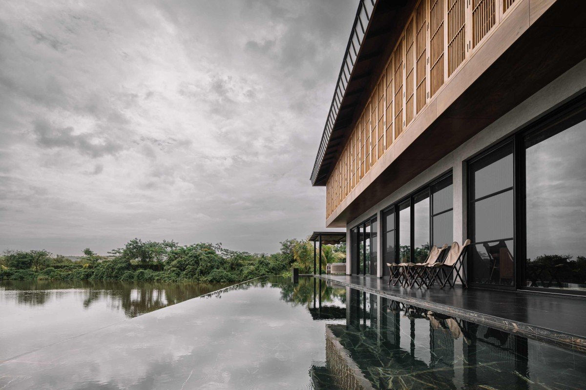
Coastal regulations in Goa limit how much you can build and where, which meant that 6,000 square feet had to carry five bedrooms, six bathrooms, a full program of living and dining and kitchen and bar, and a spa below the pool deck, without the excess that a less considered brief might have allowed. Parikh and Shah responded by placing the house at the southern edge of the largest salt pan so that the reflective body of water sits in constant, shifting view and by letting the logic of the site and the demands of the tropical climate set the terms for everything else. The result is a house of three distinct layers that reads from the outside, particularly from across the pool where the infinity edge dissolves into the saline water and the mangroves stretch beyond it, as a single unhurried object held carefully against the Goan sky.

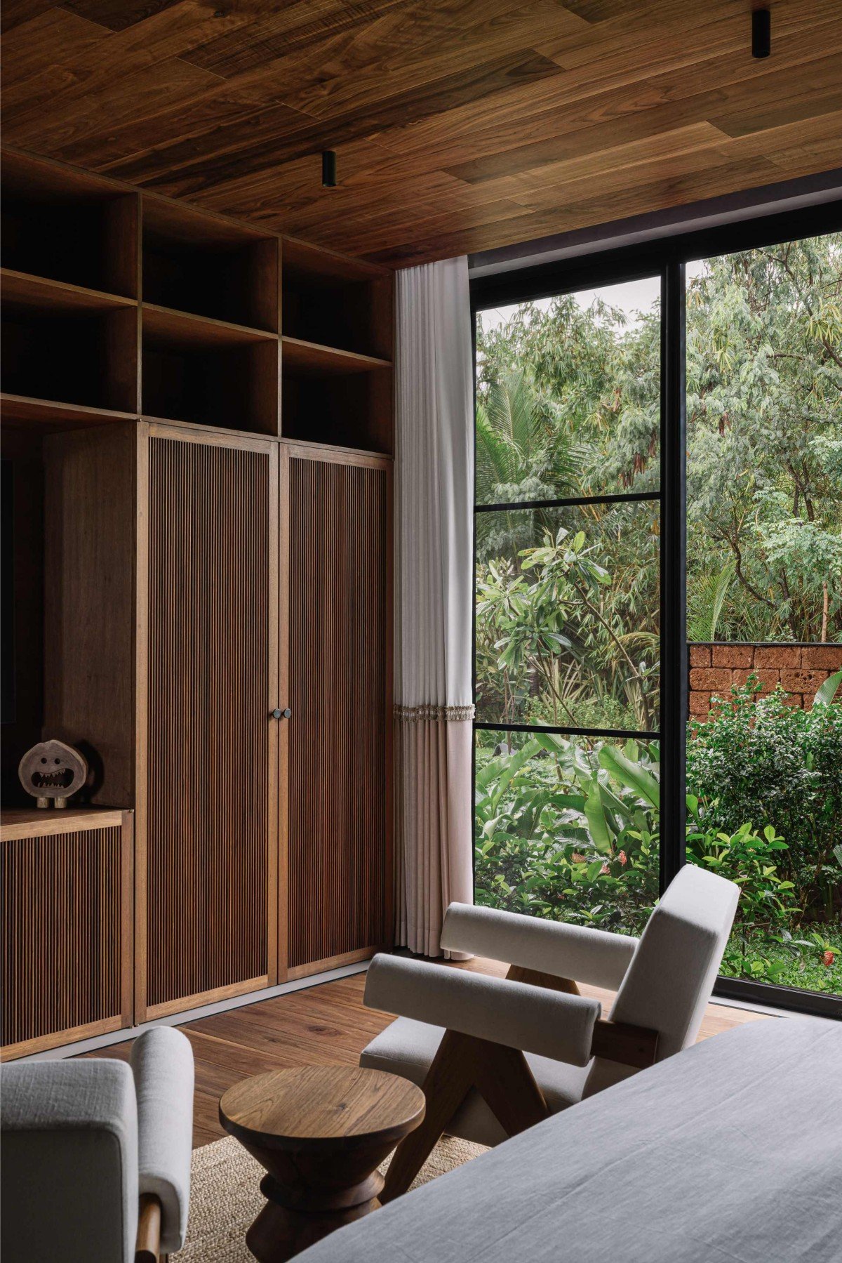
The ground floor is raw concrete, low and heavy, anchored to the earth. The living and dining rooms, the kitchen, a bar, and a guest bedroom that faces south toward a belt of dense foliage all occupy this level, opening through full-height glazing to the pool deck and the salt pan beyond. Above it, a cantilevered volume entirely wrapped in openable teak louvered screens holds four bedrooms and a family lounge, the warm grain of the teak sitting against the grey of the concrete below with the ease of materials that belong in the same landscape. A titanium-zinc alloy roof, dark and precisely pitched, sits over everything, its clean edge cutting against the grey monsoon sky in photographs that make the building look as though it has always been part of the horizon it interrupts. At night, the light filtering outward through the teak screens gives the upper floor a lantern quality, visible from across the water.

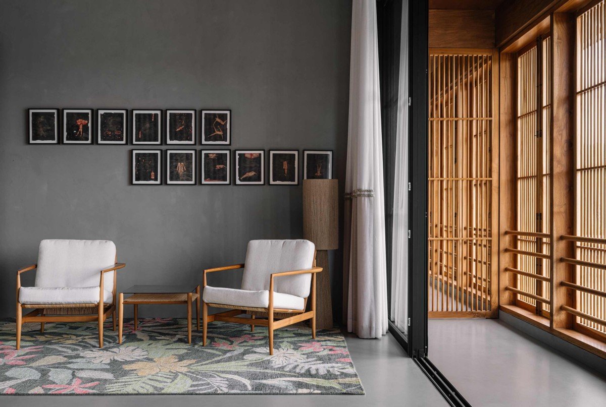
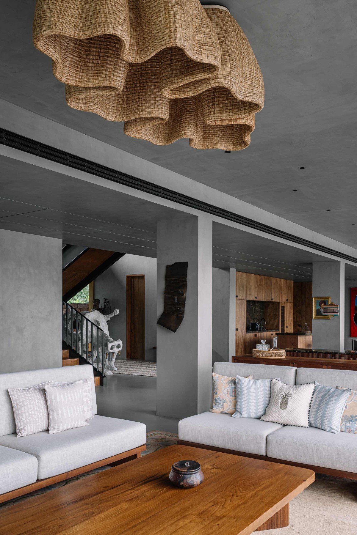
Arrival is from the land side, up black stone steps beneath a steel-framed entrance canopy flanked by laterite brick walls, the red of the laterite warm against the grey of the concrete and the dark of the steel. The entrance frames a view straight through the double-height interior to the salt pan on the other side so that the landscape the house sits within is present from the very first moment of entry. Inside, the ceiling rises to follow the pitch of the roof, with grey cement plaster walls running uninterrupted from the floor to the exposed timber beam. Two low grey linen sofas sit around a long solid wood coffee table on the polished concrete floor, a large woven rattan pendant overhead, its form organic and voluminous, more closely related to something found on a shoreline than to anything manufactured. Bamboo roller blinds on one side, the full width of the salt pan through the glazing on the other. On days when the light is flat and the water is still, the pool and the pan beyond read as a single continuous surface, the boundary between the built and the natural genuinely indistinct.

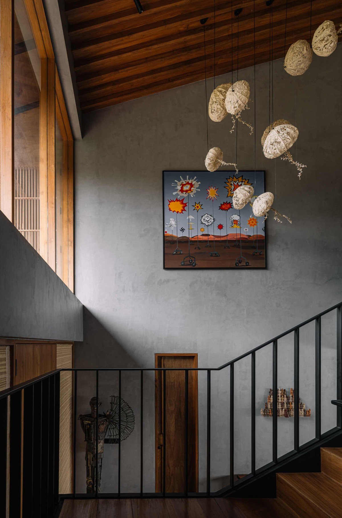
An ancient carved wooden panel leans against a column near the staircase. The art in this house is not decorative in any conventional sense. It accumulates through the rooms the way a personal collection does over decades, which is to say without a single governing logic, each piece present on its own terms. A dark abstract work is mounted on the wall of the living room. A circular painting anchors the dining area. Framed works in various registers punctuate the grey plaster at intervals across the ground floor. At the base of the black steel staircase, a large, imposing pale grey sculptural form takes up the floor with authority, dramatically altering the character of the space around it. It sits beneath the staircase the way a significant work always sits: as though the room was arranged around it rather than the other way.

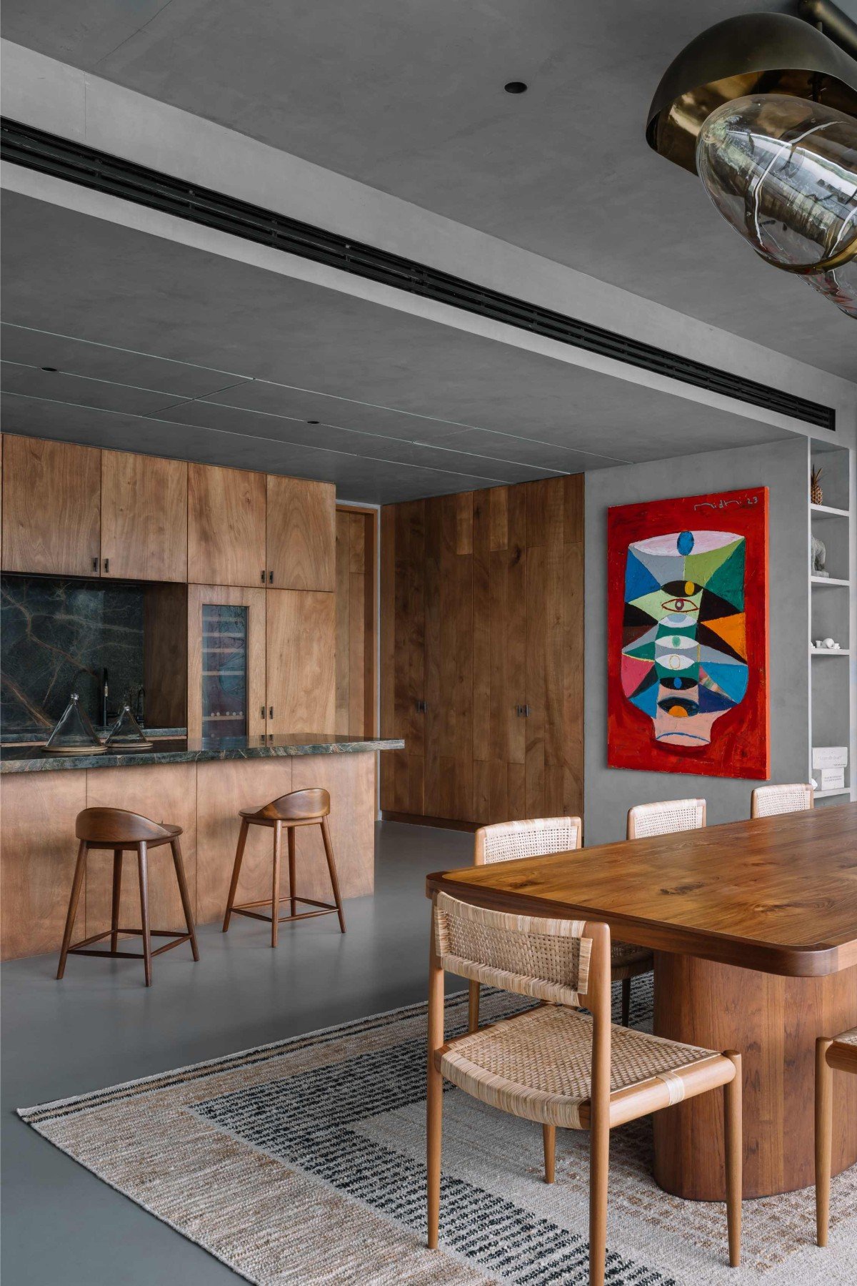
The dining table is solid teak, long and rounded at both ends, surrounded by cane-back chairs. A brass and glass industrial pendant hangs above it. The bar and kitchen cabinetry behind is warm oak, floor to ceiling, set against countertops and a backsplash in richly veined dark green granite, the stone so particular in its patterning that it reads almost as a geological specimen. An aged brass pendant hangs over the island. The concrete floor continues through. It is a kitchen that is completely resolved without drawing attention to itself, which in a house so full of things demanding attention is its own kind of achievement.

The black steel staircase climbs through the double-height void beside a large, bold painting in vibrant yellows, reds, and oranges, the only vivid element in an otherwise muted house. At the upper landing, looking across the black railing, a full-width picture window frames an unbroken wall of tropical green, the mangrove canopy so close it reads almost as a painted surface. Organic nest-like pendant lights cluster from the timber ceiling of this landing, echoing the nearby vegetation and blurring the boundary between the manmade and the natural.

The first-floor corridor runs between the bedroom doors on one side and the teak louvered screens on the other, and on a sunny day the slats cast long parallel lines across the grey cement floor that shift and narrow as the hours pass. It is the kind of incidental architectural experience that photographs well but feels better in person, the quality of light so particular to this building and this landscape that it could not have been produced by any other combination of materials and orientation. The family lounge at the end of this corridor is the warmest room in the house: a large curved pleated sofa in pale grey, round armchairs, a circular jute rug, a dark wood coffee table, and a bronze pendant light shaped like a cluster of tropical leaves hanging from the timber ceiling, the teak screens filling the full wall behind the furniture, the landscape beyond them present in fragments.

The bedrooms share the same material ground throughout: grey cement plaster, dark timber ceilings, ceiling fans, teak screens, and full-height glass opening to the continuous balcony that wraps the entire first floor. Within that shared register, each room has its own character. One has a platform bed with a solid wood desk integrated behind the headboard, a framed artwork in deep red and grey above it, a patterned rug, and through the glazed wall, nothing but a tropical canopy. Another has a walnut bed with paired side tables and lamps, a cane bench at its foot, black sculptural wall sconces flanking a framed figurative work, and the salt pan landscape reading through the louvered screens in long horizontal lines of water and sky. A third room features floor-to-ceiling glass opening to a private garden, warm timber flooring, and upholstered armchairs facing the lush Goan green, blurring the boundary between the room and garden.

The bathrooms are where the house allows itself the most freedom. One bathroom features black textured stone, an organically shaped mirror in a rope-wrapped surround above a black undermount sink, and sculptural black sconces with globe bulbs. It is so monochromatic and so still that it reads more like a room designed for thought than for grooming. The other goes somewhere entirely different: dark green-veined marble covering every wall and surface, the stone’s white veining catching the light in ways that change depending on where you are standing, a ceiling installation of glass and ceramic beads in green and white forming botanical and tropical leaf shapes overhead, a white ceramic vessel sink on a timber vanity, and brass fittings throughout. In two rooms of the same house, there are two completely different understandings of what material intensity can achieve when it is given enough confidence to follow through.

Below the pool deck, reached by a separate stair, a spa with a steam room, sauna, and changing rooms occupies a subterranean level that completes the program without altering the building’s profile from the outside. The ten acres beyond the house hold a pickleball court, an all-weather gym fitted with equipment made from recycled timber, a yoga pavilion, a greenhouse growing produce for the household, and a private jetty that reaches toward the river. Each element is thoughtfully integrated, harmonizing with the house and the surrounding landscape.

Building within a coastal regulatory zone in Goa brought specific technical demands. A coffer dam was required for the pool. An open municipal drain had to be integrated into the site planning. Each problem was resolved within the design rather than around it, making the house more thoughtfully designed as a result.

What Parikh and Shah have built on this salt pan in Agarvado is a house that is deeply specific to where it stands, to the quality of light that moves across that water, to the weight of the monsoon sky, and to the way the mangroves hold the horizon at a particular height. The materials are local, the logic is climatic, and the art that fills the rooms is personal in the way that only a collection gathered over decades can be. It is 6,000 square feet on ten acres, and the proportion feels exactly right.


Fact File

Project: Salt Pan House

Location: Agarvado, Goa, India

Area: 6,000 sq ft

Year of Completion: 2025

Design Firm: We Design Studio

Lead Architects: Ar. Nupur Shah and Ar. Saahil Parikh

Photography: Ishita Sitwala / The Fishy Project

Instagram: @wedesignstudio_mumbai

May 26, 2026 0 comments
0 FacebookTwitterPinterestEmail
Residential

Flip Wentink Architecten’s Conversion of a Listed 1885 Barn in Nijkerk Places a Self-Supporting Pine Plywood Helical Staircase by EeStairs at the Centre of a Net Zero Home

by DDI Edit Team May 24, 2026
written by DDI Edit Team

The date 1885 is set in brick above the central arched opening of the Ahof barn in Nijkerk, and that number, visible in every exterior photograph of the building’s main facade, is the clearest statement of what the renovation carried out by Flip Wentink Architecten, with interior architecture by Julia van Beuningen and staircase design and fabrication by EeStairs, was required to negotiate: a listed 19th-century Dutch agricultural building whose character was inseparable from its construction, its materials, and its form, and whose transformation into a 162 square meter contemporary residence completed in 2022 had to be achieved without erasing what makes the building worth preserving in the first place.

The Exterior

From the front, the Ahof barn presents a facade of warm red and brown brick beneath a thatched roof whose steep pitch and hip form at each end are among the building’s most defining features, and the renovation has left that facade substantially as it was, with the traditional black timber shutters retained at the smaller flanked arched openings on either side of the main entrance and at the larger central arch, where large glazed panels in a black steel frame now replace what were originally solid barn doors, allowing the interior to be seen from outside and light to pass through the full depth of the building. Pleached trees frame the entrance on either side, and the combination of the old brick, the thatch, and the new glazing is managed with enough restraint that the building reads as continuous with its own history rather than interrupted by it. On the opposing gable, the thatched roof sweeps down low at the sides, and two skylight windows have been cut into its surface to bring natural light down into the upper floor that the renovation has introduced into the building’s volume.

The Ground Floor

Inside at ground level, the barn reveals the full spatial generosity that made it worth converting in the first place. The polished concrete floor runs continuously across the entire plan, and the lime plaster walls in a warm sand and beige tone provide a quiet, even background against which the original timber structural frame of the building, the large central posts, and the diagonal bracing timbers of the 1885 construction stand in full visibility, their rough-hewn surface and dark weathered color in clear contrast to the smoothness of the plaster and the concrete floor. Directly in from the main arched entrance, the space is open and essentially undivided at ground level, with the kitchen placed to one side as a dark steel island unit with an integrated hob and black tap, its grey-black color sitting deliberately apart from the warm tones of the timber and plaster around it and introducing the lightly industrial note that Julia van Beuningen has used as a counterpoint throughout the interior. A freestanding black steel-framed wood burner with a glass panel sits at the side of the ground floor, adding a domestic point of warmth to a space that is otherwise defined by the architecture of the barn rather than the furnishings introduced into it.

The Staircase

The pine plywood helical staircase designed in collaboration between Julia van Beuningen and EeStairs is the first of its kind that EeStairs has engineered and fabricated, and the full-length photographs of it rising through the barn interior make clear why the project has received the attention it has. The staircase is self-supporting, meaning there is no central column interrupting the sweep of the helix as it rises from the polished concrete of the ground floor to the first-floor level above, and the entire form is executed in raw pine plywood whose grain runs visibly across the curved balustrade surfaces and whose layered edges are exposed and precisely finished at each tread and at every curved profile visible along the balustrade. The material choice, pine plywood rather than the marble, glass, or noble hardwood with which curved and helical staircases are conventionally associated, is the decision that gives the project its particular quality: the staircase is both technically ambitious and materially humble, its industrial frankness matching the barn’s own history of functional use without apology, and the pale warmth of the pine sitting naturally within the lime plaster and original timber environment of the building rather than competing with it.

Seen from the ground floor with the arched glazed entrance door open behind it and the Dutch agricultural landscape visible through the glass, the staircase occupies the interior as a sculptural form that holds its own against the scale of the original structure, and from the upper level looking down, the curved plywood balustrade and the exposed original timber rafters of the thatched roof above frame the same space in a different register, the new and the old in a dialogue that the building’s listed status required and the design has managed with considerable precision.

The First Floor

The first floor is where the bathrooms and bedrooms have been integrated into the barn’s volume without disturbing the spatial character of the ground floor below, and the material language here shifts from the warm plaster and raw concrete of the lower level to pale whitewashed pine timber paneling that covers the walls, doors, and built-in storage throughout the upper level. The built-in cabinetry, shelving, and cupboards are all in the same whitewashed pine, with simple timber handles and flush doors that give the upper floor a quiet, domestic character appropriate to its program, and the floor is finished in dark-stained timber planks that contrast with the paleness of the pine paneling and the light falling through the skylight windows cut into the thatched roof above. The exposed original timber rafters and purlins of the 1885 roof structure remain fully visible at the upper level, running above the inserted floor and partitions and connecting the new domestic spaces to the building’s inherited spatial logic, so that even at the bedroom level the occupant is still inside the barn rather than inside a conventional room that happens to be located within one.

Materials and Sustainability

The renovation of the Ahof barn was designed and built using traditional materials, specifically timber, lime, and flax, which together dramatically reduce the environmental impact of the project compared with a renovation carried out using contemporary synthetic construction products, and the absence of unnecessary fixtures or decorative additions on the interior wall surfaces is a direct consequence of the brief to respect the structure and preserve its inherited quality of stillness. The barn was renovated to achieve zero energy consumption, with solar panels and ground source heat pumps producing on-site the same amount of energy the building consumes. EeStairs’ contribution to the project extended this sustainability commitment by using FSC-certified timber, less polluting adhesives and finishes, and minimizing environmental impact at every stage from material sourcing through fabrication and transport.

The Ahof as a Broader Project

The Ahof farmstead in Nijkerk brings together several typical 19th-century Dutch buildings on a 791 square meter site that has been in the current client’s ownership for approximately thirty years, bought with the ambition of creating a renewed environment for the land and its historic buildings. The land has been rewilded, and its ancient wetlands, including Alder swamp groves, have been reinstated, and the team works alongside local farmers to explore regenerative farming practices across the surrounding area. The barn, completed in 2022 from a 2021 design, is the second of five buildings on the site to be completed, and the wider project frames the architectural renovation within a long-term commitment to the land and community it sits within, giving the material restraint of Flip Wentink Architecten’s work here a context that extends well beyond any single building.

Project Details

Project name: Ahof Farmhouse. Architecture firm: Flip Wentink Architecten. Location: Nijkerk, Netherlands. Photography: EeStairs, Alex Baxter. Staircase design and fabrication: EeStairs. Interior design: Julia van Beuningen. Gross internal floor area: 162 m². Site area: 791 m². Design year: 2021. Completion year: 2022. Primary material: Wood. Client: Private.

May 24, 2026 0 comments
0 FacebookTwitterPinterestEmail
Newer Posts
Older Posts

Recent Posts

  • Florim Introduces SensiVenezia, a Porcelain Stoneware Collection Inspired by Venetian Terrazzo
  • LEGO Botanical Wave Transforms TANK Shanghai with 380,000 Brick-Built Flowers
  • The Great Eastern Home Introduces Its Latest Collection of Italian Vintage Mirrors
  • Smart Homes Are Changing Architecture: What Happens When Technology Becomes Part of the Building?
  • AARQE9’s Nikhaar Dhawan & Bahaar Dhawan Rohatgi Unveil the Sculptural Lunar Drip Table

Recent Comments

  1. Smart Home Architecture: How Technology Is Changing Design on Aqara Smart Lock U500: Three Versions for Gates, Glass Doors and Standard Entrances

Newsletter

  • Home
  • About Us
  • Contact Us
  • Editorial Policy
  • Privacy Policy

© 2026 Design Diary International. All Rights Reserved.

Design Diary International
  • Home
  • Project
    • Residential
    • Hospitality
    • Commercial
    • Public & Cultural
  • Interview
    • Architect
    • Interior Designer
    • Founders & Brand
    • Artist
  • Material
  • Product
  • Feature
  • DDI Finds
    • Emerging Studio
    • Rising Designers
    • New Practices
  • About
  • Magazine
  • Contact Us