• Home
  • Project
    • Residential
    • Hospitality
    • Commercial
    • Public & Cultural
  • Interview
    • Architect
    • Interior Designer
    • Founders & Brand
    • Artist
  • Material
  • Product
  • Feature
  • DDI Finds
    • Emerging Studio
    • Rising Designers
    • New Practices
  • About
  • Magazine
  • Contact Us
Design Diary International
ArtistInterviews

Jason deCaires Taylor, Underwater Sculptor, UK: The Artist Who Gave His Work to the Sea

by DDI Edit Team May 31, 2026
written by DDI Edit Team

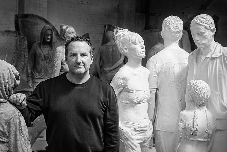
He was a trained diver before he was a sculptor, which perhaps explains why his relationship with the ocean is less about conquest and more about conversation. Jason deCaires Taylor speaks to Shweta of Design Diary International about surrender, authorship, and what it means to make art that is designed, from the very first day, to disappear.

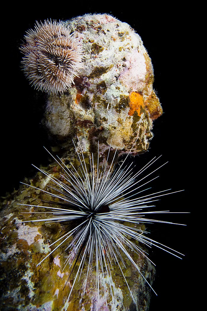
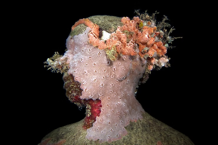
Most artists spend their careers fighting time. Jason deCaires Taylor has built his entire practice around giving in to it. His sculptures do not resist the ocean. They wait for it, softening and darkening over months and years as algae forms across their surfaces, as fish begin to shelter in their cavities, and as sponges and corals settle into every crevice until the original form is so thoroughly overwritten by living growth that the hand of the artist becomes almost impossible to find. This is not accidental. It is entirely the point. Where most monumental art insists on its own permanence, Taylor’s practice is built around a considered and deliberate surrender, an understanding that the most interesting thing a sculpture can do underwater is become a home for something that was not there when it was placed.

He describes his sculptures not as finished works but as beginnings, as catalysts for a process that the artist can initiate but not control. Once a piece is placed on the seabed, he says, the dialogue begins, and from that moment the ocean takes over as both curator and critic, reshaping intention so thoroughly and so continuously that what eventually remains is not the work he made but something the sea has made from it, something that carries his original idea somewhere inside it the way a reef carries the memory of the structure it grew from. This willingness to step away from ownership is performed boldly. It is the structural logic of everything he does, the premise from which every material choice, every formal decision, every collaboration with marine biologists and environmental engineers proceeds.
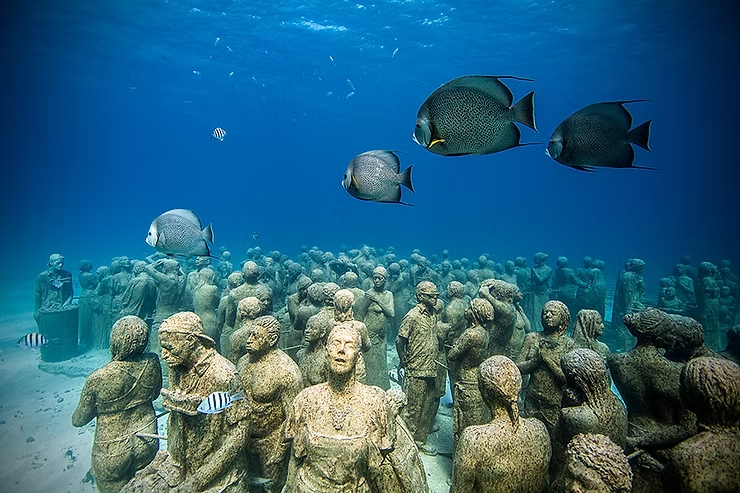
Because the material choices in Taylor’s work are not peripheral to its meaning but are the meaning itself. Each figure is cast using pH-neutral, marine-safe cement formulations developed in close consultation with scientists, where mineral content and surface roughness and porosity are calibrated not for visual effect but to encourage biological colonization, to make the sculpture as hospitable as possible to the marine life it is intended to support. The work is infrastructure as much as it is art, a fact Taylor is entirely comfortable with and which distinguishes his practice from almost anything else operating in the same visual territory. From the beginning, he says, he has been mindful of what he places in the marine environment, and the standard he holds himself to is clear: the materials have to give something back. Over time, as the sculptures transition from inert forms to living reef systems, they begin to draw visitor attention away from the fragile natural reefs nearby, redirecting human presence toward structures that can absorb it without being damaged by it. The long arc of that transformation, from cast form to living habitat, defines his practice more completely than any single installation.
Among his works, A World Adrift carries a particular emotional weight that sets it apart from the ecological logic of the broader project. The installation depicts children balanced on fragile, origami-like boats drifting across the sea, figures rendered with a stillness that holds childhood innocence and genuine precarity in the same moment, wonder and unease sitting side by side without either resolving into the other. Taylor describes the work as a meditation on the inheritance of conditions between generations and the fragile balance between ecosystems, climate, and the future that today’s children will face. The children in the work are observant and resilient, not depicted in crisis but not depicted in safety either, poised in a calm that the sea around them does not quite guarantee. It is a portrait of a generation living with consequences it did not create while still holding the capacity to imagine its way through them, and the power of the piece lies precisely in its refusal to offer any resolution to that tension. Hope and fragility share the same frame, and neither wins.
Over two decades Taylor has expanded the ideas behind individual works to a scale that few artists working in any medium have attempted. Early projects in Grenada proved that submerged sculpture can serve as both an artistic experience and an ecological intervention, benefiting both human visitors and the marine environment. Larger projects followed, among them the Museo Subacuático de Arte off the coast of Cancún, one of the largest underwater art installations ever created anywhere in the world, and Ocean Atlas in the Bahamas, a single monumental work of considerable scale and presence. These sites are often described as museums, but Taylor is careful with the term because it implies a relationship to objects that does not quite describe what these places are. They are not repositories of static things. They are evolving environments, living systems that change continuously and cannot be fully understood from a single visit because they are different from one season to the next and one decade to the next, shaped by currents and temperatures and the accumulated growth of thousands of organisms that were not consulted during the design process and are not following any plan.

His vision for these sites extends beyond what they are today. He hopes they will become marine sanctuaries in the fullest sense, places where art and science and conservation meet in a way that makes each more effective than it would be operating alone, where the presence of art draws human attention and generates the kind of emotional connection that scientific data alone rarely produces, and where that connection translates into the will to protect what is being looked at. Technology is increasingly part of how he imagines this future, with virtual dives and real-time ecological monitoring and scientific partnerships beginning to shape both how these environments are experienced and how they are studied, so that culture becomes not something separate from nature but something embedded within it, growing from the same substrate and subject to the same slow processes of change.

Public art at this scale and in these contexts inevitably invites controversy, and Taylor is candid about the scrutiny that some of his installations have attracted, including Alluvia in the United Kingdom, which generated intense debate around interpretation and the nature of public space. He does not experience this as failure. Public art exists in dialogue, he says, and the people who encounter it bring their own histories and beliefs and emotions to it, reading into it things the artist did not place there and sometimes resisting things the artist very much intended. Discomfort in that context is not a problem to be managed but a signal of genuine engagement, an indication that the work is asking questions rather than simply offering reassurance. The ocean itself operates in a similar register, powerful and unpredictable and frequently misunderstood by people who have not spent enough time inside it, and placing art within it is not an attempt to tame it but an acknowledgement of the limits of control, an acceptance that the work belongs to the environment it inhabits more than it belongs to the person who made it.

When the conversation turns to India, Taylor speaks thoughtfully and without easy projection, aware that a coastline carrying deep cultural and spiritual significance as well as extraordinary ecological richness requires a particular quality of listening before any artist attempts to add something to it. The ocean, he observes, has always been both provider and sacred presence in Indian coastal culture, and any work placed there would need to begin from that understanding rather than arriving with an external narrative already formed. He imagines a series of works rooted in ideas of renewal and coexistence, drawing from the communities and traditions of those coastlines rather than imposing a language they did not ask for, where the goal would not be spectacle but resonance, a living gallery where coral and culture might be allowed to grow alongside each other over the years that follow its creation.

What ultimately makes Taylor’s practice singular is its refusal to chase the kind of immortality that most monumental art is designed to guarantee. His sculptures are not made to remain as they were cast. They are made to change, to erode and be colonized, and eventually to dissolve so completely into the environments they inhabit that the boundary between artwork and habitat becomes impossible to locate. In a cultural moment that has tended to equate scale with dominance and permanence with significance, this proposition is genuinely different. Art can exist without conquest; he demonstrates this through the work itself rather than through any argument. It can support life rather than displace it, can be temporary without being insignificant; it can surrender authorship and find in that surrender something more interesting and more lasting than control would have produced. His sculptures are not asking to be preserved in pristine condition. They are asking to be used and altered and absorbed, to be finished by something larger and older and more patient than any human maker, and in that asking they quietly redefine what it means to leave something behind.
May 31, 2026 0 comments
1 FacebookTwitterPinterestEmail
Founders & BrandsInterviews

Andrea Turri of Turri, Italy: A Century of Making Furniture That Tells You Exactly Who Lives There

by DDI Edit Team May 31, 2026
written by DDI Edit Team

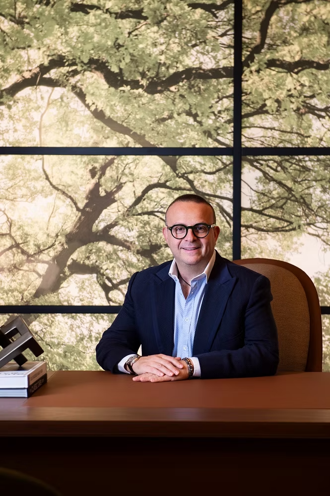
Founded in a small workshop in Brianza in 1925, Turri has spent four generations building furniture that sits somewhere between art and architecture, between heritage and tomorrow. Andrea Turri, CEO and fourth-generation custodian of the brand, discusses the role of wood in Turri’s legacy and why, after a century, luxury is defined by personal expression.

Pietro Turri opened his workshop in Carugo, in the heart of Brianza, in 1925, with wood as his primary material and craftsmanship as his only brief. He was not trying to build a brand in the modern sense of the word. He was making furniture the way people in that part of northern Italy had always made furniture, with the kind of patient, material-deep attention that turns a piece of wood into something that carries the character of the hands that shaped it. What he was building, without quite intending to, was the foundation of something that would last a hundred years and travel to homes on every continent.

The decades that followed shaped the company through a series of decisions that each generation made with a mixture of instinct and necessity. The 1950s brought a significant expansion, a showroom in Milan and a move of production to Briosco, and in 1961 Turri participated in the inaugural Salone del Mobile, a moment that placed the brand formally within the conversation of Italian design at exactly the point when that conversation was beginning to matter to the world. International growth came in the 1980s, with a particular presence in Europe and the Middle East, and by the 1990s and early 2000s, the brand had entered the Chinese market, deepening its reach in a way that made the phrase “Made in Italy” mean something beyond geography. When Andrea Turri took over leadership of the company in 2007, he brought with him a vision he describes as simultaneously rooted in the past and oriented toward the future, a more contemporary and internationally attuned design language that was simpler and more restrained than what had come before, which he named the Modern Luxury era. In 2023, Turri joined Dexelance, the only design organization listed on the Italian public exchange, a relationship that has extended the brand’s visibility in international markets and its capacity to respond to the growing demand for high-quality custom furniture at a pace and precision the previous structure could not have supported.

What has remained constant through all of this movement and change is something that Andrea Turri describes not as a policy but as a conviction, the belief that furniture is not simply made but that it reflects how people live, that every piece carries within it an idea of life as it might be lived rather than simply a solution to the problem of where to sit or what surface to place things on. The passion for handcrafted excellence has not shifted across four generations, and the approach to bespoke design has not shifted either, though the vocabulary through which it is expressed has evolved considerably. Custom design at Turri is not, he is careful to say, simply a matter of offering options and letting clients choose among them. It is a genuine creative experience in which the client is involved at every stage of the process, from the first conversation about what a space needs to feel like through to the final finishing of the individual piece, so that what emerges at the end is something that could not have been made for anyone else because it was made in such close conversation with a specific person and a specific life.

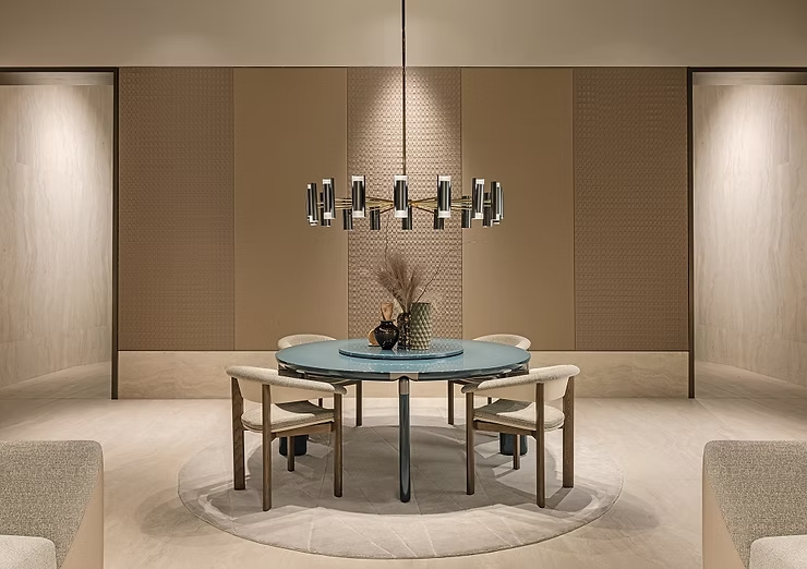
Materials are where this conversation tends to become most concrete and most telling. Wood remains the central character in every Turri piece, chosen by craftsmen who understand individual timbers well enough to hear the particular story each one is capable of telling and worked with the lacquering techniques and polishing methods that have become so distinctively associated with the brand that they function almost as a signature. But wood is never alone. Turri pieces are built from careful combinations of wood and leather and marble and metal, each material chosen for how it relates to the others, for the conversation it creates between textures and finishes, and for the way the whole becomes richer than any of its individual parts would suggest. The finest marbles are selected for their natural beauty and the unrepeatable quality of their veining. Leathers are worked with a precision and care that the brand treats as non-negotiable. The result, in each case, is a piece that feels at once contemporary and permanently itself, never quite dateable to a particular moment because it is grounded in materials and processes that have a longer history than any single collection.

The question of how to honor that history while still speaking to clients and designers who are working in a completely unique present is one that Andrea Turri has thought about carefully and answers with a clarity that suggests it has been genuinely resolved rather than diplomatically hedged. The strategy operates on two tracks simultaneously. The Heritage Collection preserves the more maximalist design vocabulary that the brand developed between 2014 and 2018, keeping it available for clients whose sensibility is aligned with that particular richness. The Turri Collection, developed in collaboration with contemporary designers brought in from around the world, speaks a more current language while being shaped by the same underlying values around material quality and craft depth. The designers who have contributed to this second track include Andrea Bonini, Matteo Nunziati, Giuseppe Viganò, Paola Navone, Monica Armani, Toan Nguyen, Marco Acerbis, and Francesca Lanzavecchia, each one bringing their own perspective while working within a brief that keeps the brand’s character intact. These collaborations have done more than introduce new formal ideas into the collection. They have helped Turri think more precisely about what home means now, about the relationship between residential and contract design, and about how a brand with a century of history can continue to grow its audience without losing the specificity that gives it its reason to exist.

The individual collections carry their own distinct personalities, shaped by the materials and emotional intentions that define them rather than by any single formal gesture. The Vine armchair, designed by Frank Jiang, draws directly from the branched natural wood construction and armrest forms characteristic of 1950s design, a reference that is not nostalgic but genuinely structural, using the logic of a particular moment in design history to produce something that feels both familiar and entirely current. The story behind each collection comes from the balance Andrea Turri describes as the brand’s deepest instinct: between new ideas and inherited ones, and between cultural references that come from many places and a consistent desire to make each piece feel personal and specific to the person it is being made for. The common thread running through all of it, regardless of how different individual collections look from each other, is what he describes as the brand’s savoir-faire, the accumulated knowledge of how to make something with a quality of finish and a depth of material engagement that cannot be replicated through automation or accelerated through efficiency savings, because it depends on the judgement and the sensory intelligence of people who have spent years learning to work with these specific materials in these specific ways.

The role of the artisan’s hand at Turri is not a marketing position. It is a practical reality. New technology and contemporary machinery are used in the production process, and Andrea Turri is entirely clear about the value they bring, but neither can substitute for what the craftsman brings to the finishing of each piece: the care and precision and the quality of attention that comes from a person who understands what they are making and why it matters. The characteristic wood lacquering processes that have become one of the most recognizable elements of Turri’s output, the particular feel of polished wood surfaces, and the detailed leatherwork—these all require a quality of human involvement that a machine can assist with but cannot replace, and the brand’s commitment to maintaining that involvement is not sentimental. It is the reason the furniture looks and feels the way it does and the reason clients who have lived with Turri pieces for ten or twenty years come back.

The demand for customization has grown considerably recently, and in a way that reflects a broader shift in how clients across different markets understand what they are buying when they commission furniture at this level. As the world has become more connected, clients have become more specific about wanting their interiors to reflect their own culture and personality and way of living rather than a generalized idea of luxury that could belong to anyone. Turri has responded to this by expanding not just the customization options available within its collections but the scope of what it offers entirely, providing full bespoke design services for both private residences and high-end contract projects so that a client who wants to work at the level of an individual piece and a client who wants to design an entire interior from wall panels to decorative objects can both be served with the same depth of engagement.

Looking forward, Andrea Turri sees the global design landscape moving in a direction that aligns closely with where Turri has always been positioned, even if the language used to describe that direction is new. The boundaries between different design traditions and material cultures are becoming more porous, creating conditions in which designers can draw from a much wider range of references while still producing work that feels grounded and specific rather than generically international. Luxury interiors, in his reading of where things are heading over the next decade, will become more subtle and more individually calibrated, with a shift away from the kind of declarative richness that characterized an earlier understanding of what a premium interior should look like and toward something more refined and more quietly considered, where comfort and beauty and the quality of craft are the primary registers rather than the immediate visual impact of expensive materials. More minimalist in the sense of being more disciplined rather than more empty. More immersive and more personal rather than more impressive and more universal.

Luxury, for Turri today, is how you live. It is the particular quality of a space that has been made for you specifically, where every surface and finish and detail reflects not a general idea of elegance but a specific understanding of who you are and how you want to inhabit the rooms you spend your life in. It is beauty that does not announce itself but that you feel more clearly each year you live with it, the kind that becomes more itself over time rather than less and rewards sustained attention rather than exhausting it on first encounter. What Turri has been making since Pietro opened his workshop in Carugo a hundred years ago, under many different names and in many different formal languages and for clients on many different continents, is fundamentally this, furni

May 31, 2026 0 comments
1 FacebookTwitterPinterestEmail
Founders & BrandsInterviews

Enzo Catellani of Catellani & Smith, Italy: The Man Who Decided Light Should Feel Like Poetry

by DDI Edit Team May 31, 2026
written by DDI Edit Team

Since 1989, his workshop along the river Serio near Bergamo has been making lamps entirely by hand, one at a time, to order, without an assembly line in sight. Enzo Catellani, founder of Catellani & Smith, speaks to Design Diary International about the miracle that started it all, why small imperfections are a sign of something alive, and what a sphere of aluminum wire made at Palazzo Poli became to the world.

He did not begin with a business plan or a brand strategy or even a clear idea of whether anyone would want what he was making. He began in a small workshop, studying how different materials interacted with light, assembling components, welding, shaping, and building lamps that came out of his hands before they came out of his mind, because the idea, for Catellani, has always needed to take physical form immediately rather than live on paper until someone decides to make it real. He had spent the late 1970s in contact with the lighting world and its key players, absorbing enough to know that what he wanted to make was not quite what anyone else was making, and so he made it himself and waited to see what would happen.

What happened was the Ambiente Fair in Frankfurt, where he presented those first entirely handmade lamps to an international audience and received more than 1,400 orders. It was almost miraculous, he says, and the word is not rhetorical. He had not anticipated it and had not prepared for it, and suddenly he had to enlarge his production and build the infrastructure of an actual company around an instinct that had, until that moment, existed only as a private obsession with material and light. Catellani & Smith was founded in 1989 to fulfill those orders and has been fulfilling orders in essentially the same spirit ever since: handmade, to commission, without stock, without an assembly line, without any of the mechanisms of standardization that would make the operation more efficient and considerably less itself.

The collections that followed those first pieces, which he calls Timeless Objects, carry names that have become genuinely iconic within lighting design globally: Luci d’Oro, Stchu-Moon, Lucenera, Fil de Fer, and PostKrisi. Each one emerged through the same process that produced the originals, not from a drawing but from a prototype, because for Catellani the idea must immediately become an object and must be held and looked at and adjusted with the hands rather than refined on a screen until it is ready to be made. The actual design phase, the feasibility studies, and the technical specifications follow the prototype rather than preceding it. The object comes first, and the documentation of it comes second, which is either an entirely inefficient way to run a lighting company or the only way to make lamps that feel the way his do, and given what the market has confirmed over thirty-five years, the answer is fairly clear.

The creative intention behind all of it is consistent enough that Catellani can describe it in a single sentence: he wants to create illuminating objects capable of producing light that is emotional and engaging and delicate and decorative and relaxing, while at the same time being objects strong enough in their own presence to personalize the room and the space they inhabit. This sounds straightforward until you consider how rarely lighting actually achieves it, how most fixtures either recede entirely into the background or insist so heavily on themselves as designed objects that the light they produce becomes almost incidental. Catellani has been working in the territory between these two failures for his entire career, and the breadth of what he has produced there is considerable: from the minimal and poetic lamps like ID, Light Stick, and For You that emit a delicate glow without drawing attention to their own presence, to the more technically complex Lucenera, to the fully sculptural PostKrisi and Ensō, which cast light in ways that transform the surfaces around them and make a room feel inhabited by something you cannot quite name.

The study of how materials interact with light is where all of this begins and where it continues to generate new work. Brass has been the material that has surprised him most recently, and the list of what it allows reveals why: it can be drawn, milled, turned, laser-cut, engraved, or spun; purchased in bars or tubes or sheets or wires of any cross-section; used to create structures that are either extremely lightweight or very heavy depending on what a piece demands; welded; given galvanic finishes; painted; and it conducts electricity. It is, as Catellani puts it, a material they are still discovering, still finding new possibilities within despite the years of working with it, and that quality of ongoing revelation in a familiar material is something he clearly values as much as the formal properties themselves.

Fil de Fer is the piece most associated with the Catellani & Smith name, and the story of how it came to exist is one of those accounts of creative accident that turns out, on examination, to be less accidental than it first sounds. He was commissioned to design a light fixture for Palazzo Poli near the Trevi Fountain in Rome, the requirement being something lightweight yet voluminous, and among the several prototypes he developed for the project, working with iron wire one day, there was a sphere, born almost spontaneously from the material in his hands. It was not the piece that went into the Dante Room of the Palace, but it was the piece that became Fil de Fer, named after the French for “iron wire,” a lamp made entirely by hand by artisans who bend aluminum wire, weave it into a spherical form, and then insert the small bulbs individually, one by one, into the structure. The original iron wire was replaced early on by aluminum, which is more malleable and more luminous, and the lamp has been in continuous production and continuous evolution ever since: developed into outdoor versions and gold anodized finishes, into the Uomo della Luce, where the sphere is supported by the sculpted arms of an iron silhouette; into Sweet Light, where the sphere in smaller dimensions switches on and off with a touch; into Nuvola and Cascata and Corrimano, each one a variation on the same essential idea of a sphere that holds light the way the night sky holds stars, voluminous and weightless at the same time.

Fil de Fer is now part of the permanent Italian Design collection at the Triennale Design Museum in Milan and the Expo Museum in Shanghai and is among the works held in the Quirinale Contemporaneo collection in the Palazzo of the Presidency of the Italian Republic in Rome. It has been recognized by Italian courts as a work of ingenuity deserving copyright protection for its creative and artistic value, a status that is not commonly extended to lighting design and that speaks to the degree to which the piece functions as something other than, or at least more than, a lamp. Its longevity and its consistent ability to read as at home in both classical and contemporary interiors, in private residences and renowned hotels, in intimate rooms and large public spaces, are what Catellani identifies as the key to whatever he means by “timeless,” and it is not a quality he designed in. It emerged from the particular honesty of the object, from the fact that it does exactly what it looks like it does and is made of exactly what it appears to be made of, and that transparency of means turns out to be as durable as any formal decision could have been.

The question of what handmade means at Catellani & Smith compared to industrial production is one he answers through the particulars of how the workshops actually operate rather than through any abstract argument about craft values. Each lamp is made to order, which means there is no stock and no production that happens in advance of demand, and this allows a flexibility in meeting custom requests from architects and designers that a stockbased model cannot offer. In the workshops along the river Serio, there is no assembly line and no repetitive single-task work, but instead artisans who rotate through the various phases of production in spaces that have parquet floors and wooden furniture and music playing in the background, because Catellani believes in giving each lamp the time it needs and in creating the conditions in which the people making them can bring the quality of attention the work requires. Small imperfections in the finished pieces are not flaws to be corrected before shipping, he says, but characteristics of the handmade, evidence that a specific person’s hands were involved at every stage, and it is precisely this trace of the maker that gives each lamp what he calls a soul, a quality of presence that the absence of imperfection would actually diminish.

The geographic spread of where Catellani & Smith sells reflects the degree to which this approach has found its audience across very different design cultures. Italy accounts for roughly thirty percent of turnover, with the remaining seventy percent coming primarily from European markets, Germany historically being the first country to appreciate the work, followed by France, Switzerland, Belgium, and the Netherlands, and then beyond Europe, with Asia representing the most significant territory, particularly China, Hong Kong, and India. Different markets show preferences for specific collections or finishes, but the bestsellers travel with a consistency that suggests the qualities Catellani is working toward are not culturally specific in the way that more trend-dependent design tends to be.

In the studio at the moment, the work is exploratory in the way that the early stages of a new Catellani collection always are, various possibilities being evaluated, materials being studied, potential solutions being assessed without any predetermined direction. The most recent collection, Pòta!, was presented at Euroluce in Milan in April 2025, and the thinking now turns toward what comes next. Looking back across the body of work, Catellani identifies three recurring generators for new pieces: a new light source, as with the LED-driven collections Atman, Light-Stick, Lederam, Petites Bijoux and Pòta!; the discovery of a new material and its particular interaction with light, which produced Stchu-Moon, Fil de Fer, PostKrisi and Luci d’Oro; or the development of an innovative and patented system for distributing electrical energy through a structure, as in Ensō and Pòta!. New projects will be evaluated against these three areas, which is not a formula but a map of the territory where his curiosity has consistently found something worth making.

Thirty-five years after those first lamps achieved their unexpected success in Frankfurt, the Catellani & Smith workshops are still along the river Serio, the lamps are still entirely handmade, and each one still begins not with a drawing but with a prototype taking shape in someone’s hands. The company has grown, the production has expanded, the technology has advanced considerably, and the global recognition has accumulated in ways that Pietro’s Frankfurt moment could only dimly foreshadow. None of this has changed the essential nature of what happens in those workshops, which is that a person who understands light and material spends the necessary time with both of them, and the result is a lamp that carries that time within it and gives it back to whatever room it finds itself in, evening after evening, for as long as it lasts.

May 31, 2026 0 comments
1 FacebookTwitterPinterestEmail
Residential

EMA, Malappuram, Kerala- India by Yuuga Design Collective

by DDI Edit Team May 31, 2026
written by DDI Edit Team

In Malappuram, where the monsoon arrives heavy and the land stays green through most of the year, Yuuga Design Collective has built a house for a family of three that draws its spatial logic from the Kaavu, the sacred grove of Kerala tradition, where humans, nature, and other living beings share the same ground without any one of them claiming authority over the rest.

EMA, completed in 2025, is 1,700 square feet of lime plaster, reclaimed timber, salvaged stone, and Mangalore tile, designed for a husband, wife, and their son Siva, and conceived from the start as an environment to be inhabited rather than an object to be seen. 

This is EMA, a 1,700-square-foot residence in Malappuram, Kerala, completed in 2025 by Yuuga Design Collective, led by Mithun Balan and Arun. It was built for a family of three, a husband, a wife, and their son Siva, with an intentionally spare brief: two bedrooms, a shared living, dining, and kitchen space, an attic for work and fitness, and a seasonal summer bedroom designed to function without air conditioning. The aspiration was for a house that feels inward-looking and tactile rather than outwardly expressive, privileging sensory comfort over visual display. Yuuga Design Collective conceived EMA through the philosophy of the Kaavu, the sacred grove of Kerala tradition, where humans, nature, and other living beings coexist without hierarchy. Within this worldview, architecture is not an act of dominance over land but a quiet participation in an existing ecosystem, and every decision in the project, spatial, material, ecological, and philosophical, flows from that position.

The design process followed a reverse methodology. Rather than beginning with form or plan, it began with materials. The architects spent months collecting, cataloguing, and studying salvaged elements from old Kerala homes and temples, understanding their proportions, their weathering patterns, and their structural capacities before a single spatial decision was made. Doors, windows, timber members, terracotta tiles, and stone were gathered, some estimated to be over two hundred years old. The spatial framework then evolved through adaptation and negotiation with these collected pieces, each reclaimed element guiding its own placement and the details around it. The house was not imposed upon its materials. It emerged from them.

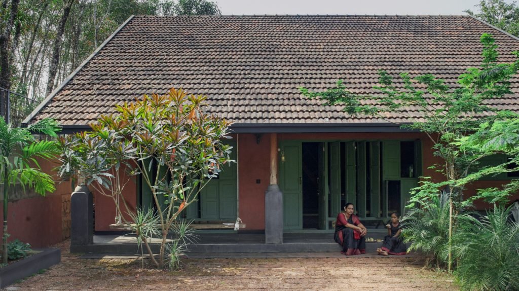
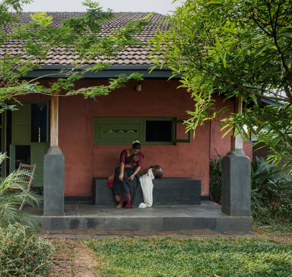
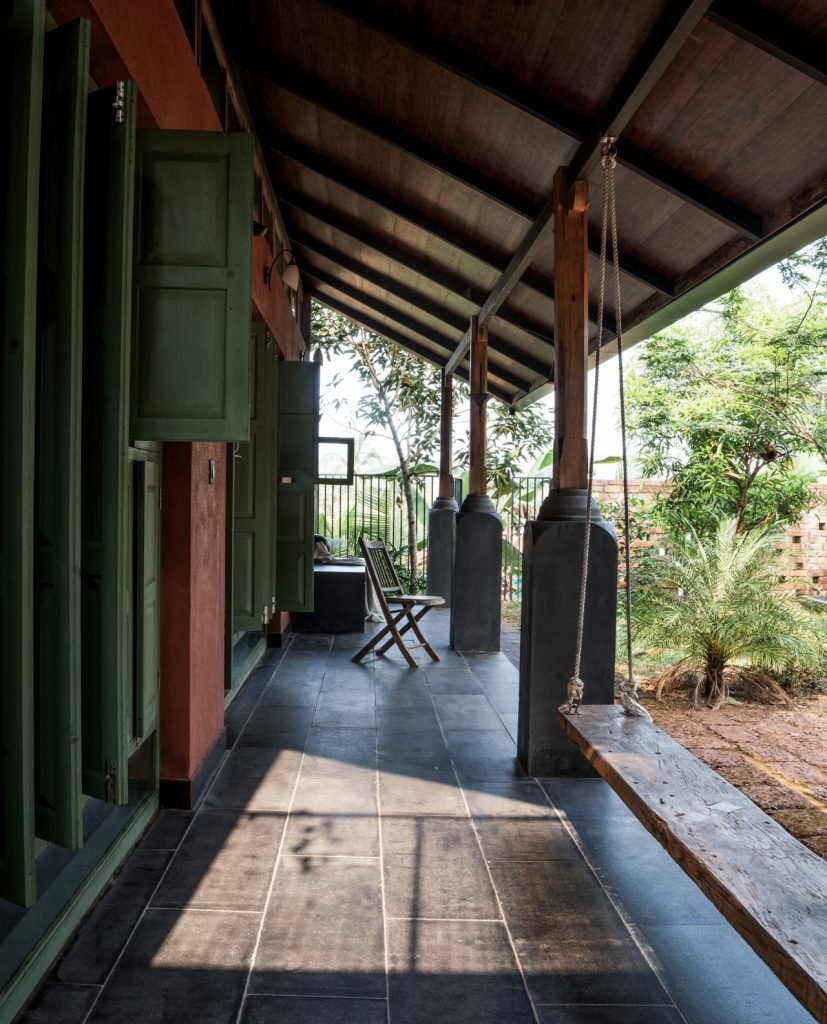
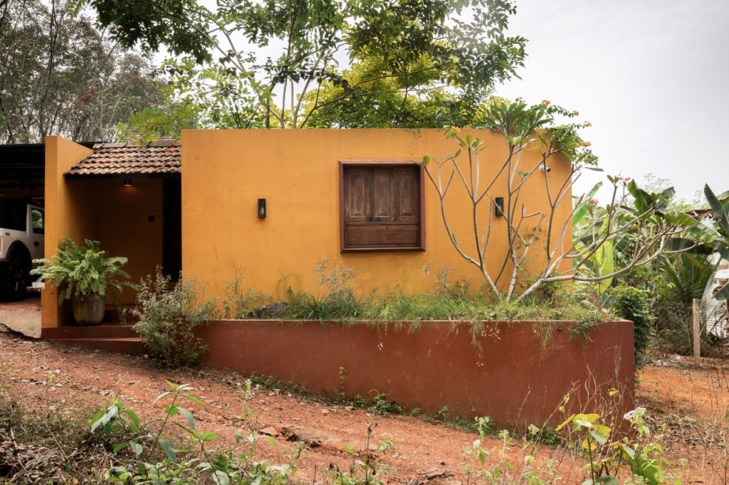
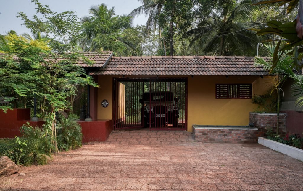
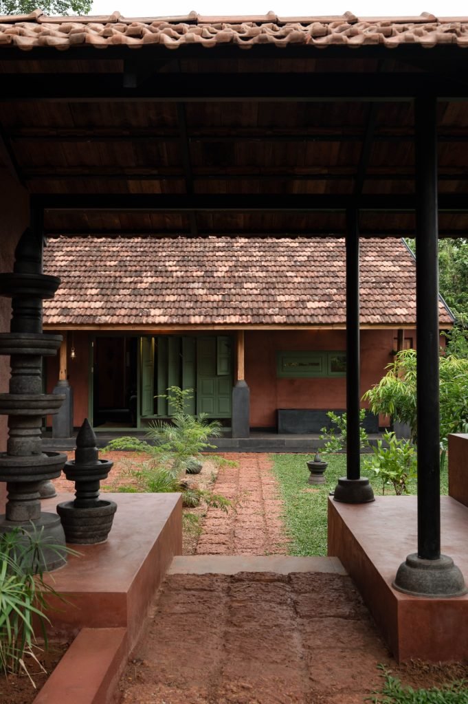
Approaching from the road, a low gate structure in ochre yellow sits at the entrance under its own small Mangalore tile roof, a red iron gate set into it, coconut palms and tropical trees rising on either side. The red oxide driveway leads through, and the main house comes into view, a long low form under a hip Mangalore tile roof with wide overhangs that shade the rust red lime plaster walls through the hottest hours of the day. The color of those walls is a warm, slightly irregular shade that lies somewhere between laterite stone and raw earth, and against them, the joinery—every door, window, and shutter throughout the entire house—is painted in a deep sage green. The column bases supporting the veranda roof are drum-shaped dark stone, reclaimed from an older structure, their carved profiles sitting comfortably between new construction and centuries-old craft. A rope swing made from a thick wooden plank hangs between two of these columns on the veranda, which has dark stone tile flooring and an exposed timber ceiling following the pitch of the roof. The garden presses right up to the edge of the tiled floor, dense and uncontrolled in the best sense, the way a Kaavu would be.

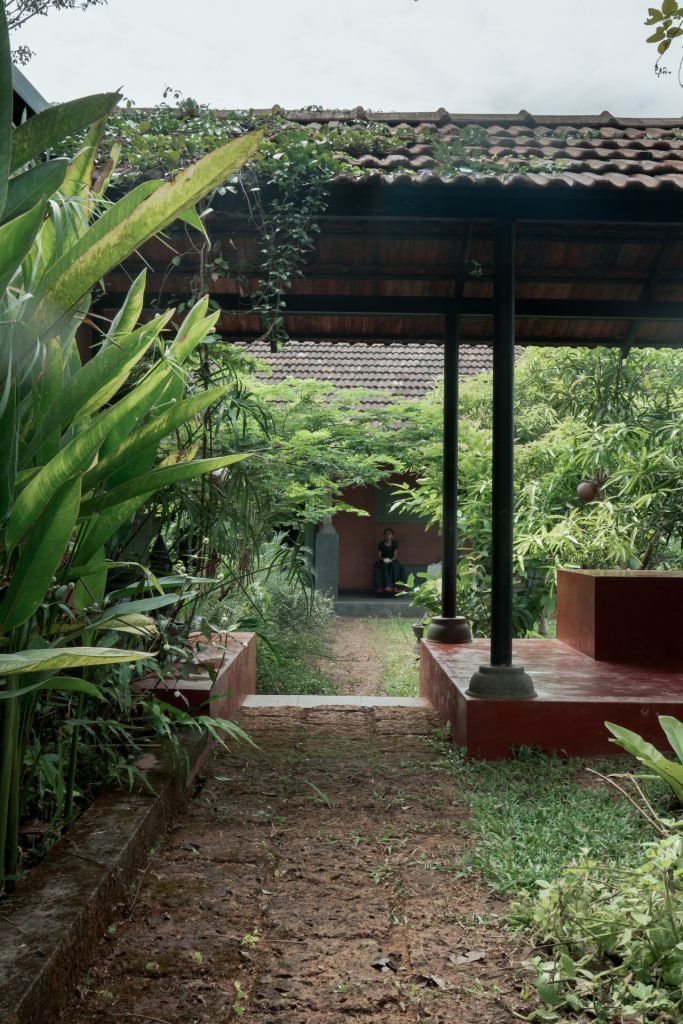
The practice extended the Kaavu philosophy beyond built form to shape every ecological decision in the project. The existing trees were preserved, and the site contours were left largely undisturbed. Biodiversity and the accommodation of non-human life were treated as integral to the design rather than incidental to it. The terracotta hexagonal paving stones in the forecourt carry the same red tone as the walls, river stones, and rocks placed among the young plants, as if the garden is still becoming itself. A covered walkway with black steel columns and a Mangalore tile roof moves through the eastern side of the garden, terracotta raised platforms flanking it, the path leading toward a sitting area where a figure is visible in the distance among the trees. This is a garden designed to be inhabited slowly, a place where the line between architecture and landscape is genuinely unclear.

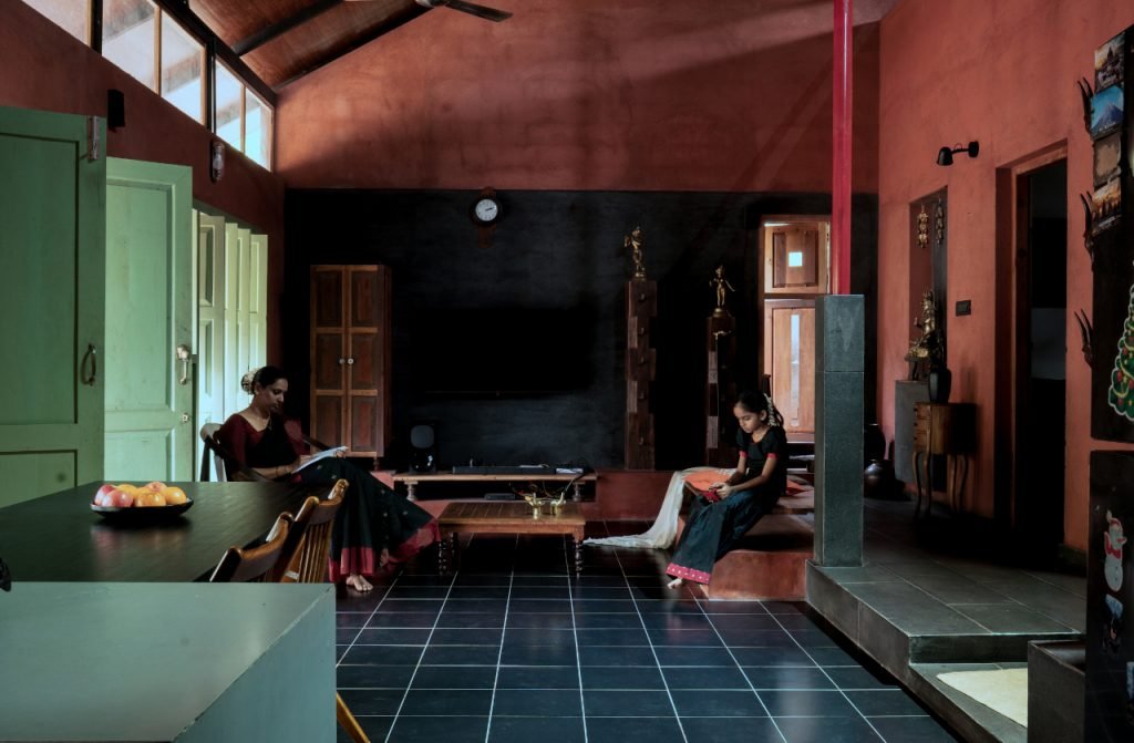
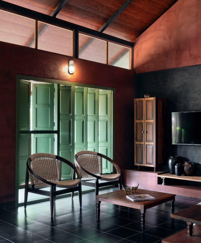
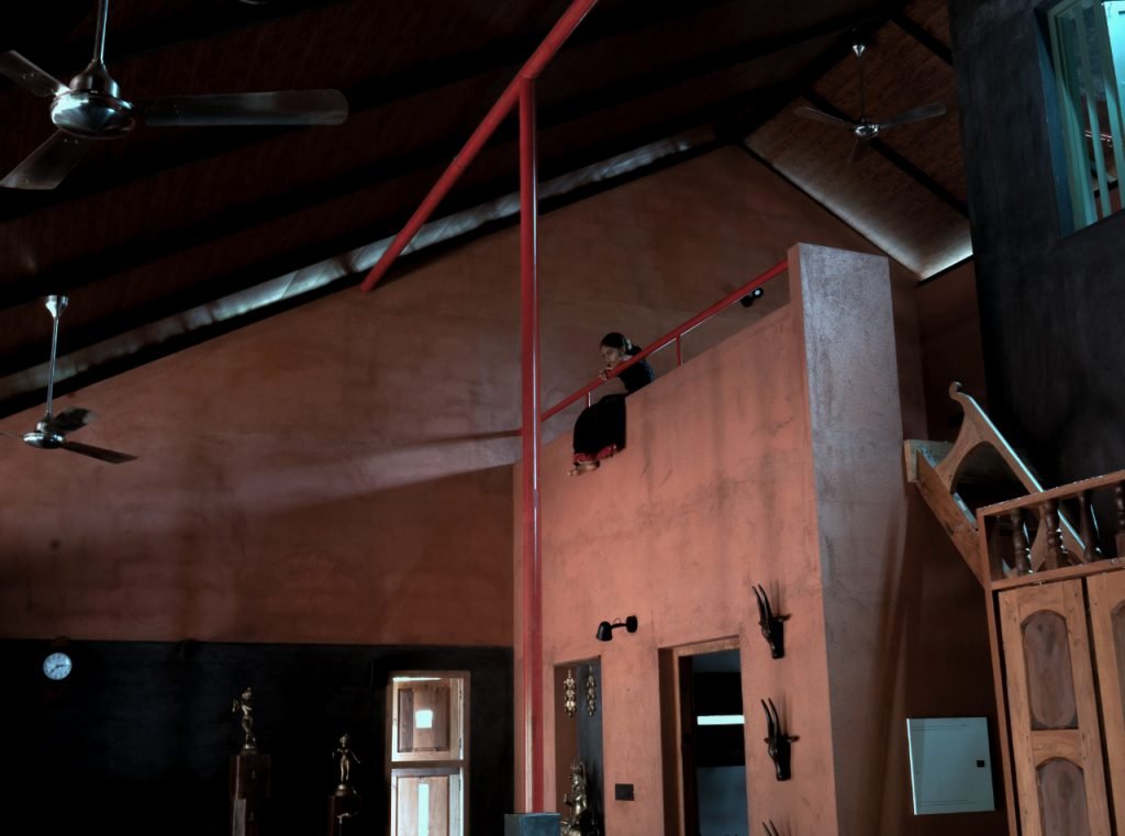
Inside, darkness is valued as a spatial condition that softens light, enhances thermal comfort, and creates an emotional stillness unattainable in brighter rooms. The main living and dining space has rust red walls on three sides and a deep charcoal black accent wall on the fourth, with the pitched timber ceiling visible overhead and a band of clerestory glazing running along the ridge that admits diffuse light from above without ever allowing the room to feel conventionally bright. A ceiling fan turns slowly.

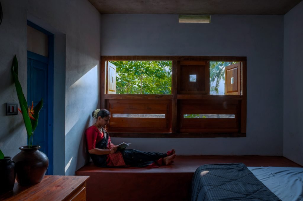
Objects and artifacts collected over a lifetime sit on surfaces and shelves without any curatorial self-consciousness. Black oxide tiles cover the floor, cool underfoot and absorbing rather than reflecting the available light. The green shuttered doors fold back entirely to open the living space to the veranda, and through them, the garden is immediately present, banana palms and tropical trees filling the frame. A mother and her daughter sit in the room separately, each absorbed in something, the quality of the light and the scale of the space making both feel entirely at ease.

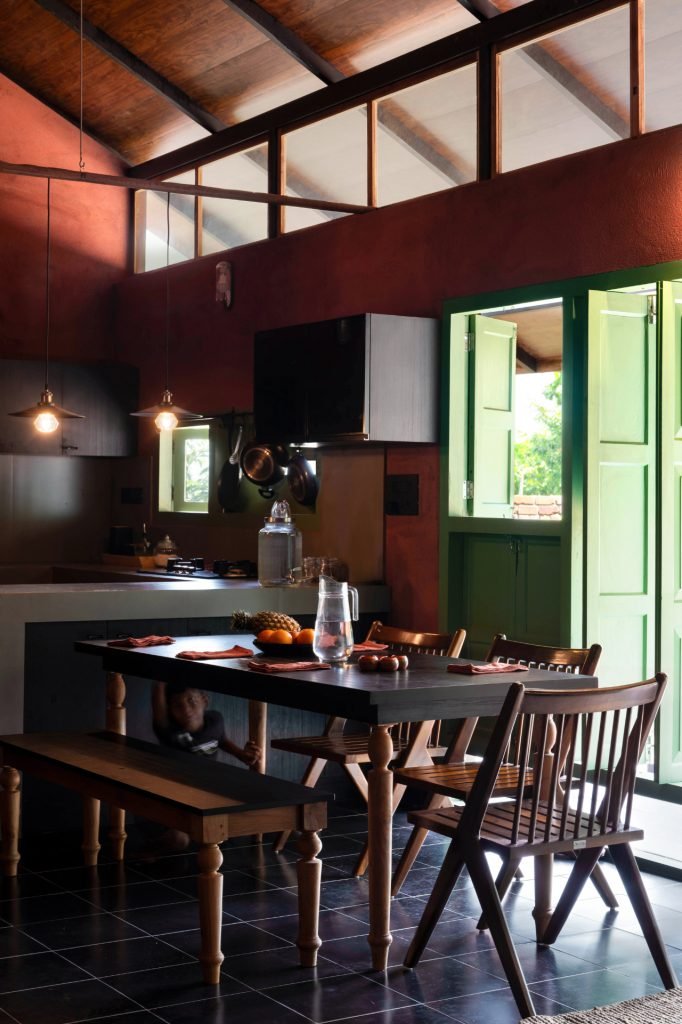
The kitchen and dining area continue without interruption in palette and feeling. The same red walls, the same timber pitched ceiling with its clerestory glass panels overhead, the same black tile floor. A dining table with a wooden bench on one side and individual wooden chairs on the other occupies the center, with two pendant lights hanging low above it. The green folding doors that open this room to the exterior are salvaged; their proportions and hardware belong to a different era, and they fit the room as if the room were built for them, which, in a meaningful sense, it was. The kitchen is restrained and functional behind the dining area, dark cabinetry receding behind the quality of the space.

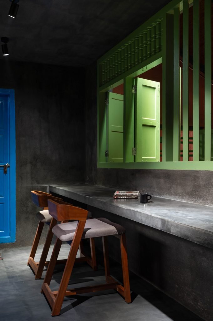
One of the more arresting rooms in EMA is a bar and studio space where the walls and ceiling are entirely charcoal black, the room deliberately nocturnal in character against the warmth of everything else in the house. A long concrete counter runs the length of one wall with wooden bar stools pulled up to it, a coffee cup, and a few magazines on the surface. Above the counter, a reclaimed green-painted wooden window with spindle detailing folds open to reveal the rust-red room beyond, framing it in vivid contrast as though it were a view into another world entirely. A blue door on the adjacent wall completes the composition. The color choices in EMA—rust red, charcoal black, sage green, and occasional blue—affect the room’s temperature and mood rather than serve merely as decoration.

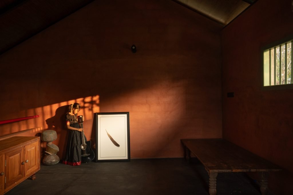
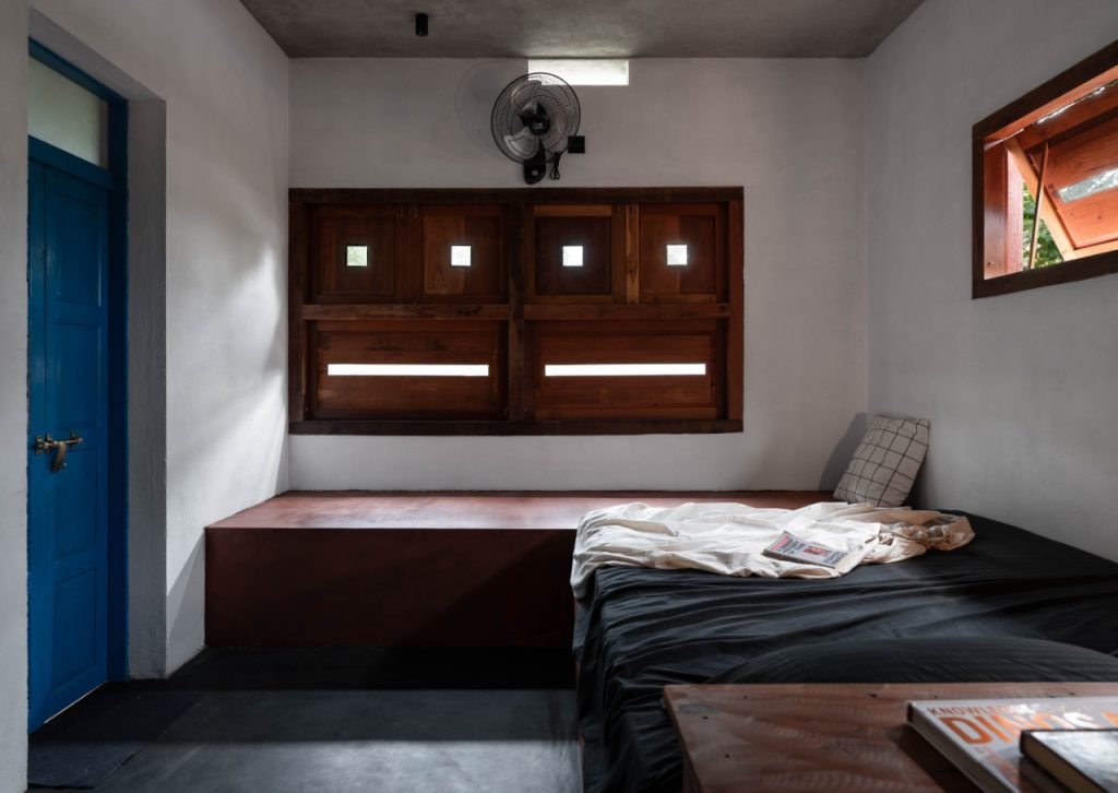
The second bedroom is a room of deep rust red walls and a sloped ceiling that follows the roofline, small barred windows admitting raking light at particular hours that falls across the textured plaster surface in long diagonals. In one photograph, a child in a black dress stands in this room holding a guitar, a framed artwork leaning against the wall beside her, the afternoon light from the window falling exactly on her. The room has the quality of a space where concentration comes naturally, where the enclosure and the warmth of the surfaces create the kind of stillness the project describes as a spatial virtue.

The attic, designed for work and fitness, is accessed not by a conventional staircase but by a steep reclaimed timber ladder that rises at a sharp angle from the living space below. It is one of the more memorable moments of movement in the house, the act of climbing it making the transition between the levels feel deliberate rather than incidental. A small green-framed opening in the attic floor looks down into the living space below, and in the photographs a figure leans through it looking down; the section of the house is suddenly readable as a series of connected levels with genuine spatial relationships between them.

Passive cooling runs through every decision in EMA without ever becoming the story in itself. The deep roof overhangs shade the walls through the hottest hours. The lime plaster walls breathe and regulate surface temperature in a way that synthetic renders do not. The oxide flooring stays cool. The built-in masonry platforms and benches and counters absorb and release heat slowly through the day. The deliberate and measured openings draw cross-ventilation through the rooms while the darkness of the interiors prevents solar gain. The seasonal summer bedroom is designed to function without mechanical cooling, a significant commitment in Malappuram.

Yuuga Design Collective describes EMA as a house intended to age gracefully. The lime plaster will gather patina. The Mangalore tiles will mottle with moss through the monsoon seasons. The reclaimed timber, already weathered when it arrived on site, will continue to the condition of the older buildings it came from. Time is treated not as an adversary to be resisted but as a collaborator that deepens character and meaning. The house records the rhythms of monsoon, heat, and daily inhabitation in its surfaces, and that recording is the point. EMA proposes a way of building that is less about creation and more about continuity, shaped by memory, sustained through ecology and enriched by craft. In 1,700 square feet in Malappuram, it makes that case quietly and completely.


Fact File

Project Name: EMA

Location: Malappuram, Kerala, India

Architect: Yuuga Design Collective

Principal Architects: Mithun Balan, Arun

Project Type: Private Residence

Project Size: 1,700 sq ft

Year of Completion: 2025

Photography: Shamil, Sanjay P

Creative Direction (Photography): Arshad Ashraf, Asfar

Instagram: @yuugadesigns

May 31, 2026 0 comments
0 FacebookTwitterPinterestEmail
Residential

Sindhu House, Sangamner- Maharashtra, India by Ajit Bendre Design Studio

by DDI Edit Team May 31, 2026
written by DDI Edit Team

Set within the agricultural landscape of Konkangaon near Sangamner, Sindhu House is a 2,500 sq. ft. weekend residence designed by Ajit Bendre Design Studio for a family of four. Conceived as a rural retreat, the project embraces its surroundings by reflecting the local climate and slower rhythm instead of imposing a polished farmhouse aesthetic.

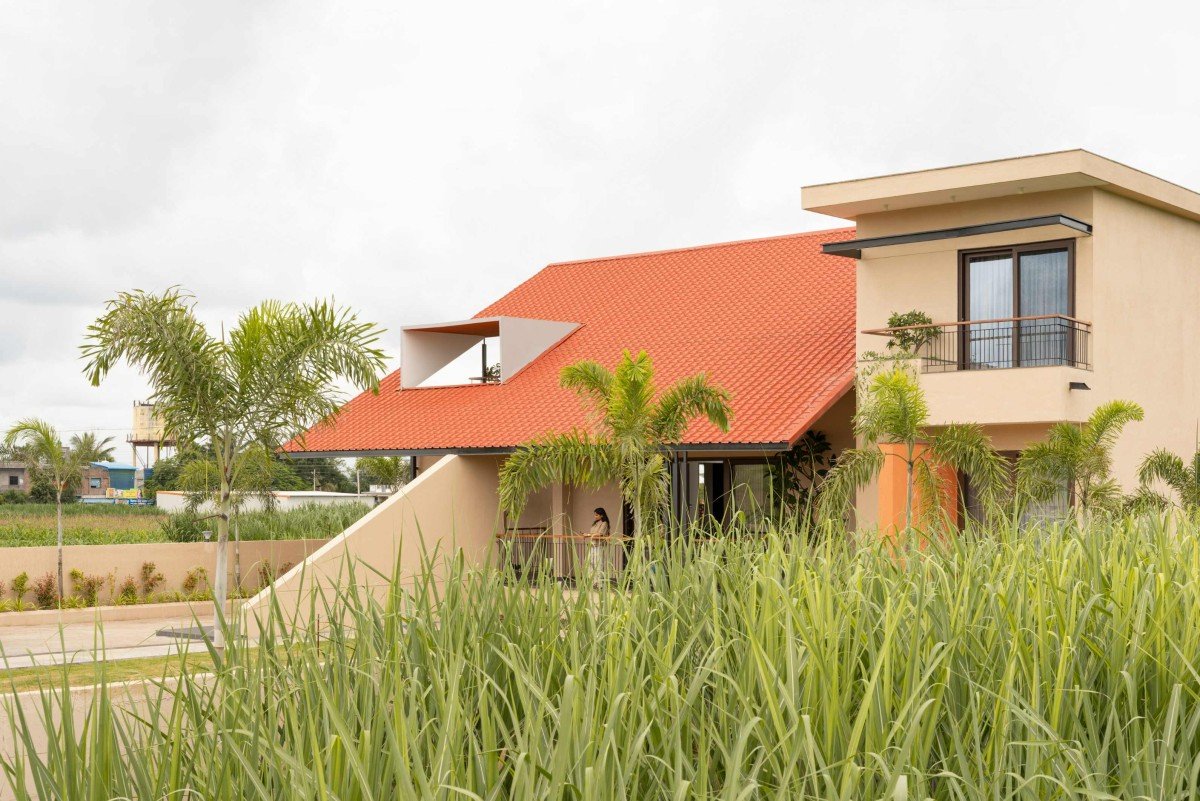
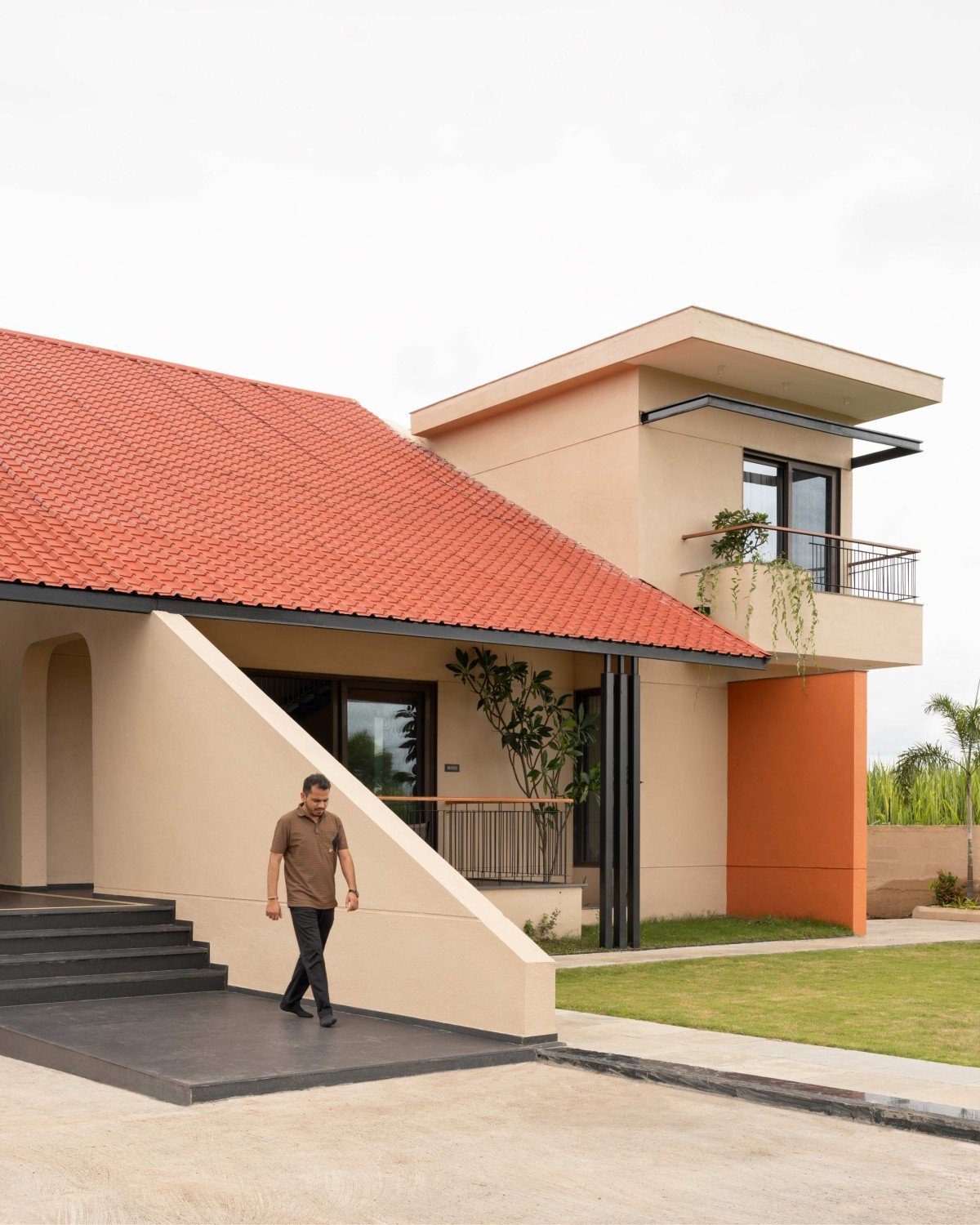
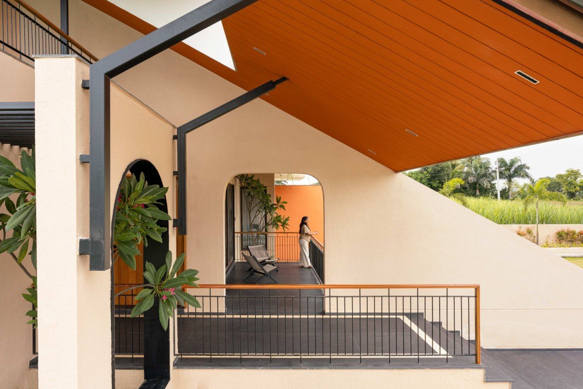
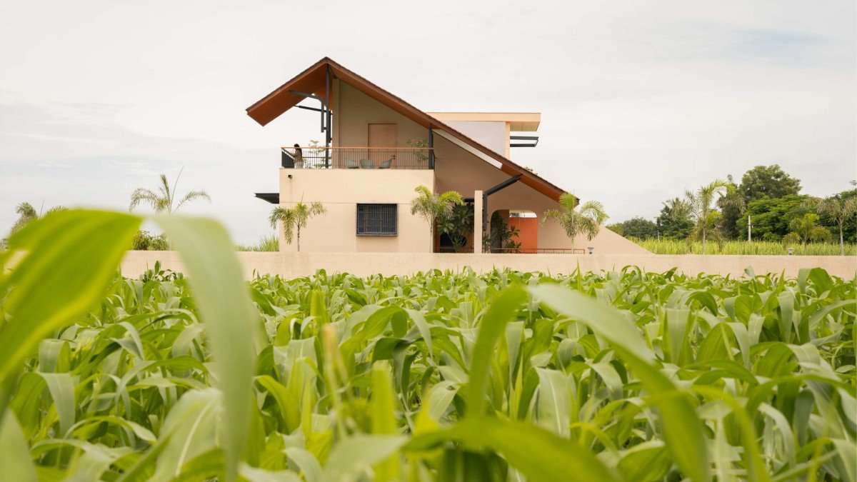
The house is immediately recognizable for its large sloping terracotta roof, which stretches across the structure in one continuous gesture. More than a visual feature, the roof becomes the organizing element of the design, creating deep overhangs, shaded terraces, semi-open sit-outs, and protected circulation spaces. In the context of Maharashtra’s intense summers and heavy monsoon rains, this oversized canopy plays a practical role while also giving the home its distinct profile against the surrounding fields.

Viewed from the farmland, the structure feels low and expansive despite its multiple levels. The roofline slopes dramatically downward, visually tying the upper floor to the ground and softening the overall scale of the house. The architects avoid heavy or imposing forms, instead breaking the mass into layered volumes and open edges that allow light and air to move freely through the spaces.

The idea of overlap becomes central to the planning of the home. Indoor spaces consistently open into transitional zones rather than ending abruptly at walls. Living areas spill into verandahs, terraces remain partially sheltered under the extended roof, and large openings frame uninterrupted views of the surrounding greenery. This approach gives the house a sense of openness while still maintaining intimacy for family living.

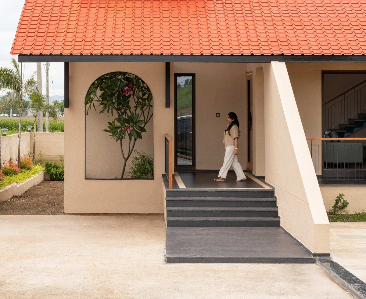
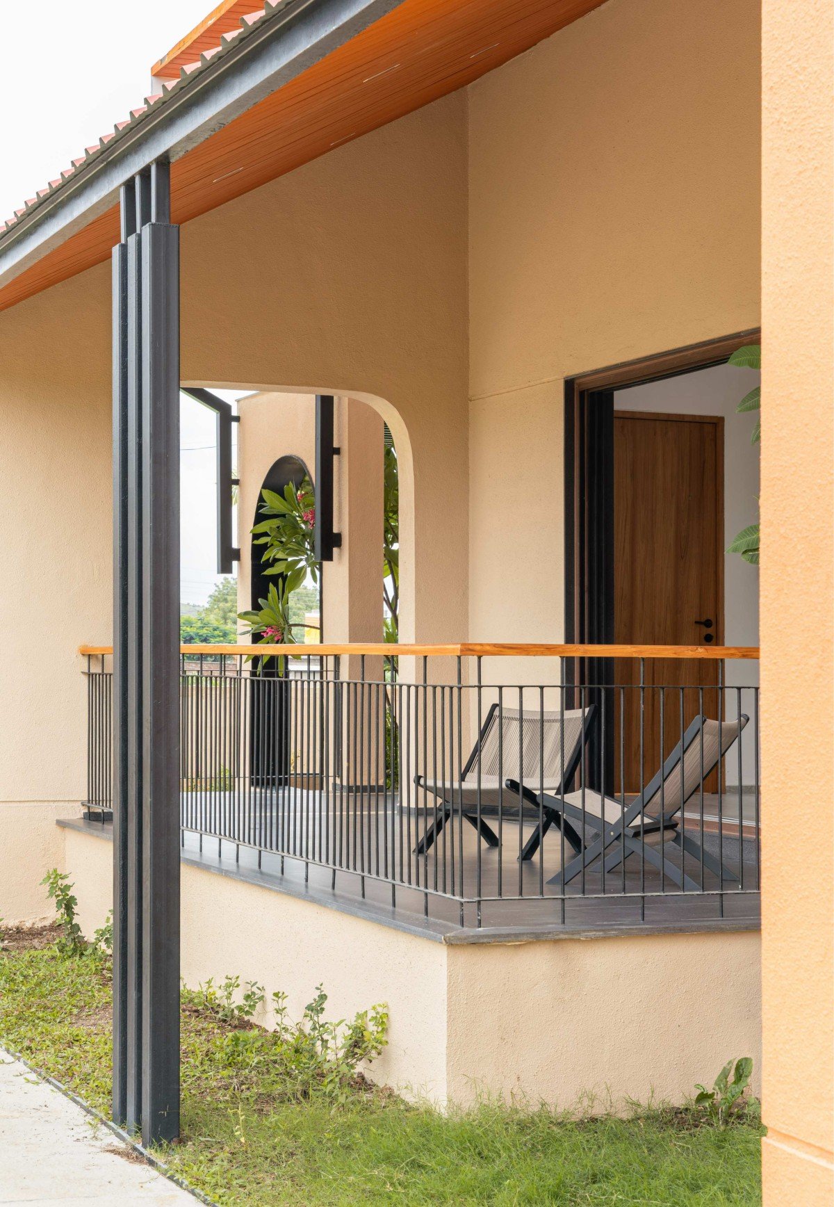
The entrance sequence reflects the same restraint seen throughout the project. A modest shaded porch leads into the home, framed by angular structural supports and softened with pockets of landscape. One of the most striking details here is the recessed planter niche integrated into the wall, where a flowering tree becomes part of the architectural composition rather than an added decorative element. The palette remains deliberately simple: muted plastered walls, terracotta roof tiles, dark metal members, and natural textures that sit comfortably within the rural setting.

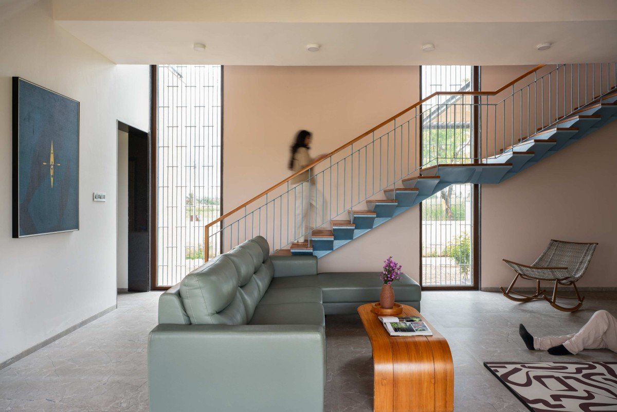
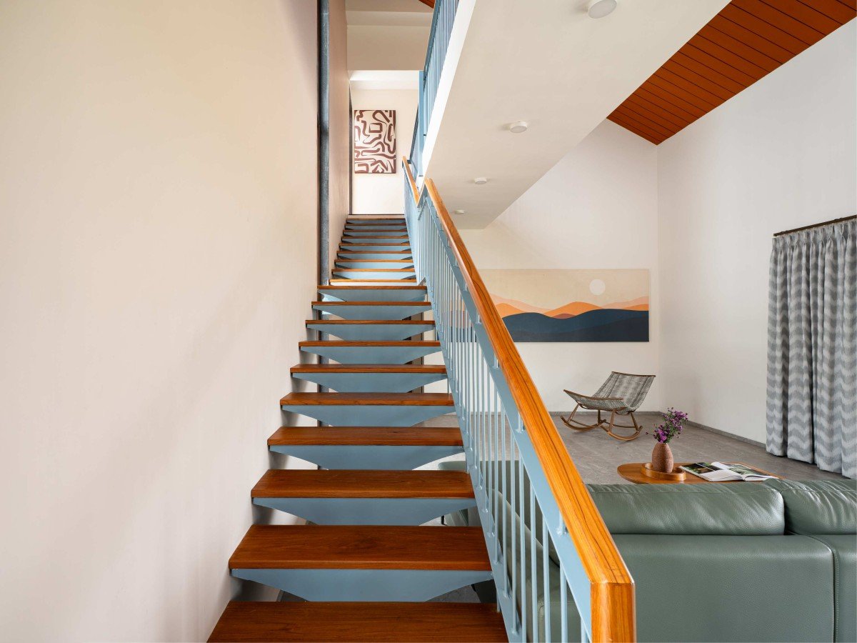
Inside, the double-height living room forms the spatial core of the house. Tall glazed openings bring in natural light throughout the day while maintaining visual connections with the outdoors. A linear staircase moves diagonally across the volume, adding movement and structure to the otherwise calm interior language. Slim railings and exposed stair undersides keep the element visually light, allowing the openness of the room to remain uninterrupted.

Furniture and finishes are intentionally understated. Soft neutral tones, clean surfaces, and minimal detailing allow the architecture itself to remain the focus. Instead of relying on decorative excess, the interiors derive character from proportion, daylight, and the relationship between solid and open spaces.

The upper terraces further reinforce the weekend-home character of the project. Protected under the sweeping roof yet open to the landscape, these spaces are designed for slower routines: sitting outdoors in the evening, gathering with family, or simply looking over the fields after rain. The architecture does not isolate itself from the site but remains constantly aware of it through framed views, cross ventilation, and shaded outdoor extensions.

What makes Sindhu House compelling is its measured approach. The project does not attempt to romanticize rural living, nor does it treat the countryside as a backdrop for spectacular architecture. Instead, the design focuses on climate responsiveness, spatial comfort, and continuity between the built form and the landscape around it. The result is a contemporary weekend residence that feels rooted in its setting without becoming nostalgic or overly stylized.


Fact File

Project Name: Sindhu House
Location: Konkangaon, near Sangamner, Maharashtra, India
Typology: Private Weekend Residence
Architects: Ajit Bendre Design Studio
Built Area: 2,500 sq. ft.
Completion Year: 2025

May 31, 2026 0 comments
0 FacebookTwitterPinterestEmail
Residential

Altura, Pune Studio Co.create

by DDI Edit Team May 30, 2026
written by DDI Edit Team

The hills around Pune sit at a particular distance from the city, close enough to feel like context and far enough to feel like escape. The 15,000-square-foot villa that Studio Co.create has completed on one of those hillsides for a private client works with that distance as a design condition rather than a view, framing it differently from each room, making it the most constant presence in a home that changes character considerably as you move through it.

The brief asked for a home that could hold large gatherings and daily family life in equal measure, that could be expansive in its public spaces and intimate in its private ones, and that could give each of the five bedrooms its own distinct identity while maintaining a coherent design language across all 15,000 square feet. Ar. Nishita Desai of Studio Co.create resolved the challenge through a palette of stone, warm wood, brass, and textured surfaces, applied differently in each zone but consistently enough that the home reads as a single considered work rather than a collection of individually designed rooms.

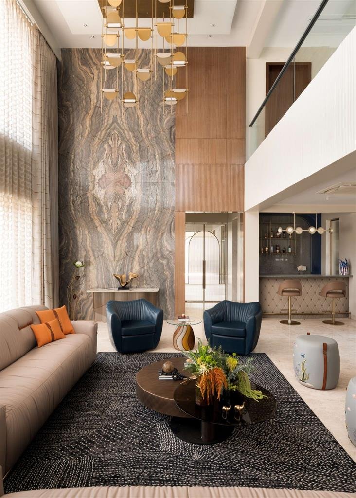
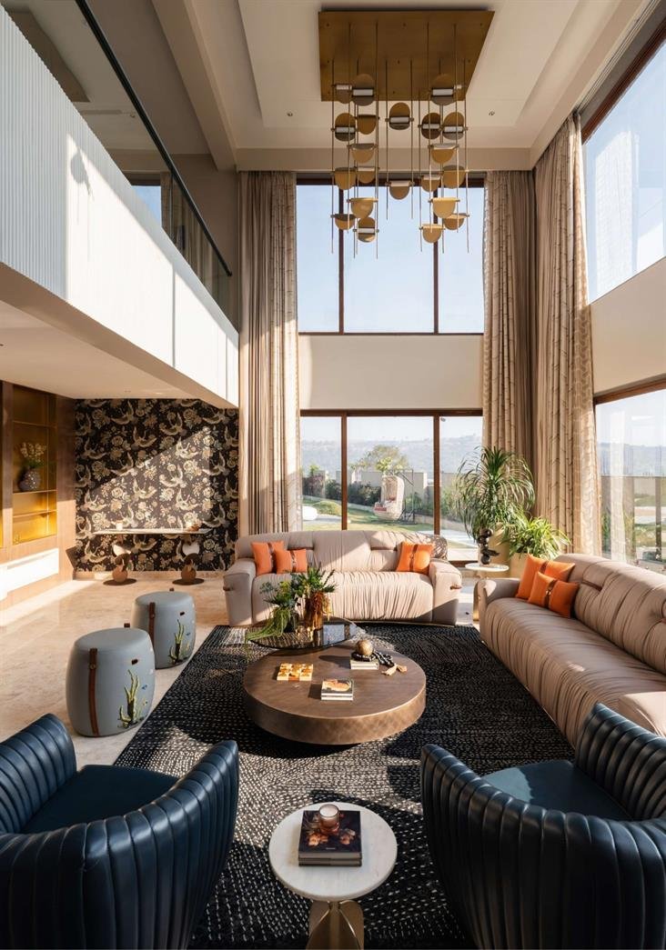
The double-height living room, at 25 feet, is the home’s most immediate declaration of intent. Full-height glazing on two sides of the room frames the hillscape, floor-to-ceiling sheers in warm beige filtering the afternoon light into something soft and diffused. A large brass chandelier with multiple disc-shaped pendants drops at different heights from the upper level, its scale calibrated to the volume rather than competing with it. The seating arrangement below is generous: two large pleated cream sofas with orange cushions, deep navy blue ribbed leather armchairs with a presence that reads almost as architectural, a round hammered brass coffee table sitting on a dark textured rug, and pale blue ceramic garden stools with painted botanical motifs placed as occasional tables across the floor. The orange of the cushions and the blue of the armchairs are the room’s two deliberate color notes, warm and cool sitting against each other with enough tension to keep the space from settling into any single mood.

One wall of this room carries a full-height slab of richly veined marble, its grain running in a dramatic, near-symmetrical pattern that makes the stone read as much as an artwork as a surface. Against this, on the opposite side, a section of dark floral wallpaper in black and gold frames the bar area, its botanical pattern dense and decorative in deliberate contrast to the mineral clarity of the marble. The bar itself is fitted with brass shelving and glassware, positioned within the living zone as a sculptural extension of it rather than a separate service element. From the upper-floor gallery, the glass balustrade reveals the living room’s full plan, which organizes the spacious area using color, materials, and furniture scale without walls.

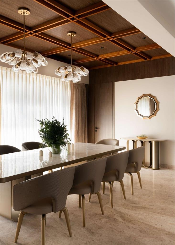
The dining room is a different register entirely. A coffered ceiling in warm walnut with brass inlay detailing establishes an atmosphere of considered formality before anything else does, its grid of warm timber overhead giving the room a sense of enclosure that the open living spaces do not have. Two large chandeliers with curved crystal elements and brass fittings hang above a long marble-topped table with brass edge detailing, the table surrounded by upholstered chairs in taupe with brass legs. A curved console table in cream stone with brass arch legs sits against the wall alongside an octagonal mirror with a brass and dark frame. The room is composed and unhurried, the light through the sheer curtains on the window side falling across the marble in a way that shifts through the day.

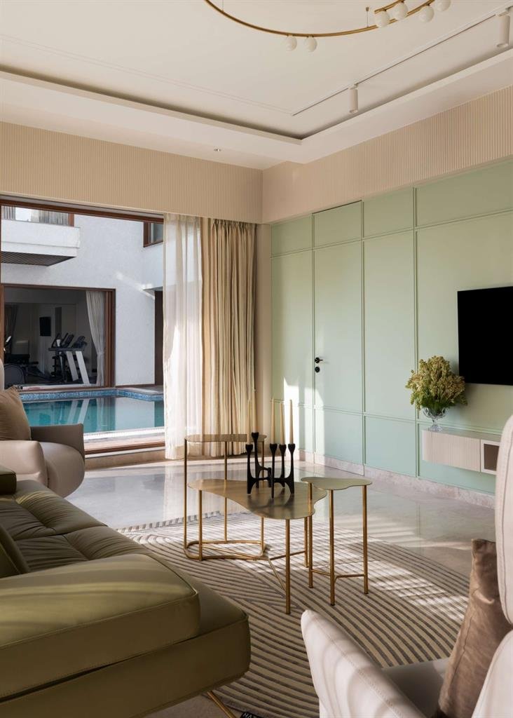
The family room sits adjacent to the pool, connected to it through large sliding glass doors that open the room directly to the pool deck, with the home gym visible through the glazing beyond. The mood here is lighter: a mint green paneled wall carries the television, an olive green chaise sofa and a white armchair face a pair of brass cloud-shaped coffee tables on a striped rug, and a brass ring ceiling light with globe bulbs keeps the lighting warm without being dramatic. It is the most casual room in the social sequence of the house, and it looks it in the best possible way.
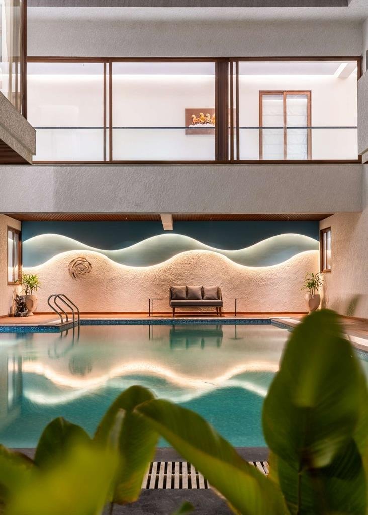
The indoor pool is the space that photographs least predictably and impresses most in person. The end wall of the pool enclosure carries a sculptural wave-form installation in textured plaster, its undulating surface backlit with warm LED light that makes the waves glow from within and then reflect perfectly in the still blue water below. A dark teal wall behind the wave installation deepens the color of the reflection. A coiled rope-like sculptural element sits on the wave surface. A small grey two-seater settee at the pool edge, blue mosaic tiles in the water, and the upper-floor gallery with a glass balustrade visible above complete a space that functions as both a swimming pool and a room designed around its own light.

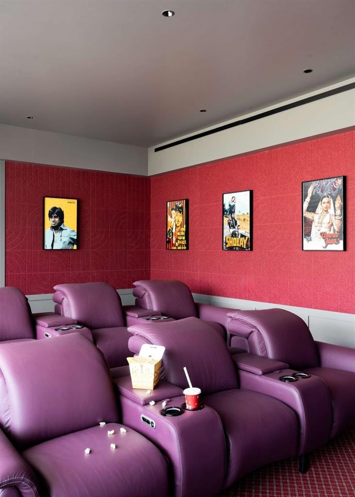
The home theater has committed entirely to its own personality. Deep raspberry-red acoustic panels with a subtle embossed pattern cover the walls, purple leather recliner seats with cup holders fill the floor in rows, and Bollywood film posters hang at intervals: Sholay, Mera Naam Joker, Umrao Jaan, and a portrait of Amitabh Bachchan in his early career. Red patterned carpet underfoot and a black ceiling above. It is a room that is entirely and unapologetically itself, which in the context of a house this careful about its own restraint is a welcome and generous surprise.

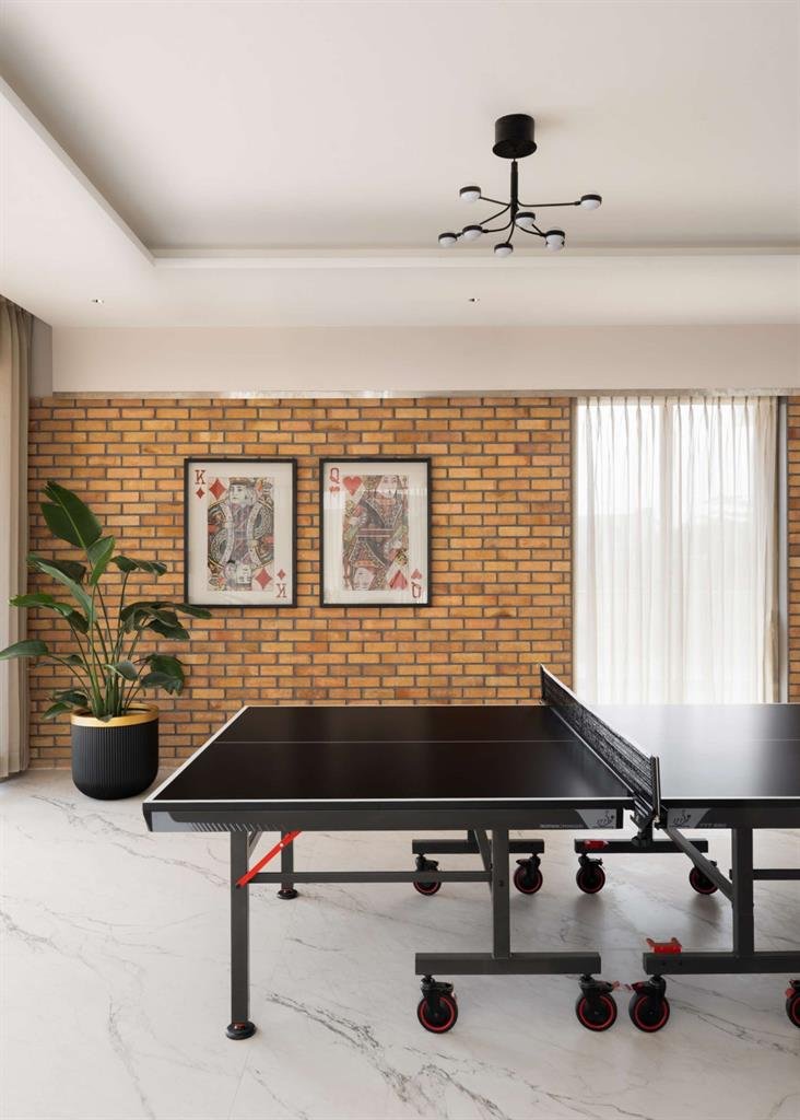
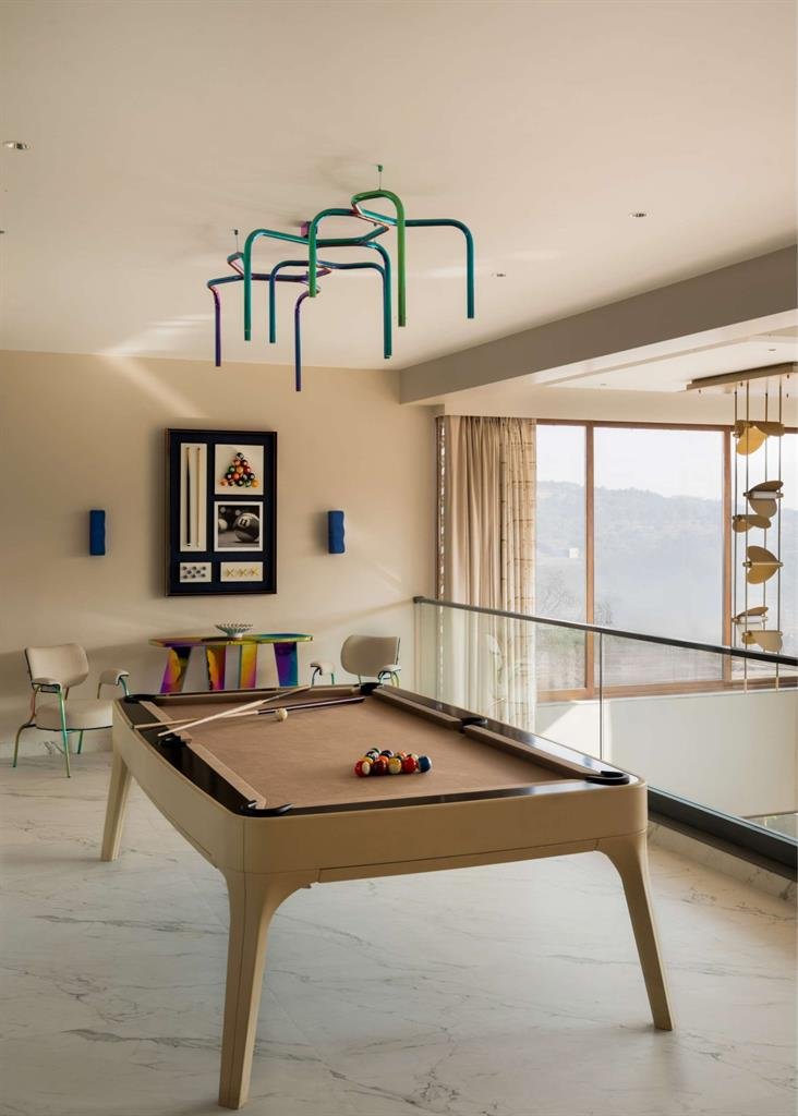
The games area runs across two adjoining spaces. The billiards room has a cream- and sand-colored pool table with taupe felt at its center, above which a multicolored iridescent chandelier with rainbow-toned tubular forms hangs, its colors shifting as you move around the room. A matching rainbow-finish side table and blue cylindrical wall sconces sit alongside framed billiards-themed artwork, and through the window the Pune hills are visible in the distance, a gold kinetic leaf sculpture catching the light on the other side of the room. The table tennis room next to it takes a different approach: an exposed brick wall in warm yellow-orange tones provides the backdrop, with framed King and Queen playing card artworks mounted on it and a black spider-form ceiling light above. The two rooms share a marble floor but nothing else, each one given enough freedom to feel distinct.

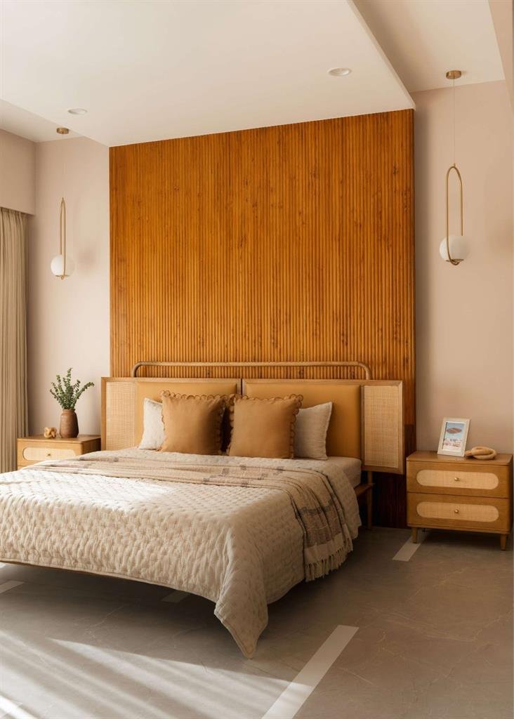
The five bedrooms are where the brief’s requirement for individual character is most fully realized and where Studio Co.create’s range as a practice is most visible. The first is organized around a full-height bamboo fluted panel in warm amber that runs floor to ceiling as the headboard wall, the cane-panelled bed frame and matching cane-fronted bedside tables continuing the material into the furniture, brass arc pendant lights with globe shades hanging on either side, dusty pink walls, and a grey stone floor. It is warm, tactile, and composed, a room that reads as a complete material idea.

The second bedroom takes a softer approach: a sage green botanical wallpaper with birds and foliage covers the headboard wall, and against this a scallop-edged upholstered headboard in pale grey sits with layered cream and linen bedding, a bleached wood bedside with three drawers, a ceramic vase of white lilies, and lace-perforated curtains that let through light in a particular quality. The room is gentle in a way the rest of the house is not, and the contrast makes it feel like a deliberate choice.

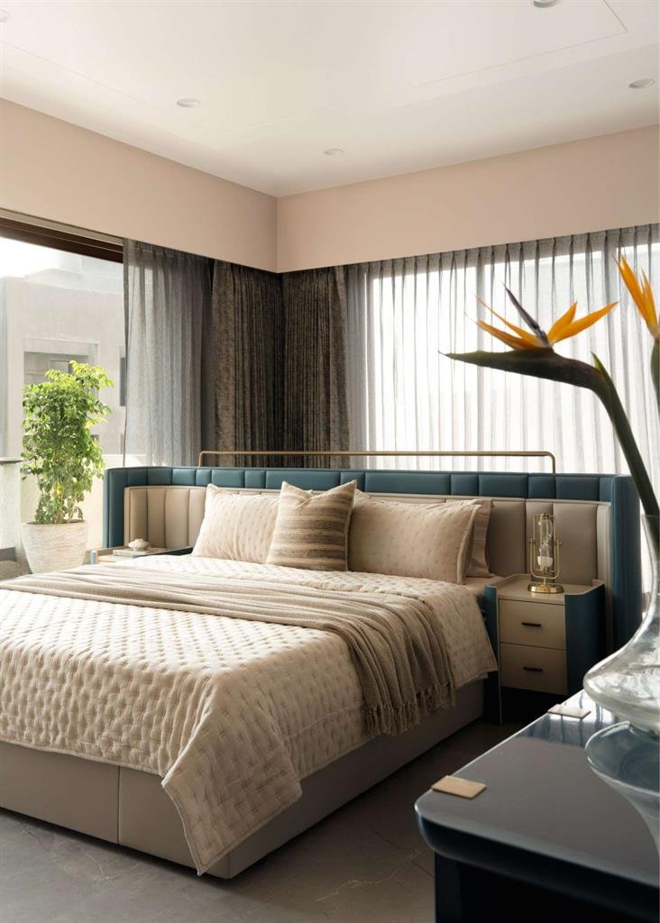
The third has a teal blue channelled leather headboard with a brass rail running across the top, a taupe bed frame, blush pink walls, and a large glazed opening to the private terrace with a bird of paradise flower visible in the foreground, the terrace planting close enough to feel like part of the room.

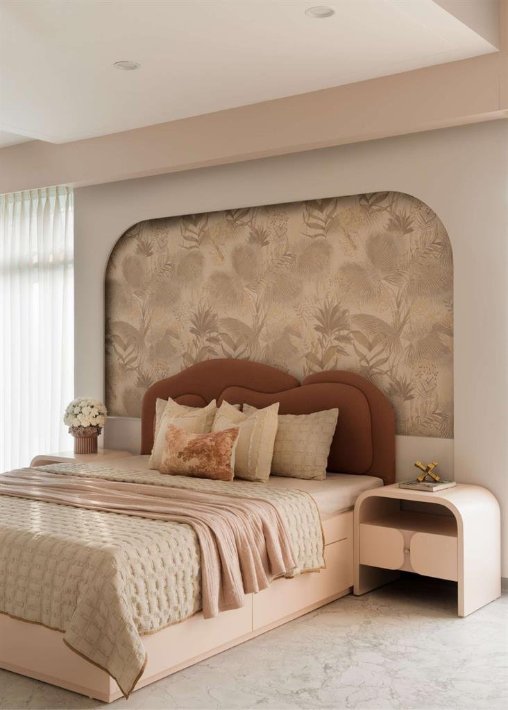
The fourth organizes its headboard wall as an arched alcove, within which a wallpaper in warm sand tones with tropical leaf forms sits framed by the curved arch edge. A rust-colored cloud-form upholstered headboard floats in front of the wallpapered alcove, and a blush pink bed frame with matching arched bedside tables with rounded corners completes a room that is the most quietly playful in the house.

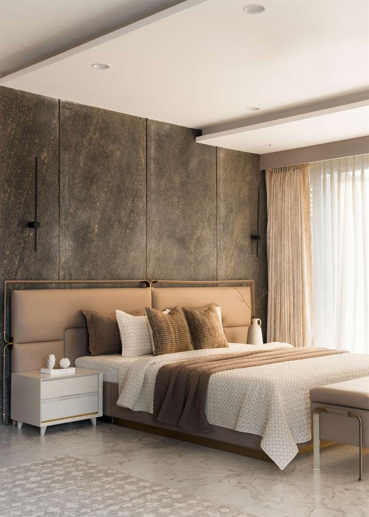
The fifth is the most dramatic of the five. Large format panels in a dark oxidized bronze texture cover the entire headboard wall, floor to ceiling, their surface warm and complex, sitting between stone and metal in visual quality. A wide camel-leather upholstered headboard with a brass rail above it, brown and cream textured bedding, white fluted bedside tables with gold detail, black wall-mounted reading lights, and a marble floor with a geometric inlay pattern. It is the room that most directly references the material ambition of the living room downstairs, and it lands as a destination rather than a place to sleep.

Across 15,000 square feet on a hillside in Pune, Studio Co.create has built a home that holds its scale well; keeps its character consistent without making every room feel like every other; and gives the hills outside the kind of relationship they deserve: present from most rooms, framed rather than simply seen, and part of the house without being something the house depends on.


Fact File

Designed by: Studio Co.create

Project Type: Interior Design

Project Name: Altura

Location: Pune, Maharashtra, India

Area: 15,000 sq ft

Year of Completion: 2025

Lead Architect: Ar. Nishita Desai

Photography Courtesy: Studio Colourblind

May 30, 2026 0 comments
0 FacebookTwitterPinterestEmail
Commercial

McKinsey & Company, Delhi NCR Ultraconfidential Design

by DDI Edit Team May 30, 2026
written by DDI Edit Team

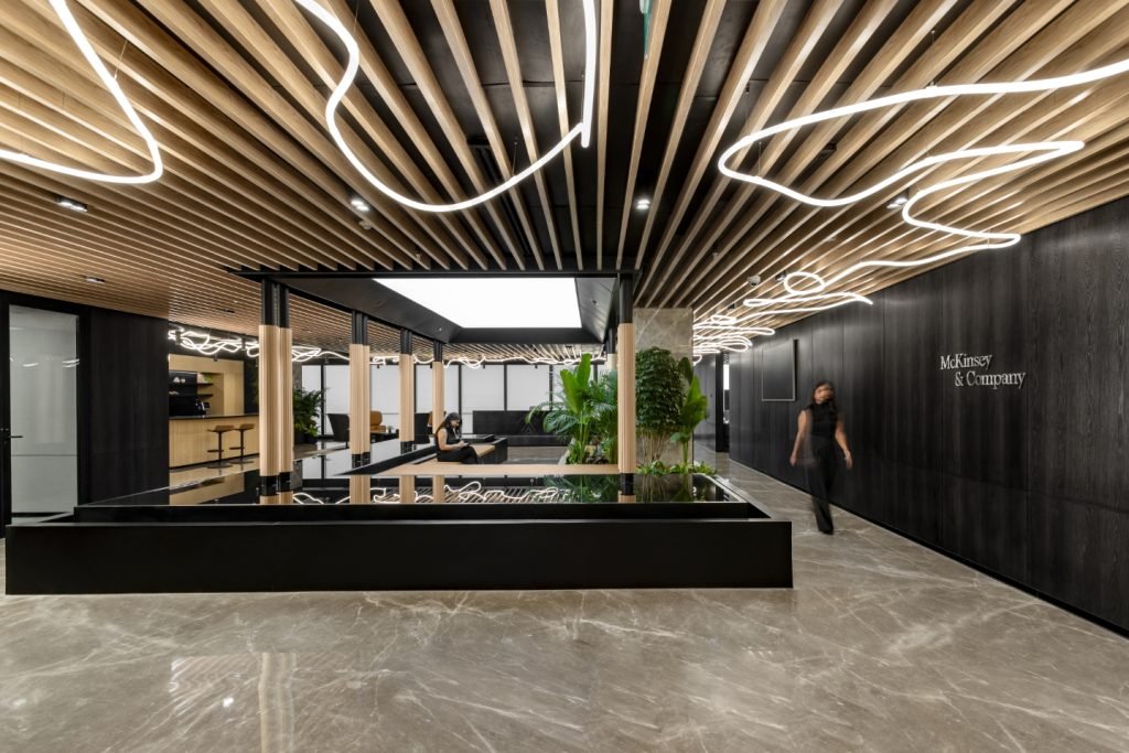
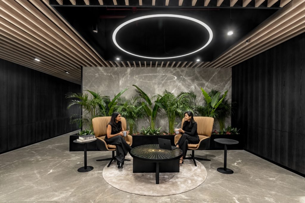
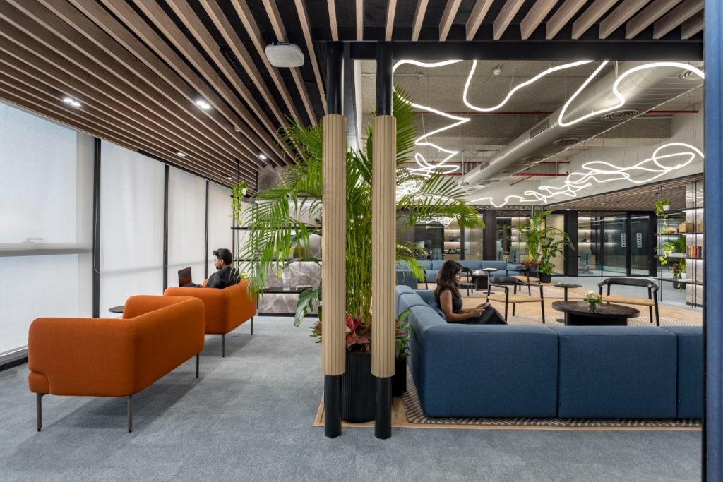
Seventy thousand square feet is a significant amount of space to make feel coherent. For McKinsey & Company’s new head office in Gurugram, Ultraconfidentiel Design resolved this not through a single dominant gesture but through a design logic that runs consistently from the reception to the deepest workstation bay: a palette of dark wood veneer, light oak, black steel, grey marble, and dense tropical planting, held together by a freeform white LED installation that threads through the entire floor plate like a continuous drawn line.

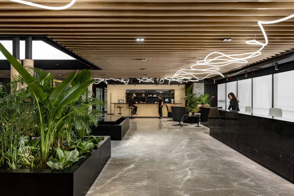
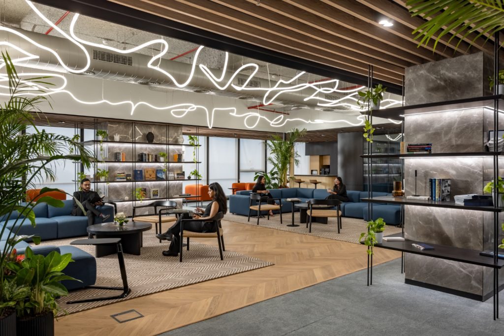
That installation is the first thing you register on arrival. Moving through the reception, the ceiling shifts between warm wood slats and exposed black-painted slab, and across both surfaces the white LED tubes loop and curve in organic, unbroken forms, their glow steady and cool against the warmth of everything below. The effect from a distance is of something between a light fitting and a drawing, the lines too fluid to read as architectural and too deliberate to read as accidental. They establish the character of the floor before anything else does.

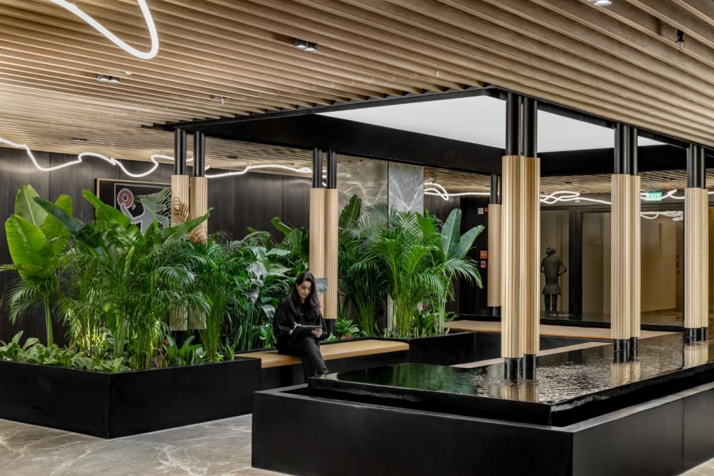
The reception itself is organized around a courtyard, carried across from McKinsey’s previous environment and reinterpreted here as the spatial and emotional center of the new office. A black steel and light oak pergola structure frames a still, dark water feature set into the black marble floor, the reflective surface doubling the planting that surrounds it: banana leaf plants, areca palms, ferns, and ground-level tropical growth filling the black planters on all sides. A timber bench seat within the pergola offers a place to pause that reads more like a garden than a waiting area. The grey veined marble flooring of the reception runs into and around this installation, the contrast between the hard reflective stone and the living density of the planting giving the arrival sequence a quality that most office lobbies of this scale do not manage: genuine calm. The McKinsey name sits on the full-height dark wood-veneered wall to one side, the identity present without needing to dominate.

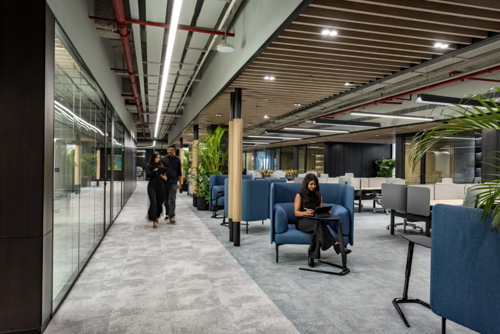
From reception, the floor opens into a social library and lounge zone where the ceiling shifts again, the wood slats giving way to the exposed grey concrete slab, with the LED installation continuing through it. Blue sectional sofas and terracotta-orange single sofas occupy this zone in separate groupings, divided by the wood-clad columns with black steel bases that appear throughout the floor plate, each column base planted with a tall areca palm in a black cylindrical pot. The planting is not decorative in the way office planting usually is. It is dense and varied enough to function as a spatial element, the palms and banana leaves creating visual boundaries between zones without walls or partitions, the green moving through the space as a continuous thread from reception through to the workstation floor.

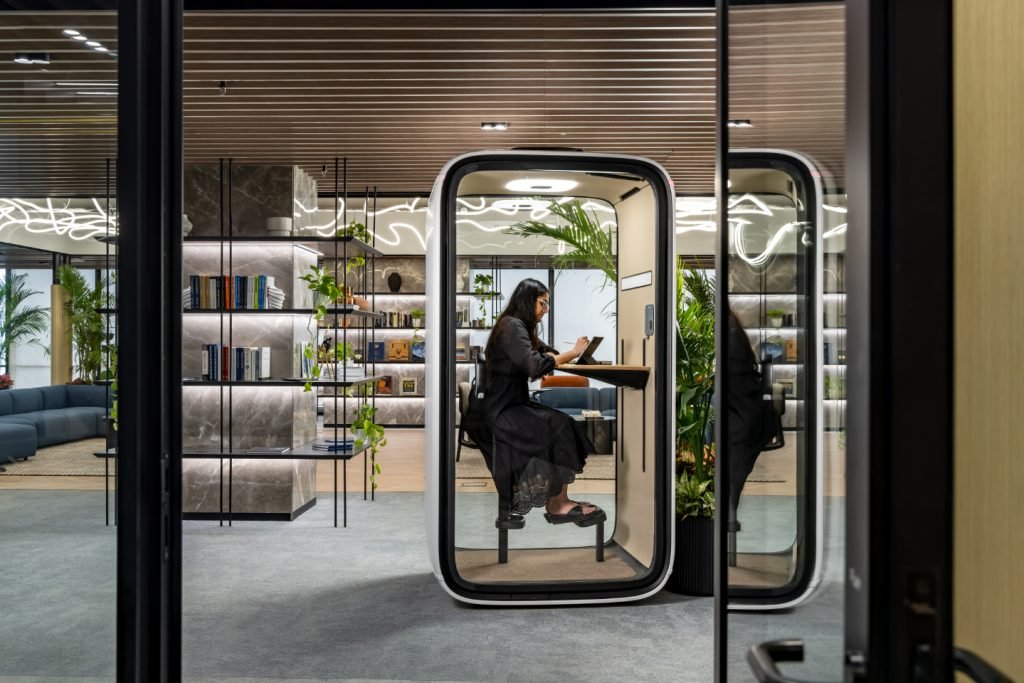
Within the social library, a compact private phone pod sits against the bookshelf wall: a fully enclosed unit with a rounded black and white frame, lit internally, and a desk surface inside. The shelving behind it holds books, ceramics, and small objects alongside trailing plants, the grey marble panels of the wall giving the library zone a material weight that distinguishes it from the softer lounge areas around it.

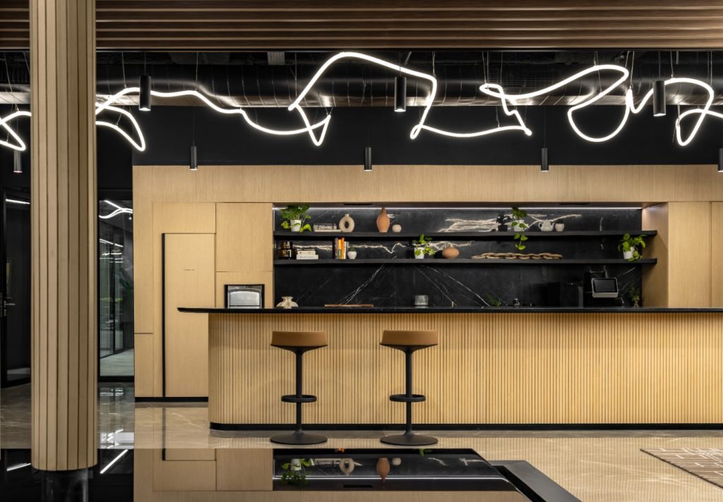
The café counter, finished in light oak fluted panels with a black marble top and open shelving above displaying ceramics, plants, and a few books, sits under the most concentrated section of the white LED installation; the freeform tubes are particularly dense above this counter, its black ceiling making the white lines more vivid here than anywhere else on the floor. Two tan leather tulip stools are at the counter. It is the social infrastructure of the office, and it looks the part.

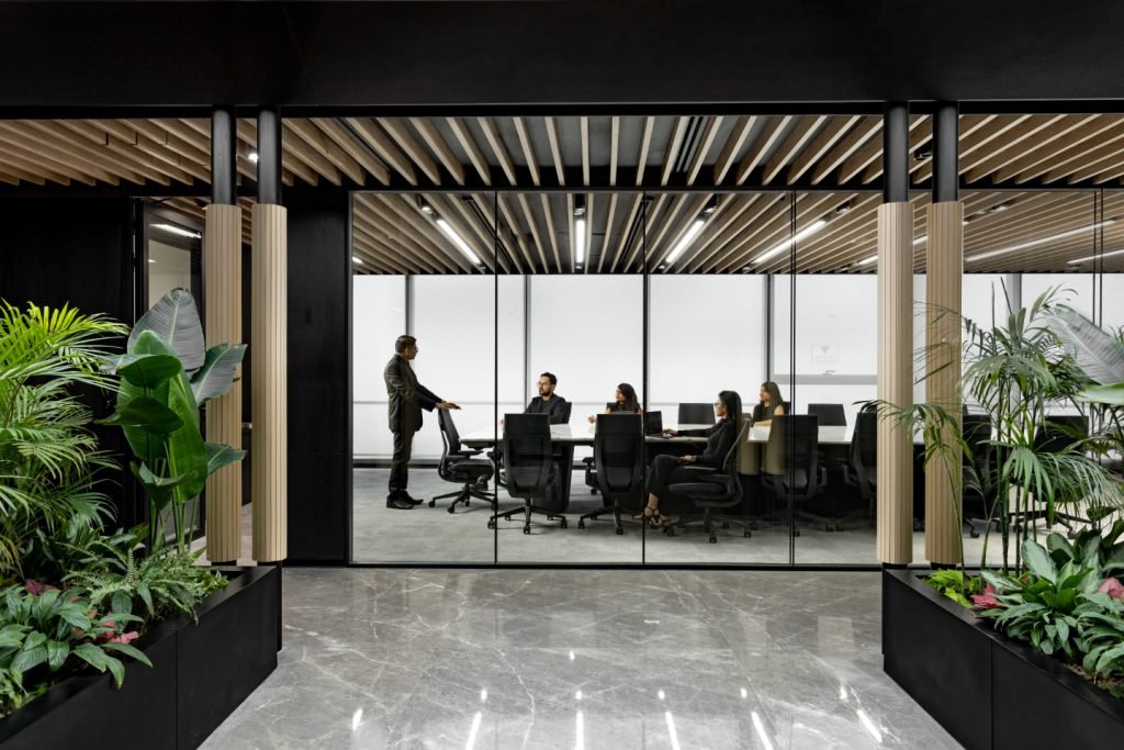
The meeting rooms run along the perimeter in a glazed corridor of black steel framed glass walls, the rooms behind them distinguished by internal acoustic panels in cream fluted fabric, wood slat ceilings, and in one smaller room a single yellow upholstered armchair alongside a standing-height worktop, an informal meeting room that sits between a conversation space and a private focus room. The main boardroom carries a long white conference table and black task chairs, a presentation screen at one end, the window behind it letting in the views of the highway and city skyline that the brief describes. Between the meeting rooms, in the corridor, dense tropical planting fills black troughs, the large leaves visible through the glass walls of the rooms, so that even in a formal meeting the greenery is present in the peripheral vision of everyone at the table.

The workstation floor is straightforward in its organisation: long benching runs with light surfaces and grey upholstered task chairs, acoustic screen panels between positions keeping the noise down without blocking sightlines. Black linear pendants run in parallel above the workstation banks, the ceiling here exposed concrete. Glass-partitioned rooms with warm amber tinted glazing line one side of the workstation floor, the amber giving those rooms a visual warmth that distinguishes them from the open floor while keeping the transparency that the design maintains throughout. Along the circulation spine between workstations and enclosed rooms, bar-height counters in light oak with white bar stools offer an alternative to desk working, the locker bank in dark timber behind them, a framed artwork on the wall, an elliptical white LED ring above. The phone pods appear again here in a line down the corridor, the palms continuing between them.

Handpicked marbles, bold wood veneers, Andreu World and Steelcase furniture, Interface flooring, Dorma partition systems, and Regent and Luz lighting. The material and product specification is consistent with the floor’s overall ambition: every element is chosen to perform well and last well; nothing is present for effect alone.

Fact File

Designed by: Ultraconfidentiel Design

Project Type: Office Interior Design

Project Name: McKinsey & Company

Location: Delhi NCR

Project Size: 70,000 sq ft

Client: McKinsey & Company

Scope: Design & Build

Lighting: Regent Light, Luz Light

Partition System: Dorma

Flooring: Interface

Furniture: Andreu World, Steelcase, Howorth, MMA

Photography Courtesy: Jeetin Sharma

May 30, 2026 0 comments
0 FacebookTwitterPinterestEmail
Hospitality

1331 Lounge, Vadodara Studio Imagine

by DDI Edit Team May 29, 2026
written by DDI Edit Team

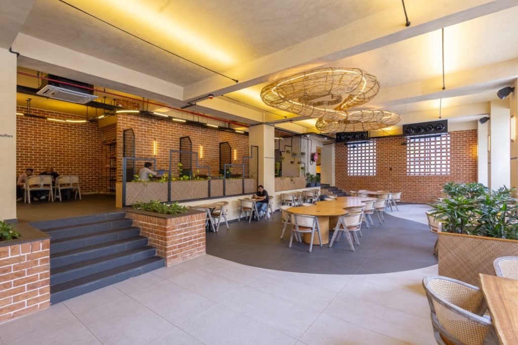
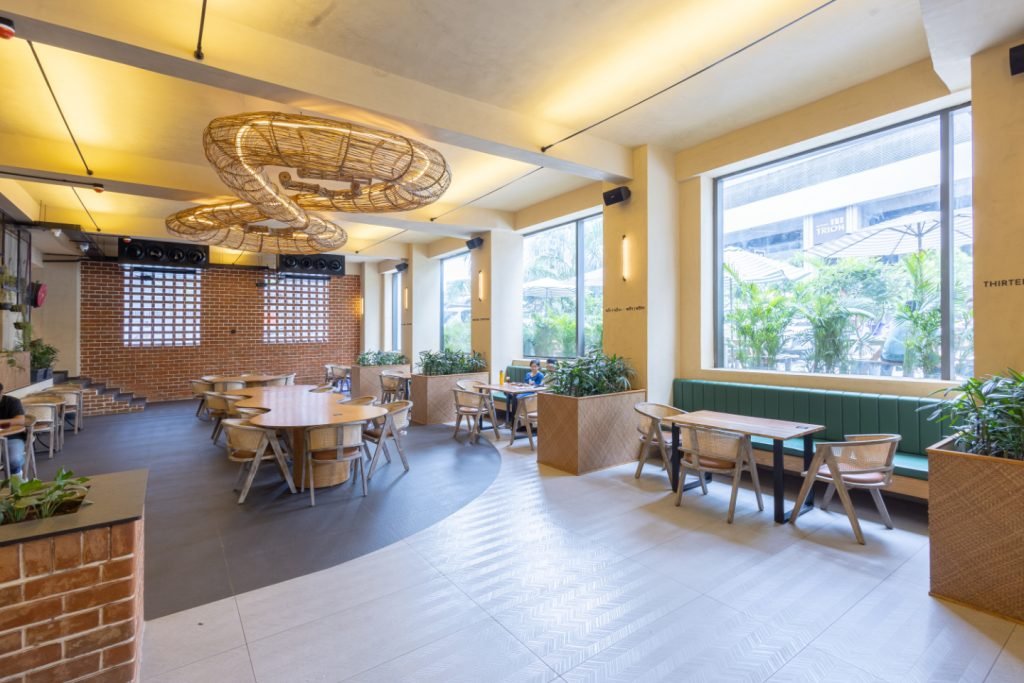
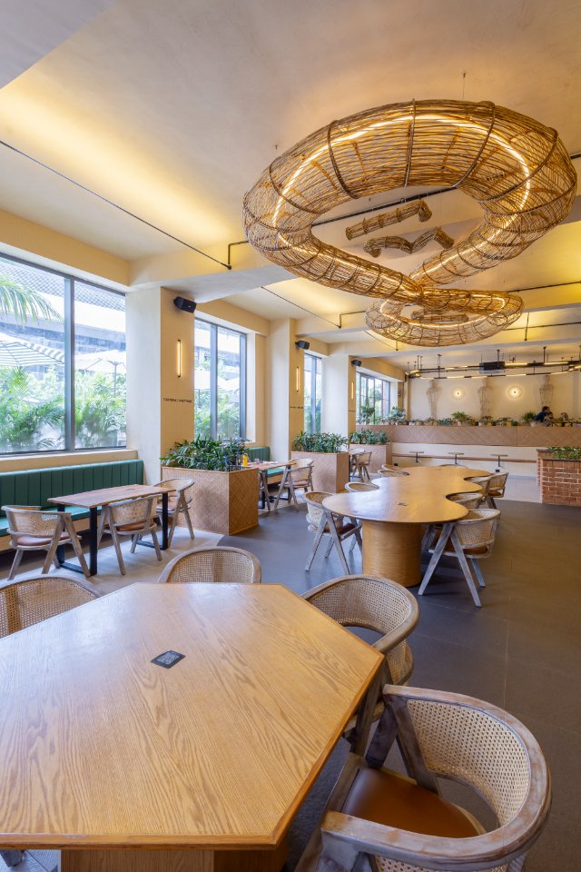
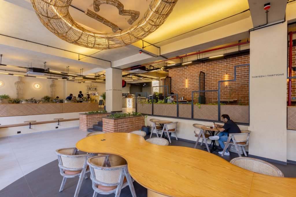
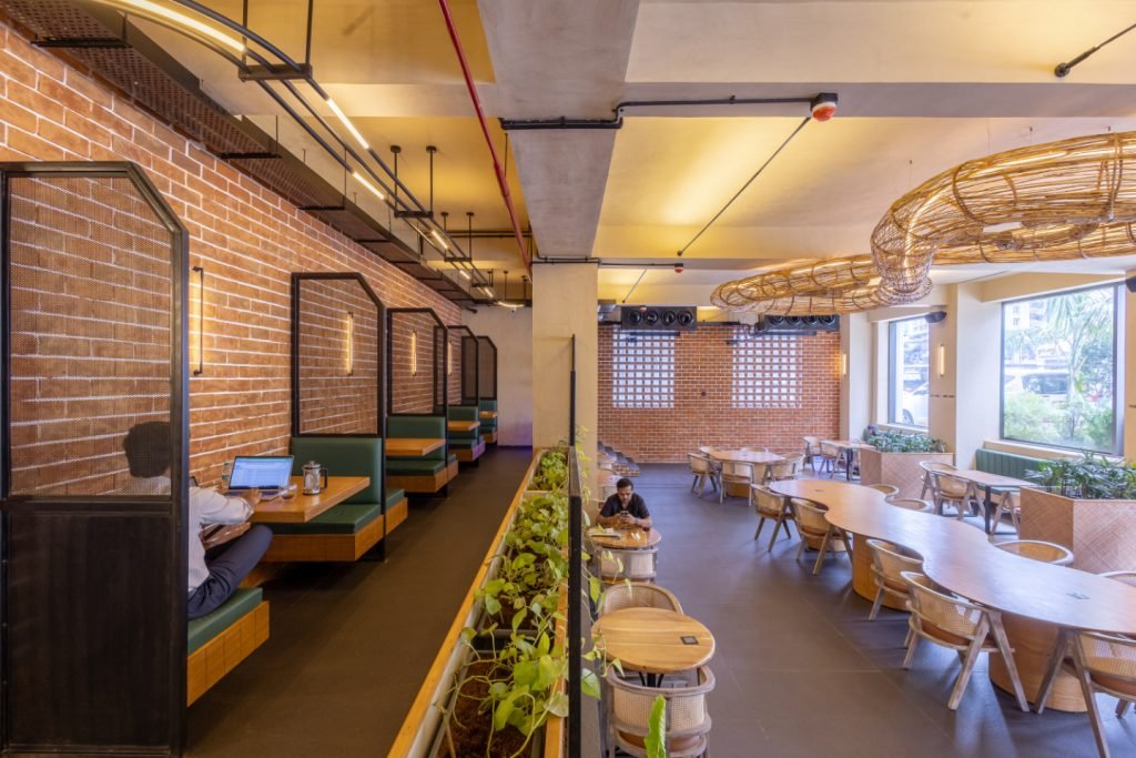
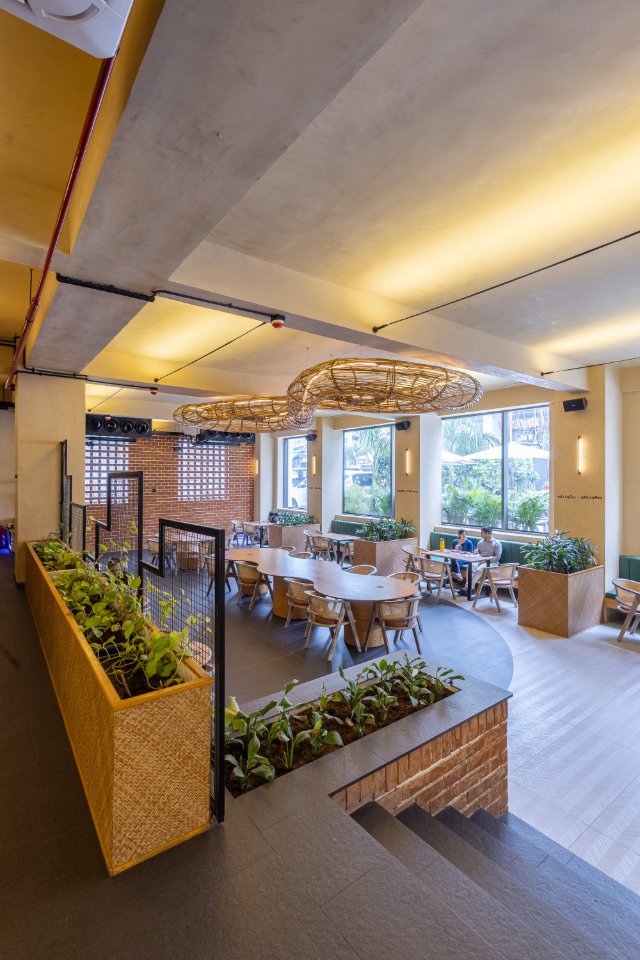
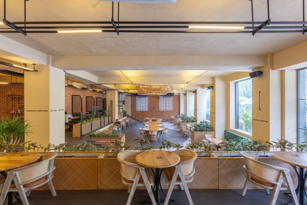
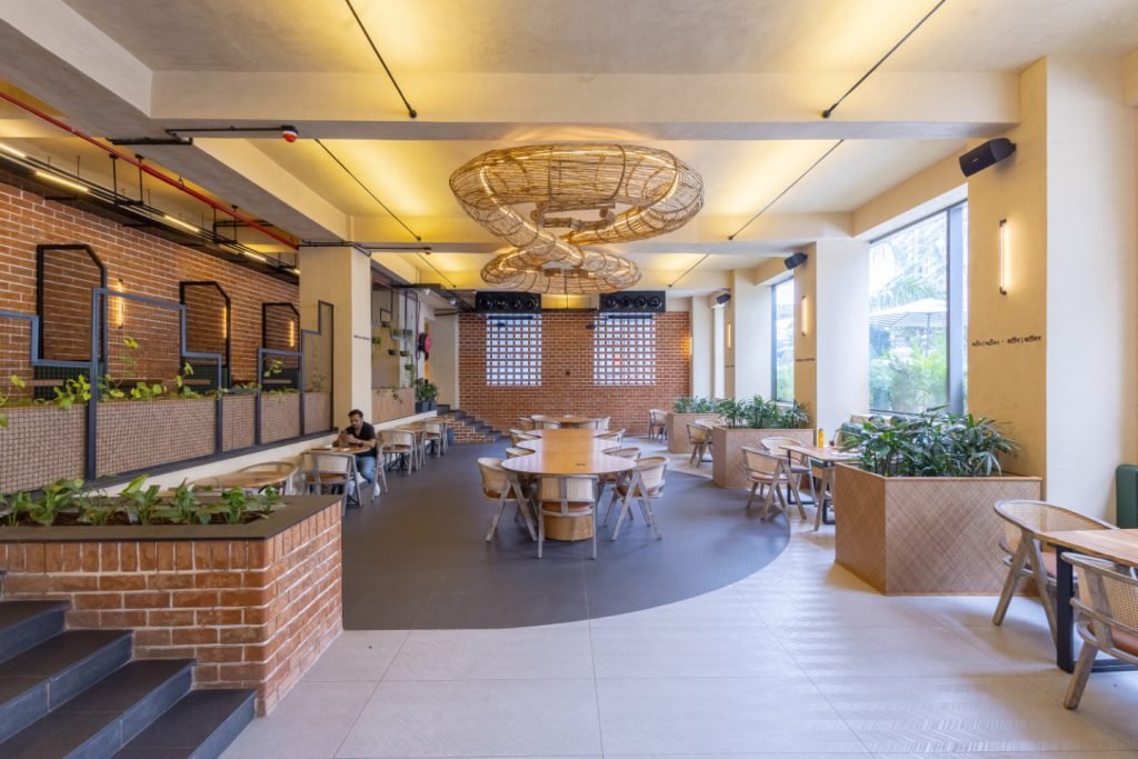
The name comes from the address. Thirteen and thirty-one, flipped and mirrored, are the two numbers that give the lounge its identity and run through the design as a thread rather than a logo. The most visible expression of this concept is overhead: a large woven rattan installation suspended from the ceiling in overlapping rings of different scales, lit from within with warm LED strips, with the numbers 13 and 31 worked into the form of the woven loops. It hangs above the main dining zone, drawing the eye upward upon entry with its warm, handcrafted design against the off-white plaster ceiling—an unforgettable focal point. There are actually two of them, staggered at slightly different heights and positions. The effect from below is something between a sculptural installation and a lighting fixture, occupying enough visual territory that the rest of the room organizes itself underneath.

In 2025, Studio Imagine designed 1331 Lounge on the Sarabhai Campus in Vadodara, transforming 3,430 square feet into a multifunctional cafe and lounge that accommodates various activities seamlessly. Someone working alone on a laptop in a booth, a group of six around a communal table, two people at a window seat with no intention of leaving quickly: the space accommodates all of them, and it does so through design rather than through size.

The floor plan works across two connected levels. A short run of dark stone steps, their base edged in exposed brick, separates the lower zone, where the main communal dining sits on a curved dark grey floor, from the upper level, which shifts to large-format light herringbone tile and carries smaller tables close to the full-height windows. The curve of the dark floor zone on the lower level is one of the more quietly effective moves in the plan. It draws a boundary around the central communal tables without walls or partitions, giving the main dining area a defined territory within the open space so that the room feels organized without feeling divided. The organic-edged solid wood communal tables sit within this curved zone, surrounded by a mix of cane-back chairs and lighter folding chairs, the combination keeping the seating from reading as too uniform or too deliberate.
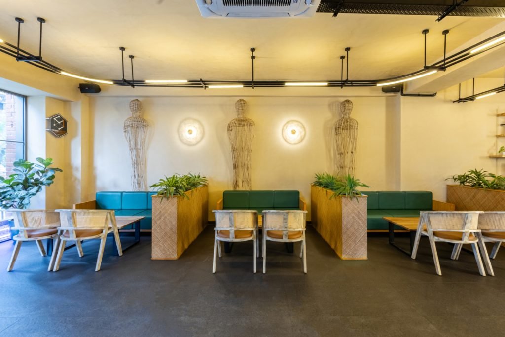
The upper level on the herringbone tile is a different atmosphere. The full-height windows here look out to the palm-lined campus exterior, the outdoor planting close enough and dense enough to read as part of the interior, the light coming through green-tinted and generous. Smaller individual and paired tables sit near the glass, and the quality of this zone, the particular light, the view, and the slightly removed position from the busier lower floor make it the part of the cafe where people tend to stay longest.

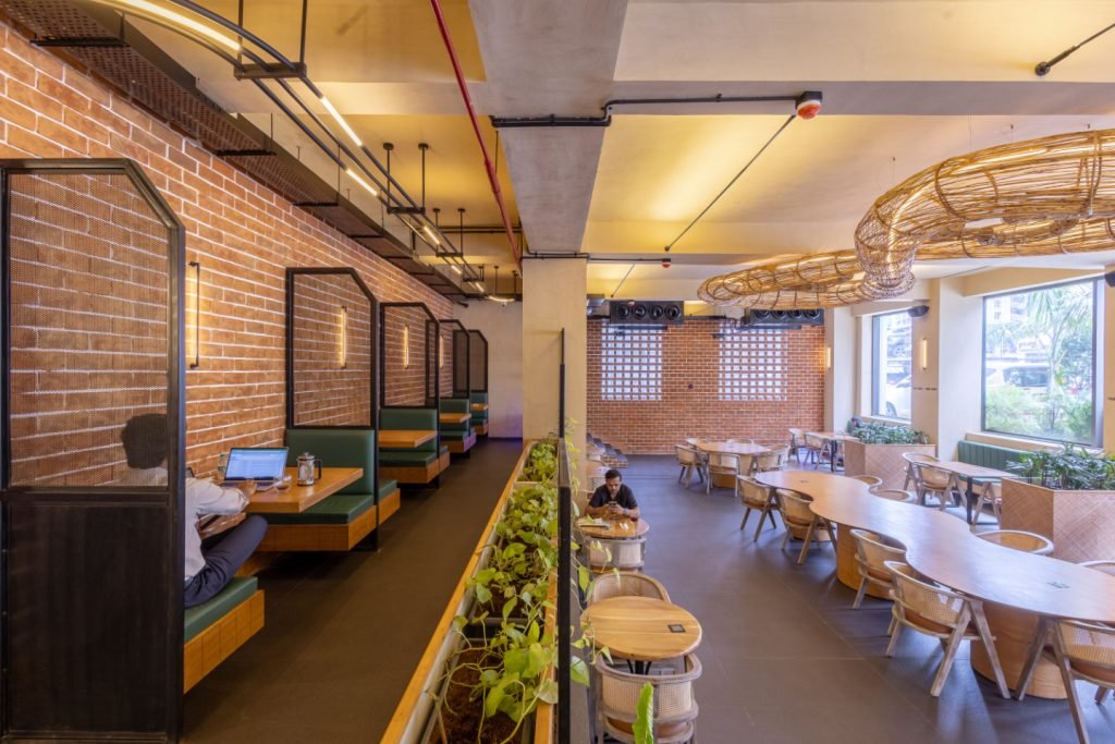
The rear wall of the space is full-height exposed brick, warm red, running the entire back of the room and wrapping around into the booth zone on the left. Within the brick, jali sections perforated in a grid pattern are set at intervals, filtering light through while keeping the texture of the wall continuous. It is the room’s warmest and most material surface, and it gives 1331 its character more than any other single element. The brick serves as the anchor around which the rest of the palette is assembled, contrasting with the ochre yellow of the other walls, the warm wood of the furniture, and the dark grey of the floor.

Along the left wall, the booth zone runs the full length of the brick. Each booth is a semi-enclosed enclosure framed in black metal with cane mesh panels on the sides, dark green upholstered banquette seating inside, and a small table in front. The black metal framing and deep green upholstery provide cool contrast in an otherwise warm room, positioning the booths as distinct destinations rather than mere seating options. Above them, a black pipe grid carries linear tube lighting that keeps the booth zone distinctly and separately lit from the warmer pendant atmosphere of the main floor, reinforcing the sense that this is a different kind of place to be within the same room. Through the day the booths fill with people working, the cane mesh panels giving enough visual separation for focus without isolating anyone from the life of the room going on around them.

Between the booth zone and the open dining floor, a long planter runs the full length of the dividing partition, trailing green plants spilling over the edge. Greenery appears throughout the space in the same way: at the base of the brick steps in low planters, in large freestanding boxes near the windows, and in smaller pots on the upper level. The greenery serves as a cohesive design element that connects the interior to the campus landscape, surpassing the effect of the full-height windows alone.

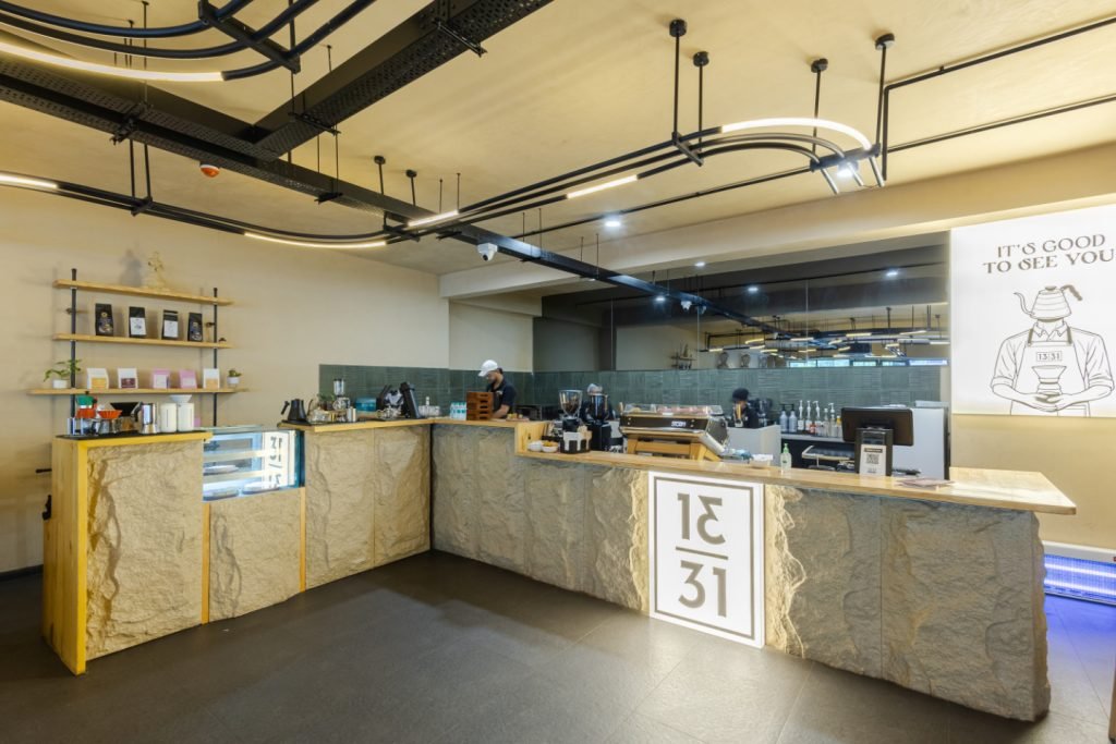
The coffee bar counter sits clad in textured stone with warm wood accents, the 1331 identity marked on its face. On the wall nearby, an illuminated text piece reads “It’s good to see you.” It is a small, unelaborate gesture, and it lands well because the space behind it has already made good on the promise before you reach the counter.


Fact File

Designed by: Studio Imagine (https://www.instagram.com/studio.imagine19/)

Project Type: Cafe Interior Design / Hospitality

Project Name: 1331 Lounge

Location: Sarabhai Campus, Vadodara Year Built: 2025

Project Size: 3,430 sq ft

Principal Architect: Ar. Ajal Shah (https://www.instagram.com/ajalshah/)

Design Team: Nehal Sangani and Jalpa Rana

Photography: Jay Gajjar

Materials and Vendors: Finishes: Veneer, Fluted panel, Granite stone, Laminates from Swastik Ply and Veneer / Lighting: Reflection Lights, Kesha Lights / Paint: Dulux, Asian Paints PU paint / Artefacts: Khandelwal Vadodara / Furnishing: Khandelwal Vadodara

This feature has been written on the basis of images and information provided.

May 29, 2026 0 comments
0 FacebookTwitterPinterestEmail
Residential

Pied-à-Terre by Empire: A Mumbai Apartment Built Around the Art of Staying Still

by DDI Edit Team May 29, 2026
written by DDI Edit Team

The clients were based in Dubai, and what they wanted in Mumbai was not another home in the conventional sense but somewhere to return to, a place that could hold them briefly and well, that could accommodate a personal art collection without competing with it, and that could offer, within the density of the city, something genuinely close to quiet. Shonali Mahajan and Rustom Cooper of Empire received this brief and approached it not as a decorative exercise but as what the studio calls a sensorial composition, building an environment where atmosphere, proportion, and material intelligence take precedence over anything that needs to announce itself.

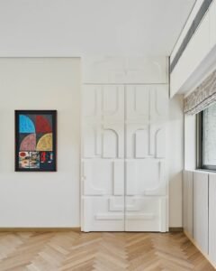
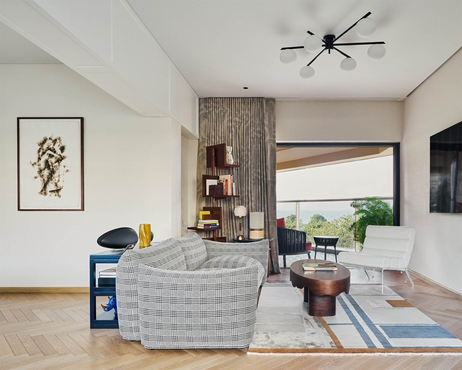
The spatial intent is legible from the moment of entry. An architrave frames the transition from the foyer into the living room, a deliberate pause before the apartment opens into a continuous living and dining zone. There are no partitions. The furniture placement alone defines the spaces, while the herringbone wooden flooring unifies the 2,000-square-foot apartment, adding warmth and acoustic softness that a harder floor lacks. Moving through the apartment, the paneled walls in soft cream and the consistent grain of the wood underfoot create a visual continuity that makes the space feel larger and calmer than its footprint suggests.

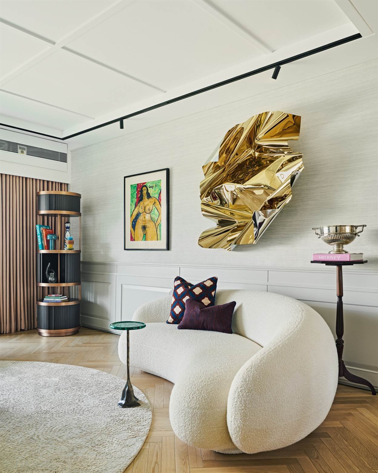
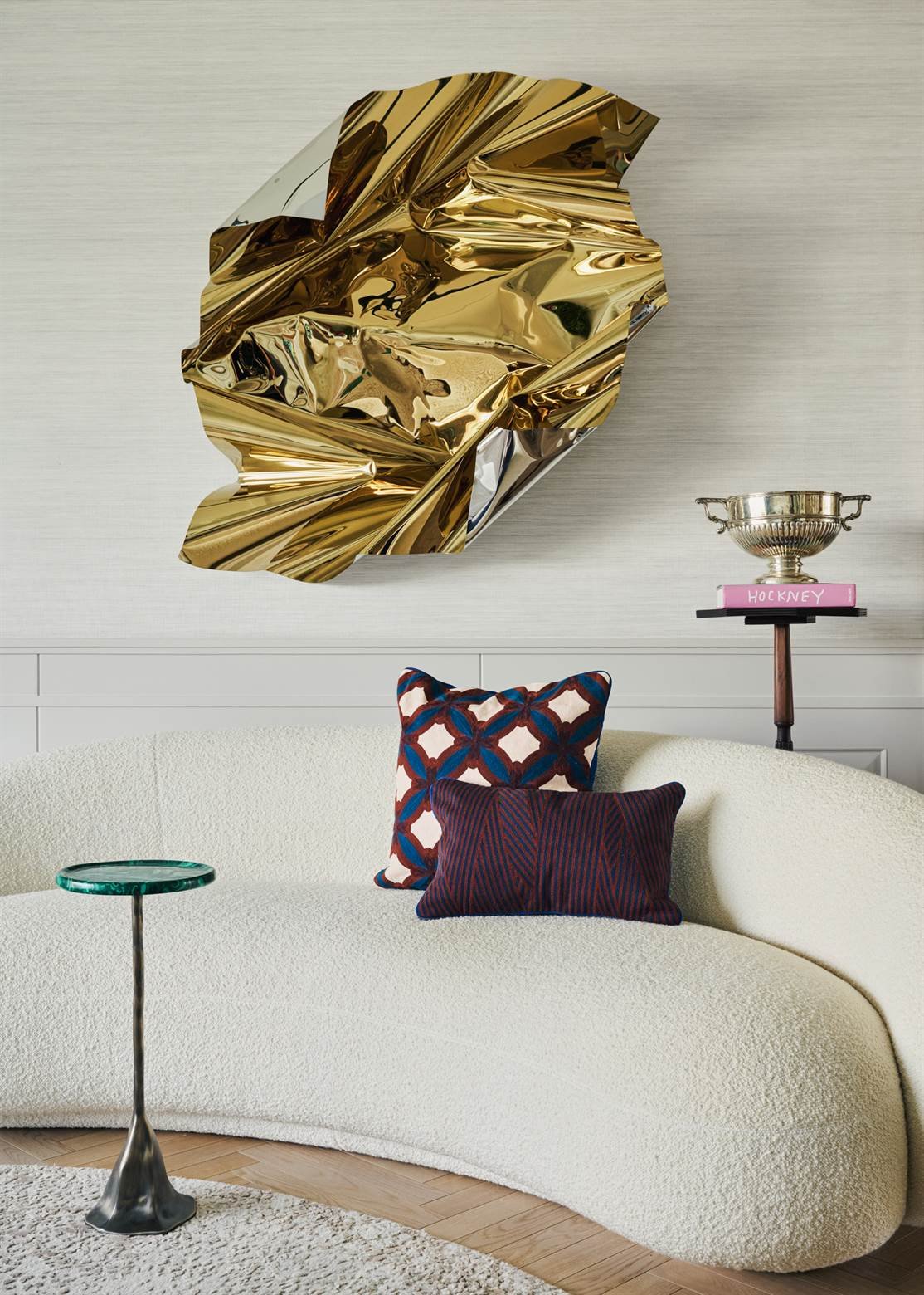
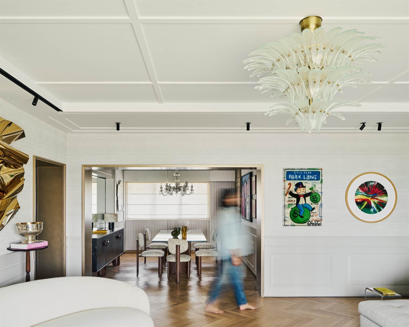
The living area is organized around the Aldo Chaparro sculpture, a large crumpled gold metallic piece that dominates the wall above the seating without overwhelming it, its surface catching light differently depending on where you are standing and what time of day it is. Below it sits a curved, kidney-shaped ivory bouclé sofa, the softness of the form and the texture of the fabric doing precisely what the Chaparro piece does not, absorbing rather than reflecting, settling into the room rather than commanding it.

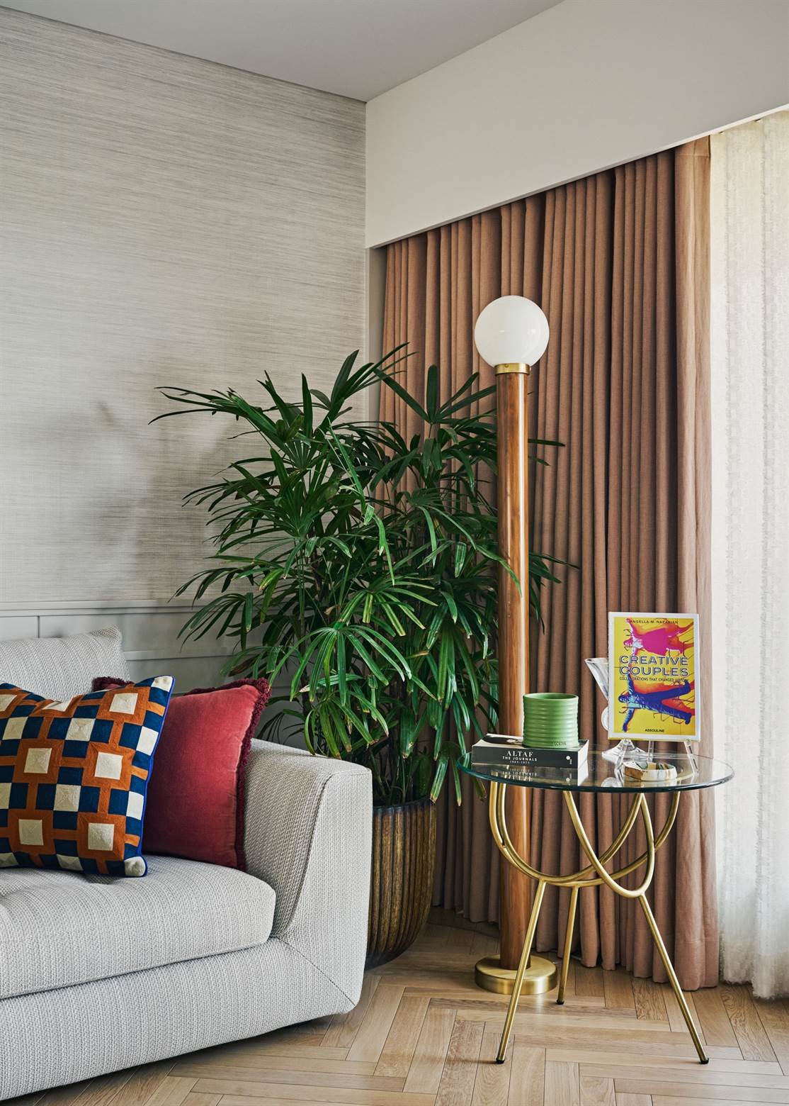
A circular white rug grounds the seating arrangement on the herringbone floor, and a cylindrical bookshelf in dark tones with brass accents introduces a vertical element that draws the eye upward without competing with the art. A framed figurative work hangs alongside the sculpture, part of the same collection and held within the same register of quiet visual authority. The palette throughout is soft greys and warm whites, a ground restrained enough that every piece within it reads clearly without needing to fight for attention.

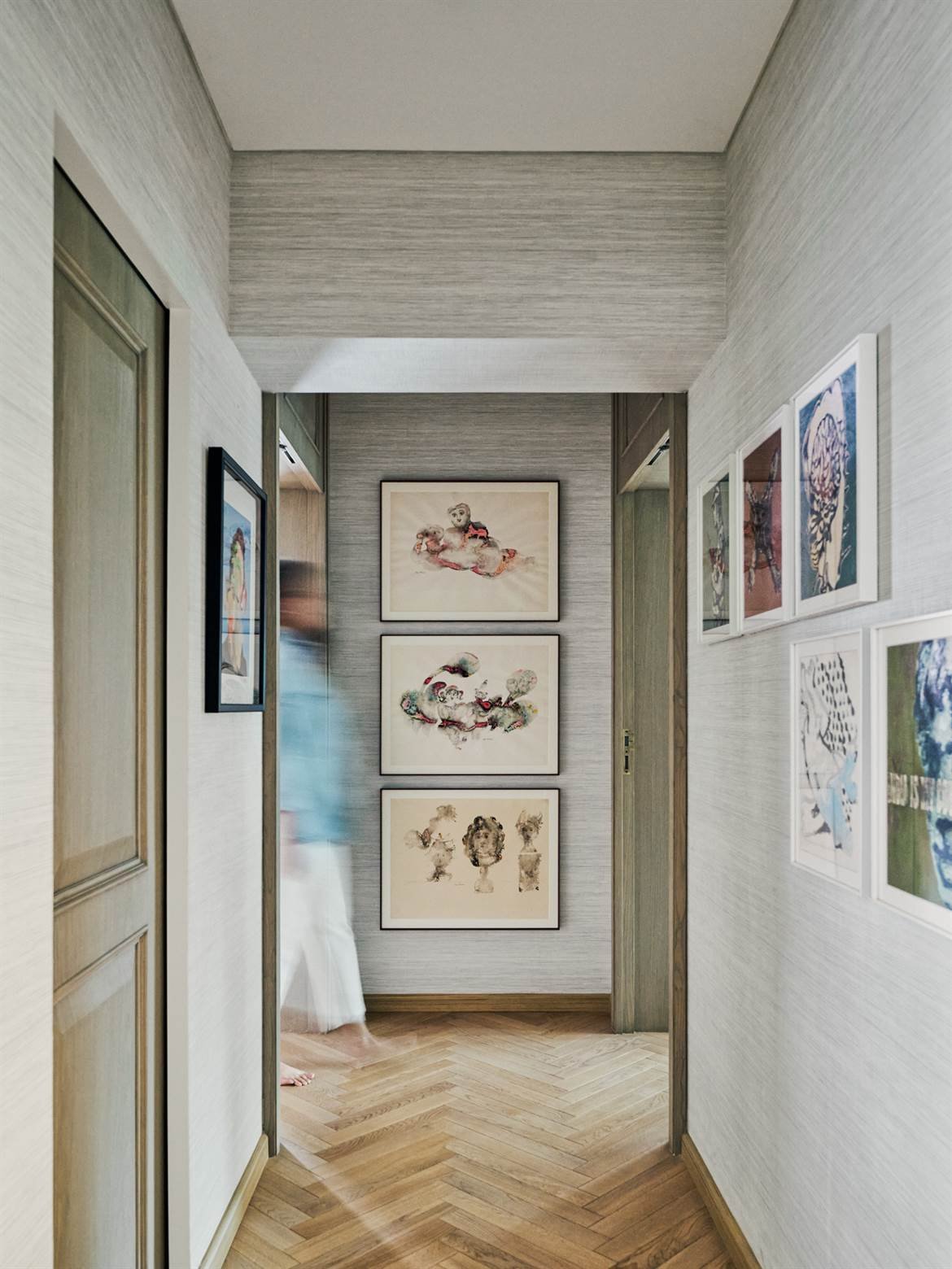
A framed line-drawing in the passage between the living area and the dining space offers a moment of pause, its spare marks on paper a counterpoint to the sculptural weight of the Chaparro beyond. The view through the archway from this passage into the living room, with the gold sculpture and the round brass medallions on the wall visible in the middle distance, gives the apartment the quality of a home that rewards moving through it slowly, of spaces that reveal themselves progressively rather than presenting everything at once.

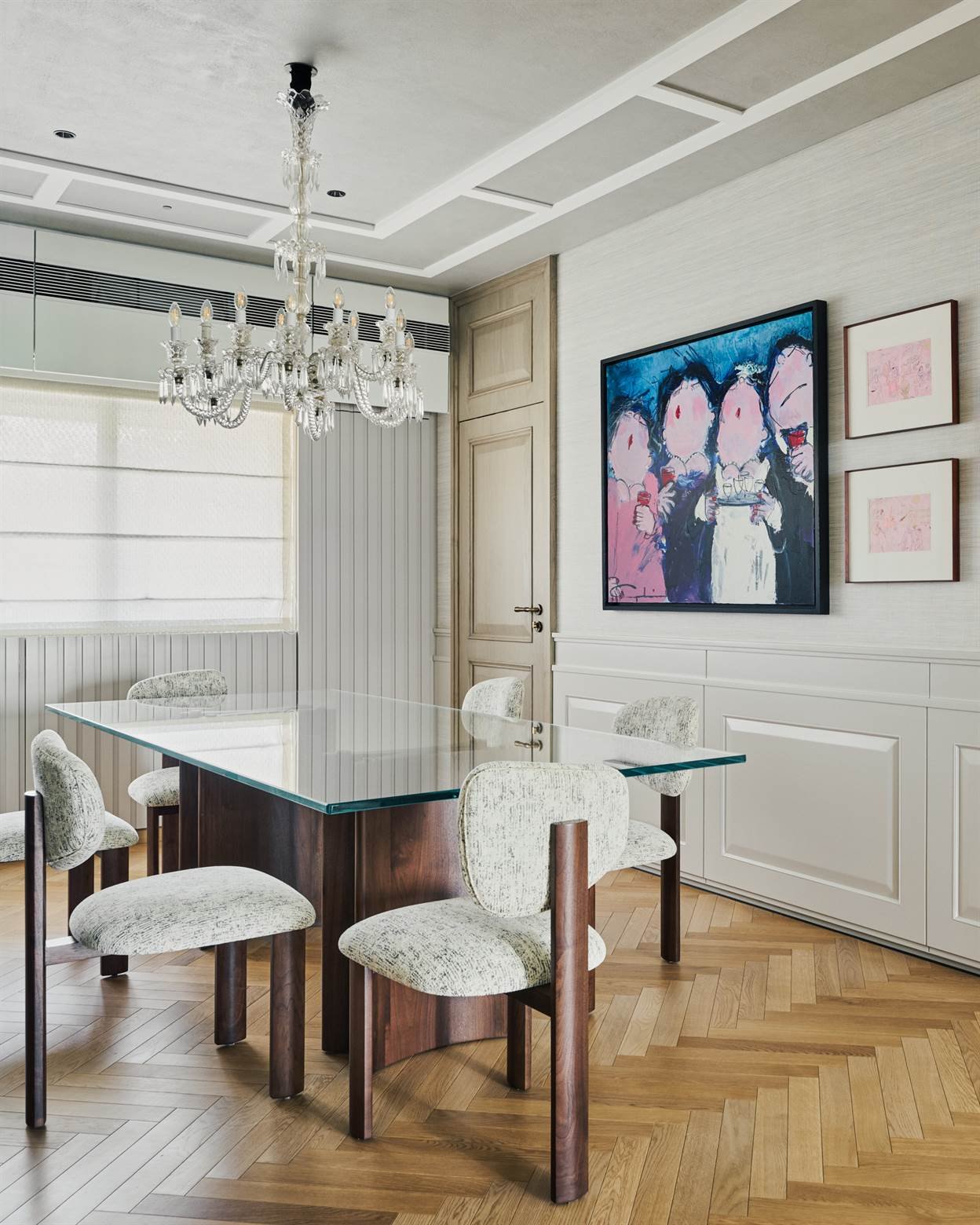
The dining area continues the established palette. A glass-topped table on a dark marble base sits beneath a Baccarat crystal chandelier, the glass of the table and the crystal of the light in conversation without either one being made to compete with the other. Boucle dining chairs in cream and white echo the texture of the living room seating. On the wall, a large blue painting by Gerdine Duijsen anchors the space, its expressive energy contained by the restraint of everything around it, and smaller pink Souza sketches hang beside it, a shift in scale and register that keeps the wall from reading as a single composition and gives the dining room the feeling of a space that has been lived with rather than installed.

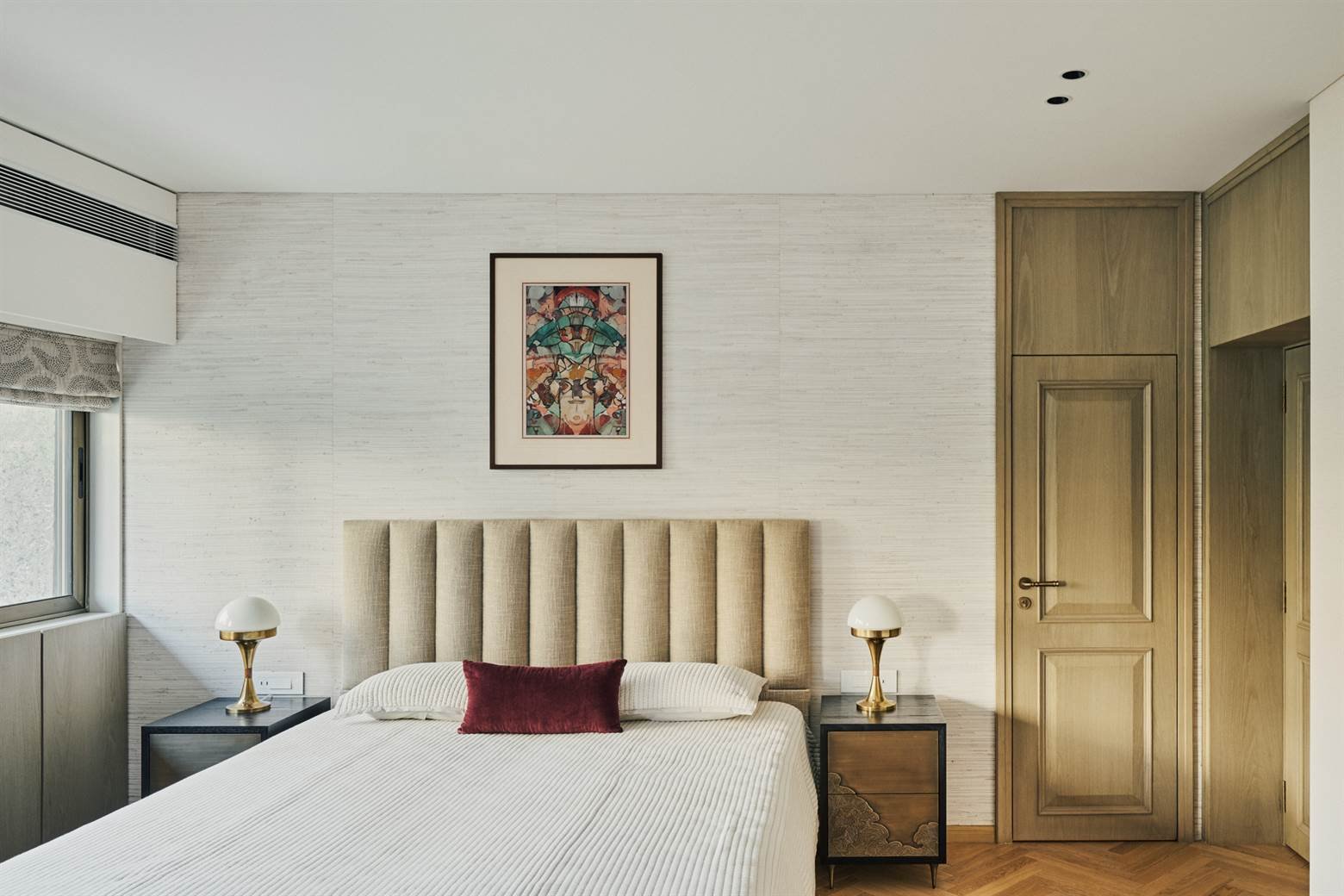
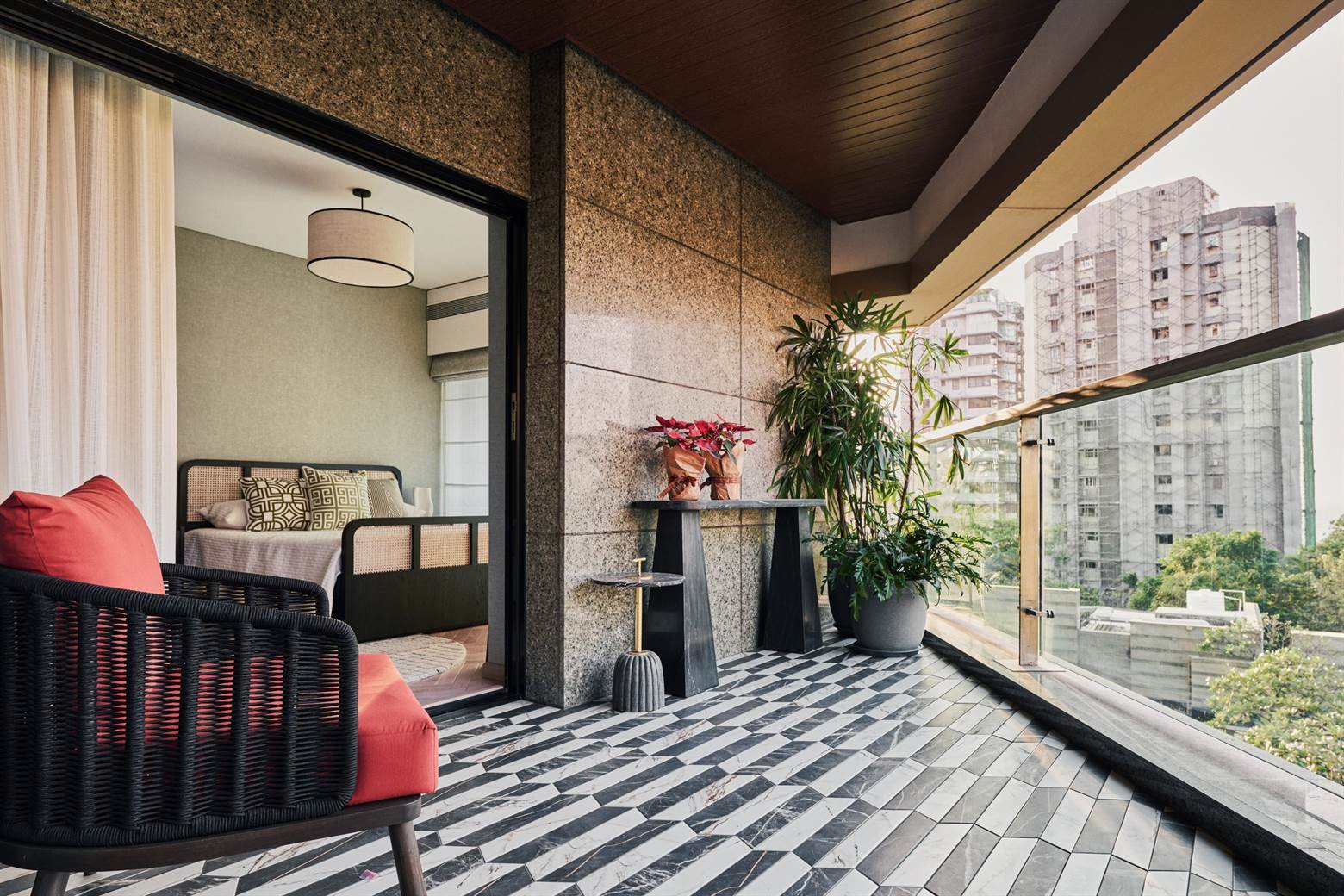
The private areas are approached with the same discipline. The primary bedroom integrates the television zone, walk-in wardrobe, and dressing area into a continuous sequence that prioritises ease of movement, with French fenestrations opening onto the shared balcony, its geometric black and white tiled floor, a dark woven chair with coral cushions, and a glass balustrade framing the Mumbai skyline and the green canopy below. The stone-clad wall of the balcony and the timber ceiling visible through the opening give the outdoor space its own material character, distinct from the interior palette but continuous with it in spirit.
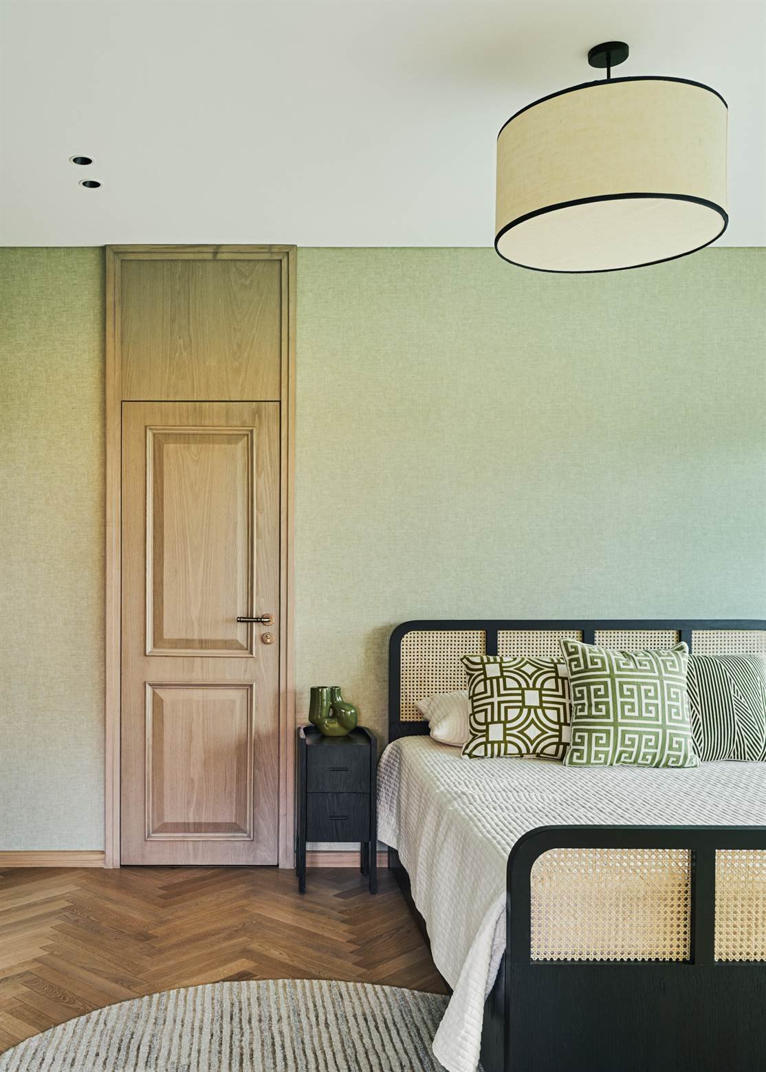
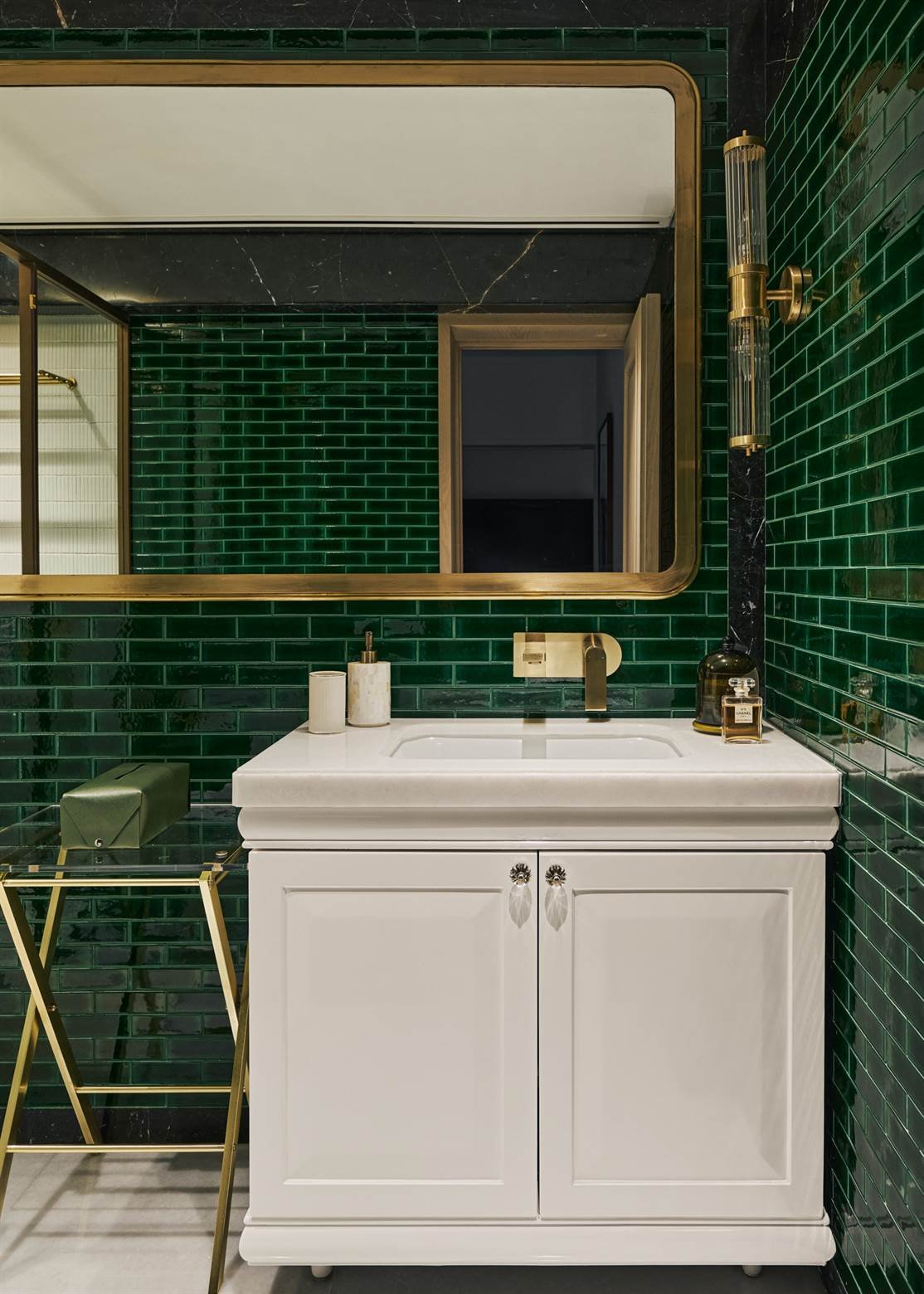
The guest bedroom features a custom black-framed rattan bed and muted light green walls that create a considered atmosphere, enhanced by soft lighting from Terra Trading.

And then the master bathroom, which is the apartment’s single most decisive gesture, is described. Deep emerald green subway tiles cover the master bathroom walls from floor to ceiling, strikingly contrasting with the apartment’s soft greys and creams. A white pedestal vanity with classic cabinet doors and silver hardware sits against this field of green, and a brass-framed mirror and brass fittings throughout introduce a warmth that stops the room from reading as stark. It is a room that operates on entirely different terms from the rest of the apartment, more saturated, more specific, and more prepared to make a statement, and it works because the restraint everywhere else has earned it that permission.

Lighting across the home is designed as a responsive system, with soft indirect illumination tracing the walls and interior planes and smart automation shifting the atmosphere from daylight to evening without interruption. The wooden flooring and textured wallpapers throughout absorb sound and keep the rooms feeling composed rather than reflective, materials chosen for how they perform as much as for how they look.

For a family moving between cities, what Empire has built here is an apartment that does not present itself but receives the people within it, holds their art with enough clarity that each piece can be seen properly, and offers, in return, the particular quality that a secondary home should have above all else: the feeling, on arriving, that you have been expected.

Fact file:

Project Name: Pied-à-Terre
Location: Mumbai, Maharashtra
Built-up Area: 2,000 sqft
Project Completion Year: 2023
Design firm: Empire – The Living Company
Typology: Residential
Photography Credits: Suleiman Merchant
May 29, 2026 0 comments
0 FacebookTwitterPinterestEmail
Hospitality

Hotel Villa Dubrovnik — Dubrovnik, Croatia

by DDI Edit Team May 29, 2026
written by DDI Edit Team

Studio Arthur Casas Renovates a Protected Adriatic Landmark From the Inside Out


Fact File

Interior Design: Studio Arthur Casas

Type: Hotel Renovation

Rooms: 56

Year: 2025

Photography: Fran Parente


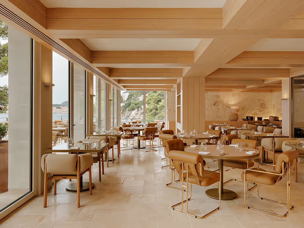
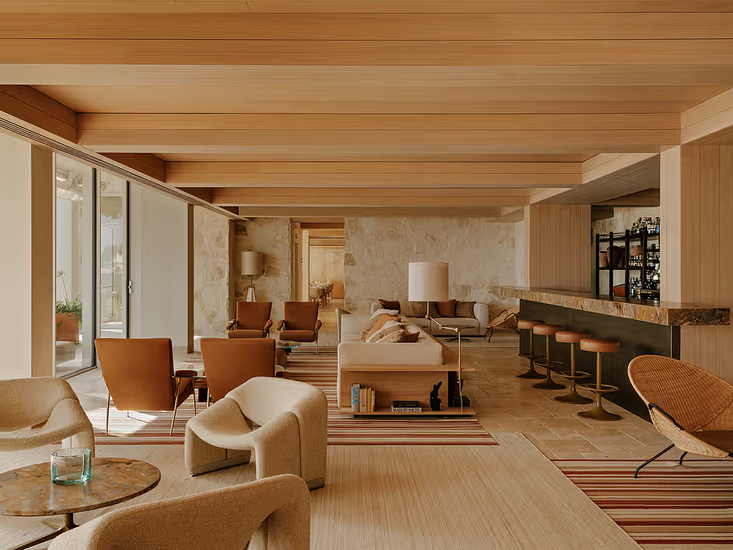
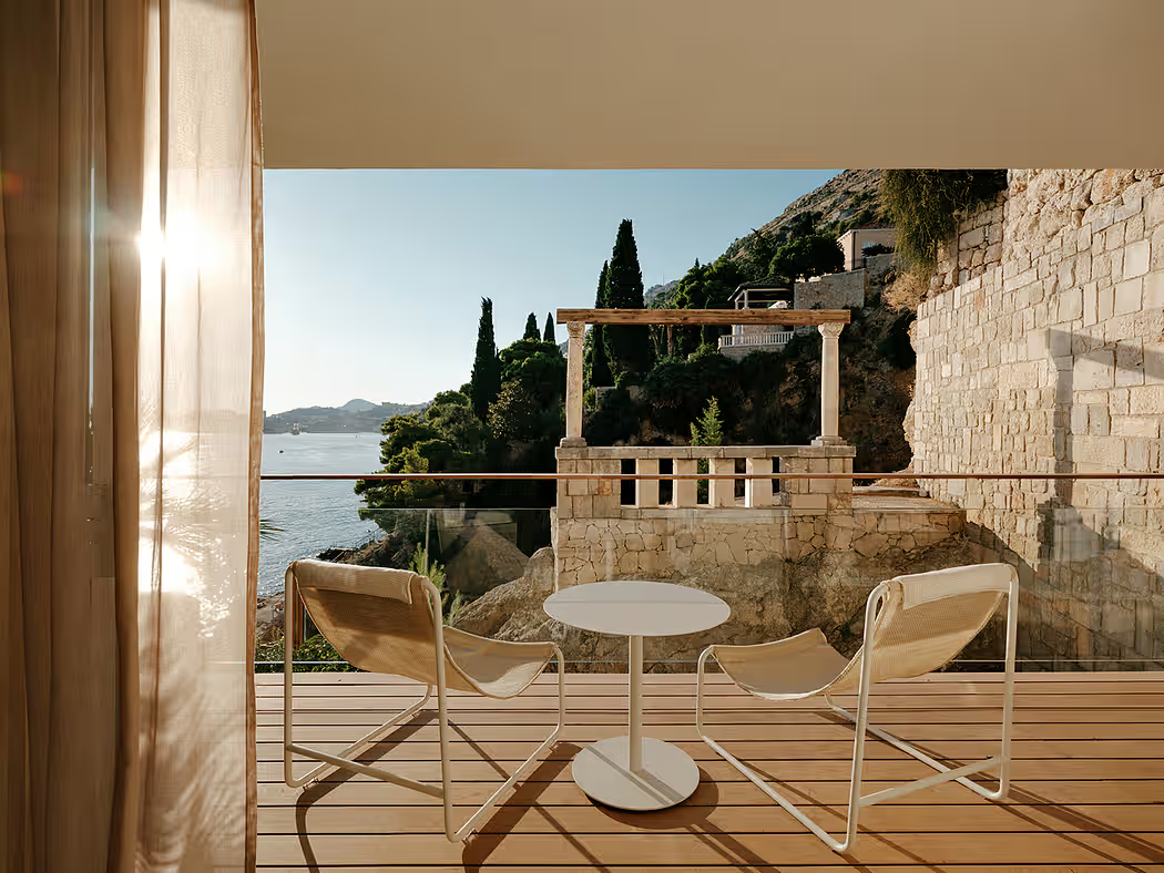
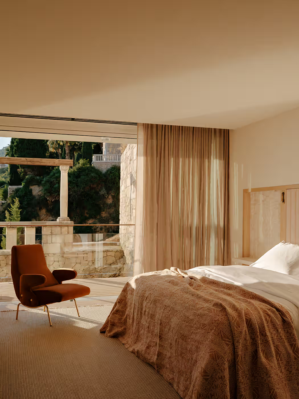
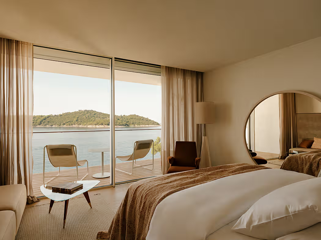
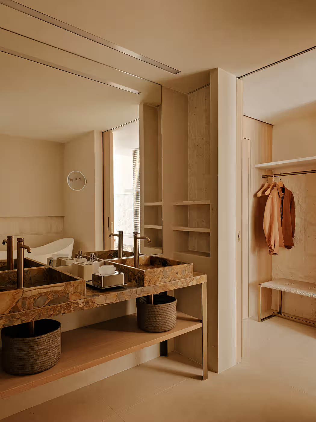
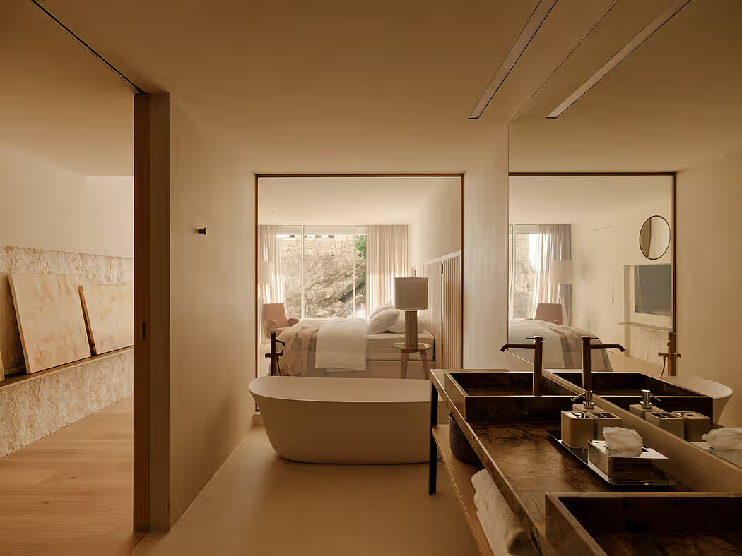
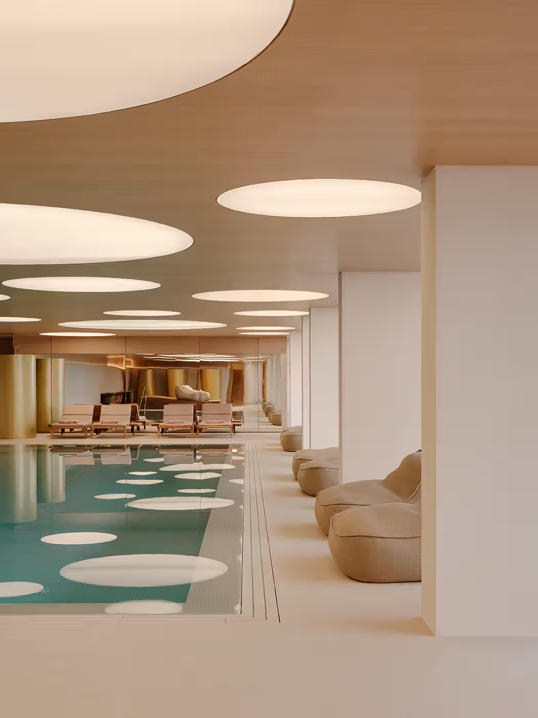
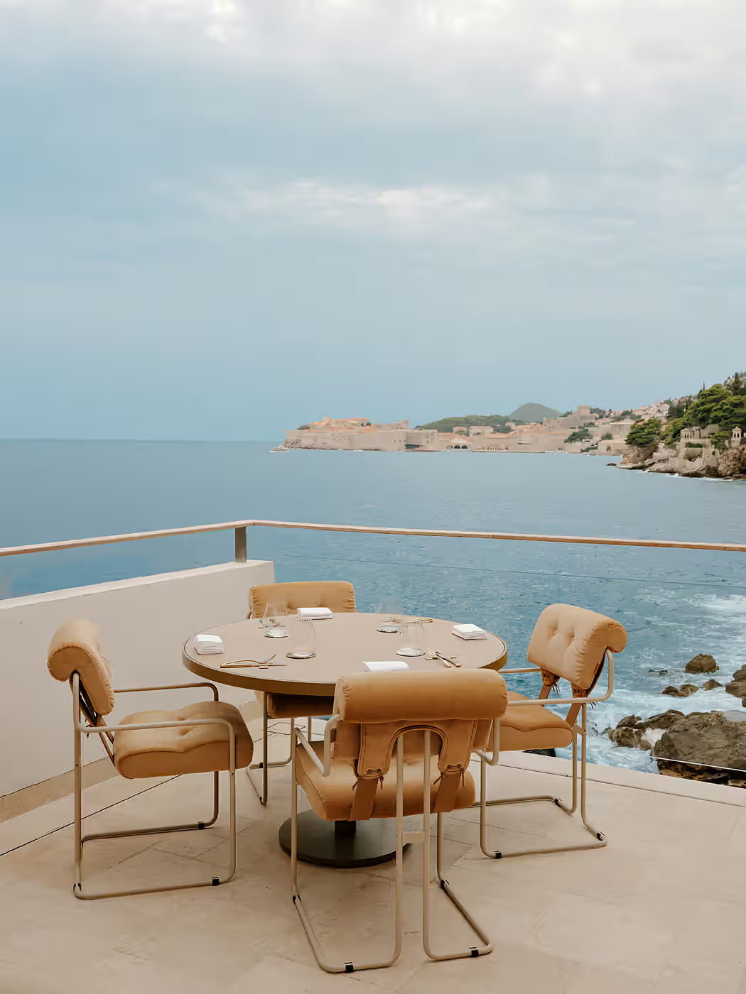
The building sits on a cliff in Dubrovnik’s Sveti Jakov area, carved into the limestone of the Dalmatian coast a short walk from the UNESCO-listed Old Town, its architecture a protected part of the city’s skyline since 1961 when it was first built as a private residence for Yugoslavia’s political elite. The protection means the facade cannot be touched. Whatever Studio Arthur Casas does with this hotel must happen entirely on the inside, within the walls of a structure that the Croatian authorities have determined belongs as much to the city as to the people who own it. This constraint, which would frustrate many practices, becomes in the hands of a designer as attuned to interior atmosphere as Arthur Casas the defining logic of the entire project: a renovation that works by going inward, toward the specificity of the place and the materials and the culture rather than outward toward any expression of the building’s new identity.

Hotel Villa Dubrovnik had been closed since October 2023, shuttered for what would become a nearly two-year transformation, and it reopened in the spring of 2025 as a member of The Leading Hotels of the World, a designation that carries specific expectations about what luxury in a hotel means and that Studio Arthur Casas interprets here not as opulence but as alignment — between the building and its cliff, between the interior and the Adriatic outside its windows, between a Brazilian design practice and the particular visual and material culture of the Dalmatian coast. The result is a 56-room hotel whose interiors feel less like the product of a design intervention than like the building finally becoming what the site and the city always suggested it should be.

The palette that governs every surface is drawn from Dubrovnik itself. The stone walls of the Old Town, visible from almost every room in the hotel, are limestone in shades of white and sand and pale beige, and these are the tones that run through the interior, from the wall finishes to the upholstery to the millwork, creating a visual continuity between the building and its surroundings that makes the Adriatic views from the private balconies feel less like something framed and looked at than like something the interior is already participating in. Against this neutral field, warm terracotta introduces the colour of Dubrovnik’s rooftops, the distinctive reddish-orange that gives the Old Town its aerial character, and accents of Adriatic blue bring the sea itself into the material conversation of the rooms. The palette is specific to this city in a way that a hotel anywhere else in the world could not replicate, which is precisely the point.

The materials are local in a way that goes beyond sourcing. Croatian stone appears throughout in finishes that acknowledge its geological relationship to the cliff on which the building sits. Hand-glazed terracotta tiles bring the craft traditions of the Dalmatian coast into the interior surfaces. Polished wood introduces warmth alongside the stone, and the combination of the two follows a logic familiar to anyone who has spent time in the older buildings of the Croatian coast, where timber and limestone have been worked together for centuries in the construction of structures that are as much geological as they are architectural. Casas and his team studied the traditional Croatian lace patterns that are recognised by UNESCO as part of the country’s intangible cultural heritage, and their geometric logic appears in the decorative details of the interior as a reference that local guests will recognise and international ones will find intriguing without needing to understand its origin.

The bespoke furniture designed for the hotel includes pieces produced in collaboration with Prostoria, the Croatian furniture brand whose contemporary interpretation of local making traditions gives its objects a quality of belonging that imported pieces could not have achieved. The Dubrovnik lamp, designed specifically for this project, is the most visible of these bespoke elements, its form responding to both the aesthetic language of the interior and the particular quality of light on the Adriatic coast. Custom sofas throughout the public spaces continue this dialogue between the practice’s design language and the specific material culture of the place, the result being furniture that reads simultaneously as the work of Studio Arthur Casas and as something that could only have been made for this building in this city.

The hotel serves as a curated gallery for Croatian art, a function that Casas has integrated into the project as something more than wall decoration. The painters Ivana Pegan and Dubravka Tulio, the sculptor Ivo Dimnić, and the fashion designer Juraj Zigman each contribute to the hotel’s identity in different ways, with Zigman designing the staff uniforms as an extension of the hotel’s visual language into the people who animate it, a gesture that turns every interaction with the hotel’s team into a continuation of the aesthetic experience the rooms provide. Alongside this Croatian programme, the hotel’s furniture and objects include pieces by Gio Ponti, Patricia Urquiola, Pierre Paulin, Paola Lenti, and Eileen Gray, the presence of these international mid-century and contemporary design landmarks giving the interior a depth of reference that the local work alone could not have produced and that the local work alone makes meaningful.

The hotel’s organisation follows the natural topography of the cliff, descending from the rooftop bar to the private beach below in a sequence of spaces that Casas describes as each naturally dialoguing with its surroundings, making the landscape the main protagonist. Galanto Bar at the top, Dubrovnik’s only rooftop bar, overlooks the Adriatic at the level where the city and the sea meet in the most dramatic combination of man-made and natural landscape available from any position in the city, the Old Town visible to the west and Lokrum Island across the water to the south. The Michelin-recognised Pjerin Restaurant occupies the dining level below, its panoramic terrace above the sea serving a menu built around locally sourced Croatian ingredients and the daily Adriatic catch under Executive Chef Robert Račić, whose cuisine treats the proximity of the sea as a design brief as specific as any that Casas received for the interior. The Libero Bar introduces a book-lined lounge at a different register, quieter and more residential, its display of historic Croatian costume replicas connecting the present of the hotel to the deeper past of the coast. The Giardino, open-air and shaded by the Mediterranean pines that grow from the cliff around the hotel, provides the most relaxed of the hotel’s dining experiences, the kind of outdoor table where the line between being in a hotel and simply being in Dalmatia becomes difficult to locate.

The Croatian concept of fjaka, the particular art of easy living that the Dalmatian coast has elevated to a cultural value, shapes the hotel’s atmosphere as surely as its material palette. Fjaka is not merely relaxation but a specific quality of unhurried presence, the willingness to let time pass without accounting for it, that the Adriatic coast produces in people who spend enough time beside it. The rooms and suites, nearly all with private balconies suspended above the sea, are designed for this quality of occupation, their loggias sized and furnished for morning coffee with Lokrum Island across the water and evening wine with the Old Town’s lights reflected in the Adriatic below. Some suites include private outdoor jacuzzis, and the Villa Spa on the lower levels offers five treatment rooms, a fitness centre, Finnish sauna, and an indoor swimming pool whose views continue the hotel’s dialogue with the sea. The private beach at the foot of the cliff completes the descending sequence from rooftop to water, the building participating in the Adriatic as much as it overlooks it.

What Studio Arthur Casas has delivered at Hotel Villa Dubrovnik is a renovation that treats the constraints of a protected building not as limitations to be worked around but as the precise conditions that make a certain kind of design both necessary and possible. The exterior belongs to the city. The interior belongs to the people who inhabit it, and those people, whether for a night or a week, inhabit it as guests of a landscape and a material culture that the design has done everything possible to bring inside.


villa-dubrovnik.hr


May 29, 2026 0 comments
0 FacebookTwitterPinterestEmail
Newer Posts
Older Posts

Recent Posts

  • Florim Introduces SensiVenezia, a Porcelain Stoneware Collection Inspired by Venetian Terrazzo
  • LEGO Botanical Wave Transforms TANK Shanghai with 380,000 Brick-Built Flowers
  • The Great Eastern Home Introduces Its Latest Collection of Italian Vintage Mirrors
  • Smart Homes Are Changing Architecture: What Happens When Technology Becomes Part of the Building?
  • AARQE9’s Nikhaar Dhawan & Bahaar Dhawan Rohatgi Unveil the Sculptural Lunar Drip Table

Recent Comments

  1. Smart Home Architecture: How Technology Is Changing Design on Aqara Smart Lock U500: Three Versions for Gates, Glass Doors and Standard Entrances

Newsletter

  • Home
  • About Us
  • Contact Us
  • Editorial Policy
  • Privacy Policy

© 2026 Design Diary International. All Rights Reserved.

Design Diary International
  • Home
  • Project
    • Residential
    • Hospitality
    • Commercial
    • Public & Cultural
  • Interview
    • Architect
    • Interior Designer
    • Founders & Brand
    • Artist
  • Material
  • Product
  • Feature
  • DDI Finds
    • Emerging Studio
    • Rising Designers
    • New Practices
  • About
  • Magazine
  • Contact Us