• Home
  • Project
    • Residential
    • Hospitality
    • Commercial
    • Public & Cultural
  • Interview
    • Architect
    • Interior Designer
    • Founders & Brand
    • Artist
  • Material
  • Product
  • Feature
  • DDI Finds
    • Emerging Studio
    • Rising Designers
    • New Practices
  • About
  • Magazine
  • Contact Us
Design Diary International
Residential

The Lobster, Prato, Italy by Bucci Quentin

by DDI Edit Team July 9, 2026
written by DDI Edit Team

Bucci Quentin’s renovation of a 1970s flat in Prato’s Pietà district runs on one idea carried through in restraint: a single shade of lobster red, present throughout the 168-square-meter home but never allowed to dominate any one surface. The flat sits on the first floor and attic of a stone-clad multi-family villa, with clear proportions and views out to the surrounding greenery. Still, years of piecemeal use had stripped it of any real spatial identity by the time the studio took it on.

That identity starts to come back at the entrance, where floor-to-ceiling olive green millwork organizes the arrival zone and directs movement without needing extra walls. Green works as a kind of neutral here, a contained backdrop that lets the lobster red register more precisely once it appears further in. Underfoot, herringbone oak parquet begins at the threshold and runs uninterrupted through the rest of the flat, the material continuity doing much of the work that in other projects might fall to color or texture. It’s a discipline the studio has used before, most notably on its Arcipressi villa renovation in Florence, where the same logic of material continuity carrying spatial meaning was already in play.
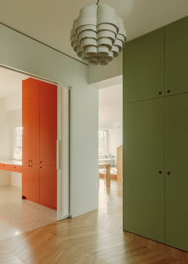
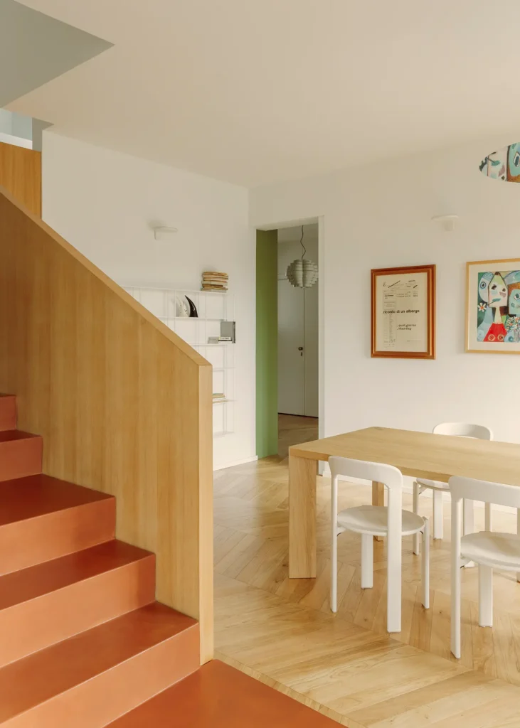
Achieving this level of openness in the plan required significant reduction. Partitions were thinned or removed, rooms were opened toward one another, and the living room was raised slightly on a platform, enough to read as separate from the dining area without a wall standing between them. The living, dining, and kitchen spaces then unfold toward the garden, with windows placed on every side so the Tuscan landscape reads as a continuous sequence of framed views rather than the occasional glimpse.

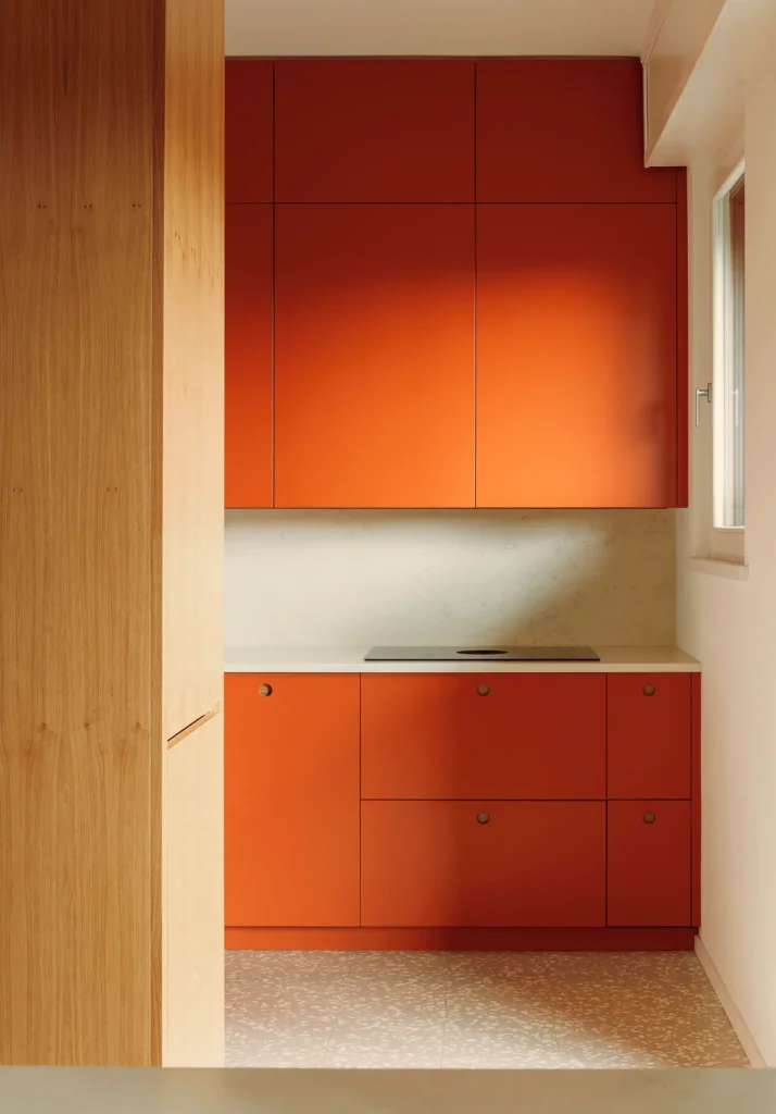
It’s in the kitchen that the red finally takes center stage. A fully custom kitchen in lobster-red lacquered joinery, designed by Bucci Quentin and built by AJ Interiors Design, occupies the space as one solid block of color, contained to that room rather than spilling into the living areas beyond it. The flooring changes here too, from oak parquet to MIPA Seeds terrazzo, a speckled stone whose aggregate carries flecks of the same red, tying the color into the horizontal plane the way the staircase, finished in the same resin, ties it into the vertical one.
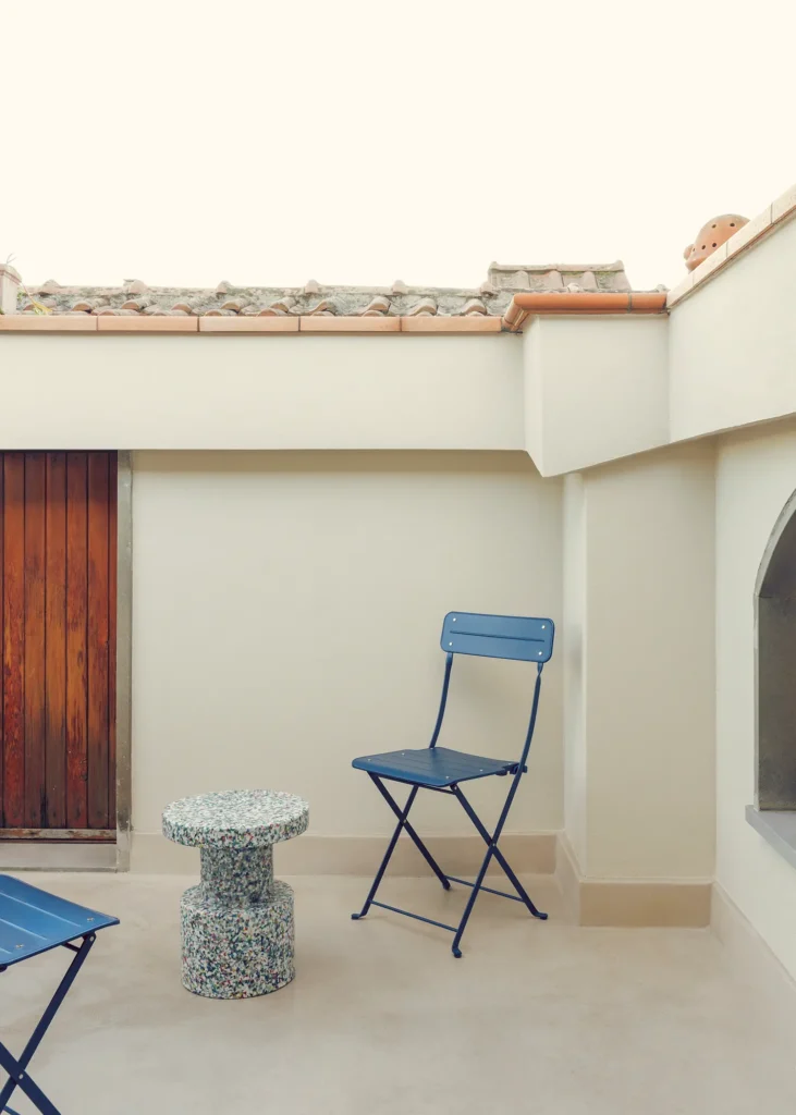
That staircase becomes the clearest expression of the idea once it reaches the attic. The lobster-red resin treads rise between a full-height oak panel on one side and a plain white plaster wall on the other, turning the ascent itself into a material transition. Upstairs, the register shifts entirely: lower ceilings, softer light, arched windows framing the surrounding rooftops, and a hybrid program that folds in a screening room, a study area, a laundry room/bathroom, and a small terrace.

The bathrooms use the same formula, varied three times. One pairs sage green ceramic tiles with a lobster-red vanity in Egger U335 ST9 panels, a second swaps in deep forest green tiles against the same red vanity, and a third reverses the pairing entirely, with white tiles and a green vanity in Egger U604 ST9 panels. All three use Vogue Materia 10×20 handmade ceramic tiles, which have a surface variation that prevents the finish from appearing flat or mass-produced, even though the underlying logic—one field color plus one red accent—remains constant across all three rooms.
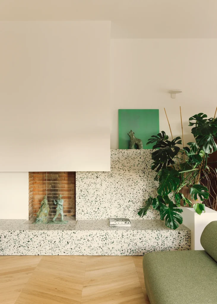
Back on the ground floor, a stepped terrazzo plinth wraps the existing fireplace and extends into the room as a low shelf. Its aggregate pulls in green, white, and terracotta, compressing the project’s wider palette into a single surface. It’s also the only element in the flat that’s built rather than fitted, standing apart from the joinery-driven logic that shapes almost everything else in the home.

What keeps the concept from tipping into gimmick is where red shows up and where it doesn’t. It never reaches the walls or the floors, staying instead on the staircase, the kitchen cabinetry, and the bathroom vanities, specific, contained gestures rather than an atmosphere. That containment is what makes it read as an architectural decision rather than a styling choice.

Fact File:

Project: The Lobster

Typology: Residential

Architect/Studio: bucci quentin

Location: Pietà district, Prato, Tuscany, Italy

Year: 2026

Area: 168 square metres

Key materials: Oak herringbone parquet, lobster-red resin finishes, bespoke lacquered joinery, multicoloured speckled terrazzo, ceramic wall tiles

Kitchen fabrication: aj interiors design

Photography: Nicolò Panzeri

July 9, 2026 0 comments
0 FacebookTwitterPinterestEmail
Residential

Gradients of Earth, Kalyani Nagar, Pune, India by Alkove-Design

by DDI Edit Team July 7, 2026
written by DDI Edit Team

Alkove-Design has built a four-bedroom apartment across 3,612 square feet in Kalyani Nagar, Pune, around a single material conceit: the striated, layered look of rammed earth, translated into lime plaster, reclaimed wood, and natural veneer. The studio calls the project Gradients of Earth, reflecting a design organized around tonal shifts rather than traditional rooms, mimicking the way light moves through the space. The visitor must decide whether that reads as a genuinely novel organizing idea or as an elegant frame placed after the fact around a fairly conventional 4-BHK layout.

The starting point, according to Principal Architect Ninada Kashyap, was the tactile quality of rammed earth and the gradients thrown up by its banded layers, an interest that she says evolved through conversations with the clients into a palette of earthy finishes chosen for the tonal range each could hold. It is a clear and coherent origin story, though everything known about the brief here comes from the studio, with no client voice offered independently to test how much of the earth-gradient narrative drove the decisions and how much was assembled around them afterward.

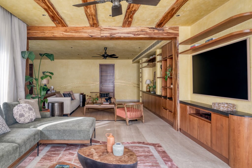
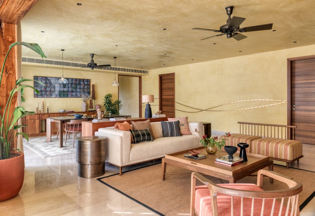
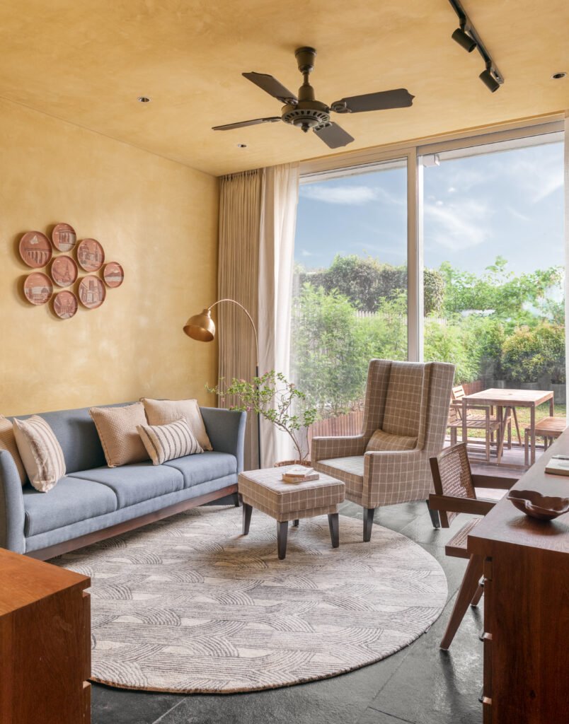
The living area is the largest gesture, opening west through generous glazing, and the architects have washed walls and ceiling in a lemon-ochre-lime finish that they credit with keeping the scale from turning austere. The published photographs support this interpretation to a point, the surfaces receding into shadow as light travels deeper, and a pair of glass mosaic lines threading across a connecting wall provides a controlled flash of shimmer against the matte ground. The image is persuasive, but warm lime washes and side lighting flatter it, leaving the humane feeling of the unstyled expanse unrepresented in the frames.

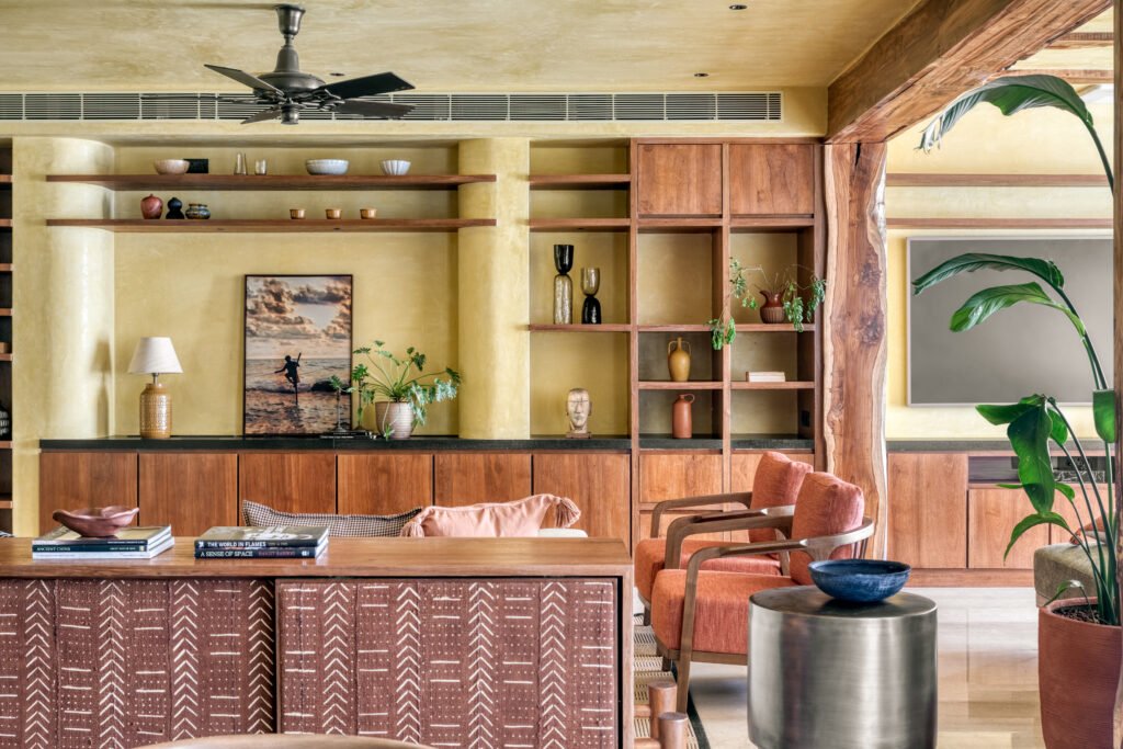
The living, family, and dining zones run into one another, divided by shifts in material rather than walls, with a reclaimed-wood frame marking the threshold to the family room. A textile centerpiece anchors the dining area: Kshitichitra, produced by Morii Design in collaboration with artisan communities, combining Bela block printing from Kutch with Sujni embroidery from Bihar. The studio’s layered composition echoes the gradient theme while also standing as a strong object that enhances the surrounding scheme.

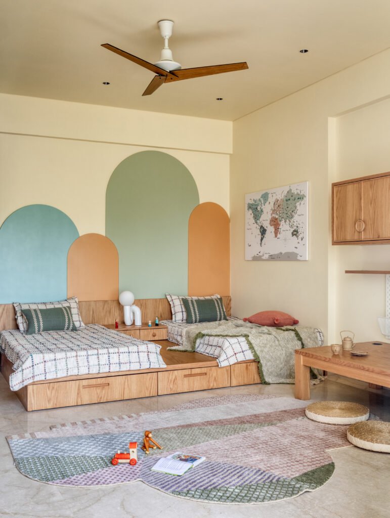
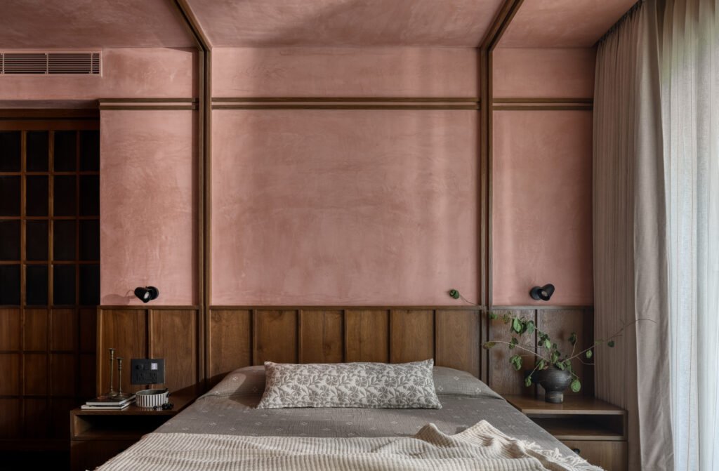
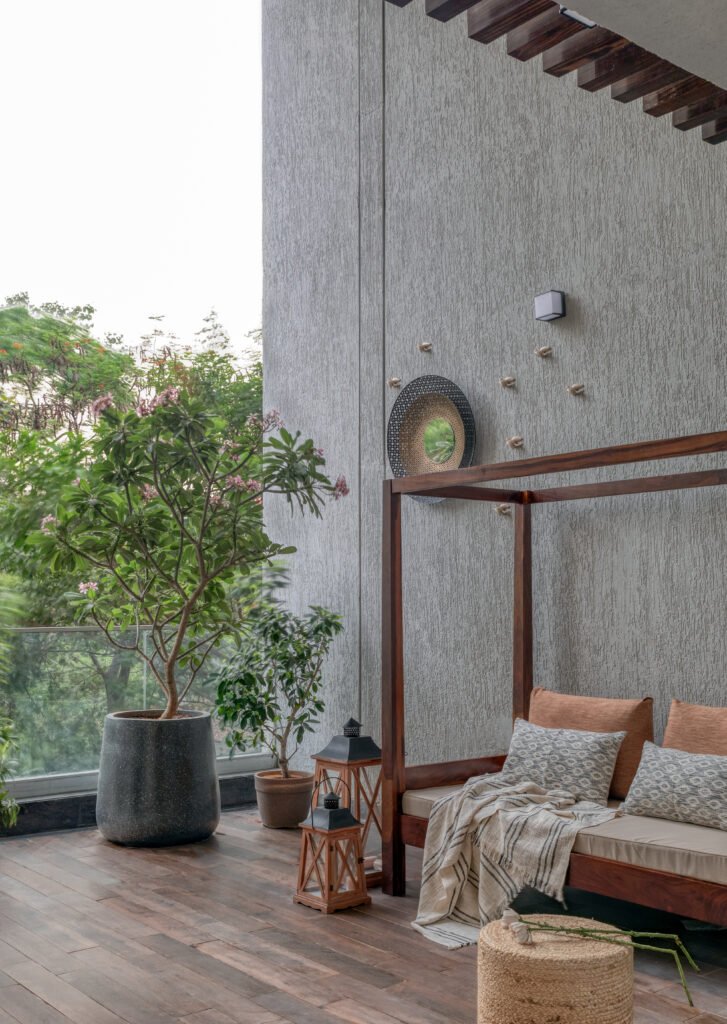
Deeper in, the palette cools from lemon ochre to a sienna rose in the master bedroom, a move Principal Architect Komal Mittal describes as a deliberate turn toward repose at the clients’ request. Terracotta-pink lime-washed walls meet a black river-washed Betamcherla stone floor, and a Victorian four-poster has been reworked in a pared-back form, its slender wooden strips running across the wall and ceiling. The eastern wing, reached along a corridor, turns to morning light, wrapping the children’s and guest bedrooms in a softer yellow; the two share a tonal ground but diverge, the guest room composed in honey-maple gradients, the children’s lighter in soft cedar with arched, colorful accents. A prayer alcove sits between them in an arched, wood-lined niche.

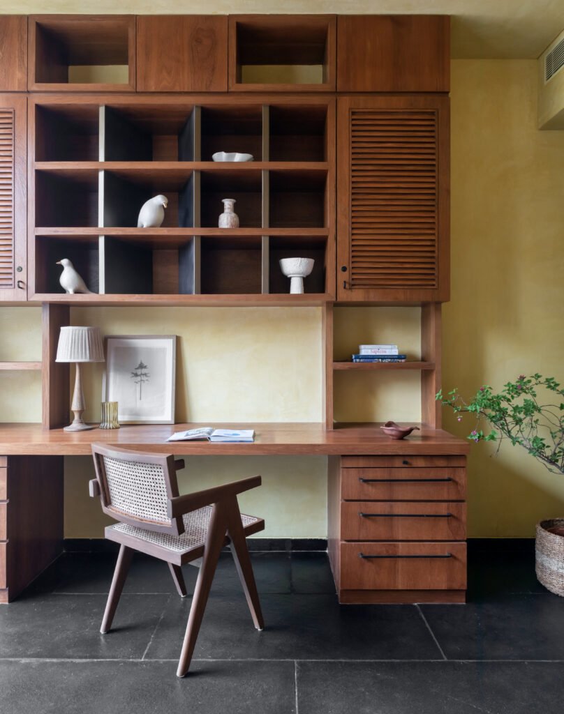
The quieter end holds a study where the lemon-ochre returns against black Betamcherla flooring, its walls carrying embossed terracotta plates by the artist Dhanashree Kelkar that reference the family’s journeys, with a private garden beyond softening the line between inside and out. The studio’s closing claim is that the atmosphere here is carried by grounded transitions rather than statement pieces, and across the apartment the gradient logic does hold together with unusual discipline. What a single visit, or a single photo set, cannot confirm is whether that consistency is felt as the quiet, cumulative mood the architects describe, or simply seen, room by room, as a well-executed and tightly controlled palette.

Gradients of Earth: Interior Design Gallery

Fact File:
Project name: Gradients of Earth
Office name: Alkove-Design
Typology: Residential (4-BHK apartment)
Project location: Kalyani Nagar, Pune, India
Built area: 3,612 square feet
Principal Architects: Ar. Komal Mittal, Ar. Ninada Kashyap
Photography: Pulkit Sehgal
Styling: @spaces_and_stories

July 7, 2026 0 comments
0 FacebookTwitterPinterestEmail
Commercial

Brick on Sticks, Bangalore, Karnataka, India by Dot Bot Studio

by DDI Edit Team June 29, 2026
written by DDI Edit Team

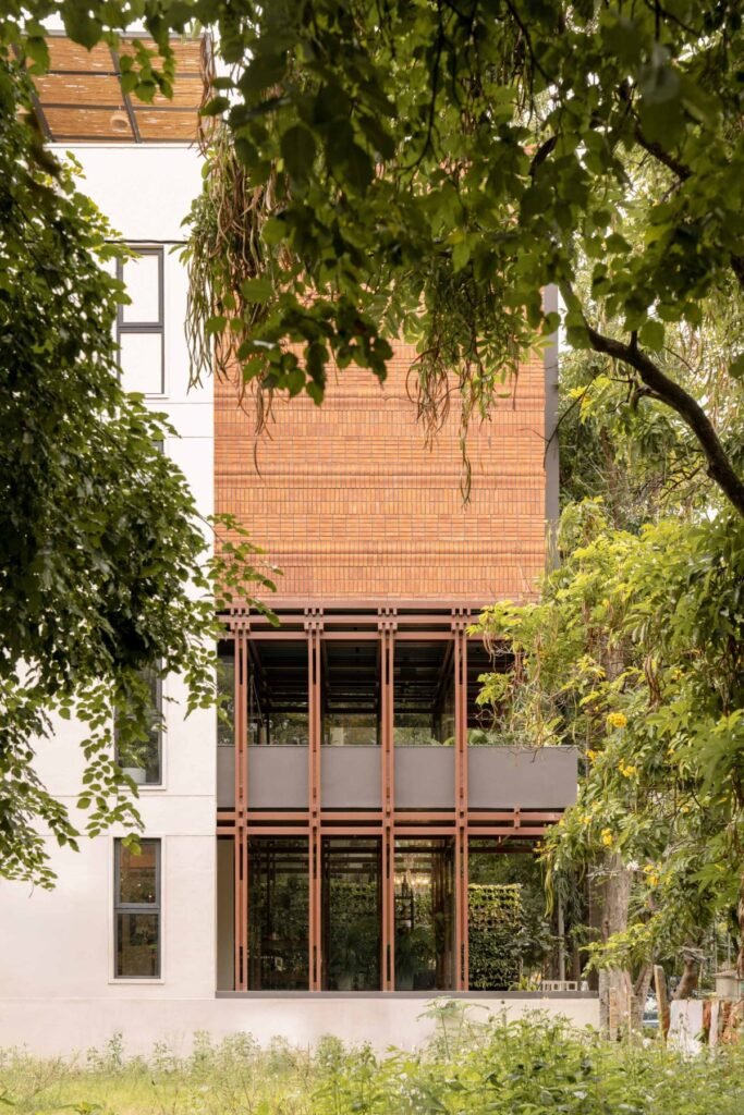
Dot Bot Studio has built a G+3 block on a 40 by 60 plot in the commercial sprawl of Domlur-Indiranagar, which, according to the studio, aims to avoid drawing attention to itself. The architects say they deliberately avoid bulk and spectacle, instead focusing on what they call a calibration of structure, material, and intent, and the published photographs support this claim to some extent, as two street trees on the footpath partly screen the building and break up its mass from the pavement. Whether that reticence reads as restraint or simply as a small building on a tight plot making a virtue of its limits is left to the viewer to decide.

The brief, as relayed by the studio, came from a couple working in interior design and styling who funded the project with their own savings rather than as developers. They wanted, in the architects’ telling, a nonconventional commercial environment that could hold their luxury furniture showroom downstairs while attracting a design-literate tenant to the floors above, without breaking from the texture of a Bengaluru street. It is a clear and unusually personal brief, though it is worth noting that everything known about it here comes from the people who designed and paid for the building, with no independent or tenant perspective to test it against.

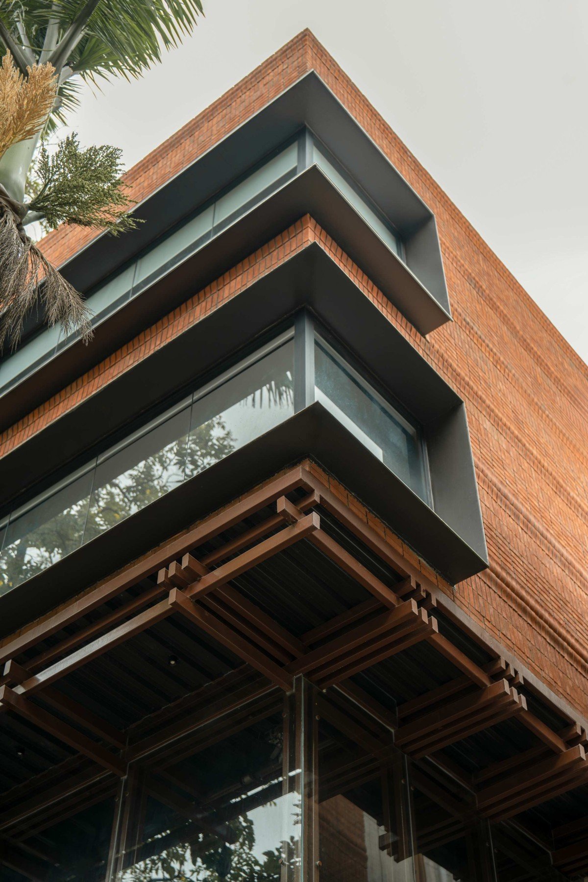
The plan splits cleanly, with the ground and first floors given to the clients’ Arkaa showroom and the upper two floors set aside for rent. That division, the architects say, forced every square foot to account for itself, and they trace their response back to the logic of furniture. Joinery became the structural and conceptual starting point, so the metal columns and beams are detailed as joinery-like assemblies, and the primary structure consists of precision-engineered steel box sections measuring 60 by 60 millimeters left deliberately exposed. In the corner photographs, the layered steel brackets resemble enlarged furniture joints, though the studio’s assertion that structure and expression fully merge reflects their perspective rather than a neutral observation.

The central idea, which gives the building its name, is what the architects call a tectonic inversion: a heavy brick mass appearing to hover on a filigree of steel columns. They are explicit that the slender frame, not the brick, carries the gravitational load, with the masonry acting as a spatial and climatic envelope rather than support. The photographs sell the illusion convincingly, the brick block sitting on its thin legs with glazing slipped between, but the effect is also one that wide-angle images shot through foliage are particularly effective at flattering, and how persuasively the brick reads as floating at street level, in person, is the kind of thing a photo set cannot settle.

The massing follows the same logic, with services buried in the basement, the lower floors pulled back toward the rear, and the upper levels pushed out as a street-facing volume, so the building reads heavy on top and light below. A double-height glazed front turns the showroom into a vitrine, and at dusk the staged interior, with a red sofa and styled vignettes, sits behind the glass like a shop window onto the street. That is effective retail theatre, and it is fair to ask how much of the building’s quiet-versus-display tension is architecture and how much is merchandising.

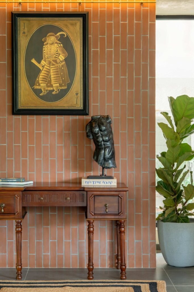
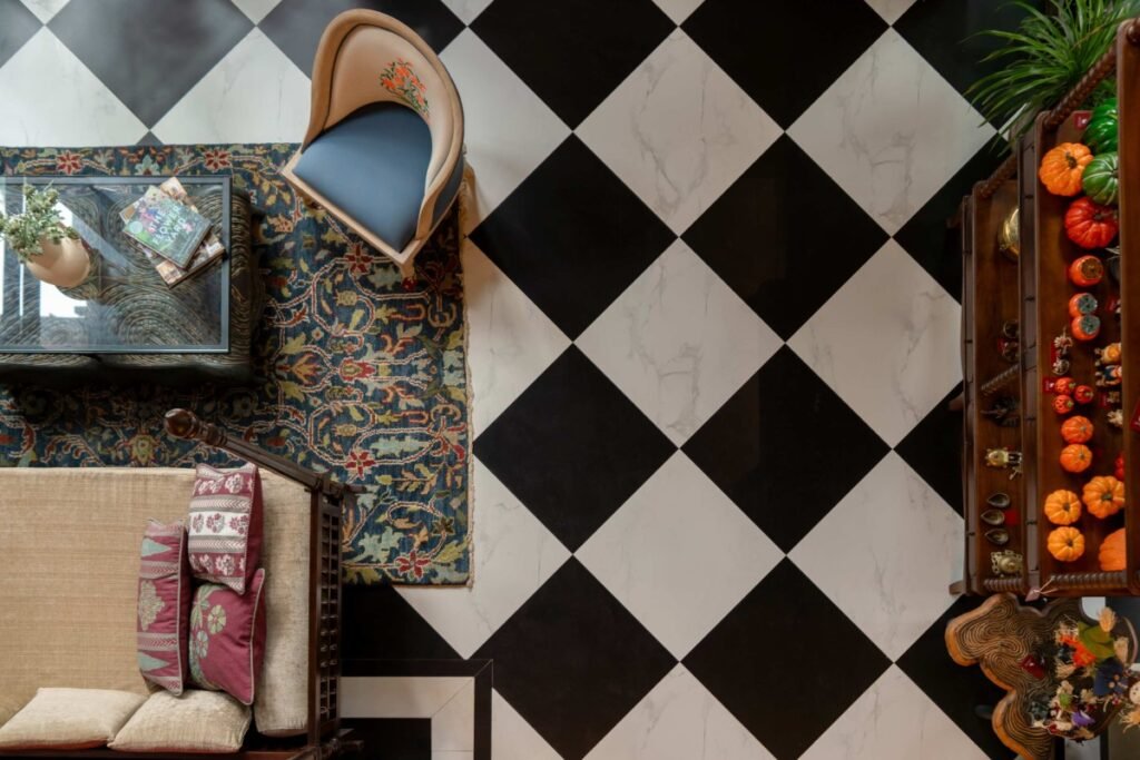
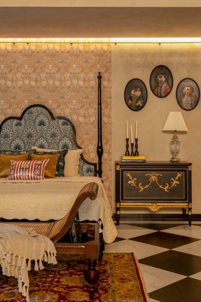
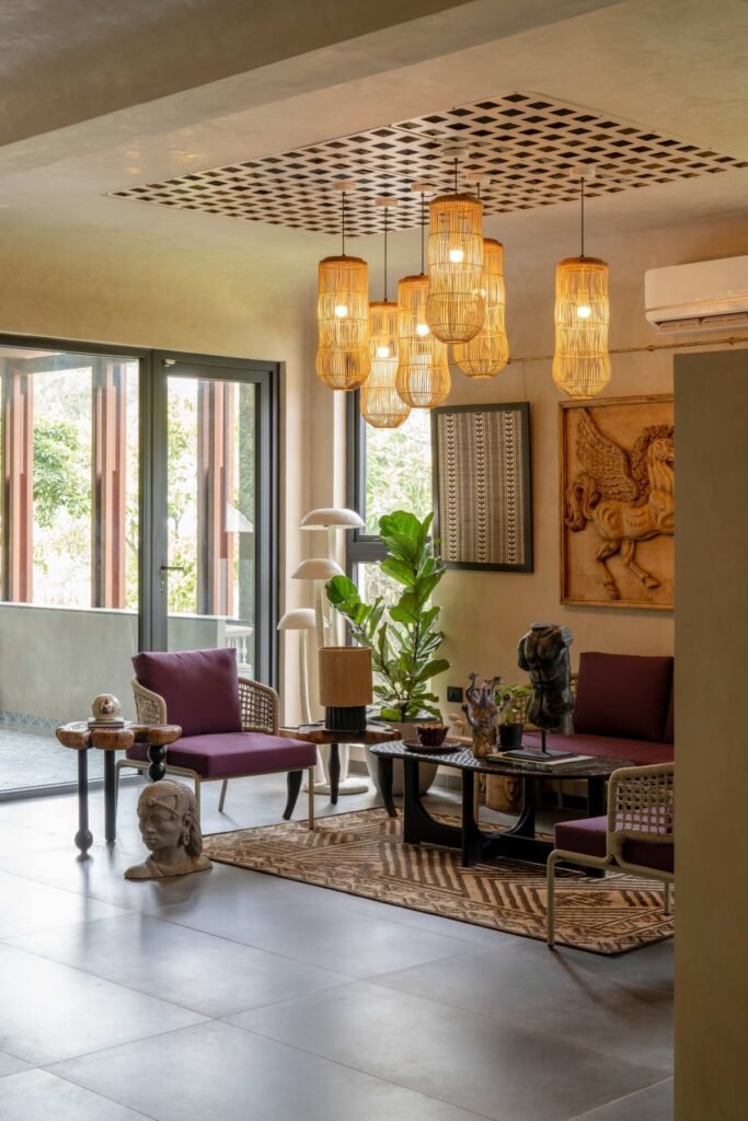
Inside, the Arkaa showroom runs to a collected, maximal sensibility that sits in sharp contrast to the restrained shell. One vignette pairs a terracotta-tiled wall with a dark torso sculpture, an antique writing desk, and a framed playing-card king. A staged bedroom suite mixes a carved four-poster, checkerboard marble, damask wallpaper, and oval portraits of animals in aristocratic dress. Plaster-toned lounge settings gather plum cane chairs, woven cage pendants, and arched niches of blue-and-white ceramics. It photographs richly, though as showroom styling it is doing a selling job of its own and reads more as curated retail set-dressing than as a fixed architectural condition.

The rental floors above are quieter, opening onto balconies framed by the timber-toned steel screen with the street trees close against the glass. The same brick-filtered light carries through, which supports the studio’s stated aim of giving the lettable space the same identity as the showroom rather than leaving it as a bare shell. It is currently impossible to determine if this consistency attracts the desired niche tenant, as the building has just been completed and lacks an occupancy record.

Fact File

Project name: Brick on Sticks
Office name: Dot Bot Studio
Typology: Commercial, retail (furniture showroom with rental floors)
Project location: Domlur-Indiranagar, Bangalore, Karnataka, India
Completion year: 2025
Built area: 10,000 square feet
Lead architects: Ar. Kavin Prasanth, Ar. Sabari Vijayakumar
Photography: Gopikrishnan Vijikumar

June 29, 2026 0 comments
0 FacebookTwitterPinterestEmail
Residential

Aurora Arquitectos Renovate a Lapa Townhouse With a Burgundy Staircase

by DDI Edit Team June 23, 2026
written by DDI Edit Team

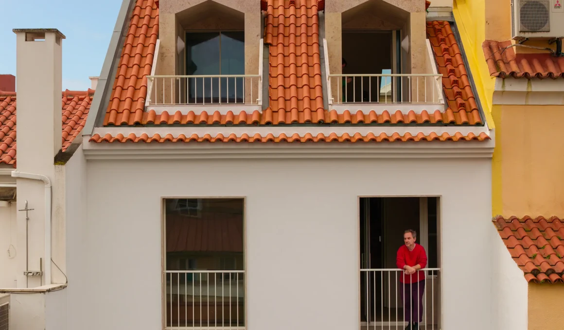
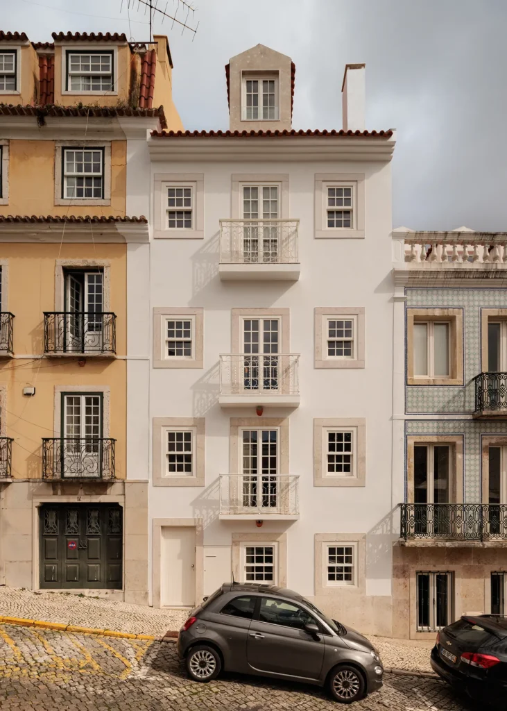
The street facade of the Remédios à Lapa Building has not changed, and that very restraint stands as Aurora Arquitectos’ most precise architectural decision, because everything behind it has been transformed completely. This intervention into a vertical house in Lisbon’s Lapa district, a refurbishment and upward extension completed in 2026, adds two new upper floors without announcing a single architectural gesture to the cobbled street below. The classical limestone surrounds, the traditional window proportions, the wrought iron balconies, and the terracotta roof tiles all remain intact, preserved as a continuous part of the streetscape. Measuring 390 square meters, the project begins quietly at the threshold and reaches its climax at the skylight above the burgundy lacquered staircase, a dark chromatic vessel that rises through the full section of the house and draws natural light downward from the roofline to every floor it touches.

Lapa is one of Lisbon’s most architecturally controlled residential neighborhoods, a hillside fabric of classical urban buildings in which the street elevation functions as a shared formal commitment and where any intervention that breaks that line reads less as an architectural statement than as an act of disrespect towards the city itself. Working within this discipline, Aurora Arquitectos make the only move available to a studio that takes both the typology and the neighborhood seriously, choosing to restore the facade rather than redesign it. The architecture, as a result, lives entirely on the inside.

The extension introduces two floors of private program, comprising bedrooms and attic spaces, set above the refurbished lower levels of an existing narrow urban house. Seen from the rear, the addition becomes legible, where terracotta roof tiles and two pointed dormers read as a considered intervention that honors the material vocabulary of the Lapa roofscape without copying it literally. From the street, however, the building offers no such clue, since the new floors are quietly absorbed into the vertical silhouette and sealed behind the restored facade.

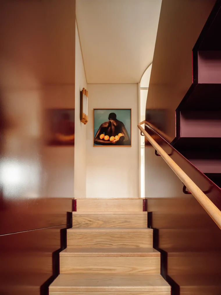
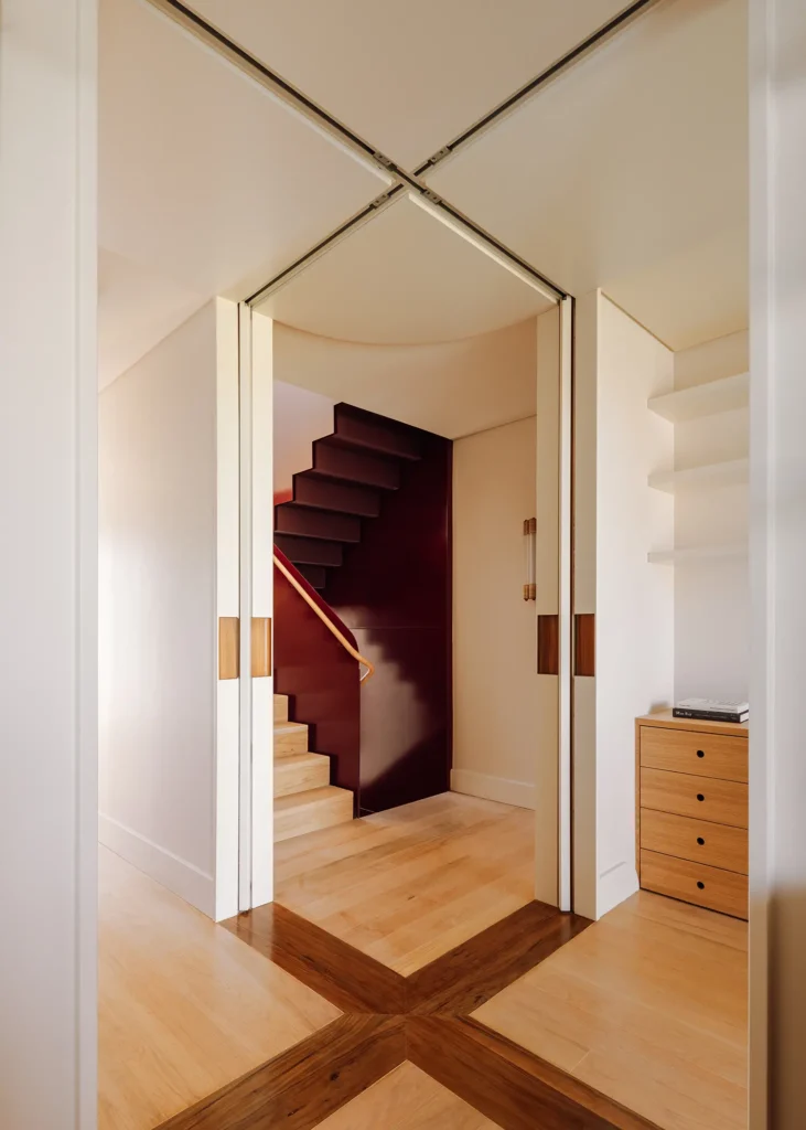
The staircase is the central spatial decision around which everything else turns. Enclosed in deep burgundy lacquer, a finish that allows it to read as an autonomous object within the section rather than a piece of the structural fabric, it climbs from the lower floors all the way to the attic, where a skylight floods the entire shaft with light from above. The dark lacquered walls set against the warm oak treads produce a deliberate chromatic opposition so that a shadowed and intimate vertical vessel comes to connect a sequence of light-filled rooms, each one warm and rich in material yet none sharing the staircase’s register. One ascends through shadow towards light, and the whole section is organized around that single experience.

Detached from the enclosing walls, the staircase opens a continuous passage for air, light, and sound through the full height of the house, achieving precisely the spatial argument the brief sets out. Freed from the structure, it allows the house to behave as a single vertical volume rather than a stack of independent floor plates. In Francisco Nogueira’s photography, the staircase and skylight epitomize the project’s strongest spatial sequence, showcasing how the narrow Lisbon renovation typology transforms into architectural strength.

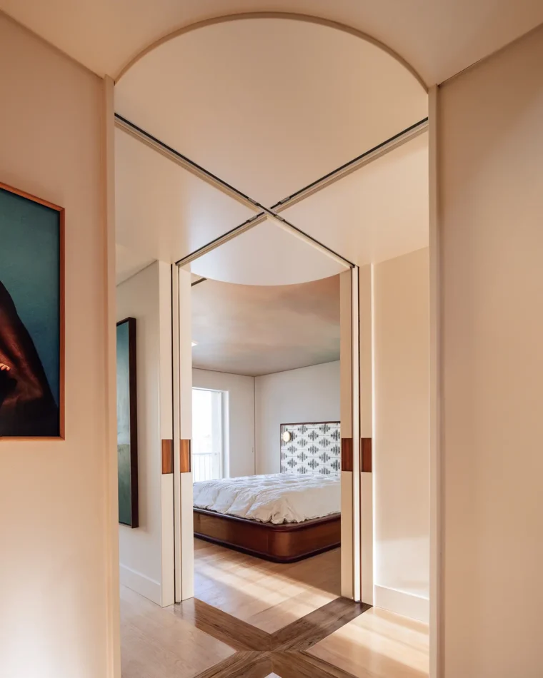
At each floor a pivot system concentrates all circulation into a single point, forming a four-panel sliding-door arrangement whose panels meet at a cross-shaped ceiling track set within a rounded, arched opening. When the panels are drawn open, they retract into the walls, and the arched threshold then connects rooms that feel entirely independent the moment they are closed again. A cross inlay pattern on the oak floors mirrors the geometry of the ceiling track above, marking the pivot point in the plan and binding floor to ceiling in a single bespoke detail executed by Facecamo.

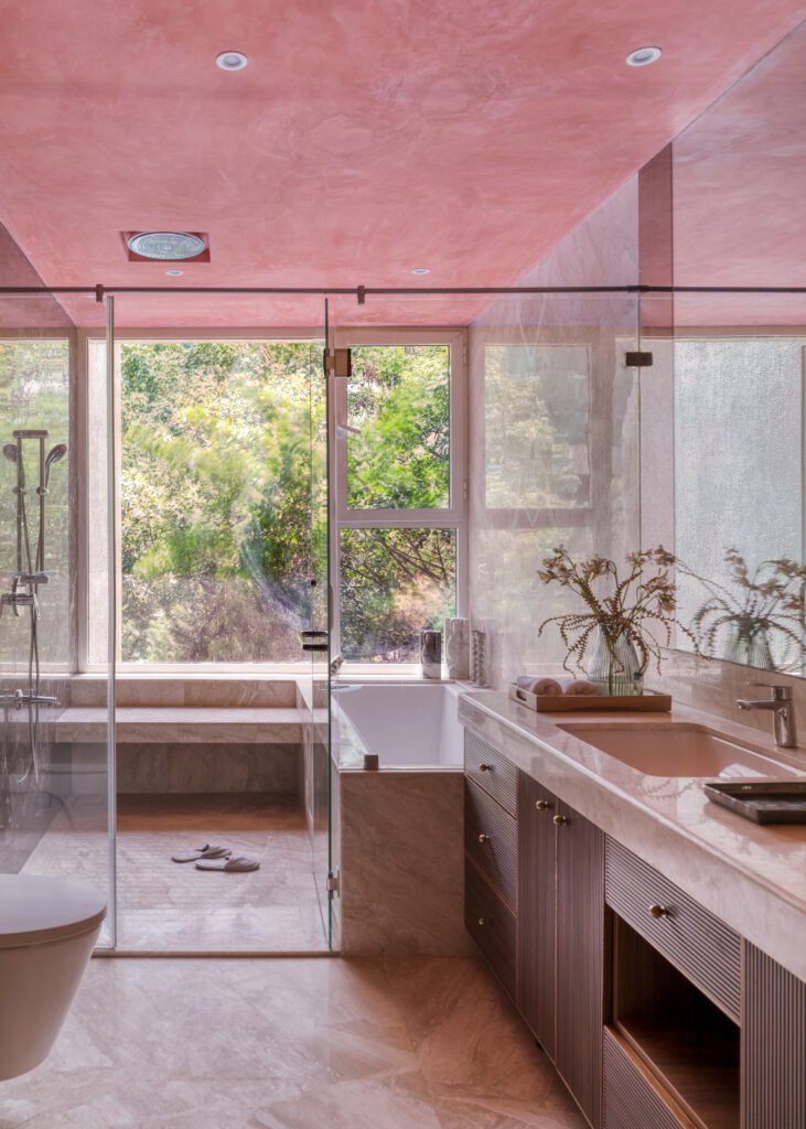
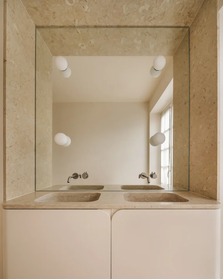
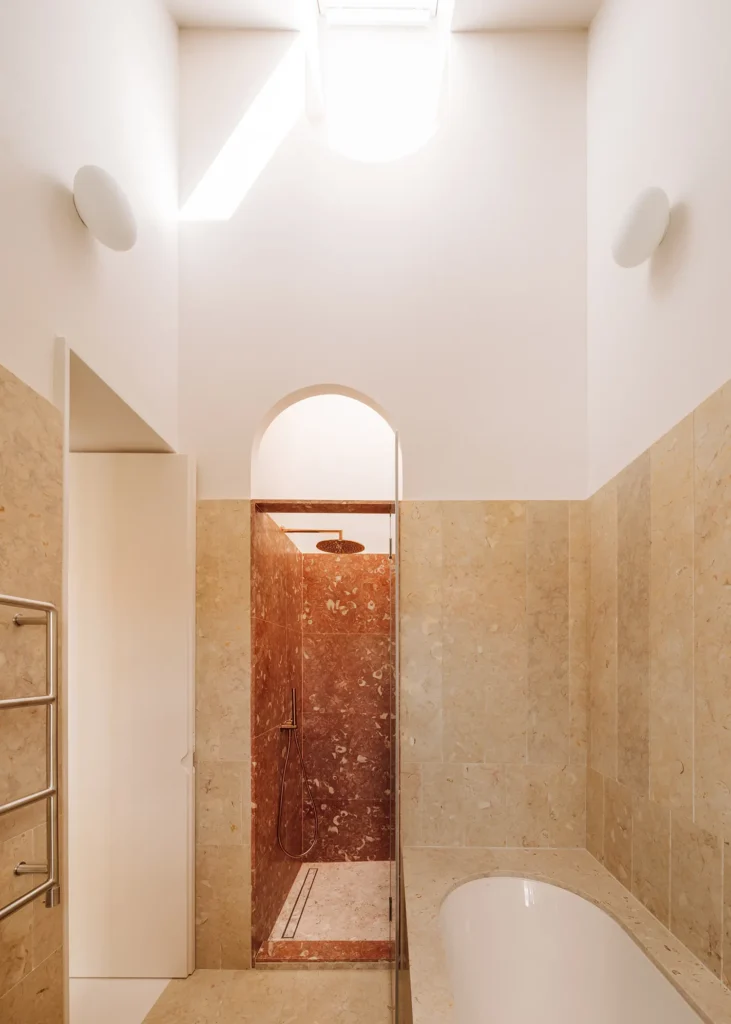
The material palette unfolds across the house in distinct registers. The bathrooms are clad entirely in limestone across walls, ceilings, and integrated stone countertops with carved double sinks, rendered in a warm cream travertine that turns each one into a solid stone volume rather than a mere service room. The shower zone introduces a contrasting terracotta marble, reached through a small arched opening that frames the shift in color and texture with real precision. Decoration by Labaye Sumi completes the interior with the same restraint the architecture itself demands.
The attic is perhaps the most unexpected space in the entire house. Clad in the same cream limestone as the bathrooms, across floor, walls, and ceiling alike, it opens to the Lapa roofscape through the pointed arched dormers that are visible from the rear exterior. A central limestone pier divides the room into two framed views across the neighborhood, where the terracotta rooftops and the Lisbon skyline become the only decoration the space requires. The stone enclosure against the sky mirrors the staircase’s contrast below, creating a solid interior that maintains a boundary with the city.

The most specific quality of the Remédios à Lapa Building is the consistency of its logic across every scale. The facade restores the street, the staircase anchors the section, the pivot system resolves the plan, and the attic frames the sky. Each of these is the same argument made at a different level of the building, namely that the Lisbon vertical house typology does not require transformation to generate spatial richness, only precision. Whether that precision, applied to a building that refuses to announce itself, ultimately produces architecture the city can read and learn from, or whether its finest moments remain forever hidden behind a classical facade, is the question Aurora Arquitectos deliberately leaves open at Remédios à Lapa.

Fact File

Project name: Remédios à Lapa Building
Office name: Aurora Arquitectos
Project location: Lapa, Lisbon, Portugal
Typology: Residential, single-family townhouse (refurbishment and upward extension)
Completion year: 2026
Gross floor area: 390 square metres
Key materials: limestone, burgundy lacquer, oak, terracotta marble
Photography: Francisco Nogueira

June 23, 2026 0 comments
0 FacebookTwitterPinterestEmail
Public & Cultural

Delcy Morelos Fills the Barbican Sculpture Court With 30 Tonnes of Earth

by DDI Edit Team June 23, 2026
written by DDI Edit Team

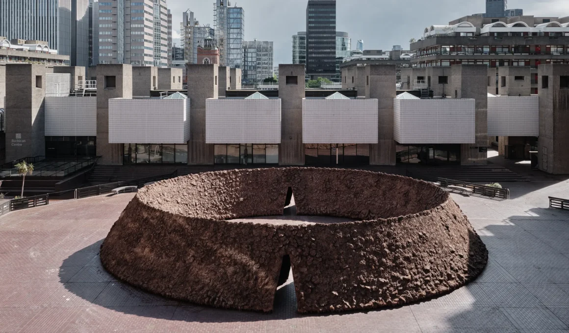
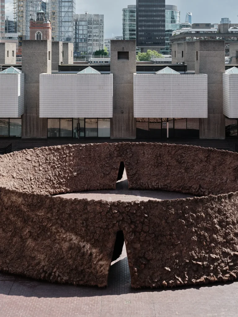
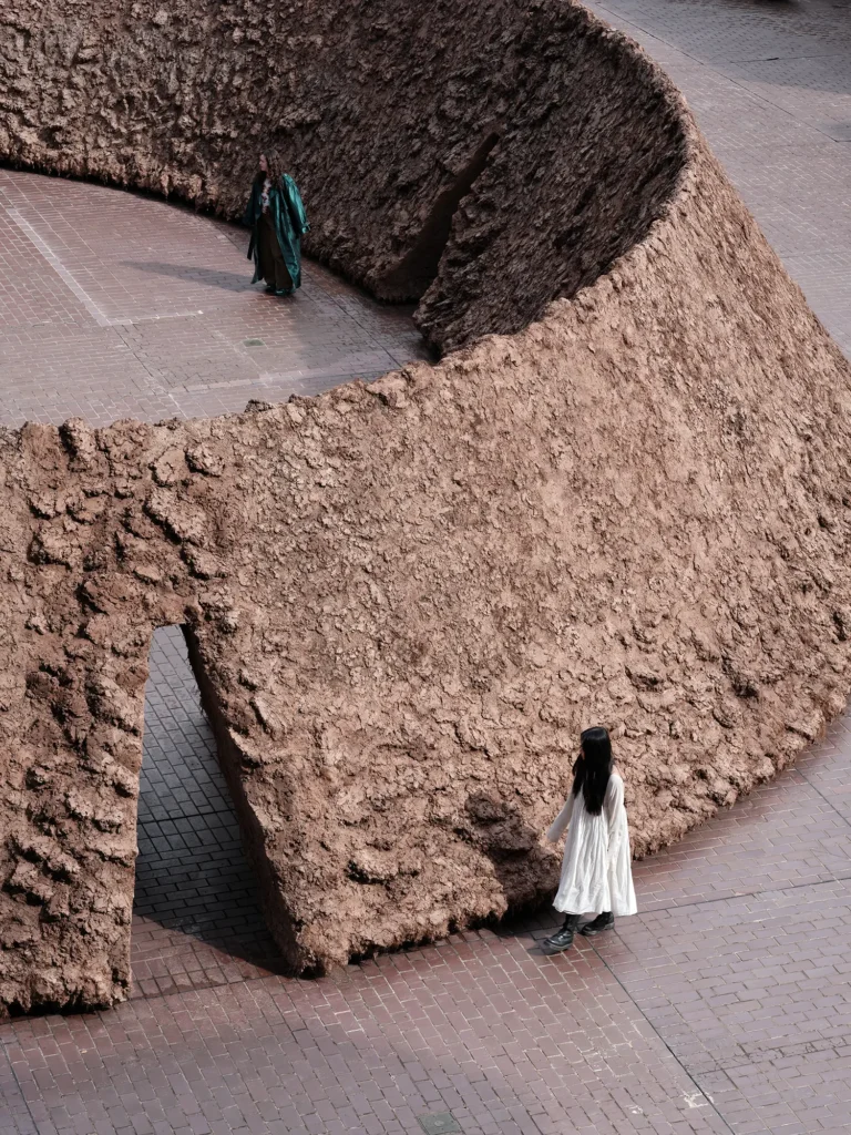
Delcy Morelos has planted thirty tonnes of spice-infused soil in the middle of London’s most uncompromising brutalist complex, and as a result, the Barbican’s Sculpture Court, left unused for its original purpose for a decade, has never felt more alive. Origo, commissioned by the Barbican and on view until 31 July 2026, is the most ambitious outdoor work the Colombian artist has produced to date, a twenty-four by eighteen meter oval earthwork that rises more than three meters from the paved court, hand-built from clay, soil, hay, plant seed, cinnamon, and cloves by Morelos and her team across more than a month of sustained physical labor. It is also, in the way Morelos frames it, a philosophical position rendered into material, since in Andean ancestral traditions the human being is understood as living earth, and the artist speaks of herself as a body and as earth, describing the exhibition space as a place where the earth expresses itself and becomes both the center and the mirror of what we are.

The biography behind the work is inseparable from its material. Born in 1967 in Tierralta, in Colombia’s Córdoba region, an area devastated by armed conflict rooted in illegal land appropriation and large-scale mining throughout the 1990s and early 2000s, Morelos began her practice making paintings from red clay pigments that mapped the entanglements between body, territory, and violence. That origin is not incidental context but rather the conceptual engine of everything she has made since. Soil, for Morelos, is never a sculptural medium in the conventional sense but instead a site-specific material that carries political weight, ecological memory, and ancestral Andean knowledge about the relationship between human bodies and the land they inhabit. The earth, in her reading, does not belong to us, for we belong to it.

The departure from Morelos’ established formal language is significant. Over the last decade she has developed a vocabulary of precise, angular earthen forms; geometric volumes that impose order on organic matter; and Origo breaks that pattern deliberately. The structure takes on a rounded, ovular shape that the artist describes as a response to the Barbican’s own architectural features, its curved residential terraces, its circular towers, and its concentric geometries. The result is something closer to a geological formation than a sculpture, a form that looks as though it might always have been there, pushing up through the paving and somehow preceding the concrete that surrounds it. In certain lights and from certain angles, the soil installation appears older than the building beside which it sits.

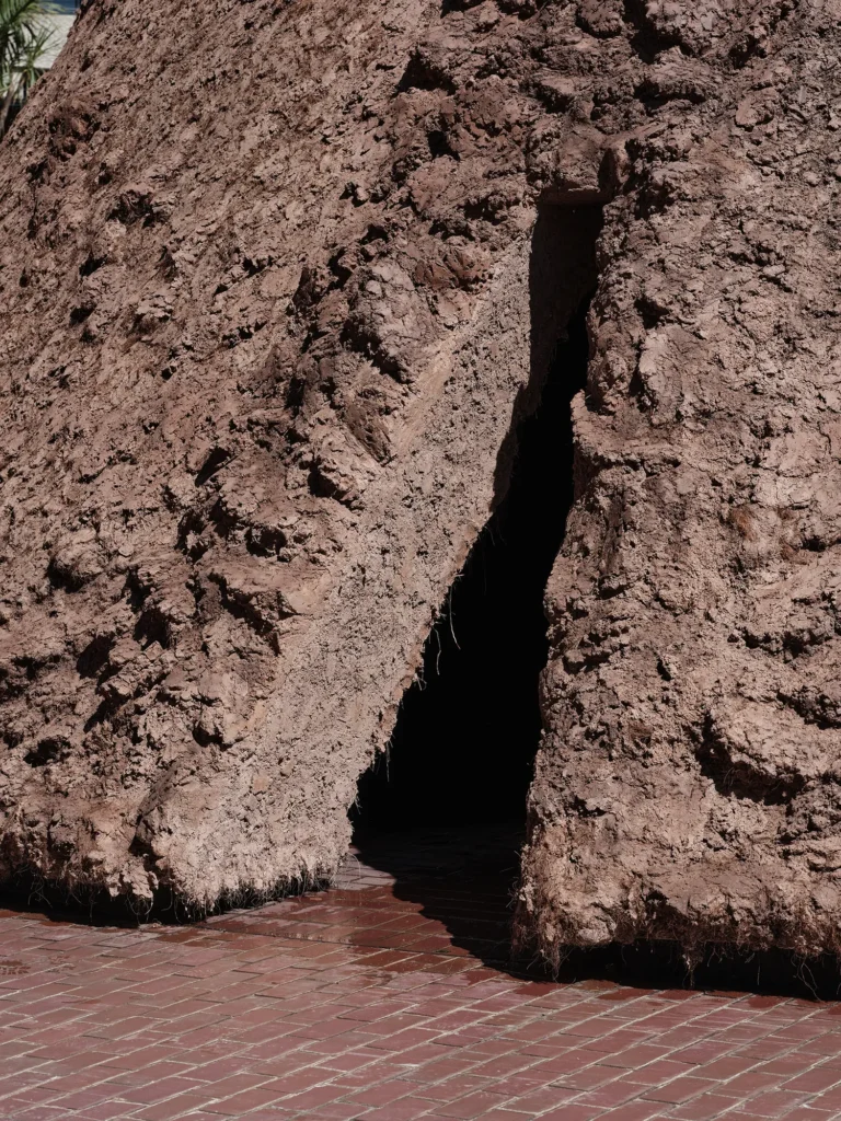
Inside, the logic inverts entirely. A series of openings, hollows carved through the volume and informed by the geometry of ancient burial sites, serve as entry points into internal tunnels that lead towards a central courtyard. Each tunnel has its own symmetry and depth, and each draws light differently depending on the hour and the angle of the sun, so that the movement through the structure becomes one of inward circulation, the body drawn down into the earth rather than moving across its surface. Curator Diego Chocano precisely describes how the monument’s grandeur contrasts with its humble materials and intimate tunnels that invite visitor immersion. The installation asks visitors not to stand before it and look, but to enter it and be absorbed.

The spices are not decoration. Cinnamon and cloves were mixed into the earthen body of Origo for reasons that are at once functional and philosophical, since both contain antifungal properties essential for maintaining the biological health of the soil over the course of the exhibition, a practical decision that doubles as an argument about the intelligence embedded in ancestral knowledge systems. The heady, warm fragrance that fills the Sculpture Court as a result creates a multisensory encounter that operates below the threshold of conscious analysis, so that visitors who have never read a word about Morelos’ practice will feel the work before they understand it. The smell evokes memory and emotion in ways that visual experience cannot, fostering a more ethical relationship with what Morelos calls the mother of all materials.

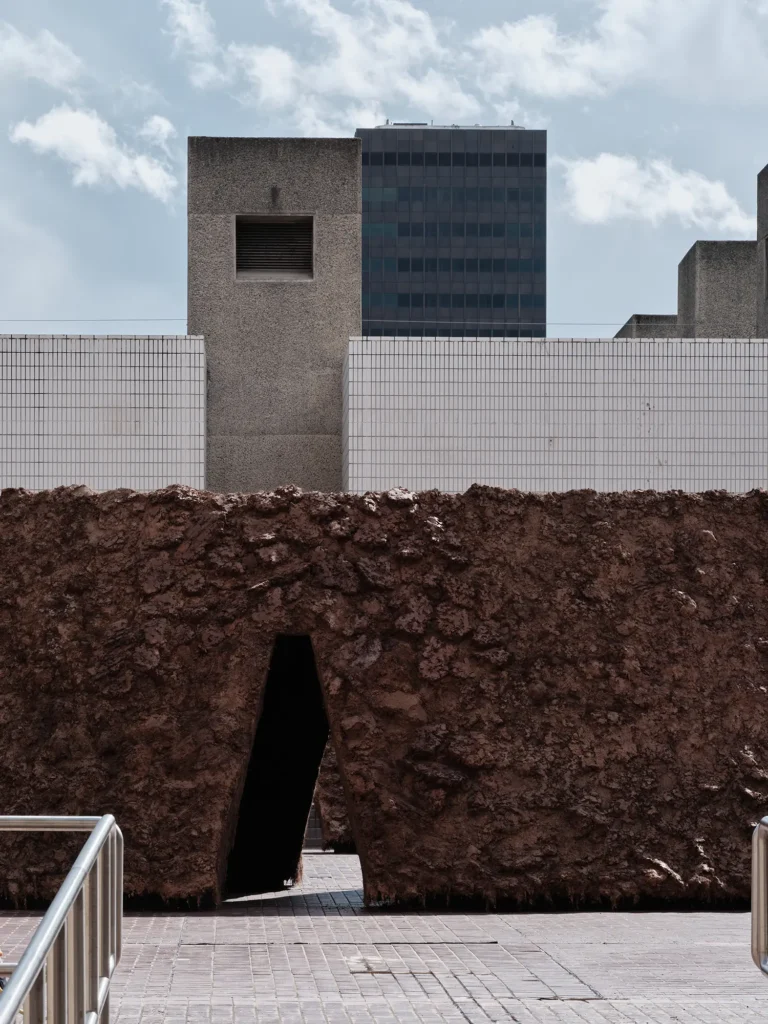
The dialogue with the Barbican’s brutalism is the conceptual hinge of the entire project. The Barbican was designed in 1959 by Chamberlin, Powell, and Bon, influenced by Le Corbusier, as a utopian city within a city, combining high-density housing, elevated walkways, integrated cultural infrastructure, and a humanist approach to urban living. Its hand-hewn concrete surfaces are tactile and reflect the labor involved, with the Sculpture Court designed to integrate art into everyday communal life. Origo responds to all of these elements with a precision that feels earned rather than assigned, placing the precarious and malleable in dialogue with the rigid and imposing, and in doing so it highlights the permeability of our bodies and their entanglement with the very material of the earth. Concrete and soil, it turns out, share more than they appear to, since both are composed of the earth, both carry the trace of human hands, and both age in public view.

The shadow gap at the base is the installation’s most restrained formal decision. The volume of Origo perches on a recessed base, creating a thin line of shadow that makes the entire mass appear to float fractionally above the paving. It is a detail so small that it might be missed entirely and yet so precise that once noticed, it changes the reading of the whole, since an earthwork this heavy and this dense should not seem to hover. The gap measures less than a centimeter, but it carries the weight of the installation’s entire tonal argument, insisting that the earth is not anchored here, that it arrived, and that it could just as easily leave. The work makes its temporary status visible in its very foundation.

The scale of the physical labor deserves its own paragraph. Morelos and her team applied over thirty tons of soil and clay by hand across more than a month of construction, with no machinery shaping the exterior surface, so that the texture visitors see, rough and organic and alive with irregularity, is the direct record of human touch at monumental scale. Chocano described it as a gargantuan task that was physically and emotionally taxing yet incredibly gratifying. In a field increasingly mediated by digital fabrication and industrial production, Origo insists on the irreducible value of the handmade, not as nostalgia but as argument, carrying the labor of its making as content rather than mere process.

What Origo ultimately proposes, and this is the claim worth taking seriously, is that the most radical act of public art in 2026 is not technological disruption or institutional critique but the placement of thirty tonnes of living earth in the middle of a post-war utopian housing complex, scented with cinnamon, open to the rain and slowly changing as seeds germinate within its walls. Morelos has built something the Barbican’s architects would have recognized as continuous with their own project, not an interruption of the communal space but a deepening of it, expanding the definition of who belongs in that community to include not only the human residents of the estate but also the microorganisms in the soil, the seeds that will or will not germinate, and the spices releasing their fragrance into the London air. Community, as Origo proposes it, occurs beyond our species.

Fact File

Project name: Origo
Artist: Delcy Morelos
Typology: Public art installation, site-specific earthwork
Location: Barbican Sculpture Court, Silk Street, London EC2Y 8DS, United Kingdom
Commissioned by: Barbican
Exhibition dates: 15 May to 31 July 2026
Dimensions: 24 by 18 metres, rising over 3 metres
Materials: clay, soil, hay, plant seeds, cinnamon, cloves
Photography: Thomas Adank / Barbican Art Galleryrol, water
Applications: daylight screens, sun shading, room partitions, wall panels
Published in: Frontiers of Architectural Research
Funding: Swedish Energy Agency
Year: 2026

June 23, 2026 0 comments
0 FacebookTwitterPinterestEmail
Commercial

Beymen Tersane by OMA Turns an Ottoman Shipyard Into a Department Store

by DDI Edit Team June 23, 2026
written by DDI Edit Team

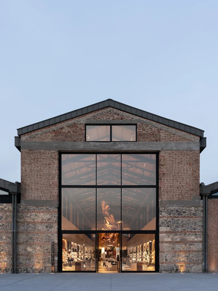
For six centuries the site was where the Ottoman Empire built its ships. Now it sells shoes. OMA’s conversion of the Tersane-i Âmire into a department store rests on one stubborn idea: that nothing old should be hidden to make room for anything new. The two simply coexist, in full view of each other.

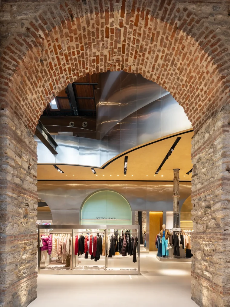
Completed in 2026 on the northern shore of the Golden Horn, the store covers twelve thousand square meters inside the Arsenal’s former shipbuilding halls. OMA’s contribution is a run of freestanding galleries, each given its own shape and surface, dropped into the halls like furniture into a much larger room. Above and around them, the brick arches, the cast iron columns, and the timber trusses of the original building stay exactly where they have always been. You cannot really separate the shop from the shipyard, which is the point.

The Arsenal’s history is not a footnote here. Naval production began on this site in the sixteenth century and continued as the fleet’s primary yard until the Empire fell in 1922, after which the halls limped along in industrial use until shipbuilding left the Golden Horn in the 1970s. Decades of emptiness followed. The wider redevelopment, now called Tersane Istanbul, reopens this stretch of waterfront to the public with a new promenade, and Beymen Tersane is the first significant piece of it to open its doors.

Rather than stack the store floor by floor, OMA lays it out as one long horizontal walk through the halls. The galleries change as you go in scale, in material, in mood, so the experience reads less like shopping across levels and more like moving from one room of weather into another. By the studio’s own account, these galleries form a new layer inside the shipyard, one that holds contemporary art alongside the merchandise while leaving the bones of the building on show.

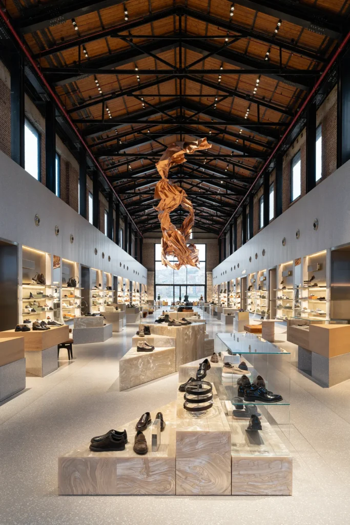
The shoe hall makes the whole approach legible in a single space. Its timber truss roof is left bare overhead, black steel diagonals cutting across pale wood, spanning a long nave of lit shelving and onyx-veined marble plinths. A twisted copper sculpture hangs from those same trusses at the center of the hall, suspended at the exact point where old structure and new display press hardest against each other. The far wall opens into a full-height pane of glass, and through it sits the city on its hill, the Süleymaniye Mosque crowning the view directly behind a line of mannequins.

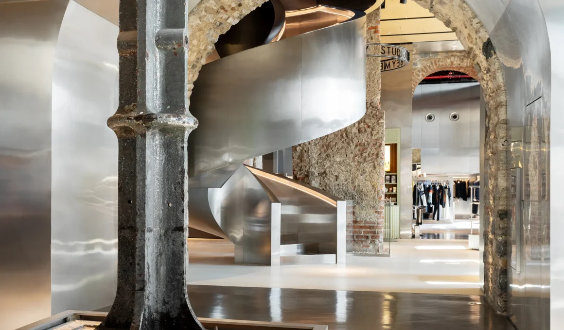
The staircase is the one moment where OMA raises its voice. A polished stainless steel spiral climbs through one of the Arsenal’s original stone arches, its mirrored skin bending the brick, the vault, and every passing visitor into soft distortion. At its foot, a cast iron column salvaged from the building’s industrial years stands on a low plinth, rust and all, the precise opposite of the bright metal turning beside it. OMA neither wrapped the column nor folded it into a new wall. It is left as found, and no other gesture in the project says as plainly what this design is willing to leave alone.

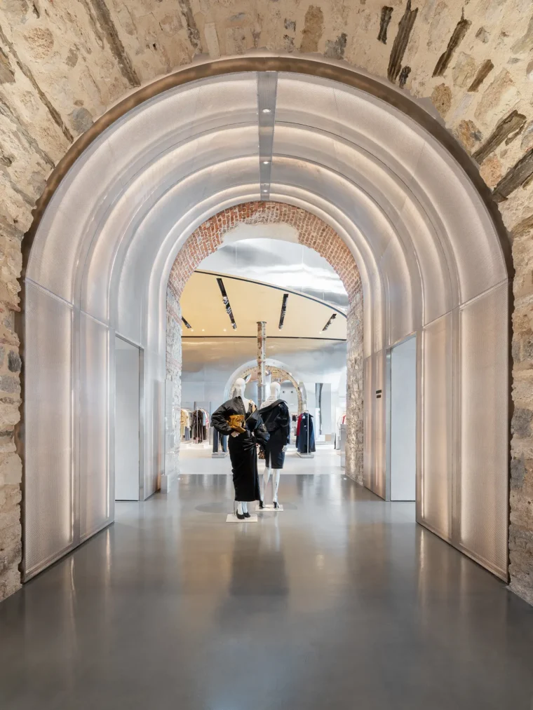
Moving between galleries means stepping through a recurring trick. OMA sets new arches inside the old stone ones, smooth and backlit and lined in perforated metal mesh, so the curve repeats, but the material never does. Rough limestone and worn brick on the outside, polished surfaces, and cream plaster within. The new opening keeps answering the old one without ever pretending to be it.

OMA partner Iyad Alsaka places the project where two of the studio’s long-standing interests overlap, shopping and conservation. He describes Beymen Tersane as the reactivation of a site whose meaning for Istanbul rivals that of the Arsenale in Venice, handing a long-sealed piece of the city back to public life. The clearest proof of that ambition is also the strangest room in the store, a hall of fat terracotta cylinders filled with tropical plants, their rammed-earth texture talking directly to the stone walls overhead, the ceiling dotted with white tubular pendants. Planters sit at the base of each column. Nothing about it behaves like luxury retail, and that is the gallery insisting the project was never only about selling things.

The menswear room goes the other way entirely. Matte dark grey panels seal it into a complete interior, a cool box set against the warm stone of the arsenal. Then OMA cuts a clean rectangle out of the ceiling to expose the timber trusses overhead, framing a deliberate glimpse of everything the walls are trying not to be. What hangs on that decision is real: the acoustics, the brand’s atmosphere, and the odd question of what a customer is actually paying for when they shop inside a shipyard.

The open question is durability of a different kind. On a first visit the run of spaces, from shoe hall to spiral stair to arched corridors to terracotta garden to dark menswear box, holds together as a confident and generous argument. Whether it keeps working on the tenth visit, or whether the Arsenal slowly swallows the goods it was meant to frame, is a verdict the architecture critics will not deliver. The returning customers will.

Fact File

Project name: Beymen Tersane
Office name: OMA
Typology: Commercial, department store (adaptive reuse of a historic shipyard)
Project location: Tersane-i Âmire, Haliç, Istanbul, Turkey
Completion year: 2026
Gross floor area: 12,000 square metres
Client: Beymen Group
Partner in charge: Iyad Alsaka
Key materials: polished stainless steel, onyx marble, terracotta, exposed original brick and timber trusses, cast iron
Photography: Marco Cappellettiö, Zeinab Hefny
Ingredients: baker’s yeast, cellulose fibres from wood, alginate from algae, glycerol, water
Applications: daylight screens, sun shading, room partitions, wall panels
Published in: Frontiers of Architectural Research
Funding: Swedish Energy Agency
Year: 2026

June 23, 2026 0 comments
0 FacebookTwitterPinterestEmail
Materials

Chalmers Researchers 3D Print an Architectural Material From Baker’s Yeast

by DDI Edit Team June 23, 2026
written by DDI Edit Team

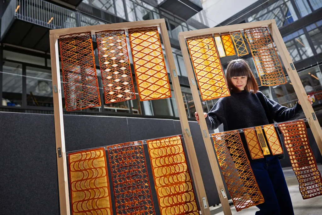
The unexpected ingredient at thecentere of this material is the same one that makes bread rise. A research team at Chalmers University of Technology in Sweden has turned baker’s yeast into a 3D-printable building material, aimed squarely at the interior elements that today rely on plaster, plastic,, and synthetic textiles. Think daylight-filtering screens, sun shading, room dividers, and wall panels, all reimagined from something entirely organic and renewable.

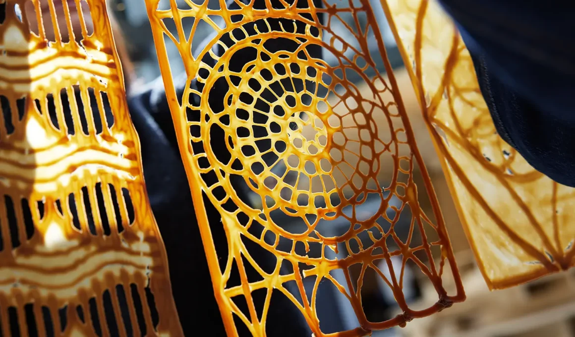
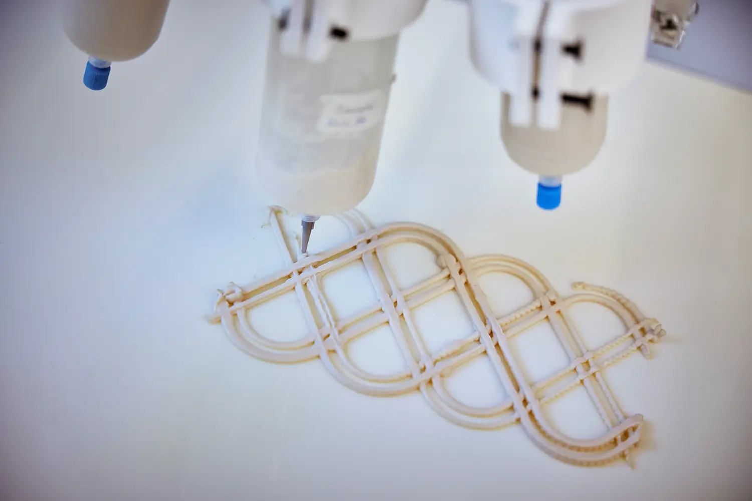
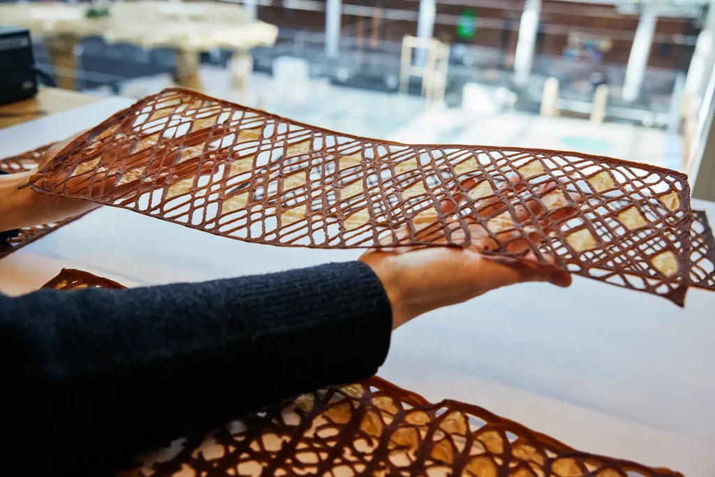
The recipe reads more like a kitchen than a laboratory. Yeast forms the structural base, joined by cellulose fibers from wood, alginate drawn from algae, glycerol from plants, and water. Combined, these ingredients produce a hydrogel, a soft and jelly-like mass that can be pushed through a printer and shaped at will. The yeast itself is not doing the work it usually does. It is heat-deactivated first and stabilized rather than left to ferment, so it functions as biomass and structure instead of a rising agent.

What sets this product apart from the broader field of engineered living materials is not the ambition but the choice of raw material. Yeast is cheap, produced industrially at an enormous scale, and leaves behind large quantities of residual biomass through brewing and agriculture that currently has no second life. The argument from Professor Malgorzata Zboinska, who led the study, is that leftover yeast unfit for food or animal feed could instead find a home in architecture. It is a way of pulling value out of what would otherwise be discarded.

The production method is deliberately low-tech, and that is part of the appeal. The hydrogel is printed using air pressure at room temperature, then left to air dry into its final form. There is no energy-hungry heating, no support scaffolding, and no offcut waste. Small tweaks to the formula shift the material’s transparency, color, and surface texture, which makes it adaptable to a range of interior uses without reinventing the process each time.

The most interesting idea here is philosophical rather than technical. Most building materials are engineered to last as long as possible, and their durability is treated as the goal. This material is designed to biodegrade. The team incorporates decay into the design, intentionally building shorter and circular life cycles from the start. It reframes sustainability not as cleanup but as a decision made at the moment of creation.

None of the material is ready for the building site yet, and the researchers are clear about that. Fire safety, behaviour under moisture, structural strength at larger scales, and the logistics of robotic printing all need much more work before anything like this technology reaches widespread use. What the study offers for now is a credible proof of concept and a genuinely different way of thinking about where construction materials come from and where they are meant to end up.

Fact File

Material: 3D-printable yeast-based architectural material
Institution: Chalmers University of Technology, Gothenburg, Sweden
Typology: Material innovation, bio-based building material for interiors
Lead researcher: Professor Malgorzata Zboinska
Co-author: Yagmur Bektas (doctoral researcher)
Research team: Yagmur Bektas, Malgorzata A. Zboinska, Cecilia Geijer, Tiina Nypelö, Zeinab Hefny
Ingredients: baker’s yeast, cellulose fibres from wood, alginate from algae, glycerol, water
Applications: daylight screens, sun shading, room partitions, wall panels
Published in: Frontiers of Architectural Research
Funding: Swedish Energy Agency
Year: 2026

June 23, 2026 0 comments
0 FacebookTwitterPinterestEmail
Residential

Mazha by 7th Hue Architecture Collective Wraps a Kerala Home Around a Green Courtyard

by DDI Edit Team June 23, 2026
written by DDI Edit Team

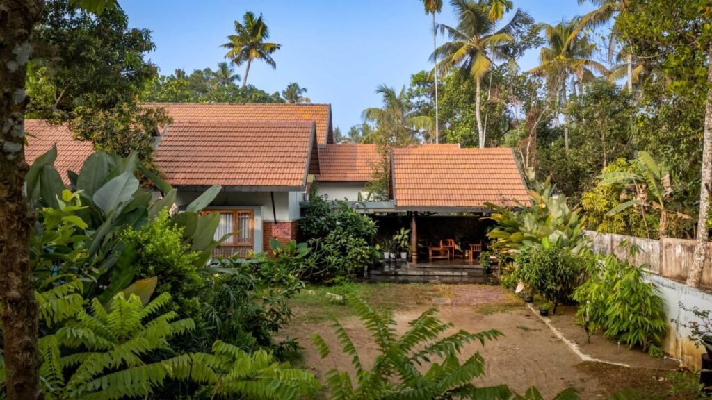
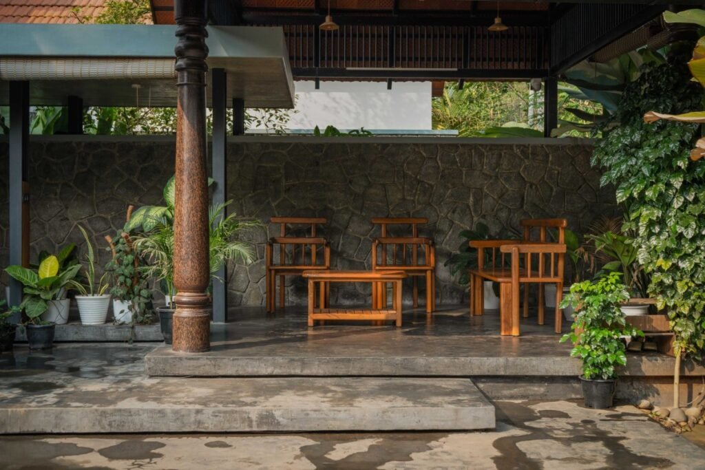
A house named Mazha, the Malayalam word for rain, sits in Mathilagam, a quiet coastal pocket of Thrissur where a nearby beach sets the pace of everyday life. From the outside, the house keeps a soft, almost familiar profile. Pitched roofs clad in terracotta tiles step down across the plot, their gables trimmed in dark fascia, while exposed brick, rough stone, and a turned timber column on the verandah anchor it firmly in the Kerala landscape. Coconut palms lean in from every side, and the building seems to settle into the greenery rather than stand apart from it. It reads less as a statement and more as a continuation of the place it belongs to.

The brief came from a client living with his parents and three children, a household that included three generations living together. What that family needed was closeness, a home where everyone could move freely and stay connected without anyone feeling crowded. The architects at 7th Hue Architecture Collective answered by placing nearly all the primary spaces on the ground floor and organizing the entire plan around a central courtyard so that togetherness became the structural logic of the house rather than an afterthought.

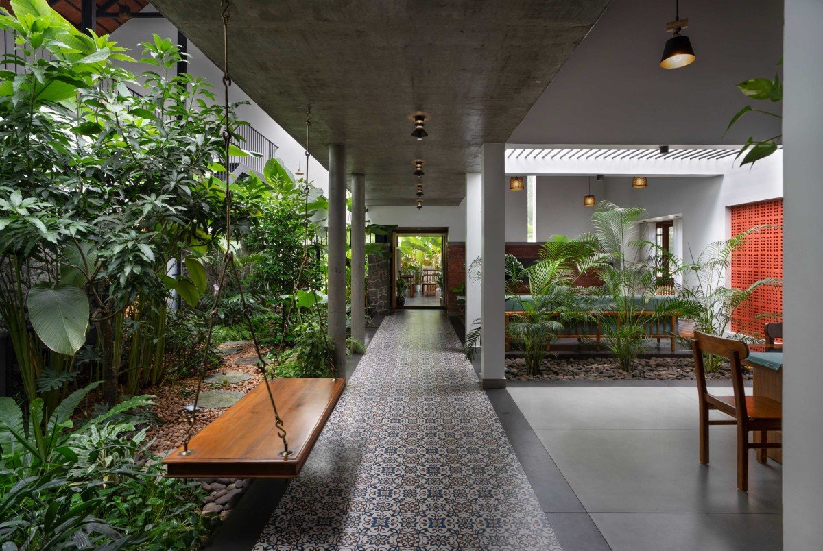
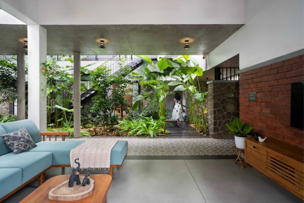
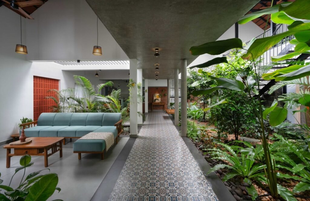
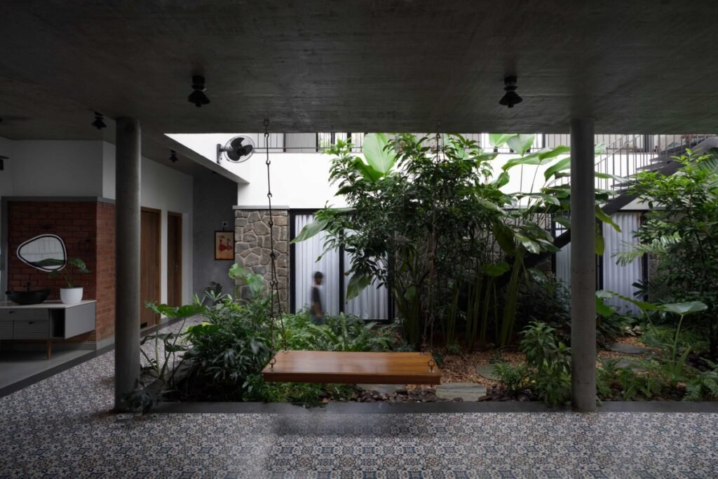
That courtyard is the heart of the project, and the photographs make clear how much work it does. Open to the sky and dense with planting, it brings tropical foliage, ferns, and slender trees right into the middle of the home. A flat timber plank swing hangs on chains from the concrete soffit, and a patterned encaustic tile path threads along its edge, setting an intricate blue and ochre floor against the smooth grey of the polished concrete around it. Slim cylindrical columns hold up the exposed concrete ceiling, framing the green void so that from almost every room your eye lands on leaves, light, and open air. Living, dining, and circulation all gather around this space, and the boundary between inside and garden remains deliberately loose.

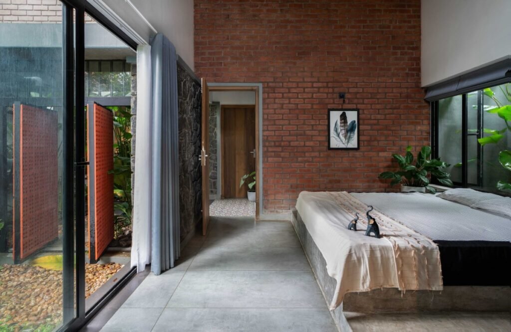
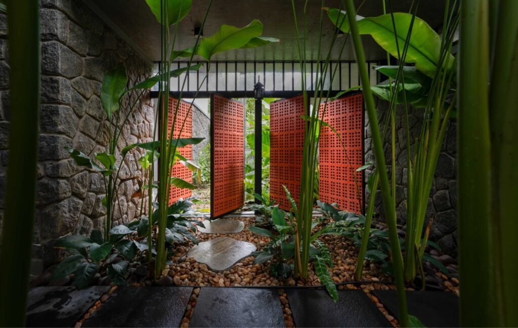
Light and ventilation clearly drove the design, and rather than relying on the single central court, the architects cut four courtyards into the plan. The smaller ones tuck against the bedrooms, lined with rough stone walls and filled with broad-leaved plants and river pebble beds, so that even the most private rooms open onto a slice of greenery. One of these is screened by a set of perforated terracotta panels in a warm rust orange, pivoting open onto a pebbled garden of stepping stones and tall foliage, a detail that recurs across the house as both a privacy filter and a quiet shot of color.

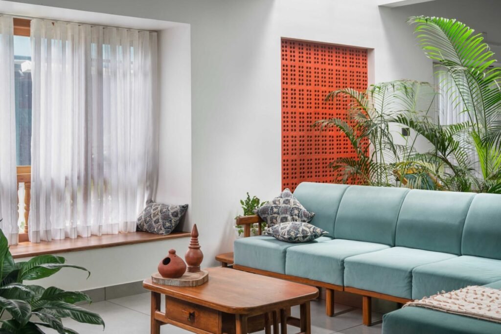
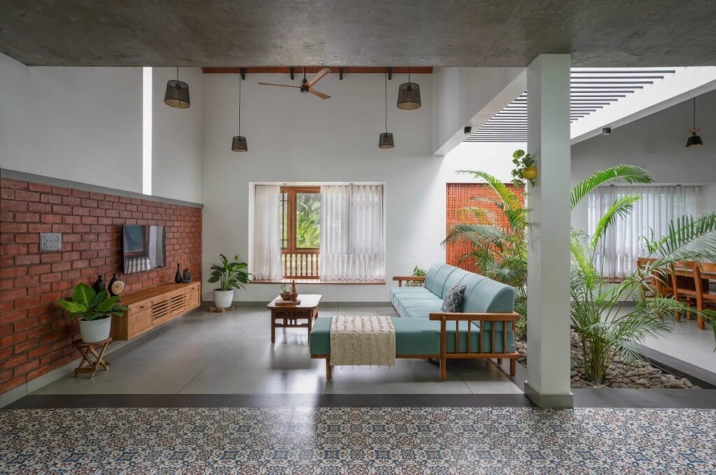
The living spaces carry a confident material palette that the photographs reveal far more vividly than the plan suggests. Exposed red brick walls sit against crisp white plaster and raw concrete ceilings, while a long sage green sofa, warm teak furniture, and woven pendant lamps soften the harder surfaces. The rust orange jali panel reappears here too, glowing against the white walls. There is nothing precious about any of it, and that is the point. The house feels lived in from the first glance, a place built for daily use rather than display.

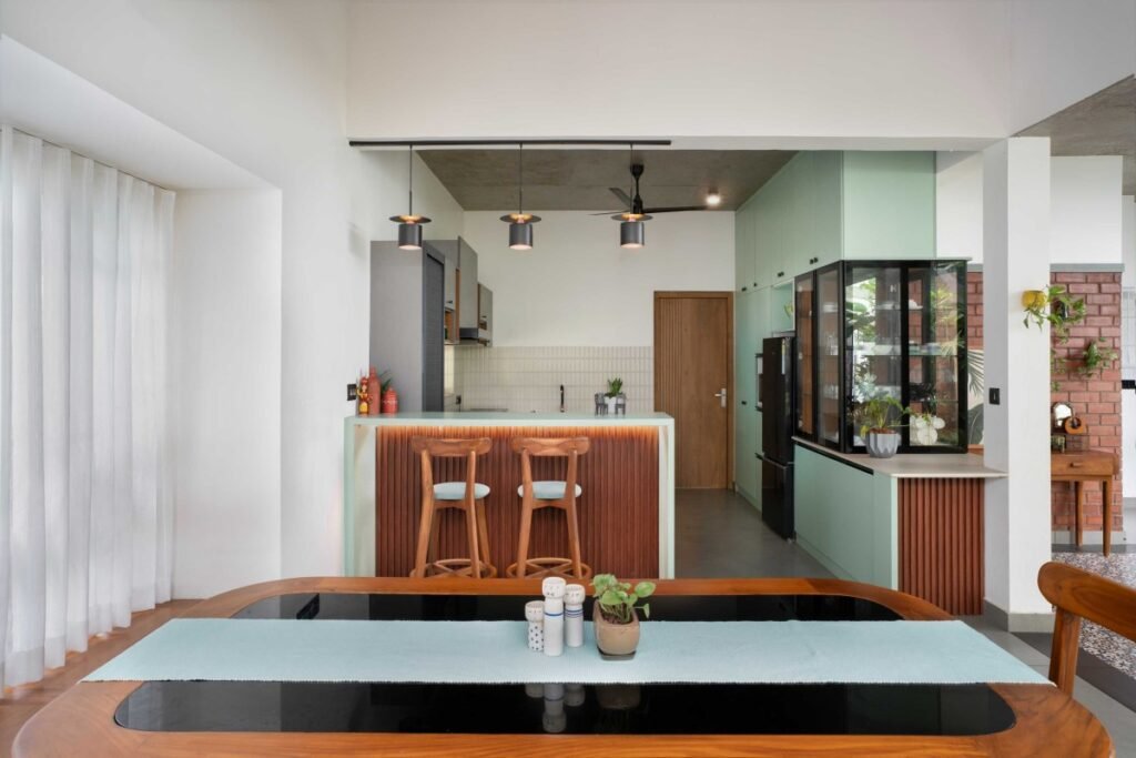
The kitchen and dining zone continues the same easy mix. Mint green cabinetry and a fluted timber breakfast counter meet a glossy dark dining table, with a tall glazed display unit and a brick column edging the space. Pendant lights drop from an exposed concrete slab, and the planting from the adjoining court spills visually into the room, keeping the cooking and eating heart of the home connected to the garden like everything else.

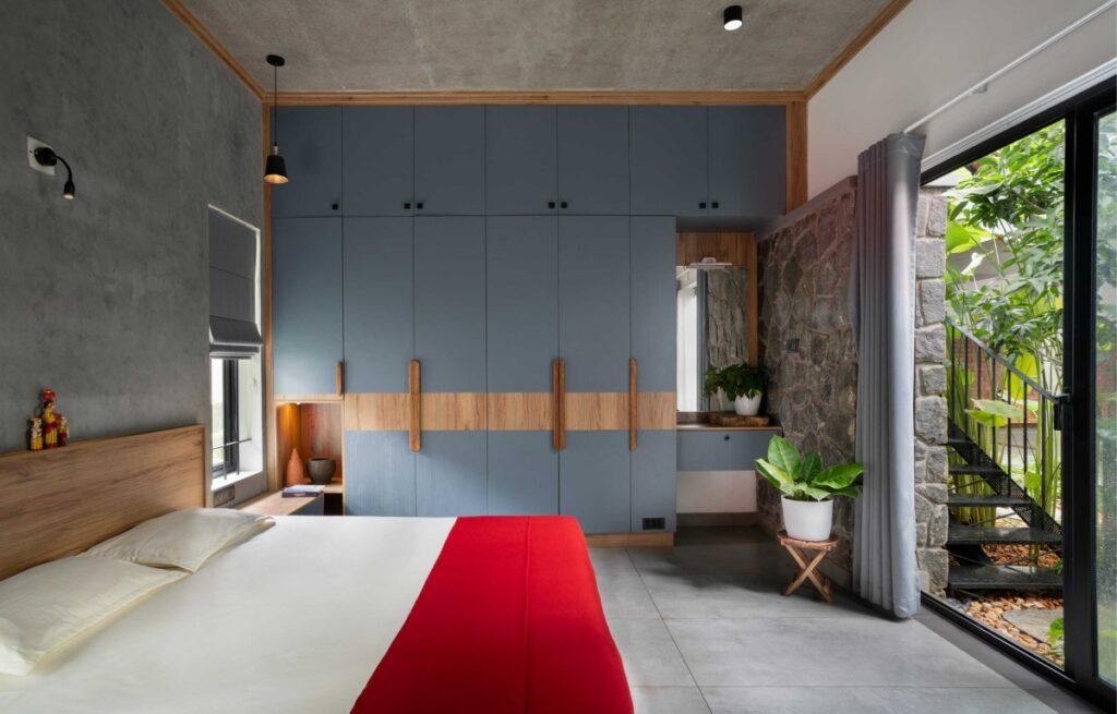
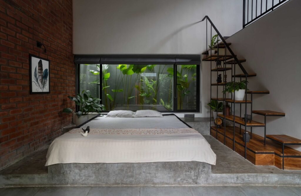
The bedrooms are where the material contrasts are sharpest. One pairs a tall red brick wall with polished concrete floors, a low plinth bed, and a black-framed window that opens directly onto a planted stone court, with the same rust jali panels pivoting beside it. Another set has muted blue-grey wardrobes, banded with a strip of natural timber, against a grey plaster wall and a rough stone surface, with a single red throw at the foot of the bed cutting cleanly through the cool tones. In each case a glazed opening pulls the garden right up to the bed, so privacy never means closing the room off from nature.

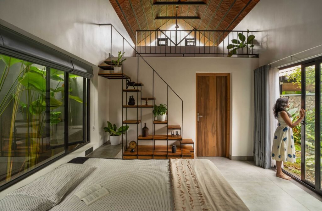
The upper floor is kept deliberately spare, holding just one multipurpose room imagined as a study and play zone for the children. Tucked beneath an exposed timber and woven roof structure, it sits behind a slim metal railing and looks down through the double-height volume to the courtyard below. A delicately built open metal and timber stair, doubling as a display shelf for plants and small objects, climbs up to it. This raised perch provides the children with their own creative space while allowing them to stay within sight and sound of the activities downstairs.

Across the whole house the same idea holds steady. Natural materials, generous planting, filtered light, and an unbroken connection to the courtyards combine into an atmosphere that is warm and grounded rather than merely minimal. Mazha balances function and feeling with real care, strengthening the bonds of a large family while celebrating the ordinary moments of daily life, all of it framed by the steady green presence of the gardens woven through its center.

Fact File

Project name: Mazha
Office name: 7th Hue Architecture Collective
Typology: Residential, single-family house
Project location: Mathilagam, Thrissur, Kerala, India
Completion year: 2024
Built area: 3,000 square feet
Lead architect / designer: Ar. Shyamraj Chandroth
Design team: Ar. Liliya Paul
Photography: Ar. Premil Varghese Mathew

June 23, 2026 0 comments
0 FacebookTwitterPinterestEmail
Residential

The Box in the Barn, Brtev, Lázně Bělohrad, Czech Republic by Facha architekti

by DDI Edit Team June 22, 2026
written by DDI Edit Team

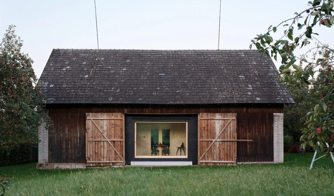
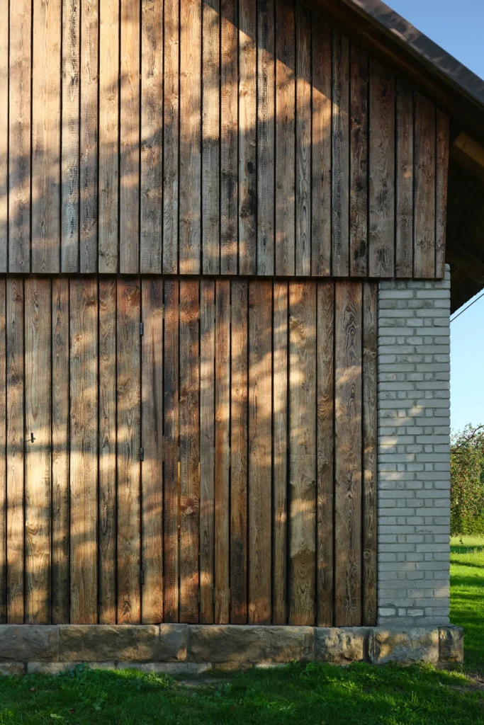
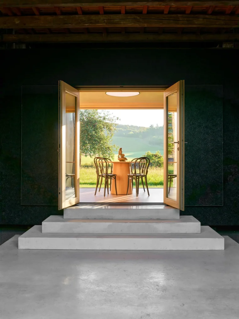
Seen from the orchard, the old barn at Brtev gives almost nothing away, standing as it always has on a low base of stone and pale brick, its dark weathered boards catching the dappled shade of the apple trees while its mossy tiled roof sags gently with age. Only at the center does something change, where one bay of the barn doors swings open and a clean rectangle of warm interior light glows out into the dusk, a small table and chairs just visible inside. That single lit opening is the only sign that Facha Architekti have placed an entire house inside.

The brief evolved from initially considering a renovation of the farmstead’s residential area to a more compelling idea: an independent dwelling ingeniously placed within the barn. Completed in 2025, it offers 42.5 square meters of usable floor area within a barn of roughly 150 square meters, a compact retreat that treats the older structure not as a building to be converted but as an environment to inhabit.

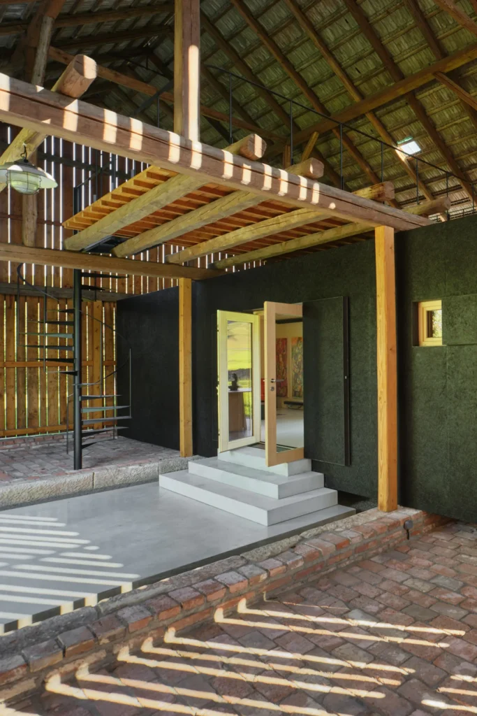
The founding principle was respect for what already stood here, and the photographs show how literally the architects meant it since the barn keeps its raw timber cladding, its hand-worn doors and side shutters, and even the marks of weather and time across its boards. When everything is closed, there is no hint of a new structure inside at all. The studio created a distinctly contemporary freestanding volume wrapped in dark, fibrous asphalt panels that resemble felted stone, rather than blending it with the old structure. It sits structurally independent from the barn around it, a building within a building, and the contrast between the soft, aged wood and the taut black skin makes the place stunning.

A single visual axis organizes the plan, running through the threshing floor of the open barn, out past the old apple trees, and on into the rolling green landscape beyond.

The architects let that line drive the layout, placing a large panoramic window and the dining table along it so the view becomes the spine of the interior. The photograph through the open doors makes the move plain, a small round timber table and bentwood chairs framed dead center, the Czech hills falling away behind them in the evening light. Inside, a second window frames a wall of clipped green hedge like a living picture, so the box looks out in two directions at once.

The threshold is handled as a piece of theatre, with a pale concrete surface flowing out of the courtyard, running through the empty half of the barn under the old timber roof, and rising into broad monolithic steps at the entrance, a smooth grey carpet laid through the rough brick floor. Those stacked concrete slabs, set against the black panelled wall and a slim timber door surround, turn the simple act of stepping up into the house into the project’s quiet ceremonial moment. Bars of sunlight slip through the barn’s slatted upper wall and stripe the concrete as you approach.

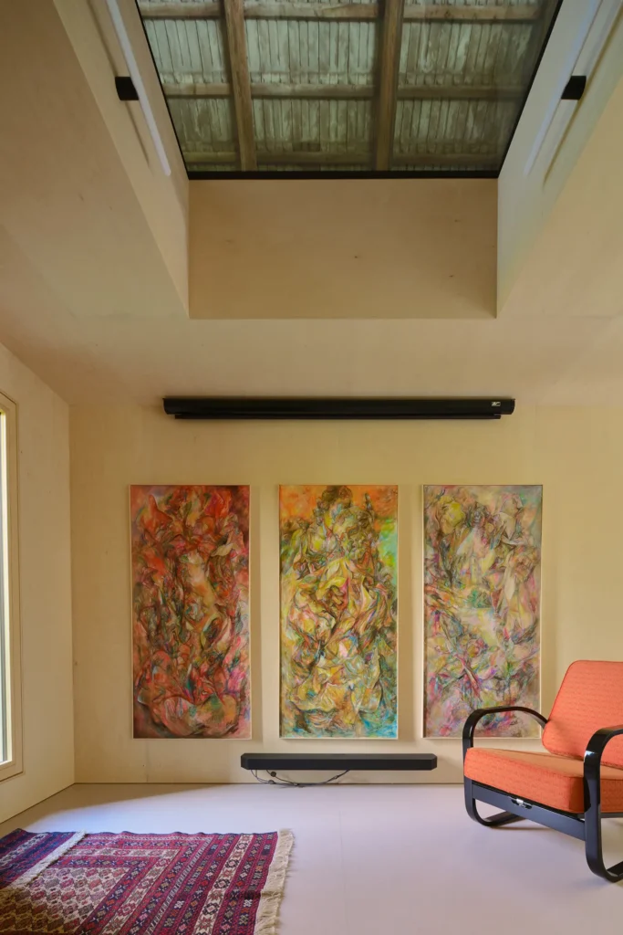
Within, the interior shifts register completely, as the dark exterior gives way to a calm, warm space lined in pale birch plywood, soft and luminous against the black asphalt outside. A built-in block of black-dyed MDF holds the kitchen, the bathroom, and the storage, and this dark core does the quiet work of separating the main living area from the sleeping area, so a small footprint still reads as distinct rooms. In the living space a square skylight has been cut up through the volume, opening to the underside of the original barn roof above and pulling soft daylight down onto a wall hung with three large expressionist paintings, a vintage orange armchair, and a patterned rug grounding the room in lived-in comfort.

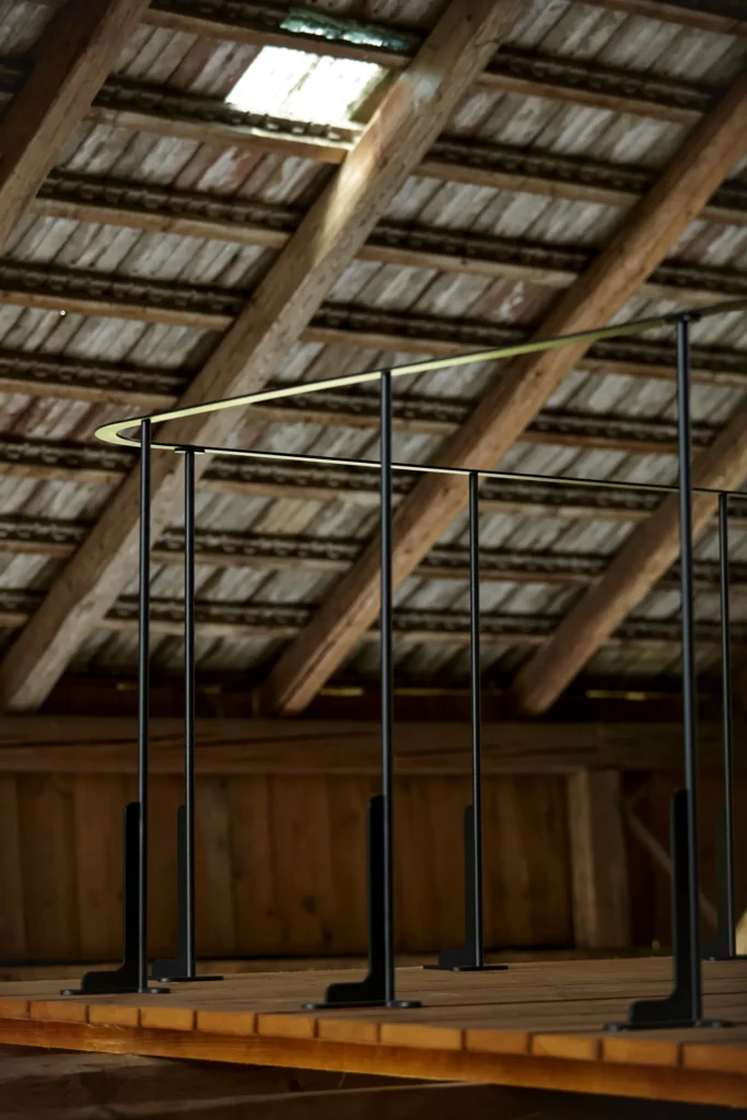
Circulation between levels is resolved as a single sculptural gesture, a tight black spiral stair of folded steel treads winding up from the brick floor, set against the flat black panels of the box, and climbing through the section to a mezzanine. Up there, a slender black railing with a single bent steel handrail traces the edge of the platform, sitting just beneath the magnificent old timber rafters and their pale board underside. From this perch, the full drama of the project is clear: the new dark insertion tucked carefully beneath the ancient roof, the two never quite touching.

Structurally, the box is a lightweight timber frame of KVH beams with a vapor-open assembly, which sets it up primarily for seasonal use, though insulation and underfloor heating extend its life into year-round habitation when the owners want it. The barn serves as a natural climate buffer, protecting the interior from summer heat and winter weather, in line with the project’s core sustainability concept.

What the project ultimately offers is an argument about sustainability, because by adapting a structure that already existed rather than building anew, it leans on what was already there, and the studio treats that reuse as the essential green move rather than an afterthought. The Box in the Barn makes its case gently, but the logic is hard to miss. The most responsible new building is often the one the landscape never even notices has arrived.


Fact File

Project name: The Box in the Barn
Office name: Facha architekti
Typology: Residential, seasonal retreat (insertion within an existing barn, adaptive reuse)
Project location: Brtev, Lázně Bělohrad, Czech Republic
Design year: 2020
Completion year: 2025
Plot size: 900 square metres
Barn built-up area: 150 square metres

June 22, 2026 0 comments
0 FacebookTwitterPinterestEmail
Public & Cultural

A Cappella, Jacksonville, Florida, United States by The Urban Conga

by DDI Edit Team June 21, 2026
written by DDI Edit Team

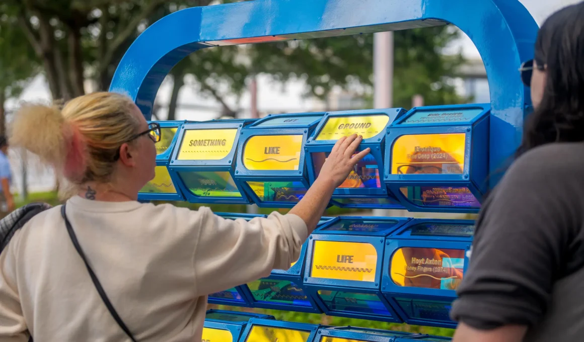
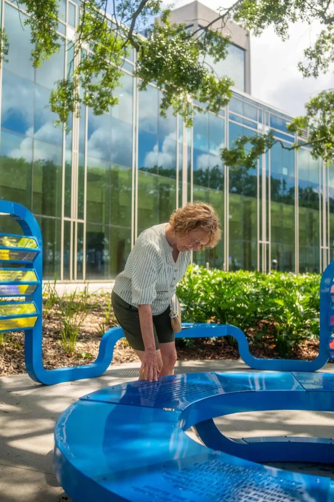
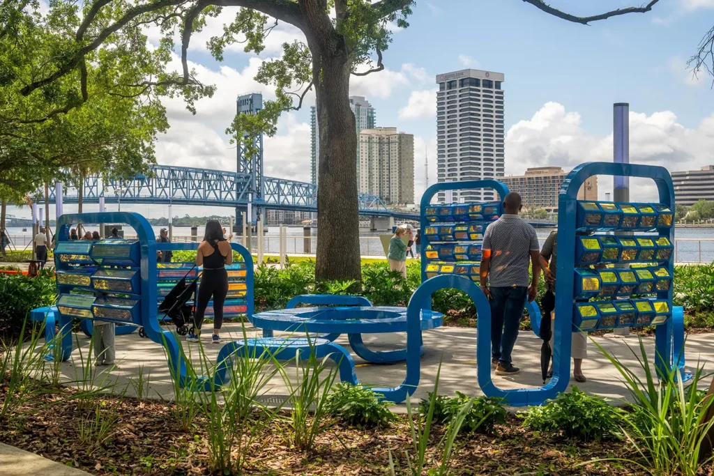
The Urban Conga has completed A Cappella, a public art installation set into the new Jacksonville Riverfront Music Garden along the St. Johns River, drawing on 84 songs by more than 60 local artists across a century of musical history and then handing the result back to whoever turns up. The work sits within a musical note carved into the landscape, next to the Jacksonville Symphony behind the Moran Theater and Jacoby Symphony Hall, and is organized into four sections that mirror the movements of a symphony: motivation, home, love, and freedom. The premise is simple and quietly ambitious, treating Jacksonville’s music not as a canon to be sealed behind glass but as a living conversation that any visitor can extend.

The community assembled this before the studio ever shaped it, since through an extensive public engagement process, Jacksonville residents themselves identified the songs and lyrics that best reflected the city’s character, a collection running from the 1920s through to the 2020s and crossing genres, generations, and neighborhoods. The result is not a curatorial selection imposed from outside but a portrait drawn by the people it represents, and that distinction carries real weight, because interactive public art that begins with community authorship holds a different authority than work that consults a community only after the fact.

The physical form makes that openness tangible since A Cappella is built from a single continuous line of powder-coated aluminum, here finished in a bright cobalt blue, that loops and curves through the landscape to weave together upright panels, archways, and seating into one flowing circular structure. Aluminum was chosen for hard practical reasons too, as a durable material able to take the Florida climate, the extreme heat, and the storms as a permanent outdoor fixture. The blue line reads as playful and almost cartoonish against the greenery, and in the wider shots, it frames the city skyline and the steel-blue Main Street Bridge across the river, tying the artwork firmly to its place.

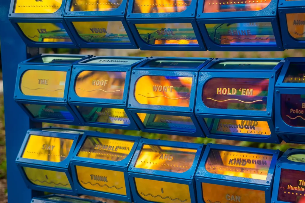
The core mechanism of the work is deconstructive, as selected lyrics were broken down into individual words and short phrases mounted on spinnable units, each face carrying a single fragment so that visitors can flip and rearrange them into entirely new compositions. The panels glow in amber, gold, and shifting dichroic color, with words like “let,” “your,” “soul,” and “shine” sitting in rows ready to be reshuffled, so a Lynyrd Skynyrd line can be threaded through a 1940s blues verse or a contemporary rapper spliced into a Prohibition-era lyric. The recombination is the whole point, surfacing unexpected connections across time and revealing how ideas about home, freedom, and belonging have been sung in Jacksonville for a hundred years without ever being fully resolved.

The visual language is built to refuse permanence, since dichroic and reflective surfaces shift color, light, and shadow across the day as visitors move through the four sections. The panels work as both surface and atmosphere, changing what the installation looks like depending on when you arrive and making every visit formally distinct from the last. It is a familiar move in public art, yet here it reinforces the concept directly, because a work about the instability and recombinability of cultural expression should itself never look quite the same twice.

The communal dimension is anchored by integrated seating and a central circular bench, which does a specific job beyond rest, explaining the relationship between the four symphonic movements and the four sections of the artwork and giving first-time visitors a structural map before they begin. Making that explanatory element a gathering place rather than a wall text or a screen is a deliberate choice, since understanding the work is treated as a social act rather than a private one. The Riverfront Music Garden is conceived as a destination in its own right, and A Cappella operates as its interpretive and participatory core.

The four movements are not equal in mood, since motivation opens the sequence with energy and forward momentum, home settles into something more contemplative, love introduces the most personal register, and freedom closes with the widest emotional range. The progression mirrors the arc of a live performance rather than a static display, a scored experience with a beginning, a development, and a resolution, so visitors who move through in order encounter song lyrics as landscape, each zone carrying its own tempo and emotional weight that shifts the body’s relationship to the space.

The installation is explicitly designed to grow, since its framework can take on new artists as Jacksonville’s musical story keeps unfolding, positioning A Cappella not as a finished archive but as an open score. This assertion is the most rigorous claim the work makes: that a city’s cultural identity is not a fixed object to be commemorated but an ongoing composition future voices will continue to rewrite. The participatory design invites visitors to add their own verses directly, making the boundary between audience and author as permeable as the dichroic panels make the boundary between color and light.

What A Cappella ultimately argues, and this is the claim worth taking seriously, is that the most honest form of cultural commemoration is one that makes itself incomplete by design. The sixty-plus artists already embedded in the work stand for a century of Jacksonville’s voice, while the verses visitors write today stand for the next chapter. A monument that can be rewritten is not a lesser monument. It is a more accurate one and a rarer thing than the public art genre usually produces.


Fact File

Project name: A Cappella
Studio: The Urban Conga
Typology: Public art, interactive participatory installation
Location: Riverfront Music Garden, 300 Water Street, Jacksonville, Florida 32202, United States
Year installed: May 2026
Project size: 437 square feet
Studio leads: Ryan Swanson and Maeghann Coleman
Role: design, fabrication and installation
Source material: 84 songs by more than 60 Jacksonville artists, spanning the 1920s to the 2020s
Key materials: powder-coated aluminium, dichroic and reflective panels
Photography: Christopher Brickman
Studio: Marc Fornes / THEVERYMANY
Typology: Public art, permanent pavilion / civic installation
Location: Wheland Foundry Trailhead, Chattanooga, Tennessee, United States
Commissioned by: Public Art Chattanooga
Structure: self-supporting double-layer aluminium shell
Material: 3mm aluminium strips, hand-riveted
Method: computational form-finding, machine-cut components, hand assembly
Photography: Keith Isaacs

June 21, 2026 0 comments
0 FacebookTwitterPinterestEmail
Newer Posts
Older Posts

Recent Posts

  • Florim Introduces SensiVenezia, a Porcelain Stoneware Collection Inspired by Venetian Terrazzo
  • LEGO Botanical Wave Transforms TANK Shanghai with 380,000 Brick-Built Flowers
  • The Great Eastern Home Introduces Its Latest Collection of Italian Vintage Mirrors
  • Smart Homes Are Changing Architecture: What Happens When Technology Becomes Part of the Building?
  • AARQE9’s Nikhaar Dhawan & Bahaar Dhawan Rohatgi Unveil the Sculptural Lunar Drip Table

Recent Comments

  1. Smart Home Architecture: How Technology Is Changing Design on Aqara Smart Lock U500: Three Versions for Gates, Glass Doors and Standard Entrances

Newsletter

  • Home
  • About Us
  • Contact Us
  • Editorial Policy
  • Privacy Policy

© 2026 Design Diary International. All Rights Reserved.

Design Diary International
  • Home
  • Project
    • Residential
    • Hospitality
    • Commercial
    • Public & Cultural
  • Interview
    • Architect
    • Interior Designer
    • Founders & Brand
    • Artist
  • Material
  • Product
  • Feature
  • DDI Finds
    • Emerging Studio
    • Rising Designers
    • New Practices
  • About
  • Magazine
  • Contact Us