• Home
  • Project
    • Residential
    • Hospitality
    • Commercial
    • Public & Cultural
  • Interview
    • Architect
    • Interior Designer
    • Founders & Brand
    • Artist
  • Material
  • Product
  • Feature
  • DDI Finds
    • Emerging Studio
    • Rising Designers
    • New Practices
  • About
  • Magazine
  • Contact Us
Design Diary International
Products

knIndustrie’s Cutting Board Collection Treats Material Research as the Design Brief

by DDI Edit Team July 14, 2026
written by DDI Edit Team

knIndustrie’s cutting board range, comprising Barrique, S/Lab, and Essenze, approaches a familiar kitchen object as a study in material sourcing and longevity rather than pure form. The three pieces share a working philosophy: that the transition between food preparation and serving doesn’t need two separate objects and that the material itself, not applied styling, should carry the design.
Barrique is the collection’s most material-forward piece. Built from reclaimed wine barrels, it comes in two formats, 19×80 cm and 28×50 cm, and retains the aromas and surface characteristics left behind by the barrel’s prior use. Rather than refinishing the wood into something neutral, knIndustrie keeps the marks of its origin visible, positioning the object as a direct continuation of the barrel’s working life rather than a disguised reuse of scrap material.

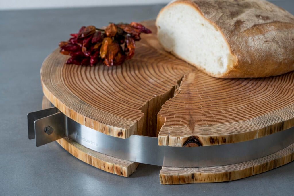
S/Lab takes an opposite approach, built entirely around what solid wood does on its own. At roughly 40 cm in diameter and edged with a slim metal band, the board is cut from solid larch, meaning the tree’s growth rings are visible across the surface of every piece. No two boards read identically. The design decision here is essentially an absence of decision: let the material’s own structure be the only variable.

Essenze, at 70×18 cm, is the most functionally oriented of the three, made in Italian walnut, pear wood, and cherry wood. Each board retains the natural silhouette of the trunk it came from, avoiding the squared-off standardization common to mass-produced boards. It’s built for daily rotation between kitchen and table rather than display.

Taken together, the collection reflects a broader position knIndustrie has staked out across its catalog: that functional objects built for repeated daily use deserve the same material rigor typically reserved for furniture or architectural fittings, and that sustainability, here expressed through reclaimed barrel wood and solid-cut timber, functions as a design constraint rather than a marketing footnote.
July 14, 2026 0 comments
0 FacebookTwitterPinterestEmail
Residential

Casa Xoltic, Coyoacán, Mexico City, Mexico by AMASA Estudio

by DDI Edit Team July 13, 2026
written by DDI Edit Team

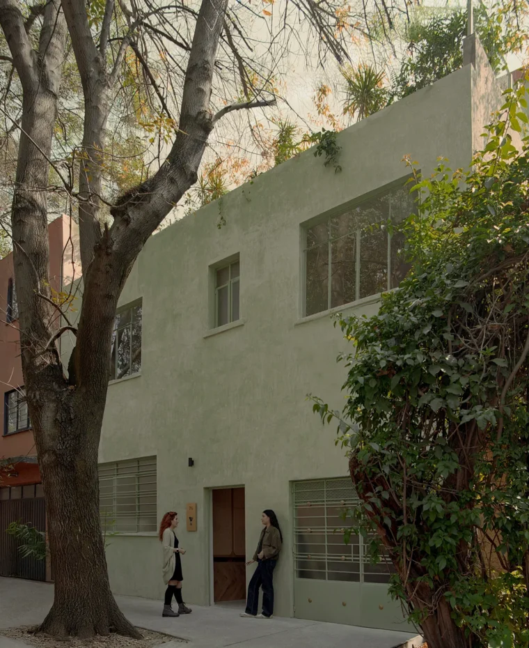
AMASA Estudio’s decision to rehabilitate a 1940s house in Colonia Del Carmen, Coyoacán, represents an urban position in a city where development pressure typically leads to demolition and replacement. The house had a solid structure and clear domestic proportions. What it had lost through decades of piecemeal alteration was spatial logic, and restoring that logic rather than replacing the building was the project’s central argument.

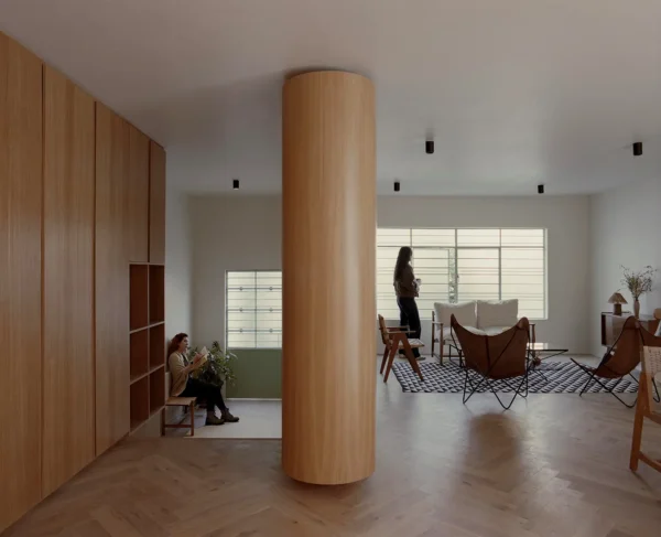
The entrance reconfiguration establishes the methodology before the interior opens. Rather than building additional walls to create a threshold between the street and the social spaces of the house, AMASA Estudio designed a custom millwork system, a continuous wooden element running floor to ceiling that integrates storage, filters direct views from the street, and sequences the arrival without any new construction. The piece does the work of architecture through furniture, compressing the entry in a way that makes the subsequent openness of the plan legible. The studio developed a comparable intelligence around thresholds and domestic transition zones in two previous Coyoacán projects, Casa Sofia and a residence for painter Daniela Riquelme.

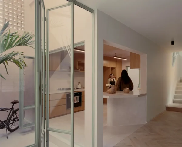
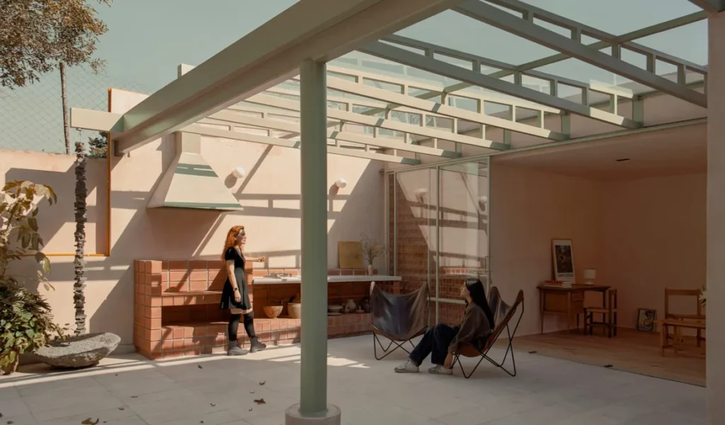
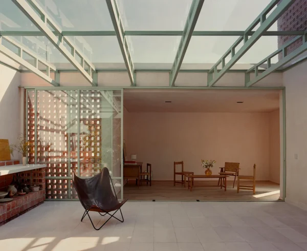
The kitchen sits at the center of the ground floor as a spatial connector between interior and exterior, finished in cast-in-place terrazzo that reads as a continuous surface tying the living room, dining area, and patios into a single thermal and visual system. Cross ventilation and visual depth run the full length of the level. The patios in this plan are not incidental outdoor spaces appended to the house but structural components of its organization, and the terrazzo floor that extends between them makes that relationship physically legible. AMASA Estudio treated the kitchen not as a service room at the back of the plan but as its anchor, and the open sequence that flows from it in both directions carries the logic of that decision throughout the ground floor.

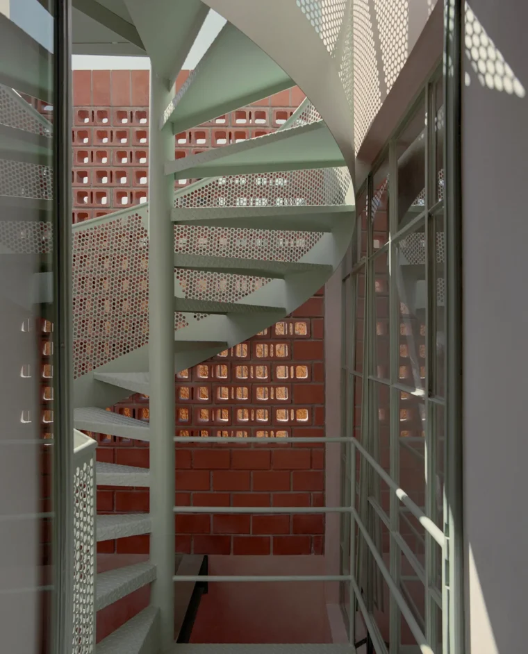
Vertical circulation was rebuilt from scratch in a way that reveals the project’s structural intelligence. The main staircase handles the connection between the ground and first floors. A new cantilevered steel stair, painted in the same sage green that runs through all the ironwork of the house, resolves access to the rooftop terrace independently, anchored by a single structural beam and requiring no intermediate columns that would otherwise fragment the patios below. The result is a circulation system in which each level connects to the next without interrupting the spatial quality of the one below, and the rooftop terrace arrives as a natural consequence of the section rather than an afterthought added on top. The spiral stair with its perforated metal treads sits against the red brick lattice wall, the geometry of the stair and the geometry of the screen in deliberate dialogue.

Light was the dominant constraint in the original north-south-oriented plan. AMASA Estudio introduced new openings and expanded visual connections between spaces, but the principal strategy was the deployment of brick lattice screens to carry east-west light through the volume. The screens do not simply filter light but redistribute it, the house shifting across the day from soft and diffuse in the mornings to laterally sharp at noon to warm and reflective in the afternoon. This is the functional output of the screen strategy, and it is what gives the interior its different quality at different hours.

The material argument at Casa Xoltic is the project’s most explicitly stated position. AMASA Estudio identified a specific condition in contemporary Mexican residential architecture: the overuse of chukum and mineral plasters across domestic, cultural, and commercial spaces has produced a homogenization of surfaces, buildings that could be anywhere, expressing nothing particular about their location. The studio’s response was not to refuse the material but to delimit it. Chukum appears only where its technical properties justify its use, on facades, patios, the rooftop terrace, bathrooms, and the kitchen. In dry interior spaces, smooth domestic plaster creates a quieter and more contained atmosphere, the surfaces receding so that the millwork, the column, the furniture, and the light become the elements that define the room.

For the exterior surfaces, the studio selected a soft pink chukum finish chosen for its luminous behaviour in a temperate climate and its dialogue with Coyoacán’s vegetation. The studio has noted that Coyoacán has long been defined by color, citing iconic references such as the Casa Azul as demonstrations of how color operates as urban identity. The pink of Casa Xoltic is not illustrative of that history but calibrated by it. The restored ironwork throughout the house, the glass roof structure over the patio, the spiral stair, and the entrance framing, all in sage green, produce the chromatic counterpoint that activates the pink, the combination shifting across the day and anchoring the house to its specific environment.

All elements, the millwork, the ironwork, the cast terrazzo, the brick screens, and the applied finishes, were designed specifically for the project and executed on-site by Mexican artisans using durable materials and manual processes that allow the house to be maintained, adapted, and repaired over time. AMASA Estudio frames craft not as an aesthetic preference but as a constructive position, one that takes the long life of the house seriously as a design requirement.

Fact File:

Project Name: Casa Xoltic
Location: Colonia Del Carmen, Coyoacán, Mexico City, Mexico
Architect: AMASA Estudio
Project Type: Residential Renovation
Year of Completion: 2025
Key Materials: Chukum plaster, cast-in-place terrazzo, brick lattice screens, steel, wood millwork
Photography: Zaickz Moz
Firm Website: amasaestudio.com

July 13, 2026 0 comments
0 FacebookTwitterPinterestEmail
Public & Cultural

AlUla Manara, AlUla, Saudi Arabia by Heatherwick Studio

by DDI Edit Team July 13, 2026
written by DDI Edit Team

Heatherwick Studio’s AlUla Manara begins with a constraint that has no precedent in architectural history, having been selected by the Royal Commission for AlUla following an international design competition. The building must function as two entirely different structures depending on the time of day. During daylight hours in one of the most extreme desert climates on Earth, the cluster of tubular forms that define the visitor center act as shading devices, managing solar gain and protecting the interior from the elements through embedded shading devices and operable windows that respond to varying desert weather conditions. After dark, those same tubes become the instrument through which the building preserves the dark-sky conditions that justify its existence. The spiral geometry that references galaxies, planetary rings, and natural Fibonacci patterns is, at the structural level, the only formal solution that resolves both problems simultaneously.

The site is the project’s most consequential design decision. Located in the remote deserts of northwest Saudi Arabia near the ancient city of AlUla, a UNESCO World Heritage Site, the area has recently been designated one of the first Dark Sky Parks in the region. This is not incidental context. It is a planning constraint of the highest order. Any building placed here must actively protect the atmospheric conditions that make the location scientifically valuable. AlUla Manara cannot negotiate a compromise between architectural ambition and environmental responsibility. The dark sky is the asset. The building either protects it or destroys the reason for its own existence.

Three interlocking telescope-like formations reach upward from a base clad in textured stone cladding that references AlUla’s sandstone landscape, rooting a cosmologically themed building in the geology immediately beneath it. Stuart Wood, Executive Partner at Heatherwick Studio, describes the formal logic as a dialogue between earth and universe: the design draws from the spiraling geometries that shape both the solar system above and the natural world below, the formations reaching skyward while remaining grounded in the desert. The renders show the cluster lit from within at night against the Milky Way, the tubular openings glowing amber across the desert floor, and people gathered at the base, giving a sense of the scale. In daytime the same forms read in warm sandy tones that sit close to the desert surface around them, the textured cladding absorbing rather than reflecting the landscape.

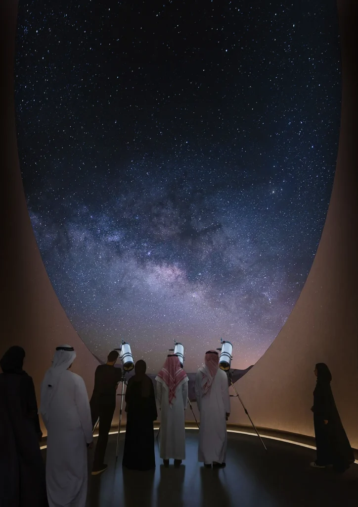
The program inside AlUla Manara is more complex than a standard visitor attraction. The building will contain exhibition spaces with immersive displays, a planetarium, a restaurant, a rooftop observation deck, and active research facilities operating in real time, with visitors offered a view of live science as it happens. Wood described the ambition as transforming space observatories from remote, sterile outposts into an engaging experience that invites visitors to connect with the cosmos. An interior render shows visitors standing with telescopes before a large oval opening framing the night sky, the Milky Way filling the aperture above them, the geometry of the tube acting as both shelter and frame simultaneously.

The wider master plan extends the program further across the site, incorporating on-site accommodation, a stargazing lodge, remote observation pods, connections to nearby hiking trails, and several new world-class telescopes built close to the center, creating a scientific infrastructure that positions AlUla Manara as a research destination rather than a popularized version of one.

The question AlUla Manara will have to answer when built is whether its formal drama serves the astrotourism mission or competes with it. The building’s role is to frame Saudi Arabia’s dark sky, protect it, and make it accessible. Whether three interlocking spiral tubes clad in sandstone-textured stone can perform that act of framing without overwhelming what they frame is the only question the renders cannot yet answer.


Fact File

Project Name: AlUla Manara
Location: AlUla, north-west Saudi Arabia
Architect: Heatherwick Studio
Executive Partner: Stuart Wood
Client: Royal Commission for AlUla
Project Type: Public & Cultural
Status: Design revealed, competition winner
Key Materials: Textured stone cladding, tubular steel structure, integrated shading devices
Images: Heatherwick Studio
Firm Website: heatherwick.com

July 13, 2026 0 comments
0 FacebookTwitterPinterestEmail
Residential

Monterols, Sarrià, Barcelona, Spain by Not a Studio

by DDI Edit Team July 13, 2026
written by DDI Edit Team

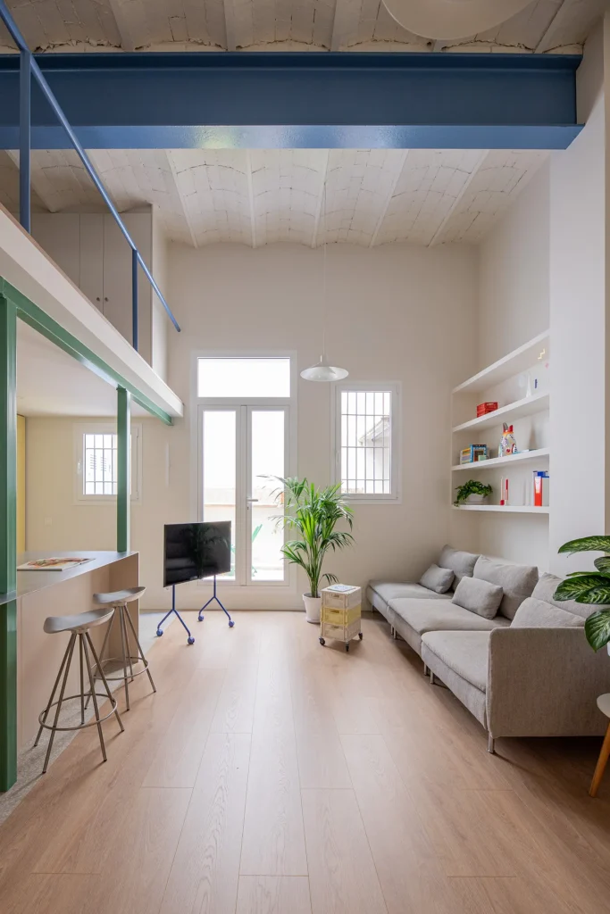
A 36-square-meter ground-floor flat in a 1919 building in Barcelona’s Sarrià neighborhood is not an obvious candidate for architectural ambition. The flat had belonged to the same family for generations, subdivided across four rooms, a kitchen, a dining area, and a bathroom located on the terrace. A previous renovation two decades earlier had installed a mezzanine that captured the apartment’s most valuable asset, nearly five meters of Catalan brick vault ceiling height, without doing anything useful with it. The original vault had been darkened with varnish, partition walls interrupted the volume, and the flat was actively hostile to light. Rocco Bibbiani of Not a Studio inherited all of these challenges.

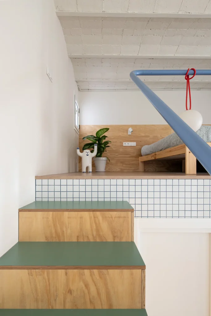
His central argument was that the correct response to a constrained footprint is not cleverness but clarity. The project did not add a single centimeter of floor area. What it did was remove everything that was preventing the space from working. Every partition wall came down to produce a single continuous volume. The mezzanine was reimagined as a sleeping platform integrated with the floor below, creating a unified spatial experience rather than two separate rooms. Once the vertical dimension was free to operate, the nearly five-meter Catalan vault became the primary architectural element of the apartment rather than an obscured irrelevance, and the plan resolved itself around that fact.

Colour entered the project not as decoration but as what Bibbiani describes as ballast. Blue, green, and yellow were applied to the structural beams, pillars, and the large iron beam set perpendicular to the vault, each hue chosen to calibrate visual weight against the whitened walls and pale laminate floor below. Bibbiani has said the assignment of each color emerged intuitively during construction in a search for total harmony, each element given its hue for how it reads within the whole rather than for what it structurally represents. The sky blue beam at mezzanine level runs across the full width of the space, connecting the floor zone to the sleeping platform chromatically in the way a section drawing does spatially. The green horizontal beam sits at the mezzanine edge below it. Together they hold the upper register of the room without darkening it, their colors light enough against the white vault to keep the ceiling reading as the generous volume it is.

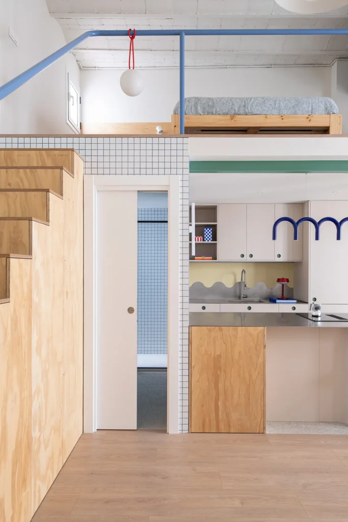
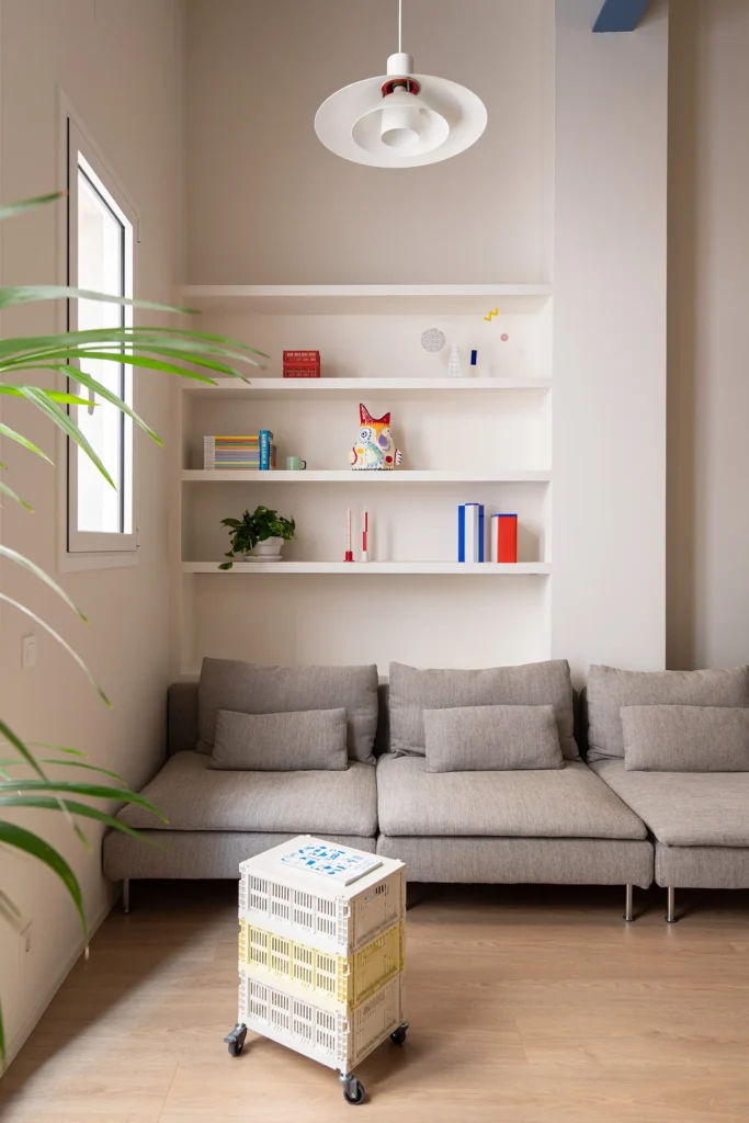
The staircase connecting the two levels was designed and fabricated by the studio in phenolic pine plywood, with storage integrated under every tread. The handrail is a single blue-painted tubular steel rod detailed to the minimum section so that the sightline between the floor and mezzanine remains uninterrupted. The kitchen uses an IKEA METOD framework fronted with panels from the Madrid-based manufacturer CUBRO in a warm greige tone, circular green dot pulls at every cabinet and drawer, a custom stainless steel countertop, and a yellow backsplash with a grey undulating wave border at its lower edge fabricated by Plecoart. Above the upper cabinets, a series of blue tube lights formed into repeated arch shapes runs the full length of the kitchen, the motif appearing at enough frequency to read as a pattern. Square white mosaic tiles from CE.SI. line the wet zone, their small grid in deliberate geometric dialogue with the circular pulls throughout. The same tile carries into the bathroom below the mezzanine, maintaining material continuity across both wet areas so that the flat reads as a single considered object rather than a sequence of rooms handled independently. Storage is available throughout the home, under the stairs, in the PAX wardrobe system with CUBRO fronts, and along the built-in shelving in the living area.

Bibbiani’s background is in advertising, and he describes every home he renovates as a canvas to paint on. The references he draws on include studios BURR, Plutarco, H3O, and AMOO, whose work he cites as having shaped his own thinking about color in small-scale renovation. What Monterols demonstrates is that the discipline of a small-space renovation does not reside in its tricks but in the quality of subtraction, specifically in what the designer agrees to remove, expose, and leave unresolved. A flat this compressed can absorb a sky blue structural beam painted for visual axis rather than architectural drama precisely because nothing else is competing for attention. The restraint is what makes the color possible, and that sequence is the decision worth studying.


Fact File

Project Name: Monterols
Location: Monterols Street, Sarrià, Barcelona, Spain
Architect: Not a Studio
Principal Architect: Rocco Bibbiani
Project Type: Residential Renovation
Project Size: 36 sqm
Year of Completion: 2026
Key Materials: Phenolic pine plywood, CE.SI. glazed white mosaic tile, VIVES porcelain tile (Portofino), laminate flooring, stainless steel countertop, IKEA METOD and PAX systems with CUBRO fronts, WAVES backsplash by Plecoart
Photography: Rocco Bibbiani
Firm Website: itsnotastudio.com

July 13, 2026 0 comments
0 FacebookTwitterPinterestEmail
Art & Exhibition

Threshold, Chapelle Expiatoire, Paris by Emilio Ferro

by DDI Edit Team July 13, 2026
written by DDI Edit Team

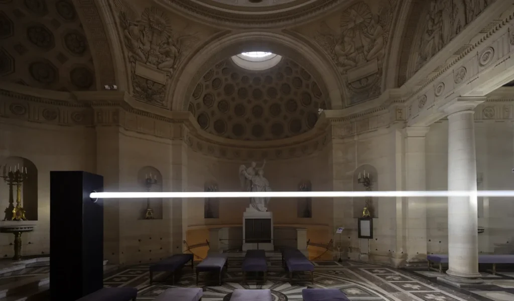
The Chapelle Expiatoire in Paris’s 8th arrondissement was built in the early nineteenth century on the site where Louis XVI and Marie Antoinette were first buried before their remains were moved to Saint-Denis. It is a building that carries a particular charge around presence and absence and visibility and concealment, and it was into this specific historical weight that Italian artist Emilio Ferro placed Threshold, commissioned by the City of Paris for Nuit Blanche on 6 June 2026.

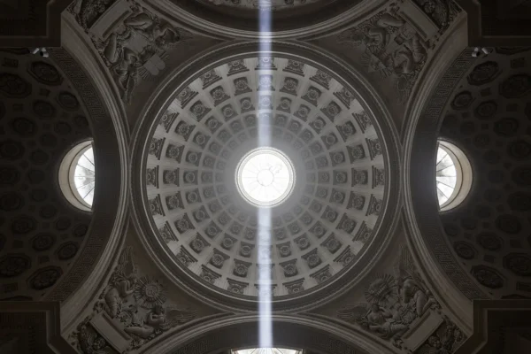
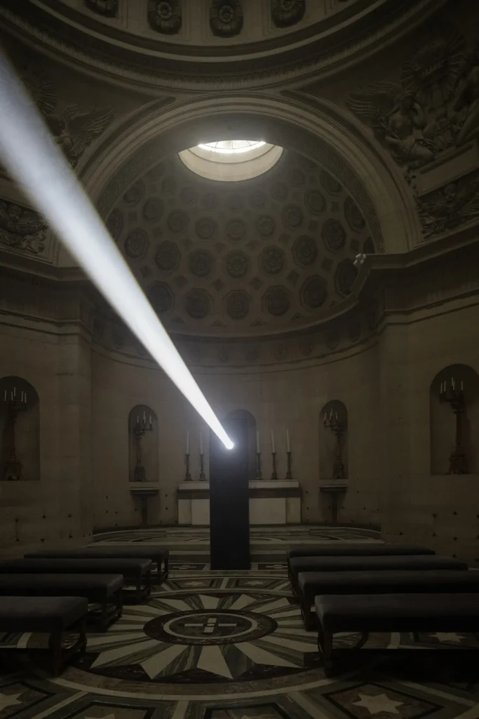
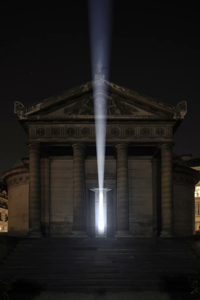
The premise is architectural before it is artistic. A powerful beam of white light extends through the interior and produces a luminous volume that reads as almost tangible, emerging from a metal structure positioned at the chapel’s entrance. The beam pierces upward through the chapel’s ornate coffered dome, its circular oculus at the apex becoming the point through which the light appears to escape into the night sky above. When the doors open, the beam extends outward toward the surrounding garden. When the space closes, the light retracts and settles onto the interior surfaces. The chapel becomes the instrument. The opening and closing of its doors, the building’s own operational logic, is the primary compositional variable of the work. Ferro does not impose the installation on the monument. He makes the monument’s behaviour visible.

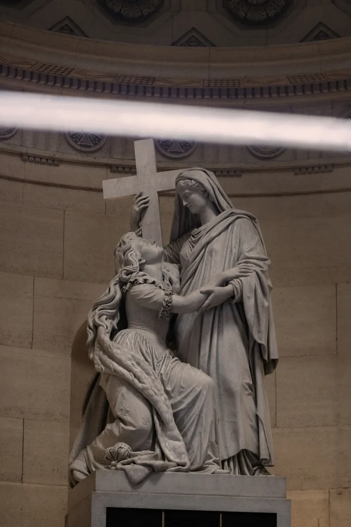
The choice of site carries precise meaning within the work’s formal logic. A light that advances when the space opens and retreats when it closes operates in this building as a spatial metaphor, with the chapel’s own history continually adding meaning. The immaterial beam enacts something about presence and absence that the memorial function of the building has always implied but never made visible. The marble sculpture group inside the chapel, two figures at a cross, is caught in the beam in one of the installation’s most quietly powerful moments, the centuries-old stone and the immaterial light occupying the same space without competing.

Sound extends the installation beyond the visual register. An original composition developed from magnetic field frequencies recorded by Ferro and subsequently reworked accompanies the light, not as an ambient backdrop but as a structural layer that expands the work’s spatial claims. The frequencies sourced from electromagnetic data were never intended to be heard. Ferro renders them audible through an act of artistic translation, the particular quality of data that belongs to no musical convention producing a suspended atmosphere in which the experience of duration slows. Time and space appear to behave differently inside Threshold than outside it.

Visitor movement is written into the logic of the piece. Rather than presenting a fixed spectacle, the installation responds continuously to presence, duration, and viewpoint; each body passing through the chapel introduces subtle variations in the light’s behaviour and the sound’s spatial distribution. This is not interactivity in the contemporary digital sense but something closer to the older idea of the responsive environment, a space that registers human presence without translating it into data or spectacle.

Ferro’s technical methodology distinguishes his practice from the broader field of immersive light art. His research integrates custom-developed light and sound systems, hardware experimentation, and spatial acoustics, the technology remaining invisible and subordinated entirely to the perceptual and emotional experience of the visitor. The commission at the Chapelle Expiatoire, a monument managed by the Centre des Monuments Nationaux, places Threshold within a curatorial framework that usually prefers less formally demanding work. It reflects the scale of Ferro’s established practice, which includes the first light art installation at the Giza Pyramids with Portal of Light in 2022 and a permanent installation near the Sanctuary of Vicoforte titled Miracle in 2024, as well as a broader institutional shift in how French cultural heritage sites are beginning to think about contemporary art in historic spaces, not as decoration applied to significance but as a means of making that significance perceptible to audiences who arrive without the historical context to feel it directly.

“All elements were specifically designed for the project,” the studio noted, framing craft as a constructive position rather than an aesthetic preference. For Ferro, the most precise moment in Threshold is also its simplest: when the door of the Chapelle Expiatoire opens, the monument and the installation change state at exactly the same instant. The threshold the work is named for is not a concept being illustrated. It is a door, and what happens when it moves.

Fact File:

Installation: Threshold
Artist: Emilio Ferro
Location: Chapelle Expiatoire, 29 Rue Pasquier, 75008 Paris, France
Event: Nuit Blanche 2026
Date: 6 June 2026 (Concluded)
Typology:  Public Art Installation
Commissioner: City of Paris
Venue Management: Centre des Monuments Nationaux
Photography: Roberto Conte
Artist Website: https://www.emilioferro.it/

July 13, 2026 0 comments
0 FacebookTwitterPinterestEmail
Art & Exhibition

Bangers and Mash, Treasure House Fair, London by Alex Chinneck

by DDI Edit Team July 13, 2026
written by DDI Edit Team

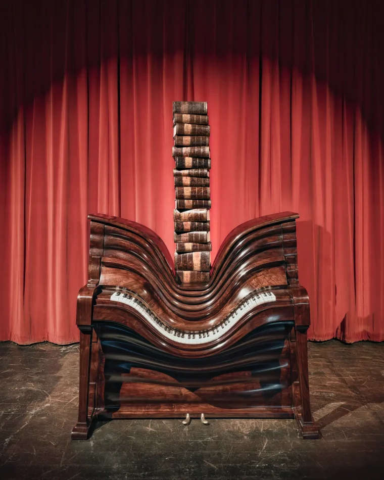
Alex Chinneck’s Bangers and Mash, premiering at the Treasure House Fair at the Royal Hospital Chelsea from 24 to 30 June 2026, is a life-sized grand piano carved entirely from American Black Walnut that has been made to look as though it no longer has any structural integrity at all. A stack of antique 19th-century leather-bound books presses down on the instrument’s body, sending waves and ripples through the case, the keyboard, and every straight line the piano once had. The two-meter-high sculpture does not depict compression as a physical event. It depicts it as a permanent condition, fixed forever in a material that cannot actually bend.

American Black Walnut is dense, dimensionally stable, and resistant to deformation. Chinneck and his collaborator Jonathan Fernhead carved it into a form that reads as the opposite: keyboard keys that curve where they should be flat, a case that ripples where it should be rigid. The vintage Bakelite piano keys embedded in the carved walnut body extend the material contradiction further. Bakelite, an early synthetic plastic prized for its hardness and heat resistance, here occupies a form that implies softness and failure. The books press down with the visual logic of actual weight, spines visible, stacked with the particular authority of 19th-century volumes, and the piano responds as though the weight were real and ongoing, the waves traveling through the instrument’s form as though the process of deformation were still happening and had simply been caught at a particular moment.

The title is the first signal of what the work is doing. Bangers and Mash, British working-class slang for sausage and mashed potato, applied to a grand piano being systematically flattened by a column of 19th-century books inside a fair that also features works by Picasso, Dalí, Henry Moore, and David Hockney. The register is deliberate. Chinneck’s practice has consistently operated at the intersection of the technically demanding and the visually comic, and the title does in two words what the sculpture does in three dimensions: it punctures the expected solemnity of the object before the viewer has time to supply it.
The context of the Treasure House Fair adds a layer the studio has not foregrounded but which the work makes legible. The fair brings together galleries dealing in antiques and works by canonical twentieth-century figures. The 19th-century books that flatten the piano come from the same period as the antiques surrounding it at the fair; one category is preserved, the other is used as a weapon. The Sculpture Walk within which Bangers and Mash appears was curated by sculpture specialist Flo Horswell, art historian Wilfrid Wright and New York-based interior designer Benjamin Brougham and includes 35 works throughout the fair. Robert Young Antiques, the exhibitor who invited Chinneck to show, has a longstanding engagement with his practice. Robert Young has described the work as challenging perceptions, exploring mediums, pushing boundaries, and defying gravity while redefining the understanding of contemporary sculpture.
Chinneck’s own framing of the collaboration focuses on process rather than outcome. He has said he has always enjoyed forging working partnerships in places where you would not typically expect to find contemporary artists and that cross-interest, cross-sector, and cross-disciplinary collaborations give birth to surprising outcomes. The statement applies equally to the sculpture’s own internal logic, the cross between furniture and instrument, between collapse and permanence, and between a title that suggests the kitchen table and a material that suggests the concert hall.

The photographs by Charles Emerson, shot at The Astor Theatre in Deal against deep red stage curtains, frame the sculpture as something between an abandoned prop and a stage presence, the theater setting adding a performative quality to an object built around the idea of a performance that can no longer take place. This technique is a recurring approach in Chinneck’s large-scale work, The Arrested Moment, where the impossible material state is presented as evidence of something that could not have occurred. From facades peeling away from buildings to brick walls dissolving mid-collapse, the work is most effective when the viewer’s eye accepts what the mind knows to be structurally impossible. Bangers and Mash applies that method at the scale of a single instrument in a room full of antiques, with a title borrowed from the school canteen.

Fact File

Work: Bangers and Mash
Artist: Alex Chinneck
Collaborator: Jonathan Fernhead
Typology: Public Art Installation
Location: Treasure House Fair, Royal Hospital Chelsea, London
Dates: 24 to 30 June 2026 (concluded)
Exhibitor: Robert Young Antiques
Sculpture Walk Curators: Flo Horswell, Wilfrid Wright, Benjamin Brougham
Photography: Charles Emerson
Artist Website: alexchinneck.com

July 13, 2026 0 comments
0 FacebookTwitterPinterestEmail
Commercial

Dymak Headquarters, Odense, Denmark by BIG Bjarke Ingels Group

by DDI Edit Team July 13, 2026
written by DDI Edit Team

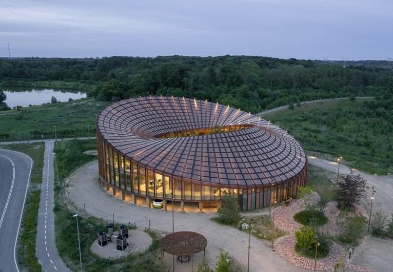
Dymak, a Danish supplier of natural building materials, commissioned BIG to design a headquarters that would do more than house its operations. The brief called for a building that could demonstrate, at full architectural scale, the materials the company supplies. The result, completed in Odense and certified DGNB Gold, Heart, and Diamond, is a 2,800 square meter workplace in which timber, clay, cork, eelgrass, and recycled paper fiber are not finishes applied to a building but the building itself.

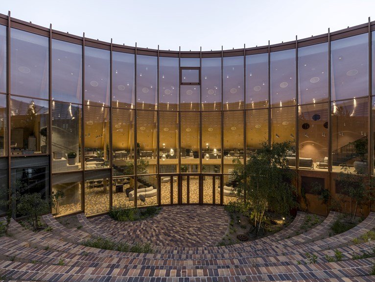
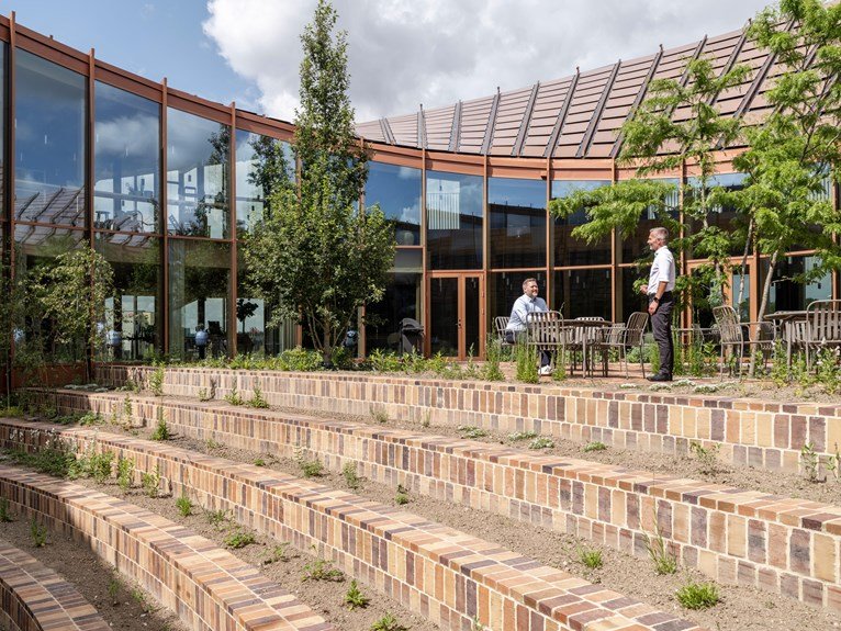
The site sits between the industrial outskirts of Odense and the wetlands surrounding Glisholm Lake, at one of the main gateways into Denmark’s third-largest city. BIG positioned the headquarters as a circular form that mediates between the emerging industrial district behind it and the natural landscape opening toward the lake. The plan is organized around a central courtyard conceived as a green amphitheater, with broad-stepped brick seating, native trees, flowering perennials, grasses, and herbs, creating a shared outdoor room that functions as the social center of the workplace. Brick paving runs continuously from the interior out into the courtyard and the surrounding landscape, the material carrying the connection between inside and outside without any change of surface.

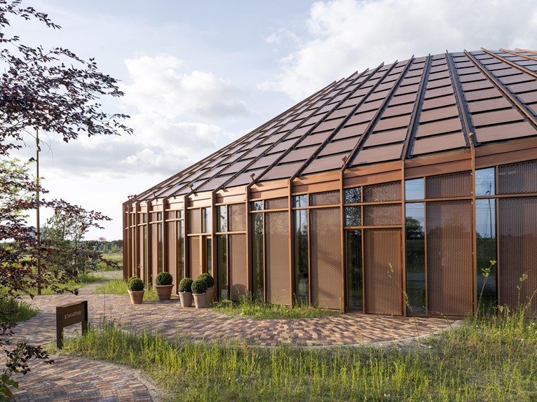
The roof is the building’s defining element. Its undulating surface rises toward the northern forest to frame views of the landscape and the lake while cascading southward to provide shade, improve the indoor climate, and reduce noise from the nearby road infrastructure. Bjarke Ingels has described the geometry as similar to a Möbius strip, a continuous form in which the roof rises and falls without any clear beginning or end. Across this surface, approximately 880 custom-shaped photovoltaic panels are integrated, the solar strategy made possible by the same geometry that gives the building its silhouette. From the aerial view at dusk, the copper-toned roof reads as a single continuous disc with a crescent opening above the courtyard, the building glowing from within along its full curved perimeter.

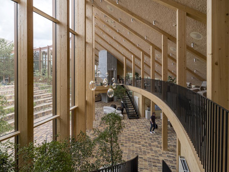
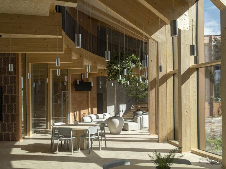
The structure is built primarily from mass timber, clay tiles, clay mortar, and eelgrass, materials chosen to reduce embodied carbon through their natural and low-impact properties. The timber-and-glass facade wraps the full circumference of the building in a rhythmic grid of vertical fins, the density of the fins adjusted by orientation: closer together on the south facade to reduce heat gain and more open toward the north to maximize natural light and views. Inside, the mass timber structure is exposed throughout, the warm pale grain of the wood visible in columns, beams, and ceiling surfaces across every level. The ceilings are finished in recycled paper fiber panels that soften acoustics while maintaining the natural material register of the interiors. Walls and surface finishes throughout use Dymak’s own product range, with cork, clay, and eelgrass appearing in details and linings that allow employees and visitors to experience the materials at the scale of a complete building rather than a sample board.

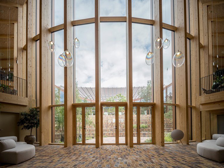
The ground floor accommodates a showroom, photo studio, and fitness facilities alongside the double-height entrance lobby, which opens directly toward the courtyard through full-height glazed doors. The lobby has large glass globe pendant lights hanging at varying heights, the curved mezzanine above it supported on the mass timber structure with a black steel balustrade following the arc of the circular plan. Upper levels hold open-plan offices, meeting rooms, and informal lounges that look down into the courtyard through the full-height glazing. The stepped brick terracing that surrounds the courtyard outside is visible from every level of the interior, the outdoor seating integrated into the landscape as a series of planted tiers that double as an informal amphitheater for company gatherings.

Rainwater management is handled above ground rather than hidden in infrastructure, open channels, and landscaped basins collecting and distributing water across the site as a visible element of the landscape strategy. Roads and parking have been integrated into the surrounding site planting, making the approach to the building feel more like a landscape arrival than a car park.

For BIG, Dymak HQ showcases how environmental performance and architectural expression can serve the same purpose rather than competing for priority. The circular plan creates a protected, daylit, and socially connected workplace. The sculptural roof generates energy. The natural materials reduce embodied carbon. Each is also a spatial and sensory decision, and the building works as well as it does because none was treated as a technical requirement separate from the architecture.


Fact File

Project Name: Dymak Headquarters
Typology: Commercial
Location: Odense, Denmark
Architect: BIG Bjarke Ingels Group
Client: Dymak
Project Size: 2,800 sqm
Certifications: DGNB Gold, Heart and Diamond
Key Materials: Mass timber, clay tiles, clay mortar, eelgrass, recycled paper fibre, photovoltaic panels
Photography: Rasmus Hjortshøj, COAST, courtesy of BIG
Firm Website: www.big.dk

July 13, 2026 0 comments
0 FacebookTwitterPinterestEmail
Products

Node and Loft: LAYER Designs a Charging Ecosystem for Daily Objects

by DDI Edit Team July 9, 2026
written by DDI Edit Team

Charging accessories occupy a strange category. They sit on desks and bedside tables permanently, get touched multiple times a day, and are almost never designed with any intention beyond function. LAYER, the London studio founded by Benjamin Hubert, is betting that gap is worth closing. Its new collection for Daily Objects, Node, and Loft treats charging hardware as an object category in its own right rather than an accessory to be tolerated.

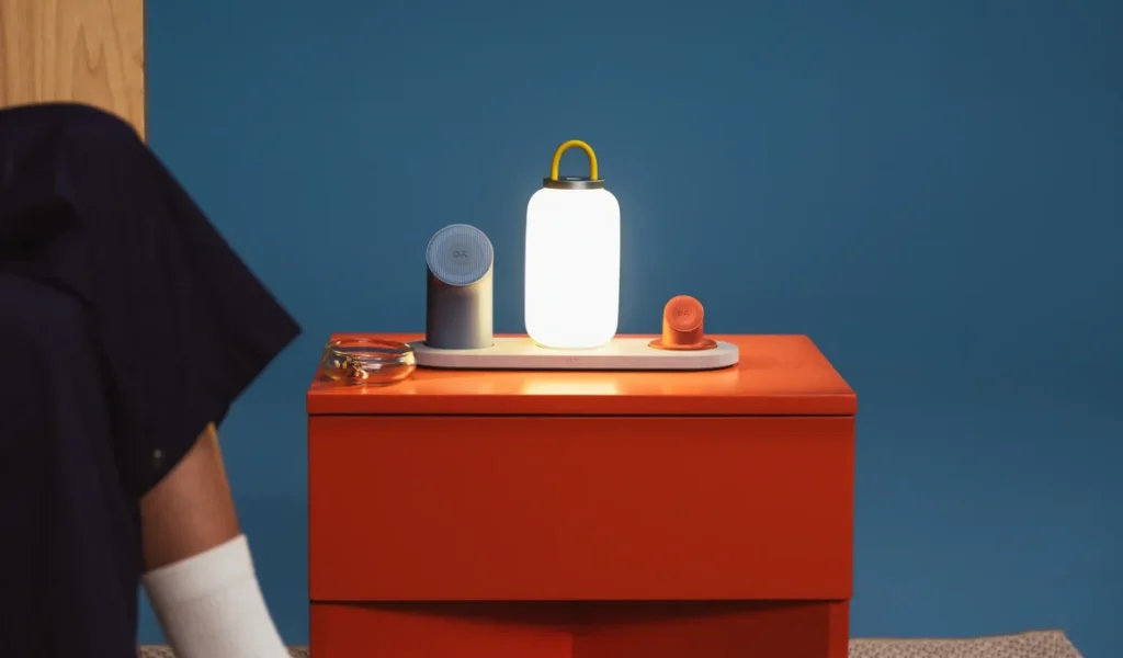
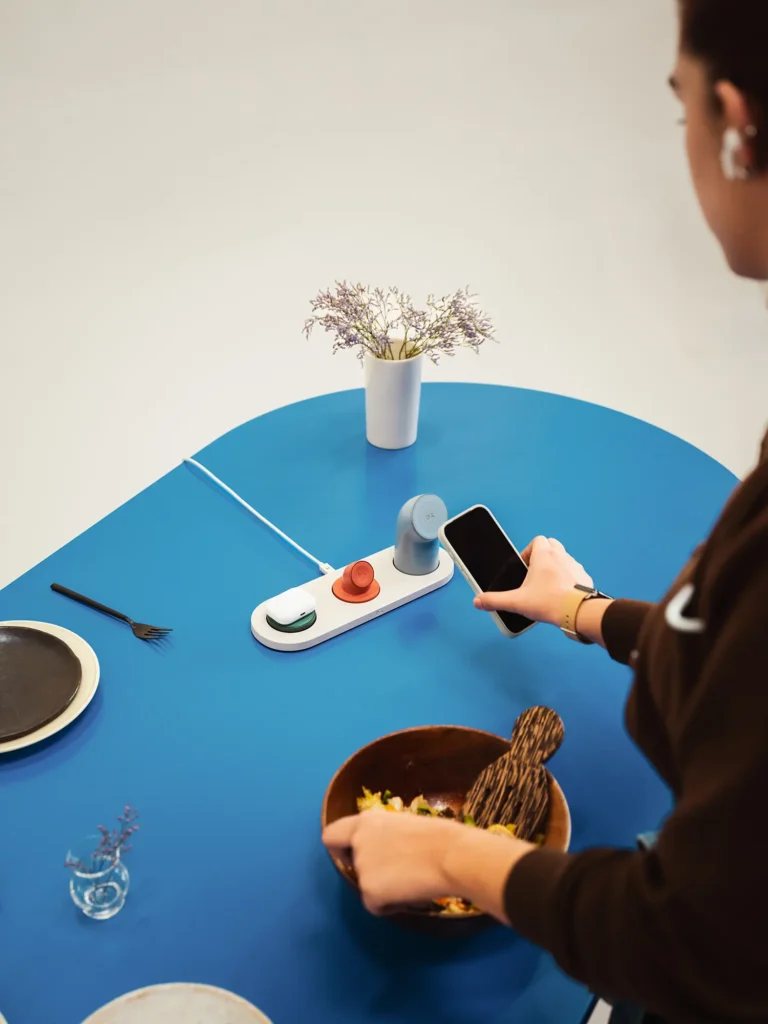
Node is the more ambitious of the two. Built around a single-wire base, it accepts four interchangeable modules, a wireless charging phone stand, a charging disk, an Apple Watch stand, and a portable lamp, each usable on its own or docked together. The phone stand carries a 7800mAh battery alongside its 25W charging, so it can be pulled off the base and carried from room to room without losing power. Depending on how many modules are attached, the whole system scales from a minimal single dock to a fuller three-piece setup.

The lamp is the module doing the most interesting work. It has its own glass diffuser, aluminum detailing, three dimming settings, and roughly eight hours of runtime independent of the base. It would function as a standalone lamp regardless of whether it ever touched the charging system, which says something about what LAYER is actually trying to build here: not a charger with extra features bolted on, but a small ecosystem of domestic objects where charging happens to be one of them.

Loft is a simpler proposition. It’s a fixed desktop station rather than a modular one, combining two mains ports and two USB-C ports in a single arched form. The ports face forward at an angle, so plugging in doesn’t require repositioning the unit, and a braided nylon cord with an integrated cable loop keeps the usual mess of wires contained. It’s a smaller idea than Node, but a more immediately useful one for anyone who just wants their desk to look less like a server closet.

Color does a lot of the positioning here. Loft’s four finishes, Charcoal, Clay, Forest, and Mandarin, sit closer to a furniture or ceramics palette than anything in consumer electronics, and Node’s blue-grey and terracotta modules against a concrete base follow the same logic. This restraint aligns with LAYER’s functional designs, such as Earth Rated and the Mazzu camping mattress, where the studio aims to elevate utilitarian objects.

The bigger claim buried in this collection is about Daily Objects itself. Node and Loft are described as the start of a wider visual identity for the brand, meaning the arch, the circular motif, and the material choices here aren’t one-off decisions but a language meant to carry into future products. That’s a reasonable design strategy. A separate question that design alone won’t answer is whether it actually changes how people think about charging accessories or whether Node and Loft simply become two well-designed products in a category that still reads as clutter to most people.

July 9, 2026 0 comments
0 FacebookTwitterPinterestEmail
Residential

Surf House, Levanto, Italy by llabb

by DDI Edit Team July 9, 2026
written by DDI Edit Team

In a 1930s beach apartment in Levanto, Genoa-based llabb worked around a constraint most studios would have tried to design past. Load-bearing masonry partitions meant the plan couldn’t be reconfigured, so the entire brief, three bedrooms, two bathrooms, a remote-work study, a kitchen, and a living room- all within 104 square meters, had to be absorbed by furniture rather than by moving walls.

The apartment sits in a historic seafront villa known locally as the Blondet house, part of an early twentieth-century development 12.5 meters from the beach. It was commissioned by Erika and Morgan, a family from Orange County, California, who chose Levanto specifically for its distance from the Cinque Terre crowds rather than proximity to them. The studio described the town’s appeal in its own words: “Levanto feels alive. Alive with year-round residents, with families who have been coming to the sea for generations.” The original polychrome marble entrance ramp, including locally quarried Levanto red marble, was kept intact and became the starting point from which the rest of the interior builds.

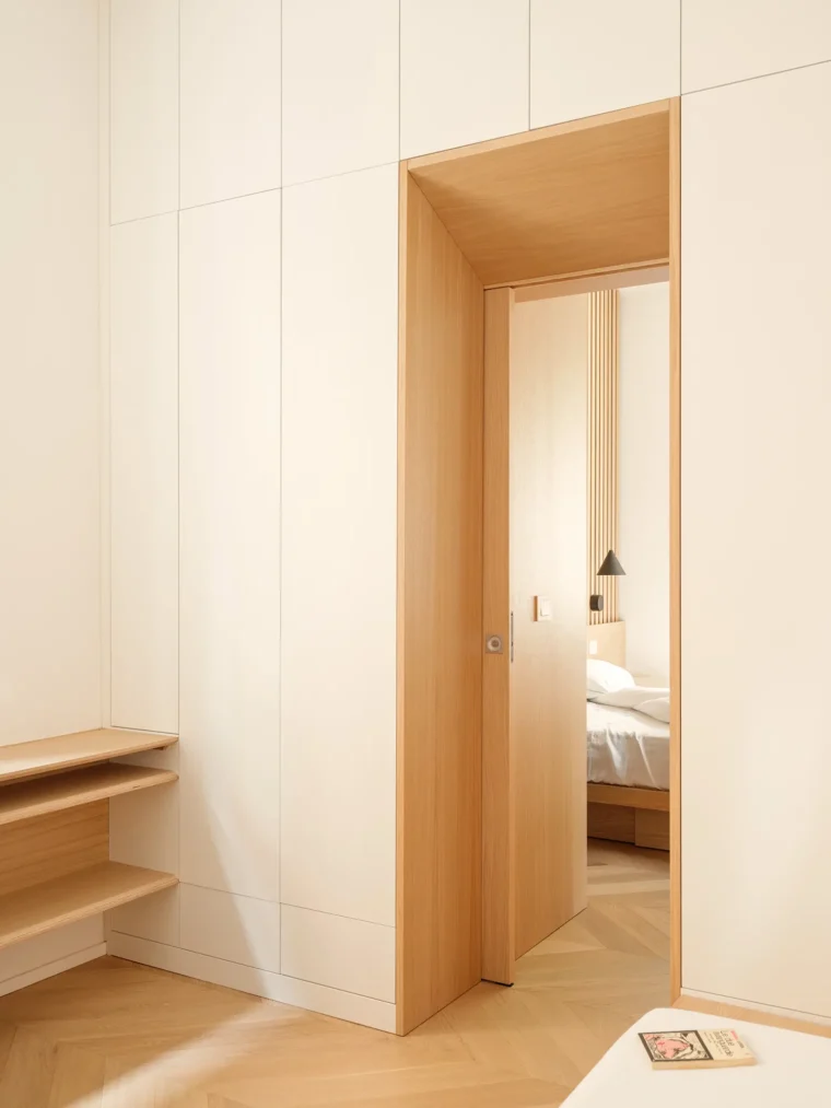
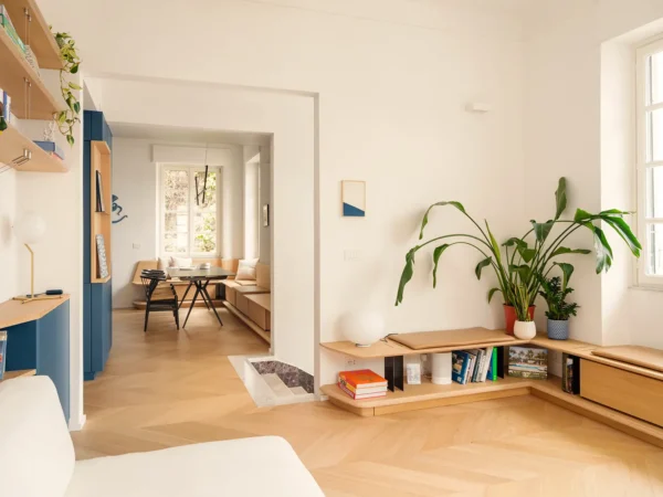
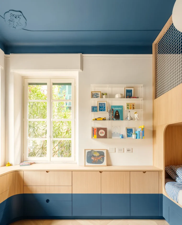
What holds the apartment together is a single continuous band of custom oak millwork, partially lacquered in deep matte blue and partially left with a clear acrylic coat, built across two construction phases. It runs uninterrupted through the plan: kitchen cabinetry, dining bench, TV unit, bookcase, storage niches, a changing niche in the corridor, the children’s beds, a desk, a fold-down bed in the study, built-in wardrobes, and the headboard in the main bedroom are all part of one system. llabb calls it the project’s throughline, “deep blue and oak that runs through the entire apartment like a long wave stretching toward the horizon.”

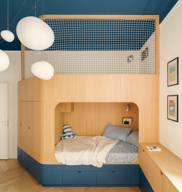
That same wood shifts character depending on where it lands. In the living and kitchen zones, it’s precise and restrained, closer to nautical joinery than domestic cabinetry. In the children’s room, it loosens considerably: curved bunk bed profiles, rope netting strung across the upper level, a deep blue painted ceiling, and metal support brackets shaped to reference surfboard fins. llabb began as a carpentry workshop before it became an architecture practice, and this room is where that history shows through most clearly.

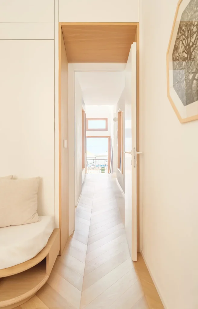
Rather than knocking down walls, the studio opened the plan through alignment. Two large metal-framed openings replace what was once a solid wall between the two south-facing rooms, connecting the living space and kitchen while still keeping them legible as separate rooms. The apartment’s 3.2-meter ceiling height, generous for its footprint, is never broken up by lowered sections, which keeps the space feeling larger than its square footage suggests. Underneath it all, natural oak herringbone parquet runs continuously, tying together the deep blue lacquer, warm oak, and white plaster that make up the rest of the palette.

The two bathrooms take deliberately different directions. The master bathroom leans darker and more controlled, with a Rexa space-saving washbasin and black metal fittings. The second bathroom is warmer, built around a custom travertine washbasin designed by llabb with an oak base made by Falegnameria Ratto in Genoa. Both stay within the same material logic as the rest of the apartment rather than treating finishes as a separate decision.

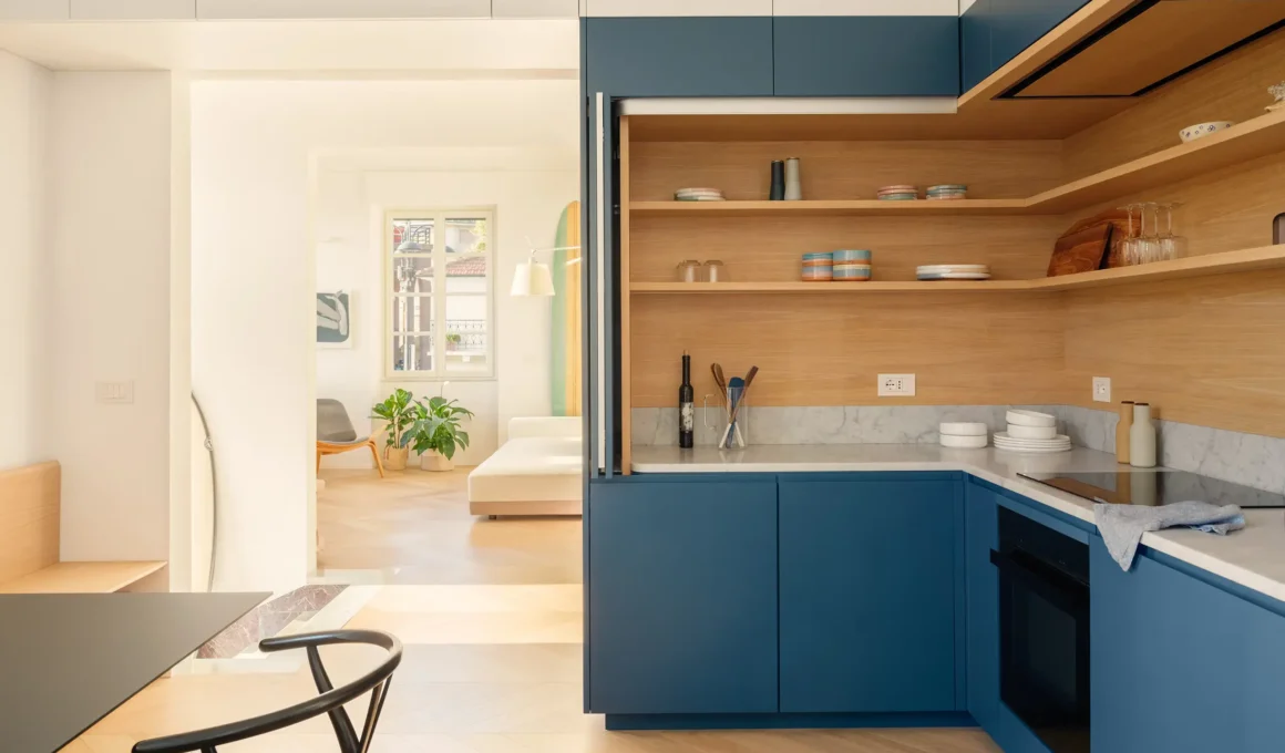
Furniture throughout was chosen to sit quietly alongside the millwork rather than compete with it: Carl Hansen CH24 chairs, an Extendo Balance table, a Ditre Italia Sanders sofa, and a Carl Hansen CH07 armchair. As the studio put it, “The extensive millwork leaves little room for additional large furniture pieces, and this approach was the only way to accommodate all the required functions within just 100 square meters.” That’s really the core of the project: the apartment works not despite the millwork taking up so much of the floor area but because it does, folding storage, circulation, and furniture into one continuous piece

The risk with a single material running through an entire apartment is that it starts to read as surface rather than structure. Surf House avoids that mostly through contrast, the shift between lacquered blue and raw oak, and the shift in tone between the restrained joinery of the living areas and the looser, more playful built-in furniture in the children’s room. Whether that playful register still feels right once the children outgrow the bunk beds is a separate question, one this renovation doesn’t have to answer yet.

Fact File:

Project: Surf House

Typology: Residential

Architect/Studio: llabb

Location: Levanto, La Spezia, Liguria, Italy

Year: 2025

Area: 104 square metres

Key materials: Oak blockboard millwork (lacquered and clear-coated), deep blue lacquer, natural oak herringbone parquet, Levanto red marble, travertine

Photography: Anna Positano | Studio Campo

July 9, 2026 0 comments
0 FacebookTwitterPinterestEmail
Residential

House in Las Rozas, Madrid, Spain by Fran Silvestre Arquitectos

by DDI Edit Team July 9, 2026
written by DDI Edit Team

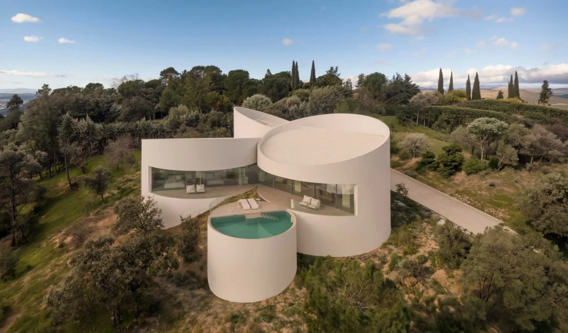
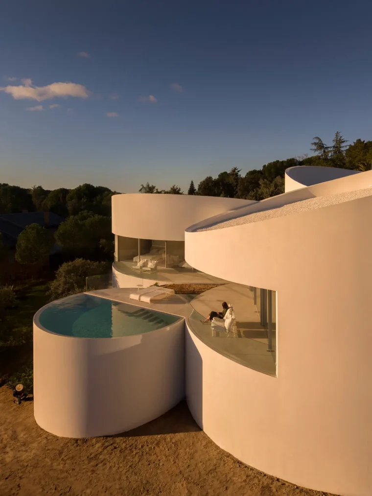
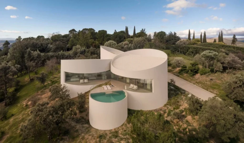
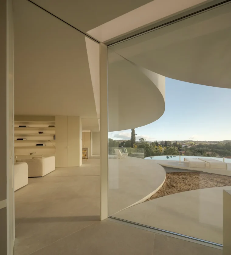
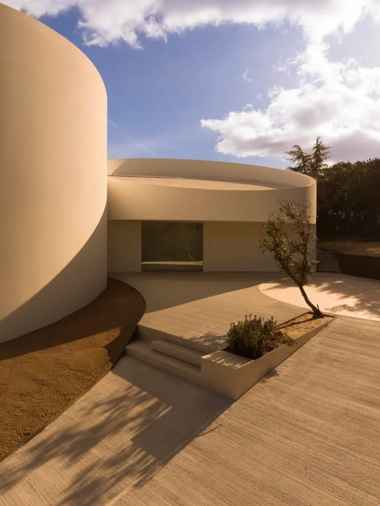
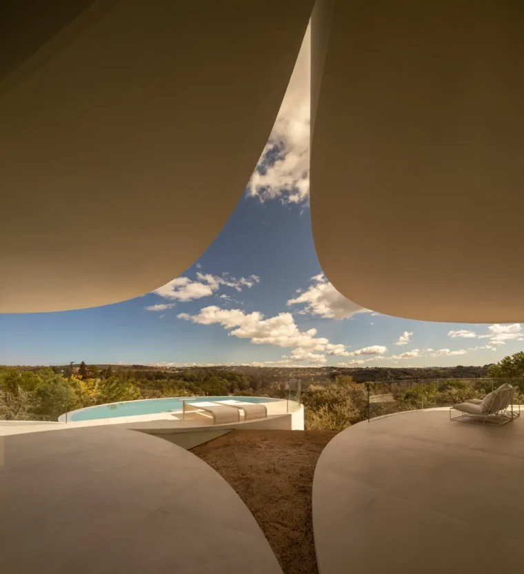
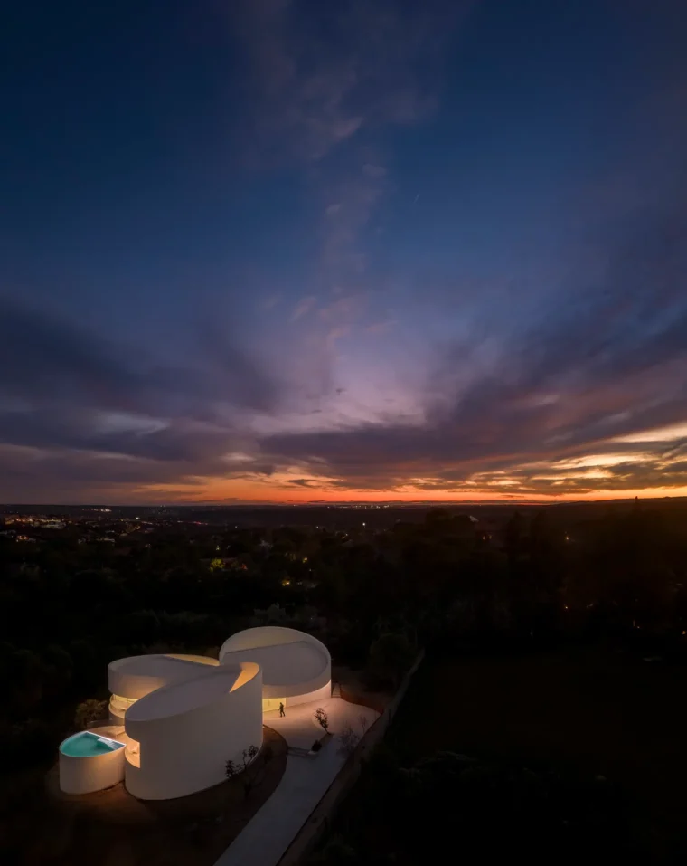
On a sloped site in Las Rozas, just outside Madrid, Fran Silvestre Arquitectos has built a house out of five distinct cylinders, each one carrying a different part of the program. One holds the bedrooms, another the living area, a third combines the garage with vehicular access and a wellness zone, a fourth contains the pool and technical facilities, and a fifth marks the entrance. The studio designed the house so that the geometry of the five cylinders directly dictated their functions, ensuring each one clearly reflects its purpose.

Getting five cylinders to sit comfortably on a hillside meant cutting each one obliquely at the top, which does more than one job at once. The angled cuts let the volumes settle into the slope without heavy excavation or retaining walls, and at roof level they resolve into a pitched form, a typology the region more or less expects, while each cut faces a slightly different direction depending on which volume it belongs to. That variation isn’t just a formal flourish. Because each cylinder’s angled roof captures light from its own orientation, the bedrooms, the living spaces, and the wellness volume all end up tuned to different daylight conditions rather than sharing one uniform pitch across the whole house, a calibration the studio has approached before, in a different climate, on its WELL-certified Camiral House in Girona.

Between the cylinders, the plan breaks its own rule just once. A small courtyard forms where orthogonal walls meet at 120-degree angles, representing the one rationalist move within an otherwise curved system. It’s a modest space, but it does a fair amount of perceptual work. Because the surrounding walls meet at angles instead of running parallel, light and shadow shift continuously through the space over the course of a day, so the courtyard reads differently at nine in the morning than it does in late afternoon, without a single material in it changing.

The house also opens toward the Sierra de Guadarrama, though the more interesting decisions happen at the scale of each volume rather than the house as a whole. Two of the cylinders get their own private courtyards, shielded from wind and outside view, while a third opens directly onto a terrace instead. It’s a strategy the studio has tested elsewhere, distributing privacy and exposure unevenly across a plan rather than treating the whole house as a single gesture, as in its Villa 95 in Sotogrande. The same instinct, resolving issues cylinder by cylinder rather than house by house, also carries through the roof cuts and the courtyard, and reappears in the studio’s Villa 18 in La Moraleja, suggesting that it is less an isolated choice here and more a working method to which the practice keeps returning.

The studio points to Andreu Alfaro’s sculpture Homage to Brancusi as an intuitive starting point for the project, not as a literal formal source, but as a way of thinking through how curved, separate volumes might still read as one composition. Whether that reference explains the design or simply dresses up decisions already made for structural and site-driven reasons is worth sitting with rather than accepting outright.

House in Las Rozas Madrid: Exterior & Interior Gallery

Fact File:

Project: House in Las Rozas

Typology: Residential

Architect: Fran Silvestre Arquitectos

Location: Las Rozas de Madrid, Spain

Year: 2026

Photography: Fernando Guerra

July 9, 2026 0 comments
0 FacebookTwitterPinterestEmail
Newer Posts
Older Posts

Recent Posts

  • Florim Introduces SensiVenezia, a Porcelain Stoneware Collection Inspired by Venetian Terrazzo
  • LEGO Botanical Wave Transforms TANK Shanghai with 380,000 Brick-Built Flowers
  • The Great Eastern Home Introduces Its Latest Collection of Italian Vintage Mirrors
  • Smart Homes Are Changing Architecture: What Happens When Technology Becomes Part of the Building?
  • AARQE9’s Nikhaar Dhawan & Bahaar Dhawan Rohatgi Unveil the Sculptural Lunar Drip Table

Recent Comments

  1. Smart Home Architecture: How Technology Is Changing Design on Aqara Smart Lock U500: Three Versions for Gates, Glass Doors and Standard Entrances

Newsletter

  • Home
  • About Us
  • Contact Us
  • Editorial Policy
  • Privacy Policy

© 2026 Design Diary International. All Rights Reserved.

Design Diary International
  • Home
  • Project
    • Residential
    • Hospitality
    • Commercial
    • Public & Cultural
  • Interview
    • Architect
    • Interior Designer
    • Founders & Brand
    • Artist
  • Material
  • Product
  • Feature
  • DDI Finds
    • Emerging Studio
    • Rising Designers
    • New Practices
  • About
  • Magazine
  • Contact Us