• Home
  • Project
    • Residential
    • Hospitality
    • Commercial
    • Public & Cultural
  • Interview
    • Architect
    • Interior Designer
    • Founders & Brand
    • Artist
  • Material
  • Product
  • Feature
  • DDI Finds
    • Emerging Studio
    • Rising Designers
    • New Practices
  • About
  • Magazine
  • Contact Us
Design Diary International
Residential

The Dip Pavilion, Ahmedabad, India by andblack design studio

by DDI Edit Team August 7, 2026
written by DDI Edit Team

Set into the garden of an existing residence in Ahmedabad, The Dip Pavilion was designed by andblack design studio as a poolside retreat built mainly for evening use. The brief asked for a lounge, a gym, outdoor seating and a swimming pool to sit together as one composition, while keeping a measured distance from the main house rather than competing with it.

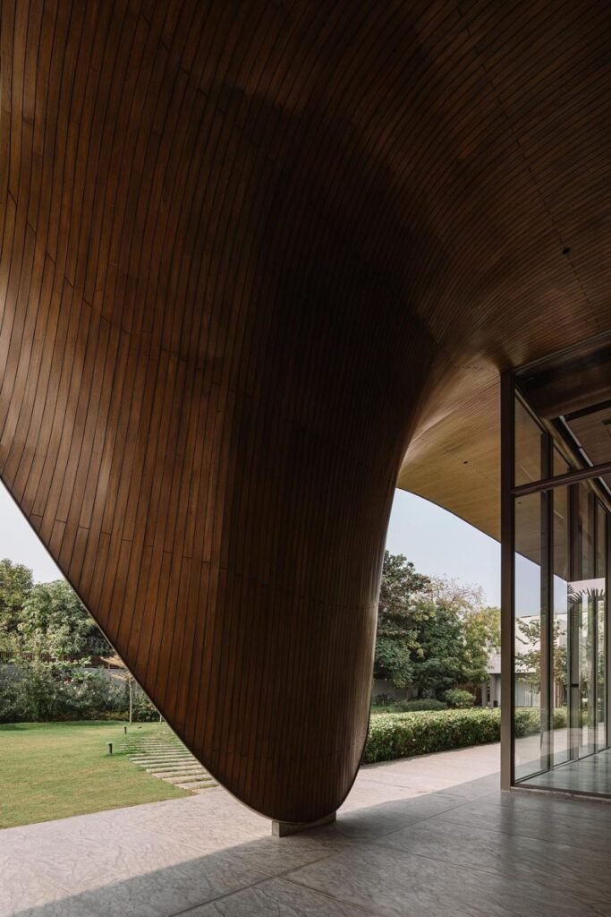
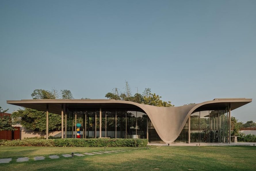
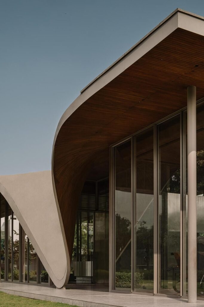
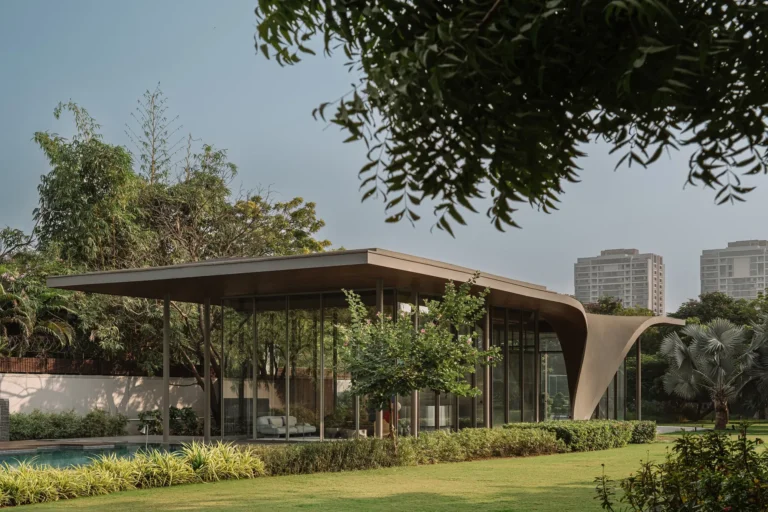
The roof is the pavilion’s defining move, and it reads less like a plane that folds down at one point than a single continuous surface that dips at its centre and lifts again at both ends, curving down almost to the ground before rising back up into two broad, flat overhangs. Seen head on, the effect is closer to a wide, shallow V stretched horizontally across the building than a conventional roofline. Cast in pale concrete on the outside, the underside is lined entirely in narrow strips of dark timber, laid to follow the roof’s curve so the wood itself seems to bend with the structure rather than sit flat beneath it. Slender round columns, set back from the glass line, carry the roof at even intervals, keeping the walls beneath it almost entirely transparent.

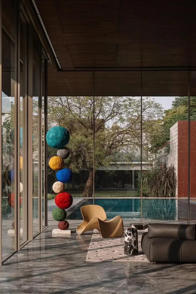
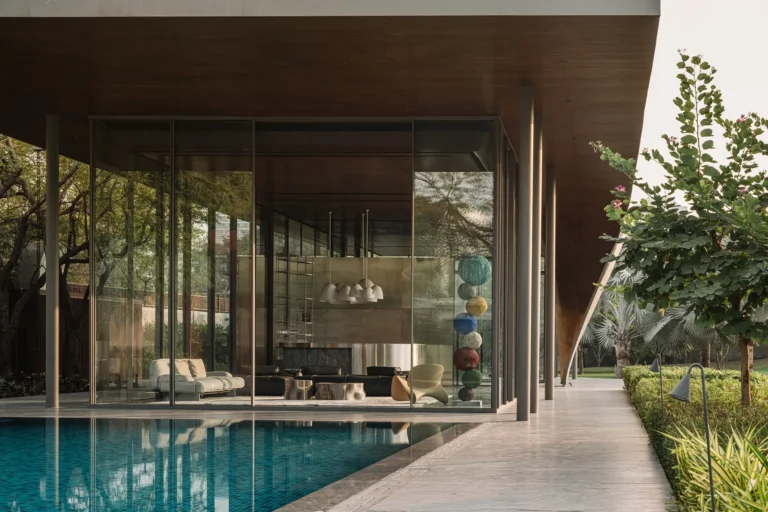
That glazed volume runs the full length of the pavilion, floor to ceiling, with narrow black-framed panels dividing the glass into a steady rhythm. Inside, the lounge holds a mix of low-slung dark leather seating and pale bouclé pieces, arranged near a full-height mirrored panel and a run of pendant lights with round, softly lit glass shades. A totem of stacked, rough-textured spheres in blue, ochre, red, green and stone tones stands near the glass, running floor to ceiling beside a sculptural wooden armchair and a black-and-white stone side table, all visible straight through the facade from outside.
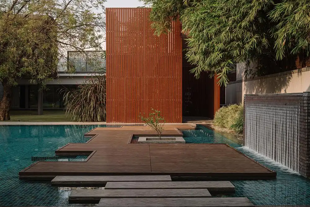
At the rear, the pool runs alongside the pavilion in dark green tile, with a stepped timber deck set into the water, cut through with small square openings that let jets rise directly out of the pool’s surface. A tall screen in rust-toned vertical timber battens stands at one end, partly enclosing a stone-clad wall where a sheet of water runs down in a continuous curtain into the pool below, audible presumably from the deck itself.
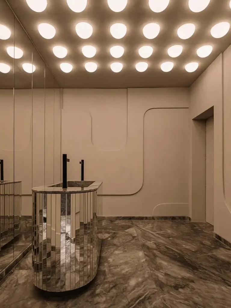
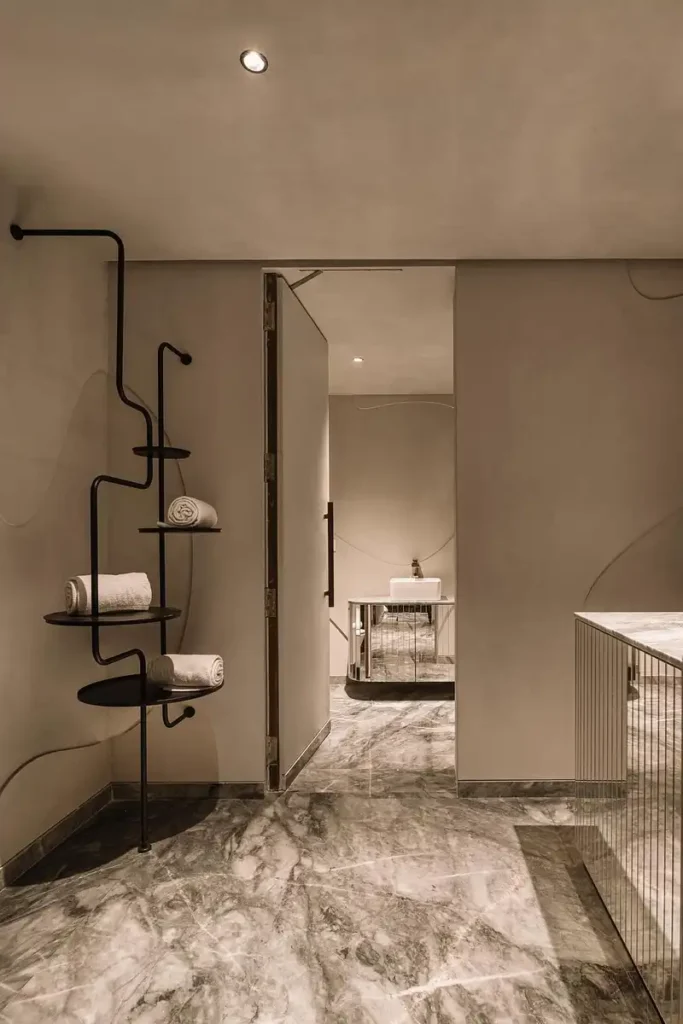
Two washrooms extend the same material language. One is finished almost entirely in grey-veined marble, floor and walls together, with a mirrored, fluted cylindrical basin unit and a sculptural black wall-mounted rack for towels, bent into an irregular geometric line rather than a straight bar. A second washroom is lined in a soft, curved plaster wall with rounded recessed grooves, its ceiling fitted with a dense grid of small, individually lit dome-shaped fixtures, paired with a similar mirrored cylindrical basin set against a run of full-height mirror panels.
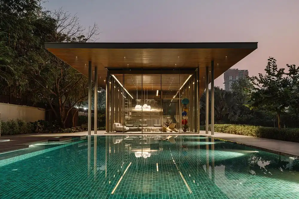
At dusk, the glazed volume glows from within against the darkening garden, the pool lit in deep teal beneath it, the roof’s pale underside catching the last of the light before the timber lining disappears into shadow above.

Fact File

Photography: Ishita Sitwala

Typology: Residential Poolside Pavilion (Residential)

Architecture Studio: andblack design studio

Architect/Designer: Jwalant Mahadevwala

Collaborator: Studio In-Dtale

Engineering: Shehzad Irani, Schafbock design+workshop

Landscape Architect: A. Y. Retiwalla

Client: Sukoon and Shanna Shah

Location: Ahmedabad, Gujarat, India

Project Year: 2025

Program: Lounge, gym, floating deck, waterfall, swimming pool
August 7, 2026 0 comments
0 FacebookTwitterPinterestEmail
Products

Elementi: Snaidero’s Sistema Kitchen, Now on Display in Bangalore

by DDI Edit Team July 31, 2026
written by DDI Edit Team

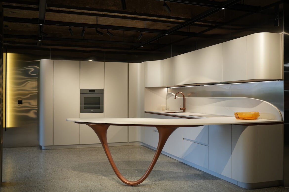
Among the Snaidero Sistema compositions currently rolling out across the brand’s expanding international network, Elementi is the one built around a single dramatic gesture: a waterfall island counter carried on a single sculptural leg, cast in a warm copper tone, curving down from the underside of the countertop to the floor in one continuous arc rather than sitting on a conventional base or run of cabinetry.

Snaidero Elementi kitchen island with waterfall counter on a single copper-toned leg, Bangalore showroom

The counter itself runs in a pale stone-look surface, extending into a curved end that wraps past the edge of the cabinetry run behind it. That run carries a matching curve of its own, with tall cabinetry finished in a soft off-white bending around the corner of the kitchen without a hard seam and a built-in wall oven set into the same run. Behind the island, a stainless steel backsplash panel runs the full width of the counter, catching the light in loose, rippled reflections, with a copper-finish gooseneck tap rising from the surface in front of it.

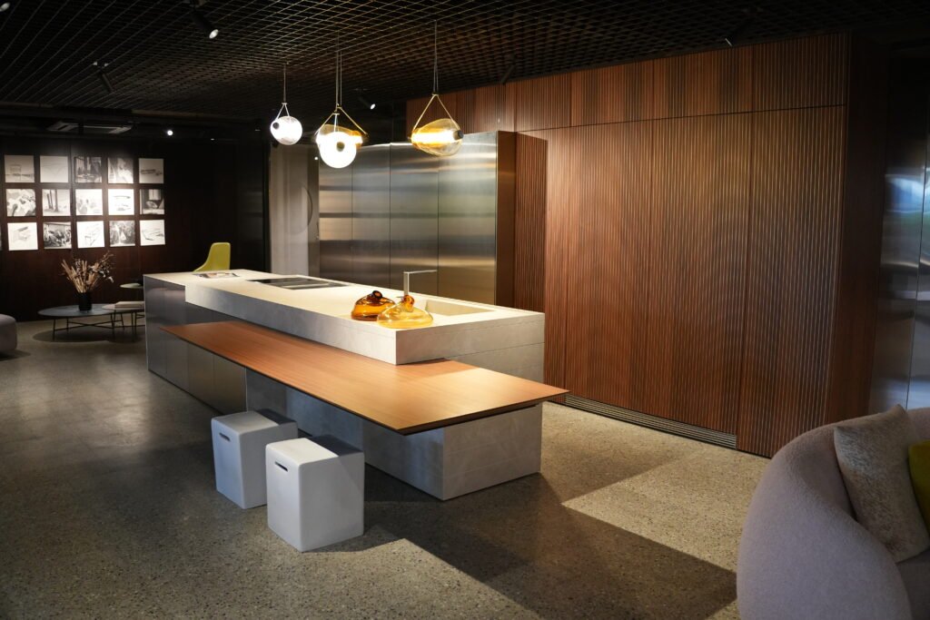
In a second configuration shown in the same showroom, the system is set up as a long island in grey stone, paired with an extendable dining leaf in warm wood veneer that slides out from beneath the counter on a matching grey base, with seating arranged on simple cube-shaped stools finished in a pale concrete-effect surface. Behind this version, full-height cabinetry alternates between polished stainless steel and vertically ribbed wood paneling, with a trio of pendant lights in blown amber and clear glass hanging low over the counter.

Elementi’s presence in Bangalore lines up with Snaidero’s broader push into India this year, part of the nearly 400 square meters of combined showroom space the brand has added across Mumbai and Bangalore, with the same composition also shown internationally in Tokyo, alongside Orbita, Folio, and Opera, as one of the Sistema line’s touring configurations.

Website: www.snaidero.com

July 31, 2026 0 comments
0 FacebookTwitterPinterestEmail
Public & Cultural

Dr. Caro Urban Bus Interchange, Elx, Spain by ARN / Arquitectos

by DDI Edit Team July 28, 2026
written by DDI Edit Team

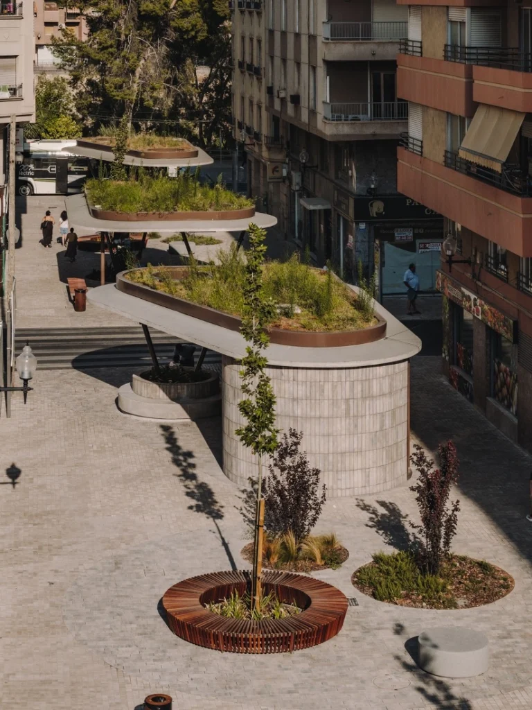
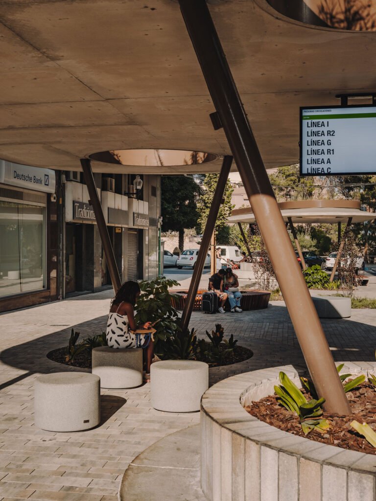
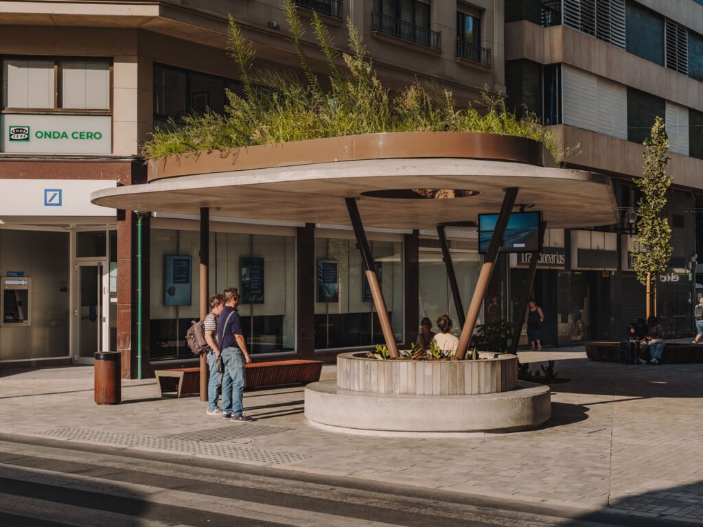
The site sits on a pedestrian street in Elche, close to the VinalopĂł River, on ground that ARN / Arquitectos describes as previously lacking spatial or environmental character, a stretch where vehicle traffic once took priority over people on foot. The brief asked for a mobility hub that could fold public transport together with cycling, adding parking, public bicycle stations, a ticket office, restrooms, covered waiting areas and real-time information systems into a street built, in the firm’s words, for lingering rather than passing through.

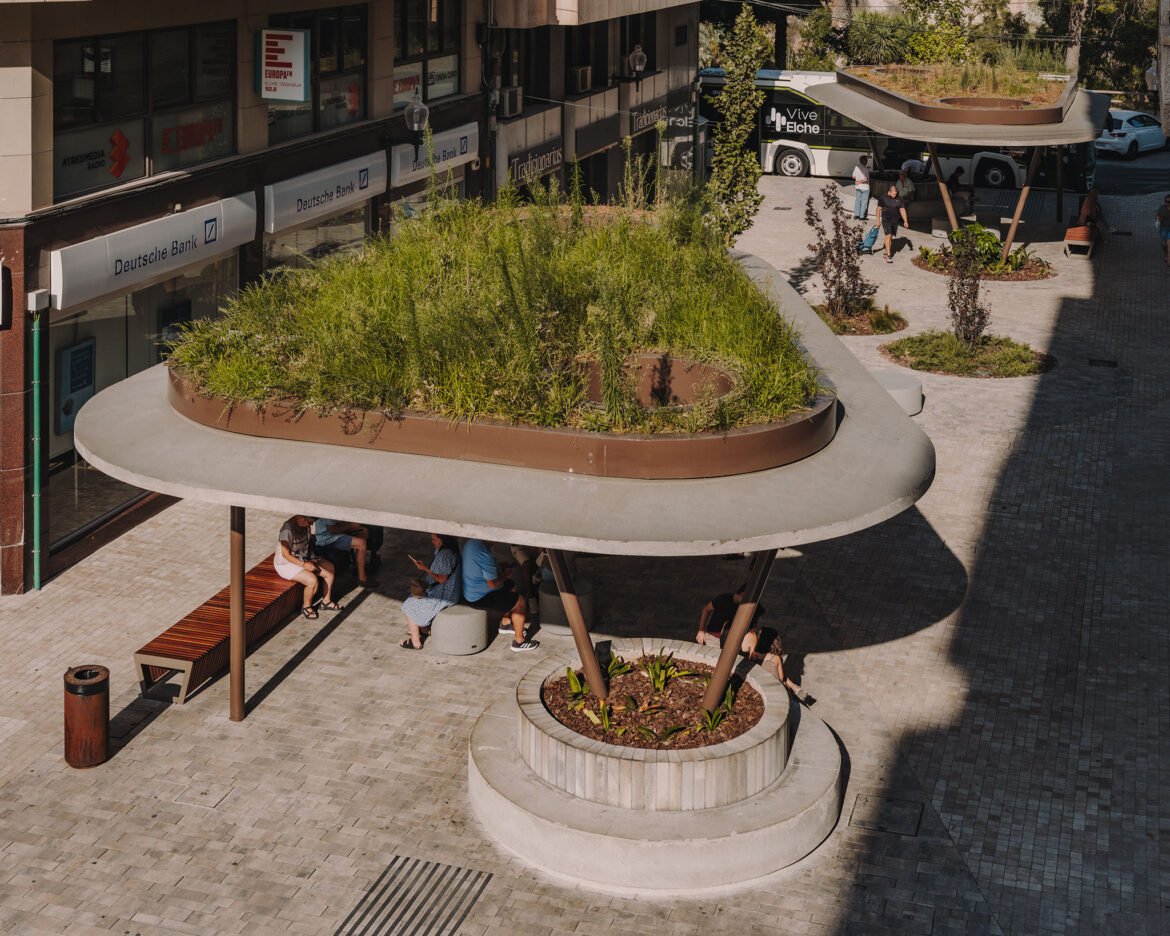
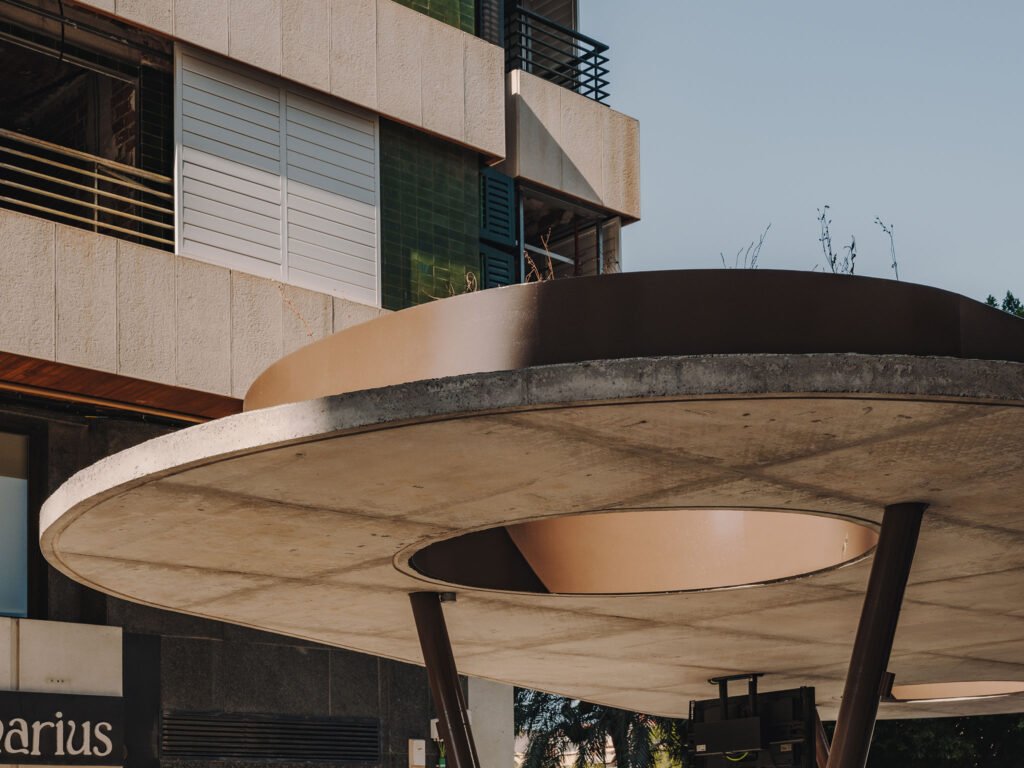
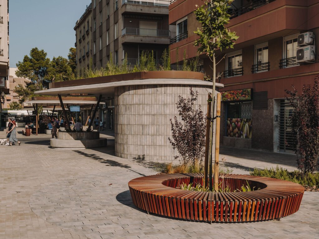
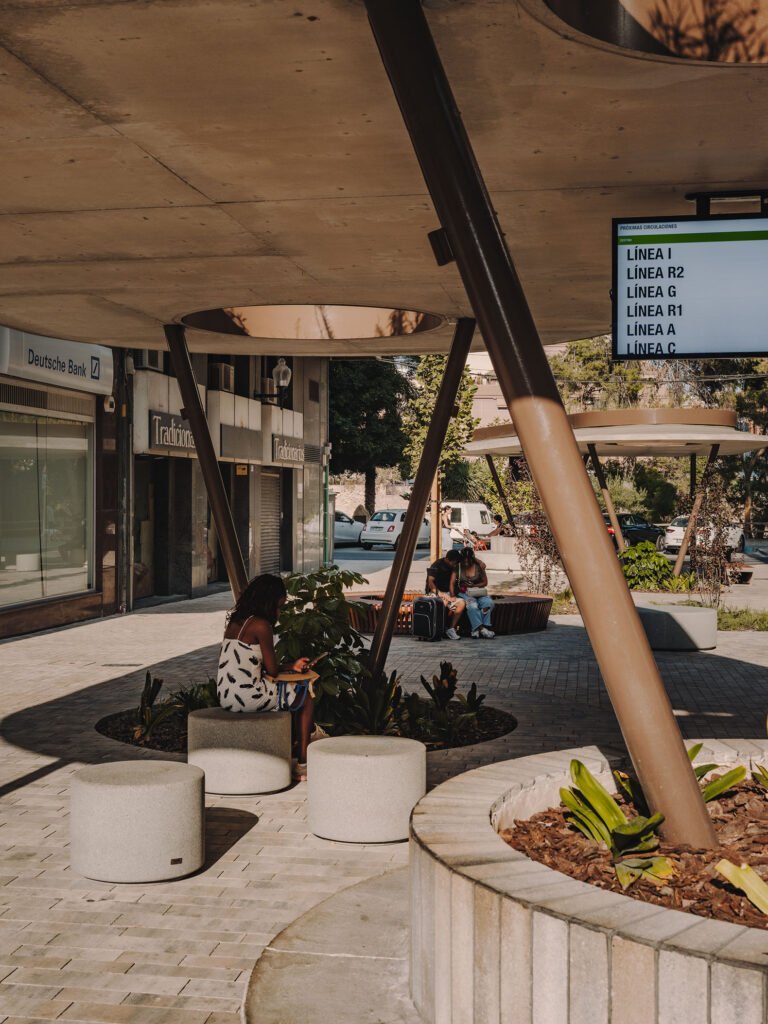
Three concrete pergolas anchor the space, each one a low, wide disc raised on angled steel columns, their undersides pierced with a circular skylight cut. Sedum planting runs along the rim of each roof in a band edged with weathered copper-toned metal, grasses and low shrubs left to grow loose rather than clipped. According to the firm, a green roof of this kind absorbs somewhere around 1.387 kg of CO2 per square metre, alongside working to cool the surrounding air, ease the local heat-island effect and improve humidity in the immediate area. Photocatalytic concrete pavers cover the ground plane throughout, chosen for their ability to break down airborne pollutants underfoot.

At the base of one pergola, a cylindrical volume clad in narrow, ribbed grey tile houses the ticket office and restroom module. Its curved wall wraps around uninterrupted, broken only by service access, and the green roof above it does double duty here, its evapotranspiration drawing heat away from the enclosed space during warmer months.

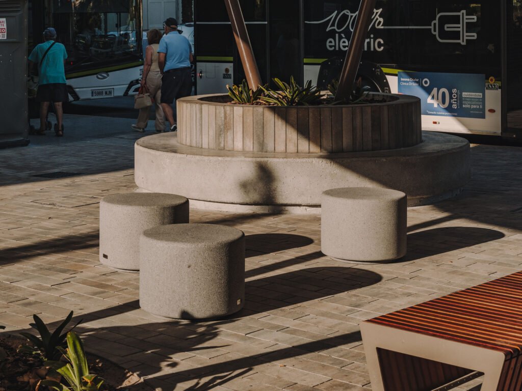
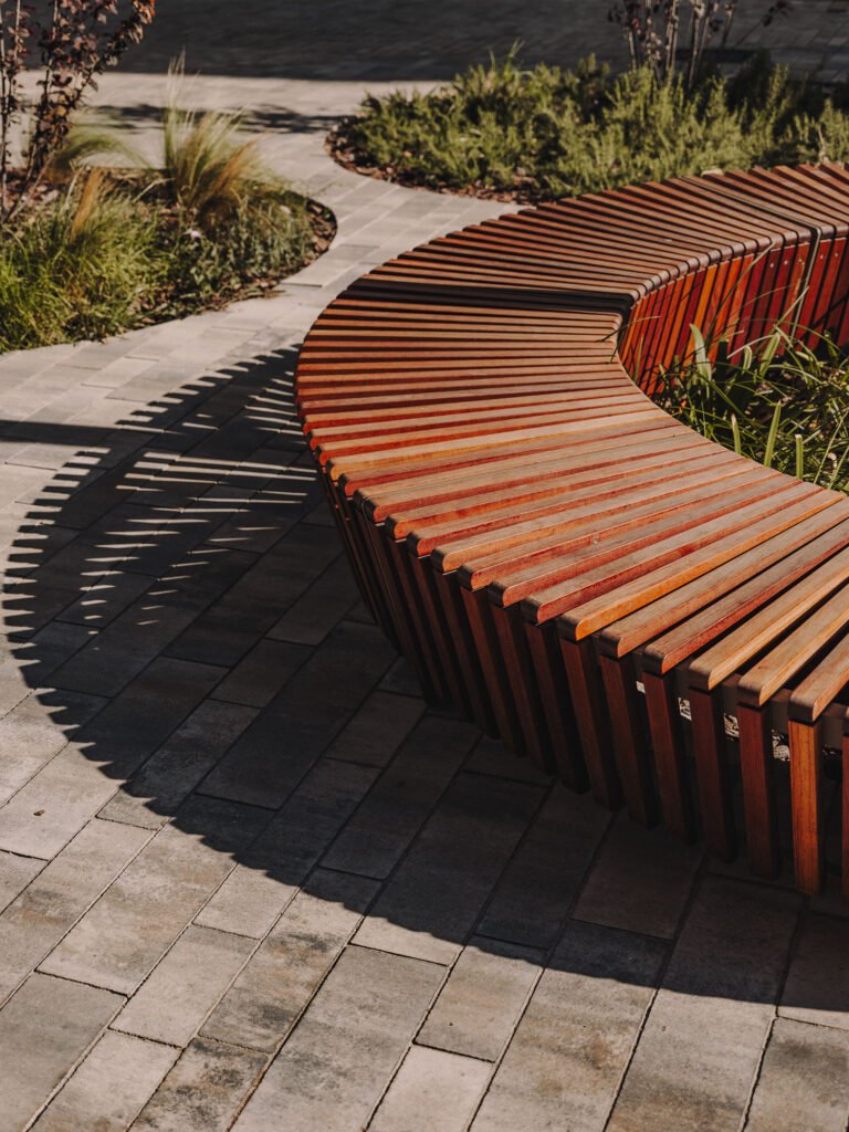
Seating comes in three distinct forms, each built by Escofet. Low, drum-shaped stools in pale cast concrete sit loose in clusters, small and playful enough to invite people to shift them into conversation. Around the base of each pergola, a circular planter-bench in the same textured concrete wraps the support columns, letting people sit in the shade cast overhead regardless of the hour. A third form, a long, curved bench built from close-set timber slats stained in shifting tones of red and amber, rings a planted tree bed at grade, its slatted seat following the bend of the path rather than cutting across it.

The result threads a bus stop, cycling infrastructure and public seating into a single connected stretch, treating a daily commute less as a point of transit and more as a piece of the city meant to be occupied.

Fact File

Year: 2025

Typology: Public Park, Transport and Infrastructure (Bus) (Public and Cultural)

Firm: ARN / Arquitectos

Design Team: Jose Amoros, Luis Rubiato Brotons, Patricia Navarro MazĂłn

Collaborating Firms: Benito Design Group, Inc. (street furniture); Escofet (street furniture)

Location: Elx (Elche), Alicante, Spain

Status: Built

July 28, 2026 0 comments
0 FacebookTwitterPinterestEmail
Residential

A Slice of Ubud, Varca, South Goa, India by Natasha Kumar and Abhijit Sawant

by DDI Edit Team July 28, 2026
written by DDI Edit Team

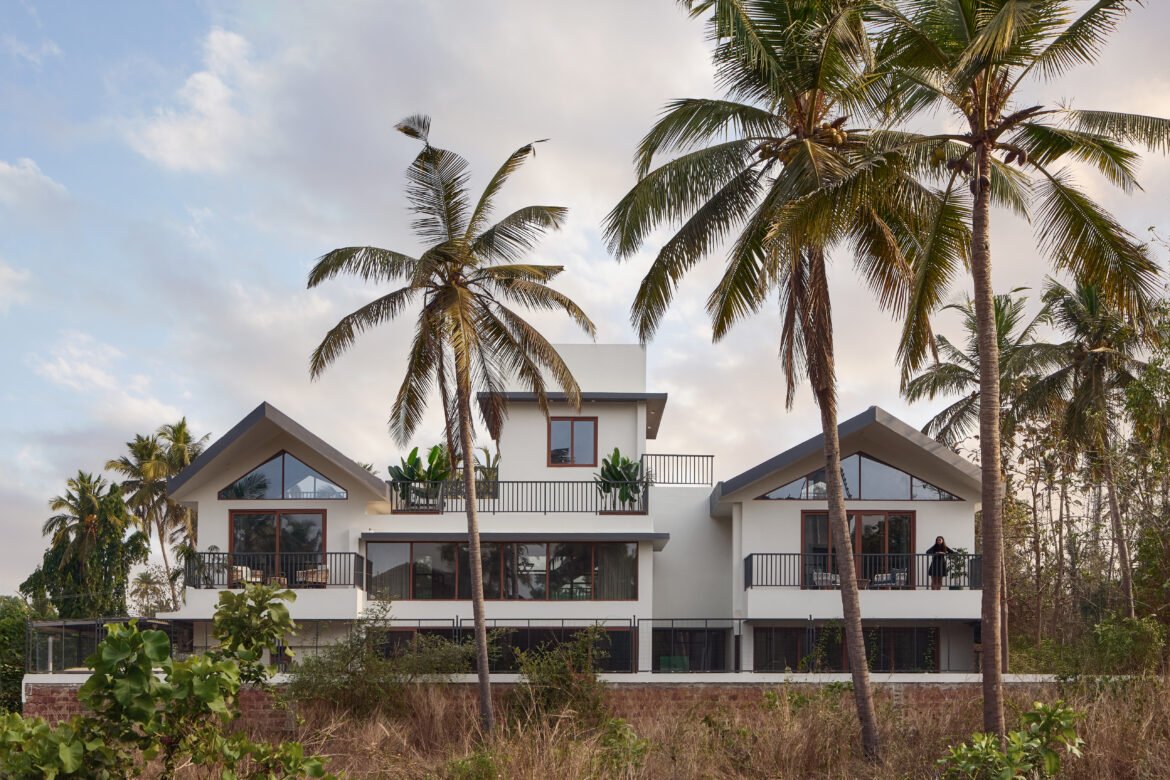
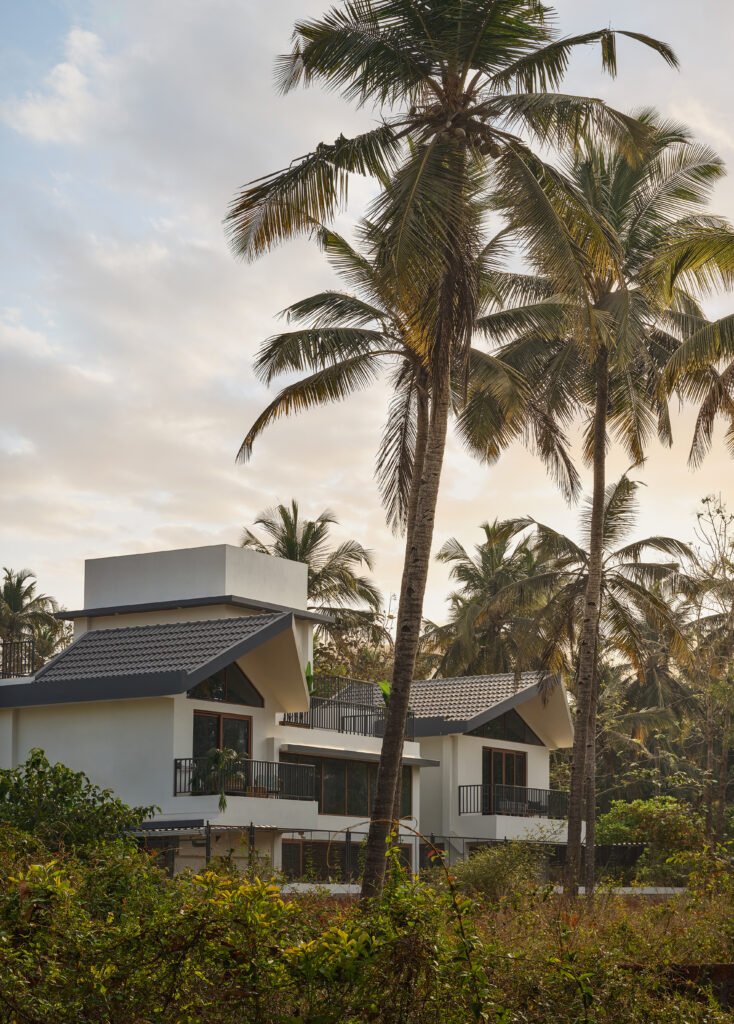
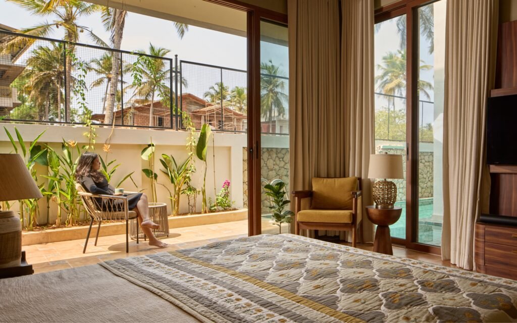
The 3,000 sq ft villa sits in Varca, on Goa’s southern coast, built for a family of four and shaped by a brief that leaned toward Balinese sensibility while staying grounded in its Goan setting. Studio Tilt handled the interiors and landscape, working alongside architects Natasha Kumar and Abhijit Sawant on a house where light, water and vegetation carry the design rather than sit as decoration on top of it.

The plan runs north to south, a decision that keeps daylight diffused and even through the day and lets cross-ventilation work with the region’s tropical climate. Large openings and high ceilings support that same goal, and this framework becomes the mechanism through which the house lets nature in, not as a finishing touch but as something built into how the plan works.

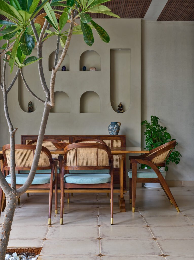
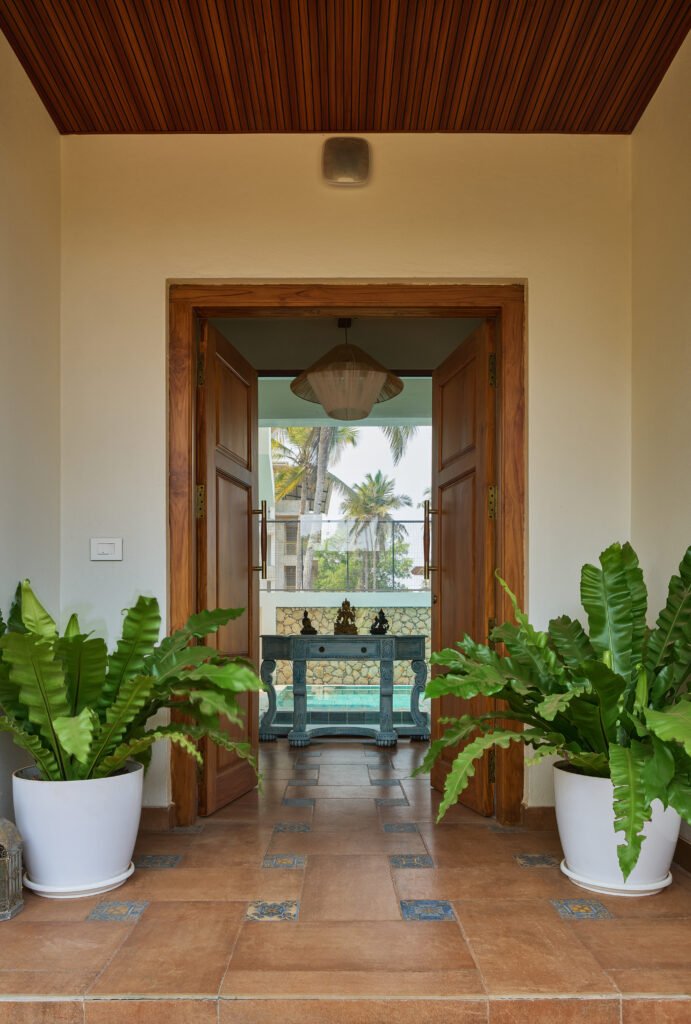
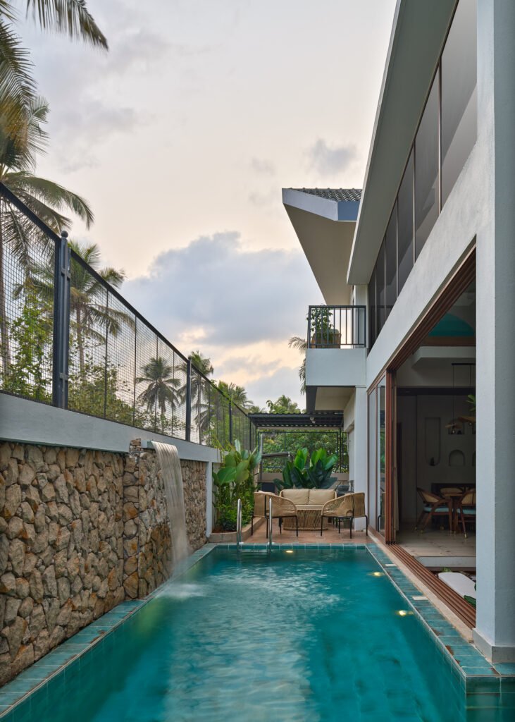
Water announces itself early. The pool sits directly behind the foyer, visible on arrival, setting up the relationship between the built house and what surrounds it. A water body then runs into the centre of the plan, easing the transition between common areas and private ones. Rising through this same zone, in the double-height living and dining space, a frangipani tree grows under a skylight positioned to let daylight move across the interior over the course of the day, the tree and the light working as a single spatial idea rather than two separate features.
Living, dining and kitchen occupy the ground floor as one continuous, open space, holding visual contact with the outdoors throughout. The living area sits close enough to the pool for a tactile relationship with the water, while the open kitchen and its breakfast table are positioned for daily, shared use. Toward the rear, the pool extends further and meets a jacuzzi, and together they form a threshold, both physical and visual, between the communal spaces and the master suite.
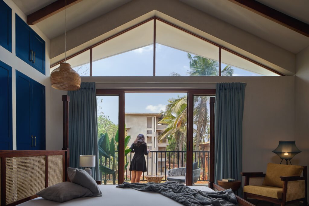
The upper floor holds the more private programme: a family lounge, a guest room, and the children’s bedrooms at either end. The sloped, overhanging eaves and large openings established on the ground floor carry through here, and a window in the daughter’s room looks back down into the living space below, tying the two levels together visually.

Materially, the house works with restraint. Beige stone cladding runs from the interior through to the pool backdrop outside, keeping that transition seamless, with green and blue accents pulled from the surrounding landscape set against the neutral base. Natural materials, the water elements and the shaded volumes of the house combine into an environment built for a specific kind of sensory calm.
The Balinese references built into the brief show up as spatial decisions rather than surface style: water bodies are threaded through the plan, there’s an inset living area, and continuity is kept between indoors and out. Adapted to a Goan tropical climate, these choices also carry the house’s climate-responsiveness and energy efficiency, rather than functioning as reference points on their own. Architecture, interiors and landscape were developed together from the start, and the result treats the boundary between inside and outside as something meant to dissolve, letting the house read as an extension of the ground it sits on.

Fact File

Photography: Manthan Yadav

Project Name: A Slice of Ubud

Typology: Residential Villa

Location: Varca, South Goa, India

Built-up Area: 3,000 sq ft

Principal Designers: Natasha Kumar, Abhijit Sawant

Interior Design & Styling: Studio Tilt

Landscape Design: Studio Tilt

July 28, 2026 0 comments
0 FacebookTwitterPinterestEmail
Residential

Casa Paradiso, Delhi, India by Studio Reset

by DDI Edit Team July 27, 2026
written by DDI Edit Team

The plot sits on a dense Delhi street, hemmed in by neighbouring apartment buildings on either side. The brief for Casa Paradiso asked for grandeur within that constraint, an 11,000 sq ft residence that could feel expansive despite its narrow, linear footprint. Ansh Goel, founder of Studio Reset, found the answer in a section rather than a plan. Verticality carries the experience here, with space expanding through volume, light and visual porosity across levels rather than through width.

Raised above a stilt level, the house rises through three floors organised around a triple-height atrium. That volume does more than anchor the layout. It pulls natural light down through the plan, letting it reach spaces well removed from the front facade. Rooms opening onto this core share in the scale, with ceiling heights exceeding 13 feet throughout.

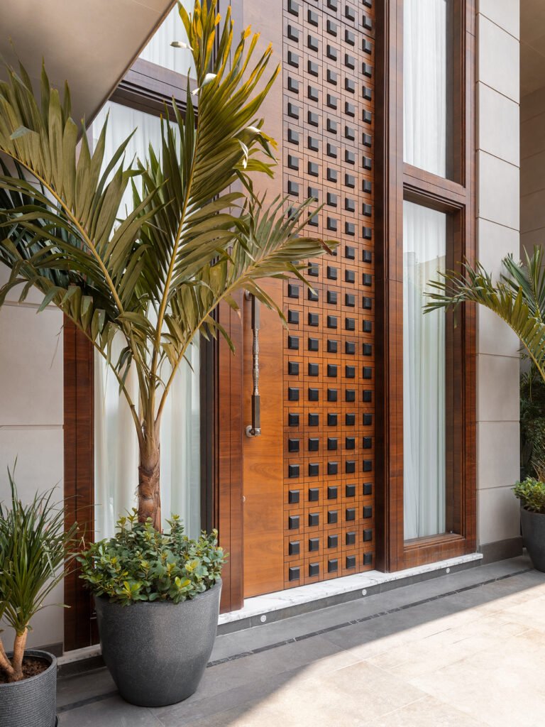
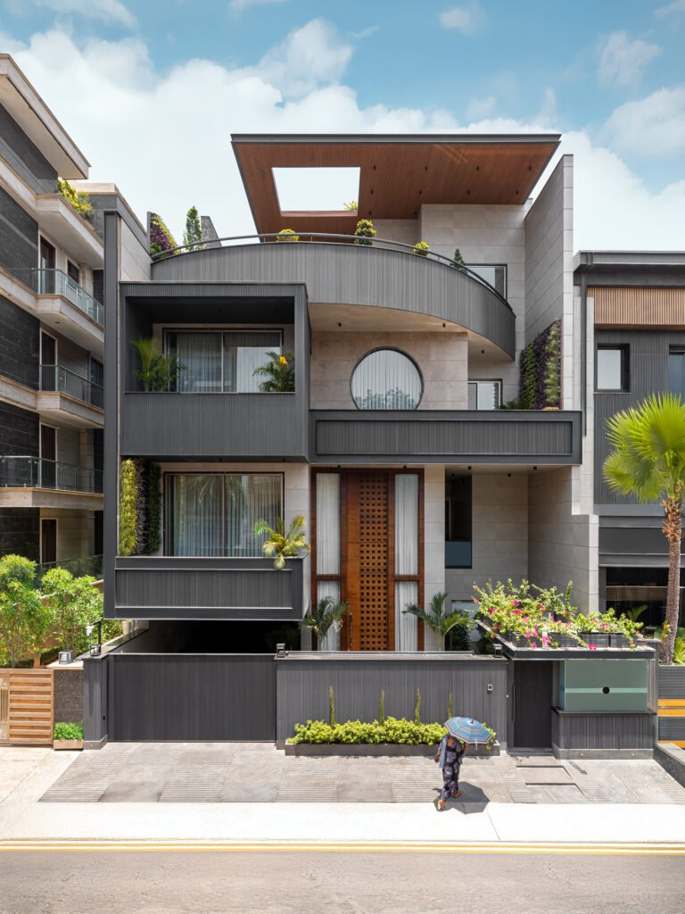
Getting there structurally took its own resolving. “We were dealing with significant height and large spans, so the challenge was to make sure beams and columns didn’t interrupt the volume, allowing the atrium to read as one continuous, open space,” says Ansh. None of this shows on the exterior. The upper storeys are wrapped in dark graphite metal cladding, run in narrow vertical flutes, and cantilever out over a lighter stone-clad base. A circular window, screened by vertical louvres, sits at first-floor level, and a timber-slatted door assembly, flanked by glass panels, is recessed at the entrance beneath the overhang. Vertical planting runs up sections of the facade between the openings. At the top, a curved balcony traces a bowed line across the front of the house, capped by a timber-lined canopy roof cut through with a square skylight opening.

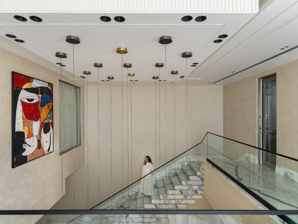
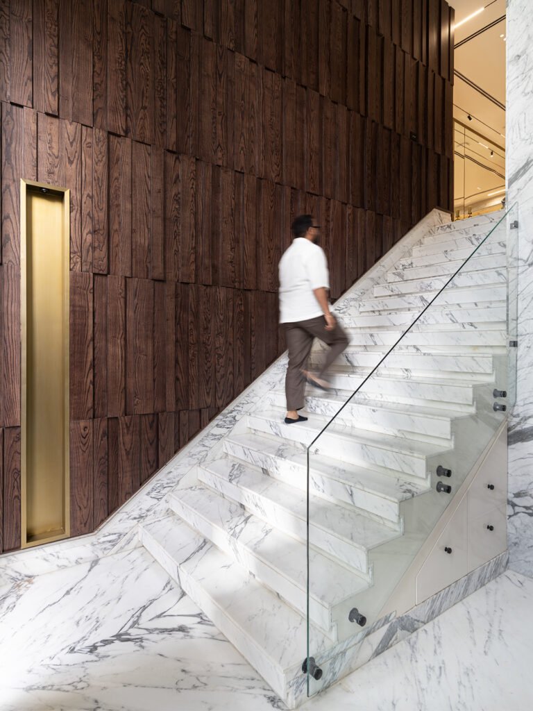
The staircase that Ansh describes as a defining presence in the house is built entirely in marble; its treads run against a glass balustrade with a slim black handrail, set beneath a run of pendant lights hung at staggered heights, a mix of dark bronze disc fixtures and brass ones. Behind it, a wall in fine vertical fluting continues the same rhythm the architect points to elsewhere in the interiors. A large abstract painting, its palette built from red, black, ochre and blue in a fragmented, face-like composition, hangs on the wall facing the stair.

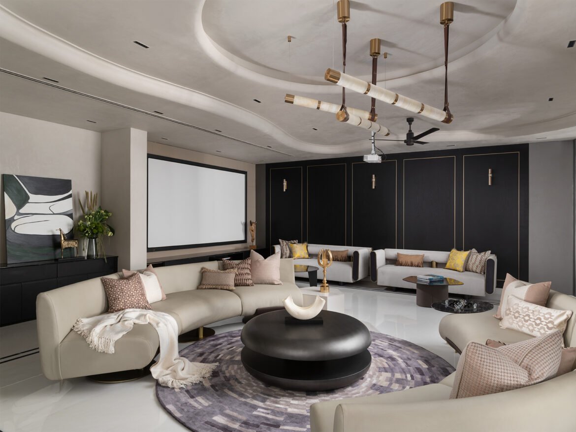
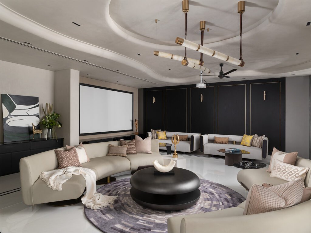
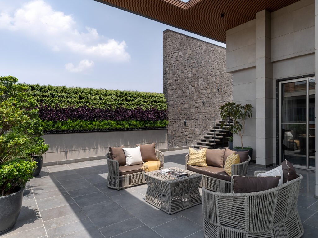
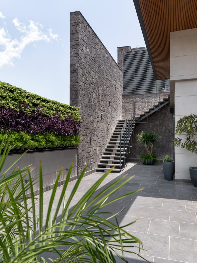
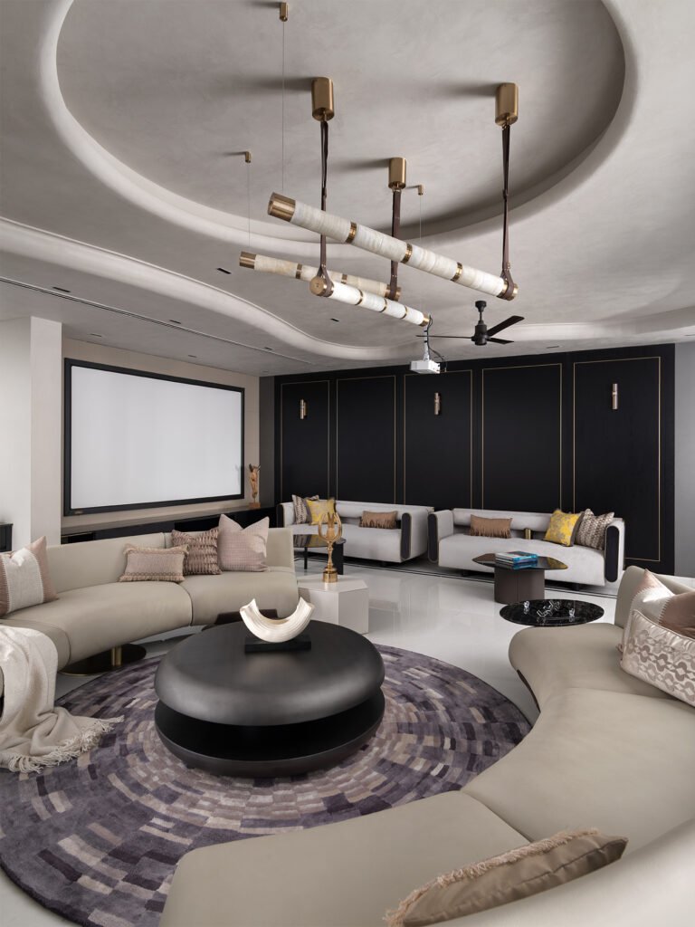
The entertainment lounge on the top floor, the room the brief describes as the journey’s endpoint, is finished in dark tones, with black panelled walls outlined in fine gold trim set beneath a curved cove ceiling detail. A long pendant fixture made of alabaster tubing banded in brass runs the length of the room, hung on leather straps from the ceiling, alongside a black-bladed ceiling fan and a recessed projector aimed at a wall-mounted screen. Curved sectional sofas in beige are arranged on a circular rug patterned in muted grey, mauve and taupe blocks, dressed with fringed cushions in mustard, brown and taupe. A round black leather pouffe serves as the central table, holding a pale sculptural object, alongside a smaller black table and a white cube side table. This room opens onto the terrace, furnished with grey rope-woven sofas and an armchair; brown cushions offset with a scattering in a mustard geometric print; and a rope-topped coffee table holding a stack of magazines. A stone-clad accent wall, laid in an irregular stacked pattern, runs alongside a living green wall planted in layers of green and deep purple foliage, the whole terrace sheltered under the same timber-slatted canopy visible from the street.

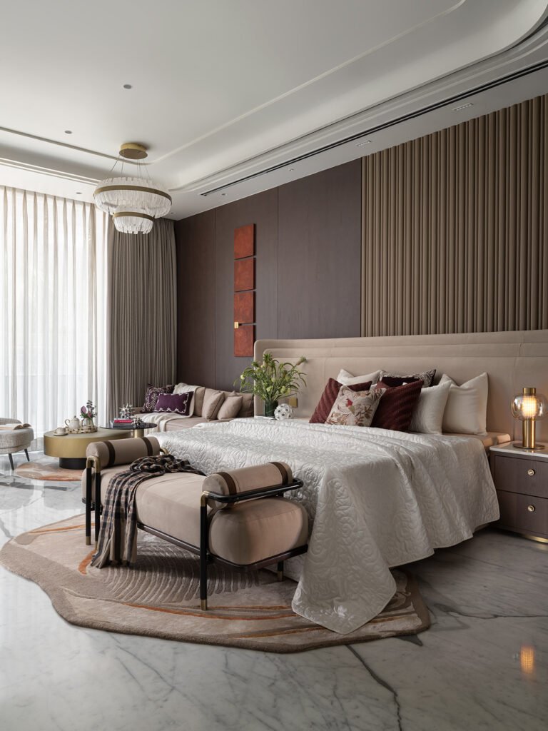
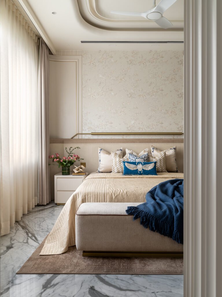
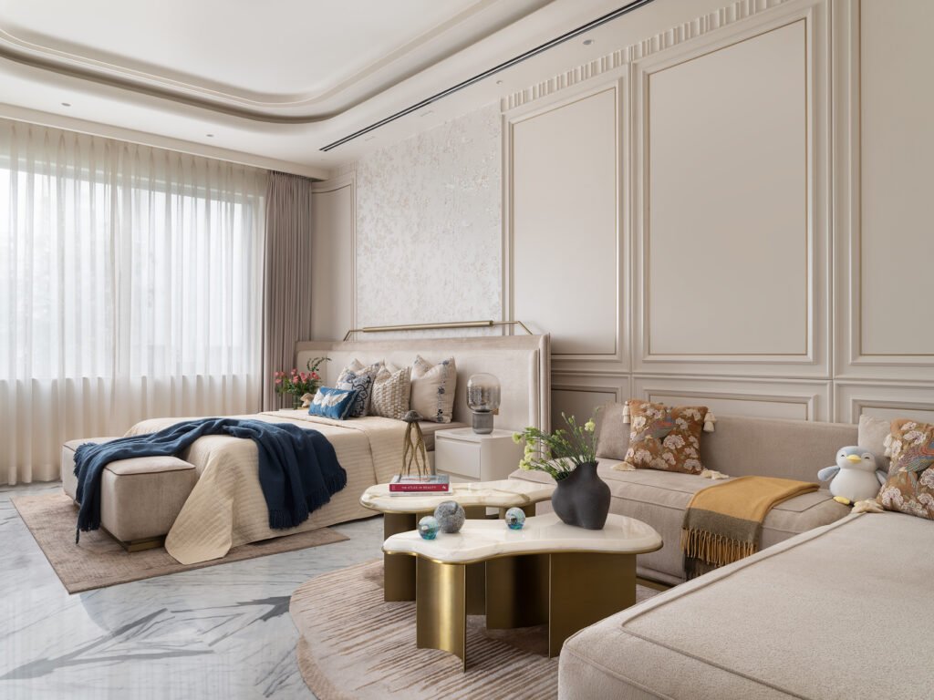
Each bedroom is treated as a suite, with its own lounge and wardrobe, and one of these sitting areas, done in a floral wallpaper panel with softer, lighter tones, matches the daughter’s room as described in the brief. A banquette-style daybed with a tufted, upholstered headboard sits against the wallpaper, dressed with floral-print cushions with tasselled trim, a mustard throw and a plush toy left on the cushions. Overhead, a brass chandelier with curved tubular glass arms hangs from a coved ceiling detail that echoes the one in the entertainment lounge below. Two organic, curved marble-top tables on brass fin legs sit on a striped rug in front of the daybed, holding books, a black ceramic vase with white flowers, glass spheres and a small bronze sculpture. A white bedside table with a mushroom-shaped glass lamp sits beside the upholstered headboard of the bed itself.

“A conscious decision was made to limit the number of rooms so that scale and spatial generosity could take precedence over density,” Ansh explains. That restraint is what carries the house. Casa Paradiso builds its sense of luxury from height, openness and the connections it draws across its own levels, rather than from footprint alone.

Fact File

Photography: Deepak Aggarwal

Project Name: Casa Paradiso

Typology: Private Residential Villa

Category: Residential

Location: Delhi, India

Built-up Area: 11,000 sq ft

Architect: Studio Reset

Principal Designer: Ansh Goel

July 27, 2026 0 comments
0 FacebookTwitterPinterestEmail
Casa em Melides lime plaster facade cork oaks Sabrab Architecture
Residential

Casa em Melides, Grândola, Portugal by Sabrab Architecture

by DDI Edit Team July 18, 2026
written by DDI Edit Team

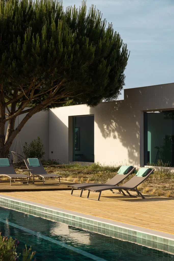
Sabrab Architecture has completed a 500-square-metre residence in Melides, in Portugal’s Alentejo region, working around a stand of mature cork oaks rather than clearing the site to build. The project takes cues from the region’s traditional building forms, reworking them through more contemporary construction rather than copying their appearance directly.

Casa M Ariane arquitetura Miguel Sabrab e fotografia Ivo Tavares

The clients, a family based internationally, asked for a house that could serve two different purposes at once: a quiet retreat for time alone and a space equipped to host guests without feeling stretched between the two functions. Sabrab organised the house as a series of low volumes that step across the site’s existing slope instead of flattening it first, finished externally in lime plaster supplied by Fassa Bortolo. Keeping the building’s profile low and the layout worked into the terrain rather than against it, the design avoids the visual weight a larger single volume would carry on the same plot.

Casa M Ariane arquitetura Miguel Sabrab e fotografia Ivo Tavares

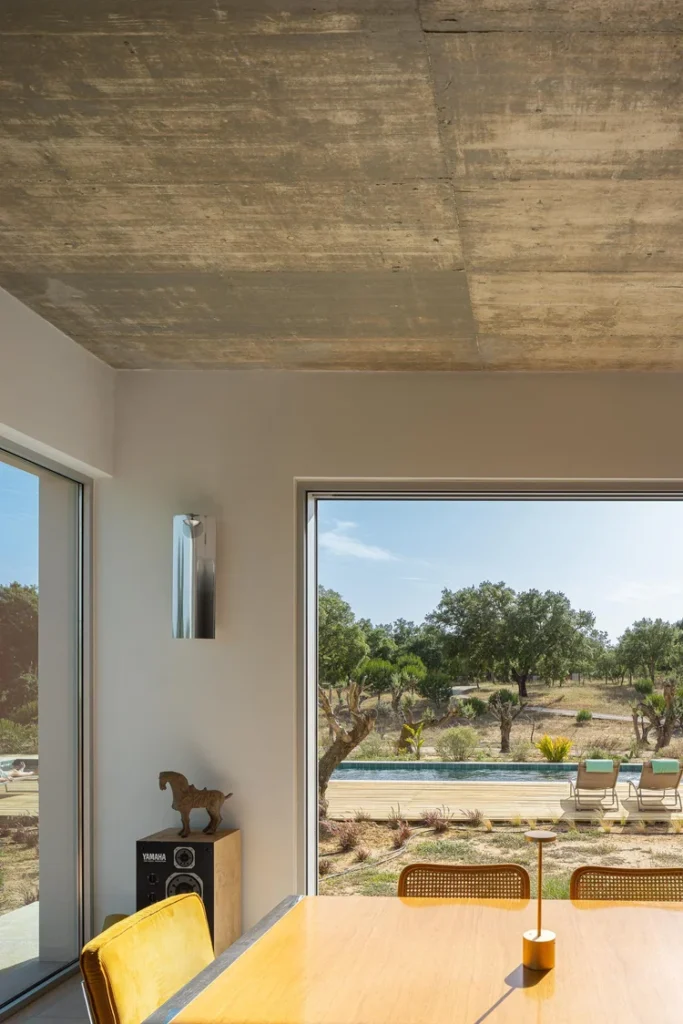
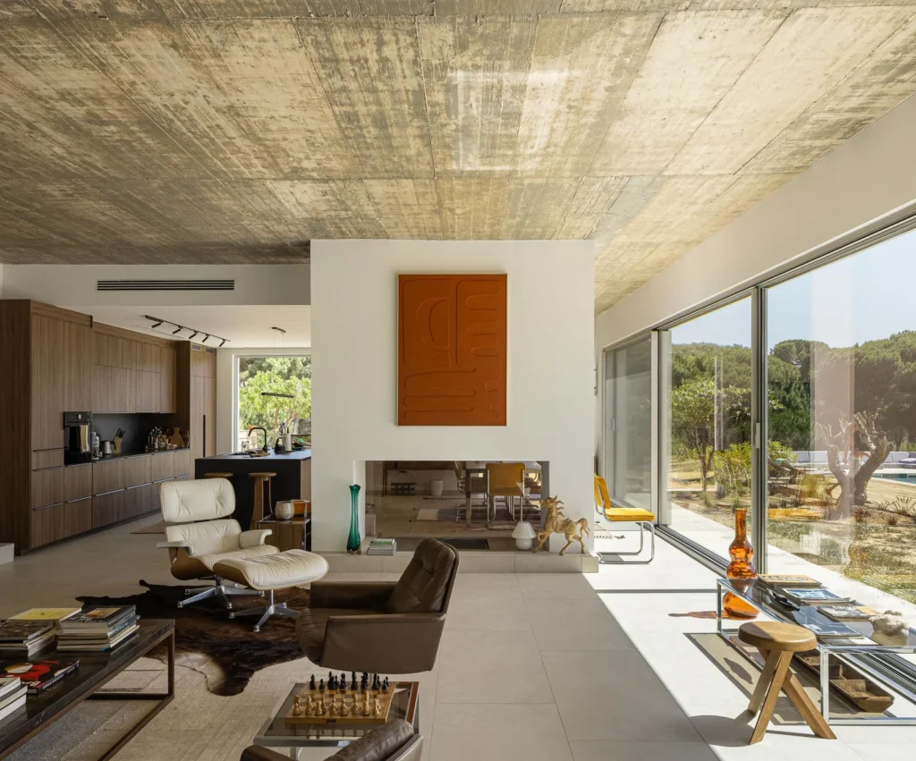
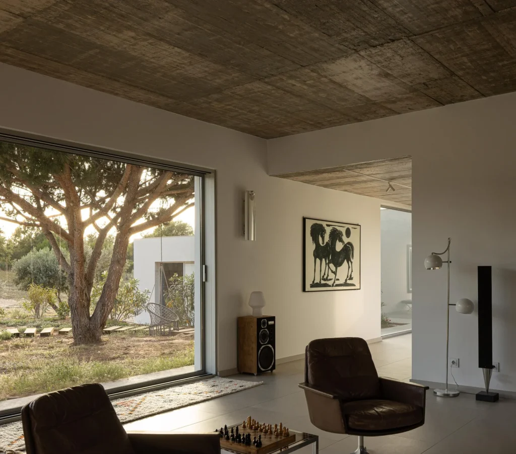
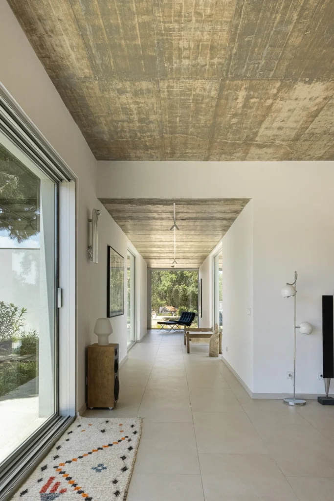
Wide glazed sections run along much of the house’s length, positioning the surrounding pine and cork oak trees as a constant, deliberate part of each interior view rather than something glimpsed occasionally. The connection to older Alentejo building methods, thick perimeter walls, muted earthy colouring, and deep roof overhangs for shade shows up here in updated form, still functioning as climate protection rather than serving as a purely visual reference. Ceilings finished with a rough concrete texture and floors laid in Margres stone both respond to daylight differently depending on the hour, giving interior surfaces a changing quality across a single day.

Casa M Ariane arquitetura Miguel Sabrab e fotografia Ivo Tavares

The interior design carries the same restraint. Custom-built timber cabinetry sits alongside a black stone kitchen island, with fixtures from Gessi throughout, together keeping the spaces understated without tipping into bareness or unfinishedness. Artemide light fixtures add warmth to the dining and living spaces once the sun goes down. Furniture selections, a mix of pieces made by Sabrab and modern classics from Vitra, including Eames and Barcelona chairs, were chosen with long-term use in mind rather than short-term trends. Colour stays deliberately muted across every room, leaving the view of surrounding trees to supply most of the visual variation instead of the furnishings themselves.

Casa M Ariane arquitetura Miguel Sabrab e fotografia Ivo Tavares

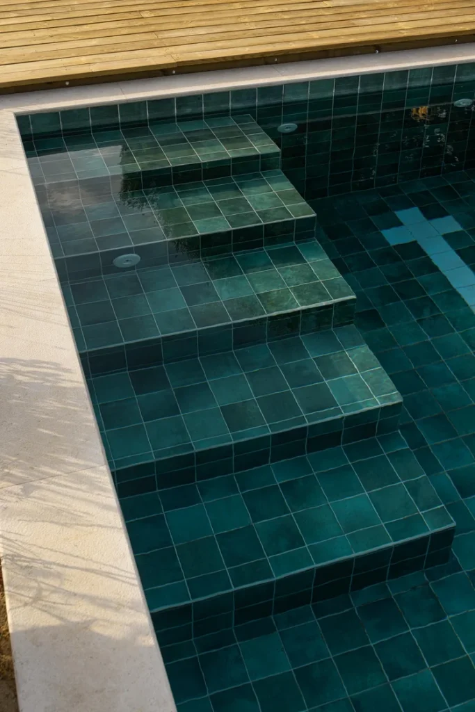
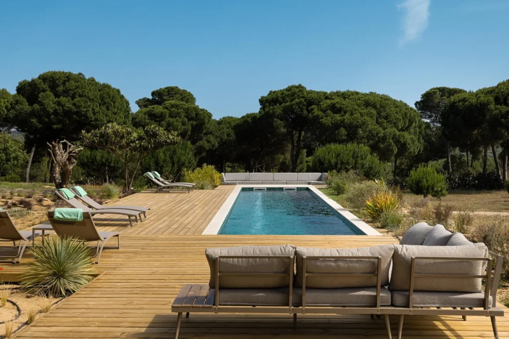
Outdoors, a pool is set into a timber deck at one edge of the property, stretching the usable living area beyond the house’s walls and softening the boundary between built structure and forest. Fixed seating runs along the deck’s edge, supplemented by freestanding loungers, giving the exterior areas the same level of planning applied to the rooms inside.

Casa M Ariane arquitetura Miguel Sabrab e fotografia Ivo Tavares

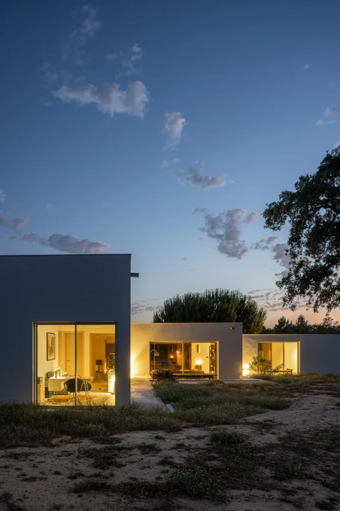
At night, the house takes on a different presence. Each low volume stays lit from within, visible individually against the surrounding dark landscape rather than reading as one continuous illuminated mass. The result is a house whose scale sits comfortably within its site rather than working to be noticed from it.

Fact File:

Project: Casa em Melides

Typology: Residential

Architecture: Sabrab Architecture

Interior Design: Sabrab Interior Design Atelier

Location: Melides, Grândola, Portugal

Year: 2025

Area: 500 sq. m.

Key materials: Natural lime plaster (Fassa Bortolo), Margres stone flooring, concrete-textured ceilings

Lighting: Artemide

Fixtures and sanitaryware: Gessi

Furniture: Sabrab (sofas, kitchen); Vitra (Eames and Barcelona chairs)

Photography: Ivo Tavares Studio

July 18, 2026 0 comments
0 FacebookTwitterPinterestEmail
Residential

Maison Terra, Dubai, UAE, by D’Ora Tokai Designs

by DDI Edit Team July 18, 2026
written by DDI Edit Team

Maison Terra started with a decision that shaped everything after it: no television in the rooms where the family actually gathers. In this four-bedroom villa in Tilal Al Ghaf, D’Ora Tokai Designs kept the main living areas screen-free, leaving space for conversation, reading, and the kind of unplanned interaction a glowing screen tends to interrupt. A separate family room absorbs the television instead, freeing the rest of the home to run on different terms, more open, more present, and without a single fixed point pulling everyone’s attention.

That same instinct carried through the rest of the project. The brief began with two targeted extensions, expanding the living areas and adding a pair of home offices that account for how much work has folded into daily domestic life. Rather than treating these additions as afterthoughts, the design team built them into the home’s existing logic, so the offices read as considered rooms rather than spaces added out of necessity.

Maison Terra curved column living dining D'Ora Tokai Designs

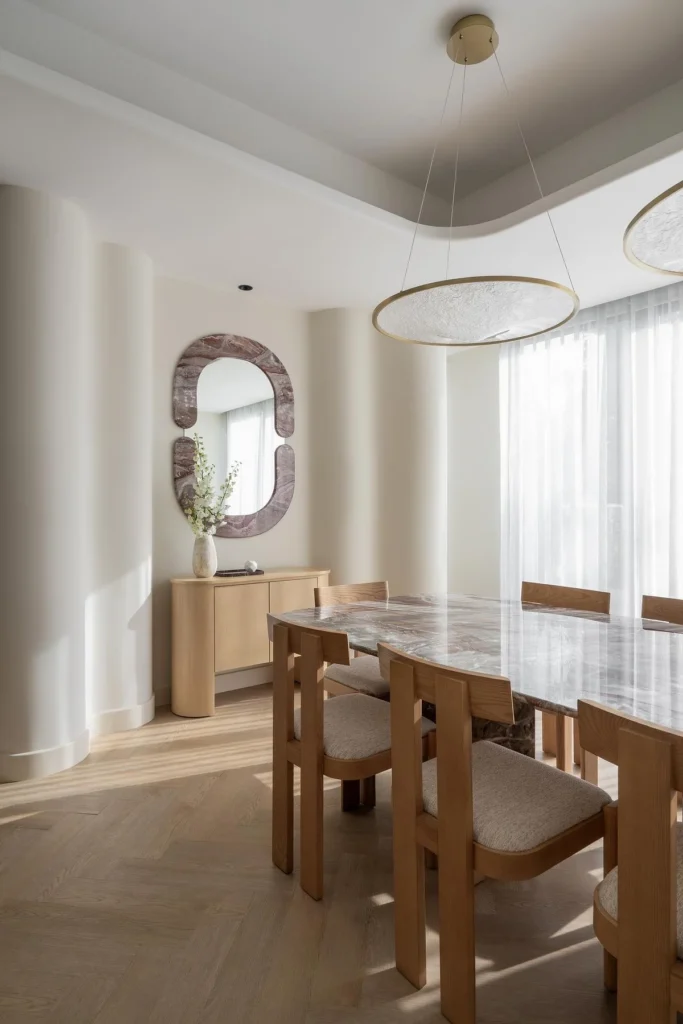
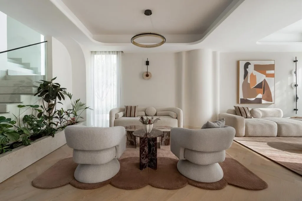
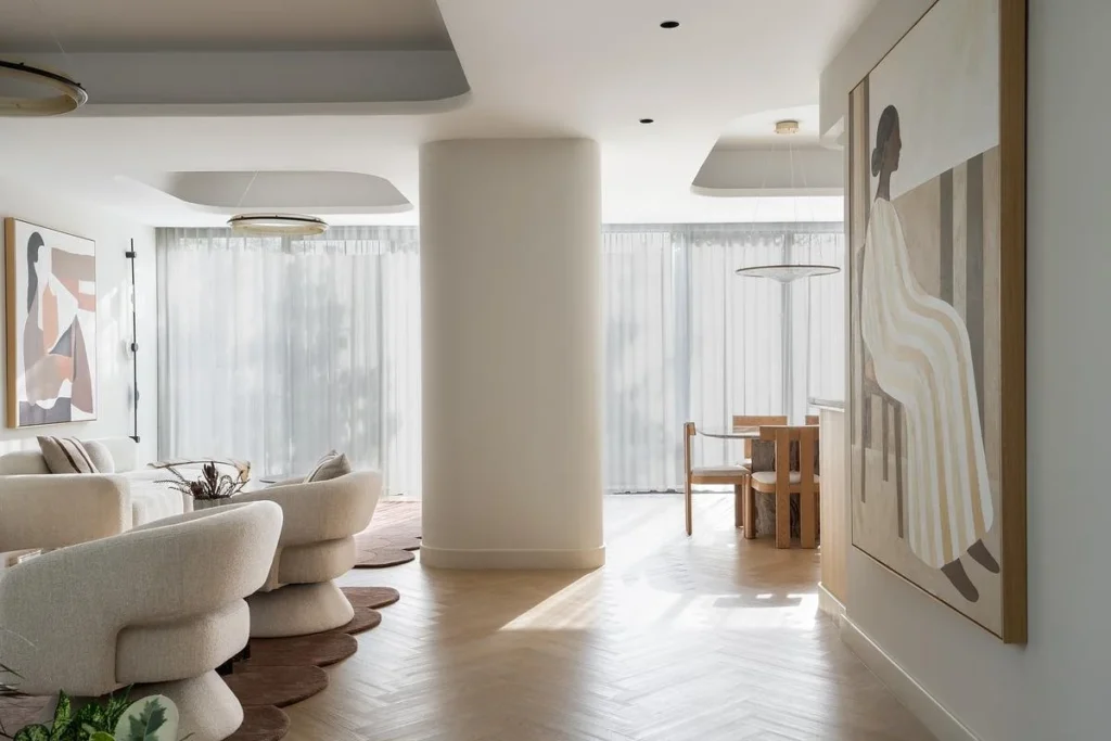
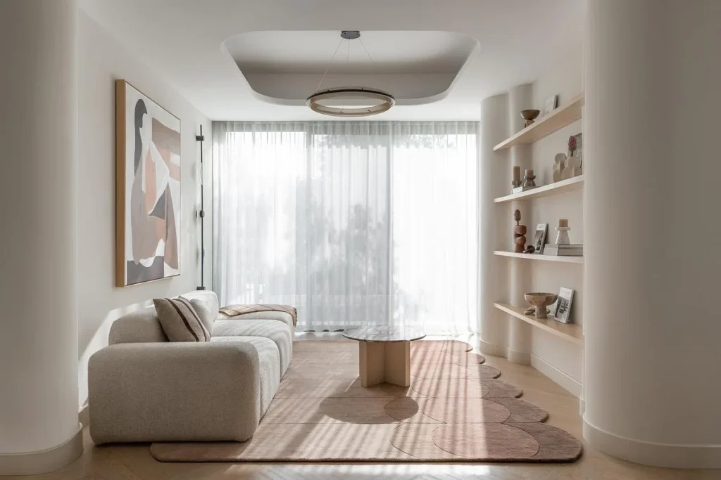
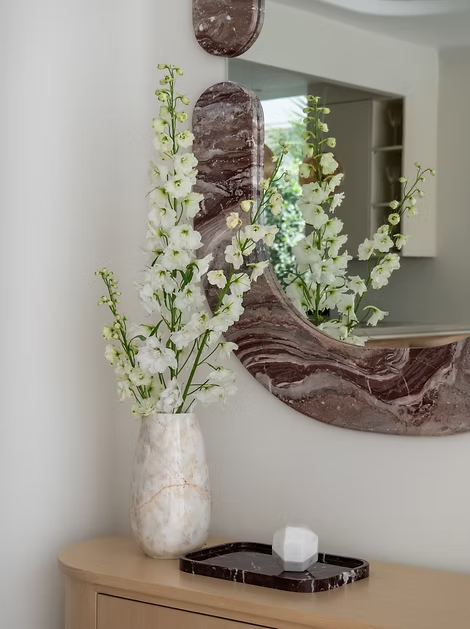
The house’s most defining feature actually grew out of a limitation. A structural column near the ground floor couldn’t be removed, so instead of working around it, the designers reworked it into a curved architectural element that now separates the living and dining areas. That curve became something of a recurring signature, echoed afterwards in ceilings, joinery, mirrors, and freestanding furniture throughout the villa. A rounded mirror with a stone frame repeats the same soft geometry near the entry, and the curved column reappears in plaster form elsewhere on the ground floor, its rounded profile catching light differently as the day moves. What started as a structural constraint ended up setting the tone for a house built around precise but never hard-edged geometry.

Maison Terra curved column living dining D'Ora Tokai Designs

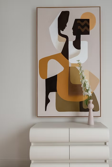
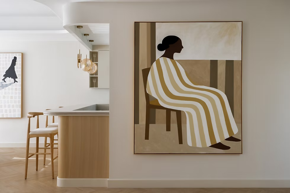
Material choices follow that same restraint. Plastered walls, light oak flooring, and natural stone form a warm, continuous base across the home, layered with muted blush, terracotta, plum, mustard, and softened yellow tones. In the living room, that palette shows up in bouclé seating and abstract figurative artwork worked in ochre and rust, while the dining room pairs a stone-topped table with a rounded, arched mirror in the same warm marble tones. Nowhere does one colour take over the room; the effect comes from layering rather than any single bold statement.

Maison Terra curved column living dining D'Ora Tokai Designs

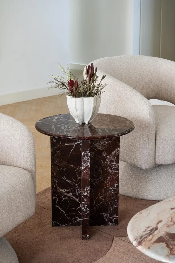
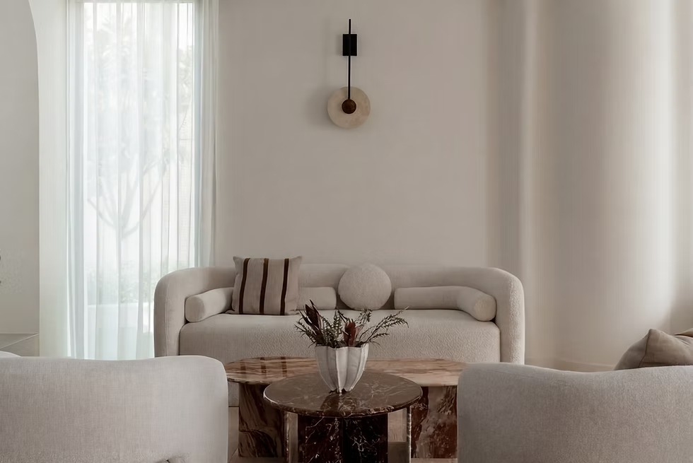
Bespoke furnishings, developed with DOT Objects, hold the rooms together with a consistency closer to architecture than styling. A round-topped marble side table with a fluted stone base sits in the main living room, its dark veining picking up the same tones used in the entry mirror and dining table elsewhere in the home. The dining table itself, a swirling stone slab set on a similarly veined base, was designed specifically for this project, as was the arched mirror and much of the integrated shelving throughout the ground floor. A behind-the-scenes preparation kitchen keeps the main kitchen visually calm, letting it function as a space for hosting rather than one built purely for cooking.

Maison Terra curved column living dining D'Ora Tokai Designs

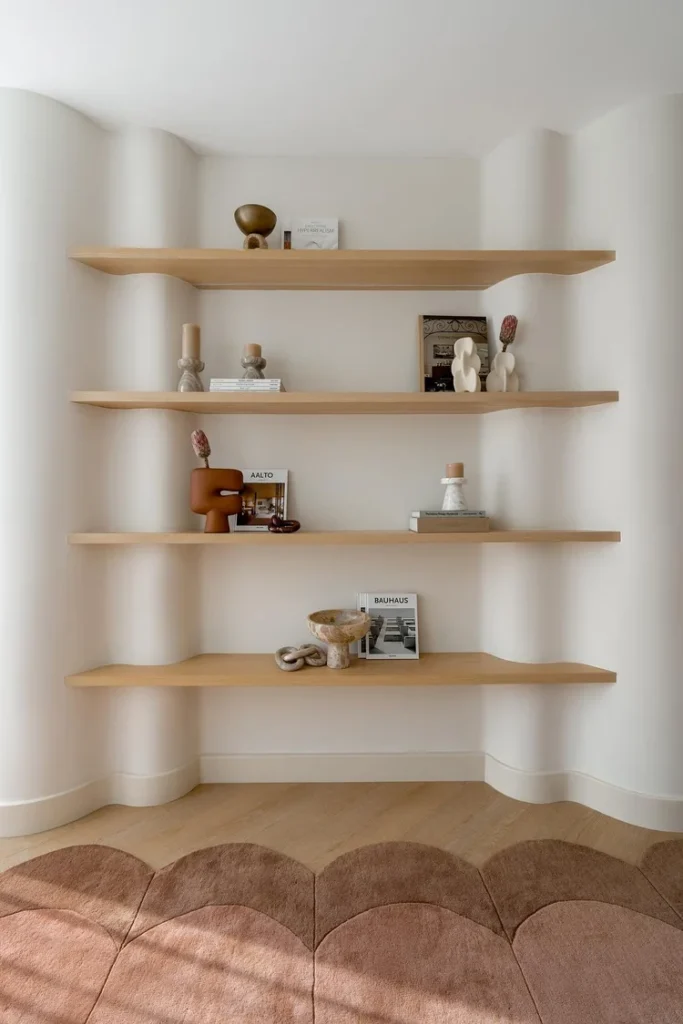
The ground floor separates into distinct zones without walls doing all the work. One area gathers around conversation and low, curved seating; another sits apart for quieter reading and retreat, tucked behind a run of open wood shelving lined with small ceramic objects and books. This layering of function lets the home shift naturally across a single day, from morning coffee to evening hosting, without anyone needing to physically leave the room they’re already in.

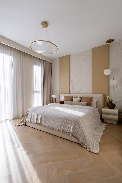
Upstairs, bedrooms carry the same material restraint into a quieter register. In the primary bedroom, a textured plaster panel rises behind the bed, framed on either side by vertical strips of light oak, with a pair of round pendant lights hanging beside it on brass rods. The effect softens what could otherwise read as a stark headboard wall into something closer to a piece of applied craft.

Vastu principles informed the planning throughout, guiding not just aesthetics but the underlying spatial alignment of the home. D’Ora Tokai Designs describes Maison Terra as an extension of its broader approach to restorative residential design, building homes meant to support how people actually live day to day rather than simply how a house is meant to look.

Fact File:

Project: Maison Terra

Typology: Residential

Interior Design: D’Ora Tokai Designs

Location: Tilal Al Ghaf, Dubai, UAE

Bespoke furniture: DOT Objects

Key materials: Plaster, light oak, natural stone, marble

July 18, 2026 0 comments
0 FacebookTwitterPinterestEmail
Residential

Lisichkin Les House, Moscow Oblast, Russia by Le Atelier Architectural Bureau

by DDI Edit Team July 18, 2026
written by DDI Edit Team

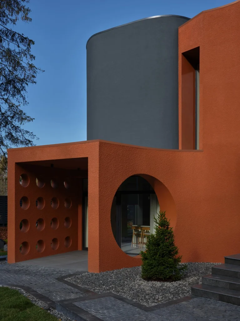
Le Atelier Architectural Bureau has completed Lisichkin Les House in a cottage estate outside Moscow, emphasising terracotta and charcoal as primary design materials rather than secondary accents. The facade folds into two interlocking volumes, one curved and dark and one angular and rust-toned, punctured by a grid of circular openings and a single oversized porthole window that frames the entrance. The result reads as a fairly direct argument, made without much apology, that a house can be sculptural and confident in colour without needing a written concept to justify the choice.

Lisichkin Les House terracotta charcoal facade Le Atelier

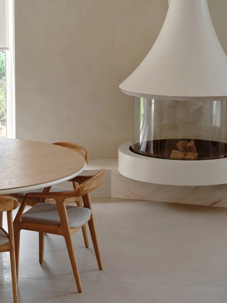
The brief behind the house was practical rather than conceptual. A family with two children needed a floor plan that balanced shared family space with room for retreat while preserving specific sightlines to the surrounding trees and open landscape beyond the property. The ground floor holds the shared parts of daily life: a living room built around a freestanding cylindrical fireplace, an open kitchen and dining area, a light-filled entrance hall, and a sauna suite tucked to one side. Upstairs, the plan splits cleanly into two wings, children’s rooms on one side and a master suite and private study on the other, giving each part of the family its own separated zone without needing a larger footprint to do it.

Lisichkin Les House terracotta charcoal facade Le Atelier

Inside, the material palette shifts noticeably from the exterior’s boldness into warm off-white plaster, stone, timber, and soft textiles, a quieter register but not a disconnected one. The same confidence that defines the facade still surfaces at specific points throughout the interior. A circular soaking tub sits against terracotta hexagon tile in one bathroom, echoing the curved forms used outside. Elsewhere, a veined marble backsplash reads almost like a landscape rendered in miniature, its natural patterning doing more visual work than a flat material would. Upstairs, a dressing area features bold yellow cabinetry, bringing the facade’s visual confidence into a private space rather than limiting it to the public areas.

Lisichkin Les House terracotta charcoal facade Le Atelier

Window placement was worked out room by room rather than following one fixed rule across the house. From the living room sofa, the surrounding tree line closes in tightly around the glass, framing a private, enclosed view. From the primary suite upstairs, by contrast, the roofline of a neighbouring cottage sits deliberately within the frame, a view chosen rather than simply left open to whatever happened to be outside. Across the house, the surrounding landscape functions as a material in its own right, considered with the same level of intent as the colour and form used elsewhere in the design.

Lisichkin Les House terracotta charcoal facade Le Atelier

The house doesn’t lean on an explicit concept to justify its more unusual choices: the circular cutouts, the collision between the curved grey volume and the warmer terracotta one, and the sunburst of yellow tucked into a private dressing room. It holds together as built, legible on its own terms without requiring a written explanation to make the pieces cohere.

Fact File:

Project: Lisichkin Les House

Typology: Residential

Architect: Le Atelier Architectural Bureau

Project Team: Sergey Kolchin, Gleb Kulikovsky, Anastasia Volkova

Location: Lisichkin Les cottage estate, Solnechnogorsk district, Moscow Oblast, Russia

Year: 2025

Area: 222 sq. m.

Photography: Maxim Loskutovst in pairing craft techniques with newer materials and production methods.

July 18, 2026 0 comments
0 FacebookTwitterPinterestEmail
Products

Kettal Launches Grosso Sofa by Patricia Urquiola

by DDI Edit Team July 18, 2026
written by DDI Edit Team

Kettal has introduced Grosso, a new sofa by Patricia Urquiola, the latest addition to a design relationship between the two that stretches back to her Maia collection in 2005. Unlike Maia’s reliance on rope and teak and Plumon’s fabric designs, Grosso adopts a sculptural form, crafted as a single, oversized volume that contours to the body.

The surface is built from a patchwork of stitched segments, with each seam contributing to a visible rhythm across the piece rather than being hidden or minimised. Underneath, layers of foam at varying densities give the sofa its structure, letting it compress under weight in different ways depending on where someone sits, then return to its original shape once the pressure is removed. That layered foam system is really what defines Grosso’s feel more than its surface pattern does.

The sofa is scaled closer to a large pouffe than a traditional three-seat sofa, seating up to three people within one continuous form rather than across separate cushions or sections. Its shape allows a small amount of rotation, so a person can shift from a more reclined position to sitting upright without needing to physically move the piece or rearrange cushions.

Grosso is built to work in more than one way. Grosso serves as a daybed for lounging or a compact seat for focused use, and multiple units can create larger modular arrangements within the same design language.

The piece continues a working relationship between Urquiola and Kettal that now spans two decades and includes Maia, Plumon, and a scattering of smaller pieces like the Kettal Cottage, generally built around Urquiola’s stated interest in pairing craft techniques with newer materials and production methods.

July 18, 2026 0 comments
0 FacebookTwitterPinterestEmail
Hospitality

Hidden Spa – Water Hope, Cam Ranh, Vietnam by IDEE Architects

by DDI Edit Team July 18, 2026
written by DDI Edit Team

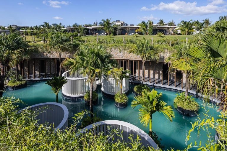
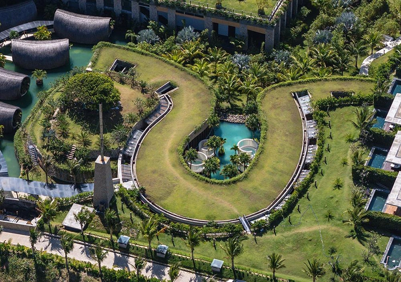
DEE Architects has completed Hidden Spa – Water Hope, a 3,000-square-metre wellness complex set beneath the sand dunes of Bai Dai on Vietnam’s south-central coast. Conceived as landscape architecture rather than a standalone building, the project uses water, shade, and planting to shape a cooler, quieter microclimate within a demanding coastal site. Completed in 2025 for client Amiana Cam Ranh, it was later named the 2026 Architizer A+ Awards Jury Winner in the Hospitality – Spa & Wellness category.

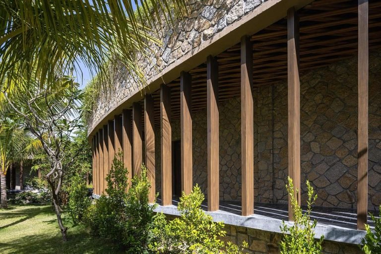
Rather than levelling the dunes to make way for construction, the architects shaped the spa as a continuous curved structure that follows the site’s existing contours. The roof rises and falls with the terrain, forming a planted surface that visitors can walk across while the rooms themselves sit partially concealed below. This keeps the building’s apparent scale low and lets the dune landscape stay the dominant visual presence on site, rather than competing with it.

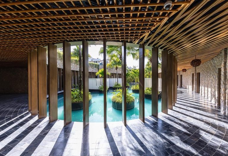
That low-profile approach also shelters the interior and circulation spaces from the coast’s strong winds. Shaded passages, enclosed edges, and gradual shifts in level create a sequence of compressed and open spaces throughout the complex, so visitors discover the architecture gradually through movement instead of encountering a single dominant facade on arrival.

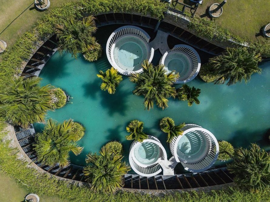
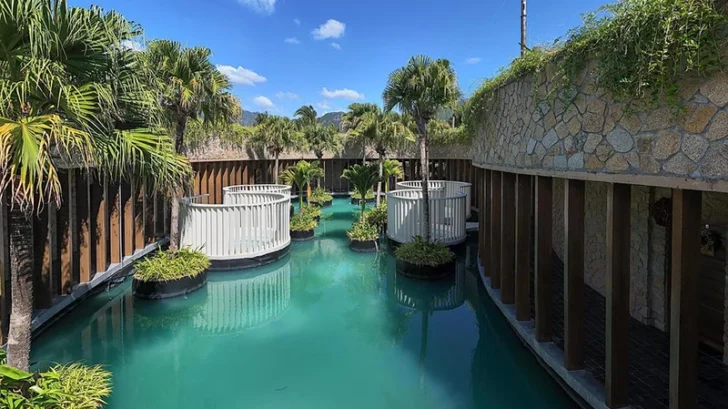
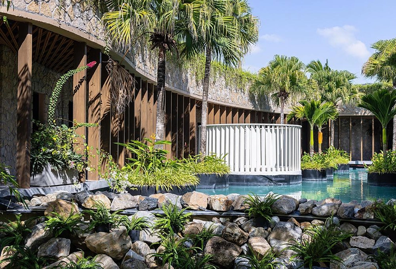
Reflecting pools, planted islands, and sheltered walkways run through a water courtyard that ties the rest of the plan together. Water here does more than decorate the space: its presence tempers the immediate environment, marking a clear shift from the dry dunes outside to the cooler landscape within. Treatment rooms, mud-bath spaces, and circulation routes all connect back to this courtyard, with sightlines kept open to planting and sky throughout. Light bounces off the pools onto stone surfaces, air moves through open corridors, and humidity becomes part of how the space feels rather than something mechanical systems are asked to eliminate entirely.

Hidden Spa Water Hope planted roof dune architecture Vietnam

Local stone, timber, bamboo, and exposed concrete make up the material palette, chosen for their durability on a site exposed to salt air and heat. Thick stone walls add thermal mass, while bamboo-lined ceilings and open corridors support natural ventilation through the complex. Every material choice stays deliberately subdued, leaving shadow, water reflection, and vegetation to carry most of the visual character instead of the architecture itself.

Hidden Spa Water Hope planted roof dune architecture Vietnam

Overhead, the planted roof reduces solar heat gain while visually continuing the surrounding dune terrain, effectively disguising the building’s footprint from a distance. Rainwater collected off the sloped roof gets reused for irrigation, and the design minimised excavation to limit disruption to the original landform, treating these choices as part of the design method itself rather than sustainability features added on afterwards.

Hidden Spa Water Hope planted roof dune architecture Vietnam

One mature tree that stood on the dune before construction began was kept in place, with the building’s layout adjusted around it. The addition of shade, water, and vegetation transformed the previously exposed ground into a lush green area, integrating the project with its pre-existing landscape.

Fact File:

Project: Hidden Spa – Water Hope

Typology: Hospitality (Spa and Wellness)

Architect: IDEE Architects

Location: Bai Dai, Cam Ranh, Khanh Hoa Province, Vietnam

Year: 2025

Area: 3,000 sq. m.

Key materials: Local natural stone, timber, bamboo, exposed concrete, planted roof, water features

Photography: Trieu Chien

July 18, 2026 0 comments
0 FacebookTwitterPinterestEmail
Newer Posts
Older Posts

Recent Posts

  • Florim Introduces SensiVenezia, a Porcelain Stoneware Collection Inspired by Venetian Terrazzo
  • LEGO Botanical Wave Transforms TANK Shanghai with 380,000 Brick-Built Flowers
  • The Great Eastern Home Introduces Its Latest Collection of Italian Vintage Mirrors
  • Smart Homes Are Changing Architecture: What Happens When Technology Becomes Part of the Building?
  • AARQE9’s Nikhaar Dhawan & Bahaar Dhawan Rohatgi Unveil the Sculptural Lunar Drip Table

Recent Comments

  1. Smart Home Architecture: How Technology Is Changing Design on Aqara Smart Lock U500: Three Versions for Gates, Glass Doors and Standard Entrances

Newsletter

  • Home
  • About Us
  • Contact Us
  • Editorial Policy
  • Privacy Policy

© 2026 Design Diary International. All Rights Reserved.

Design Diary International
  • Home
  • Project
    • Residential
    • Hospitality
    • Commercial
    • Public & Cultural
  • Interview
    • Architect
    • Interior Designer
    • Founders & Brand
    • Artist
  • Material
  • Product
  • Feature
  • DDI Finds
    • Emerging Studio
    • Rising Designers
    • New Practices
  • About
  • Magazine
  • Contact Us