• Home
  • Project
    • Residential
    • Hospitality
    • Commercial
    • Public & Cultural
  • Interview
    • Architect
    • Interior Designer
    • Founders & Brand
    • Artist
  • Material
  • Product
  • Feature
  • DDI Finds
    • Emerging Studio
    • Rising Designers
    • New Practices
  • About
  • Magazine
  • Contact Us
Design Diary International
ArtistInterviews

Jae Ko, Maryland: The Artist Who Turned a Roll of Cash Register Tape Into a Career

by Shweta August 26, 2026
written by Shweta

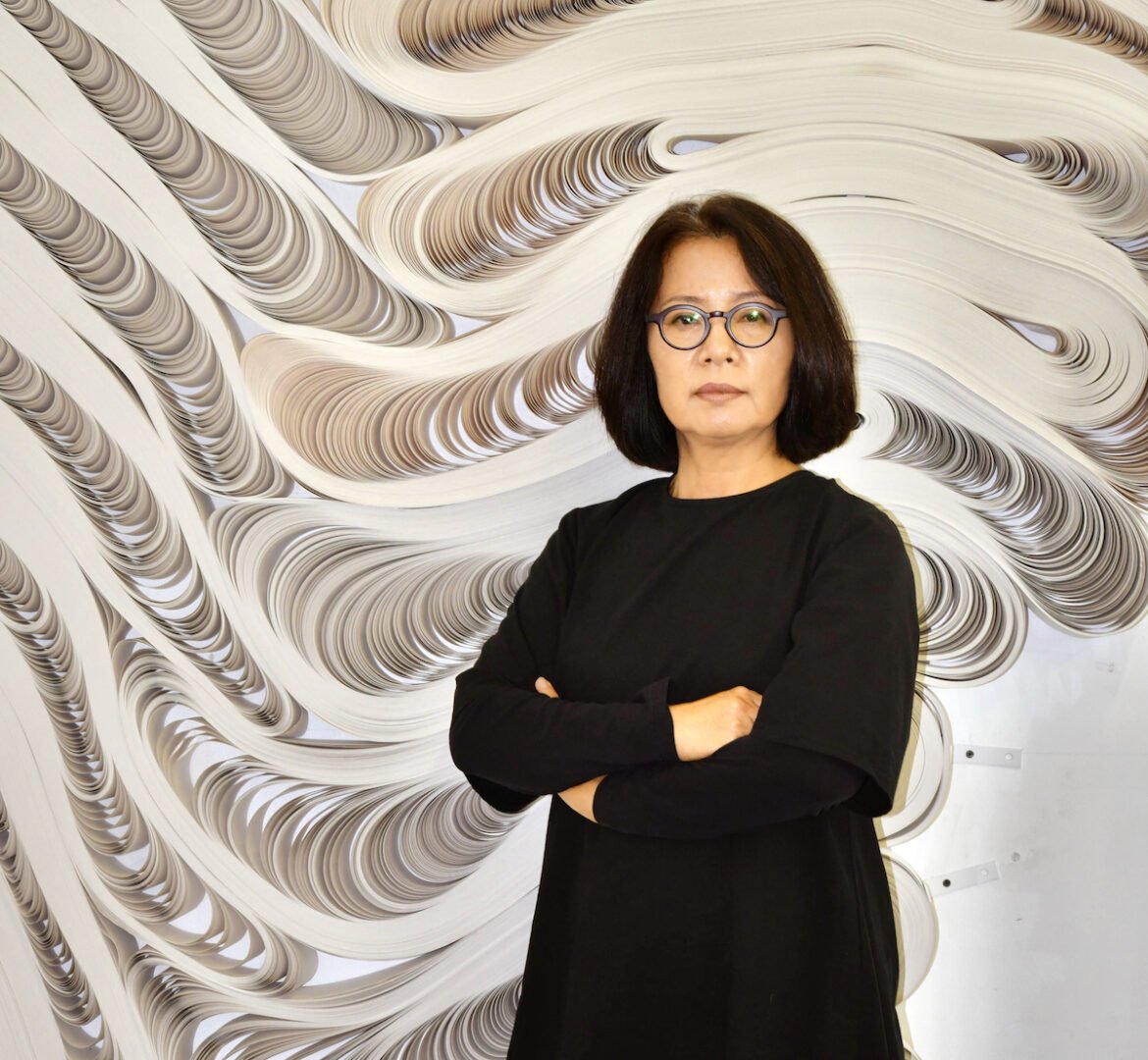
She works alone on an island, feeding rolls of paper onto a wheel the way a potter would work clay, decades of instinct deciding how tight or loose a single roll needs to be before it becomes something else entirely. Shweta of Design Diary International speaks with Jae Ko, ahead of Striated, her debut solo exhibition in Belgium, about the classroom assignment that became a career, the trees and glaciers that reshaped her sense of form, and why she’d rather leave a work unexplained than tell you what to feel.
Jae Ko’s earliest education wasn’t in sculpture at all. She trained at Toyo Art School in Tokyo through the early 1980s, in commercial design, packaging, hand lettering, illustration, book layout, work that paid but rarely asked the questions she actually wanted answered. Four years of that was enough, and she moved to Wako University for a fine art degree instead, chasing something she calls simply more intriguing, more attractive than solving other people’s design problems. Even then, paper hadn’t left her. Through her twenties she built floor-to-ceiling installations from stacked rice paper, twenty by fifty inch sheets, and experimented with heated acrylic plates bent into wave shapes to print on the same material, work that survives now only in old photographs.

Asked when she first knew paper was her material, she resists the idea of a single turning point, describing it instead as something closer to a drift than a decision. “There was no single moment I knew paper was my material,” she explains. “It was a slow transition from a sheet to draw on, to the creation of a form.” That gradual shift found its clearest expression a decade later, in 1996, partway through her MFA at the Maryland Institute College of Art, when a class assignment on circles sent her into a shop for a roll of adding machine tape, ordinary cash register paper, mostly because it was already a perfect circle and cost almost nothing. She slit the roll open with a knife and dropped it into a pool of ink and water, watching how the shape held or failed under that pressure, then started unrolling it by hand and winding it back up looser than before, over and over, learning through repetition exactly how much tension a roll could carry before its character changed completely. She still calls that, plainly, her aha moment.
Those years between finishing at Wako in 1988 and completing her MFA in 1998 weren’t formal training at all, and she’s matter-of-fact about what they taught her instead: less about technique, more about survival.


“I have learned about those things I had to give up and how difficult it is to survive being an artist,” she reflects. Early wall pieces from that period were dyed first with natural pigments, saffron and indigo, before she settled into watercolor. Joseph Beuys comes up as a reference point when she talks about that time, not for the material he used but for what it carried, and she draws a careful distinction between the two: where felt held the weight of Beuys’s own postwar history, rolled paper for her carries something older and more communal, tied to centuries of paper’s place in Korean, Chinese, and Japanese craft. By the early 2000s, flat work had started to feel like a boundary she no longer needed to respect. She wanted to see all the sides of a piece, a hunger for dimension she traces partly to the Bristlecone Pine, a species that survives past four thousand years, bent and twisted by wind into forms that endure the punishment rather than break under it.
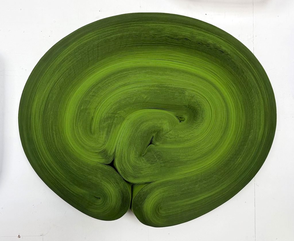
25.5x22x6”


The connection between her two core materials runs deeper than most people notice on first look. Sumi ink comes from burned wood, and paper comes from trees, so the two share an origin before they ever meet on her worktable. Put that observation to her directly, though, and she waves off any suggestion of a deliberate concept behind it. “My core inspirations come from Nature, so it all fits,” is as far as she’ll take the thought, treating the overlap less like a clever idea worth unpacking and more like something that was bound to be true from the start.

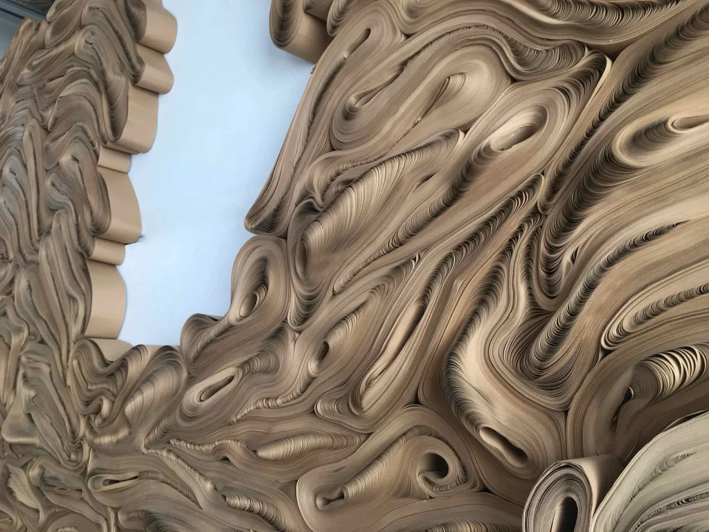
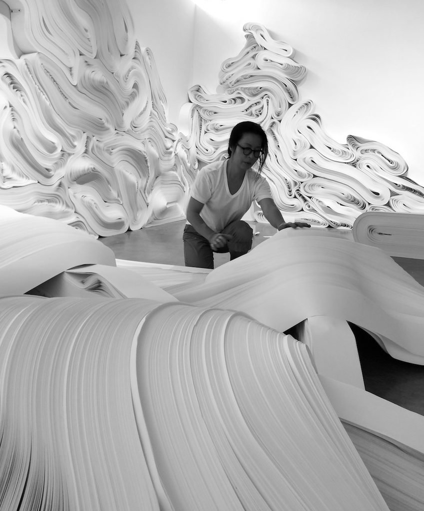
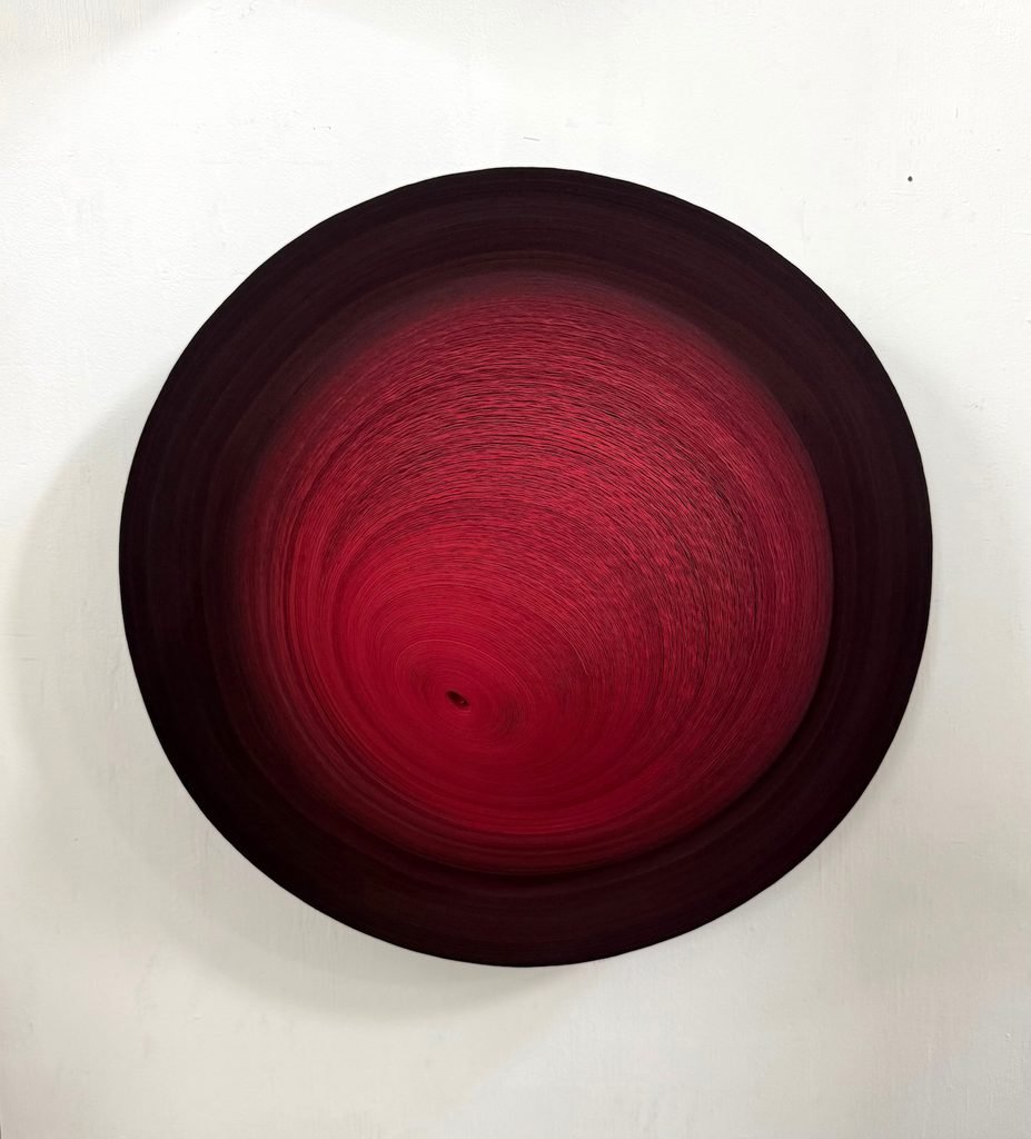
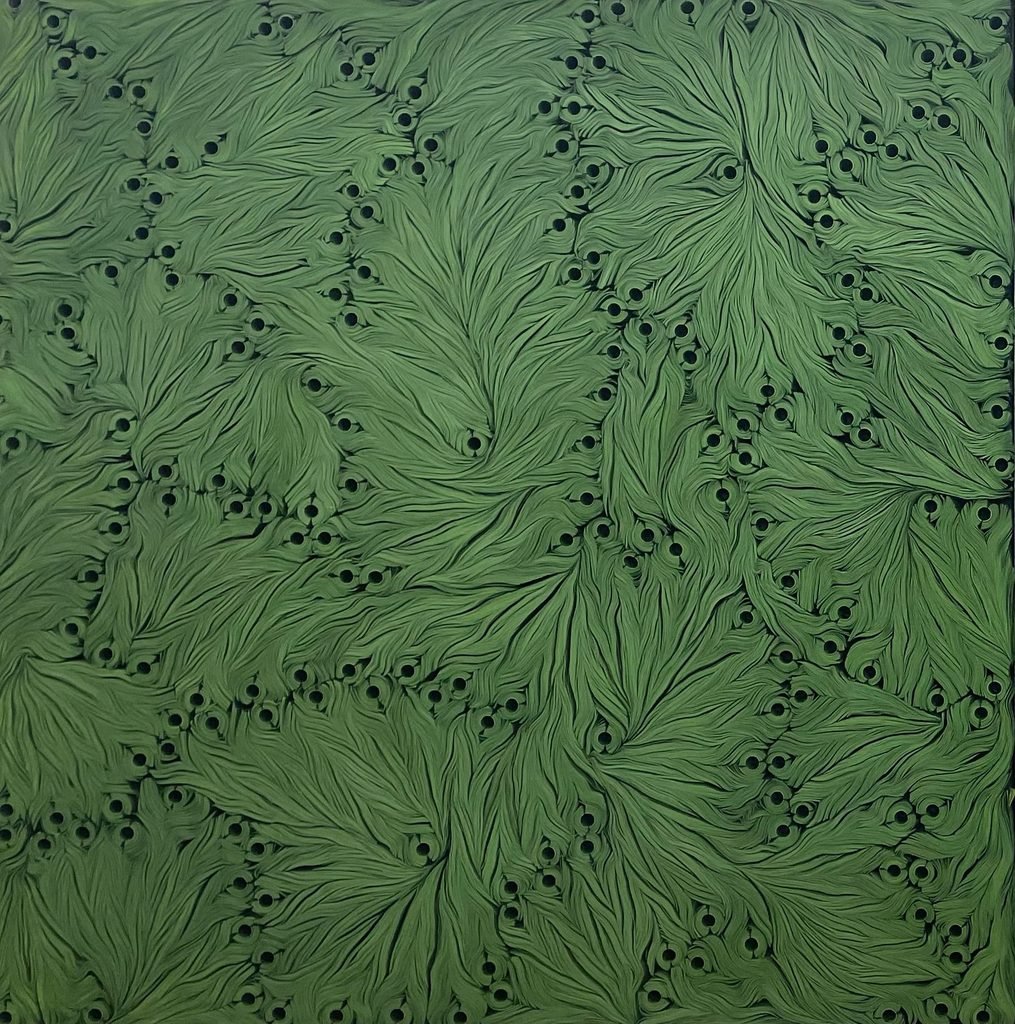
Her studio process today still runs closer to an industrial workshop than a conventional sculpture practice. Tightly bound rolls of tape get fed onto a spindle mounted to what is essentially a pottery wheel, sometimes paired with a second, manually operated turntable running alongside it, and as the wheel spins, the paper reloads itself looser than it started, built up roll after roll until it reaches two or three feet across. From there she bends and twists the mass by hand into shape, soaks it in water carrying sumi ink as colorant, and lets paper’s own tendency to swell under moisture do part of the sculpting, an effect she compares, almost fondly, to the childhood trick of dropping a paper straw into water and watching it curl. Once a shape holds, she seals the back in glue and pulp and leaves it to dry for weeks or months, slowly enough that it stays rigid once mounted, at which point she can turn it over and saturate the surface with further color. Her palette runs conservative by instinct, an ultramarine blue she keeps returning to after years mixing water-based inks shipped over from Korea, or, just as often, the raw white of unaltered paper, chosen because it holds the shadow systems she builds into a piece, the gaps between rolls and folds carrying as much of the work as the paper itself.
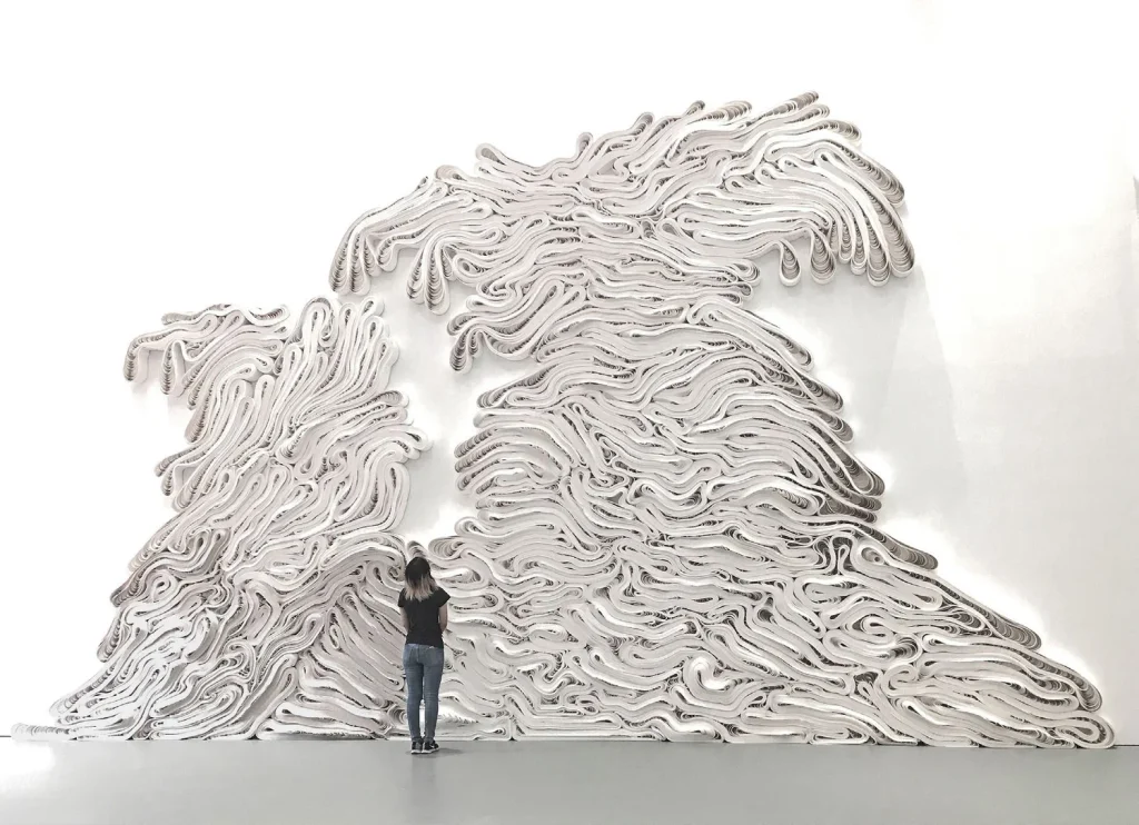
Larger installations are governed by an entirely separate discipline. Ko builds a precise scale model of a space first, then orders paper and controls its looseness to match what the model already told her would work. Force of Nature, her 2011 installation at The Phillips Collection, used hundreds of earth-toned kraft paper rolls that kept settling and shifting under their own weight for the full run of the show, changing the way an actual landscape does, gravity finishing part of the composition after she’d finished her own. The same logic carried into Shiro and Escalante at Grounds For Sculpture in 2015, built from white recycled paper this time, and later into Flow at the Contemporary Arts Museum Houston, where she drew on ice formations near her own home to hold something cold against a Houston summer that runs steamy from June through September. Pressed on exactly when a piece stops being a sculpture and becomes something larger, her answer comes without hesitation: “They only become environments when they leave the wall.”

Her sources have widened well beyond that one landscape over the years, pulling from repeated trips through the canyons and stratified rock of Utah, Colorado, and New Mexico, and later from Newfoundland, Labrador, and Alaska, where glaciers left as deep a mark on her as anything in the American desert had. Asked how three very different cultures, Korean, Japanese, American, quietly shape how she sees form, she frames it as an advantage rather than a tension to resolve. “The things I have learned from one culture I can apply to the next,” she notes. “I can combine the vast American landscape with the more urban Japanese or Korean.” She’s just as careful not to let any of it read as environmental advocacy dressed up as art, positioning herself less as an activist and more as someone presenting landscapes already reinterpreted and enhanced through her own hand.


That instinct toward restraint runs through how she talks about control itself. Asked how much of her process is deliberate and how much is letting the material do what it wants, she doesn’t hesitate: accidents are part of how she works, and a piece that came out exactly as planned would have taught her nothing worth learning. The same philosophy carries into how she thinks about the tensions running through her own practice, caught between East and West, writing and sculpture, the organic and the architectural. Rather than resolve any of it, she’d rather sit inside the friction. “Geological forces and tensions are the point,” is how she puts it, not something to smooth over on the way to a tidier statement. Nor is she plugged into whatever’s trending, online or otherwise. Working alone in a studio on an island, she describes herself as unmoved by popular media culture, digital or otherwise, artificial intelligence included, shaped instead by the ocean outside her window, the glaciers she’s seen firsthand, the stratification she studies in landforms, natural media rather than the manufactured kind.

That reluctance to over-explain carries straight into Striated, opening this October at 22MUSE in Antwerp, her first solo exhibition in Belgium, running from 23 October through 28 November. The title borrows its meaning from geology, thin parallel grooves and layered strata built up over time, and mirrors the slow, accumulated logic of her own process closely enough that it barely needed translating for the show. She won’t predict how visitors will feel walking into the room, pointing out that she’s never worked inside that particular gallery before, and that every space pulls something different out of the same material once she’s standing inside it.
That same unsentimental streak runs through nearly everything she says about the shape of her career so far. Two grants landed at very different moments, the Pollock-Krasner Foundation Grant in 2002 and the Anonymous Was A Woman Award a decade later, and she talks about both without any of the reverence you might expect. One covered her studio bills. The other simply moved things forward. It’s the same practicality she brings to the pieces that leave her altogether, work that now sits permanently in the Hirshhorn or The Phillips Collection. She doesn’t think about them much once they’re gone, she says, mostly because she trusts they’ve landed somewhere they’re meant to be. Even a question aimed at her insecurities gets turned gently aside. Asked what unfinished work keeps her up at night, she brushes the premise off entirely. “Not sure how to answer this question,” she says, “but I sleep well.” And when asked what architects and designers might see in her sculptures that a purely art-world audience wouldn’t, she doesn’t offer a theory to fill the silence. She’s simply interested, she says, in whatever conversation unfolds between herself and whoever happens to be standing in front of the piece.

Ask her to imagine designing a building instead, and she doesn’t pause to consider it. “I don’t build buildings,” she says. “I built sculptures.” It isn’t a rejection so much as a boundary she’s never felt the need to test, the difference between something people move through and something they simply stand in front of. Buildings ask to be lived in. What she makes asks only to be looked at, sat with, returned to, and left to mean whatever it means to whoever’s standing there that day.

It’s a fitting place to leave her, given how the whole conversation started, with a roll of cash register tape bought for a few cents because it happened to already be a perfect circle. Thirty years on, the material hasn’t changed nearly as much as what she’s learned to do with it, unroll it, wet it, twist it, let it dry into something with weight and shadow and its own quiet argument for what paper was always capable of becoming. Striated will be the latest test of that instinct, in a room she’s never stood in, with visitors she can’t predict. She seems entirely at ease not knowing how it lands. That, more than anything else across this conversation, is the real throughline, not the material, not the method, but the willingness to keep handing the work over and trusting it to speak for itself.

More on Jae Ko’s exhibition Striated is available through 22MUSE
August 26, 2026 0 comments
0 FacebookTwitterPinterestEmail
Hospitality

Refuge, New Delhi, India by Studiio Dangg — A Sculptural Resto-Bar

by DDI Edit Team August 26, 2026
written by DDI Edit Team

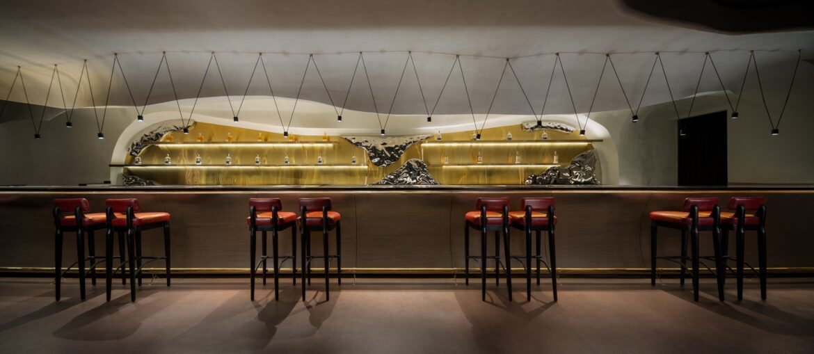
Refuge is a 3,200 sq. ft. resto-bar in Delhi, designed by Studiio Dangg across two levels. The brief asked for a coffee and dining area, a lounge, and a bar to sit together as one continuous interior, built on curved plaster forms rather than straight walls.

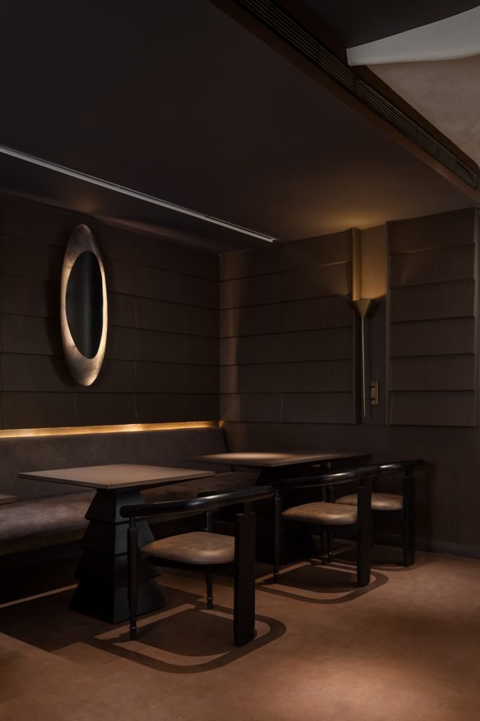
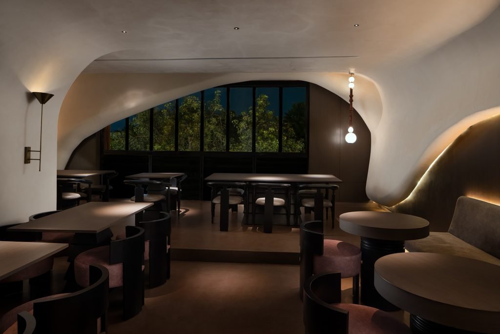
The dining area sits under a curved plaster ceiling that folds down into an archway, framing a floor-to-ceiling black-framed window that looks out onto trees, photographed at dusk against a deep blue sky. Rectangular wood tables are paired with dark bentwood chairs, their rounded seats upholstered in a soft blush tone. A cone-shaped brass wall sconce is mounted on a flat wall to one side. Near the archway, a pendant light made of stacked round glass globes hangs from the ceiling on a slim rod. Round side tables on dark cylindrical bases sit alongside pink upholstered stools. To the right, a curved wall finished in brushed gold is lit from below with a concealed cove light, backed by an olive velvet banquette.

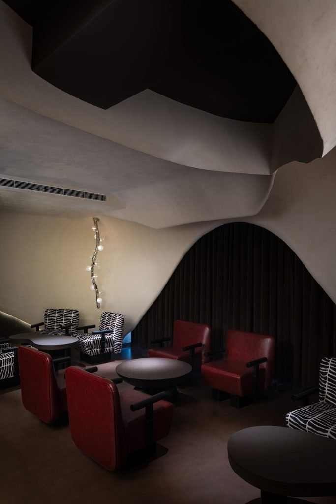
The lounge area sits beneath a curved plaster ceiling that meets a pointed arch, framing a black curtain behind the seating. Seating combines red leather armchairs with black armrests and black-and-white striped fabric armchairs, arranged around round black tables. A sculptural wall-mounted light, shaped like a twisting branch and set with round glass spheres at intervals, runs vertically down the wall.

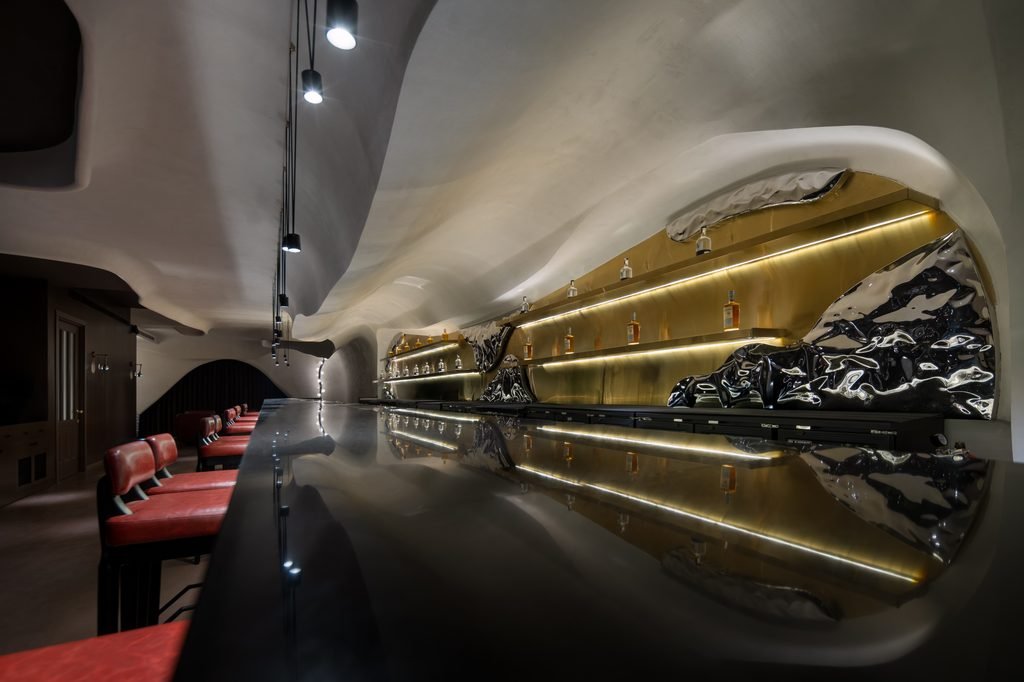
The bar area is anchored by a long counter finished in brass and black. Red leather bar stools with black wooden legs line the counter on both sides. Behind it, tiered brass shelving holds bottles lit with strip lighting built into each shelf edge. Suspended above the counter, black cables strung in a zigzag pattern hold small round pendant lights at intervals, set against the same curved plaster ceiling used elsewhere in the space.

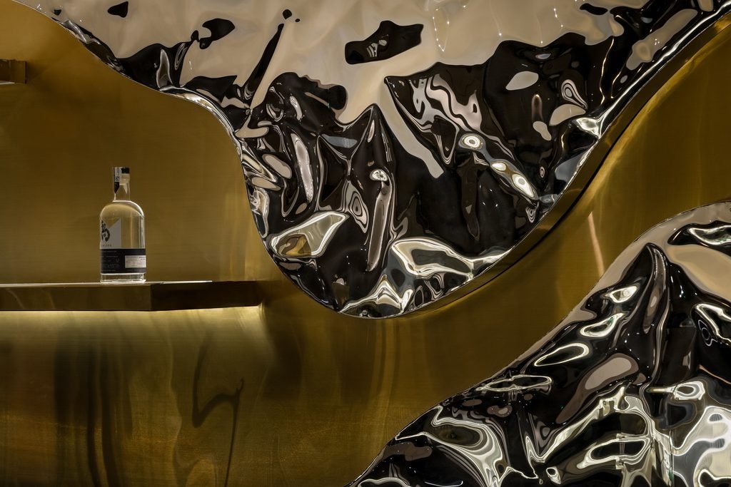
Set into the brass bar backdrop and counter are custom Ramé sculptures by Nitush-Aroosh, made of rippled stainless steel with a mirror finish that reflects the surrounding brass and lighting. One section of the brass counter holds a bottle of Samsara Indian Gin on a raised ledge, positioned beneath one of the steel inserts.

Fact File

Photography: Ekansh Goel
Typology: Hospitality
Design Studio: Studiio Dangg
Principal Designer: Manav Dangg
Location: New Delhi, India
Area: 3,200 sq.ft

August 26, 2026 0 comments
0 FacebookTwitterPinterestEmail
Founders & BrandsInterviews

Marc Meeuwissen of Dear Objects, Belgium: The Designer Who Builds With One Sheet and One Saw

by DDI Edit Team August 24, 2026
written by DDI Edit Team

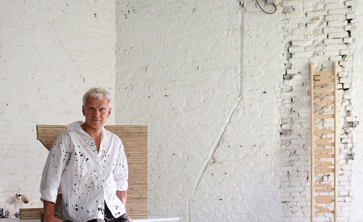
He spent years designing corporate identities, and the physical work that came with them, a bar counter here, a ticket desk there, all built to someone else’s deadline. Eventually he built a second practice with none of those limits attached. What he learned surprised him: total freedom wasn’t the answer. A single rule was. Alisha Maindola speaks with Marc Meeuwissen of Dear Objects, ahead of his continued run of collectible-design showings across Europe, about restriction, imperfection, and a future he’s not sure human intuition survives.


Corporate identity work paid Meeuwissen’s bills for years. It also came with a ceiling. A theatre café needed a counter. A lobby needed a divider. Each brief arrived with a client attached, and a client meant a deadline, and a deadline, he’s since decided, is usually where good work stops rather than where it finishes. “Without a client, you have the opportunity to continue that process until you’ve achieved the best possible result. Only then, in my view, can you reach a level that’s worth investing all your time and energy in.” Dear Objects exists because he wanted to keep going past the point where a brief would normally end.

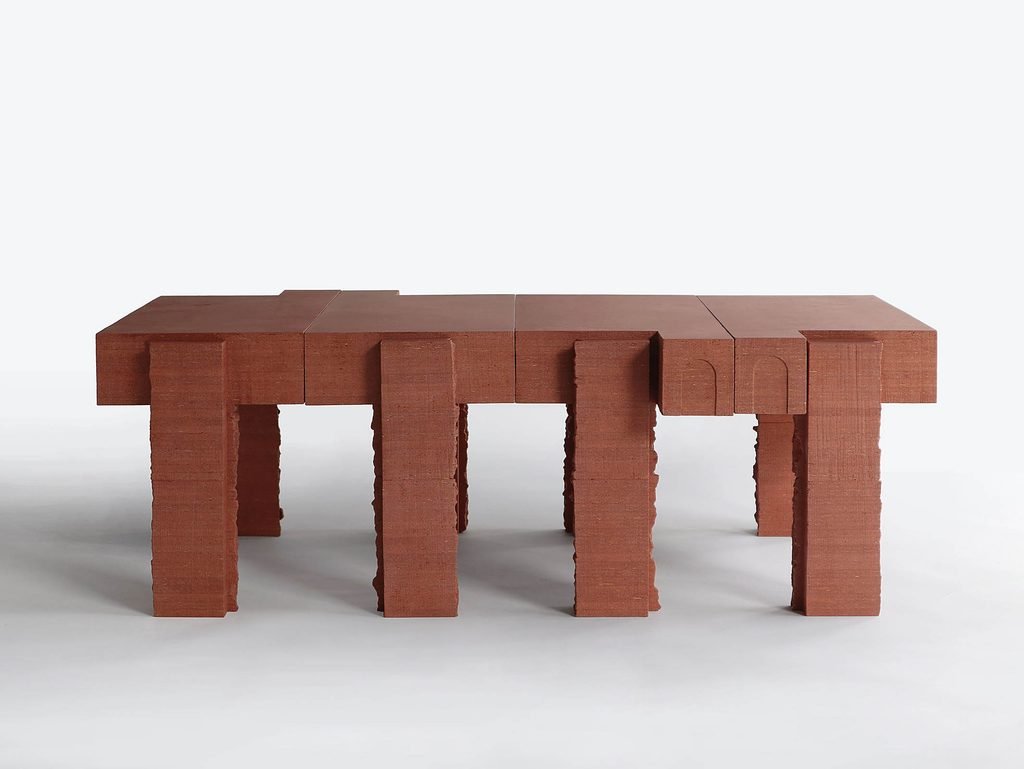
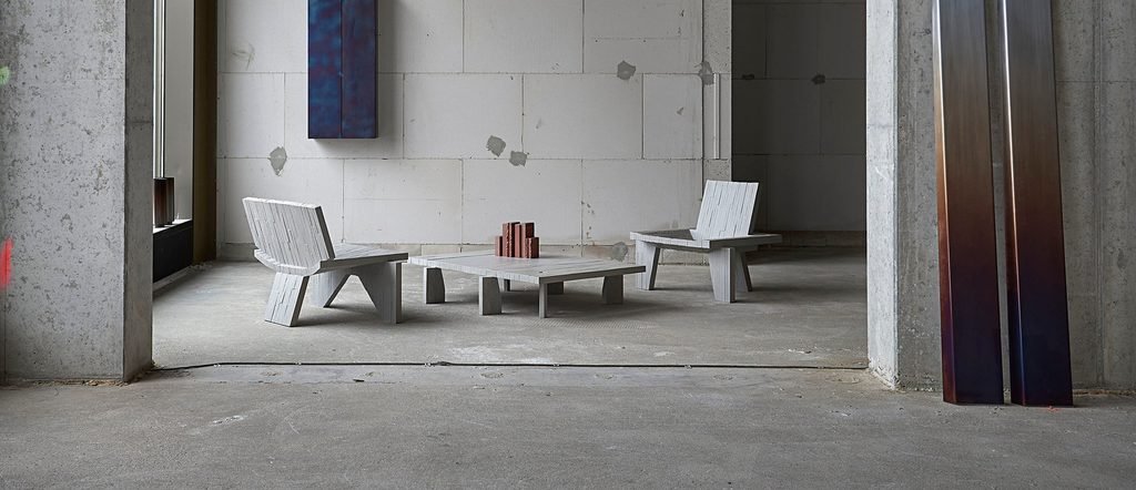
Freedom didn’t arrive as clarity, though. He calls the early period a rudderless adventure, a head full of half-formed ideas with nothing steering them. Should function outweigh form? Make it himself, or have someone else fabricate it? Does the story behind an object matter more than its shape? None of these resolved quickly. What did arrive, gradually, was a method rather than an answer: limit everything down to one material, worked by one tool, by hand. Sawing a single sheet of timber-based board turned out to sharpen his instincts rather than box them in. “The more you realize what is not possible, for example, sawing a circle, the more focused and inventive the design process becomes.” One sheet. One saw. One object. That line became the entire premise behind BRUTALISTA, his best-known series, and close to a founding document for everything Dear Objects has made since.
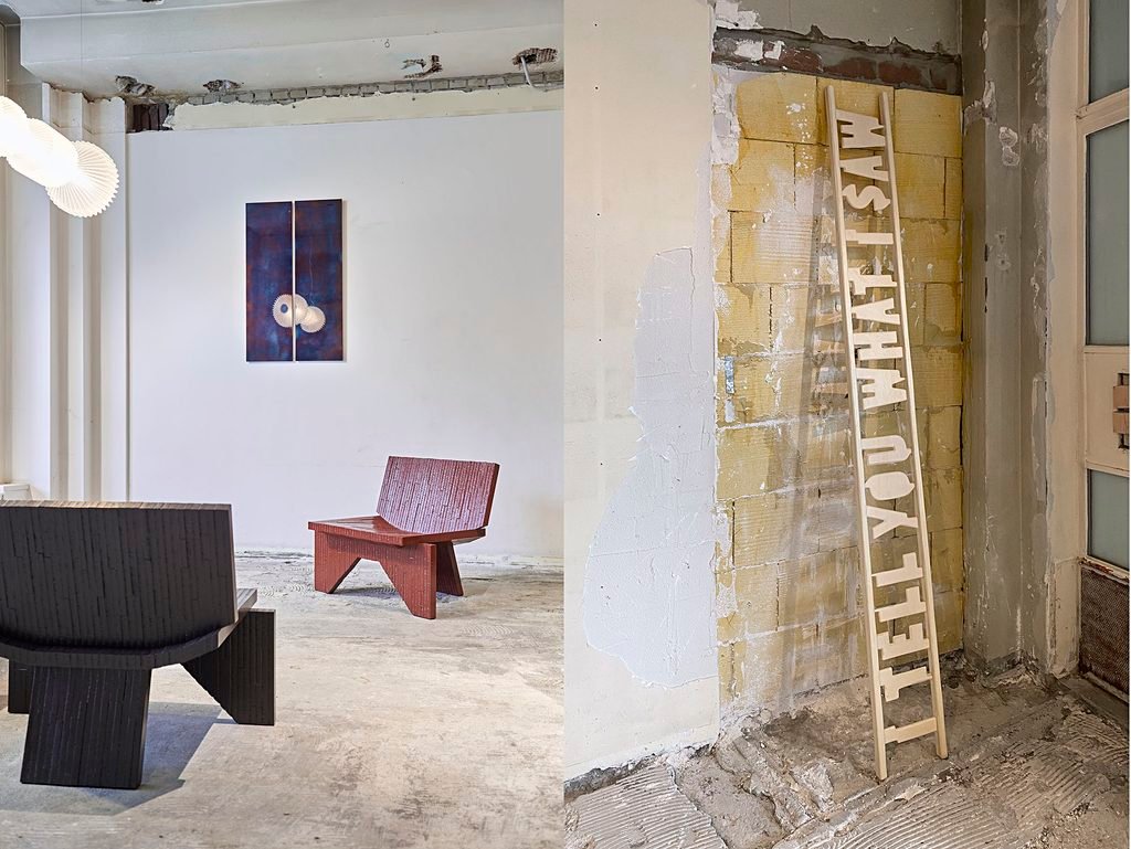
Working almost entirely by hand wasn’t only practical. It was a small act of positioning. His earliest pieces read less like furniture and more like short stories told in wood, objects built around a single memory or observation rather than a functional gap in a room. He named that first series I Tell You What I Saw, a fairly direct admission that after years spent producing polished visuals for other people’s brands, he finally wanted the images to be his own.

Object, sculpture, architecture, Meeuwissen doesn’t bother drawing lines between them. What he’s chasing is a form powerful enough to stand on its own, and that, in his estimation, is the one trait every designer, sculptor and architect he respects actually shares. Technique is a means, never the point. Even the word “object” gets used deliberately, less as a category than as an exit ramp, a way to dodge the flatter, more limiting language of “chair” or “table” and skip the tired debate over whether something counts as art or design. Call it an object, and it gets judged purely on its form.

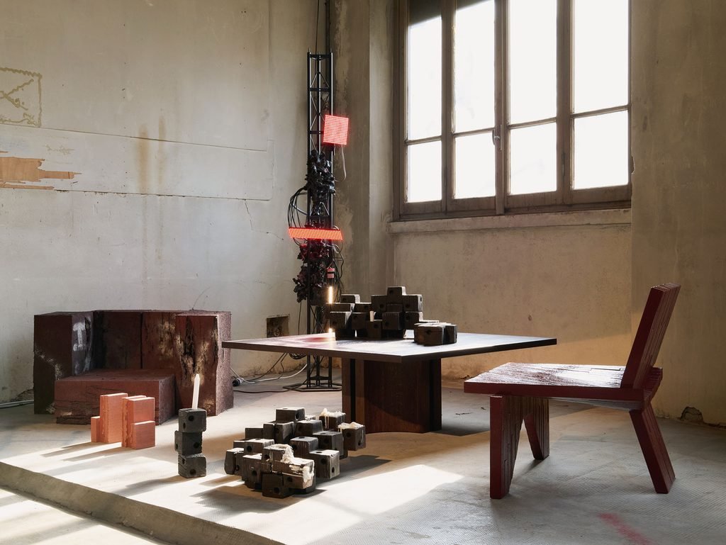
Most designers sketch first. Meeuwissen reaches for a material he doesn’t fully understand yet, often one being pushed to do something it wasn’t built for. That habit produced MAKE AND BREAK, a series built on Viroc, a cement-bonded chipboard that borrows concrete’s strength and wood’s flexibility without behaving quite like either. Nobody, including Meeuwissen, can fully predict how it fractures under pressure. Rather than hide that unpredictability, he built the series around it. Layers get stacked into a single mass, then broken apart by hand, and the resulting fracture line is now the series’ signature, proof that a material can teach a designer something a sketch never could.

FRP


Even inside Dear Objects, direction took time to find. Total freedom, it turns out, guarantees very little. Was storytelling more important than form? Did making the piece himself actually matter, or was conceiving it enough? These weren’t questions he answered at a desk. They answered themselves slowly, through the physical act of making, one broken panel or badly cut sheet at a time.

Ask Meeuwissen why visible process matters so much to him and the answer sounds closer to ethics than aesthetics. He wants no gap between how an object looks and how it was actually built, no hidden step smoothed over for presentation’s sake. That’s what first drew him to Marcel Wanders’ Knotted Chair, and later to Dirk van der Kooij’s Chubby Chair, two objects whose form simply can’t be separated from the specific, visible process behind them. It’s also why he leans into imperfection rather than sanding it away. A hand tool leaves a mark that functions almost like a signature, evidence of one specific person at one specific moment. He preserves that quality even where machinery enters the process. High-speed waterjet cutting, his mechanical stand-in for a handsaw, still leaves an irregular trace on every cut, since speed, angle and material density shift constantly through a single pass. Even the machine, in his hands, leaves fingerprints.

Knowing when a piece is finished, he says, isn’t really knowledge at all. It’s a decision. Either he can live with an object as it stands, or pushing it further would achieve nothing, and whatever comes next belongs to a different piece entirely.
His years in graphic design shaped how he still builds form today, more than most people would guess. He constructs three-dimensional work the way a layout designer builds a page, stacking flat shapes until they resolve into volume, working first through scale models glued together from layered cardboard or wood before scaling up into whatever sheet material he’s committed to. Photographing those models early, he’s found, tends to expose a design’s weak points long before a full-size version exists. A genuinely strong object, in his view, has to hold up from every single angle, not just the one that ends up photographed.
Anish Kapoor comes up when he talks about influence, specifically Leviathan at the Grand Palais. So do Herzog & de Meuron’s Reading Pavilion in Jinhua, the painter Bernard Frize, and video artists Richard Mosse and David Claerbout. Different disciplines, same trait, according to Meeuwissen: each one builds a self-contained universe strong enough to make a viewer lose track of time and place, disorienting and poetic at once. He’s precise about the distinction he wants drawn here. They didn’t shape his worldview. They enriched it, and he clearly considers that a meaningfully different thing.

Brutalism as a philosophy still matters to him, but narrowly, specifically where it intersects with honesty about materials. Eco-Brutalism is where he sees that idea land hardest today, buildings that refuse to hide their environmental cost behind decorative cladding and instead show their raw materials and life cycle plainly. That same instinct governs how he separates desirability from meaning. Form and colour chase trends, collect quick approval, and fade. Meaning asks more of a viewer and tends to last longer, though he won’t call the two opposites, pointing to Rietveld’s Red-Blue Chair as proof a single object can hold both at once. Meaning itself can take several shapes, functional, ecological, narrative, social, and visual appeal plays a legitimate part in all of them. It’s only when visual appeal is the entire story that he’s willing to call something, flatly, art or bad design.

On artificial intelligence, he doesn’t soften his answer. He hopes human intuition keeps distinguishing people from what a machine produces, but he’s genuinely worried it’s already losing that fight, that people are quietly outsourcing their own instincts to a system’s instead. Technology itself hasn’t diminished creative possibility, he’s careful to add, and he isn’t interested in rejecting it outright. What matters is intent. Used deliberately, as a tool rather than a shortcut around judgment, technology still leaves space for one designer to stand apart from everyone else reaching for the identical tool.

Sustainability threads through nearly everything else he says, though he resists collapsing it into a single question. Real effort is going into new materials, biocomposites, earth concrete, recycled plastics, but whether any of it scales to real manufacturing volume remains, in his words, genuinely open. For him, sustainability starts closer to home, with the relationship between a person and an object they own. Something built to age well. Something expensive enough that a buyer thinks twice before an impulse purchase, and repairs it rather than replacing it once it’s theirs. His material choices track that logic exactly. He favors engineered wood sheet materials over solid timber because they simply use less raw wood, plywood especially, and singles out Valchromat, an MDF variant built from residual branches and wood chips bonded with organic resin, as proof that a material’s upfront ecological cost can be offset by a long lifespan and minimal upkeep.

He’s not interested in pretending collectible design floats above the contradictions of a consumer economy just because it makes less of everything. More practicing designers naturally means smaller production runs, almost by arithmetic, and tools like 3D printing now let individual makers work in small batches without a factory behind them at all. But he won’t dodge the obvious tension either: making new objects while genuinely arguing for sustainability will always sit a little uneasily together, a contradiction he thinks applies to nearly everything people make, not design specifically. His own response stays practical rather than philosophical. Waste gets minimized where he can manage it. Offcuts get sourced secondhand. He visits manufacturing plants directly, looking for material they’re already throwing away.

His real worry about the future isn’t a materials question at all. It’s access. Work made by a designer’s own hand costs more than most people can spend, and Meeuwissen doesn’t dodge the implication, that collectible design risks becoming, gradually, something only the wealthy actually get to own. He doesn’t offer an easy fix for that, and doesn’t pretend to have one.

Asked what he’d want the next generation of designers to take from his own approach, he deflects the premise slightly, calling it a little presumptuous to assume anyone should learn something specific from him. If there’s anything worth taking, he offers this instead: commit to one bold idea, strict enough to shape an entire visual language, and let that single rule act as a compass for whatever comes next. One sheet. One saw. One object. It’s the same rule that built his first BRUTALISTA piece, years ago now, and by his own account, he’s never needed a second one.

August 24, 2026 0 comments
0 FacebookTwitterPinterestEmail
Features

Why Some of the World’s Greatest Buildings Were Designed for Darkness, Not Daylight

by DDI Edit Team August 17, 2026
written by DDI Edit Team

In 1933, the Japanese novelist Junichirō Tanizaki wrote an essay defending something most of his contemporaries were busy getting rid of: darkness. Electric light was spreading fast through Japan, and Tanizaki watched it flatten a way of seeing that had taken centuries to build. Gold leaf and lacquerware were never made for a bright bulb. They were made to catch and hold a single flame in a dim room, revealing themselves slowly, a little at a time, rather than all at once under even light. A traditional alcove existed to hold a pool of dimness deliberately, because a culture had learned to treat darkness as a material worth shaping, the same way it shaped wood or plaster or stone.

Take that argument outside Japan and it still holds. Cultures on nearly every continent have used shadow, concealment, and carefully rationed light as intentionally as they’ve used light itself, for privacy, for climate, for reverence, or simply because what mattered most wasn’t meant to be seen by everyone, all at once. Seven buildings below make that case in seven different materials, spanning roughly 3,500 years.


Sana’a’s Tower Houses, Yemen
Pre-Islamic origins, present form largely 16th–19th century
Sana’a’s tower houses rise as high as nine stories, stone below, sun-dried brick above. Above the main window sits a qamariya, a semicircular fanlight originally cut from thin slices of translucent alabaster, later replaced in many houses by coloured glass set into carved gypsum tracery. Below it sits a second window, the mashrabiyyah, and a wooden lattice box that opens for air and closes for privacy, historically doubling as a cooler for food and water and letting women watch the street without being watched from it.
The pairing does two separate jobs. The lower window handles air and view. The upper one handles light alone, filtering harsh desert sun into a warm, coloured gloom rather than letting it in whole.


Le Thoronet Abbey, France
Consecrated 1176, Cistercian Order
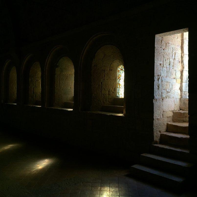
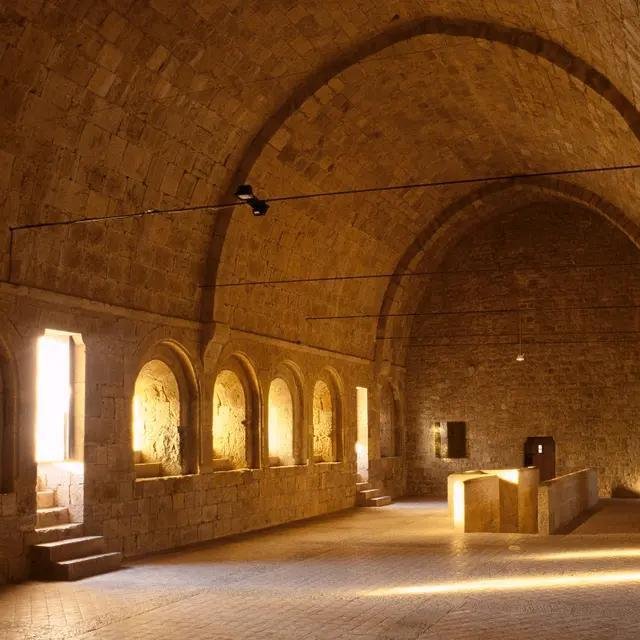
The Cistercian order built its churches on an argument for subtraction, no figurative sculpture, no coloured glass, no ornament beyond what structure required. Le Thoronet, raised in rough-cut local stone with almost nothing decorative anywhere in it, is one of the purest surviving results of that discipline. Its windows are narrow, deeply set, and few, letting light in as thin, angled shafts that shift slowly across the stone through the day instead of flooding the nave at once.
Architects have made something close to a pilgrimage out of visiting it. Le Corbusier studied the abbey in the 1950s and wrote about the relationship it builds between mass, proportion, and light. John Pawson later devoted an entire photographic study to it, drawn to the same quality Tanizaki described in a different tradition entirely: a building whose power depends on the eye slowing down and adjusting, learning to read a nearly dark room rather than being told everything at once.


Royal Tombs of the Valley of the Kings, Egypt
c. 1550–1070 BC, New Kingdom period
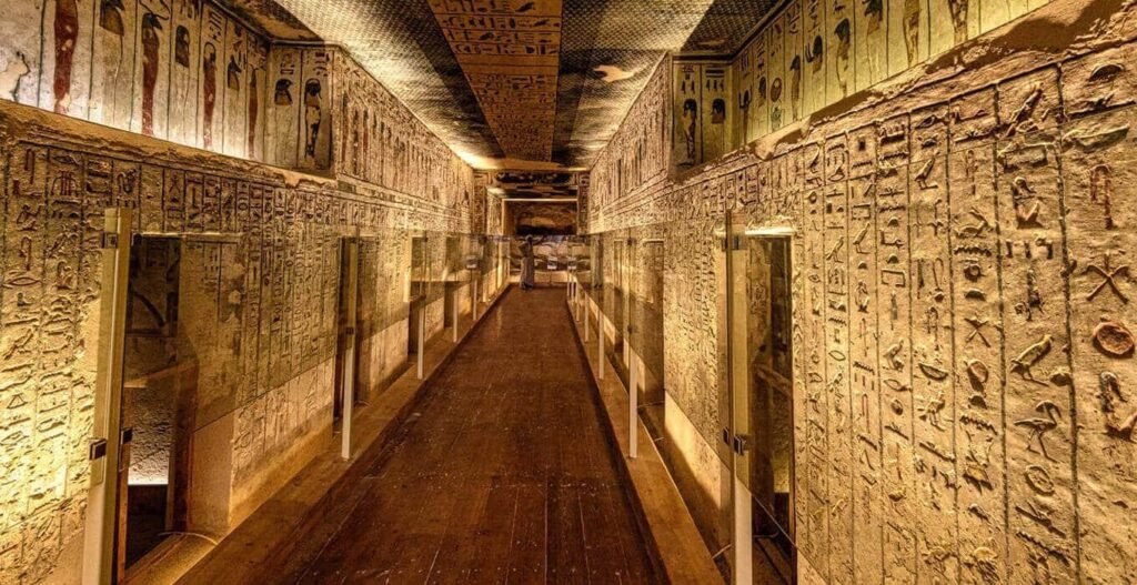
Nothing in this survey uses darkness more literally than the royal tombs cut into the Theban hills. New Kingdom pharaohs were buried in rock-cut corridors, some descending more than a hundred meters, structured as a sequence of halls growing progressively darker and narrower toward the burial chamber. A temple was built to be seen and entered by the living. A tomb was built to be sealed, and its architecture reflects that fully, no windows, no oculus, and no daylight anywhere past the entrance once the tomb closed.

What light existed during construction came from oil lamps, supplemented by workers bouncing sunlight deep into the corridors using polished copper mirrors, then finishing detail by lamplight where the mirrors couldn’t reach. The result is a building organized almost entirely around an absence, since its real intended audience, in Egyptian religious belief, was the dead traveling through darkness toward the afterlife, not a living eye at all.


Bayt Al-Suhaymi, Egypt
Core structure 1648, expanded 1796
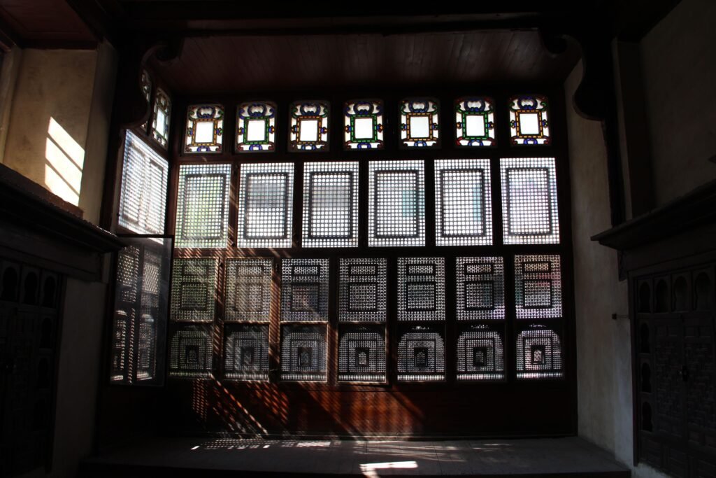
Cairo’s Ottoman-era merchant houses share a device with Sana’a’s tower houses, built from a different material logic entirely: the mashrabiya, turned-wood latticework covering windows and balconies, breaking daylight into hundreds of small, moving fragments across interior floors and walls. Bayt Al-Suhaymi, one of Cairo’s best-preserved examples, uses mashrabiya screens throughout its upper floors, particularly around the qa’a, the main reception hall, where women of the household could watch gatherings below without being seen.
The screens do more than manage privacy. Finely spaced turned wood slows airflow just enough to cool it before it enters a room, a passive climate response common across the hot, dense cities of the Ottoman Mediterranean long before mechanical cooling existed. But the defining effect stays visual: a room lit not by a window but by hundreds of tiny apertures working together, none admitting enough light on its own to flatten the space into full illumination.


Notre-Dame-du-Haut, France
Completed 1955, Le Corbusier
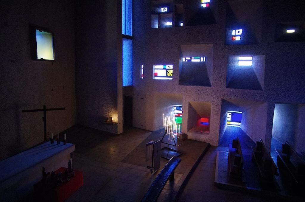
Ronchamp’s south wall runs nearly ten feet thick at its widest point. Le Corbusier spent months designing the irregular scatter of openings punched through it, each splayed at a different angle, some clear, others hand-painted by him in red, yellow, green, and blue. Because the wall runs so deep, none of these function like a conventional window. Light entering has to travel through a long, angled shaft of concrete and coloured glass before it reaches the interior, arriving diffused, tinted, and considerably dimmer than the daylight outside.
Inside, the effect reads closer to candlelight scattered across dark stone than to a lit room, small, irregular points of coloured brightness set against deep shadow. Le Corbusier also left a ten-centimetre gap where the curved roof meets the walls without touching them structurally, a horizontal crack of light he allowed to slip through deliberately. The building’s most famous light exists specifically because the walls around it are thick and dark enough to make a small amount of admitted brightness feel considerable.


Sheikh Lotfollah Mosque, Iran
1603–1619, Shah Abbas I, Safavid Dynasty
Built without a minaret or a courtyard, the Sheikh Lotfollah Mosque served as Shah Abbas I’s private mosque, reached by a corridor bent at an angle to correct its orientation toward Mecca without that adjustment showing from the public square outside. Its single domed prayer hall takes daylight from only one ring of windows set low in the drum, a deliberately narrow source for a room otherwise built almost entirely from glazed tile.
That restriction is the whole point. The dome’s cut-tile mosaic, worked in turquoise, cream, black, and gold, was calibrated so its color shifts through the day depending on how the limited light strikes it, cool and luminous in the morning, warmer by afternoon, in a room whose physical form never changes at all. More windows would have simply lit the tilework evenly and left nothing for the light itself to do.


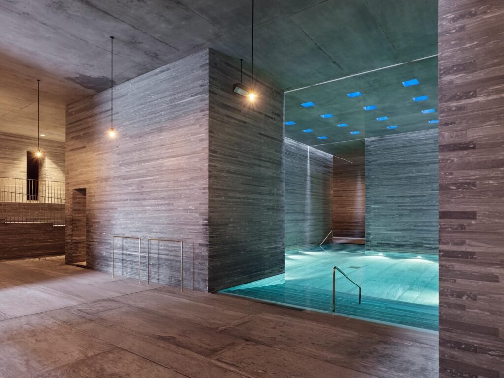
Therme Vals, Switzerland
Opened 1996, Peter Zumthor
Peter Zumthor has called Therme Vals a place of enlightenment that reveres shadow, and the description holds up literally. Built from layered slabs of local Valser quartzite, set partly into the hillside above the region’s only thermal spring, the baths take almost all their light from narrow gaps cut into the stone ceiling, admitting thin, shifting bands into an otherwise dim, cave-like sequence of rooms.

Zumthor has spoken about designing the baths around bathing as a slow, unhurried ritual, and the dim light is central to that pacing, forcing the eyes to adjust and letting touch, sound, and temperature carry more of the experience than sight does. The stone holds warmth the same way it holds shadow, and the two work together, a room dim enough that the body’s other senses take over from the eye. Zumthor won the Pritzker Prize in 2009, and Therme Vals remains the building most often cited as proof of what he calls atmosphere, material and light designed as one decision, not two.

Every ceiling in this survey’s companion piece was built to say something clearly, gold leaf, painted stars, cut tile catching light so a viewer below understood exactly what a civilization believed. These seven buildings argue something quieter, and harder to pull off well: that a room can also speak through what it refuses to fully show, that privacy, reverence, coolness, and mystery are all things architecture can build out of managed dimness rather than its absence. Tanizaki treated shadow as a material a culture had learned to work with on its own terms, not a failure of light. Across five continents and roughly thirty-five centuries, these seven buildings suggest he was describing something much larger than one country’s taste. He was describing a tool architecture has always had, and one most buildings today have simply stopped reaching for.

August 17, 2026 0 comments
0 FacebookTwitterPinterestEmail
Features

Channapatna, Karnataka: The Toy Town Built on a Borrowed Technique

by DDI Edit Team August 17, 2026
written by DDI Edit Team

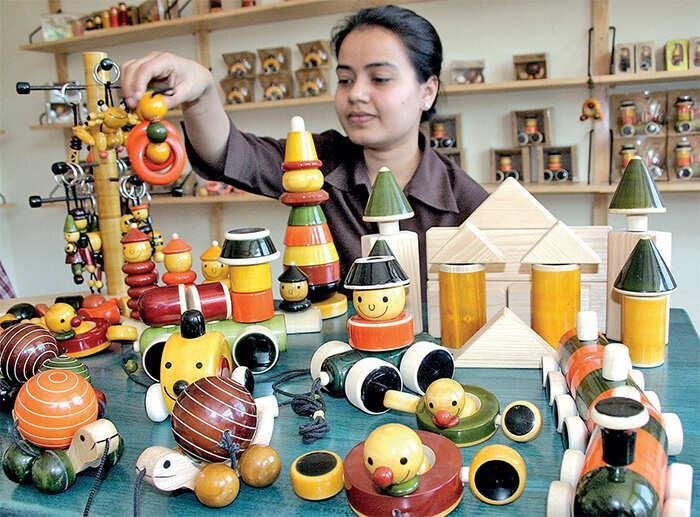
Wooden toys are not a Channapatna invention, or even an Indian one. Turned and lacquered wood has appeared across cultures that developed the tools and techniques to shape it, from Russia and Germany to Japan. What makes Channapatna unusual is not the wooden toy itself, but what happened when a technique associated with another tradition took root in one small town and, over generations, became inseparable from its identity.

Located roughly sixty kilometres from Bengaluru, Channapatna is known locally as Gombegala Ooru, or Toy Town. Its brightly coloured wooden toys have become one of Karnataka’s most recognisable craft traditions. Yet the story of how the technique arrived in the region is less straightforward than the familiar version suggests.

The most repeated account traces the craft to Tipu Sultan, ruler of Mysore from 1782 to 1799. According to the story, Tipu received a lacquered toy from Persia, was intrigued by the technique and invited Persian artisans to train local craftsmen in wood turning and lacquer work.

The connection, however, is difficult to establish with certainty. Some researchers question whether Tipu personally brought Persian artisans to Mysore, or whether his role was instead connected to the expansion and export of a craft that was already being practised locally. Tipu’s interest in overseas trade and in promoting Mysore’s indigenous goods is well documented, but the precise origins of the Channapatna technique remain less certain.

What is clear is that the technique eventually took root in Channapatna and developed a character of its own.

There is another figure in the story who receives considerably less attention.


Syed Bawa Saheb Miyan, known locally as Bawas Miyan, lived in the early twentieth century, more than a century after Tipu Sultan’s death. He travelled to Japan in 1904 and again in 1909 to study lacquer and toy-making techniques. On returning to Channapatna, he established a school to train unemployed local youth in the craft.

Several artisan families in Channapatna credit Bawas Miyan and his son-in-law, Syed Yedulla, with helping transform the craft into a larger production centre. Their influence is arguably more direct and better documented than the Tipu connection, even if it has received less attention.

The history therefore involves more than a single moment of royal patronage. It is also a story of knowledge travelling between places, being adapted by local craftsmen and eventually becoming part of the identity of a particular region.

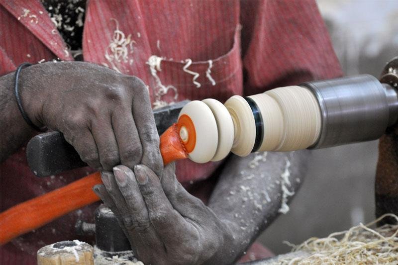
The material itself is closely connected to the area. Craftsmen traditionally work with hale mara, or ivory wood, botanically known as Wrightia tinctoria. The wood is valued for being soft enough to turn easily on a lathe while retaining a fine grain that takes colour well.

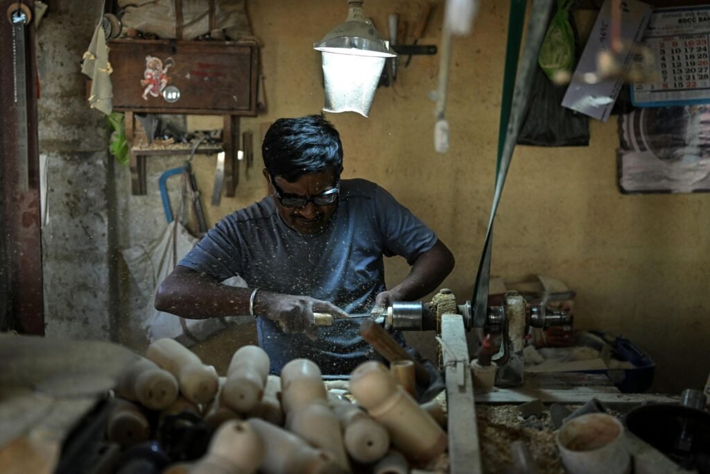
The seasoned wood is shaped on a lathe into the required form, whether a doll, animal, bangle or stacking toy. The colour comes from lac, a resin secreted by the lac insect, historically gathered from trees in the forests around Channapatna. Today, it is largely sourced from other states, including Tamil Nadu.

The lac is heated on a wooden stick until it becomes pliable. It is then blended with colour before being applied to the spinning piece of wood. A final pass with dried palm leaves burnishes the surface and gives the finished object its characteristic sheen.
The process has evolved over time. Some workshops now use motorised equipment alongside traditional foot-powered lathes. The essential relationship between spinning wood, lac and hand skill, however, remains central to the craft.

What makes Channapatna particularly interesting is how completely the technique became part of the place. Whatever its original route into Mysore, it was adapted over generations through local knowledge, materials, tools and ways of working.
A 2021 study estimated roughly 4,000 artisans working in and around Channapatna, across approximately 250 homes and 50 small manufacturing units. The craft includes independent artisans as well as workers in registered toy-making businesses, with women forming a significant part of the workforce.

The tradition has also faced its share of pressures. Mongabay’s 2024 reporting on the region noted a downward trend in traditional lacquerware as younger generations move away from the trade. Craft researchers have called for continued investment in innovation and market visibility to keep the tradition economically viable for the artisans who continue to practise it.
Channapatna toys carry a Geographical Indication tag recognising their regional identity, but that recognition does not by itself resolve the question of how the craft will move into its next generation.


That may be the more important story today. The challenge is not simply to preserve a technique exactly as it was, but to ensure that the people who possess the knowledge can continue to make a living from it.

Channapatna offers an unusual example of how craft traditions evolve. A technique may arrive from elsewhere, but that does not mean its identity remains elsewhere. Over time, materials change, tools change, markets change and new generations reinterpret what they have inherited.

What remains is a craft so closely associated with one place that its origins have become almost secondary to what happened after it arrived.

The story of Channapatna, then, is not simply about where the technique came from. It is about how a community absorbed it, adapted it and eventually made it its own.

August 17, 2026 0 comments
0 FacebookTwitterPinterestEmail
Public & Cultural

Crystal Palace’s Dinosaurs Are Restored, the Building That Housed Them Never Will Be

by DDI Edit Team August 17, 2026
written by DDI Edit Team

A major regeneration of Crystal Palace Park in South London has been completed, restoring the site’s celebrated Victorian dinosaur sculptures nearly a century after the glass building that gave the park its name burned down. The project, led by HTA Design with Maylim as contractor, was delivered jointly by Bromley Council and the Crystal Palace Park Trust.

Crystal Palace itself was built for the Great Exhibition of 1851, commissioned by the Royal Society of Arts to showcase British industrial and design ambition. The structure, designed by Joseph Paxton, won out over 245 competing entries by solving an unusual brief: it had to be the largest enclosed building ever attempted while remaining fully dismountable, leave no trace on its site in Hyde Park, extend without losing symmetry, and cover an enormous footprint without disturbing the park’s elm trees. The building later relocated to South London, where it stood until a fire destroyed it in 1936.

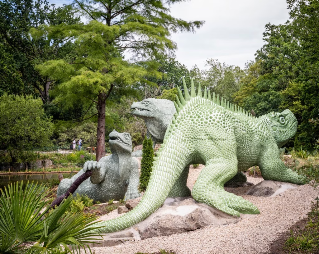
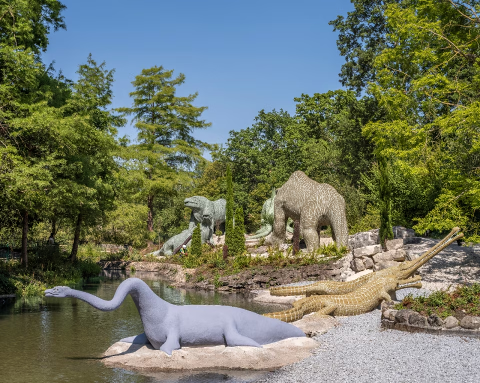
What survived, and what this restoration centers on, is the Geological Court, better known as the Dinosaur Court. Conceived by sculptor Benjamin Waterhouse Hawkins under the scientific direction of paleontologist Sir Richard Owen, the display was built to make geology and palaeontology understandable to a mass Victorian audience, animating the history of life on Earth through full-scale reconstructions rather than diagrams or fossils alone. The sculptures were built between 1852 and 1854 using a combination of brick, iron, clay, and cement, an engineering feat in its own right at the time. They represent fifteen genera of extinct animals in total, though only three of them, Iguanodon, Hylaeosaurus, and Megalosaurus, are true dinosaurs; the rest are marine reptiles and other prehistoric creatures modeled with the same period-accurate curiosity. Unveiled in 1854, they were built using the best scientific understanding available at the time, since substantially revised, and their popularity on debut is credited with sparking the world’s first wave of dinosaur mania. The sculptures were first listed as Grade II in 1973, restored extensively in 2002, and upgraded to Grade I status in 2007, recognizing their significance to both scientific and cultural history despite being, by current knowledge, largely inaccurate.

This latest restoration relied on paint analysis, material testing, and 3D printing to repair the sculptures while preserving as much of their original material as possible, work carried out by heritage specialists SSH Conservation and guided by Historic England. As a result, the sculptures have now been removed from Historic England’s Heritage at Risk Register. The surrounding Geological Court landscape was restored alongside them, with the lake desilted and a new circulation system installed to improve the site’s waterfalls. The project was carried out in collaboration with Donald Insall Associates, Alan Baxter Associates, Sally Strachey Heritage Conservators, and the Friends of the Crystal Palace Dinosaurs.

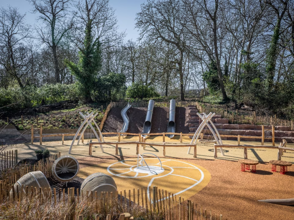
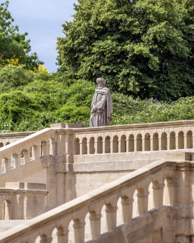
This marks the completion of the first phase of a wider, multi-million-pound regeneration of the park, the largest since the original Crystal Palace burned down. Also completed in this phase: restoration of the Grade II-listed Italian Terraces, a new dinosaur-themed playground, a new visitor center with a permanent exhibition on the park’s 170-year history, restoration of the Grand Centre Walk to its original 96-foot width, and the reinstatement of a bust of Joseph Paxton, relocated to sit at the center of the Italian Terraces. The program was supported by a £5 million grant from the National Lottery Heritage Fund, alongside funding from the sale of neighboring land for housing and contributions from several charitable foundations.


Fact File

Photography: Kilian O’Sullivan; Maylim Ltd

Typology: Public and Cultural, Heritage Restoration (Public and Cultural)

Project: Crystal Palace Park Regeneration (Phase One)

Location: Crystal Palace Park, London, UK

Client: Bromley Council and Crystal Palace Park Trust

Lead Architect: HTA Design

Contractor: Maylim

Heritage Conservation: SSH Conservation (Sally Strachey Heritage Conservators)

Collaborators: Donald Insall Associates, Alan Baxter Associates, Friends of the Crystal Palace Dinosaurs

Heritage Guidance: Historic England

Original Sculptor (1852–54 Dinosaur/Geological Court): Benjamin Waterhouse Hawkins, under the scientific direction of Sir Richard Owen

Original Architect (Crystal Palace, 1851, destroyed by fire 1936): Joseph Paxton

Listing History: Grade II listed 1973, restored 2002, upgraded to Grade I in 2007

Funding: £5 million grant from the National Lottery Heritage Fund, plus proceeds from neighboring land sale and charitable foundation contributions

Status: Phase one completed, 2026

August 17, 2026 0 comments
0 FacebookTwitterPinterestEmail
Products

RR Décor Brings Jim Thompson to Chennai with Decorgeous Lifestyle Launch

by DDI Edit Team August 11, 2026
written by DDI Edit Team

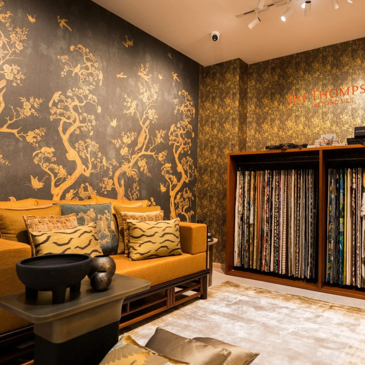
RR Décor, among India’s established luxury textile houses, has launched Jim Thompson, the Asia-wide luxury textile and lifestyle brand, at Decorgeous Lifestyle in Chennai, bringing the label into South India for the first time. The move gives architects, interior designers, and design enthusiasts across the region direct access to Jim Thompson’s fabrics, wallcoverings, home décor and lifestyle collections.

Rohit Khemka, Founder of RR Décor, frames the partnership as a meeting point between two design philosophies built on craftsmanship and lasting quality, pairing RR Décor’s market presence with Jim Thompson’s design legacy to open what he calls a new chapter for luxury interiors in India.

The Chennai launch introduced a selection of Jim Thompson’s 2026 collections. Nirin centers on hand-woven Thai silk, worked in natural colorways with textured finishes. The Citadel by No. 9 Thompson takes its cues from where urban architecture meets nature, carried through printed and embroidered textiles. Oriental Odyssey draws on motifs from Thailand’s Rattanakosin era, reworked across a collection of luxury fabrics and wallcoverings.

With Jim Thompson now part of its offering, Decorgeous Lifestyle positions itself as a growing destination for premium interior design in Chennai, bringing heritage craftsmanship and contemporary textile design together under one roof.

August 11, 2026 0 comments
0 FacebookTwitterPinterestEmail
Products

Lotus Arts de Vivre Turns Cinnamon into Sculptural Collectible Design

by DDI Edit Team August 11, 2026
written by DDI Edit Team

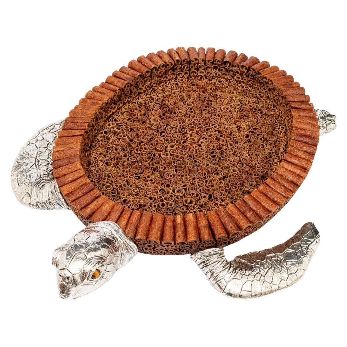
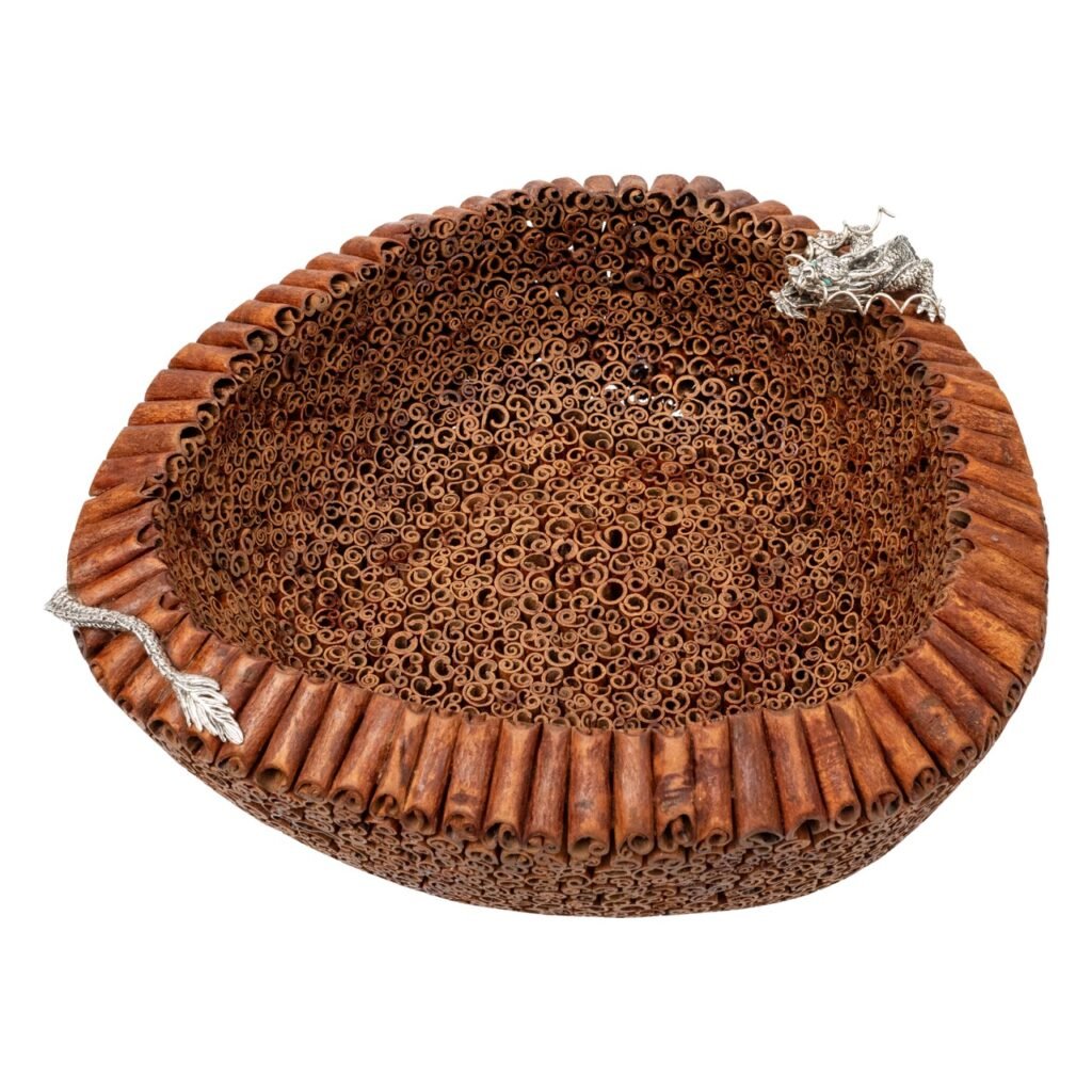
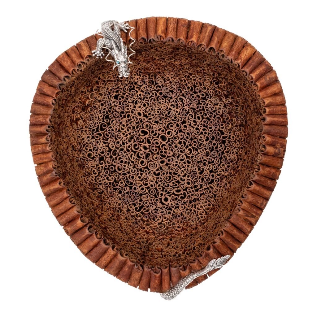
Lotus Arts de Vivre has introduced a new collection built around an unlikely material: cinnamon. Individual cinnamon sticks, placed by hand in the hundreds, are assembled into sculptural bowls and plates, each paired with hand-sculpted sterling silver creatures, sitting somewhere between a functional home object and a collectible art piece. The collection holds three works, the Cinnamon Bowl with Silver Monkeys, the Sea Turtle Cinnamon Plate, and the Cinnamon Bowl with Dragon, each retaining the natural scent of cinnamon as part of its function, doubling as a fragrant bowl for fruit or flowers as much as a display piece.

The Cinnamon Bowl with Silver Monkeys is built from close to 1,000 individual cinnamon sticks, with sterling silver monkeys set along its rim, resting on an ocean-blue hand-blown glass base by Japanese glass artist Seiki Torige. More than four artisans in Bali spent over a month assembling the cinnamon structure alone, followed by another four weeks of work from six designers and silversmiths shaping and positioning the silver figures.

The Cinnamon Bowl with Dragon uses between 400 and 500 cinnamon sticks, wrapped by a sterling silver dragon with turquoise eyes coiled around the vessel. In East Asian tradition, the brand notes, the dragon carries associations with strength, wisdom, prosperity, and protection, regarded as a guardian of fortune and a ruler of the elements.

The Sea Turtle Cinnamon Plate follows the same range of 400 to 500 cinnamon sticks, shaped into a serving piece with a sterling silver head and flippers, its eyes set in Tiger’s eye gemstone. The sea turtle is positioned by the brand as a symbol of longevity, balance, and resilience, and it took roughly three months of handwork by artisans across Bali and Thailand to complete.

Across all three pieces, the brand describes its approach as one of turning unconventional natural materials into collectible design, letting scent, symbolism, and handwork sit together in a single object.

The Cinnamon Collection is available through Lotus Arts de Vivre’s Mumbai boutique at Shop No. 3, Suleman Chambers, Battery Street, Colaba, Mumbai 400001, reachable at 9820991007, and at the Delhi boutique adjoining DDA Park on R.K. Ashram Marg, New Delhi 110001. More on the collection is available at www.ladv.com and on Instagram at @lotusartsdevivre.

August 11, 2026 0 comments
0 FacebookTwitterPinterestEmail
Features

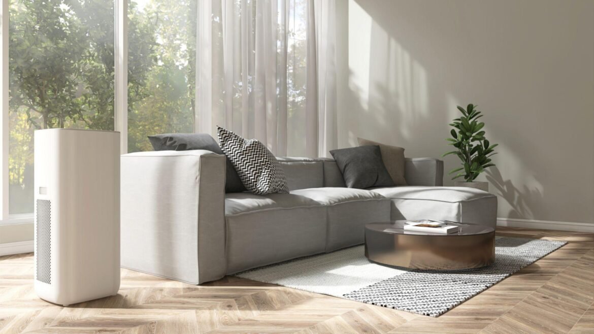
A Buyer’s Guide to Cleaner Indoor Air: 11 Purifiers Worth Considering

by DDI Edit Team August 10, 2026
written by DDI Edit Team

The eleven purifiers covered in this guide appear in random order — there’s no ranking implied by their sequence. That’s intentional, because the “best” purifier isn’t a fixed answer; it depends on your room size, your budget, and the specific air-quality problem you’re trying to fix. A unit that’s perfect for a small bedroom would be both overkill in price and underpowered in a large living room. So the smarter approach is to understand what your space actually needs first, and only then look at specific models — not simply pick whichever one is listed first.

Why this matters isn’t really debatable. Several of India’s cities rank among the most polluted in the world, and every winter — especially in the north — PM2.5 levels routinely spike well past what the WHO considers safe, getting worse during stubble-burning season when Delhi’s air turns genuinely dangerous. A purifier can’t fix the air outside your home. But inside a closed room, it can meaningfully improve what you’re breathing for the many hours a day you spend indoors.

The specs that actually matter

Purifier marketing throws a lot of numbers at you, and most of it is filler. In reality, four factors determine whether a purifier will work for your home — everything else is secondary.

Filtration. Look specifically for “True HEPA,” and ideally the H13 grade, which filters out roughly 99.95% of fine particles down to 0.3 microns — the size range most relevant to PM2.5. Watch out for vague labels like “HEPA-type” or “HEPA-like,” which usually signal a weaker H11 grade capturing closer to 95% — a real difference when pollution is at Delhi levels. H13 should be your baseline. Homes with severe asthma or other respiratory conditions may want to go further with H14, though that’s excessive for most households. Equally important — and often ignored — is a real activated carbon layer, since HEPA filters trap particles but do nothing for gases, cooking smells, or smoke. In Indian kitchens, that carbon layer wears out faster than the indicator light suggests, so it needs replacing on a schedule.

CADR (Clean Air Delivery Rate). This tells you how much clean air the machine can actually push out per hour, and it’s arguably the single most useful spec on the box — a great filter is useless if the fan can’t move enough air through it. For a bedroom around 130–150 sq ft, look for a CADR of 200+. For a living room in the 250–350 sq ft range, aim for 300 or higher. Below roughly 180, a purifier is barely doing anything meaningful against serious pollution.

Matching CADR to your room. Manufacturers tend to overstate coverage, so it’s wise to discount their claimed room size by about 30% and shop based on your real room, not the marketing number. A rough rule of thumb: multiply the CADR by about 1.5 to estimate the largest room (in sq ft) the unit can realistically handle. Buying too small is the most common mistake — an undersized purifier runs constantly at full (and loud) power, cleans slowly, burns through filters faster, and ends up costing more to run.

Running costs. Electricity use is usually minor, but filters are a recurring cost most buyers don’t think about upfront — typically replaced every 6–12 months at around ₹1,500–₹4,000 depending on the model. Check filter prices and availability before buying, because a cheap purifier with expensive or scarce filters can cost more over a few years than a pricier one with affordable, long-lasting filters.

A few practical notes before you buy

Placement matters more than people think. A floor-standing unit performs best near the center of a room rather than pushed into a corner behind furniture — the closer to the middle, the more air it can circulate effectively. If a corner is your only option due to power outlets, know you’re sacrificing some performance.

Skip the gimmicks. Ozone-generating purifiers — sometimes marketed as producing “fresher” air — can actually worsen asthma and respiratory issues, so avoid them altogether. Ionizers deliver mixed results and shouldn’t be relied on instead of proper filtration. A UV stage can be a nice extra if germs are a specific concern, but HEPA and carbon filtration are what actually do the heavy lifting.

Be clear about your priorities. For a bedroom, prioritize a quiet unit — under about 28 decibels — since it’ll run overnight. A strong smoke-specific CADR matters most if you cook often or live somewhere winters get severe. And if you’re paying extra for sleek design, quiet operation, or built-in air circulation, that’s a legitimate reason to spend more — just be clear that’s what the premium is buying you, not necessarily better filtration.

11 purifiers worth a look (unranked)

Prices shift constantly with sales, so treat the figures below as rough guidance and check current pricing before purchasing.

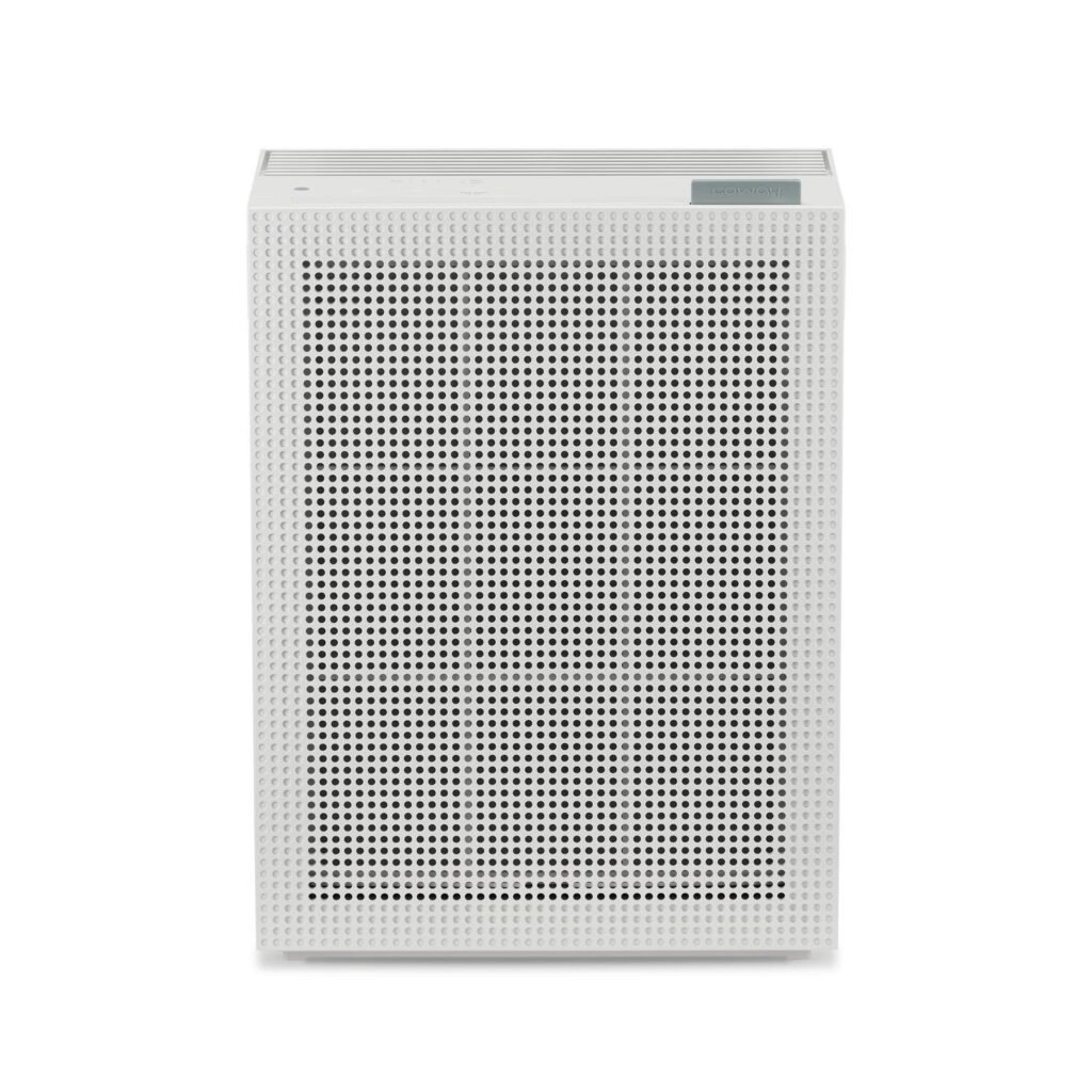
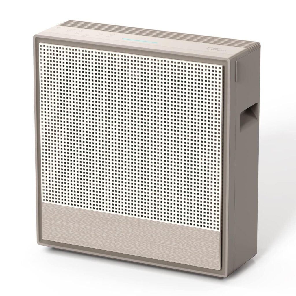
Coway Airmega 150 — A well-regarded all-rounder: True HEPA H13, CADR around 303, and notably long filter life. Quiet and cost-effective over time — a solid pick for a bedroom or mid-sized room.

Philips AC3220/60 (PureProtect 3200 series) — One of the higher-output options here at a fair price, with a CADR around 520 and HEPA plus carbon filtration. Rated by Philips for large single rooms and studios — good for bigger spaces a compact unit can’t handle.

Honeywell Air Touch V5 — A dependable mid-range option with a CADR around 380, long filter life, and a solid track record in heavy northern-India pollution — good for a living room in a high-pollution city.

Xiaomi Smart Air Purifier 4 — The smart, budget-friendly pick: CADR around 387–400, full app control with real-time air quality tracking, and some of the cheapest replacement filters available, keeping long-term costs low.

Honeywell Air Touch V1 — The budget pick that still sticks with genuine H13 HEPA. CADR around 152, suited to small rooms. Good for tight budgets that don’t want to compromise on true filtration — just double-check its coverage against your room size.

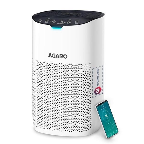
AGARO Royal — A genuinely strong value option: True HEPA H13, CADR around 300, medium-room coverage, and often discounted well below list price — one of the more cost-effective routes to real H13 filtration. AGARO’s step-up Imperial model adds an H14 filter and seven-stage filtration for those wanting more. As with most value brands, confirm replacement filters are easy to find locally before committing.

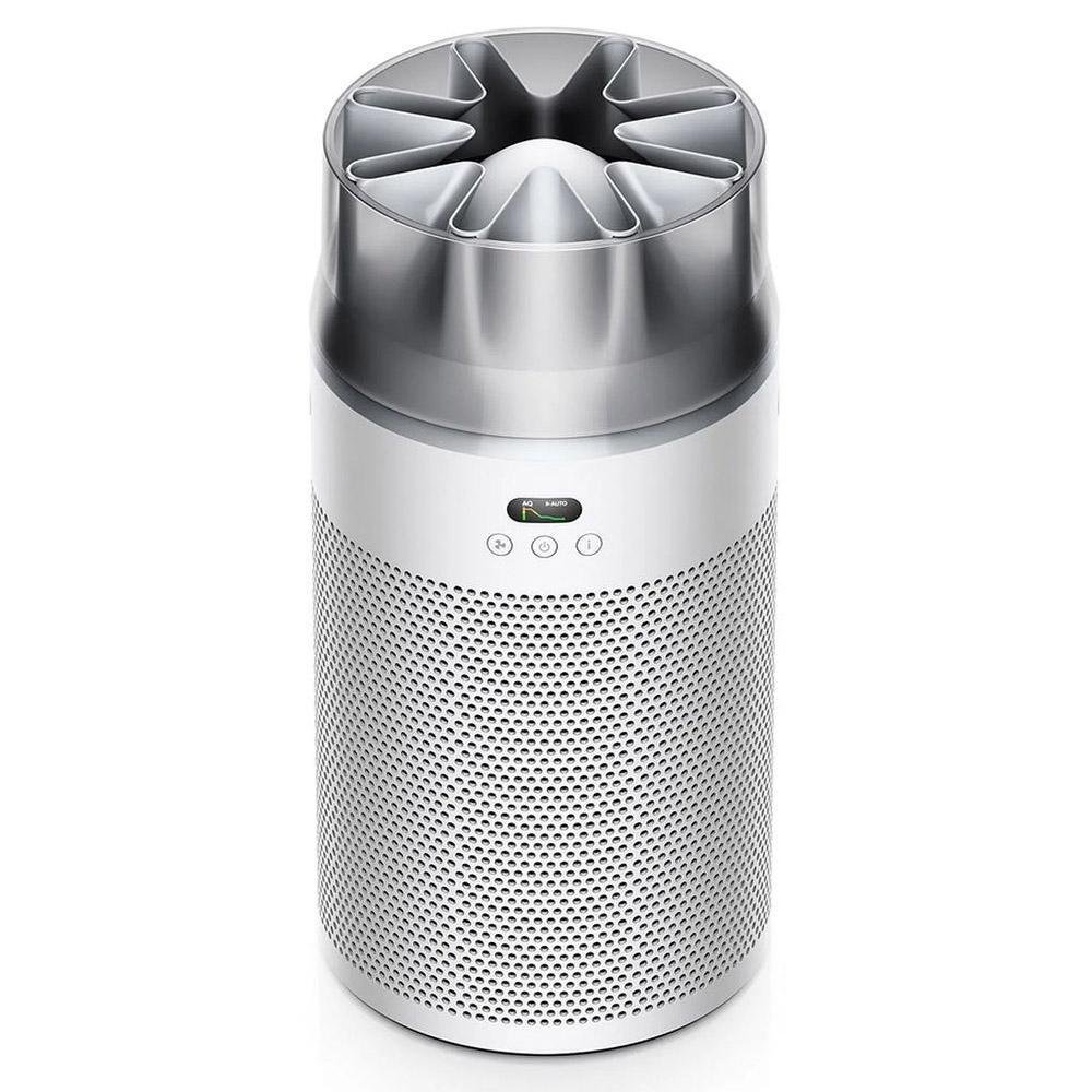
Dyson HushJet Compact HJ10 — The design-forward premium pick, with a sealed electrostatic filter rated 99.97% efficient down to 0.3 microns, very quiet operation, and long filter intervals that make its yearly filter cost more reasonable than the price tag suggests. Worth noting: cheaper machines handle Indian PM2.5 just as effectively, so this makes sense mainly if design and near-silence matter to you as much as air quality.

Coway Airmega 250 — A step up for bigger, more polluted spaces: high coverage, long filter life, and a lengthy warranty built to withstand Delhi’s worst winter months without frequent filter swaps. A sound choice for a large living area in severe pollution.

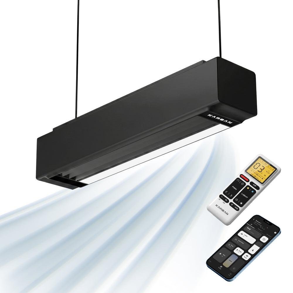
Karban Airzone Pure — A different form factor: a ceiling-mounted purifier that doubles as a bladeless air circulator with a dimmable light, actively pushing air through its HEPA filter instead of sitting still. CADR around 250, zero floor footprint. Good for a permanent, space-saving whole-room solution — it can even replace your ceiling fan and light fixture.

Blueair (mid-tier range) — Worth considering for its strong filtration reputation and a CADR around 400 at an accessible mid-range price. As always, verify the exact spec sheet and current price on the official listing.

Honeywell Air Touch U2 — The pick for the largest rooms, with one of the highest CADR ratings on this list — rated for very large coverage, so a single well-positioned unit can cover an entire open-plan living/dining area instead of needing two machines.

Bottom line

For most households, the sweet spot is a mid-range purifier with True HEPA H13 filtration and a real carbon layer, correctly sized for the room — typically ₹16,000–₹30,000, and good for several years with routine filter changes. On a tighter budget, a value H13 machine like the AGARO Royal or entry-level Honeywell still delivers genuine filtration. For a large or heavily polluted space, it’s worth stepping up to a higher-CADR model rather than overworking a small one. You don’t need to spend ₹40,000 to breathe noticeably cleaner air — a well-matched ₹20,000 machine in the right-sized room will outperform a poorly chosen premium one every time. Prioritize filter grade, CADR, and room match first; let brand and extra features be secondary. That’s ultimately what determines clean air — more than any single model name.

This guide is for general information only. Prices, models, and availability change often — confirm current details on the brand’s official listing before buying.

August 10, 2026 0 comments
0 FacebookTwitterPinterestEmail
Products

Vita Amalfi: Orange Tree’s New Lighting Collection Draws From the Coast Without the Clichés

by DDI Edit Team August 7, 2026
written by DDI Edit Team
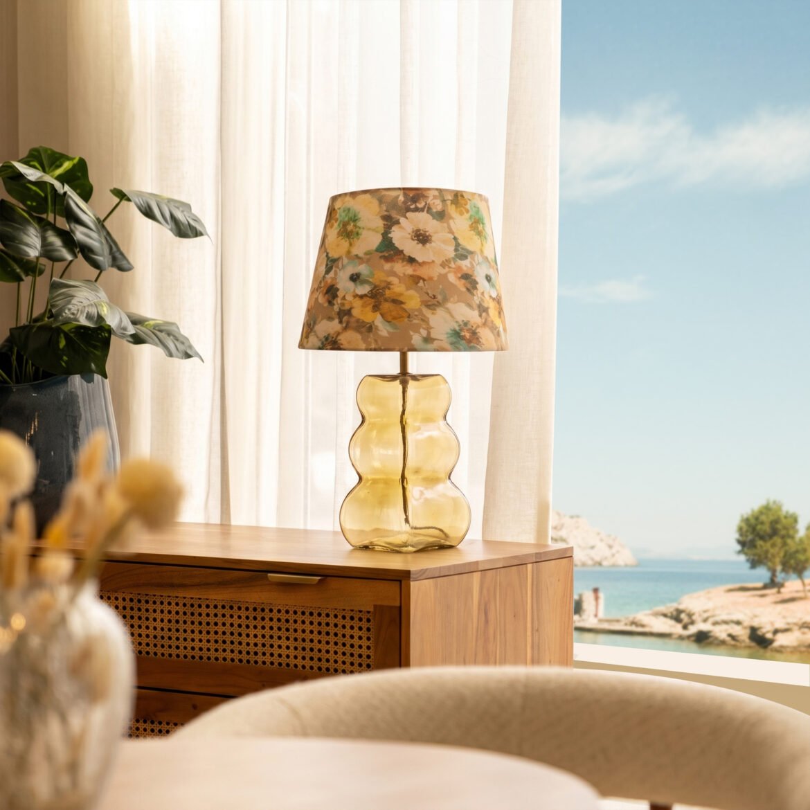
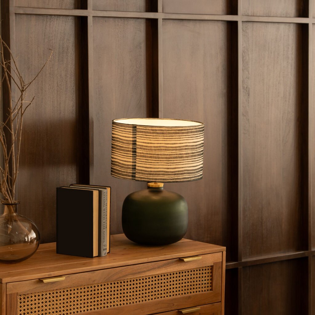
Orange Tree Vita Amalfi amber glass table lamp with floral shade coastal lighting

The Amalfi Coast has been referenced in design so many times that the risk of producing something generic is considerable. Orange Tree, a lifestyle brand known for furniture, accents and lighting that sit at the intersection of craft and contemporary sensibility, sidesteps that risk in its latest collection by taking the feeling of the coast rather than its imagery. Vita Amalfi draws from shoreline light, organic form and natural texture without reaching for a single nautical symbol.

The collection spans pendant lights, table lamps, floor lamps and wall fixtures, each piece built from a combination of ceramic, glass, metal and soft fabric and finished by hand. The materials and the silhouettes do the work that the reference might otherwise be expected to do. The Kaze floor lamp brings a quiet elegance suited to a reading corner, while the linear and circular Kaze chandeliers translate the movement of waves into pleated foam-toned white shades that carry warmth into living and dining rooms without demanding attention.

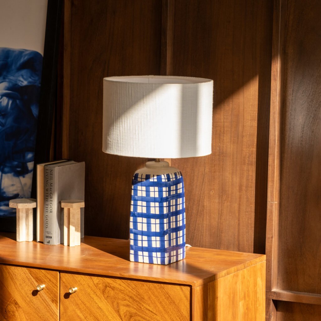
The Lior series, comprising a floor lamp, pendant and twin wall lamp, takes a softer register. Amber-toned shades, gentle curves and antique finishes give each piece a vintage quality that works as well in an intimate bedroom corner as in a dining space. The Fern table lamp moves in a different direction entirely, its frosted green glass base and blue-and-white striped shade grounded and quietly graphic, the kind of piece that holds its own in a well-considered room without overpowering it. The Auburn table lamp, with its amber glass base marked with organic black spotting and a natural linen shade, sits closest to the collection’s source material, the base reading almost like something gathered from the shoreline rather than manufactured.

Gaurav Jain, Founder and Creative Director of Orange Tree, has described the intention behind Vita Amalfi as turning lighting into more than illumination, creating instead a mood that encourages a quiet escape through subtle colours, natural textures and organic forms. The collection makes good on that intention. Each piece conveys its own version of the coast, some more sculptural and energetic, others soft and ambient, but all of them share a restraint that keeps the reference alive without exhausting it.

Vita Amalfi is available at orangetree.in

August 7, 2026 0 comments
0 FacebookTwitterPinterestEmail
Newer Posts
Older Posts

Recent Posts

  • Florim Introduces SensiVenezia, a Porcelain Stoneware Collection Inspired by Venetian Terrazzo
  • LEGO Botanical Wave Transforms TANK Shanghai with 380,000 Brick-Built Flowers
  • The Great Eastern Home Introduces Its Latest Collection of Italian Vintage Mirrors
  • Smart Homes Are Changing Architecture: What Happens When Technology Becomes Part of the Building?
  • AARQE9’s Nikhaar Dhawan & Bahaar Dhawan Rohatgi Unveil the Sculptural Lunar Drip Table

Recent Comments

  1. Smart Home Architecture: How Technology Is Changing Design on Aqara Smart Lock U500: Three Versions for Gates, Glass Doors and Standard Entrances

Newsletter

  • Home
  • About Us
  • Contact Us
  • Editorial Policy
  • Privacy Policy

© 2026 Design Diary International. All Rights Reserved.

Design Diary International
  • Home
  • Project
    • Residential
    • Hospitality
    • Commercial
    • Public & Cultural
  • Interview
    • Architect
    • Interior Designer
    • Founders & Brand
    • Artist
  • Material
  • Product
  • Feature
  • DDI Finds
    • Emerging Studio
    • Rising Designers
    • New Practices
  • About
  • Magazine
  • Contact Us