• Home
  • Project
    • Residential
    • Hospitality
    • Commercial
    • Public & Cultural
  • Interview
    • Architect
    • Interior Designer
    • Founders & Brand
    • Artist
  • Material
  • Product
  • Feature
  • DDI Finds
    • Emerging Studio
    • Rising Designers
    • New Practices
  • About
  • Magazine
  • Contact Us
Design Diary International
Commercial

Jaipur Rugs, Mumbai, India: Designed by Roar

by DDI Edit Team September 25, 2026
written by DDI Edit Team

Jaipur Rugs has opened a 20,000-square-foot flagship at Mumbai’s Empire Mills, bringing its handmade collections, Manchaha rugs, heritage weaves and designer collaborations into a former industrial space in Lower Parel. Designed by Roar, the store is as much about showing how the rugs are made as it is about displaying them, with artisans weaving on site and a selection that places contemporary work alongside pieces rooted in the company’s long association with Indian craft.

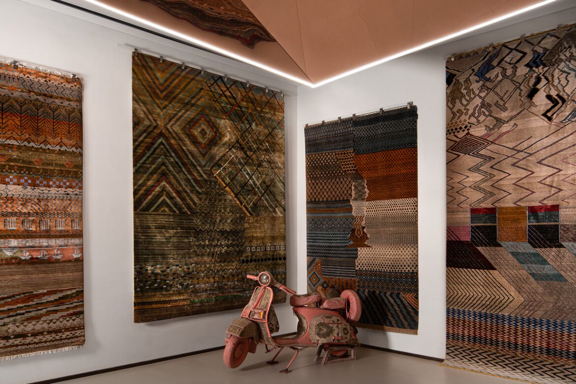
The most interesting part of the store is the way it presents the rug as a design object rather than simply an interior accessory. That becomes particularly evident in the Manchaha collection, where individual weavers are given the freedom to develop their own compositions instead of reproducing an established pattern. The resulting pieces vary considerably in color, imagery and visual language, reflecting the experiences and ideas of the people who made them.
Manchaha was introduced by Jaipur Rugs in 2010 as a way of giving weavers greater creative authorship. Rather than receiving a fixed design to execute, the artisan develops the visual composition and then translates it through the loom. The approach has produced a body of one-of-a-kind rugs in which personal memories, landscapes, everyday observations and imagination become part of the design.

Some pieces draw on rain, flowers and familiar surroundings, while others reference journeys, village life, nature or childhood. The differences between them are important. Manchaha is not intended to look like a conventional coordinated collection, and its individuality is part of its value.

Freedom Manchaha takes the idea further by providing inmates with an opportunity to learn rug-making and create original designs. The collection brings another dimension to the question of authorship in craft, placing personal experience within the design process rather than treating the artisan only as the person responsible for production.

For collectors and interior designers, these pieces occupy an increasingly interesting position between textile, furniture and collectible design. Their scale makes them significant interior objects, but their individuality comes from the process behind them. The construction, material, technique and identity of the maker become part of the finished work.

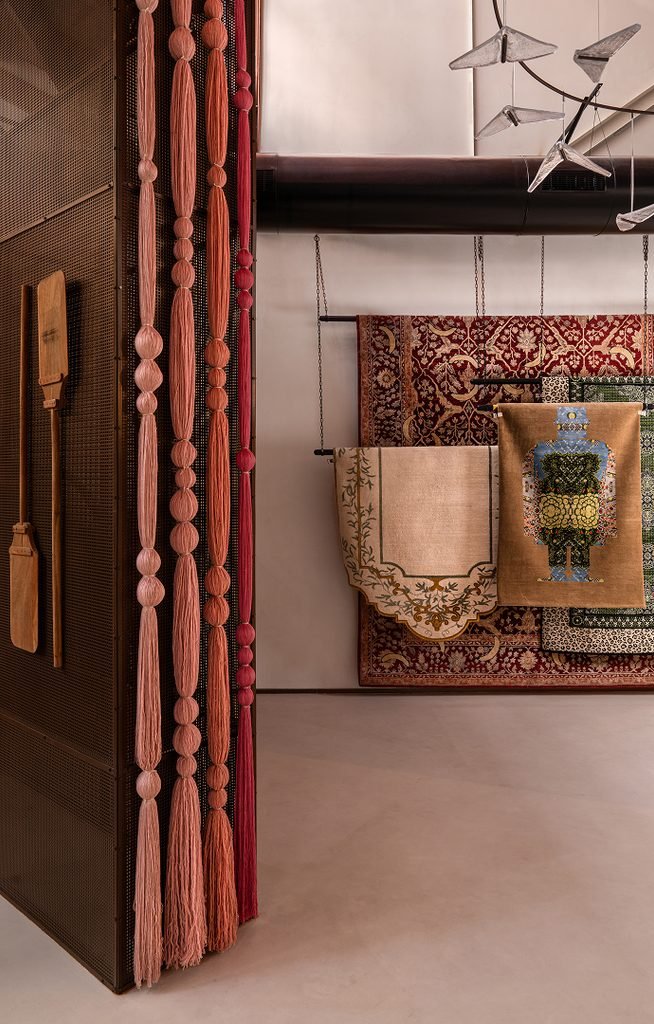
The Mumbai flagship has been designed to allow those details to be seen. Rather than organizing the space as a conventional carpet showroom, Roar has created a sequence of display areas, stepped platforms, seating zones and larger installations. Rugs can be viewed from a distance and then examined more closely, which matters when the quality of a piece depends on the density of its weave, the handling of its surface and the precision of its construction.

The building itself provides the starting point. Empire Mills is part of Mumbai’s former textile district, an area shaped by the city’s mill industry. The existing Victorian steel structure, pitched roof and clerestory glazing have been retained, giving the new store an industrial framework rather than a newly constructed retail shell.

Roar’s intervention introduces a more contemporary vocabulary. Repetition, rhythm and fractal geometry inform the stepped forms and display structures, while the architecture also draws on the visual language of Rajasthan’s traditional stepwells. The reference is abstract rather than literal, appearing through levels, platforms and changes in height across the store.
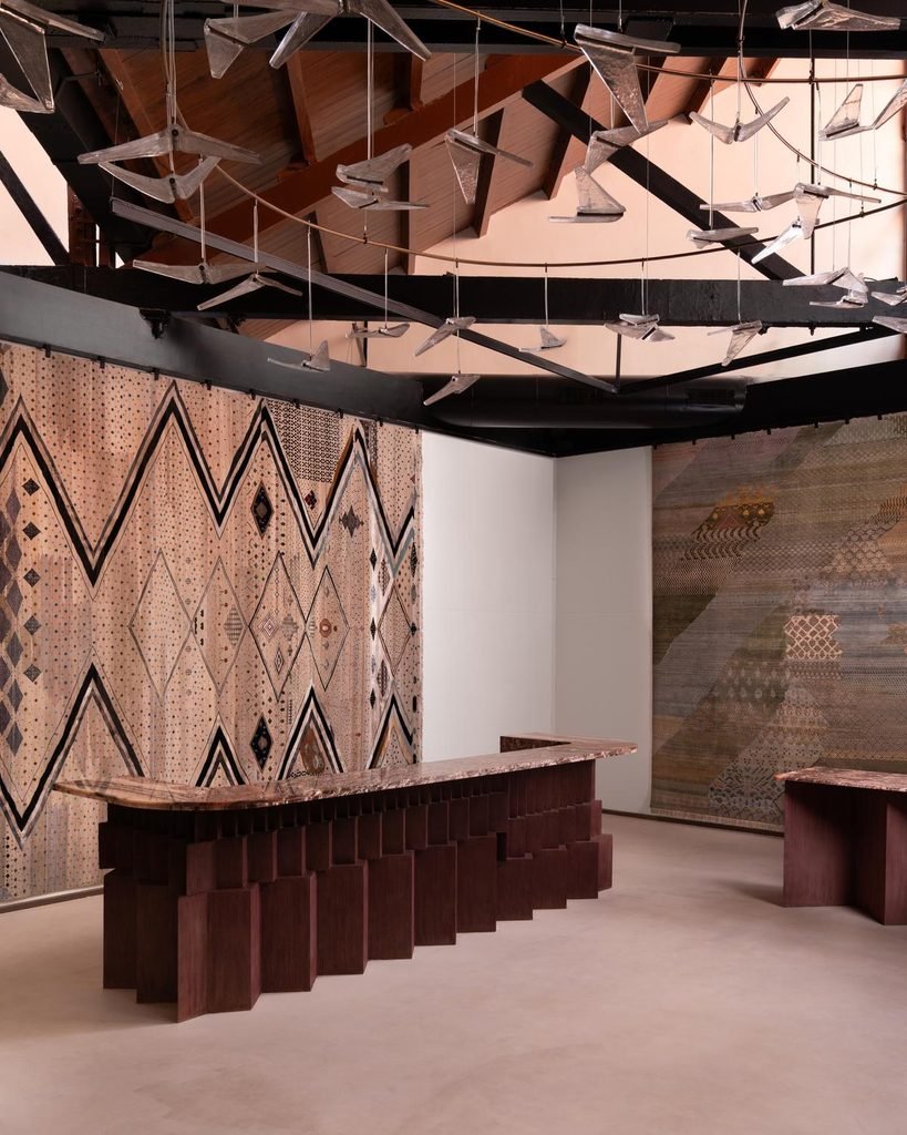
That geometry has a practical purpose. Rugs are unusually large retail objects, and displaying them effectively requires more than a series of hanging samples. The stepped structures allow individual pieces to occupy different positions within the room, while seating gives visitors the opportunity to spend time with the collection rather than simply walk past it.

The layout also creates a connection between the rugs and the history of the building. The former warehouse recalls an industrial period of textile production, while the handmade pieces introduce a very different relationship with labor, time and material. The contrast is not presented as a historical reconstruction. Instead, the old structure becomes a setting for examining how textile craft continues to evolve.

Live weaving is central to that experience. Artisans working inside the flagship make the process visible, from the handling of yarn to the repeated movements required to build a rug. For customers, this provides a more direct understanding of what distinguishes handmade production from an industrially manufactured floor covering.

It also changes the way the product is discussed. The finished rug no longer appears as an isolated object. Its construction becomes part of the conversation, as does the time required to produce it and the expertise involved in maintaining a particular technique.

Alongside Manchaha and Freedom Manchaha, the flagship presents Jaipur Rugs’ wider range, including contemporary collections, heritage weaves and collaborations with designers. This allows the store to show the breadth of what can be achieved through traditional rug-making techniques without reducing the medium to a single visual style.

The collaborations are particularly relevant to the brand’s position within contemporary interiors. Working with designers brings different approaches to color, composition, scale and pattern into the medium, while the handmade process remains fundamental to the final object. The result is not simply a designer pattern transferred onto a rug. The characteristics of the weaving process remain visible in the finished piece.

This relationship between design and making is what gives the Mumbai flagship its relevance beyond retail. The store is selling rugs, but it is also presenting a particular argument about how handmade objects should be valued. The artisan is not hidden behind the finished product, and the rug is not treated simply as another decorative surface.

That is especially evident in Manchaha, where the distinction between designer and maker becomes less straightforward. The person working at the loom can also be the person developing the composition. The process therefore produces something closer to individual authorship than standardized manufacture.

The flagship also gives Jaipur Rugs an opportunity to present its archive and continuing collections within one address. Instead of separating heritage from contemporary work, the store allows the two to exist together. A traditional weave can sit alongside an abstract composition, while a one-of-a-kind Manchaha piece can be considered next to a more restrained contemporary rug.

For a customer furnishing a home, this makes the experience less about finding a single decorative solution and more about understanding the range of possibilities within the medium. A rug can be quiet or highly graphic, traditional or contemporary, designed to disappear into an interior or intended to command attention.
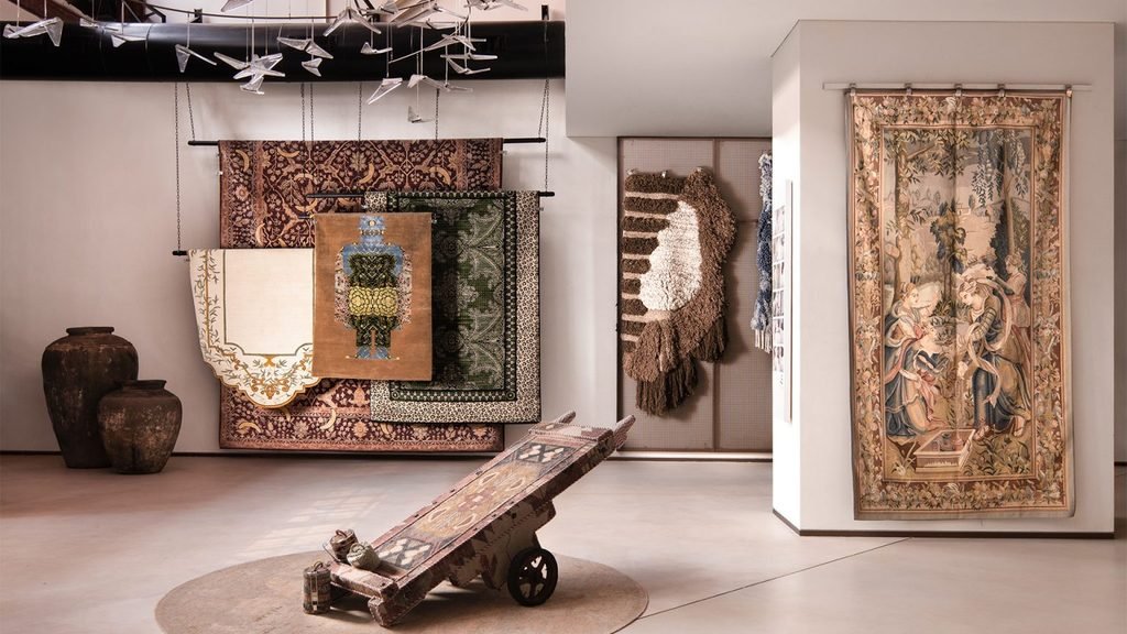
The Mumbai store therefore works best when viewed through the products rather than the architecture alone. Roar has created the framework, but the rugs provide the content. Their materials, techniques and individual stories give the space its character.

There is also a larger shift behind this approach. Handmade objects are increasingly being considered through the same lens as other forms of collectible design, where provenance, process and authorship matter alongside appearance. Rugs are particularly suited to that discussion because they combine significant physical scale with an unusually labor-intensive production process.

Jaipur Rugs’ new flagship makes that process visible without turning the store into a museum. The commercial purpose remains clear, but the environment gives visitors enough information and space to consider the object before deciding what belongs in their own interiors.

At Empire Mills, the company has brought together its current collections, established techniques and newer experiments in one physical address. The result is a flagship that places the rug and the person who makes it at the centre of the experience.

Brand Website: Jaipur Rugs

FACT FILE

Project: Jaipur Rugs Mumbai Flagship
Brand: Jaipur Rugs
Location: Empire Mills, Lower Parel, Mumbai, India
Area: Approximately 20,000 sq ft
Design Studio: Roar
Founder & Creative Director, Roar: Pallavi Dean

Photographer: Avesh Gaur

Design Approach: Adaptive reuse, contemporary retail and textile-focused spatial design
Original Building: Former industrial warehouse
Existing Elements Retained: Victorian steel structure, pitched roof and clerestory glazing
Design References: Weaving, repetition, rhythm, fractal geometry and Rajasthan stepwells
Collections: Manchaha, Freedom Manchaha, contemporary collections and heritage weaves
Experience: Rug gallery, live weaving, vertical rug archive, material displays and lounge areas
Completed: 2026
September 25, 2026 0 comments
0 FacebookTwitterPinterestEmail
Commercial

Péro’s Pérodise, New Delhi, India: Designed by Conzatti Solanki Architects

by DDI Edit Team September 25, 2026
written by DDI Edit Team

For 17 years, Péro has built its identity without a permanent store. The label’s clothes have appeared through fashion shows, exhibitions and retail partners, but the brand never had a physical address that could bring its wider world of textiles, handcraft and clothing together in one place. Pérodise, Aneeth Arora’s first flagship in New Delhi, changes that.

Located in Lodhi Colony Market, the store is not simply a new point of sale for Péro. It gives the collection room to exist beyond the boundaries of a fashion season. Arora has approached the space as an extension of the way Péro develops its clothes, bringing together different materials, techniques and makers to create something that feels assembled rather than manufactured as a single, uniform statement.

That approach is also visible in the collection presented inside. Alongside the current season, Pérodise carries Péro Classics, a continuing line of pieces that return across seasons, as well as the label’s Limited Edition jackets. These highly worked jackets are produced as individual seasonal pieces and, at the new flagship, become a permanent part of the offering. Bandhani also has a continuing presence through the Dot line, reflecting the importance of the technique within Péro’s textile vocabulary.

The idea is significant because the store is not organized entirely around newness. A customer can encounter a current collection alongside pieces that have remained part of Péro’s language over the years. Archival garments and older references can return to the floor, while one-off pieces can be shown without having to fit into the commercial structure of a particular season. The result is closer to an evolving wardrobe than a conventional seasonal boutique.

For a label whose clothing is defined by close attention to textiles and making, the setting becomes an important part of how those clothes are understood. Péro’s garments often reveal themselves through embroidery, surface treatment, handwork and unusual combinations of materials. At Pérodise, the surroundings follow a similar logic. The store asks visitors to look closely.

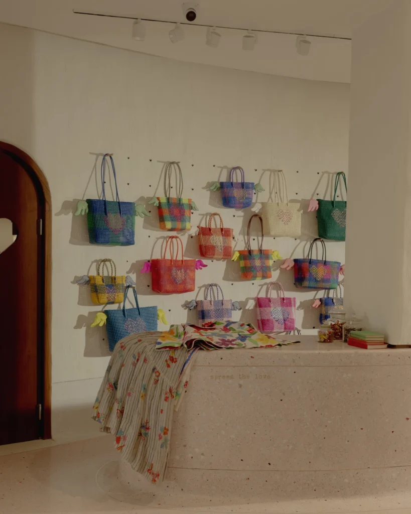
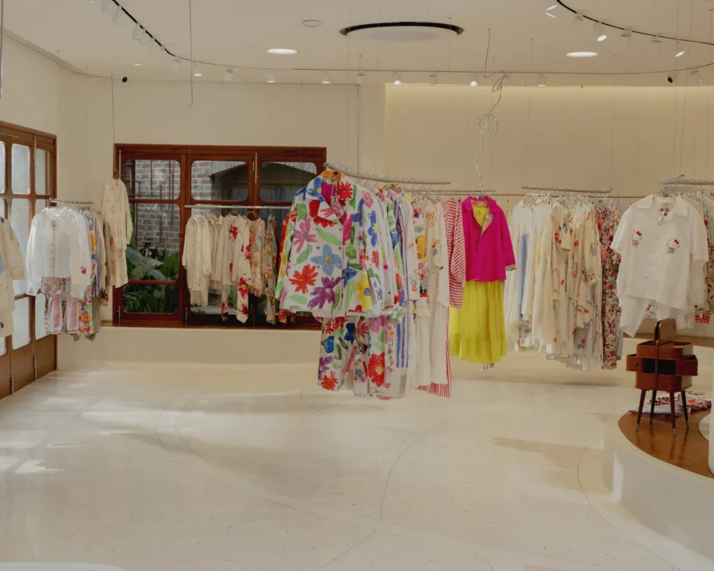
The approximately 4,000-square-foot space combines an indoor area with a large outdoor courtyard. Designed with Milan-based Conzatti Solanki Architects, the layout moves away from the hard geometry associated with conventional retail. Curved terrazzo surfaces become counters and benches, while the interior opens into the courtyard through folding doors.

The architecture has been developed around softness and movement, qualities that also appear in Péro’s clothing. There are few hard corners, and the transition between different areas is deliberately fluid. Instead of walking through a straightforward sequence of racks, customers move between spaces, discovering the collection gradually.


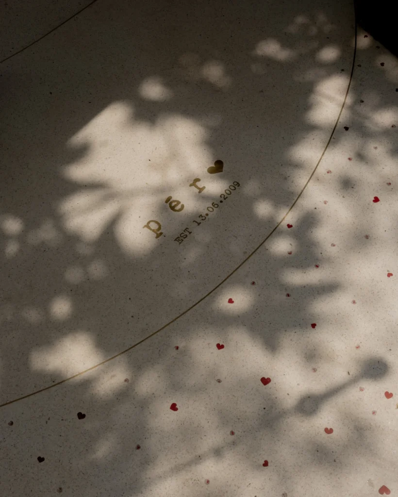
Materials are equally important. Terracotta tiles made in Odisha appear across the canopies, while copper bells from Kutch are incorporated into the rain chains. Terrazzo flooring has been laid by hand and incorporates brass detailing, hand-cut lettering and blown-glass hearts. The hangers have been developed with a metal craftsperson and shaped around Péro’s heart-and-wings motif.

The use of these materials does not function simply as decoration. They establish a direct relationship between the store and the methods behind the clothes. Péro has long worked through networks of artisans and textile specialists, with materials passing through different hands before becoming finished garments. Pérodise extends that process into the architecture, bringing together stone, brick, wood, metal, terracotta, glass and terrazzo through different forms of craftsmanship.

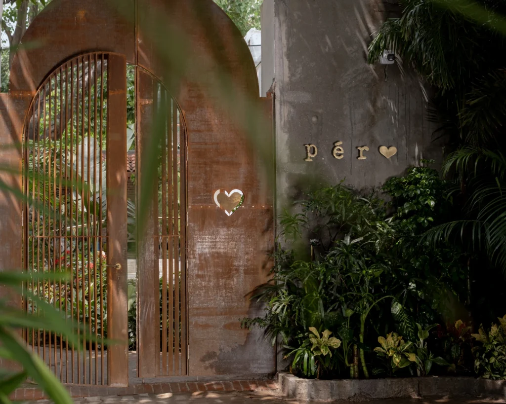
The heart motif is perhaps the clearest example. It began as a small embroidered heart placed somewhere on Péro garments, almost as a detail to be discovered by the wearer. Over time, the symbol became associated with the label and developed into part of its wider visual language. At Pérodise, the heart appears in glass, metal and flooring rather than embroidery, allowing a familiar element from the clothes to move into the physical environment.

The courtyard adds another dimension to the experience. Greenery was important to Arora from the beginning of the project, and the store has been designed to maintain a relationship between the interior and outdoors. The result is considerably removed from the enclosed, highly controlled environment of a typical luxury fashion store. There are places to sit, spaces to pause and areas where the architecture becomes part of the experience rather than simply a backdrop for merchandise.

That distinction changes the nature of shopping at Péro. The customer is not being moved rapidly from one product display to another. The space encourages a slower examination of clothing and its details. A jacket can be considered alongside the materials and objects around it, while the architecture provides enough visual interest to make the visit about more than purchasing a garment.

The store is also designed to change according to what Péro wants to present. Clothing rails can be removed, while systems within the walls and ceilings allow garments and other material to be suspended differently. This makes the space suitable for exhibitions, talks, presentations and events, allowing Pérodise to operate as a gathering place as well as a retail address.

This flexibility is particularly useful for a label that has accumulated 17 years of work. Rather than treating previous collections as closed chapters, Péro can bring selected pieces back into the store, place archival work alongside new collections and develop installations around particular textile techniques or collaborations. The physical address gives those stories somewhere to remain visible.

There is also a practical difference between seeing Péro through a multi-brand retailer and entering a space created entirely around the label. In a conventional retail environment, the clothing has to compete with other designers and with the visual language of the store itself. At Pérodise, the surroundings have been developed specifically around Péro’s vocabulary of craft, material and detail. The collection therefore becomes easier to read as a whole.

That may ultimately be the most important function of the new flagship. Péro has never been a label that depends entirely on seasonal trends. Its identity has been built through recurring techniques, textiles, silhouettes and details that return in different forms. Pérodise gives those elements a permanent context.

The store also signals a different understanding of luxury shopping, one that places time and discovery alongside the product. The materials are handmade, the displays can change, the courtyard allows the experience to slow down, and the collection is not restricted to what happens to be new that month. For Péro, the physical store becomes a way of allowing customers to spend more time with the clothes and with the ideas behind them.

After 17 years, Péro finally has a permanent address. But Pérodise does not feel like a conventional expansion into brick-and-mortar retail. It is more closely aligned with the way the label has always worked: through accumulated detail, handcraft, different materials and a willingness to let things develop gradually. The clothes remain at the center, but the architecture gives them a setting in which their material language can be understood more fully.

Brand Website: Péro

FACT FILE

Project: Pérodise, Péro Flagship Store
Typology: Retail/Commercial
Location: Lodhi Colony Market, New Delhi, India
Total Area: Approximately 4,000 sq ft
Indoor Area: 1,500 sq ft
Outdoor Area: 2,500 sq ft
Architects: Conzatti Solanki Architects
Architects: Paola Conzatti and Kalpesh Solanki
Design Approach: Fashion retail and craft-led spatial experience
Key Materials: Terrazzo, terracotta, stone, brick, wood, metal, brass and blown glass
Craft Elements: Odisha terracotta tiles, Kutch copper bells, hand-laid terrazzo and hand-beaten metalwork

September 25, 2026 0 comments
0 FacebookTwitterPinterestEmail
Products

Stone & Game Reworks the Traditional Chess Set in Marble and Onyx

by Shweta September 25, 2026
written by Shweta

A chess set is already a considered object. Its proportions are fixed, its pieces have familiar forms and the board has remained largely unchanged for centuries. Stone & Game does not attempt to redesign any of that. Instead, the Swedish design brand changes the material, working with marble and onyx to give a familiar domestic object a very different physical presence.

The new collection brings together chess and backgammon sets alongside smaller objects for the home and desk. Produced in small batches, the pieces are built around carefully selected natural stone, with the veining, color and pattern of each slab becoming part of the finished design. It is a relatively quiet intervention, but one that changes the way the games read within an interior.

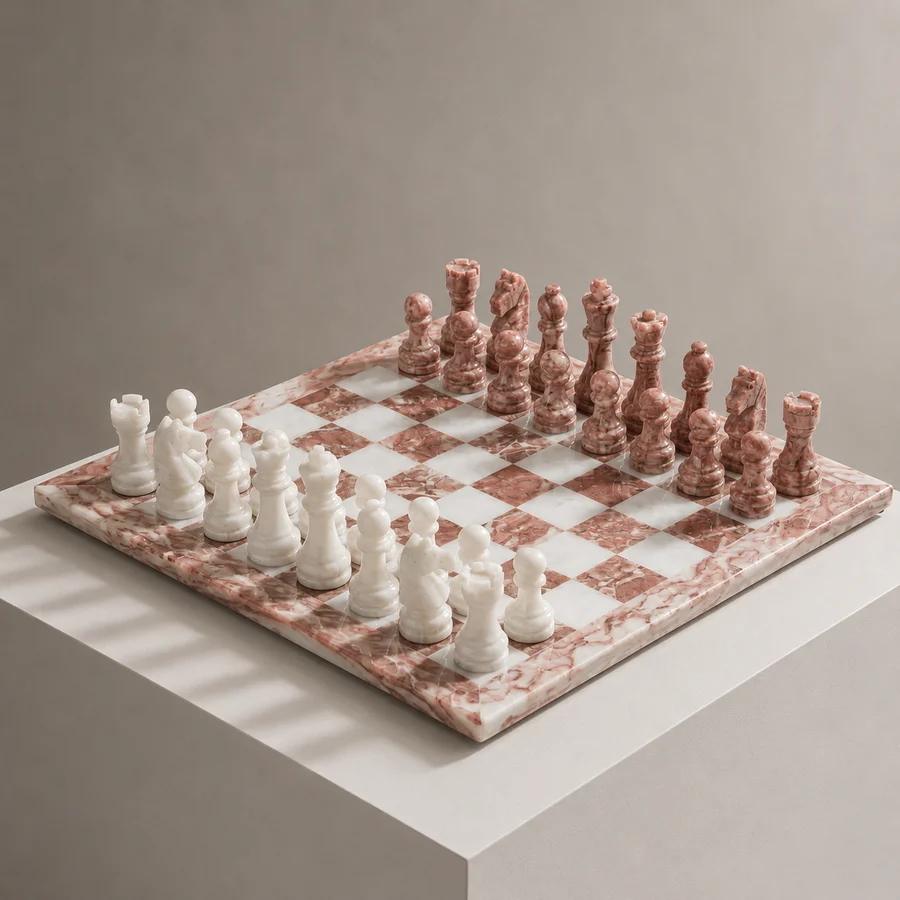
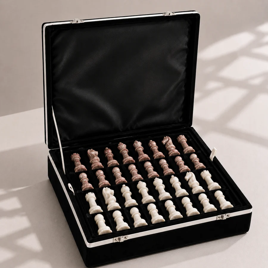
The chess collection makes the idea particularly clear. Rather than restricting the boards to the conventional dark-and-light combination, Stone & Game works across a range of marble and onyx pairings. Grey, green, pink, red, coral, brown and black appear across the collection, but the color is only one part of the difference. The natural movement within the stone means that each board carries its own pattern.

That distinction is important when the object itself is built on repetition. The chessboard is an exercise in precision, while marble is inherently irregular. Veins move across the surface, colors deepen and recede, and no two sections of stone are exactly alike. The resulting boards retain the discipline of the game while allowing the material to introduce something less predictable.

The same principle applies to the pieces. Each set contains 32 hand-carved marble chessmen, retaining the conventional forms that make them immediately recognizable. Stone & Game has not tried to make the pieces into decorative sculptures or reinterpret the game through an abstract design language. The craftsmanship is instead visible through the carving, weight and surface of the stone.

This is where the collection begins to occupy a space beyond the games cabinet. These are objects designed to be played with, but they are equally comfortable being left on a table. A marble board has enough presence to sit within an interior as a design object, particularly when the pieces are stored away in their velvet-lined case. The distinction between something intended for use and something intended for display becomes deliberately less clear.

The idea extends through the rest of the collection. Backgammon, checkers and Tic Tac Toe are treated with the same interest in natural stone, while smaller objects bring the material into more everyday settings. Rather than developing a large vocabulary of decorative details, Stone & Game allows the stone itself to establish the identity of the collection.

Its small-batch approach reinforces that position. The brand is not working towards the visual uniformity expected from mass-produced games. Natural variation is retained, and the handwork involved in carving and finishing the pieces remains part of their character. The result is closer to the way one might approach a collectible design object than a conventional board game.

There is also something practical in bringing these games back into the visible spaces of the home. A chessboard can remain on a coffee table between games; a backgammon set can become part of a study or library; a smaller stone object can function without announcing itself as a decorative accessory. The collection is designed around this idea of objects having more than one role.

For a young brand, it is an interesting place to begin. Stone & Game is not competing through complexity or novelty. It takes games that are already deeply familiar and asks what happens when their material language changes. Marble and onyx introduce weight, natural variation and permanence, while the underlying forms remain almost entirely recognizable.

That restraint is what gives the collection its strength. The games have not been turned into design objects at the expense of their original purpose. They remain games. The difference is that once the playing is over, there is no particular reason to put them away.

Stone & Game: Explore the collection

September 25, 2026 0 comments
0 FacebookTwitterPinterestEmail
Residential

Japandi House, Kharvel Nagar, Bhubaneswar- India by Chirag Design Studio

by DDI Edit Team September 25, 2026
written by DDI Edit Team

The difficulty with this house was not its size but what surrounded it. Set within an existing G+2 structure in Kharvel Nagar, Bhubaneswar, the 2,200-square-foot residence is hemmed in by buildings on either side. The arrangement left the designers with limited scope for conventional side openings, making daylight and ventilation as much an architectural question as an interior one.

Chirag Design Studio’s response was to work harder with the facade. Steel balconies project beyond the existing structure, while large windows and carefully positioned openings pull the outside further into the plan. The balconies are not simply extensions of the rooms; they become part of the mechanism through which the house acquires light, air and a greater sense of depth.

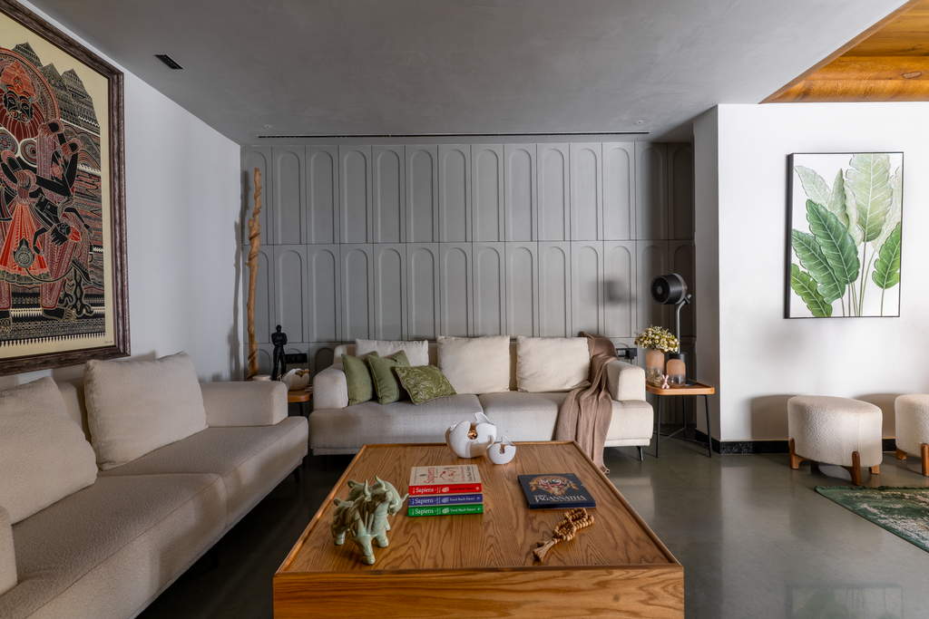
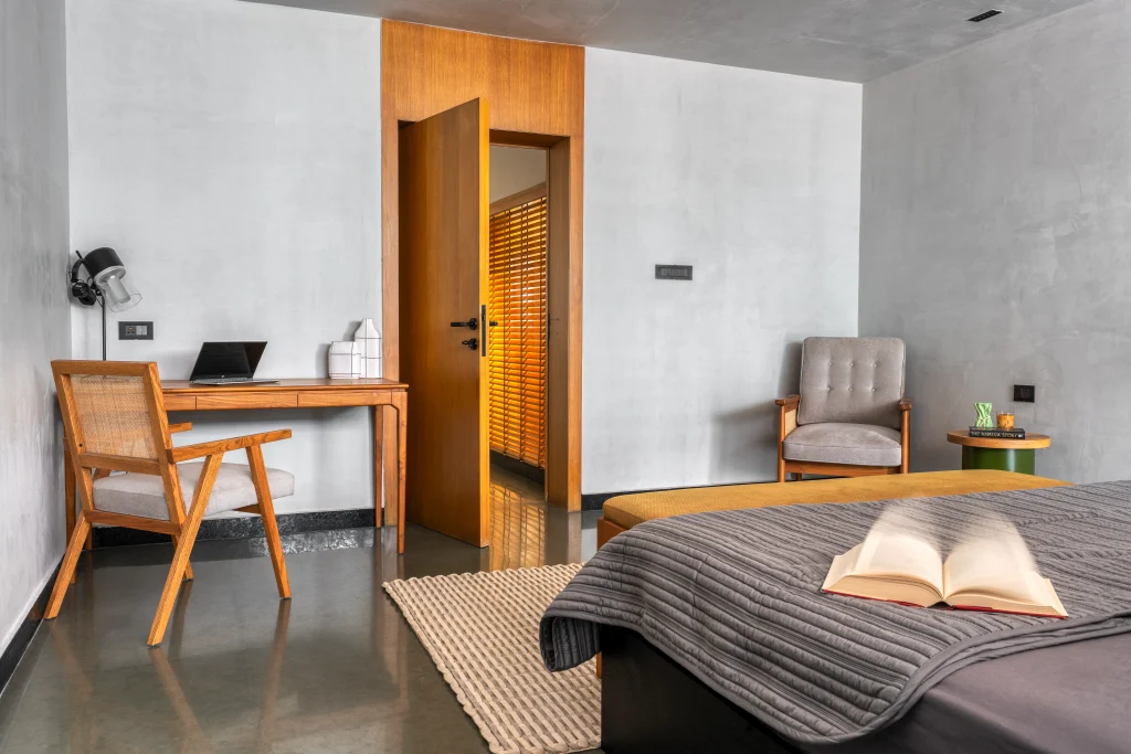
That decision is important to understanding the interiors. The house is described as Japandi, but its character does not come from applying a recognizable style to each room. There is little of the polished, highly controlled version of minimalism often associated with the term. Instead, the designers have allowed stone to remain stone, timber to retain its grain and cane to remain visibly woven. Grey lime plaster and textured concrete provide similarly unfinished surfaces. The effect is less about decoration than about reducing the number of competing visual elements.

Kota stone, laid in large 6-by-3-foot slabs, establishes much of the ground plane. Against it, light oak and oak veneers introduce warmth without changing the restrained character of the rooms. The palette stays close to stone, timber and earth, with olive, terracotta, taupe and plum appearing in smaller doses. It is a material strategy that gives the relatively compact residence some visual continuity rather than dividing it into a collection of individually decorated rooms.

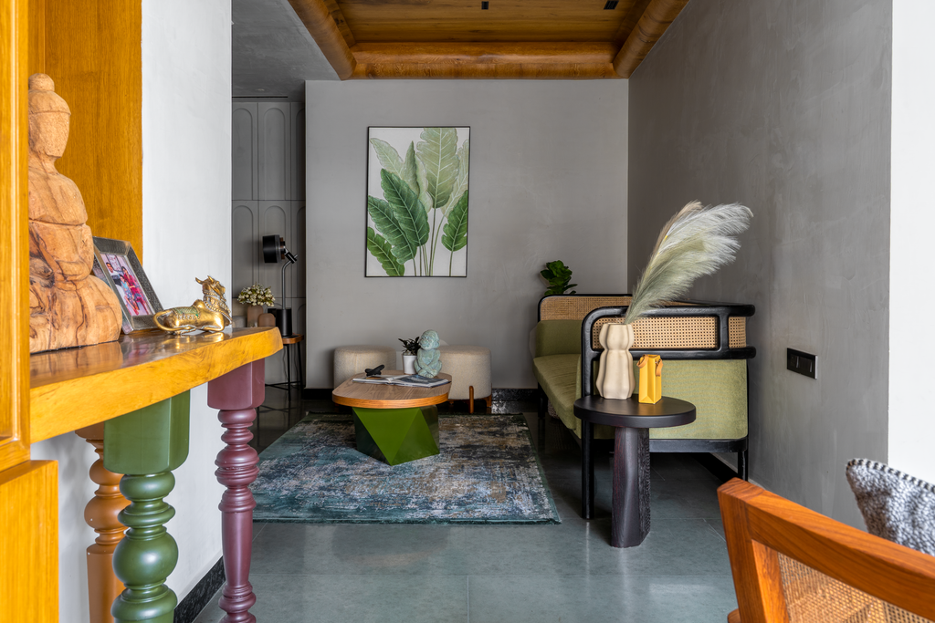
In the living room, that continuity is carried through custom furniture. Oak and cane recur in the sofas and lounge chairs, while muted upholstery keeps the pieces close to the architecture. Storage is treated similarly. Arched units with cane shutters and open niches sit between more solid architectural surfaces, while a handcrafted console, with baluster-like legs in olive, taupe, terracotta and plum, provides one of the few moments where color is allowed to become conspicuous.

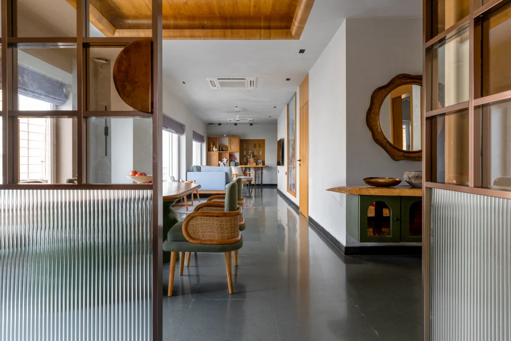
The arches are used elsewhere, although not as a decorative motif repeated for effect. Smaller arched openings establish partial views between the living and dining areas and the circulation space leading towards the staircase and lift lobby. The house therefore reveals itself in fragments. From one room, another is visible without the plan becoming completely open, an approach that allows the designers to negotiate privacy and openness at the same time.

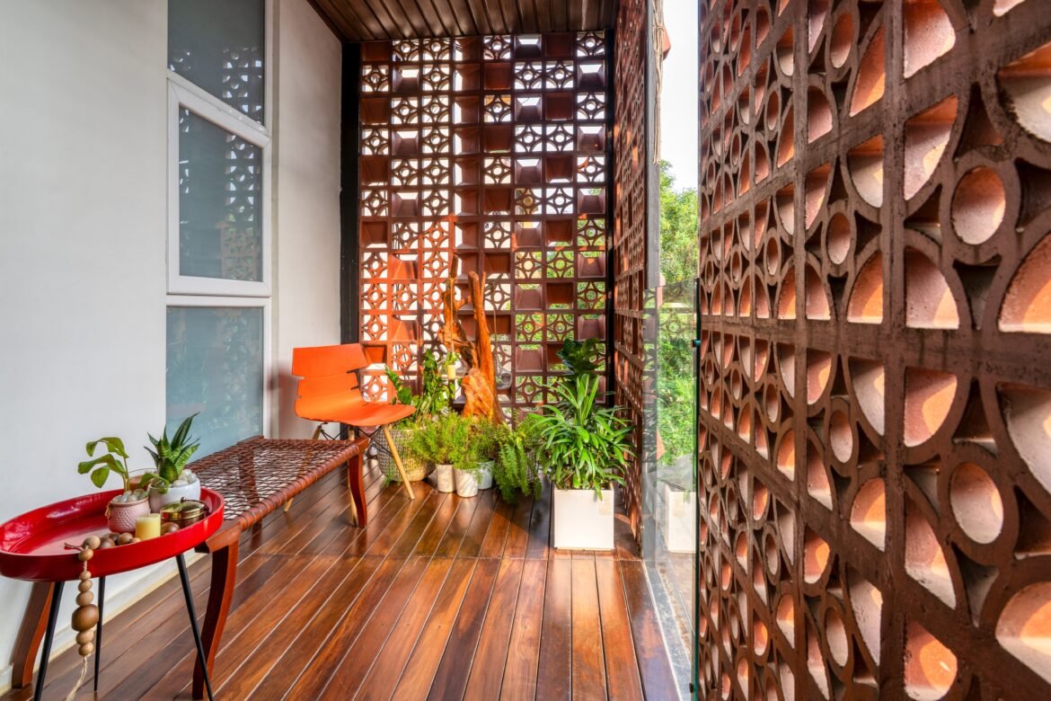
That negotiation becomes more apparent at the rear of the living spaces and in the master bedroom, where the cantilevered balconies become substantial architectural elements. The master suite opens onto a balcony running across the facade, with teak flooring and terracotta jaali screens. The screen has a practical function: it filters direct sunlight, protects privacy and allows air and daylight to pass through. On the facade, red brick cladding adds another layer of texture.

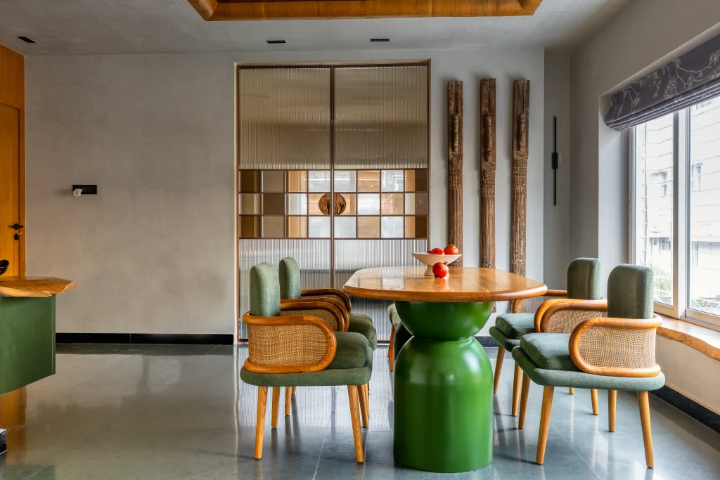
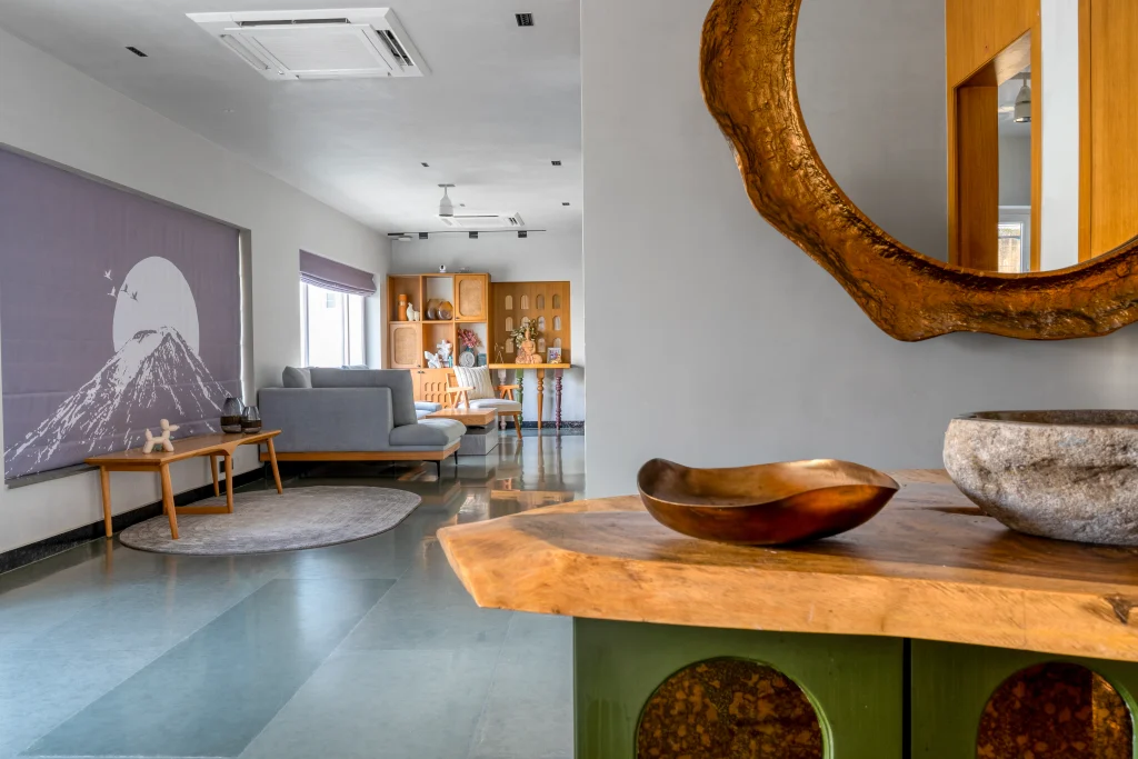
Inside, the Wabi-Sabi reference is most convincing when it appears through individual objects rather than through explanation. At the handwash area, for example, a circular hand-beaten basin has been left with an irregular edge. It sits on a live-edge oak counter, with brass detailing and an olive vanity incorporating arched brass mirror inserts. The combination works because the materials do not all arrive with the same degree of finish. Stone, timber and metal retain their different physical qualities.

The same attitude appears in the dining area, where wicker chairs and organically shaped furniture are accompanied by live-edge details. Elsewhere, hand-embroidered blinds carry small references to Japanese imagery, including Mount Fuji and birds. These details prevent the neutral palette from becoming anonymous, but they are used sparingly enough that the house does not turn into a literal interpretation of Japanese interiors.

The pooja room is similarly restrained. A fluted glass partition separates it from the adjoining space without making it completely opaque, while natural stone and brass-finished shutters keep the material language consistent with the rest of the house. Its most distinctive element is a hand-engraved white marble backdrop marked by radiating circular patterns. Rather than introducing a separate decorative vocabulary, the room uses craft and texture to distinguish itself.

The bedrooms follow the same material logic but are not identical in character. The daughter’s room is organized around an island bed, with a custom oak study table positioned behind it. Grey lime plaster, cane, warm oak and textured upholstery form the base, while burnt-orange accents bring a little more color into the room. The blinds introduce cranes and red sun motifs, giving the space a more graphic interpretation of the Japanese influence.

The kitchen takes a noticeably different approach to materiality, dictated partly by Bhubaneswar’s humid climate. Instead of continuing the timber-heavy language, the cabinetry has been customized in stainless steel using ArttDinox by Jindal Steel. Here, the decision is practical: the material offers durability, ease of maintenance and hygiene while retaining the clean lines required by the interior. Kalinga Stone surfaces complete the kitchen, with KAFF appliances integrated into the arrangement.

Bathrooms return to the more tactile vocabulary of the main interiors. Natural stone runs across floors, walls and surfaces, while white Indian marble with leather finishes is used for vanity and seating elements. Oak cabinetry and cane shutters soften the harder surfaces, keeping the bathrooms visually connected to the rest of the residence.

What gives the project its identity, ultimately, is not the presence of Japandi references but the way the designers have used restraint to solve several unrelated problems at once. The site required a response to restricted daylight and ventilation. The existing structure limited the freedom normally available to a new-build residence. The clients wanted to avoid the glossy finishes associated with trend-driven interiors. And the house still had to accommodate the very ordinary requirements of a family home.

The resulting architecture does not attempt to disguise those conditions. The balconies acknowledge the constraints of the site. The screens manage light and privacy. The material palette keeps the interiors visually connected. Custom furniture and handmade elements introduce variation without turning the rooms into displays of craft. Even the kitchen’s stainless-steel construction is a response to where the house is located rather than an attempt to force every room into one aesthetic formula.

That is where the project moves beyond a styled Japandi interior. Its strongest decisions are architectural and practical first, aesthetic second. The Japanese and Scandinavian references provide a vocabulary, but the house is ultimately shaped by light, climate, privacy, material behavior and the limitations of an existing urban structure.

Fact File

Area: 2,200 sq. ft.
Typology: Residential
Firm: Chirag Design Studio
Principal Designer & Styling: Chirag U Swain
Location: Kharvel Nagar, Bhubaneswar, India
Structure: Existing G+2 residence
Photography: Ar. Lalatendu Nayak

Design & Material Partners

Lighting: Futura Lighting
Windows & Fenestration: Beautiful Homes by Asian Paints
Artifacts: Studio Orion
Bathrooms & Bath Fittings: Kohler
Natural Stone Cladding & Flooring: Stone Life
Rugs & Carpets: Carpet Kingdom
Curtains & Blinds: Embellish
Stainless Steel Kitchen Systems: ArttDinox by Jindal Steel
Kitchen Countertops & Surfaces: Kalinga Stone
Kitchen Appliances: KAFF
Furniture: Lusso Mebel

September 25, 2026 0 comments
1 FacebookTwitterPinterestEmail
Products

Blum India Expands Its Design Network with a New Experience Centre in Ahmedabad

by DDI Edit Team September 25, 2026
written by DDI Edit Team

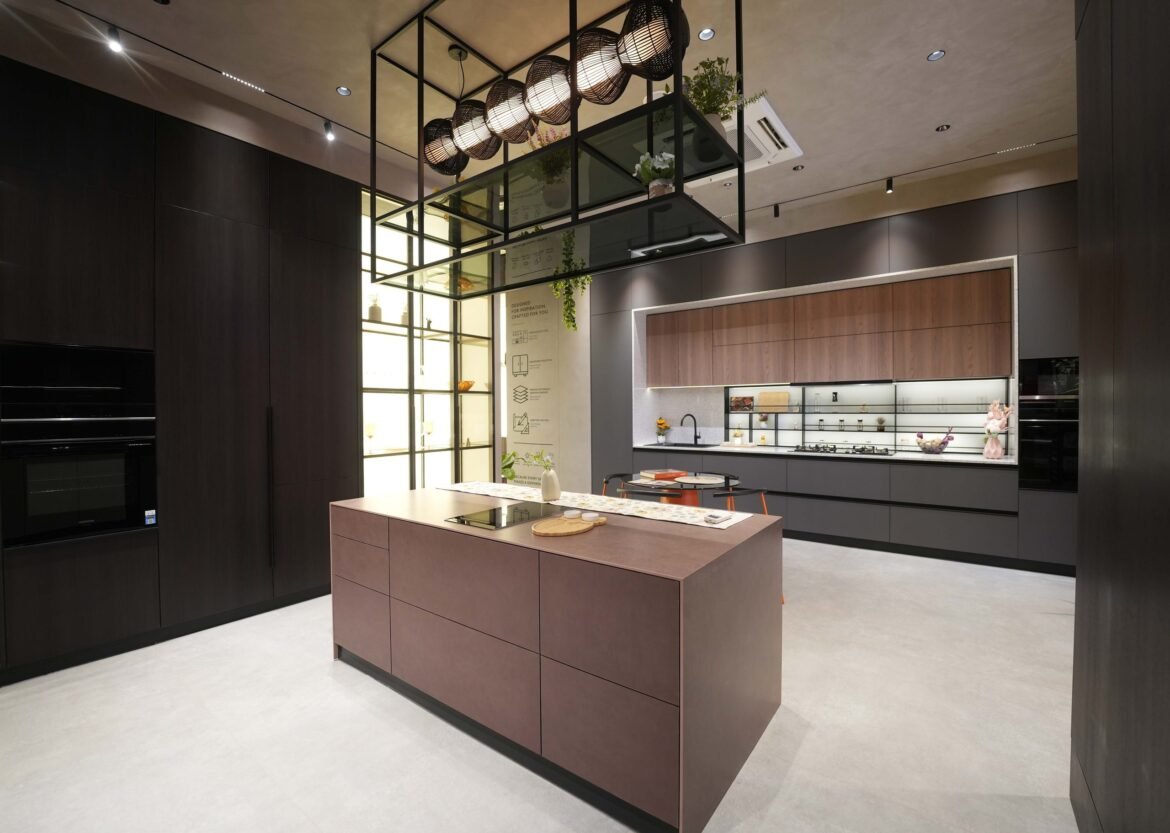
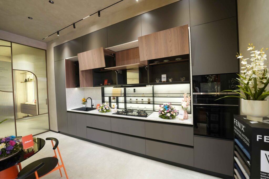
Ahmedabad’s expanding design and residential market has given furniture hardware another physical point of access. Blum India has opened a new experience center on the city’s Sardar Patel Ring Road, creating a space where architects, interior designers, furniture makers and homeowners can test the mechanisms behind contemporary kitchens and storage systems rather than encountering them only as catalogue specifications.

Located on the Bhadaj-Ognaj stretch of the SP Ring Road, the Index Blum Experience Centre brings Blum’s hardware into full-scale working applications. The distinction is important. Hinges, drawer systems and lift mechanisms are rarely the most visible elements of an interior, yet their performance determines how cabinets open, how storage is accessed and how frequently a piece of furniture can be used without friction or compromise.

The new centre presents systems including REVEGO, LEGRABOX, AVENTOS and SERVO-DRIVE in operational settings. REVEGO addresses concealed pocket spaces, allowing an entire functional area to disappear behind furniture fronts when not required. LEGRABOX focuses on drawer systems, while AVENTOS is designed for upward-opening cabinet fronts. SERVO-DRIVE adds electrical opening assistance, activated through a light touch.

Seen together in a working environment, these are less about individual fittings and more about the mechanics of everyday furniture. For a designer planning a kitchen, for example, the relevant question is not simply what a drawer looks like, but how it moves, how much access it provides and how that movement works within the dimensions of the cabinet.

That hands-on approach is the reason experience centres have become useful extensions of furniture and kitchen brands. They allow professionals to examine the relationship between hardware and design before a product reaches a project site.

For Blum, the Ahmedabad opening is part of a broader expansion of its interactive network in India. Rather than functioning purely as a retail showroom, the facility has been set up for product demonstrations and professional visits, with B2B tours available for architects, designers and furniture makers.

The format also reflects a wider shift in how kitchen and furniture hardware is being specified. As residential interiors become more integrated, hardware increasingly has a role in determining the usability of a space. Storage capacity, opening mechanisms, movement and access are design considerations alongside finishes, materials and proportions.

Blum’s presence in Ahmedabad also places Austrian furniture engineering closer to local manufacturers and design practices. Founded by Julius Blum in Höchst, Austria, in 1952, the company produces lift, hinge, drawer and pocket systems as well as motion technologies for furniture. It operates production facilities in Austria, Poland, the United States and China and serves customers across more than 120 markets.

The Ahmedabad centre is ultimately a relatively simple proposition: bring the mechanism out from behind the cabinet door and allow the user to experience it. For a designer, that can make the difference between specifying hardware from a technical sheet and understanding how it actually behaves when integrated into a piece of furniture.

Website: www.blum.com/in/en

September 25, 2026 0 comments
0 FacebookTwitterPinterestEmail
Residential

Living Tide, Punjabi Bagh, Delhi, India, by UNIIFYY

by DDI Edit Team September 23, 2026
written by DDI Edit Team

A 10,000 sq. ft. residence in Punjabi Bagh, Delhi, Living Tide by UNIIFYY is designed as a sequence of connected spaces for a family of four. The house is configured across a stilt, ground and two upper floors, with a consistent material language running through its living areas, bedrooms, circulation spaces and entertaining zones.

Timber is one of the strongest recurring elements in the interior. It appears as full-height wall panelling, cabinetry, staircase detailing and slatted ceilings, bringing a warm, continuous surface into spaces otherwise defined by stone, plaster, glass and metal. The use of timber also varies from room to room. In some spaces it forms a dark architectural backdrop, while elsewhere its warmer tones are used against pale walls and upholstery.


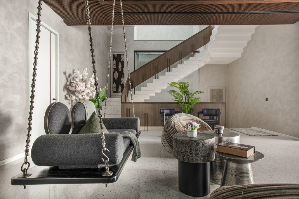
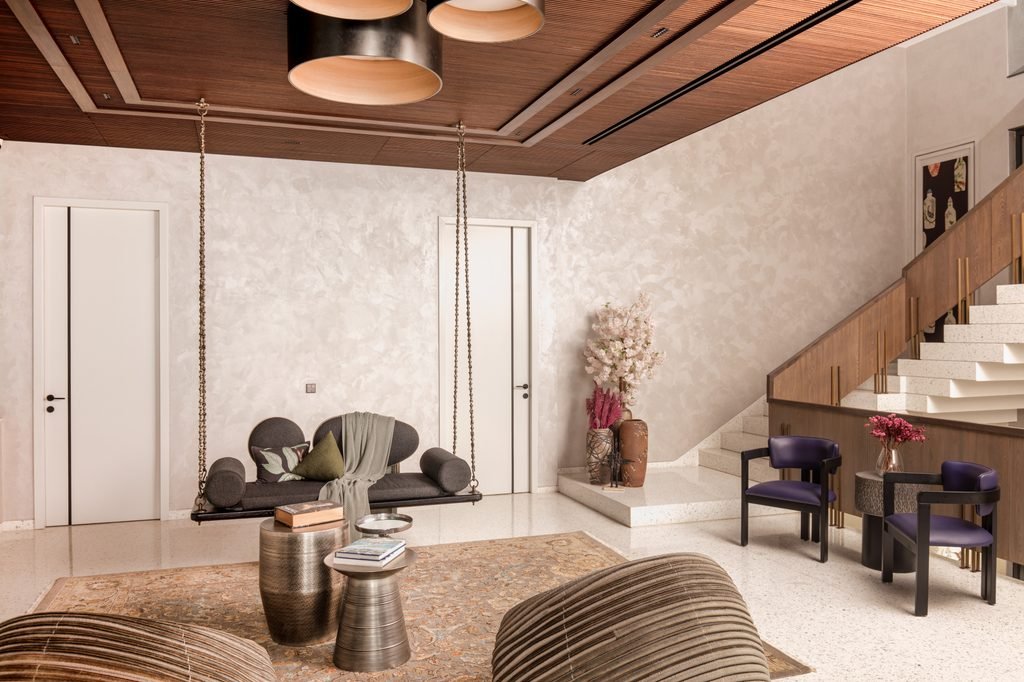
The first-floor lounge is one of the home’s more distinctive spaces. A timber slatted ceiling extends across the room, with large circular light fixtures set into the composition. A suspended swing occupies one side of the lounge, while rounded upholstered seating and low metal tables create a separate sitting arrangement. The staircase rises behind the seating area, with timber cabinetry running alongside it.

The staircase itself becomes part of the interior rather than simply a circulation element. Pale stair treads contrast with the darker timber handrail and cabinetry, while the open edge keeps the stair visually connected to the lounge below. The arrangement allows the staircase, seating and ceiling to read as parts of the same volume.


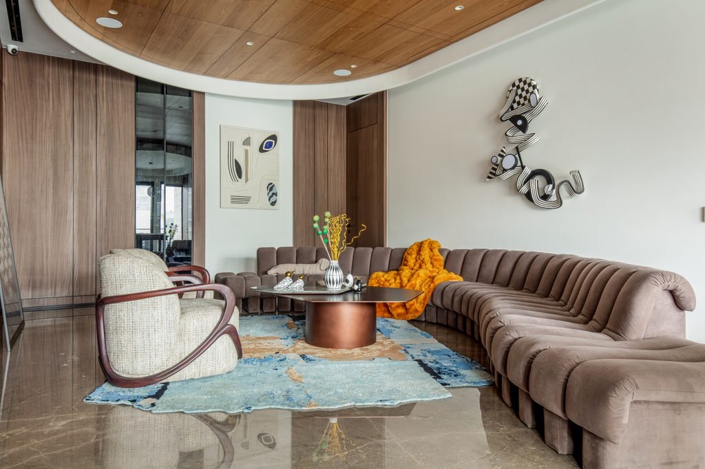
The material treatment continues into another lounge, where a large curved sectional sofa defines the room. The seating is placed against a pale wall, with timber panels and artwork positioned behind it. A copper-toned cylindrical table sits at the center, while a patterned rug introduces blue and warmer earth tones beneath the furniture.

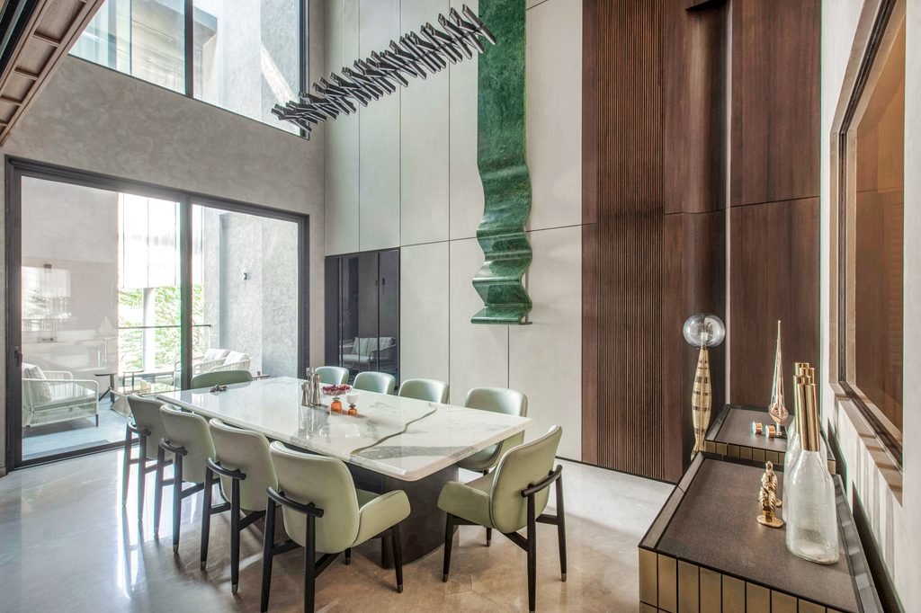
The artwork is not restricted to one particular area of the house. Sculptural wall pieces, framed works and large-scale installations appear throughout the interiors. In the lounge, a black-and-white sculptural work becomes a focal point above the sofa. Elsewhere, linear suspended artwork is positioned within a taller dining space, while a large green sculptural panel occupies the wall behind the dining table.


The dining room is organized around a rectangular stone table with upholstered dining chairs. The pale surface of the table contrasts with the warmer flooring and timber elements around it. The vertical artwork above the table adds another layer to the room without filling the wall with multiple decorative elements.

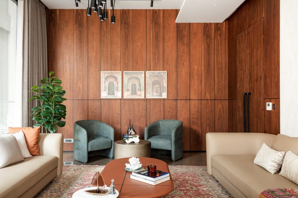
In the formal drawing room, timber becomes the dominant wall treatment. Full-height wood panelling forms the backdrop to a pair of pale sofas and green upholstered armchairs. A patterned rug in red and deeper tones establishes a stronger color field beneath the seating arrangement. The room receives substantial natural light through the large glazed opening along one side.

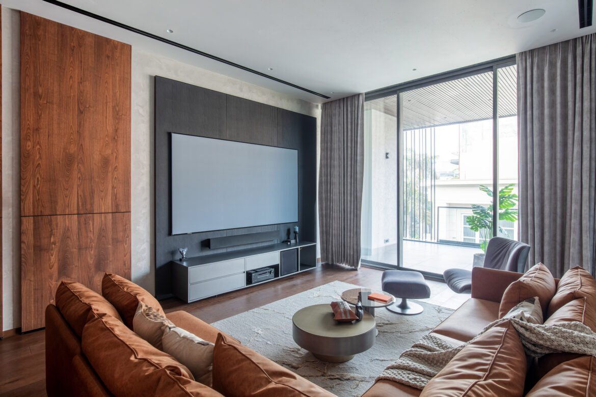
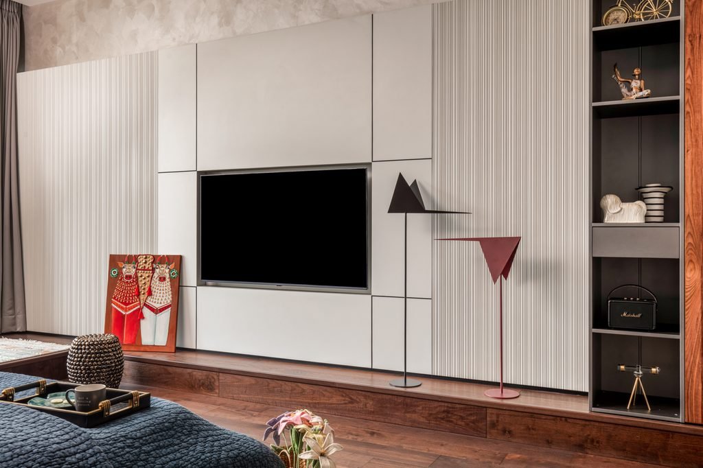
The TV lounge follows a darker material palette. A large textured black panel frames the television and media unit, while walnut-toned timber occupies the wall beside it. The darker media wall creates a clear focal point within the room, while the large glass opening brings daylight into the seating area and connects it visually with the terrace beyond.

The choice of furniture varies across the residence. Curved sofas, rounded lounge chairs, suspended seating and cylindrical tables are used alongside more linear cabinetry and wall treatments. This creates a contrast between the architectural geometry of the rooms and the softer forms of the furniture.

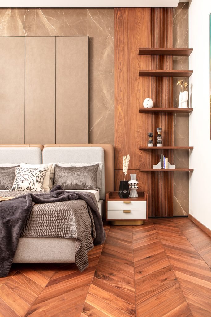
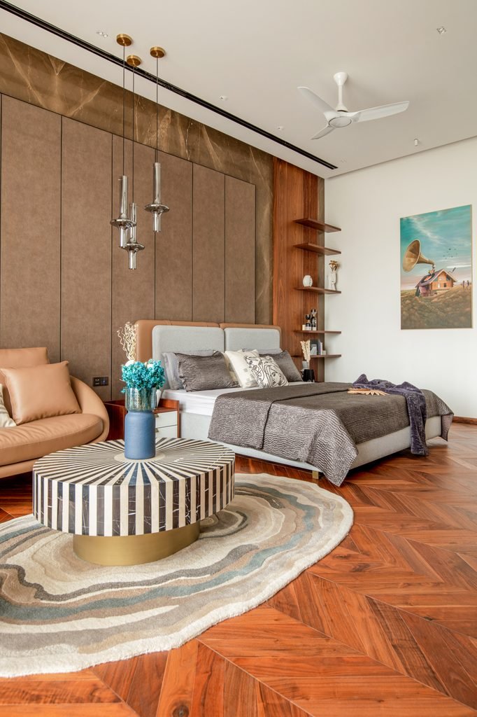
The parents’ bedroom moves into a lighter palette. A large floral artwork stretches across the wall behind the bed, framed by timber panelling. The upholstered bed, bench and seating are kept in neutral tones, while patterned cushions and smaller accessories introduce color. Floor-to-ceiling curtains soften the large window opening and filter the daylight entering the room.

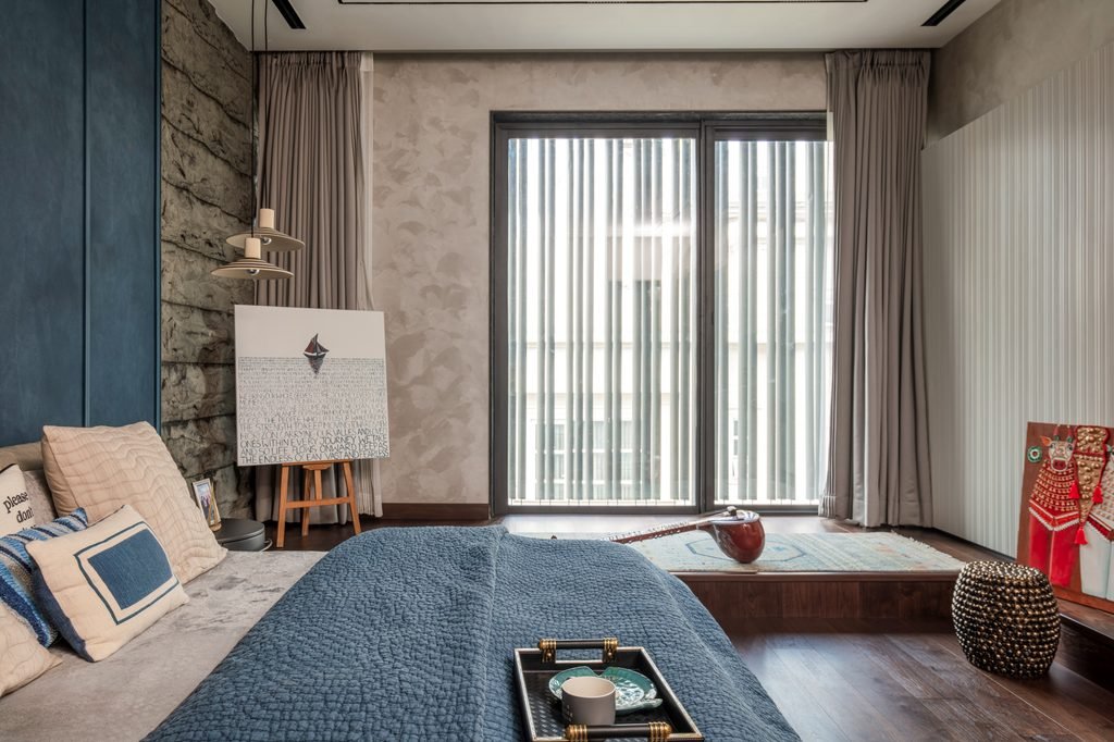
Another bedroom takes a different direction, using blue wall panels against a textured stone surface. The dark timber floor provides contrast to the cooler wall palette, while the upholstered bed and pendant lights maintain a softer residential character. An easel with artwork sits on the raised platform beside the bed, reinforcing the presence of art across the private areas of the house.

The treatment of ceilings is particularly visible in the lounge and circulation areas. Timber slats introduce texture overhead and conceal lighting and services within a consistent surface. In other rooms, recessed lighting and slim linear fixtures keep the ceiling relatively restrained, allowing the wall treatments, furniture and artwork to take precedence.

The residence also uses large glazed openings to bring natural light into the interiors. In the living and drawing areas, windows extend close to the full height of the room, while curtains provide a softer layer when required. The combination of glazing, pale surfaces and reflective flooring creates noticeable changes in the appearance of the rooms throughout the day.

The palette moves between warm timber, neutral upholstery, pale stone, darker metal details and selective color. Blue appears in rugs and bedroom finishes, while rust, orange, green and red emerge through furniture, artwork and accessories. Rather than using one colo*r scheme throughout, the rooms retain a common material vocabulary while allowing individual spaces to differ.

This is particularly apparent between the social and private areas. The larger lounges accommodate more sculptural furniture and stronger artwork, while the bedrooms use softer materials and more restrained compositions. The staircase and connecting spaces act as visual links between these different rooms.

The design also gives considerable attention to built-in elements. Timber cabinetry runs along walls and beside the staircase, creating storage while maintaining a continuous architectural surface. In the bedrooms, wall panelling incorporates bedside storage and shelving, reducing the number of separate furniture pieces required.

The home therefore relies heavily on the relationship between fixed architectural elements and movable furniture. Timber walls, ceilings, cabinetry and stair details establish the permanent framework, while sofas, chairs, rugs, tables, artwork and accessories bring variation into each room.

The result is a contemporary residence in which the same material vocabulary is interpreted differently across its rooms. Timber provides continuity, while stone, metal, textiles and artwork create contrast. The spaces are connected through their finishes and proportions, but each has its own combination of colour, furniture and visual focus.

For UNIIFYY, Living Tide brings together residential planning, material detailing and art across a large family home. Its strongest visual elements are found in the timber-lined interiors, sculptural furniture, integrated staircase and extensive collection of artworks, all of which are used across a sequence of living, dining and private spaces.


Fact File

Project Name: Living Tide

Location: Punjabi Bagh, Delhi, India

Area: 10,000 sq. ft.

Typology: Residential

Firm: UNIIFYY

Lead Designers: Ar. Ashish Batra, Ar. Kavita Batra

Project Configuration: Stilt + Ground + Two Floors

Client: Family of four

Photography Credits: Ashish Batra

Furniture: Alsorg, Wriver

Outdoor Furniture: Nardi, Luxox, Vetra

Rugs: Cocoon, Loops

Furnishing: Dialogues by Nirmals, World of Nilaya, Shades of India

Décor: The White Teak, House of Things, Glass Forest, OMA Living, Lladró

Lights: Tisva, The White Teak

Veneers: Decowood by Greenlam

Stone: Stonex, Agglotech

Windows: Winarch Fenestration System

Kitchen: MGW Interiors

Tiles: Nexion

Sanitary: Kohler

Art: Taksini, WallTart, Meet.Artwork

Instagram: @uniifyy_

Website: www.uniifyy.com

September 23, 2026 0 comments
0 FacebookTwitterPinterestEmail
Public & Cultural

When Gold Takes the Form of Air: auruBOROS on New York’s High Line

by DDI Edit Team September 23, 2026
written by DDI Edit Team

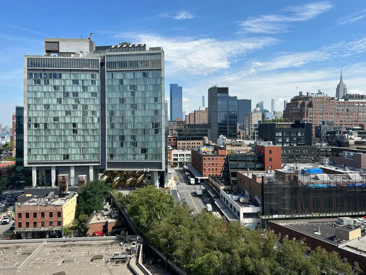
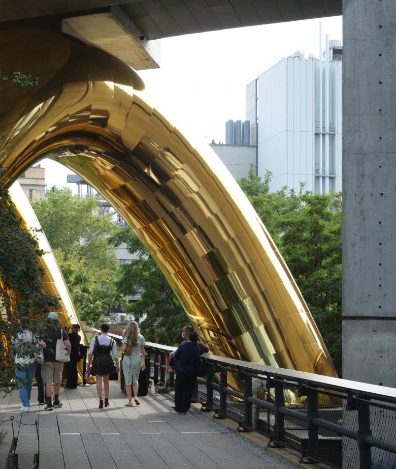
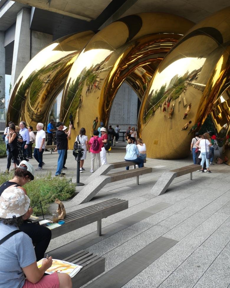
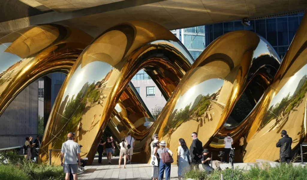
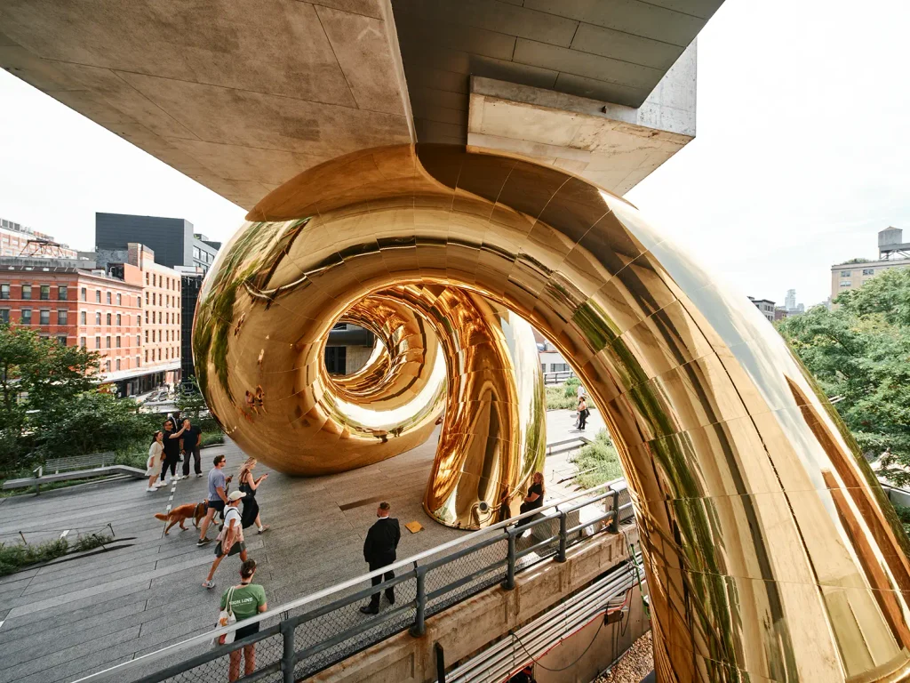
A golden serpent now moves through one of New York’s most recognizable public spaces, but there is considerably less substance to it than its appearance suggests. Rising from beneath The Standard and extending through the High Line at Little West 12th Street, auruBOROS: Urban Memory and Collective Dream is a 30-meter inflatable installation by Plastique Fantastique. Its mirrored golden skin suggests polished metal, while its actual structure depends on air and a network of ventilators.

Commissioned by Bvlgari for the New York chapter of its Serpenti Infinito series, the installation marks the Italian jewelry house’s first public art commission in the United States. Rather than reproducing the Serpenti motif as an enlarged piece of jewelry, the project places the serpent within the architecture and circulation of the city, allowing it to occupy the High Line as a temporary structure rather than a permanent monument.

Plastique Fantastique, the Berlin-based art and architecture duo founded by Marco Canevacci and Yena Young in 1999, has built its practice around temporary spaces and pneumatic structures. Both artists trained as architects. Rome-born Canevacci studied at TU Berlin, while Seoul-born Young studied at Yonsei University and Aalto University. Their work has repeatedly explored what happens when air, rather than conventional building materials, becomes the primary means of creating volume and space.

For auruBOROS, that approach is applied to one of the oldest symbols associated with Bvlgari. The title combines aurum, Latin for gold, with ouroboros, the ancient image of a serpent consuming its own tail. The artists retained the symbolic reference but abandoned its traditional circular form. Instead of closing in on itself, the serpent opens out and enters the city.

The result is a form that moves across several layers of the site. It rises from the street beneath the High Line, passes through the space beneath The Standard, and continues along the elevated park. Visitors encounter it from different levels and perspectives, sometimes walking alongside the inflated body and at other points passing beneath it.

This relationship with the existing architecture is central to the installation. The serpent has not simply been placed on the High Line as an isolated sculpture. Its shape responds to the narrow elevated walkway, the hotel structure, the street below and the movement of pedestrians through the site. Its scale is substantial, but its pneumatic construction allows it to occupy that space without the structural mass normally associated with a work of comparable size.

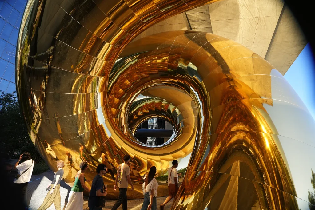
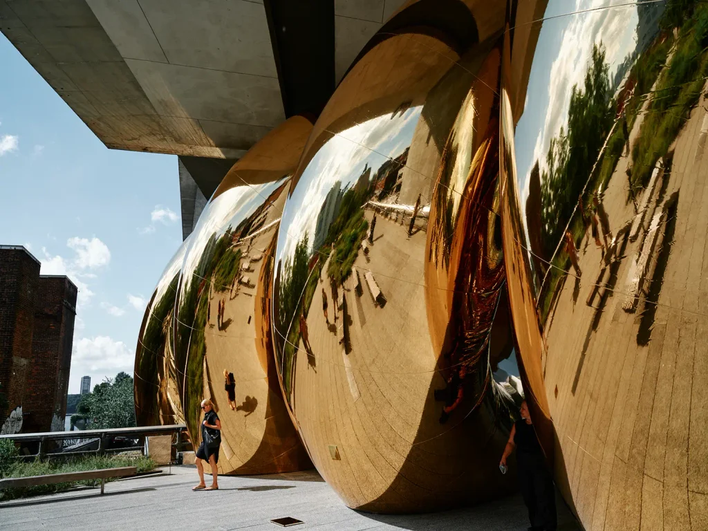
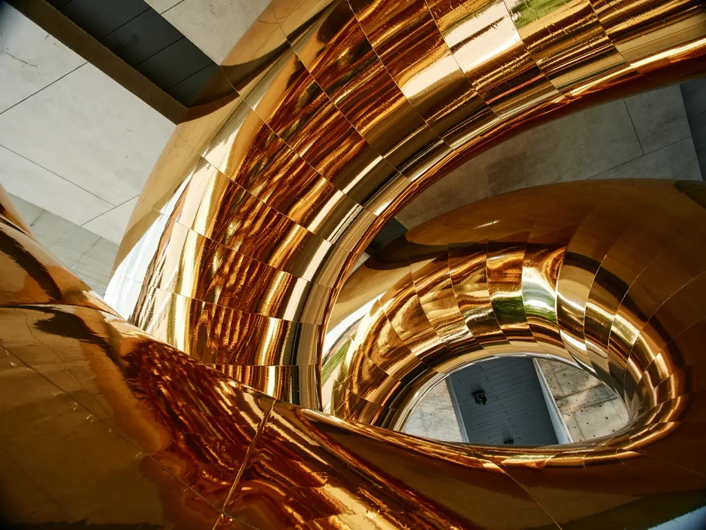
The sculpture is made from golden mirrored TPU, a material that gives the inflated tubes their metallic appearance. From a distance, the skin can suggest polished gold or another solid reflective material. Up close, the construction reveals its lightness. The apparent weight of the serpent is an optical effect created by its colour, finish and scale.

That contrast is fundamental to the work. Gold carries associations of permanence, wealth and material value, while air is invisible and transient. The sculpture depends on the latter to maintain the appearance of the former.

The artists have described this tension as an important part of the project. Although auruBOROS appears monumental, it remains light, fragile and temporary. Its existence is conditional on the continuous operation of the equipment that keeps the structure inflated.

The mirrored surface introduces another layer of change. Instead of presenting one fixed image, the sculpture constantly absorbs fragments of its surroundings. Buildings, vegetation, sky, pedestrians and passing light are reflected across the curved skin. The High Line therefore becomes part of the artwork’s appearance, with the reflected environment changing according to the time of day and weather.

A person standing beside the serpent may appear alongside a fragment of brick façade. A section of sky can occupy one curve while the planting of the High Line appears across another. The sculpture does not offer a single complete view of itself because its surface is continually broken up by the environment around it.

This makes the installation particularly suited to the High Line, a public space already defined by transformation. The elevated park occupies the former West Side Line of the New York Central Railroad, where an infrastructure built for freight movement was given a new civic purpose. Its industrial structure remains visible beneath a landscape of planting, pathways and public art.

The project also continues Plastique Fantastique’s interest in inflatable structures as a form of public architecture. The duo’s earlier projects include a large inflatable ring installed across a Paris footbridge during Nuit Blanche in 2023 and an installation at the Venice Pavilion during the 58th Venice Biennale in 2019. Across their work, the use of air allows conventional architectural ideas of permanence, weight and enclosure to be questioned.

For auruBOROS, the artists connect air to the Greek concept of pneuma, a word associated with breath, air and spirit. The reference gives the material a conceptual role, but the physical reality remains straightforward: air is what allows the structure to achieve its enormous scale while remaining remarkably light.

Bvlgari’s Serpenti has been part of the house’s visual language since the mid-20th century. The motif became particularly associated with watches and jewelry, where the snake’s coiling form could be translated into flexible structures that wrapped around the wrist. Serpenti Infinito extends that established identity into artistic and spatial projects.

Previous editions of the series have appeared in Shanghai, Seoul and Mumbai. Each location has provided a different setting for the serpent, allowing the symbol to be interpreted through local environments and artistic practices. In New York, Plastique Fantastique’s inflatable construction introduces a deliberately temporary quality to an emblem traditionally associated with precious materials.

The distinction is important. The installation does not attempt to imitate the physical properties of jewellery. Instead, it uses the visual language of preciousness while making the underlying structure almost weightless.

The work was fabricated in Lübeck, Germany, before being installed in New York. Measuring approximately 30 by 10 by 10 metres, it occupies a considerable volume while remaining dependent on pneumatic pressure rather than a conventional structural frame.

Its temporary nature also changes the way it is experienced. Unlike a permanent public monument, auruBOROS has a defined lifespan. It appears on the High Line for eleven days, from September 10 to September 20, 2026, before being dismantled.

During that brief period, the sculpture becomes part of the daily movement of the park. Visitors do not need to enter an exhibition or buy a ticket to encounter it. It occupies the same path as commuters, tourists, residents and people simply passing through the High Line.

That accessibility is particularly relevant to the project’s public-art status. The serpent is not presented as an object separated from everyday urban life. It shares the space with it.

The reflective surface reinforces that interaction. People become part of the image simply by standing near the work, while the architecture and landscape around them are incorporated into the same field of reflection. In this sense, the sculpture records its surroundings without using a conventional image-making process.

The idea of collective memory in the title therefore extends beyond the serpent itself. The work exists through the accumulation of encounters, reflections and changing conditions during the short period in which it occupies the High Line. What one visitor sees at midday will not be identical to what another sees later in the evening.

The work’s apparent permanence is consequently an illusion. The golden surface remains visually consistent, but everything around it changes. Light shifts, people move, weather alters the reflections, and the city continues its normal activity.

Eventually, the air will be switched off and the serpent will disappear. What remains is the experience of a structure that briefly altered the scale and character of the High Line without becoming a permanent part of it. For Bvlgari, auruBOROS extends the Serpenti motif into public space. For Plastique Fantastique, it continues a long investigation into air, temporary architecture and the relationship between constructed forms and their surroundings.

For New York, it is another temporary intervention in a public landscape built from the idea of transformation.

Fact File

Year: 2026
Typology: Public Art, Temporary Installation

Artist / Practice: Plastique Fantastique

Artists: Marco Canevacci, Yena Young

Commission: Bvlgari, Serpenti Infinito

Location: The High Line, Little West 12th Street, New York City, USA

Material: Golden mirrored TPU, pneumatic air system

Dimensions: 30 × 10 × 10 m

Fabrication: Lübeck, Germany

Status: Temporary installation

On view: September 10–20, 2026
September 23, 2026 0 comments
0 FacebookTwitterPinterestEmail
Products

Duravit Circle: A Rounded, Edge-Free Faucet Series for Contemporary Bathrooms

by DDI Edit Team September 23, 2026
written by DDI Edit Team

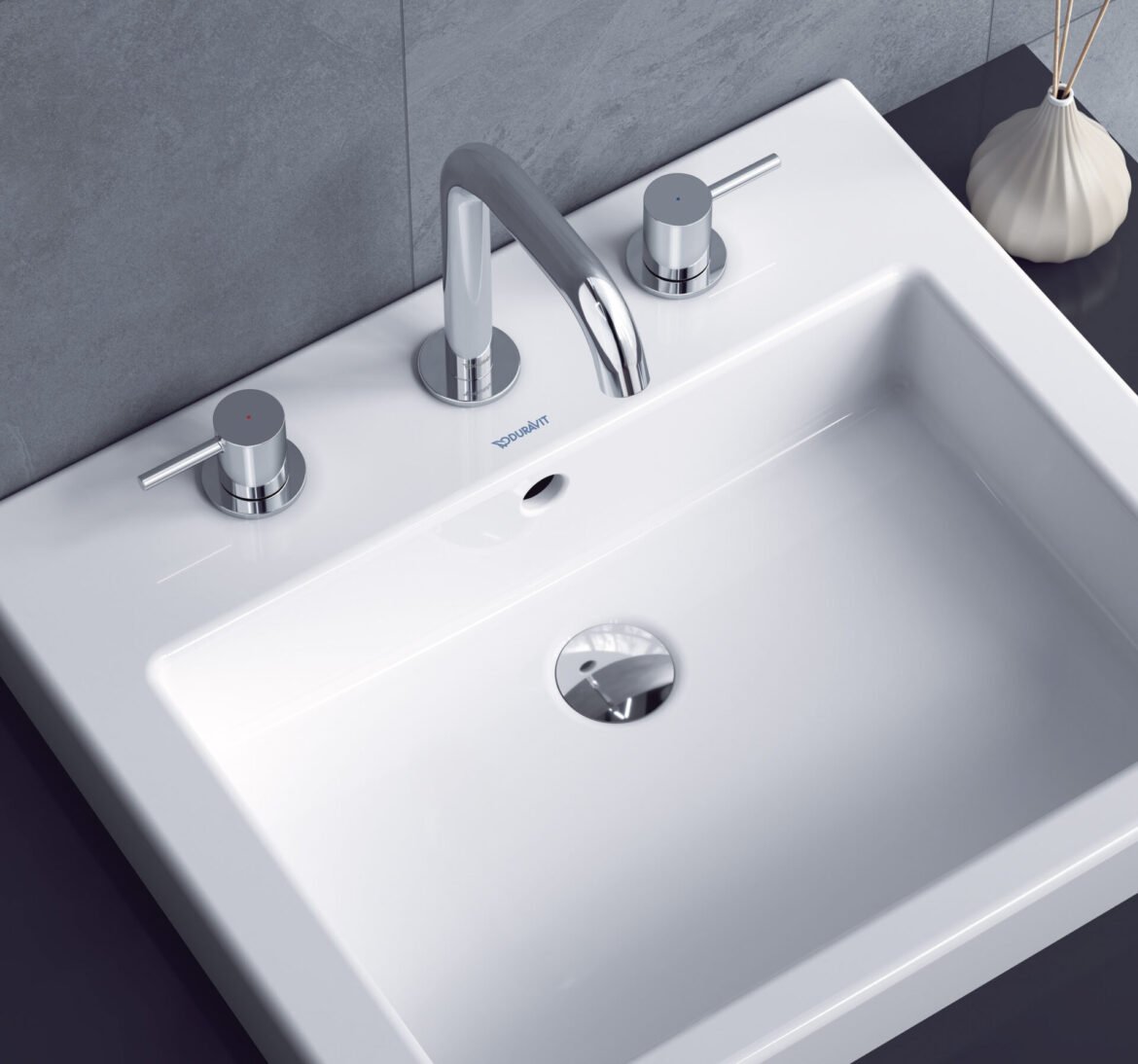
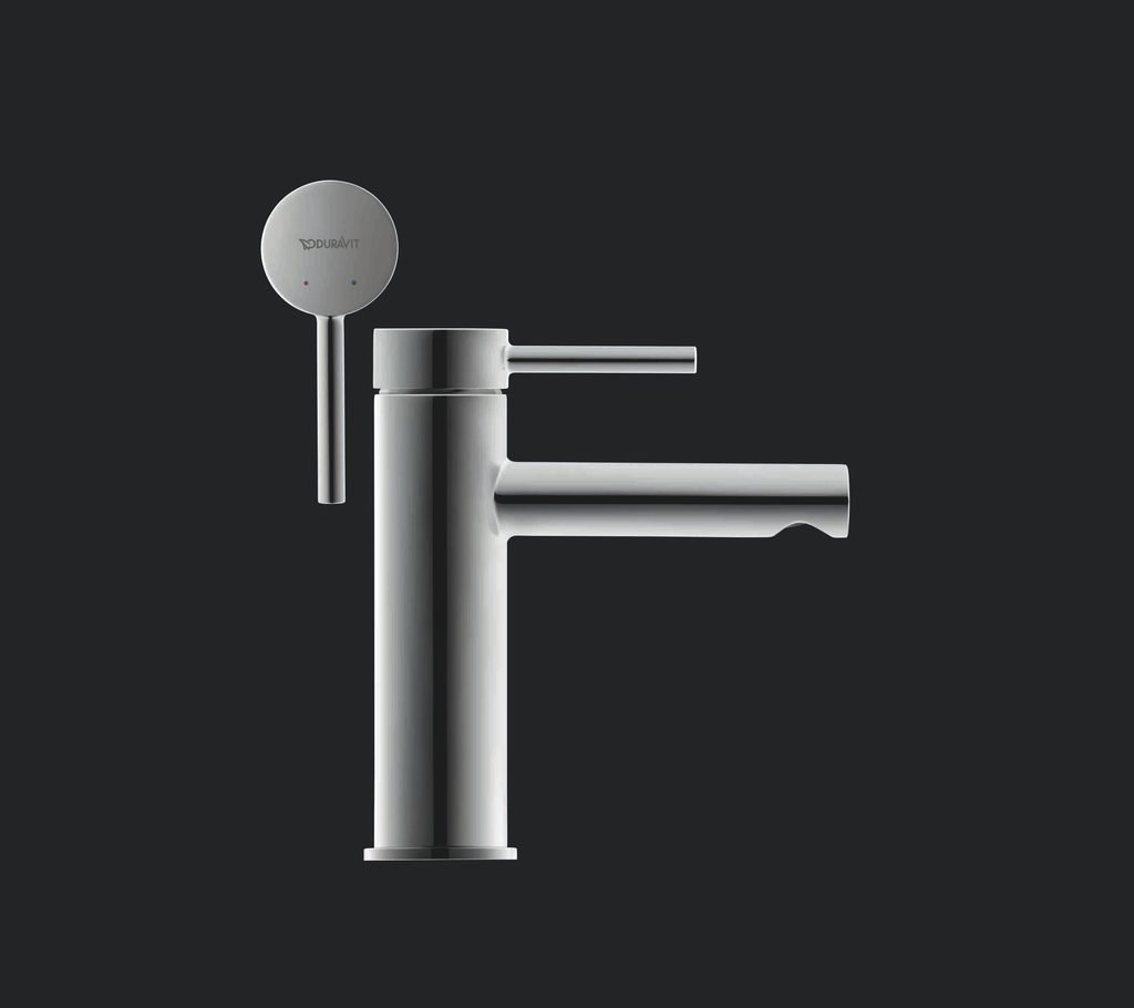
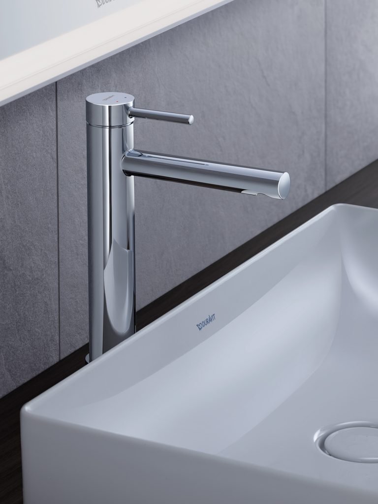
Duravit’s Circle faucet series is built from a single geometric idea carried through without exception: cylindrical bodies, rounded handles, and no sharp edges anywhere across the range. Duravit ties the shape back to the circle as a symbol of balance and infinity, language that shows up in most minimalist product launches, but here it happens to describe the object accurately rather than just decorating the press copy. The restraint shows up in the smaller details as much as the overall shape. The gap between the faucet body and its handle has been kept deliberately tight, close enough that the fitting reads as one continuous form rather than parts assembled together, with no visible seams and no hardware left exposed to interrupt the line.

The rounded geometry isn’t purely visual. Without corners or recesses, the Circle series is easier to keep clean, since there’s nowhere for limescale or grime to settle into a crevice, and Duravit backs that up with an EasyClean stream shaper, designed to let dirt and limescale wipe away before they build into residue. The technical hardware stays hidden rather than on display. A flow regulator sits concealed inside the fitting, keeping the exterior line uninterrupted, and the sink mixers run Duravit’s AirPlus system, which mixes air into the water stream for a fuller flow without increasing water use, a detail that affects how the faucet feels in daily use more than how it looks.

HyperFocal: 0

The series covers a wide range of bathroom layouts rather than a single fixed format, with single-lever mixer taps available in S, M, and L heights, alongside a concealed installation mixer, a standalone cold-water faucet, and a 3-hole faucet. That range matters for anyone specifying the series across a full bathroom, since a minimalist collection only works as a coherent look if it can actually match whatever basin or wall configuration is already in place.

Duravit was founded in 1817 in Hornberg, in Germany’s Black Forest, and now operates in more than 130 countries. The Circle series was developed by Duravit’s internal design team, working within a broader studio roster that includes Cecilie Manz, Philippe Starck, Antonio Citterio, Christian Werner, Sebastian Herkner, and Patricia Urquiola. Separately, the company has set a target of full climate neutrality by 2045, aiming to get there without relying on carbon offsets.

September 23, 2026 0 comments
0 FacebookTwitterPinterestEmail
Products

MODICO Opens a Showroom at Jakarta’s IDD, Built Around Materials as Much as Furniture

by DDI Edit Team September 23, 2026
written by DDI Edit Team

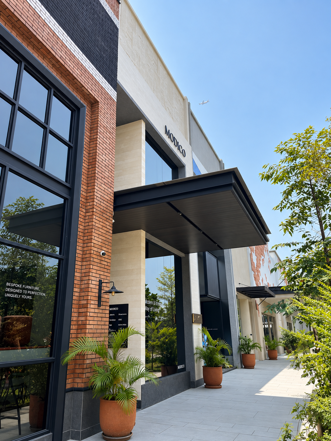
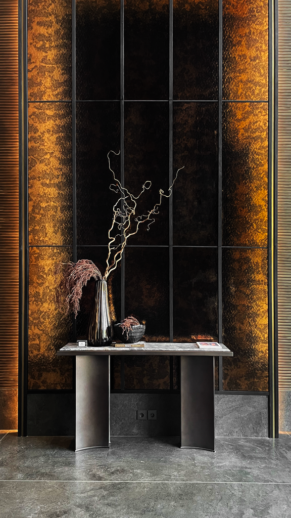
MODICO’s new showroom at Indonesia Design District, PIK 2, skips the usual furniture-on-a-floor layout. Glass, painted walls, metal, and a mix of textures and finishes run through the space, each area holding its own character while the whole thing still reads as one place rather than a series of separate rooms.

Materials here carry weight beyond backdrop duty. Where they sit, how they’re finished, what they’re paired with, all of it changes how a piece of furniture gets read once it’s placed inside the room.

Eight collaborators built the showroom alongside MODICO: Stuccoverni, Roxyglass, Magnus Aluminium, NURCO, ABCON, LTECH, Moire Bespoke Rugs, and Meglio Collection, covering surface finishes, glass, aluminum, curtain systems, lighting, bespoke rugs, and additional furniture. None of it was built separately and then assembled. The interior depends on these pieces sitting against each other.

MODICO frames this as a statement about how it wants its furniture seen: alongside light, material, and architecture, rather than on its own. Indonesia Design District itself houses more than 200 brands across furniture, interiors, and design, and MODICO IDD is the company’s entry into that wider mix.ise.

September 23, 2026 0 comments
0 FacebookTwitterPinterestEmail
Products

Wall/Pepper’s Nordic | Hygge Collection Turns Alpine Terrain Into a Design Language

by Shweta September 15, 2026
written by Shweta

Wall/Pepper has built its reputation in Italy on treating wallpaper as a material problem as much as a decorative one, developing eco-friendly, fully customizable papers produced across eight distinct material types, from soft-touch finishes to sound-absorbing and water-resistant surfaces suited to bathrooms and kitchens. That range gives the Milan-based brand room to move between very different design languages from one collection to the next, and Nordic | Hygge, part of its 2026 catalogue, is where that range gets pointed toward the Alps.

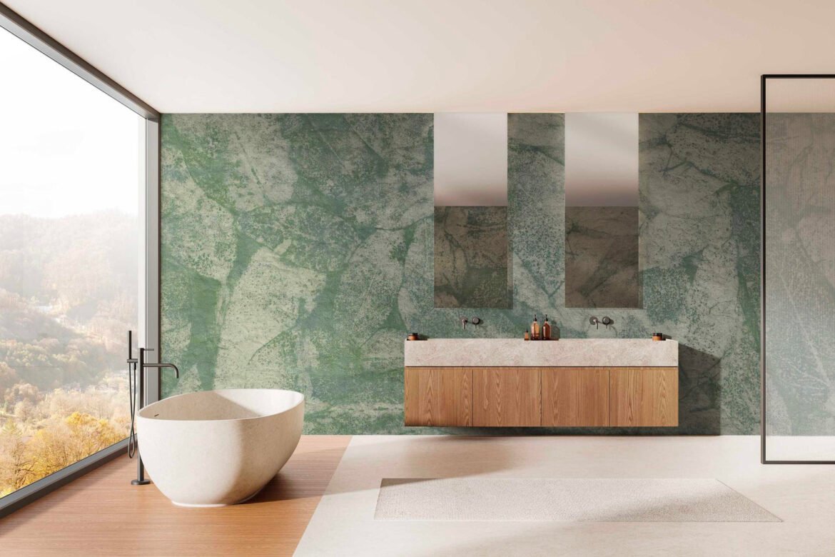
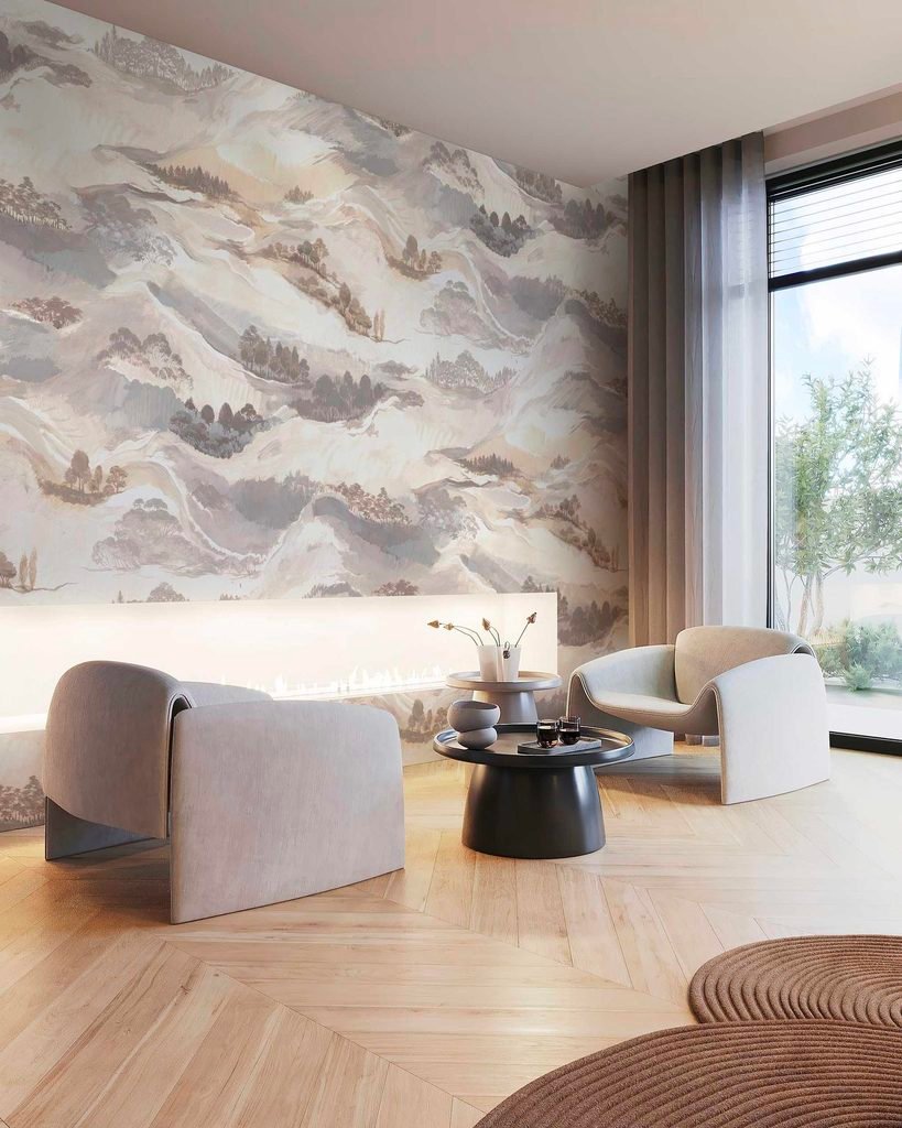
Nordic | Hygge Collection wallpaper by Wall/Pepper, 2026 catalogue

The collection works from a specific reference: clear mountain air and high-altitude flora, reinterpreted and softened into a refined decorative language that transforms the colorful, spontaneous force of untamed nature into designs meant to evoke deep emotion. That’s a narrower brief than “Nordic landscapes” suggests on its own, pointing specifically to alpine flora and atmosphere rather than the wider Scandinavian design vocabulary the name might otherwise imply.

The collection sits alongside others in the same 2026 line, including an Opus range built around painterly, sky-and-earth imagery, and a separate Déchiré Collection developed with artist Luca Artioli using a torn-paper collage technique applied to wallpaper for the first time. Nordic | Hygge takes a more restrained route by comparison, working through pattern and finish rather than collage or mixed materiality, closer to how the brand has historically approached nature-based design.

That restraint carries into how the designs can actually be specified. Every graphic in the catalogue, Nordic | Hygge included, can be produced across the brand’s full material range, and designs can also be recolored or developed as fully bespoke work, which Wall/Pepper treats as standard practice on architectural projects rather than a premium add-on.

Where Nordic | Hygge distinguishes itself is in intent rather than in a single visual signature: wallpaper used to bring an outdoor, alpine reference indoors, applied through a catalogue system built to adapt to nearly any interior condition—humid, acoustic-sensitive, or otherwise.

September 15, 2026 0 comments
0 FacebookTwitterPinterestEmail
Newer Posts
Older Posts

Recent Posts

  • Florim Introduces SensiVenezia, a Porcelain Stoneware Collection Inspired by Venetian Terrazzo
  • LEGO Botanical Wave Transforms TANK Shanghai with 380,000 Brick-Built Flowers
  • The Great Eastern Home Introduces Its Latest Collection of Italian Vintage Mirrors
  • Smart Homes Are Changing Architecture: What Happens When Technology Becomes Part of the Building?
  • AARQE9’s Nikhaar Dhawan & Bahaar Dhawan Rohatgi Unveil the Sculptural Lunar Drip Table

Recent Comments

  1. Smart Home Architecture: How Technology Is Changing Design on Aqara Smart Lock U500: Three Versions for Gates, Glass Doors and Standard Entrances

Newsletter

  • Home
  • About Us
  • Contact Us
  • Editorial Policy
  • Privacy Policy

© 2026 Design Diary International. All Rights Reserved.

Design Diary International
  • Home
  • Project
    • Residential
    • Hospitality
    • Commercial
    • Public & Cultural
  • Interview
    • Architect
    • Interior Designer
    • Founders & Brand
    • Artist
  • Material
  • Product
  • Feature
  • DDI Finds
    • Emerging Studio
    • Rising Designers
    • New Practices
  • About
  • Magazine
  • Contact Us