• Home
  • Project
    • Residential
    • Hospitality
    • Commercial
    • Public & Cultural
  • Interview
    • Architect
    • Interior Designer
    • Founders & Brand
    • Artist
  • Material
  • Product
  • Feature
  • DDI Finds
    • Emerging Studio
    • Rising Designers
    • New Practices
  • About
  • Magazine
  • Contact Us
Design Diary International
Products

For Cattelan Italia, Sergio Bicego Builds a Sofa That Keeps Changing Shape 

by DDI Edit Team September 15, 2026
written by DDI Edit Team

Sergio Bicego designed Gibson as a modular seating system made of independent upholstered volumes, where seats, backrests, and armrests aren’t fixed to a single configuration but can be moved and recombined within a space as needed. The idea runs through the whole system: a sofa doesn’t have to keep the same shape once it leaves the showroom.
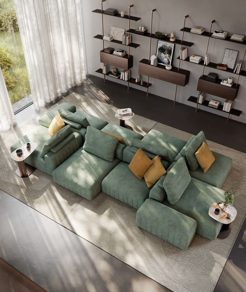
Gibson modular sofa by Sergio Bicego for Cattelan Italia with reconfigurable seats and backrests

That shows most clearly in how Gibson treats the idea of a front and a back. The sofa is double-sided, and an armrest on one module can convert into a backrest, while additional modules extend the seat into a chaise longue. There’s no fixed orientation forcing the piece against a wall or into a single reading of the room. Bicego built the flexibility into the hardware itself, which makes Gibson equally suited to a home living room and to contract settings like hotel lobbies, retail floors, and hybrid workplaces, where furniture has to survive reconfiguration far more often than in a private residence.

In those commercial settings, Gibson functions less like a single piece of furniture and more like a way to organize a room without walls. Modules can be combined, rotated, and reset into different layouts, creating loose zones for conversation, waiting, or quieter moments within a larger open space, all without a partition in sight.

The name comes from music, and Bicego has leaned into that logic in how the modules relate to each other: individual pieces functioning like notes on a score, assembled according to open compositional rules rather than one correct arrangement. The seating itself is built deep, with rounded edges and quilted detailing that picks up the softness of the polyurethane padding underneath, giving the upholstery a noticeably tactile quality. A ceramic coffee table module extends the system further, and loose cushions come in the full Cattelan Italia fabric range, either contrasting against the base palette or staying close to it in a tone-on-tone treatment.

What Bicego seems to be after with Gibson is furniture that keeps functioning as a design decision long after installation, not a fixed object but something closer to an ongoing one, reshaped as a space’s requirements shift over time.
September 15, 2026 0 comments
0 FacebookTwitterPinterestEmail
Products

ARAN Cucine’s Guadalupe Puts the Real Design Work Behind the Cabinet Door

by DDI Edit Team September 14, 2026
written by DDI Edit Team

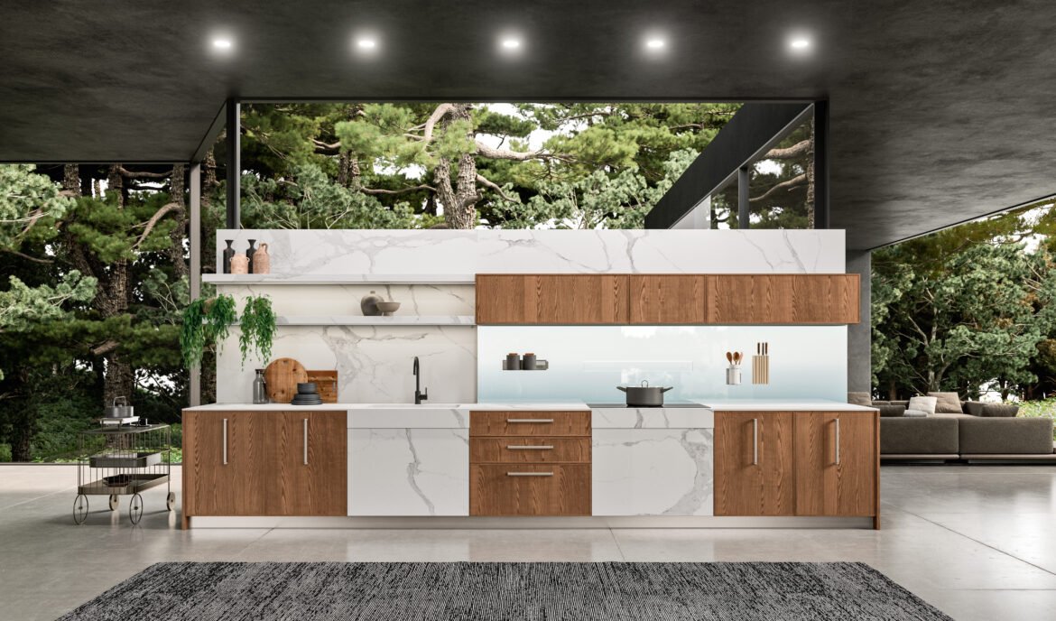
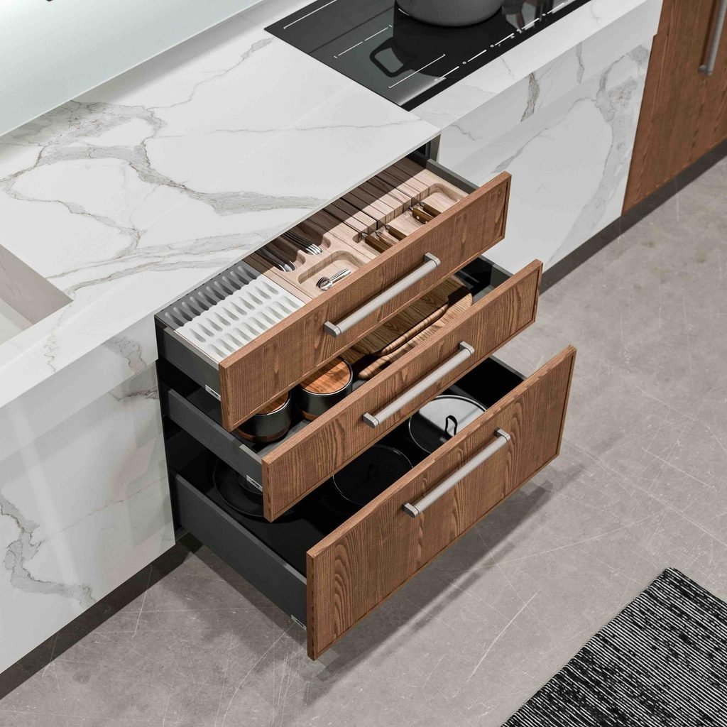
A kitchen gets used dozens of times a day, and most of that use comes down to small, repeated actions: reaching for a knife, pulling out a pot, and putting a spice jar back where it belongs. ARAN Cucine’s Guadalupe system, finished in Manhattan ash wood with titanium Groove handles, is built around making those actions easier, with an internal drawer layout designed to hold each kind of object in a place suited to it rather than leaving everything to compete for the same space.
Cutlery, knives, spices, and tools each get their own defined space in the uppermost drawer, an arrangement built around how often a hand actually returns to that drawer during a single meal. A drawer beneath it swaps fixed inserts for a modular divider system, since trays, jars, and bowls rarely come in matching sizes, and a kitchen that’s used daily needs storage that can be rearranged as often as its contents change. The heaviest load, pots and their lids, sits lower still, on full-extension runners with soft-close hardware rated to carry weight that would strain a lighter mechanism.

The difference this makes is mostly felt rather than seen. A kitchen where the right drawer opens the right way, every time, without jostling or searching, tends to feel calmer to work in, even if nothing about its footprint has changed. Guadalupe doesn’t alter how much space a kitchen has. It changes how that space behaves once someone starts using it, which, over enough repetitions, is the part that actually shapes the experience of cooking in it.

September 14, 2026 0 comments
0 FacebookTwitterPinterestEmail
Products

Turri Reworks Leather Weaving and Wood Inlay Into Its New Furniture Line

by DDI Edit Team September 14, 2026
written by DDI Edit Team


Leather weaving and wood inlay aren’t new to Turri’s workshop. What’s changed this season is where the brand is putting them.

Woven by hand from start to finish, the leather on these pieces doesn’t sit on the frame the way upholstery usually does; it becomes part of it, carrying the texture and give of a woven textile rather than a surface stretched tight over padding. Inlay takes the opposite route to a similar effect: different wood essences set against each other until the tabletop or panel holds its own pattern, no applied decoration required.

Three pieces make the case. Marco Acerbis’s Nabi chair runs a saddle-style weave across its upholstery, finished with a stickage process tight enough that the seams barely register up close. On Monica Armani’s Roma bed, woven leather shows up on the side panels for the first time, and the addition shifts how the piece reads as an object, less flat, more layered than the earlier version.

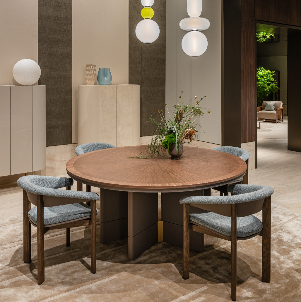
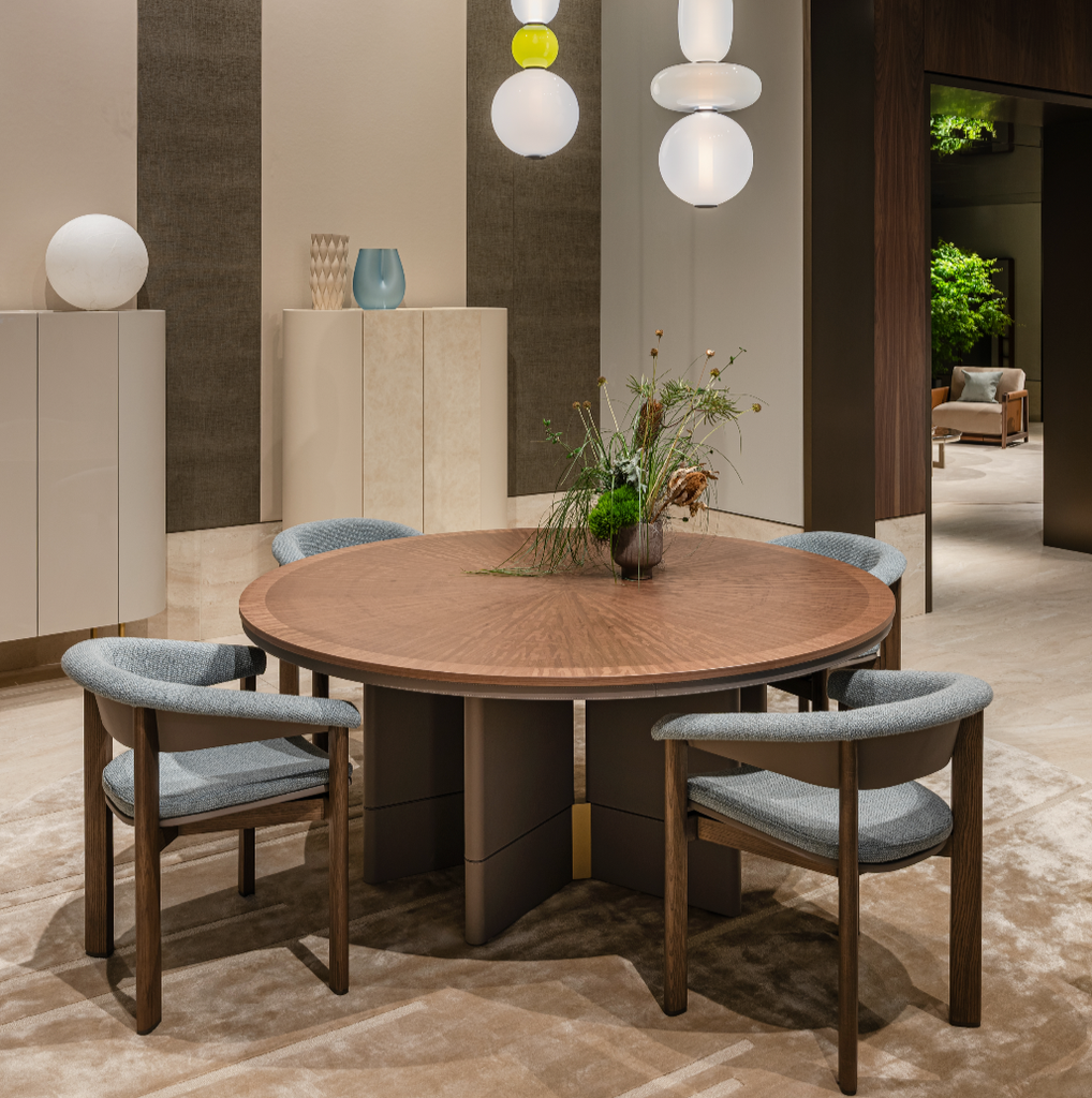
The Zero26 round table, designed by Andrea Bonini and shown at the fair, carries the inlay work furthest, its tabletop built from a pattern clearly meant to hold up under close inspection. The wider Zero26 range has also been refreshed: round and rectangular tables now both come in walnut alongside the original high-gloss lacquer, the round table sits on a lighter structure than before, and every model’s legs are leather-wrapped with the stitching left visible rather than hidden.

Weaving and inlay aren’t unusual techniques in furniture making on their own. What stands out is that Turri is pulling methods typically reserved for large contract commissions into pieces meant for regular use, domestic or hospitality alike. The brand says the same approach carries through to its boiserie and full interior projects as well.

September 14, 2026 0 comments
0 FacebookTwitterPinterestEmail
Products

TÊT: Marco Acerbis Designs a New Stackable Seat for Et al.

by DDI Edit Team September 14, 2026
written by DDI Edit Team

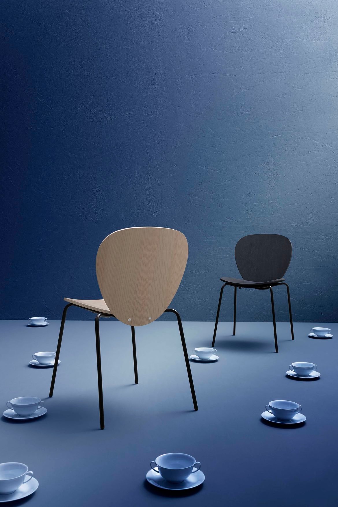
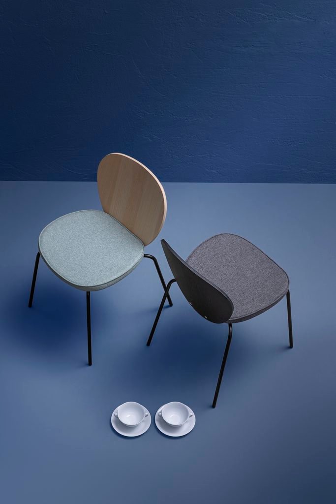
Marco Acerbis has designed TÊT, a new seat for Et al., built from two curved plywood shells that together set the chair’s outline. The construction reads as simple, yet the proportions and volumes carry a distinct formal identity.

The backrest is the piece’s clearest signature: wide, slightly enveloping, treated as one continuous surface. It carries the chair’s volumetric presence and sets the tone for everything else in the design.

The seat is also formed from curved plywood and can take an upholstered cushion, added as a separate element rather than fused to the backrest. The cushion softens the geometry of the shell and rounds out the comfort of the piece, both to the eye and to the body. TÊT comes in two configurations, fully in wood or with the upholstered seat cushion, and the choice of upholstery can shift the character of the chair without changing its underlying form. The seat and backrest, in either version, sit on a four-legged metal frame kept light and structurally straightforward.

Stackability is written into the design rather than added afterward. The chairs nest for storage, a detail that carries real weight in hospitality settings, where furniture gets moved, reconfigured, and put away on a daily basis.

Et al. brings seventy years of experience in seating, tables, and furniture accessories for hospitality and public spaces, rooted in the area between the Marche and Romagna regions, where furniture craft has passed through generations of makers. The brand names responsibility, sustainability, and care for people among its founding values. Et al. is part of Ifi S.p.A., an established name in furnishing solutions for bars, gelato parlours, pastry shops, and the wider food service sector, and a two-time winner of the Compasso d’Oro ADI award, in 2014 and 2018.

September 14, 2026 0 comments
0 FacebookTwitterPinterestEmail
Smart Living

Bandai Shrinks the Tamagotchi Into a Wearable Ring With a Color LCD Screen

by DDI Edit Team September 7, 2026
written by DDI Edit Team

Bandai has built the Tamagotchi ring, a ring-shaped device designed to be worn as an accessory. The device measures approximately 28 × 23 × 35 millimeters and fits a color LCD screen inside a compact wearable body, letting users feed, care for, and play with the digital creature directly from their finger.

The Tamagotchi ring is available in Japan in three color combinations: Pink & Pearl White, Light Blue & Metallic Gold, and Black & Metallic Silver. The pink version uses an aurora pearl finish, while the other two use plated finishes.

The original Tamagotchi was carried in a pocket, clipped to a keychain, or hung from a bag. This version moves the digital pet onto the body directly, closer to how contemporary wearable technology is worn, while keeping the simple interaction style the original devices were built around.

Tamagotchi ring Bandai wearable

Despite its size, the ring includes a color LCD display and supports the series’ familiar care and gameplay mechanics. Depending on how it’s looked after, the digital creature can develop into more than 30 different Tamagotchi characters, with secret characters also built into the system.

The ring comes in sizes 10 and 14, with an included spacer to adjust the fit. Each color version ships with its own dedicated charger, designed to display the device while it charges. A ball chain is also included, allowing the ring to be worn as a pendant instead.

Bandai describes the Tamagotchi ring as the world’s smallest ring-shaped Tamagotchi device. It runs on a rechargeable LiPo battery, charged through the included charger, with the compact body holding the screen and controls needed for the standard care cycle.

September 7, 2026 0 comments
0 FacebookTwitterPinterestEmail
Smart Living

Orphea: A Playable 13-Key Electronic Piano That Fits in Your Pocket

by DDI Edit Team September 7, 2026
written by DDI Edit Team

Orphea is a compact electronic piano developed by Pianni to test how far a conventional keyboard can be reduced while keeping its physical and musical function intact. The instrument is only slightly larger than a modern smartphone and combines a standard chromatic black-and-white key layout with physical pressable keys, polyphonic playing, octave controls, built-in speakers, headphone output, MIDI connectivity, and USB-C charging.

The current prototype spans one chromatic octave, from C to C, across 13 physical keys. Dedicated octave controls extend the playable pitch range without increasing the instrument’s size, allowing it to retain the layout and tactile feel of a conventional piano within a significantly smaller format.

Most ultra-portable keyboards reduce their size by removing black keys, switching to touch surfaces instead of physical keys, limiting polyphony, or relying on an external device to produce sound. Orphea keeps the chromatic black-and-white layout and physical key mechanism intact while building the electronic components needed for independent operation directly into the body.

Built-in speakers let the instrument play sound without additional equipment, while a headphone output allows for quiet practice. MIDI connectivity lets Orphea function as a compact controller for external software and hardware, extending its use beyond its own built-in sounds.

The instrument has gone through multiple rounds of prototyping and engineering, focused on key feel and mechanical behaviour, enclosure geometry, internal electronics, speaker placement, and overall portability. Its enclosure is a compact molded plastic body, designed to balance low weight and durability with the physical interface of a conventional piano.

Orphea is built as a portable musical sketchbook rather than a replacement for a full-sized piano. Its size allows it to be carried in a small bag and used in situations where a traditional keyboard would be impractical, including while travelling, outdoors, at a desk, or during quiet practice.

The reduced keyboard has been tested against varying levels of musical complexity. Pianni founder and pianist Jordan Daniels has used the prototype to play both simple melodies and more complex repertoire, including a three-voice Bach fugue, testing how much polyphonic playing the compact format can support. The project is currently being refined toward production and is preparing for launch through Kickstarter.

Fact File

Product Name: Orphea
Designer/Studio: Pianni
Founder: Jordan Daniels
Category: Portable Electronic Piano
Keys: 13 (one chromatic octave, C to C, with octave controls)
Features: Polyphonic playing, built-in speakers, headphone output, MIDI connectivity, USB-C charging
Enclosure: Molded plastic
Status: Prototype, preparing for Kickstarter launch

September 7, 2026 0 comments
0 FacebookTwitterPinterestEmail
Public & Cultural

The Northstar School, Rajkot, India, by Shanmugam Associates

by DDI Edit Team September 1, 2026
written by DDI Edit Team

The Northstar School is a progressive institution built around the idea that architecture should shape a central part of every child’s experience on campus. The project sits on the southeastern corner of a 17.8-acre site adjoining the RK University campus on the Rajkot-Bhavnagar highway, on land that was previously barren.

The design responds directly to Rajkot’s semi-arid climate, factoring in dusty, windy site conditions, a brief monsoon season, and the availability of treated water from RK University’s sewage treatment plant. The overall master plan was developed across three phases, with Phases 1 and 2 currently built. Key functions are placed on the ground and first floors to keep the built environment accessible to children, with corridors left open-ended to allow for future expansion.

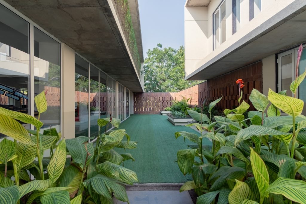
The design process began with a single classroom module, built around cross ventilation, a private garden, and an open-to-sky jaali courtyard. This module was repeated and combined into a larger composition, with a shared garden placed between pairs of classrooms so it can be monitored easily while also functioning as a space for outdoor classes and performances. One such garden runs as a narrow strip between two classroom blocks, lined with artificial turf and bordered by a perforated brick screen, with glazed classroom windows opening directly onto it and clusters of broad-leafed tropical planting set along its edge.

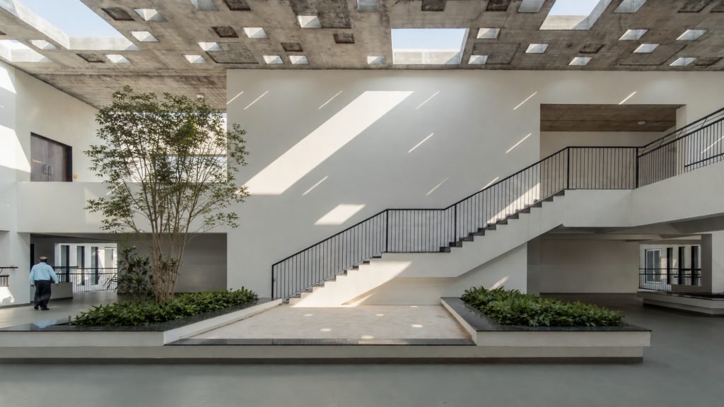
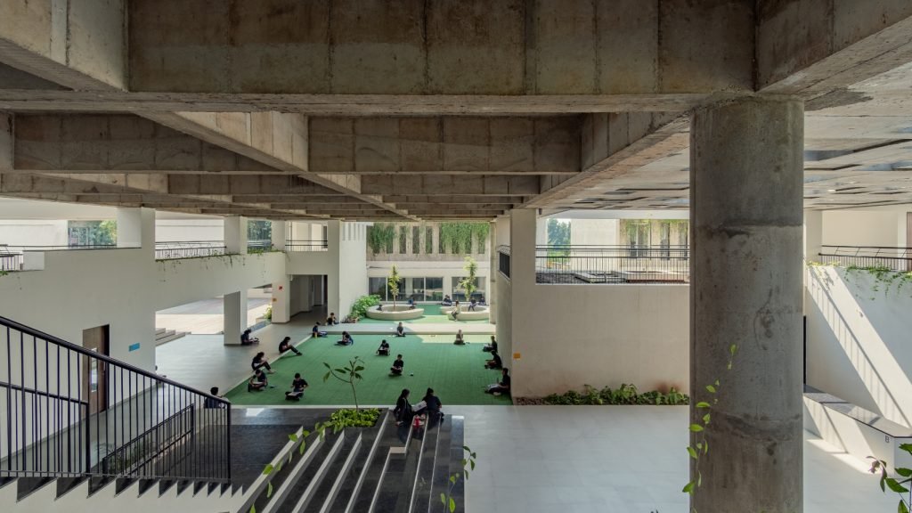
At the center of each module sits a stepped courtyard, a form drawn from Gujarat’s traditional stepped wells. This courtyard concept repeats across every phase of the school and functions as a gathering space, a circulation route, and a venue for larger events. In one such double-height courtyard, a straight concrete staircase with black metal railings rises against a white plastered wall, lit by narrow skylights cut into a coffered concrete ceiling above, which casts long strips of daylight and shadow across the stairs and floor. A single tree grows from a planted bed at the base of the stairs, flanked by raised planters with low shrubs.

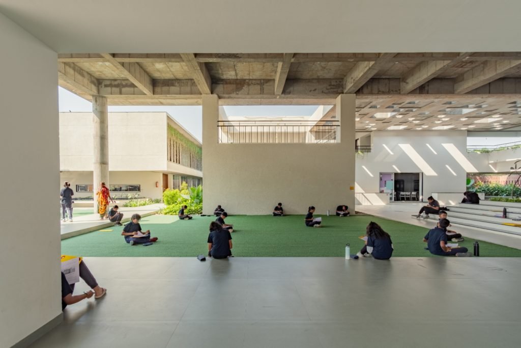
Elsewhere, a covered outdoor gathering space sits beneath an exposed concrete beam structure, its floor laid with artificial turf where groups of students sit cross-legged with notebooks and water bottles during an outdoor class. Tiered concrete steps run along one edge of this space, doubling as informal seating, while the surrounding buildings are visible through the open structural bays, including a section of facade covered in trailing green creepers.

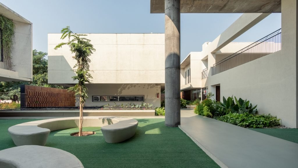
A separate courtyard features a raised circular concrete planter with built-in curved bench seating, positioned around a young tree, adjacent to a black tiled reflecting pool with water lilies set into the paving nearby. In another courtyard, curved white concrete benches ring a similarly planted tree, set against a backdrop of the building’s white plastered upper volumes and a section of dark timber slat screening along a boundary wall.

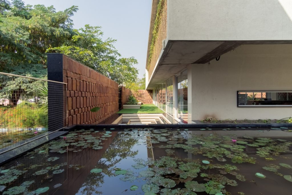
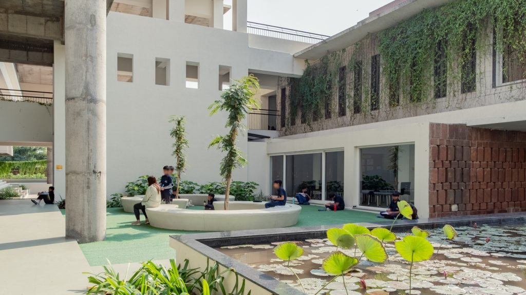
A raised black-tiled water body, planted with lotus and water lily leaves, runs alongside one wing of the school, bordered by a red brick jaali wall on one side and a glazed classroom facade on the other. Students are seen seated along this edge, near a concrete bench built into a planted island within the courtyard, backed by a taller building volume with narrow vertical window openings and a facade section covered in climbing green creepers.

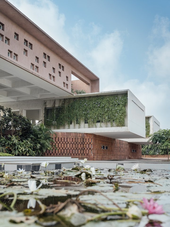
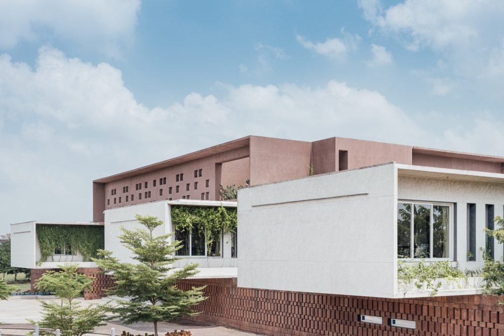
On the exterior, the school’s upper floor is finished with a repeating grid of small square windows set into a terracotta-toned limestone facade, cantilevering out over sections of exposed brick jaali walls below and window strips wrapped in green creeper growth. A large cantilevered white concrete volume, its underside faced in green climbing plants, projects over a brick base with slit window openings, overlooking a water body dotted with white and pink lotus flowers in the foreground.

On the second floor, a 250-person multipurpose hall sits as a massing block supported lightly on the floor below, engineered with the project’s structural consultant. This volume is visible from the main entry walkway, which is shaded by a dense tree canopy.

A secondary skin wraps all floors of the building to filter natural light, block dust, and add a layer of security. On the ground floor, this skin takes the form of jaali screens; on the first floor, it is built as a creeper screen. The facade material is Bella, a natural hard limestone in a terracotta tone, chosen for being locally available, economical, and suited to an institutional building.

The design incorporates ongoing change as part of its intent. An owl currently occupies an unused truncated duct on site, gulmohar trees shed flowers along the main pedestrian entry, and the school runs a horticulture program for students.

Fact File

Designed by: Shanmugam Associates
Project Type: Educational Architecture Design
Typology: Educational/ Public 
Project Name: The Northstar School
Location: Rajkot, India
Built Area: 9000 Sq.ft
Principal Architects: Santhosh Shanmugam, Raja Krishnan D & Shanmugam A
Design Team: Krishnan, Santhosh, Balasubramanian, Manish Bokdia, Vimala, Krishnan, Santhosh Shanmugam, Balasubramanian, Manish Bokdia, Vimala
Photograph Courtesy: Ishita Sitwala & Denis Amirtharaj

September 1, 2026 0 comments
0 FacebookTwitterPinterestEmail
Hospitality

Hotel Aurora, Merano, Italy, by Hannes Peer Architecture—A Three-Generation Hotel Renovation

by DDI Edit Team August 30, 2026
written by DDI Edit Team

Hotel Aurora sits on Merano’s Passer Promenade, run by the Aukenthaler family for close to sixty years. The current renovation was commissioned by third-generation siblings Melanie and Philipp Aukenthaler, who inherited the 59-room property and briefed Hannes Peer Architecture to build on the hotel’s existing design history rather than replace it. Phase one covers every guest-facing floor of the hotel: 18 redesigned rooms, a new Listening Bar, the lobby, lounge, and reception, and a new aluminum facade developed with Vienna-based studio Feld72. Phase two, adding a rooftop pool and 41 additional rooms, is scheduled for 2028.

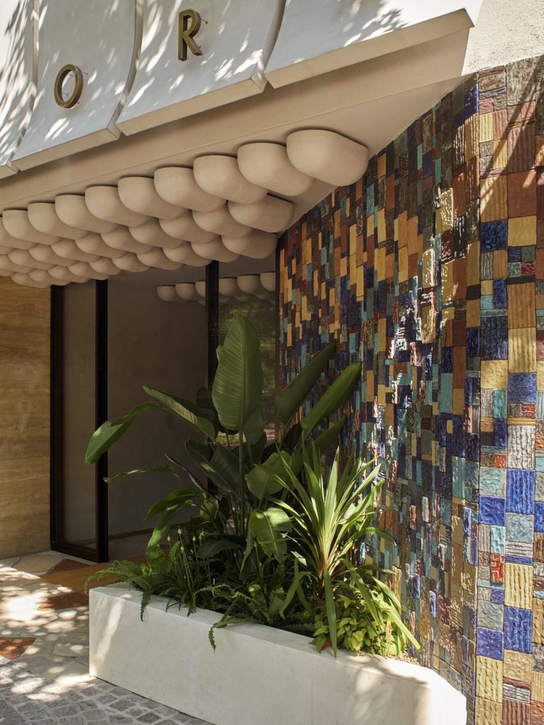
The building’s exterior is wrapped in an aluminum outer skin that varies in depth and width across its surface, changing how it reflects light through the day. At the entrance, the hotel’s name is spelled out in individual brass letters mounted above a scalloped plaster canopy, its underside built from a repeating pattern of rounded, overlapping forms. Beside the entrance, a wall is faced in a mosaic of small ceramic tiles in varied blues, ochres, greens, and rust tones, each with a different surface texture. Planting in a raised concrete trough sits at the base of this wall, with broad-leafed tropical species positioned directly beneath the canopy. Glazed doors framed in dark metal lead into a stone-floored entry corridor.

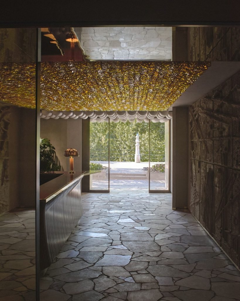
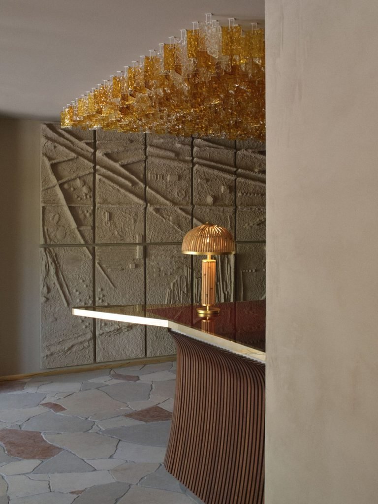
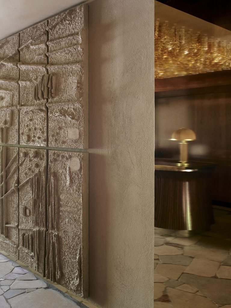
Inside the entry, a bas-relief wall panel runs floor to ceiling in pale textured concrete, its surface cut with a grid of vertical lines, notches, and raised geometric marks. The work is titled Horizon and was made by South Tyrolean artist Ursula Huber. Set into the same wall is a horizontal glass strip that runs across the panel at chest height. Beyond it, a mushroom-shaped table lamp with a fluted rattan-effect shade and brass base sits on a curved reception desk finished in a deep red lacquered surface with dark wood cladding beneath. Overhead, a chandelier made from hundreds of individual glass elements in amber, gold, and clear tones spans the width of the ceiling, its irregular clustered form catching light differently across its surface.

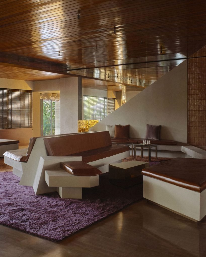
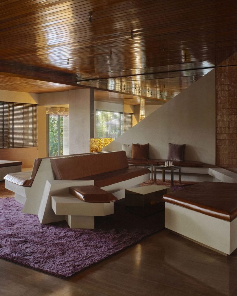
The lounge is finished in stone flooring that continues the material used on the exterior promenade. Built-in seating wraps the room in white-lacquered blocks topped with brown leather cushions, their forms cut into sharp, faceted angles rather than simple rectangles. A deep purple rug sits beneath the main seating group, with brown and mustard cushions arranged along a corner banquette. Horizontal wood-slat blinds cover the windows, filtering light across the room in narrow bands. A folding screen made from the same amber glass elements as the lobby chandelier stands near the seating area, along with a floor lamp with a turned wood base and cylindrical fabric shade.

The Listening Bar is finished in a dark red-brown ceiling of horizontal wood slats, paired with a mirrored ceiling panel that reflects the room below. Dining tables here are topped in dark lacquered surfaces, paired with chairs upholstered in burnt orange velvet with slim black metal frames. A textured concrete panel matching the lobby’s bas-relief wall is set behind one seating area, with a brass table lamp and fabric shade positioned in front of it.

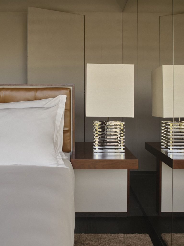
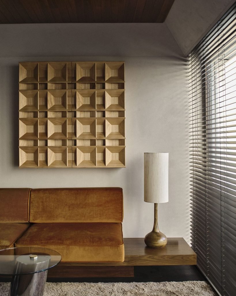
Guest rooms are finished with dark wood-framed leather headboards in tan and brown, paired with white bed linen. Bedside tables in walnut hold table lamps with square cream fabric shades set on faceted glass and chrome bases, reflected in mirrored wall panels behind the bed. In the seating areas, a wall-mounted wood shelving unit made from repeating pyramid-shaped compartments is installed above a burnt orange velvet sofa, paired with a turned wood table lamp with a cylindrical shade positioned on a low wood console beside a slatted metal window blind.

Fact File

Photography: Giulio Ghirardi
Typology: Hospitality
Design Studio: Hannes Peer Architecture
Facade Design: Feld72
Ceramic Wall Work: Hannes Peer with Officine Saffi
Concrete Bas-Relief (“Horizon”): Ursula Huber
Reception Desk: Rier
Chandelier: 6:AM
Art Platform: Carte Blanche, curated by Eva Ingram Harpf
Existing 1970s Interiors (Restored): Herbert Kinkelin, restored by Artè
Location: Merano, South Tyrol, Italy
Rooms: 59 (18 redesigned in Phase One)
Phase Two Completion: 2028

August 30, 2026 0 comments
0 FacebookTwitterPinterestEmail
Commercial

Oscar Bravo, Sydney, Australia, by March Studio—A Tailoring Store Rebuilt for the Jet Age

by DDI Edit Team August 30, 2026
written by DDI Edit Team

Oscar Bravo occupies a 70 sq. m retail space at 62 Pitt Street in Sydney, inside the former Liverpool & London & Globe Building. The building was designed by Spain, Cosh & Stewart, and opened on 15 March 1962, part of a short run of Sydney construction from the late 1950s into the early 1960s that broke from the city’s older architectural habits in favor of a lighter, more technical language. It is now heritage listed under the Sydney Local Environmental Plan, recognised in part for a wedge-shaped floor plan engineered around a single structural column per floor. Oscar Bravo selected the site specifically for this history, positioning the brand within a building tied to the same period of design it draws from.

The store was designed by March Studio, led by director Rodney Eggleston, with brand identity, wayfinding, and graphics developed separately by Cavigneaux, the identity practice founded by Anne-Laure Cavigneaux in 2025. Cavigneaux and Eggleston co-founded March Studio together in 2007 and continue to work in parallel through separate practices, with this project bringing both together on one brief. The design departs from the conventions typically associated with tailoring retail. Instead of dark timber, heavy drapery, and ornate detailing, the brief called for a material and spatial language pulled from the Jet Age: curved surfaces, aluminum, precision detailing, and an overall sense of forward motion rather than heritage.

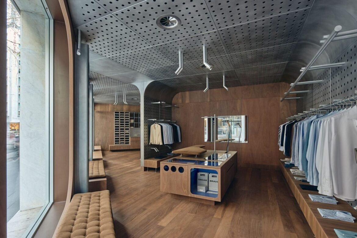
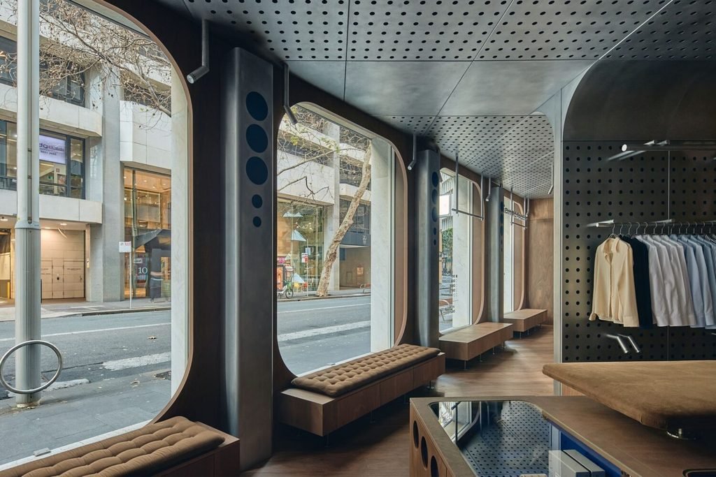
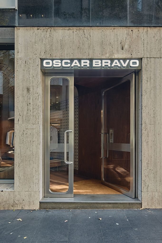
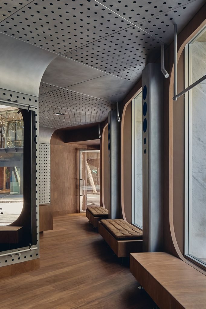
The storefront sits within the building’s travertine base, framed between sections of dark stone cladding. An illuminated Oscar Bravo sign is mounted above a pair of glazed steel-framed doors with full-height handles, opening onto a small entry vestibule finished in walnut with a stainless steel threshold strip. Through the doors, a perforated dark steel ceiling is visible immediately, its surface fitted with a dense, evenly spaced grid of round openings that continues throughout the store.

Inside, the ceiling curves downward at intervals into rounded, capsule-shaped columns that run along the shopfront glazing. These columns are finished in a combination of brushed steel and wood, with a vertical row of dark punched circles set into each one, echoing the perforation pattern used overhead. The window bays beneath them hold long tufted benches upholstered in warm brown fabric, positioned so they face out toward the street view of Pitt Street’s surrounding towers and street trees. Adjustable steel spotlights are mounted directly onto the columns, angled down toward the benches and displays.

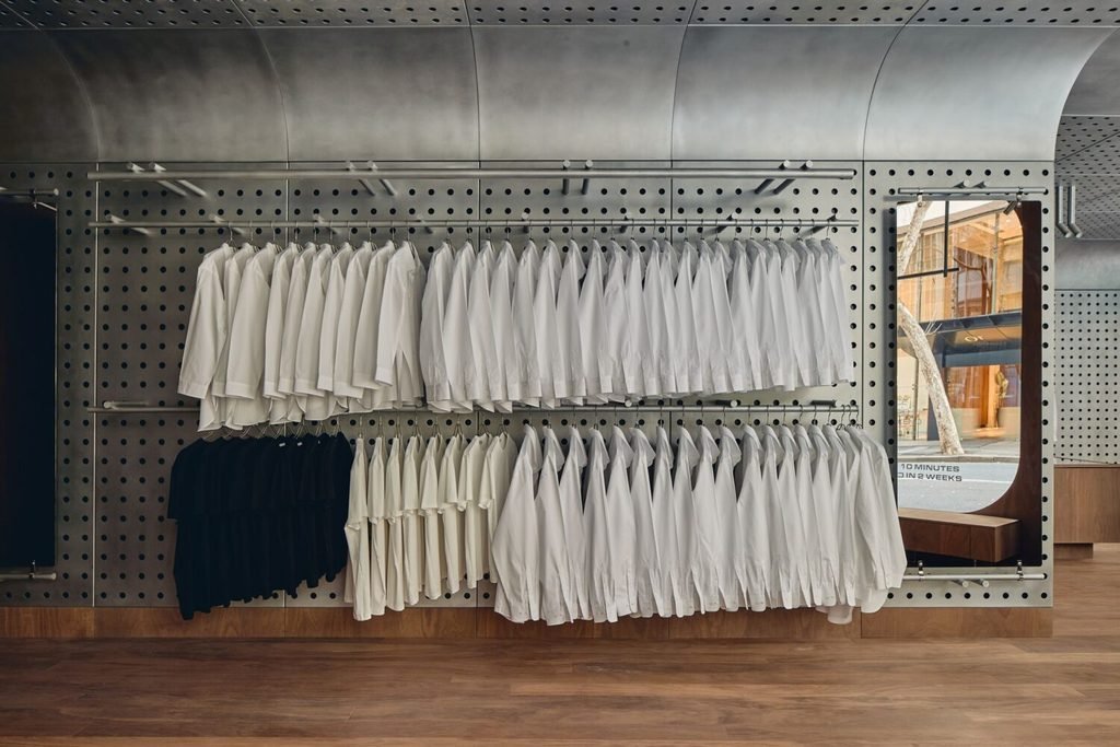
The retail floor is finished in wide-plank walnut, running continuously from the entry through to the fitting rooms at the rear. The garment display uses a perforated steel wall system fitted with removable steel rods and hooks, allowing shirts, jackets, and trousers to be hung directly against the metal rather than on a conventional rail. Folded shirts are additionally displayed on wall-mounted steel bars in tiered rows, arranged by color, with white, pale blue, and black pieces grouped separately. A central island counter, built in wood with a glass and blue laminate base, functions as the store’s fitting and pressing station. Its surface holds a padded ironing board built directly into the counter, with an angled mirror mounted on the wall behind it. Storage cubes beneath the counter are labelled “Oscar Bravo” in blue and white packaging, visible through cut-out openings in the base.

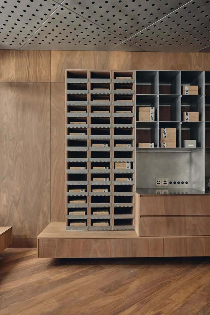
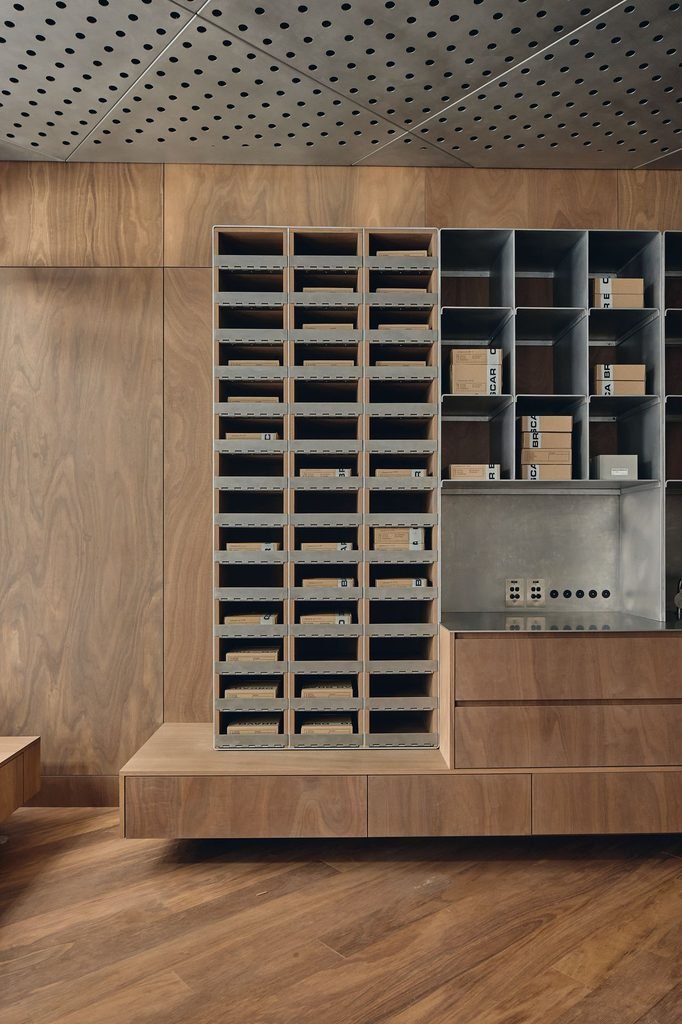
A tall storage and archive unit stands against one wall, built from a grid of steel and wood-lined cubbies stacked in columns, each holding labelled cardboard boxes. The unit sits on a raised walnut platform with drawer storage built into its base, and a stainless steel work surface with power outlets is fitted beside it.

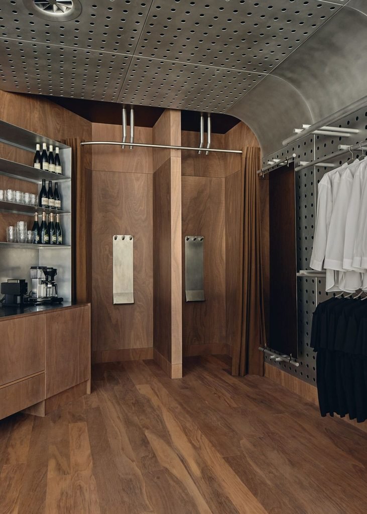
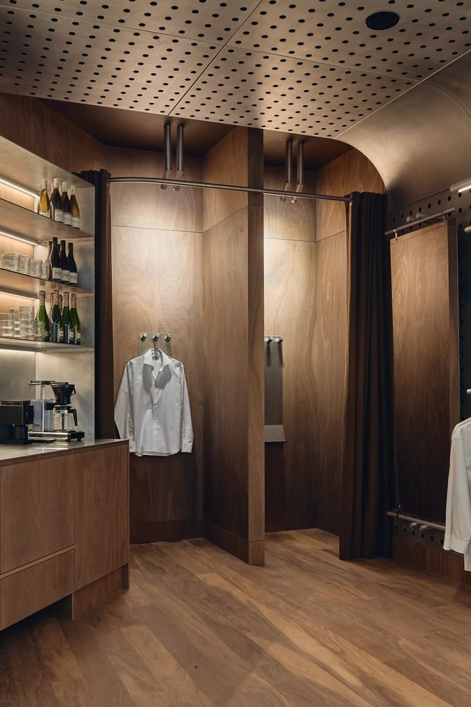
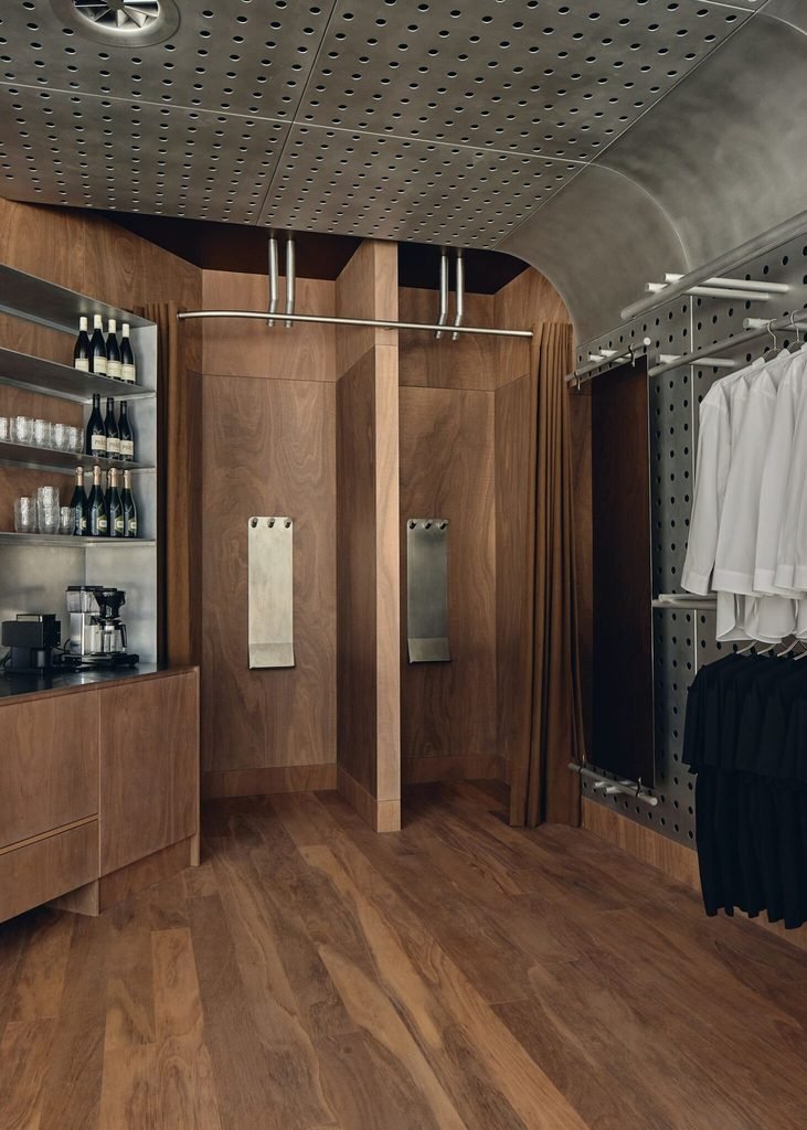
Toward the rear of the store, two fitting rooms are built as enclosed walnut volumes, separated by a shared central partition and closed off with brown curtains hung from exposed steel rail piping. Each fitting room has a steel garment hook panel mounted on the wall inside. Adjacent to the fitting rooms, a service counter in walnut holds a bar setup, with backlit steel shelving above it displaying wine and champagne bottles alongside stacked drinking glasses, and a drip coffee machine and grinder set up on the counter itself. A single white dress shirt hangs from a hook beside the fitting rooms, alongside a folded stack of dark garments displayed on the perforated steel wall.

According to the studio, the store’s central pressing counter was designed to put the labor usually hidden in tailoring on public display, with garments steamed and finished in view throughout the day rather than behind a curtain. Fitting is handled through Oscar Bravo’s own measurement system, with garments fitted on site and delivered roughly two weeks later. The bar setup near the fitting rooms was designed to offer a drink during that process, continuing the store’s overall reference to mid-century travel and hospitality.

Fact File

Photography: Peter Bennetts
Typology: Commercial
Design Studio: March Studio
Brand Identity, Wayfinding & Graphics: Cavigneaux
Location: 62 Pitt Street, Sydney, Australia
Area: 70 sq.m
Original Building Architect (1962): Spain, Cosh & Stewart
Heritage Status: Listed under the Sydney Local Environmental Plan

August 30, 2026 0 comments
0 FacebookTwitterPinterestEmail
Founders & BrandsInterviews

Rokan Liu of SANIKB, Foshan: The Manufacturer Who Treats a Spec Sheet Like a Promise

by DDI Edit Team August 30, 2026
written by DDI Edit Team

His factory floor in Foshan has been shipping kitchen and bath fittings into homes and hotels across North America for twenty-five years. He talks about ceramics the way an engineer talks about aircraft parts, in tolerances, revisions, and accountability, not trends. Alisha Maindola of Design Diary International speaks with Rokan Liu of SANIKB about why certification has to happen before tooling, what it actually takes to keep 1,860 units consistent across five phases, and why cost is no longer where Chinese manufacturing wins.

Twenty-five years ago, price, tooling capability and volume were enough to win a buyer over. That’s not where the conversation starts anymore, according to Rokan Liu, who’s watched the expectations around him shift from what a factory could produce to what it could be trusted to protect, market-specific compliance, revision-controlled drawings, product data that doesn’t change shape between one production lot and the next. Manufacturing itself has changed jobs, in a sense. It used to mean adapting a domestic design for export. Now it means building a product around how a specific market installs it, uses it, lives with it, which means industrial design, plumbing interfaces, cabinet clearances and finish tolerances all have to be worked out together rather than solved one after another.


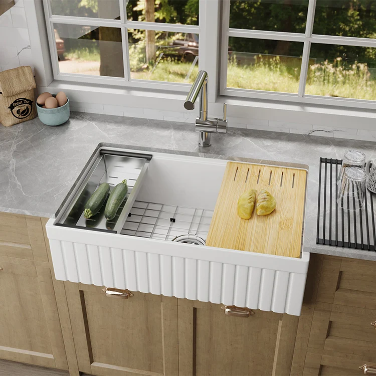
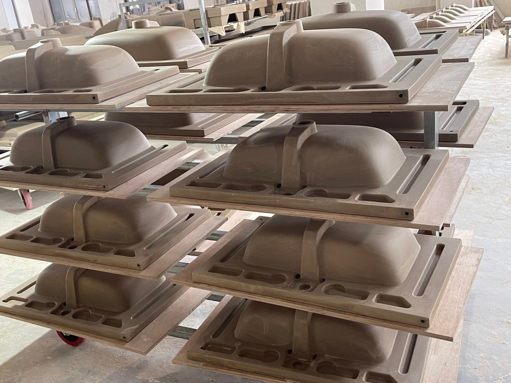
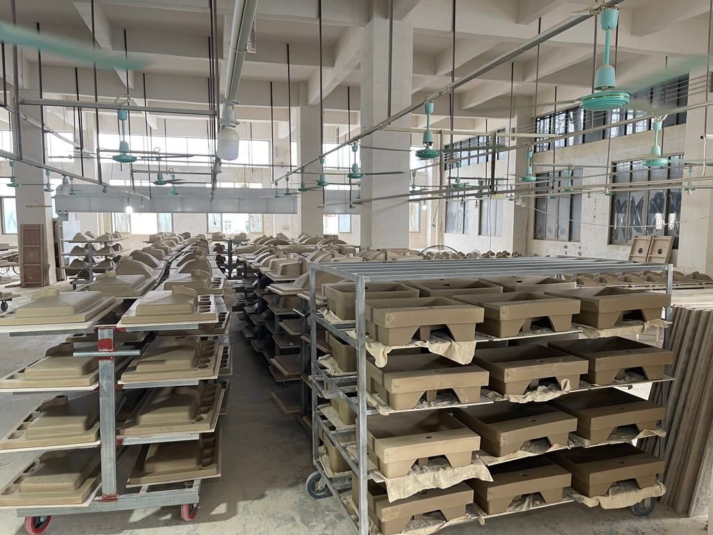
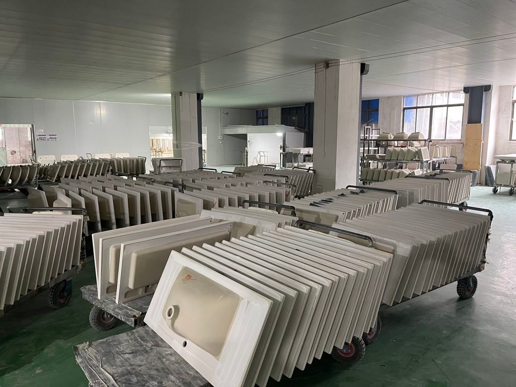
SANIKB runs its own ceramic and fireclay plant in Foshan and sources everything else, faucets, quartz, stainless steel, through a network of audited partners. “Our role is not simply to fill a container,” Liu says. “It is to translate a buyer’s brief into a controlled product specification and then protect that specification through sampling, certification, production, inspection, packing and repeat orders.” Behind that division sits a fairly simple observation: no single factory can credibly claim mastery over every material it touches. Ceramic answers to body formulation, glazing and kiln control. Faucets answer to metallurgy and plating. Quartz and stainless steel carry their own capital demands entirely. So SANIKB keeps the category closest to its identity in-house and holds its partner network to the same bar it holds itself, an arrangement Liu is careful not to let sound like outsourcing. Auditing a supplier, in his framing, isn’t the same as handing them responsibility. SANIKB still owns the approved specification, the bill of materials, the inspection criteria, the corrective-action process, whoever’s actually running the line.

Certification is where that discipline gets stress-tested. SANIKB holds cUPC and IAPMO approval for the U.S. and Canadian markets, and for Liu, that isn’t paperwork tacked on at the end, it’s a design input from the first sketch. Wait until after tooling to think about it, and the usual outcome is delay, redesign, or a certified sample that no longer resembles what actually ships. So the destination market gets defined precisely up front, drawings and materials get checked against what that market requires, and once a configuration is approved, nothing about it moves casually. “A component, dimension or material cannot be changed casually simply because it looks equivalent,” he says.

Ask Liu about the multi-phase hotel refits and residential developments SANIKB supplies, sometimes running to thousands of units, and he’ll tell you the hard part was never getting the first approved unit right. “It is making the final unit, months later, match the same intent.” An approved drawing, a locked colour standard, a golden sample every subsequent piece gets measured against, all of it exists so a small improvement introduced halfway through a rollout doesn’t quietly become a mismatch by the final phase. One project he cites, 1,860 units delivered across five phases, turned out to be less about manufacturing volume and more about something closer to information discipline, cartons correctly identified, replacement protocols already sorted before the first shipment even left the dock.


The product development process follows a similarly stubborn sequence. A buyer’s brief becomes a requirements document before any design work starts, so ambiguity gets resolved early instead of surfacing expensively once tooling is already cut. Concept, CAD, design-for-manufacture review, each stage happens before a design earns the status of what Liu calls the golden sample, the reference every later unit gets measured against. As he puts it, the entire sequence exists to prevent what he calls tooling first, solving later. “Tooling should confirm a resolved product,” he says, “not become the place where unresolved decisions are discovered.”

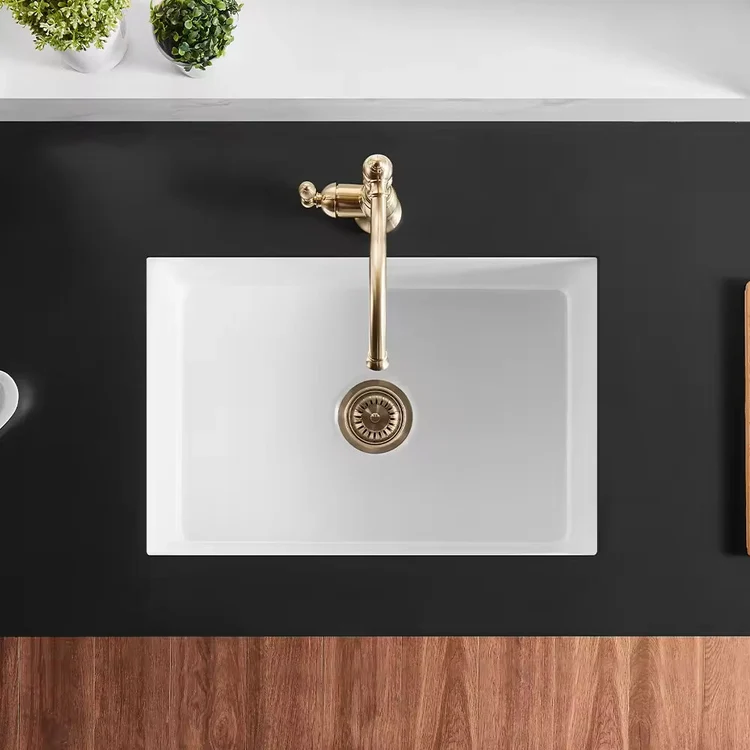
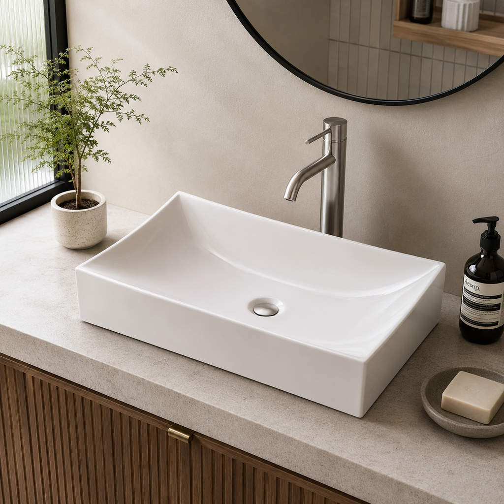
Selling into markets as different as U.S. big-box retail, the Middle East and Latin America is where most brands start to blur into something generic, chasing what Liu calls a cosmetic average. His answer is to split every product into two layers instead: a core idea, proportion, geometry, the task it’s meant to perform, and a market-specific configuration, mounting method, plumbing interface, packaging, that adjusts without touching that core. A basin, in his example, can hold the same visual character everywhere even as its drain and dimensions shift to suit a regional installation standard. “The better approach is a disciplined platform,” he says, “one clear product logic with controlled regional variants.”

Trade shows function less as trend-spotting for SANIKB and more as structured research. Liu goes into KBIS and Expo Revestir with specific questions already set, then comes out having logged the objections installers keep raising, the material pairings buyers won’t stop asking about, the gaps nobody’s filled yet. Some of it turns into a new product brief. Just as often, it turns into a decision not to chase something. “Disciplined product direction,” he says, “is partly about knowing what not to add.”


Where does Chinese manufacturing actually win over the next five years? Not on cost, in Liu’s telling, which has been the industry’s calling card for decades. He points instead to accountability, the ability to combine design, compliance, reliable data and after-sales support without losing control as programs scale, something he thinks matters more as buyers carry leaner inventories and launch more regional variants than they used to. “The companies that make that capability transparent, and accept responsibility from the first drawing through the replacement part, will become long-term product partners rather than interchangeable vendors.”


Twenty-five years in, that’s still the thing Liu keeps circling back to. Not the sink, not the finish, not the show floor, but the promise sitting behind the spec sheet, and whether it holds all the way to the last container.
sanikb.com.

August 30, 2026 0 comments
0 FacebookTwitterPinterestEmail
Newer Posts
Older Posts

Recent Posts

  • Florim Introduces SensiVenezia, a Porcelain Stoneware Collection Inspired by Venetian Terrazzo
  • LEGO Botanical Wave Transforms TANK Shanghai with 380,000 Brick-Built Flowers
  • The Great Eastern Home Introduces Its Latest Collection of Italian Vintage Mirrors
  • Smart Homes Are Changing Architecture: What Happens When Technology Becomes Part of the Building?
  • AARQE9’s Nikhaar Dhawan & Bahaar Dhawan Rohatgi Unveil the Sculptural Lunar Drip Table

Recent Comments

  1. Smart Home Architecture: How Technology Is Changing Design on Aqara Smart Lock U500: Three Versions for Gates, Glass Doors and Standard Entrances

Newsletter

  • Home
  • About Us
  • Contact Us
  • Editorial Policy
  • Privacy Policy

© 2026 Design Diary International. All Rights Reserved.

Design Diary International
  • Home
  • Project
    • Residential
    • Hospitality
    • Commercial
    • Public & Cultural
  • Interview
    • Architect
    • Interior Designer
    • Founders & Brand
    • Artist
  • Material
  • Product
  • Feature
  • DDI Finds
    • Emerging Studio
    • Rising Designers
    • New Practices
  • About
  • Magazine
  • Contact Us